What is Financial Terminal Mono?
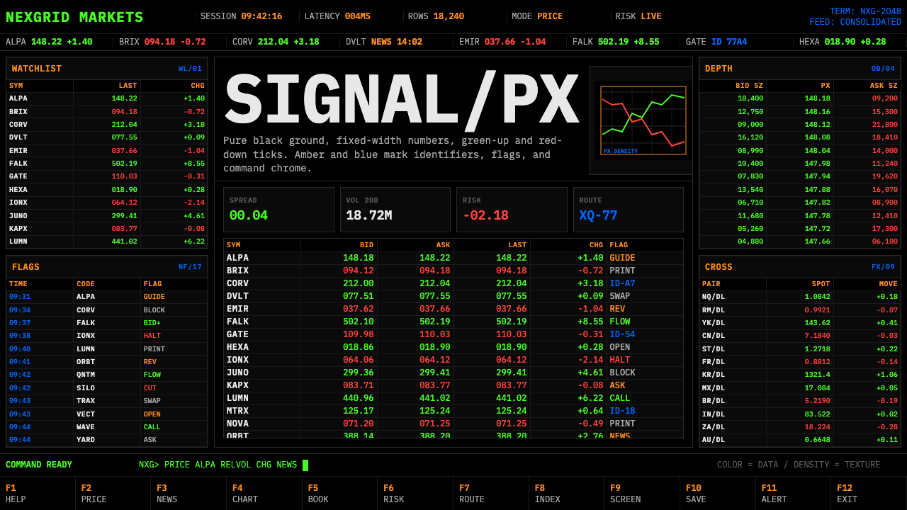
Financial Terminal Mono turns the trading screen into a ruthless information machine — black ground, monospaced figures, live color signals, and no room for ornament.
Financial Terminal Mono in brief
Financial Terminal Mono is a design system distilled from the Bloomberg-style trading screen and the wider tradition of financial-data terminals. Its defining scene is a pure-black field crowded with compact rows of quotes, symbols, directional ticks, timestamps, and supporting metadata. IBM Plex Mono gives every character a predictable footprint, allowing changing values to occupy stable columns instead of disturbing the surrounding layout.
The style is professional-utilitarian rather than conventionally minimalist. It does not achieve clarity by removing information; it achieves clarity by disciplining abundance. Green identifies upward movement, red identifies downward movement, while amber and blue separate non-price metadata from the primary market signal. Color therefore functions as a compact classification system, not as atmosphere or branding.
Movement is implicit throughout the interface. Quotes update, tickers scroll, and a command line waits at the edge for the next instruction. Yet the visual structure remains steady because fixed-width type, repeated rows, and aligned numeric columns absorb constant change. The result is an uncompromising high-contrast environment built around one principle: maximum signal per pixel, zero ornament.
Where does Financial Terminal Mono come from?
Financial Terminal Mono belongs to the canonical terminal-data aesthetic associated with the period from 1990 to 2010, while remaining continuous with trading desks today. Its geographical and institutional center is North America: Bloomberg L.P., Wall Street, and the financial-market infrastructure that connects those settings to global exchanges. It is not presented as the work of a single stylist. It emerged through product development, market-data conventions, and the repeated practical demands of professionals monitoring changing prices.
Michael Bloomberg is the central named figure because Bloomberg L.P. made the Bloomberg-style terminal screen a defining reference for professional financial information. The product did more than display isolated prices. It established an environment in which quotes, directional changes, identifiers, metadata, scrolling feeds, and command access could coexist on one dense screen. Its visual authority came from operational usefulness: the interface looked serious because every visible distinction had a job.
The Bloomberg Terminal product team translated that requirement into a durable interface language. A pure-black ground created an uncompromising stage for luminous information. Monospaced rows kept symbols and numbers aligned as values changed, while green and red turned direction into an immediately recognizable visual event. Amber and blue carried secondary information without competing with the price movement itself. Repetition across rows allowed users to compare many instruments without relearning the structure of each line.
Alongside Bloomberg was a broader market-data-vendor interface tradition. Across financial terminals and real-time dashboards, the same pressures encouraged related solutions: dense tabular organization, fixed-width typography, high contrast, scrolling data, and command-oriented interaction. Financial Terminal Mono abstracts that tradition into a transferable design style. It preserves the trading desk's logic even when used outside a literal terminal: information changes quickly, attention is limited, and every visual difference must communicate status, category, or action.
What defines the Financial Terminal Mono look?
Semantic Color
Color is data before it is appearance. Green means upward movement and red means downward movement, making direction readable without requiring a full verbal label. Amber and blue identify non-price metadata and supporting categories. The palette should therefore be assigned consistently: changing a color for decorative variety would also change its apparent meaning. Large neutral areas remain pure black so that each colored signal retains urgency.
Monospaced Typography
IBM Plex Mono supplies the typographic backbone. Because each character occupies an equal horizontal measure, tickers, signs, decimals, and changing figures can form stable columns. The benefit is not nostalgia for command-line computing but dependable comparison. A value may update repeatedly while adjacent labels stay motionless, allowing the eye to notice the change rather than reprocessing the entire row.
Tabular Alignment
Information is organized as tight, repeated rows rather than isolated cards. Labels establish identity, numeric fields align into vertical comparison channels, and metadata occupies predictable positions. Right alignment is especially useful for figures because differences in magnitude and direction remain visible along a common edge. The grid is felt through disciplined placement, not advertised through decorative framing.
Maximum Density
The terminal treats screen area as operational capacity. Rows are closely packed, secondary data remains visible, and empty space is not celebrated as a luxury. Density succeeds because the same grammar repeats: once a user understands one quote row, the next can be scanned through position and color. Compression without repetition would become noise; repetition turns compression into a working instrument.
Live-State Rhythm
Quotes, directional ticks, and scrolling tickers give the composition a live rhythm. Change appears locally inside a stable matrix rather than forcing the whole screen to reorganize. This contrast between fixed structure and moving data is central to the aesthetic. The interface should feel alert and current even in a still representation, with rows suggesting that another update could arrive at any moment.
Command-Line Utility
A command line positioned along an edge changes the screen from a report into an instrument. The user is not merely receiving market information but preparing to request, filter, or navigate it. This command-oriented presence supports terse labels, keyboard-like directness, and visible system status. Decorative icons and ornamental controls are unnecessary when text itself can name the available action.
Who shaped Financial Terminal Mono?
Michael Bloomberg is the principal individual associated with the origin of this terminal aesthetic through Bloomberg L.P. The Bloomberg-style trading screen became a reference point for presenting financial information at professional scale: numerous quotes, identifiers, directional movements, and metadata remain simultaneously accessible. His significance to the style lies in the institutional environment that made dense, real-time information display a recognizable visual category.
The Bloomberg Terminal product team represents the collective design and product work behind the terminal's lasting visual grammar. The team tradition reconciled rapid market change with structural stability through monospaced columns, repeated rows, semantic color, scrolling information, and command access. Financial Terminal Mono draws from this system-level achievement rather than attributing the interface to a single visual author.
The market-data-vendor interface tradition is a distributed contributor rather than one person or company. Vendors serving financial markets faced common demands for real-time visibility, compact comparison, and dependable status coding. Their interfaces reinforced the tabular, monospaced, high-contrast conventions now associated with trading terminals. This broader tradition explains why the aesthetic extends beyond one product and continues across contemporary trading desks.
How do you use Financial Terminal Mono today?
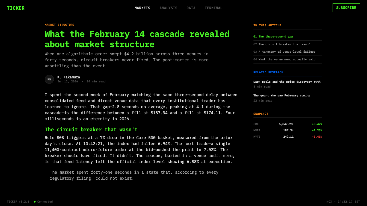
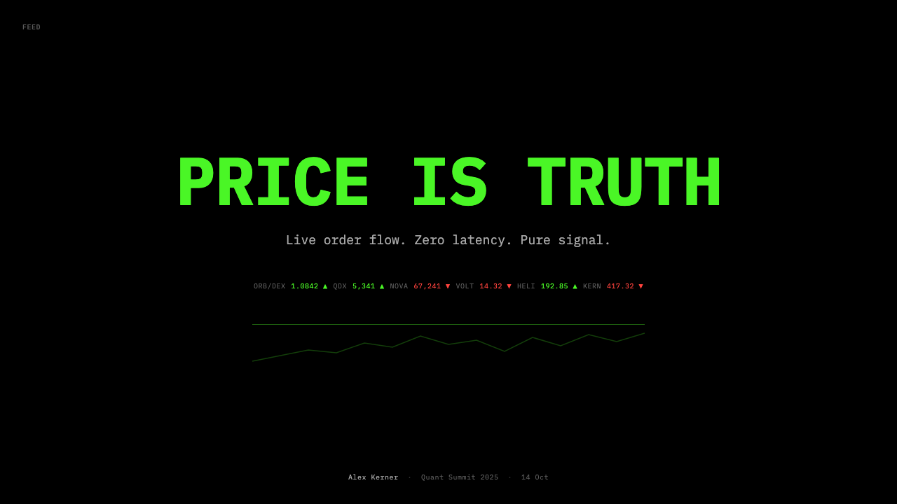
For presentation covers, Financial Terminal Mono works best when the title behaves like a system identifier rather than an advertising slogan. Place it within a black field alongside a concise ticker-like subtitle, status label, or metadata line. Content slides can use compact monospaced headings and repeated rows, but the hierarchy must remain explicit: the audience should immediately distinguish the main statement, supporting evidence, and contextual metadata.
Data slides are the style's natural territory. Tables should preserve stable columns, align comparable figures, and use green and red only when direction is genuinely meaningful. Amber and blue can separate dates, categories, sources, or other non-price context. Charts should retain the same semantic discipline, with labels close to their data and a dark field that allows live-state signals to remain visually dominant.
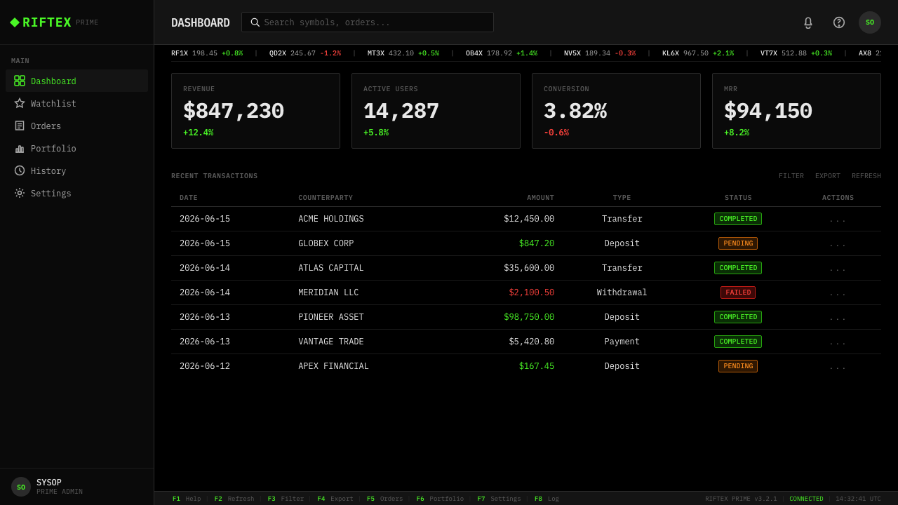
For web interfaces, the style suits dashboards, monitoring tools, and pricing pages where users compare many states or tiers. A dashboard can combine quote-like rows, scrolling updates, and an edge-positioned command or filter area. A pricing page can treat plans as comparable records rather than promotional cards, aligning features in consistent columns and reserving colored emphasis for meaningful differences, availability, or change.
Editorial and marketing applications should borrow the terminal's information logic without pretending every subject is live market data. Article pages can use monospaced metadata, dense indexes, and black-ground callouts, while preserving readable separation between long prose and compact facts. Marketing pages can frame product claims as status lines, evidence rows, or command-like prompts. The tone should remain precise, active, and operational rather than theatrical.
The most common mistake is to imitate the surface while abandoning the semantics. Random green and red text, decorative streams of numbers, or every section competing at terminal density produces costume rather than system. Begin by deciding what counts as primary data, directional change, supporting metadata, and user action. Only then assign color and position. Maximum signal per pixel means maximizing useful distinction, not filling every available space with noise.
Financial Terminal Mono — FAQ
Is Financial Terminal Mono simply a Bloomberg Terminal imitation?
No. The Bloomberg-style trading screen is its clearest reference, but the style also draws on the wider market-data-vendor interface tradition and the general development of high-density real-time dashboards. It abstracts recurring principles — black ground, monospaced tabular alignment, semantic color, scrolling information, and command access — into a design system that can be applied beyond literal financial software.
Why is monospaced type essential to the style?
Monospaced type gives every character a stable footprint. When prices, signs, or ticker symbols change, the surrounding columns do not shift, so the user can compare values vertically and detect local updates quickly. IBM Plex Mono also reinforces the terminal character of the interface, but its primary contribution is functional: it converts continuously changing text into dependable tabular structure.
Must green and red always mean up and down?
Within the canonical financial-terminal reading, yes: green communicates upward movement and red communicates downward movement. That stable pairing is what makes the colors informative at a glance. In a non-financial application, a designer may adapt the categories, but each color still needs one consistent operational meaning. Using the pair merely because it looks like a trading screen weakens the system.
Does maximum density mean eliminating all empty space?
It means treating space as scarce operational capacity, not filling it indiscriminately. The style supports tightly packed rows because alignment, repetition, and semantic color make them scannable. Separation still matters wherever it distinguishes groups, priorities, or actions. Empty space without a communicative role is reduced, but structural intervals remain necessary because they prevent one stream of information from being mistaken for another.
Where does Financial Terminal Mono work poorly?
It struggles when the primary goal is calm spaciousness, soft emotional expression, or leisurely reading. Its pure-black ground, compressed rows, live-state rhythm, and uncompromising contrast communicate vigilance and operational urgency. Long editorial prose can borrow its metadata and callout language, but reproducing terminal density across an entire reading experience would compete with comprehension. The style is strongest when monitoring, comparison, and rapid action are genuine product needs.
Related design styles
 Climbing Topo GuideBeta at a glance. Red route telemetry cuts across near-black stone and conden…
 EKG Vital MonitorClinical clarity glows. Phosphor ECG green, cyan and yellow channels lock to…
 Moog Modular SynthWalnut cabinet, brushed-aluminum panels. Toggle-blue switches, orange patch c…
 Verdana Screen SansBorn digital, built for clarity. Wide humanist letters glow in cool grey on a…
 Cassini Saturn ImagingDeep space feels exact. Butterscotch Saturn floats in black with fine tan rin…
 OS UI HumanistBuilt like a working desktop, not a brand. Window-gray ground, system-blue ch…