What is Exoplanet Survey Atlas?
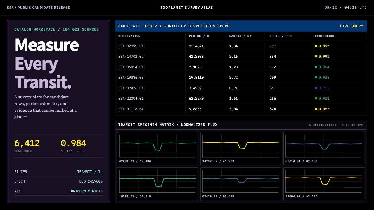
The Exoplanet Survey Atlas is the working face of a data archive, not a poster about space — a measured black plate where dense monospaced tables, transit light curves and a single perceptual colour ramp let thousands of measurements stay legible at once.
Exoplanet Survey Atlas in brief
The Exoplanet Survey Atlas style is the visual language of survey astronomy archives: black screens crowded with tables of candidate planets, small plots of stellar brightness over time, and a single colour ramp used to rank quantities. It descends from the working interface of the NASA Exoplanet Archive and the survey-astronomy data services of its era. Its purpose is to let a researcher scan thousands of rows in one view, which is the opposite purpose from a poster, a landing page or a space-themed illustration.
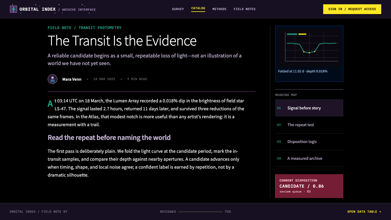
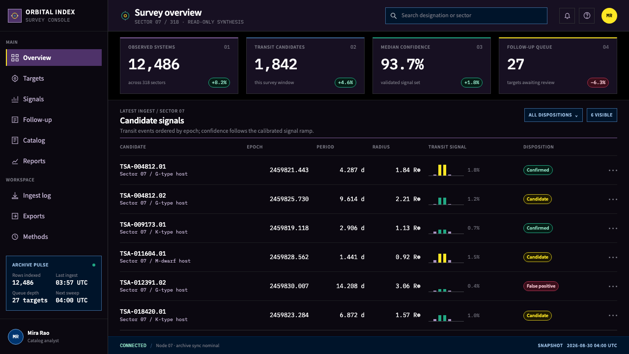
Everything follows from that purpose. The ground is a measured black. Panels in plum and deep navy sit squarely on it, body text is white, and tables run edge to edge between hairline rules, with no zebra fill, no rounded cards and no glow. Colour is not decoration; it is data. Quantity is encoded with viridis and nothing else, with a purple floor, a teal middle and a yellow ceiling, so that the shade of a cell tells you where its value falls.
The result is a style of disciplined density. Light curves are stacked as small multiples, each with its own micro-axis. The habitable zone is a green annulus drawn to scale. Star-field photography is allowed only in the masthead block. Anything that does not help a reader compare, rank or locate a number has been removed, which is why the interface feels like an instrument panel rather than a brochure.
Where does Exoplanet Survey Atlas come from?
The interface lineage behind this style runs through IPAC at the California Institute of Technology in Pasadena, which hosts the NASA Exoplanet Archive. The era the source material gives for the style is 2011 to the present, beginning with the launch of the archive service and continuing through the Kepler, K2 and TESS periods of transit surveying. Those missions made exoplanet science a field of large catalogues, so the main design problem became how to show a very large number of rows without losing any of them.
A transit survey looks for planets by measuring a star's brightness over time and watching for the small, repeated dips that a passing planet causes. The raw product is a light curve. Because a survey observes enormous numbers of stars, the natural way to show the results is not one large, beautiful chart but a grid of small ones, each with a micro-axis of its own, so that an eye can move across the grid and compare. The source lists small-multiple statistical graphics as one of the movements the style belongs to, alongside survey astronomy data archives.
The third thread is colour. For many years, scientific plots defaulted to rainbow-like ramps, which look vivid but distort data, because equal steps in value do not look like equal steps in colour. Perceptually uniform colour ramps fixed that. The most widely used of them is viridis, which moves from purple through teal to yellow, and which matplotlib adopted in the mid-2010s and made its default with version 2.0. The source names Stéfan van der Walt and Nathaniel Smith among its key figures, and lists perceptually uniform colormap design as a movement in its own right.
These threads meet in a style that treats the screen as a measuring surface. William Borucki and Natalie Batalha, also named in the source, are associated with the Kepler survey whose candidate lists this kind of interface was built to browse. The design system draws from that whole tradition at once: the table density of an archive, the small multiples of a transit survey and the ramp of a perceptually uniform colormap. The rule that binds them is that every visual choice must serve measurement.
What defines the Exoplanet Survey Atlas look?
Measured Black Plate
The ground is a pure, deep black chosen for its neutrality rather than its mood. Nothing glows against it and nothing fades into it. It is the plate on which numbers are laid out, the way a dark observing room is a place to look at faint things. Black also makes the viridis ramp read at its fullest, since each step from purple to yellow stands out clearly against it.
Plum and Navy Panels
Panels are square-cornered blocks in plum and deep navy that sit on the black ground. They group related content, such as a filter strip, a parameter list or a plot cluster, without drawing attention to themselves. White text is used throughout. Because both panel colours are dark, they distinguish regions by hue family rather than by brightness, keeping the screen calm while the data supplies the contrast.
Edge-to-Edge Tables
Candidate tables run the full width of their panel, divided by hairline rules. There is no zebra striping, no rounded card around each row and no padding that wastes space. The point is to put as many rows on a screen as a reader can still follow, and to let alignment do the work that decoration usually does. A table in this style looks like a ledger, not a list of cards.
Viridis for Quantity Only
Viridis marks magnitude and nothing else: purple for the floor, teal for the middle, yellow for the ceiling. It is perceptually uniform, so equal steps in value look like equal steps in colour, and a reader can rank a whole column by eye. Rainbow and jet ramps are treated as wrong answers here. Because the ramp means quantity, it is never used for categories, branding or decoration.
Dense Monospaced Numerals
Numbers are set in a monospaced face so that digits align in columns and values with different magnitudes can be compared by length. This is what makes a dense table scannable: decimals line up, and a longer number is visibly longer. Labels and headings stay quiet, in white or a lighter tone of the panel colour, so that the figures remain the loudest thing on the screen.
Small Multiples
Transit light curves and transit matrices are shown as grids of small, equally sized plots. Each cell has its own micro-axis and the same visual form, so the eye can compare across the grid without relearning how to read each one. A whole survey is shown at once, and an outlier simply looks different from its neighbours. This is a form of comparison by repetition, not by emphasis.
Drawn to Scale, Imagery in the Masthead
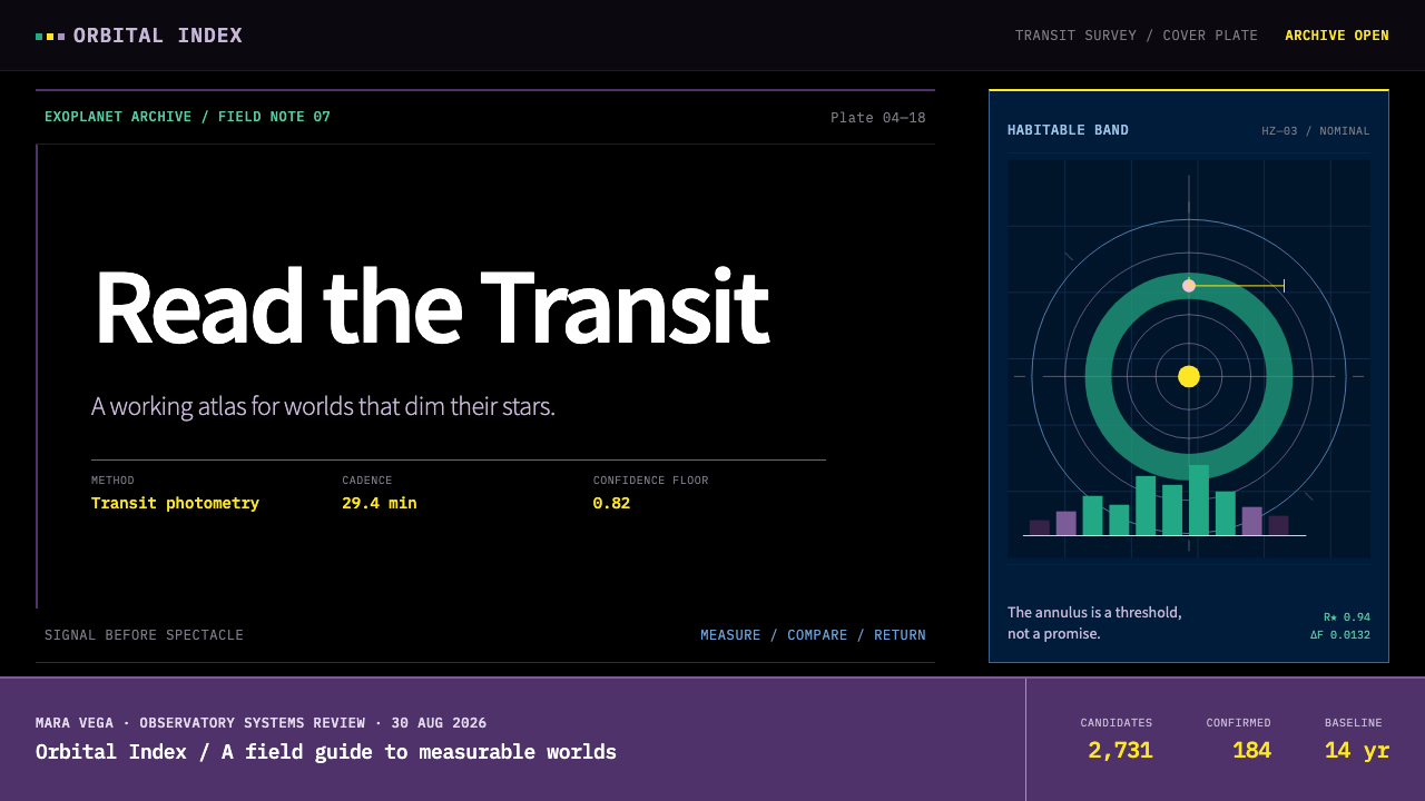
The habitable zone is a green annulus drawn to scale, measured rather than illustrated. Anything that depicts the cosmos pictorially, such as a star field, is confined to the masthead block at the top of the page and nowhere else. This keeps the working area free of atmosphere and makes the one image on the page feel like a title plate for the data beneath it.
Who shaped Exoplanet Survey Atlas?
Stéfan van der Walt is named in the source among the key figures of perceptually uniform colormap design, and is widely credited as one of the designers of viridis. His work with the scientific Python community helped move colour ramps from the rainbow default towards ramps whose steps look equal to the eye. In this style, his contribution is present in every shaded cell.
Nathaniel Smith is the second name the source gives alongside van der Walt for the perceptually uniform colormap tradition, and he is widely credited as a co-designer of viridis. Together they are associated with the ramp that now sits at the centre of the design system: a purple floor, a teal middle and a yellow ceiling that a reader can rank by eye.
William Borucki is named in the source among the key figures and is associated with the Kepler survey. Kepler's transit measurements produced the long candidate lists that archive interfaces of this kind exist to display. The style's emphasis on tables that stay legible at survey scale is a design response to the scale of the data that Kepler opened up.
Natalie Batalha is also named in the source and is associated with the Kepler survey. The cycle from raw light curves to a ranked table of candidates is the workflow this design language was built to serve. Her place in the list reminds us that the style is not abstract visual art; it is the working surface of a scientific pipeline.
How do you use Exoplanet Survey Atlas today?
The Exoplanet Survey Atlas style is the right choice whenever a product's main job is to let people read a lot of numbers quickly. It suits analytics, scientific tools, research archives, monitoring screens, financial or operations dashboards and any interface where the reader is a practitioner who wants density, not atmosphere. It is weaker where warmth, storytelling or friendly onboarding are the goal.
For presentation slides, a cover can use the black plate with a single star-field masthead image and a short title in white. Content slides work as panels on black, each carrying one table or one plot, with no decorative graphics. Data slides are where the style shines: a viridis heat map, a grid of small multiples or a ranked table with a shaded column each tell the audience exactly which values are high and which are low, without a legend lecture.
For web interfaces, dashboards are the obvious fit. Use the black ground, plum and navy panels with square corners, white text and monospaced numerals for data. Tables should run edge to edge between hairline rules, filters should sit in a slim panel, and the viridis ramp should be reserved for columns or cells that carry magnitude. Pricing and comparison pages can borrow the same table discipline: dense, aligned and free of striping.
For editorial and marketing work, this style suits data journalism, technical reports and research landing pages where the credibility of the numbers is the message. Use one masthead image and let the rest of the page be tables, small multiples and short captions. A marketing page for a data product can show its own interface as the hero, since the interface is already the visual identity. Avoid adding illustrations; they would dilute what makes the system trustworthy.
The most common mistake is to treat the style as a space theme and add nebulae, glows or planet illustrations across the page. That turns the working face into a poster. A second mistake is using viridis for categories or decoration, which destroys its meaning as a quantity scale. A third is to soften the interface with zebra stripes, rounded cards or shadows, which waste space and add nothing. Keep the black plate, the hairline rules and the one ramp.
Exoplanet Survey Atlas — FAQ
Why viridis instead of a rainbow ramp?
Because viridis is perceptually uniform: equal steps in value look like equal steps in colour, so a reader can rank a column by eye. Rainbow and jet ramps look vivid but have bands that appear brighter or flatter than their neighbours, and the eye reads those artefacts as features of the data. In a survey interface where people make decisions from colour, a ramp that invents structure is a wrong answer.
Can I use this style outside astronomy?
Yes. The style is about dense, comparable quantitative data on a dark ground, not about planets. It works for any product where readers scan many rows and rank values: observability tools, lab dashboards, market data, logistics and analytics. The astronomical details, such as the star-field masthead and the habitable-zone annulus, are optional. The black plate, the hairline rules and the single ramp are the transferable core.
Why are there no zebra stripes or rounded cards?
They cost space and add little. A zebra fill tints every second row to help the eye track a line, but hairline rules and good alignment do that job with less visual weight. Rounded cards wrap each row or panel in padding that reduces how many rows fit on a screen. The style removes both so that a reader can see more data without scrolling, and so that colour is saved for the ramp.
Where is imagery allowed?
Only in the masthead block at the top of the page. A star-field photograph can sit there as a title plate, but it should not appear behind tables, inside panels or as a background texture. Diagrams, such as the habitable zone, are drawn to scale from measurements rather than illustrated. The rule keeps the working area clean and ensures that every pictorial element is clearly separate from the data.
Is viridis accessible to readers with colour-vision differences?
Viridis was designed to be perceptually uniform, and it is widely regarded as readable by people with common forms of colour-vision deficiency, because it varies strongly in lightness as well as hue. That said, accessibility should not rest on colour alone. In this style the numeric value is always printed beside or inside the shaded cell in a monospaced face, so the information survives even when the colour is not perceived.
Related design styles
 Climbing Topo GuideBeta at a glance. Red route telemetry cuts across near-black stone and conden…
 Financial Terminal MonoMaximum signal per pixel. Pure black, IBM Plex Mono, green-red ticks, amber-b…
 Cassini Saturn ImagingDeep space feels exact. Butterscotch Saturn floats in black with fine tan rin…
 Terminal Vim Dracula (2014)Terminal-native darkness. Near-black panes carry six saturated syntax colors…
 Transhumanism (H+)The body, rendered engineerable. Electric-blue circuit-anatomy schematics and…
 Climate Refuge Seed ArchiveFacts stay cold. Concrete-grey accession rows meet one turquoise fibre-optic…