What is Climate Refuge Seed Archive?
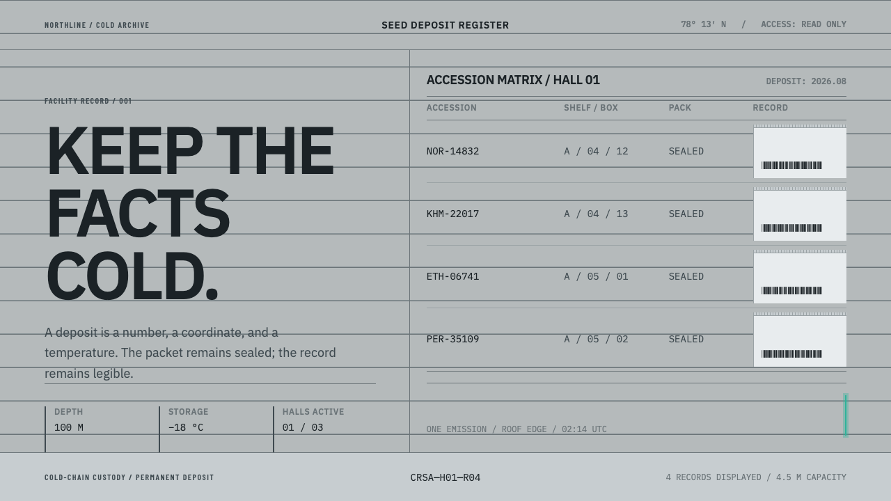
Climate Refuge Seed Archive treats the world's most carefully guarded seed collection as an information problem: cold grey rows, exact numbers, and a single thread of turquoise light.
Climate Refuge Seed Archive in brief
Climate Refuge Seed Archive is a design style drawn from the Svalbard Global Seed Vault, the backup collection of the world's crop seeds cut into a mountain on the island of Spitsbergen, at 78° north. Its look is concrete grey, ruled and numerical: accession rows laid out like a library catalogue, surfaces in the tones of brushed steel and frost, and a single narrow stroke of greenish turquoise that appears once per view as light, never as a fill.
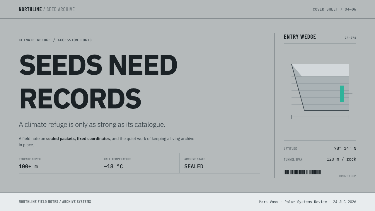
The central idea is that the facts of the place are the aesthetic. The only part of the vault you can see from outside is a board-formed concrete wedge pushing out of the mountainside. Everything that matters sits more than 100 m inside the rock, under 40–60 m of stone, held at −18 °C. The style takes none of its drama from the building's silhouette. It takes it from the catalogue: three-ply foil packets, accession numbers, shelf coordinates, barcodes, and a temperature stated as an ordinary fact.
On the page this becomes a quiet, almost clerical system. Hall, shelf, box and bag are laid out as nested rows. Identifiers are set in a monospaced face and aligned left, so the digits stack into columns that can be read by eye. It is deliberately not a post-apocalyptic look: there are no ruins, no wasteland haze and no sprouting seedlings, because the seeds are sealed in opaque foil and cannot be seen at all. The style respects that fact instead of decorating around it.
Where does Climate Refuge Seed Archive come from?
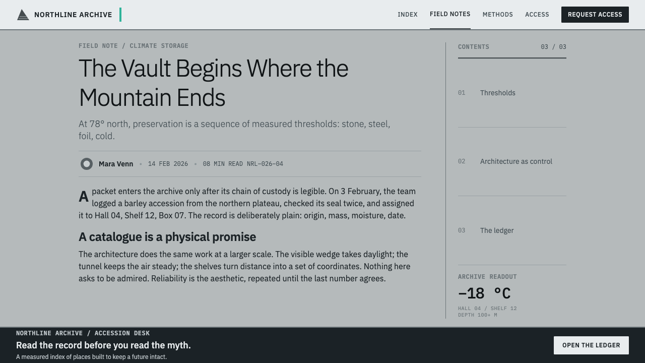
The vault opened in 2008 and is dug into the permafrost of Spitsbergen, in the Svalbard archipelago of Norway. Its purpose is insurance. Gene banks around the world send duplicate samples of their seed collections here, so that if a national collection is lost to war, mismanagement or disaster, a copy survives in the cold. Long-term operation involves NordGen, the Nordic genebank institution, and the idea of a global backup was championed by the agricultural scientist Cary Fowler, whose name is closely tied to the vault's creation. The remote location, the rock and the natural cold do most of the work. The building itself is deliberately plain.
The one gesture of art on the site is by the Norwegian artist Dyveke Sanne. Her fibre-optic work on the roof carries light across an otherwise blunt concrete form, and its greenish-turquoise glow is the colour this style borrows. The borrowing is strict. In the system, as in the artwork, the turquoise is a source of light, so it appears once in a view and is never spread across a surface.
The name adds a speculative layer. Where the real facility dates from 2008, the style extends it forward into an imagined archive for a climate-stressed century, and borrows a second idea from a different field: the long-term warning studies carried out for the Waste Isolation Pilot Plant in the United States, which asked how to mark a dangerous site so that people thousands of years from now would still understand the message. From that work comes the discipline of the marker layer: plain, durable, redundant signs that do not rely on a living language or a fashionable look. The Archive reverses the message from 'keep away' to 'this is worth keeping'.
Three traditions meet in the result. Board-formed structural concrete is poured against timber boards and keeps their grain, so even a smooth wall carries a record of how it was made. Nordic infrastructural minimalism is the habit of treating bridges, tunnels and power works as calm, load-bearing objects. Archival and catalogue information design supplies the finding-aid logic of codes, hierarchy and rows. The Archive sits where those three overlap, and it is more a way of presenting records than a way of decorating them.
What defines the Climate Refuge Seed Archive look?
Concrete, Steel and Frost
The ground is a cool grey, the tone of poured concrete under snow light, with brushed-steel greys for panels and near-white frost for highlights. Warm hues are absent. The effect is low-temperature without being gloomy: nothing is saturated, so the eye reads differences in lightness rather than differences in hue.
One Turquoise Edge
A greenish turquoise, taken from the fibre-optic roof work, is the only chromatic colour. It is used as a light source: a thin line, a glowing edge, a single indicator. It appears once per view and never fills a panel, a button or a chart area. Because everything around it is grey, that one stroke carries the whole emotional weight of the page.
Accession Grid
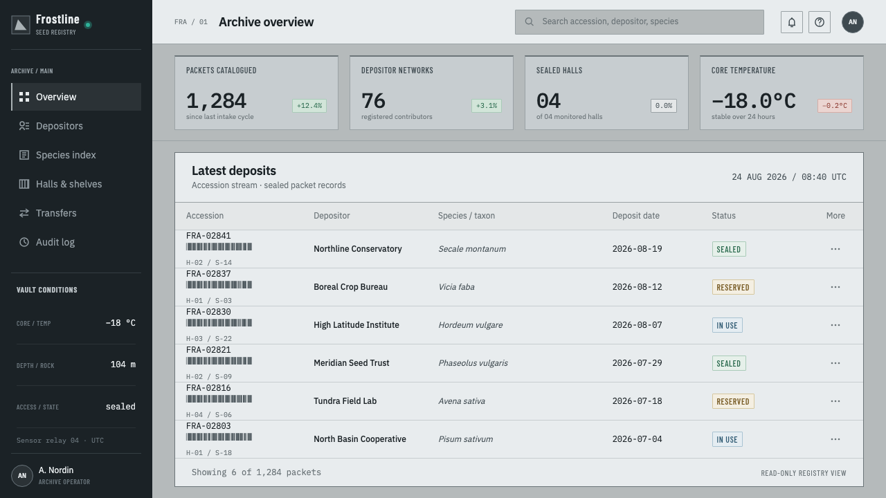
Content is organised as ruled rows rather than cards. The hierarchy mirrors the vault's own: hall, shelf, box, bag. Each level is a nesting of rows, with fine rules separating them and no decorative containers. The grid is unornamented and strictly regular, so a reader can scan it the way an archivist scans a register.
Monospaced, Left-aligned Identifiers
Accession numbers, coordinates and barcodes are set in a monospaced face and aligned to the left edge, which lets digits fall into vertical columns. The monospaced numerals are the style's main typographic voice. Surrounding text stays quiet and subordinate, there to explain the identifiers rather than compete with them.
Board-formed Surface
Where texture appears, it is the faint horizontal grain left by timber formwork in concrete, never a photographic stone effect or a noisy overlay. Surface is suggested, not simulated. Large areas stay flat so that the page still behaves like a clean information sheet.
Temperature as Plain Fact
The voice is declarative. The temperature, the depth and the count of items are printed as ordinary data, in the same weight as any other field. Nothing is dramatised with adjectives or with warning colours. The coldness is carried by the plainness of the statement.
Refusal of Apocalypse Tropes
The style rules out ruined landscapes, dust, haze, glowing wasteland skies and the cliché of a green shoot in an open hand. Seeds in this system are sealed and unseen, so the interface shows the record of the seed and not an image of it. That restraint is the difference between an archive and a disaster poster.
Who shaped Climate Refuge Seed Archive?
Norwegian artist whose fibre-optic roof work for the vault supplies the style's one chromatic note. Her piece is the reason the greenish turquoise exists in this system at all, and it explains the rule that the colour is light rather than paint. The work shows how a single artistic gesture can sit on a deliberately blunt structure without softening it.
Agricultural scientist and one of the leading advocates of a global seed backup, closely associated with the vault's creation. In design terms he stands for the purpose behind the aesthetic: the logic of duplication, insurance and long-term stewardship that makes the catalogue-like look appropriate rather than merely cold.
The Nordic genebank institution connected with running the facility. Its role is a reminder that the vault is a working record system, which is why identifiers, inventories and the hall, shelf, box and bag hierarchy are the style's main material rather than imagery of plants.
A body of work on how to mark a dangerous underground site so that people in the distant future still understand it. The Archive borrows its marker-layer discipline: plain, durable, redundant signs. The studies belong to a different subject, but the communication problem they pose, how to speak across millennia, is the one this style is answering.
How do you use Climate Refuge Seed Archive today?
This style fits any product whose job is to hold records faithfully: inventories, registers, compliance trails, research repositories, conservation and food-security reports. It rewards content that is already structured, and it punishes content that wants to be dramatic. Applying it correctly means letting the rows, identifiers and one line of light do all the work.
On slides, a cover can read like the front sheet of an accession register: a quiet grey field, the title set plainly, a short identifier line in monospace, and one thin turquoise rule as the only colour. Content slides should be tables or stacked rows with fine dividers, left-aligned, with no icons and no cards. Data slides suit the style especially well. Charts are drawn in neutral greys, with at most one series or one highlighted value taking the turquoise, so the eye lands where the argument is.
In web interfaces it suits dashboards, audit logs, status pages, inventory views and data portals. Lay out lists as ruled rows rather than rounded cards, keep numerals monospaced and left-aligned, and let the turquoise mark a single live state: the active item, the latest sync, a selected filter. Pricing pages work if tiers are presented as sheet-like rows of fields. Avoid hero imagery and soft decorative shadows, which fight with the cold, flat discipline.
For editorial and marketing work, the style supports long reports, annual reviews, foundation pages and explainers about conservation or resilience. Use narrow, orderly columns and catalogue-style captions with identifiers, and use photography only when it documents something real, such as concrete, steel, a corridor or a shelf of sealed packets. Let a precise fact do the headline's emotional work, in the manner of the vault's own plain temperature statement.
The most common mistake is spending the turquoise. Used as a fill, a gradient or on every button, it stops being light and becomes branding. The second mistake is importing the wrong mood: sprouting seedlings, wasteland skies, cracked earth or frosted-glass effects all drag the style back into disaster aesthetics. A third is centring everything and softening every corner, which removes the clerical rigour that makes the cold feel trustworthy rather than merely cold.
Climate Refuge Seed Archive — FAQ
Is this style just brutalism?
No. They share a respect for raw concrete, but brutalism is an architectural movement known for sculptural, expressive mass. This style uses concrete mainly as a palette and a source of honesty about materials, and then puts the real work into catalogue-style information design: rows, identifiers and hierarchy. It looks more like a finding aid than like a monument.
Why is there only one turquoise accent per view?
Because the colour comes from a light source, the fibre-optic roof work, not from a paint. A light source is singular and local. Spreading it across surfaces would turn it into decoration. Limiting it to one appearance per view also keeps the grey field credible and makes the single accent unmistakable, which is useful for signalling a state or a point of focus.
Why are the numbers monospaced?
Identifiers in an archive exist to be compared, matched and scanned. Monospaced digits aligned to the left edge stack into columns, so differences in length or value are visible without effort. It is also historically fitting for a register of codes. The effect is that the numbers organise themselves and need no extra decoration.
Does the style only suit environmental or agricultural subjects?
No. The vault supplies the source material, but the underlying system is a way of presenting records with calm authority. It works for libraries, data platforms, legal and compliance tools, scientific datasets, museums and any product that stores something others will rely on later. Environmental topics simply make the connection explicit.
Can it work on a dark background?
It is conceived as a light-ground style, the grey of concrete under snow light, and its frost and steel tones depend on that. A dark version is possible, but the greys would have to be rebuilt with care and the turquoise kept as the only light on the page. If you can choose, stay with the light ground, where the archival, document-like quality is strongest.
Related design styles
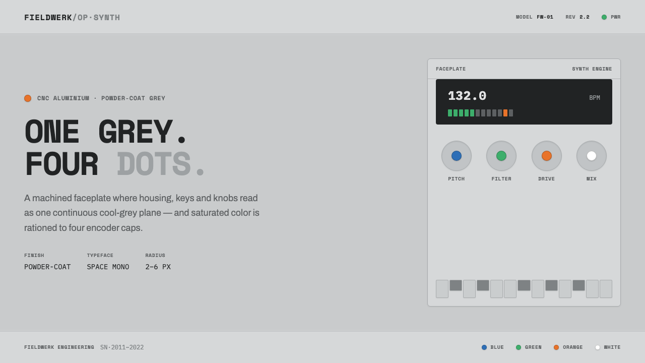 Teenage Engineering OP-1One grey, four dots. Machined aluminium in Space Mono, color rationed to tiny…
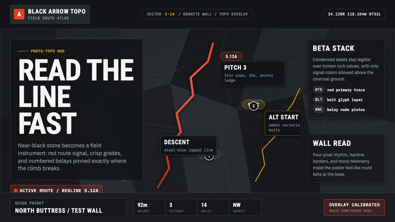 Climbing Topo GuideBeta at a glance. Red route telemetry cuts across near-black stone and conden…
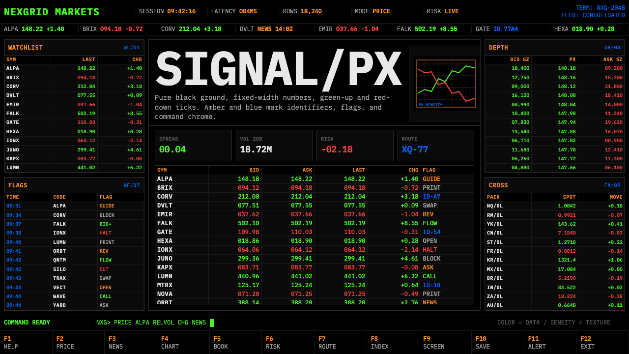 Financial Terminal MonoMaximum signal per pixel. Pure black, IBM Plex Mono, green-red ticks, amber-b…
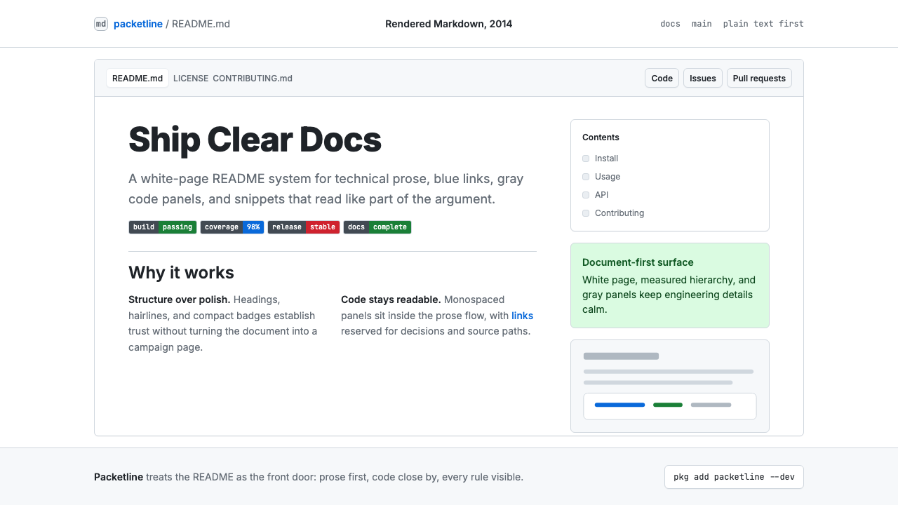 GitHub README Markdown (2014)Calm code authority. Blue links, gray code panels, and Inter/Mono stack on wh…
 Semiconductor CleanroomCold precision, scrubbed clean. Blue-white grids, wafer circles, and squared…
 Terminal Vim Dracula (2014)Terminal-native darkness. Near-black panes carry six saturated syntax colors…