What is Zerodha Kite?
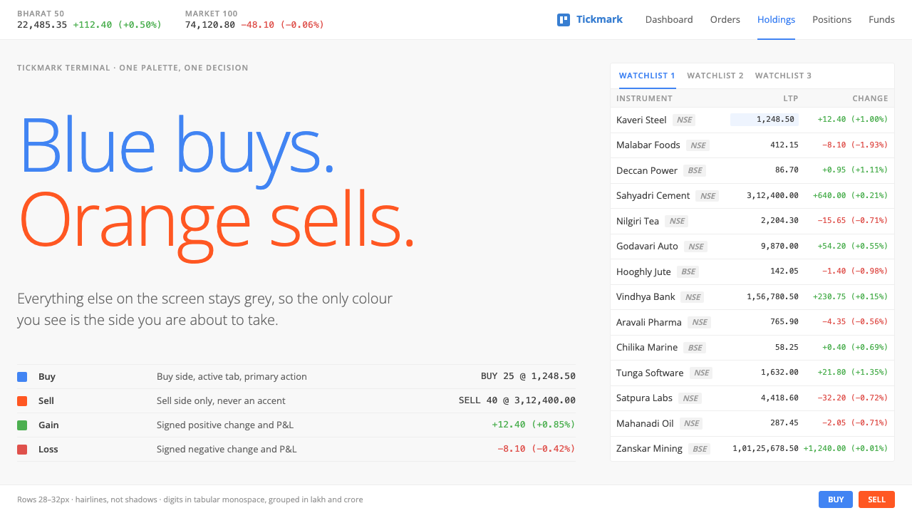
Kite spends colour on exactly one decision — blue to buy, orange to sell — and leaves everything else as quiet grey chrome, white cards and hairline rows.
Zerodha Kite in brief
The Zerodha Kite style is the look of a web trading terminal built for people who watch many instruments at once. It belongs to the Bangalore broker Zerodha, which launched the Kite web terminal in 2015, and it refuses almost every cliché of the trading screen. There is no black background with glowing green numerals, no wall of floating windows, and no ticker tape of neon. Instead there is neutral grey chrome, white cards, small Open Sans text and hairline-ruled rows.
Its governing idea is that colour has one job. Blue means buy and orange means sell, and those two hues are kept clear of every other use so that a glance at an order button answers the most important question on the screen. Everything else, from navigation to tables to panels, is deliberately subdued, so the eye is never pulled towards decoration.
The second pillar is numerical comfort. Prices sit in a monospaced face so digits never jitter as they update, rows are compact enough to show a long watchlist, and large figures are grouped in lakhs and crores because that is how Indian traders actually read them. The result is a utilitarian interface that feels almost plain, yet every decision in it serves the act of placing an order accurately.

Where does Zerodha Kite come from?
Zerodha was founded in 2010 in Bangalore, in the southern Indian state of Karnataka, by Nithin Kamath, with Nikhil Kamath among the key figures of its early story. It entered the market as a discount broker, competing on low and transparent fees rather than on advice or branches, in a country where retail investing was expanding rapidly and where the incumbent brokerage interfaces were typically heavy desktop programmes.
The Kite web terminal arrived in 2015. Its premise was that a retail trader should be able to place orders from a plain browser tab, without installing anything, and that the interface should be quick to learn and quick to read. The visual direction established then stayed largely stable for roughly nine years, until 2024, which is itself a statement: a tool that traders use daily gains value by not changing its surface.
Kite is part of two wider movements. One is Indian discount broking, which reset customer expectations about cost and simplicity. The other is the rise of API-first brokerage platforms, where the web terminal is just one client among many and developers are encouraged to build against open interfaces. Kailash Nadh is named among the key figures connected with that technical culture, which helps explain why the product feels engineered rather than styled.
The third thread is utilitarian interface design: the tradition of making tools that look like tools. Rather than borrowing the drama of financial television, Kite adopts the posture of a well-kept workshop. Its restraint is the visual expression of the company's stance on trading, which is to give people a clean instrument and trust them to make their own decisions.
What defines the Zerodha Kite look?
Color as a single signal
Blue stands for buy and orange for sell, and the rule is applied consistently across buttons, order tickets and labels. Because no other element competes for those hues, the colour carries meaning at a glance. Profit and loss still use familiar signals, but they never overshadow the buy and sell pair. The rest of the interface lives in greys, whites and a dark ink for text.
Neutral chrome
The frame of the application is a light grey that recedes behind content. White cards sit on it to hold watchlists, charts and order panels. There is no gradient, no glossy bevel and no dark mode theatrics in the default look. The chrome is intentionally boring so that the market data becomes the most interesting thing on screen.
Hairline rows
Lists and tables are separated by the thinnest possible rules rather than by boxes or alternating fills. Rows are compact, so a long watchlist stays visible without scrolling, yet the hairlines keep each instrument distinct. This is the visual signature of the system: dense but never cramped, ordered without heaviness.
Monospaced numbers
Prices, quantities and changes are set in a monospaced face. When a last-traded price ticks from one value to another, digits do not shift sideways, so the eye can follow change without having to re-find the number. It is a small technical choice with an outsized effect on how steady the screen feels during fast markets.
Typography
Interface text is set in Open Sans at a small size, with limited use of weight to separate labels from values. The type is friendly and legible rather than stylish, and its modest scale allows many columns of data to share a screen. Headlines are rare because the product is a tool, not a publication.
Indian number grouping
Large amounts are grouped in lakhs and crores rather than in thousands and millions. This is a cultural detail built into the typography of numbers, and it shows that the system was designed for its actual audience. A style that borrows Western finance conventions would look right but read wrong to the people using it.

Who shaped Zerodha Kite?
Founder of Zerodha in Bangalore in 2010. His company's discount-broking model, built on low fees and a clear product, set the tone for the whole interface: no upselling theatre, no decorative noise, just a direct path from decision to order.
Named among the key figures in Zerodha's early story. His involvement in the broker's growth belongs to the period when retail participation in Indian markets was widening, and the simple, accessible Kite terminal was one of the tools that supported that expansion.
Associated with the engineering side of the company and its API-first culture. That technical emphasis, treating the terminal as one client of an open platform, helps explain the system's disciplined, no-nonsense character, where function consistently outranks flourish.
How do you use Zerodha Kite today?
For slides, the Kite style fits fintech briefings, investor updates, product-review decks and any presentation about data that must be read quickly. A cover can be a pale grey field with a single white card and a short title in dark ink. Content slides should use hairline-ruled tables rather than heavy boxes. For data slides, set figures in a monospaced face, right-align them, and reserve the blue and orange pair for the one comparison that matters, such as inflow against outflow.
For web interfaces, the natural uses are trading and portfolio tools, admin consoles, analytics tables, inventory lists and any screen where a user scans many rows. Build the page from white cards on neutral grey, keep rows compact, and use the two signal colours only for opposing actions. Forms benefit from the same discipline: small type, clear labels and generous hit areas, with colour confined to the primary action.
For editorial and marketing work, the style supports explainers about markets, comparison pages, pricing breakdowns and honest, low-key product pages. Its plain confidence is a good match for brands that want to sound trustworthy rather than exciting. Use real figures, formatted for the local audience, and avoid hero imagery that promises returns.
Pay attention to the cultural layer. If your audience reads numbers differently, adapt grouping, currency symbols and decimal conventions to match, as Kite does with lakhs and crores. The system's credibility depends on its precision, so alignment, consistent decimals and stable digit widths matter more than any ornament.
A common mistake is to add colour in the name of liveliness. Green and red arrows, tinted row backgrounds and branded accents all dilute the buy and sell signal, and the interface starts to resemble every other trading screen. A second mistake is enlarging everything for a landing page; the style depends on compactness, so keep sizes small and rely on structure for hierarchy.

Zerodha Kite — FAQ
What is the Zerodha Kite design style?
It is the visual language of Zerodha's Kite web trading terminal: light grey chrome, white cards, small Open Sans type, hairline rows, monospaced prices, and a colour system that uses blue for buy and orange for sell and little else.
Why does it avoid the dark theme typical of trading apps?
The design aims for sustained, comfortable reading rather than drama. A light, neutral surface makes dense rows of data easy to scan, and it keeps colour free to signal the single most important decision, buy or sell. The default look favours clarity over atmosphere.
Why are numbers grouped in lakhs and crores?
Because that is how the Indian market reads large values. Grouping figures in the local convention removes mental conversion and makes amounts feel natural to the people using the terminal. It is a reminder that good interface design includes the conventions of the audience, not just the layout.
When was it created and where does it come from?
Zerodha was founded in 2010 in Bangalore, India, and the Kite web terminal launched in 2015. The visual direction described here dates from about 2015 and remained current until 2024, within the broader traditions of Indian discount broking and API-first brokerage platforms.
Can the style be used outside finance?
Yes. Any data-dense tool, such as logistics dashboards, admin panels, analytics reports or inventory systems, can use the same combination of neutral chrome, hairline rows, stable numerals and a single pair of signal colours. It works wherever users must scan quickly and act with confidence.
Related design styles
 Climate Refuge Seed ArchiveFacts stay cold. Concrete-grey accession rows meet one turquoise fibre-optic…
 Cloud Brightening FleetBrightening becomes evidence. White ship-track lines score a cool-grey satell…
 Permafrost Monitoring NetworkDepth sets the order. Overcast greys, slate profiles and hairline rules keep…
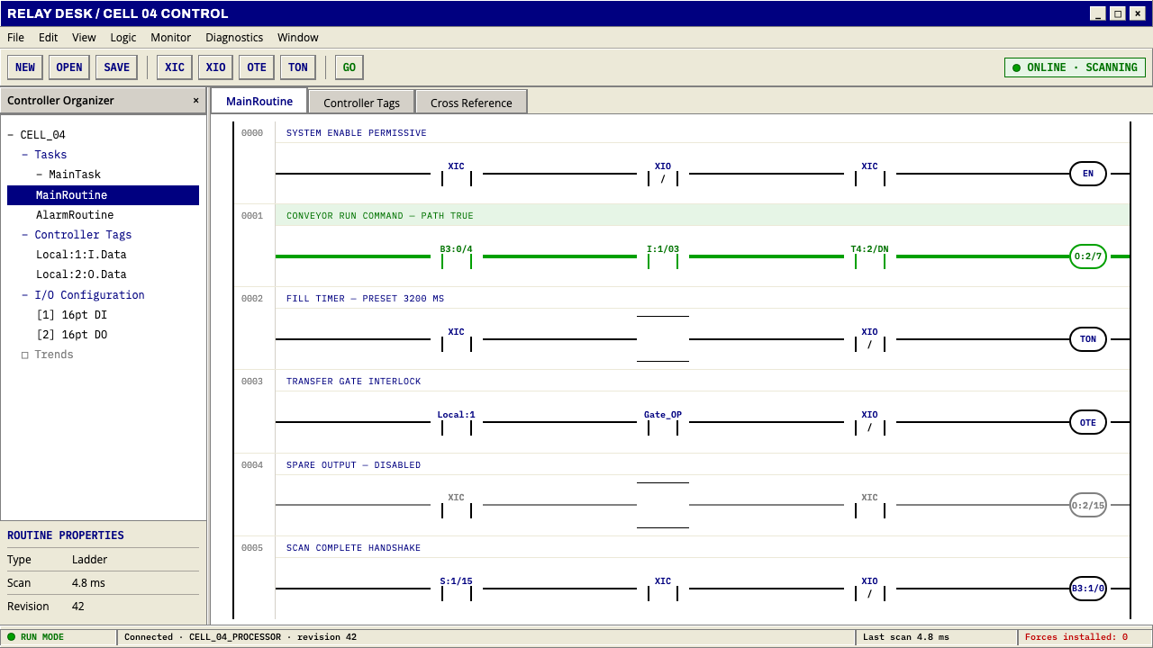 PLC Ladder LogicLogic made visible. Black rails and navy mnemonics turn green wherever the ci…
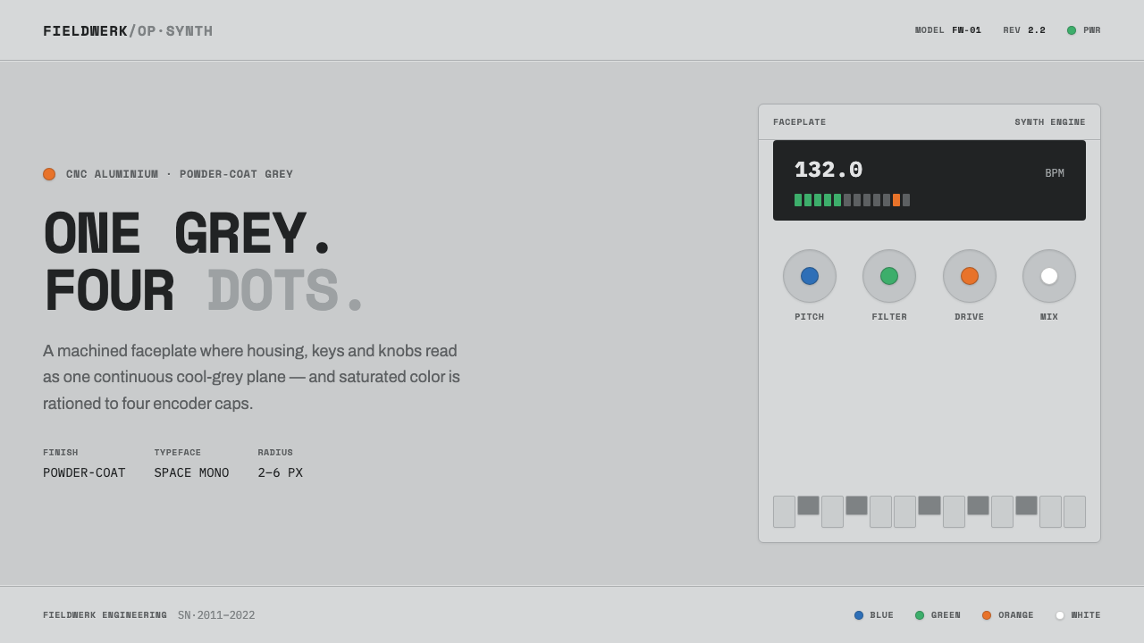 Teenage Engineering OP-1One grey, four dots. Machined aluminium in Space Mono, color rationed to tiny…
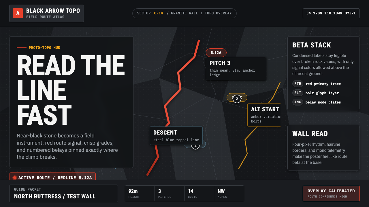 Climbing Topo GuideBeta at a glance. Red route telemetry cuts across near-black stone and conden…