What is Cloud Brightening Fleet?
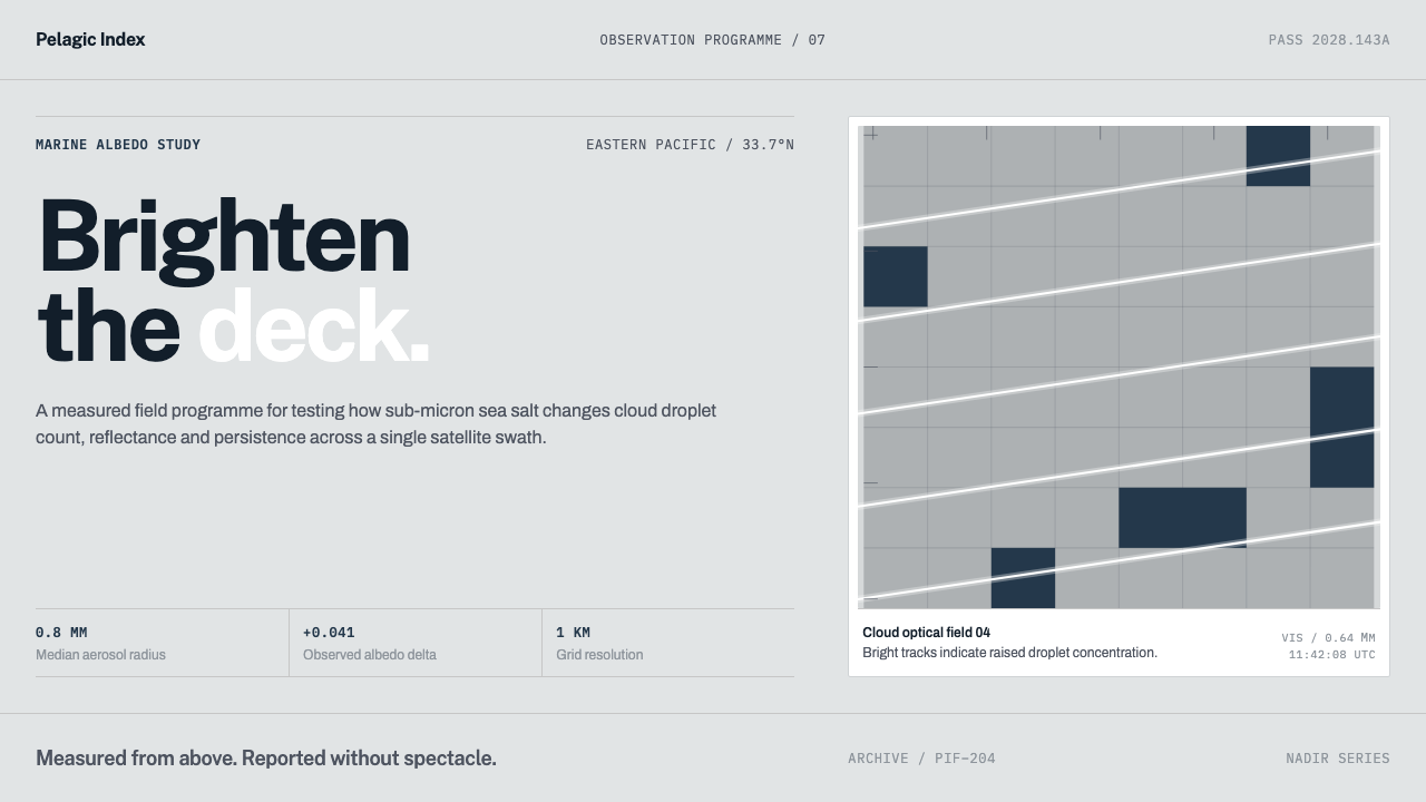
Cloud Brightening Fleet turns a satellite view of ship tracks into a design language: a flat, cool grey cloud deck on which white means brightening and everything else is instrument chrome.
Cloud Brightening Fleet in brief
Cloud Brightening Fleet is a design style modelled on marine cloud brightening, a climate-research idea in which fine sea salt is sprayed into low ocean clouds so that they reflect more sunlight. Its look is a cool, neutral grey ground, white lines that cut across it, thin rules and monospaced numerals. The page is the cloud deck itself; everything placed on it is either a trace of brightening or a piece of instrument furniture. Unlike most climate imagery, it does not reach for green or blue; it reaches for the plain grey of a working instrument.
The meaning of white is the heart of the style. White is not decoration and not a default background. It marks something that has been brightened, the way a ship track shows up in satellite imagery as a bright line scratched across a flat grey cloud field. Dark, used sparingly, is the ocean seen through gaps in the cloud. Colour has no job here at all.
Around that core sits instrument chrome in the manner of an agency or a journal: hairline rules, monospaced telemetry for coordinates, droplet radius and albedo change, square-cut edges with barely rounded corners, and wide horizontal layouts that follow the swath of a satellite pass. It looks like something published by a scientific institution: calm, quantified, and not trying to sell anything.

Where does Cloud Brightening Fleet come from?
Marine cloud brightening starts with a physical idea. Stratocumulus decks, the low, flat layers of cloud that blanket large areas of ocean, reflect sunlight back to space. If sea-salt particles smaller than a micron are seeded into them, the cloud holds more and smaller droplets, becomes more reflective, and throws more sunlight away. The proposal was set out by John Latham in a paper in Nature in 1990, and it belongs to the research field known as solar radiation management.
What gives the style its image is that the effect had already been seen from orbit. Ship tracks, the bright white lines left where exhaust particles from vessels seeded the cloud, appear in satellite images such as those from the MODIS instrument as scratches across a flat grey field. Researchers in satellite cloud remote sensing treated them as natural experiments, and agencies such as NOAA and NASA publish the imagery in a sober, quantified house style of coordinates, scales and captions. That tradition of earth-observation publishing is what the system borrows. Because a ship track is simply white on grey, the image already contains the whole palette this style needs.
Engineers and scientists then worked out how the idea might be carried out. Stephen Salter is the name tied to concepts for fleets of spray ships, and later researchers moved from modelling to small outdoor experiments. Sarah Doherty and Robert Wood are associated with the effort that tested sea-salt spraying at Alameda, California, and Daniel Harrison with work over the southern Great Barrier Reef, where brightening clouds has been explored as a way of shading coral. The era behind the style runs from the 1990 proposal through the outdoor-experiment years of the 2020s.
None of this is settled, and the style does not pretend otherwise. The research is a debated field in which measurement is the whole point, and the design reflects that: it commits to data, units and instruments, not to persuasion. In Curio's system the page becomes the deck, white becomes the evidence, and every label reads as telemetry. It is therefore a style for projects that want to be checked, not simply believed.
What defines the Cloud Brightening Fleet look?
Cool neutral grey ground
The page background is a flat, cool grey, a neutral whose red, green and blue are so close to equal that no hue shows through. It stands for the cloud deck seen from above: even, unbroken and slightly clinical. Gradients and tinted backgrounds are left out because the real thing is flat.
White as meaning
White is information. A line, a bar, a highlight or a number in white says that something has been brightened, raised or confirmed. Using white for ordinary decoration cheapens the signal, so it appears sparingly and always with a reason. The eye learns the rule within a single page and begins to read white as a verb.
Dark as water
Deep dark tones are the sea seen through gaps in the cloud. They are used for small areas, outlines of data and the occasional heavy block, never as a mood or a theme. The contrast between a dark gap and a bright track is the most dramatic thing the style allows.
Ship-track lines
Thin straight or gently curving white lines, scratched across the grey, are the signature gesture. They work as dividers, chart lines, trajectories and highlights, and they should look drawn by a track rather than by a brush: long, fine and directional, never ornamental.
Monospaced telemetry
Numbers appear in monospaced type, the way instrument readouts do: coordinates, droplet radius, albedo change, timestamps. Labels are short, set in lowercase or small capitals, and always attached to a measurement. The type does not try to be expressive. Alignment on the decimal point matters more than any flourish.
Swath proportions
Layouts spread horizontally in strips that echo the proportions of a satellite pass. Panels are wide and shallow, arranged in rows, and the page often scans left to right like a time series. Tall, narrow, phone-poster compositions are the exception rather than the rule.
Institutional furniture
Right-angle cuts, a barely rounded corner at most, hairline rules and plain panels give the system the feel of a journal figure or an agency bulletin rather than a consumer app. Buttons are modest, decoration is minimal, and everything is built to be quoted.

Who shaped Cloud Brightening Fleet?
Latham's 1990 proposal in Nature is the starting point of the field. His idea, that seeding low ocean clouds with fine sea-salt particles could make them more reflective, is the premise of everything in this system and the reason its central colour is brightness.
Salter is the engineer most often connected with the practical question of how to do it, through concepts for fleets of spray ships. His name explains the word 'fleet' in the style's title, and the sense that this is an engineering problem as much as a scientific one. Spray ships make the fleet idea concrete in a way that a simulation never could.
Doherty, an atmospheric scientist, is associated with the cloud-brightening research programme that has tested spraying outdoors at Alameda, California. She stands for the shift from simulation to instruments, and for the cautious, data-first tone the design adopts.
Wood, a cloud scientist, belongs to the same research effort. His field, the physics of low marine clouds, is what gives the style its fixation on droplet size, reflectivity and the stratocumulus deck.
Harrison is linked to the experiments in the southern Great Barrier Reef, where brightening the clouds above the reef has been studied as a way of shading coral. He shows that the idea is explored at a regional scale and not only a planetary one.
How do you use Cloud Brightening Fleet today?
Cloud Brightening Fleet suits content that wants to look measured, institutional and honest about its data. Its principles are strict: a neutral grey ground, white that carries meaning, and instrument-style type. Apply those, rather than painting everything grey and calling it technical.
For presentation slides, the cover can be a flat grey field crossed by a single fine white line, with the title in plain type and a short monospaced caption of date, place or coordinates beneath it. Content slides are wide strips, one idea per strip, divided by hairline rules. Data slides are the home of the style: white lines and bars on grey, one white highlight on the value that changed, and tables set like telemetry with aligned columns. Speaker notes can carry the sources, since the slides themselves stay quiet.
For web interfaces, the style fits dashboards, monitoring tools, open-data portals, climate and earth-observation products, and documentation for scientific software. Charts use white for the focus series and quieter greys for context. A pricing page stays plain and tabular, with the recommended plan lifted by being brighter than its neighbours rather than by a coloured badge. Hover and selection states should brighten rather than recolour: the element simply becomes whiter.
In editorial and marketing work, it suits research reports, policy briefs, annual reports, climate-tech white papers and data-journalism explainers. Figures are captioned in monospaced type with units, and pull-quotes are set plainly between rules. Photography is best satellite or aerial imagery, in grey or desaturated treatment, so the page keeps its cool, even tone and white stays rare enough to mean something. Newsletter and report covers can follow the same rule: grey ground, one white line, one caption.
The most common mistake is using white everywhere, until a page of white cards on a pale ground no longer says what has been brightened. The second mistake is adding colour to be friendly: ocean blue for water, green for environment, orange for urgency. The third is inventing telemetry. Coordinates, radii and percentages that are only there for atmosphere undermine a style built on measurement, so labels should always be attached to something real.

Cloud Brightening Fleet — FAQ
What is marine cloud brightening?
A climate-research idea in which fine sea-salt particles are sprayed into low marine clouds. The particles give the cloud more, smaller droplets, which makes it reflect more sunlight back to space. It is studied under the heading of solar radiation management and is still being tested, with the 1990 Latham proposal as its starting point.
What is a ship track?
A bright white line that appears in satellite images of low cloud, left where exhaust particles from a vessel have seeded the cloud and changed how it reflects light. Ship tracks are the visible evidence that the principle works, and this style takes their image as its starting point.
Why is the palette grey?
Because the page stands for a flat deck of cloud seen from above, and because a neutral ground is what lets white mean something. If the background carried a colour, white would be only one tint among others. Grey keeps every mark readable as either brightened or not.
Is this an environmental campaigning look?
No. It is closer to the visual language of an agency bulletin or a journal figure than to a campaign poster. It takes no position on whether cloud brightening should be done; it borrows the look of measurement and publication, and it avoids the emotional colour that advocacy design tends to use.
Does it need real data to work?
It works best with real measurements, because its labels, units and monospaced numerals imply that the numbers are genuine. It can still be used for general content, but then the telemetry should be minimal and honest: a date, a place, a source. Fake precision is the fastest way to ruin the style.
Related design styles
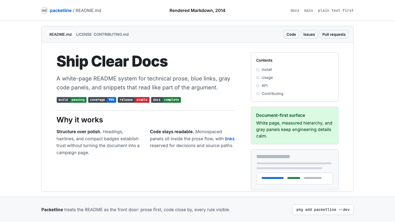 GitHub README Markdown (2014)Calm code authority. Blue links, gray code panels, and Inter/Mono stack on wh…
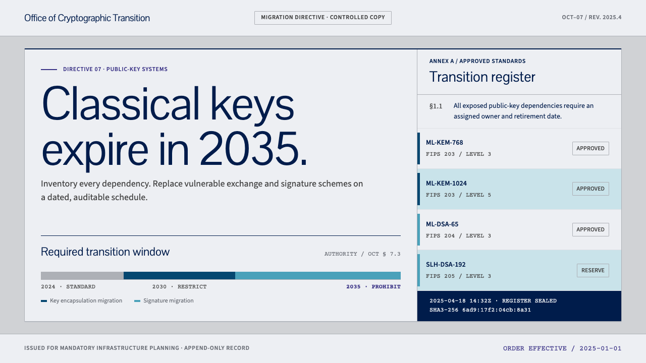 Post-Quantum Crypto AgencyCryptography with a deadline. Cool-grey document grids make every migration d…
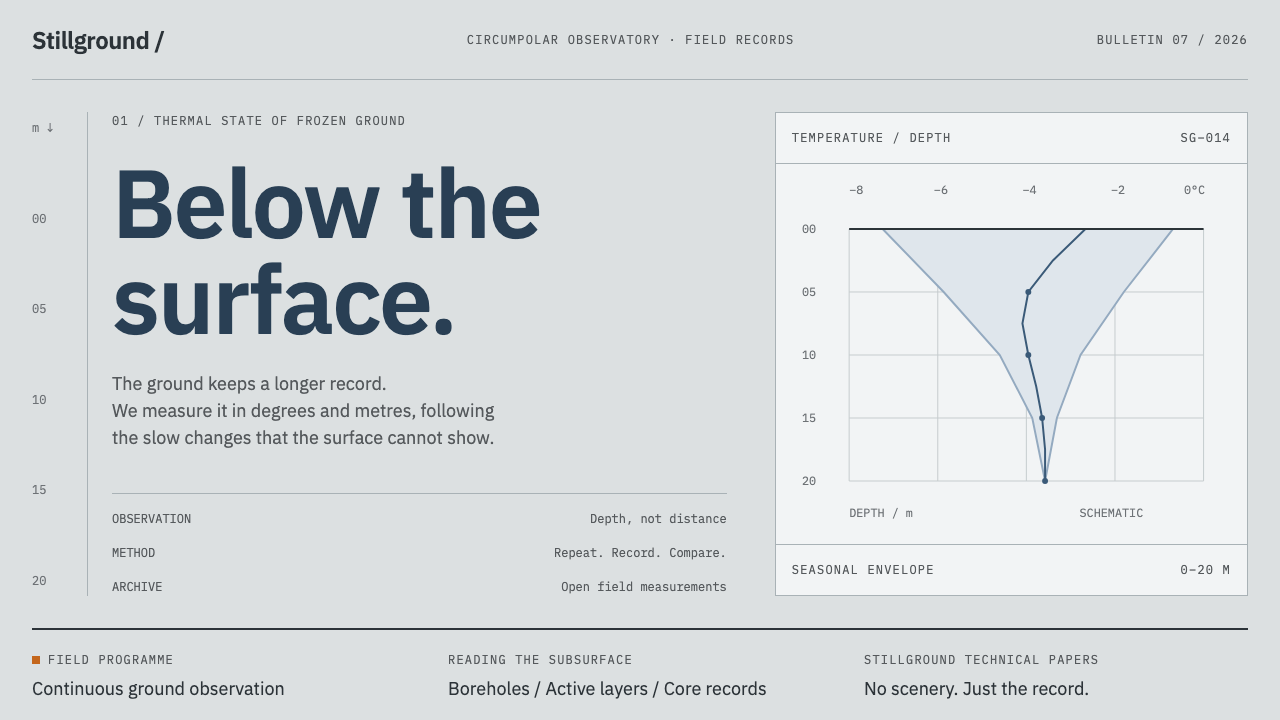 Permafrost Monitoring NetworkDepth sets the order. Overcast greys, slate profiles and hairline rules keep…
 PLC Ladder LogicLogic made visible. Black rails and navy mnemonics turn green wherever the ci…
 Airport Baggage TagBuilt to be read in motion. Burned-black codes, hard rules and functional cha…
 Climate Refuge Seed ArchiveFacts stay cold. Concrete-grey accession rows meet one turquoise fibre-optic…