What is Airport Baggage Tag?
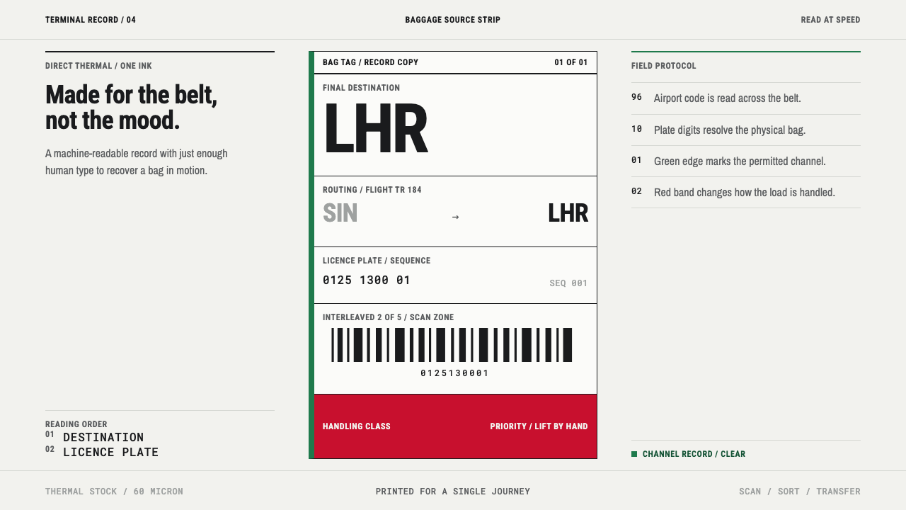
A bag tag is not designed to be liked: it is a strip of burned paper built to be read by a scanner above a moving belt, and every choice on it follows from that.
Airport Baggage Tag in brief
The airport baggage tag is a design language shaped almost entirely by function. It is a long strip of coated thermal paper, printed at check-in, looped through a bag's handle and read, for the rest of the journey, mainly by scanners positioned above a moving belt. Ten digits carry the bag's licence plate; three-letter airport codes chain the legs of the trip; everything else on the strip is a small caption above a large value, ruled off with hard lines. It looks the way it does because it has to be read in motion, in poor light, by machines first and people second.
Its visual identity comes from a single technical fact: there is no ink. A thermal head heats a coating on the paper and burns it black. The result is a black made of heat, slightly uneven in density and unstable over time. Heat, humidity, UV light and skin oils all push the image from full black through grey toward a washed ghost. The system takes that instability seriously. It uses one burned black on a neutral stock, two functional colours, and type sized not by taste but by how far away it must be legible.
Seen as a style, the baggage tag has a strict aesthetic of its own: dense, monochrome, rule-driven and entirely unsentimental. Nothing on it is there for charm. Its beauty — and it does have one — is the beauty of a form worn down to essentials by use, in which hierarchy is a matter of operational necessity. The biggest thing on the tag is the thing a handler must see first, and the smallest things are only there to say what the big things mean.
Where does Airport Baggage Tag come from?
The tag belongs to what the source calls the automated licence-plate era, roughly 1990 to 2020, before permanent and electronic tags began to replace the paper strip. In this model a bag is identified not by a name or a handwritten label but by a unique ten-digit number — its licence plate — which indexes the bag to a record called the Baggage Source Message. The plate is the only thing the tag truly needs to say. Everything else is routing.
That routing is carried by three-letter airport codes. When a journey has several legs, the codes chain together: origin, transfer, destination. People at the belt read the final code to send a bag toward the right aircraft; machines read the machine-readable code that carries the licence plate. The tag therefore serves two audiences at once, and its layout reflects it — a zone for machines, a large human-readable destination, and small captions above each value that explain what the value is.
The rules behind the tag are global. The source describes a worldwide aviation standard administered from Montreal and Geneva by the International Air Transport Association (IATA), anchored by IATA Resolution 740, the IATA Baggage Tracking Implementation Guide and the AIDM bag tag data element reference. No single designer authored the look. It emerged from airline operations standardisation, from the logic of machine-readable identification and from the physics of direct-thermal printing — three forces that together fix what can be printed, in which positions, at what size.
Two colours were added to this black-only world for operational reasons. The green edge echoes the European Union's green channel, and red marks priority and overweight handling. They are not branding. A different colour tells a person on the baggage floor that this bag needs different treatment, which is why the colours stay rare and why they appear as edges and flags, not as fills. Everywhere else the tag stays disciplined: one burned black, one neutral stock, and no ornament.
What defines the Airport Baggage Tag look?
Burned Black
The one dark tone is made by heat, not ink. It sits flat on the paper with a faint unevenness in density that no ink would produce, and it is a working colour, not a decorative one. The system treats its instability as a design fact: heat, humidity, UV and skin oils walk the image from full black through grey to a washed ghost, so every element must stay legible even when the black is no longer fully black.
Scan-Distance Scale
Type is sized by how far away it must be read, not by taste. The destination code is large because a person at the belt must read it at a glance; the licence plate is large because it must be checked quickly; captions are small because they are read only up close. The steps between sizes are big and decisive, so the hierarchy survives a quick, distant look and a poor print.
Licence-Plate Numerals
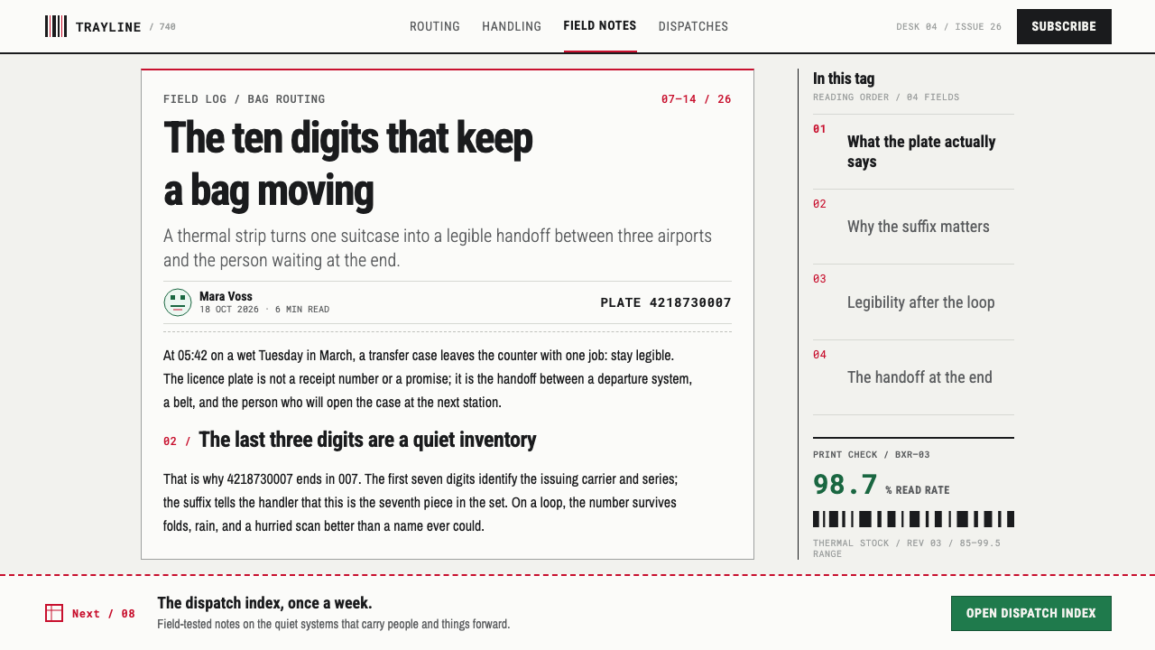
Ten digits carry the bag's identity. They are set large, evenly spaced and in a plain, upright style, with no decoration, so that a person can check them against a receipt and a machine can confirm them against the machine-readable code. The numerals are the most important thing on the tag, and the design behaves accordingly: nothing crowds them, and nothing is allowed to compete.
Three-Letter Codes
Airport codes are short, capitalised and oversized. Chained across the strip, they describe the whole journey in a few characters: where the bag started, where it changes, where it ends. Their brevity is the point. A three-letter code can be set very large on a narrow strip and still read instantly, which is why the final code often becomes the loudest element on the tag.
Caption over Value
The strip is organised as a stack of small cells. Each has a tiny caption on top and a large value beneath, and each is divided from its neighbours by a hard rule. The structure reads as a form, because it is one: every pair corresponds to a defined data element. There are no rounded corners, no fills, no soft dividers. A cell exists to say what a value is, and a rule exists to keep one cell from bleeding into the next.
Functional Colour
Only two colours are added to the burned black, and each carries a handling rule. A green edge echoes the European Union's green channel; red marks priority and overweight. They appear as edges, bands and flags rather than as large fills, because they are signals, not decoration. A tag with no coloured edge is the normal case, and the absence of colour is itself information.
Neutral Stock and Strip Format
The ground is a pale, neutral stock with no texture, tint or ornament. The format is a long, narrow strip, designed to be looped through a handle and read in sections. The strip itself is the unit: it can be folded, curled and half-obscured, so the most important content repeats or sits where it will stay visible. The design is a working label, and it accepts that it will be handled roughly.
Who shaped Airport Baggage Tag?
Named in the source material as a governing reference for the tag, Resolution 740 stands for a simple idea: a baggage tag is a specified object, not a free-form label. Agreed rules for what the tag carries and where it carries it mean that a tag printed at one airport can be read at another. In this system it works as an anchor, a reminder that every position on the strip is there by agreement rather than by taste.
The implementation guide belongs to the tracking side of the story: a bag is scanned at several points between check-in and arrival, and each scan is a data event. For design, that means the tag has to be reliably readable at every handover, in whatever light, speed and handling it meets. The guide is the reason the system favours large, high-contrast, uncluttered marks over anything subtle.
AIDM stands for the Airline Industry Data Model, and this reference lists the data elements that appear on a bag tag. It explains why the strip looks like a form: each caption-over-value pair corresponds to a defined element, with a name, a meaning and an expected format. The reference is the invisible grid beneath the tag, the reason the captions say what they say and the values sit where they sit.
How do you use Airport Baggage Tag today?
The baggage tag is a useful reference whenever a design has to be read quickly, by a stranger, under poor conditions. Its lessons are practical: decide what must be seen first, make it big, divide everything else into labelled cells, and let colour speak only when something needs different handling. The style is at its best when it is applied as a discipline of legibility, not as a retro costume.
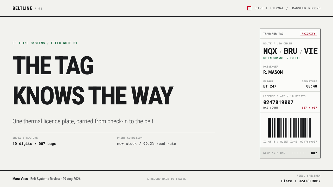
For presentation slides, a cover can be a long horizontal strip with a huge three-letter code or a single key word, a ten-digit reference number and a few captioned cells. Content slides work as grids of caption-over-value cells divided by hard rules, with one value per cell and nothing decorative. Data slides suit tables first and charts second: large figures, small captions, black bars as simple stripes, and a single red or green edge to flag the one number that matters.
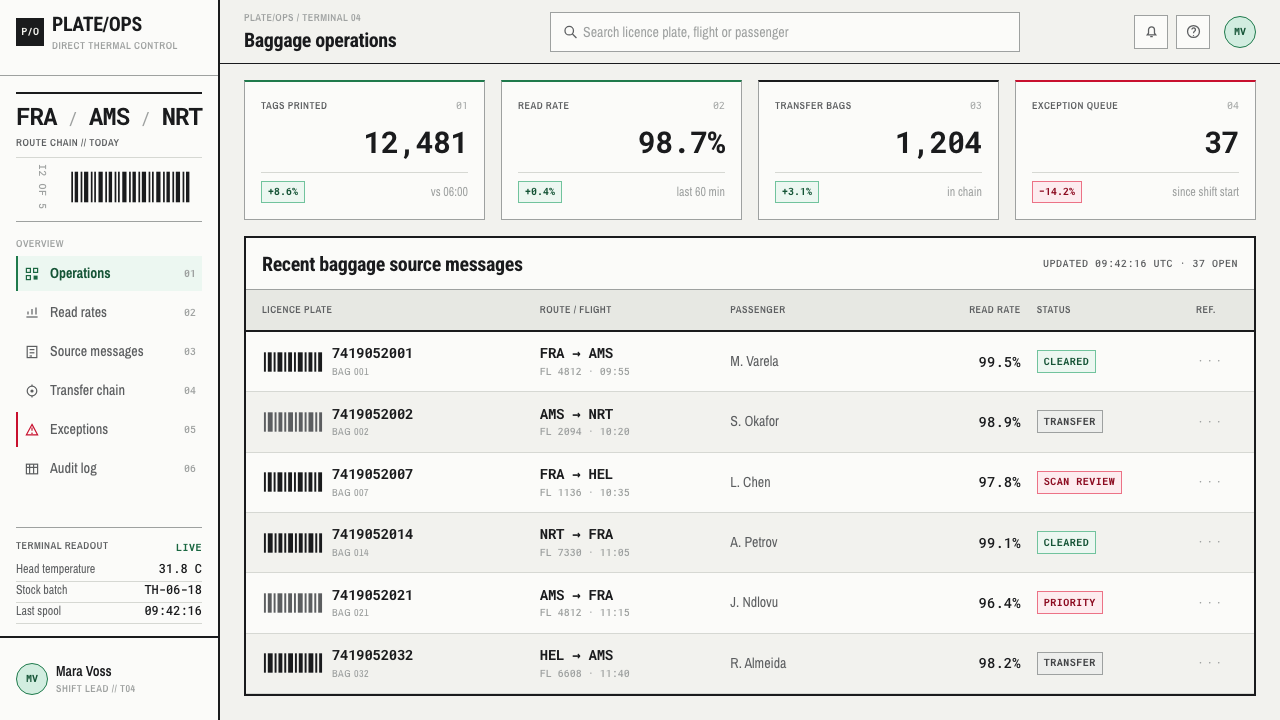
For web interfaces, the style fits operations, logistics, tracking and order-status screens, where users scan for a value and move on. Dashboards can adopt the cell structure directly, with hard rules and square corners in place of cards with soft shadows. Pricing pages can present each tier as a stack of captioned values: plan name, price, limit. Keep colour rare and meaningful, using it only for statuses that need action, and never as a background wash.
For editorial and marketing work, the tag translates into tickets, receipts, shipping labels, event badges, packing lists and operational reports. A campaign can lean on its honesty: this was made to be read, not liked. Long pages benefit from the strip's rhythm of captions and values, and from large, unadorned figures that carry the story. The look suits subjects where reliability, movement and logistics are the message.
The most common mistake is to treat thermal printing as a retro aesthetic and apply grain, noise or fade across everything. The fading in this system is a physical state to be designed for, not a texture to be sprinkled on. Other errors include adding many colours, using small type for key information, rounding the corners of cells, and decorating barcodes with no function. If an element cannot be justified by what a scanner or a handler needs, it should not be on the strip.
Airport Baggage Tag — FAQ
Why does the design avoid polish and ornament?
Because it is a working label, not a showpiece. The tag has to be read in motion, in poor light and at speed, so every decision favours legibility over charm. Ornament adds noise that a scanner or a tired handler does not need. The restraint is also what gives the style its character: a form stripped to essentials by use, with a hierarchy that exists for operational reasons.
What is the licence plate, and why does it matter to the layout?
The licence plate is a ten-digit number that identifies one bag and indexes it to its Baggage Source Message. It is the only thing the tag truly needs to say, which is why it is set large and kept clear of clutter. Everything else — airport codes, captions, colour flags — supports routing and handling around that number. A layout inspired by the tag should likewise decide what its single essential identifier is and give it priority.
Why are there only two functional colours?
Because colour on a baggage tag is a handling rule. A green edge echoes the European Union's green channel, and red marks priority and overweight. Adding more colours would turn a clear signal into a code that staff must memorise. The scarcity is what makes the colours legible: a person on the baggage floor notices a red edge precisely because most tags have none.
How should fading be treated in a design?
As a physical state, not a texture. The source explains that heat, humidity, UV and skin oils move the image from full black through grey to a washed ghost. A designer can acknowledge this by making sure every element remains legible at reduced contrast, or by showing a faded state as a deliberate, separate variant, such as an expired or inactive item. Sprinkling fade across every surface turns an honest limitation into a costume.
Why does this style not work as a dark layout?
Because the medium is a dark mark burned onto a pale surface. A thermal head can only darken the coating; it cannot print light on dark. Reversing the tag to light type on a dark ground would contradict the physics that define the style and would lose the neutral stock that gives the black its meaning. If a dark interface is required, keep the tag-like panels pale and let the dark surround them.
Related design styles
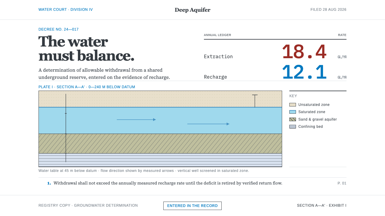 Deep Aquifer Water CourtRestraint makes the deficit undeniable. White bond, book serif, and a keyed a…
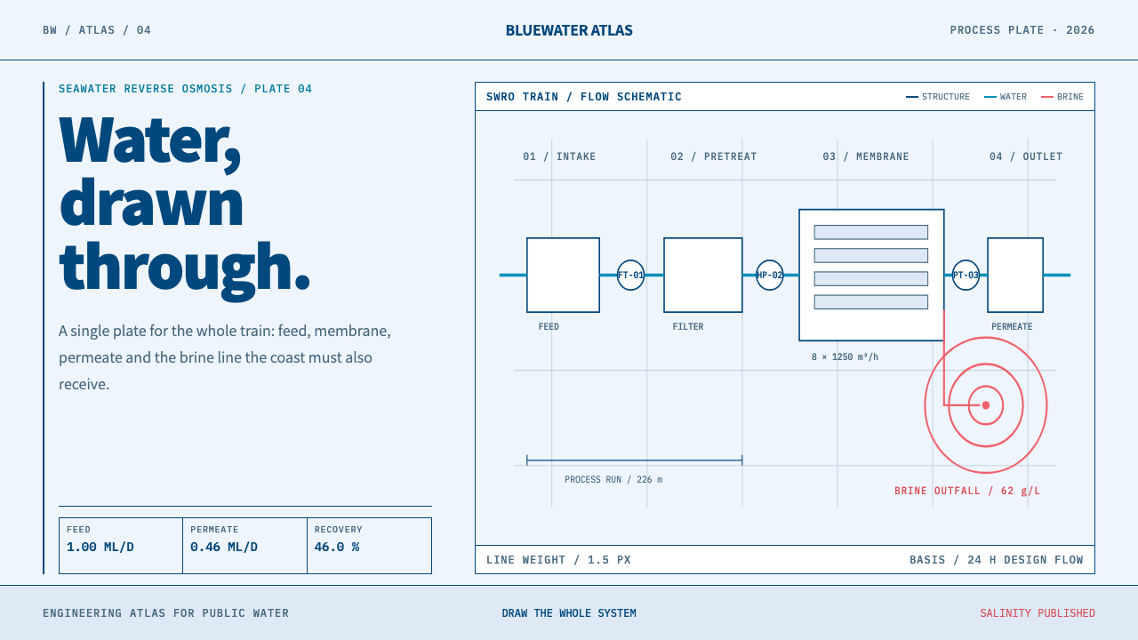 Desalination MegaplantInfrastructure made legible. Navy process lines map cyan water flow and coral…
 Elemental Social HousingBuild half a good house, well. Dusty cement-grey panels, hatched bare-frame g…
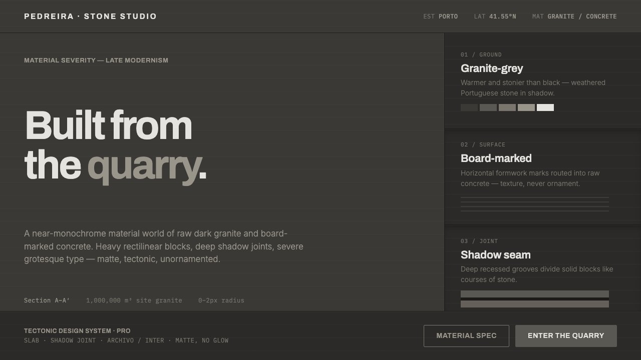 Souto de Moura GraniteArchitecture as raw matter. Dark Portuguese granite ground, board-marked conc…
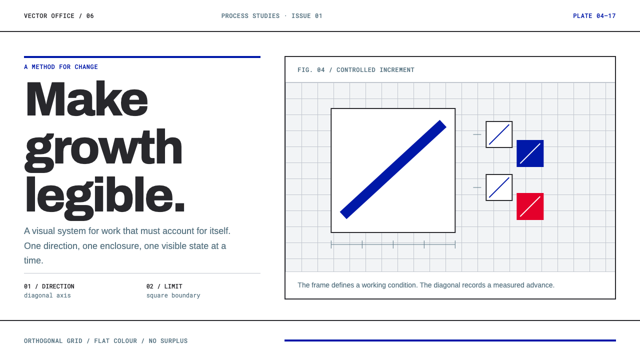 Anton Stankowski ConstructiveProcess becomes visible. Flat blue diagonals and hard square rules make chang…
 Icelandic Basalt VolcanoCold geology, engineered. Basalt black, Sora type, and one magma fissure hold…