What is Desalination Megaplant?
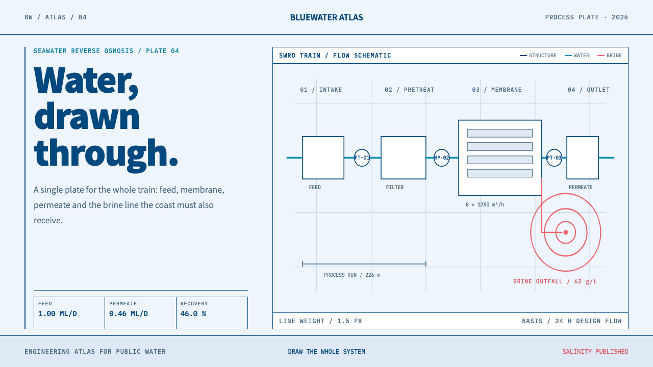
Desalination Megaplant draws a seawater reverse-osmosis plant the way its engineers do: navy process lines, cyan water, coral brine, and flat zone blocks on a cool pale ground.
Desalination Megaplant in brief
Desalination Megaplant is a design style drawn from the documentation of a large seawater reverse-osmosis plant. The plant itself is a hall of white pressure vessels racked on steel, hundreds of identical horizontal capsules, each holding membranes through which seawater is forced under pressure. The whole flow scheme, from the intake to the pipe that returns brine to the sea, is simple enough to fit on a single drawing plate. The style turns that legibility into a visual language: infrastructure made readable at a glance.
Everything in the plant is mapped onto a few graphic ideas. Membrane trains become process lines. The brine outfall, the point where concentrated salt water returns to the sea, becomes a set of concentric dispersion contours that show the concentrate thinning as it spreads. Water allocation, the question of who receives how much, becomes a set of flat zone blocks with no gradients. Each idea is drawn in the same restrained manner, so the page reads like a page from an engineering atlas.
The palette follows a strict meaning. A cool, pale blue-white ground carries the page, a single navy draws every line at an unvarying weight, cyan marks feed water and fresh permeate, and coral is reserved for the brine side and for salinity warnings. A humanist sans-serif carries text because the drawings and the door signs in the real plant are bilingual, so the type has to serve Hebrew as well as Latin. Colour is not decoration here. It is a legend that the reader learns once and then trusts.
Where does Desalination Megaplant come from?
The era of the seawater reverse-osmosis megaplant runs from about 2005 to the present. Reverse osmosis works by applying pressure to seawater on one side of a semipermeable membrane so that water passes through while most of the dissolved salt stays behind. What emerges is permeate, the fresh water, and what is left is brine, a more concentrated stream that must be returned to the sea. The principle is old, but the move to plants of enormous scale is recent, and it is that scale, the same unit repeated hundreds of times, that gives the style its visual rhythm.
Behind the plants stands a body of membrane science. Sidney Loeb and Srinivasa Sourirajan, named by the source as key figures, are associated with the asymmetric membrane that made reverse osmosis workable as a way to desalinate water. Their contribution is the reason that a plant can be drawn as a chain of simple steps: a membrane that reliably separates water from salt allows an engineer to treat the whole process as a flow of two streams, one clean and one concentrated.
The plants that give the style its subject are concentrated on the Israeli Mediterranean coast, at Sorek, Palmachim and Hadera, and at Carlsbad in California. The source marks Hadera at 2009, Sorek at 2013, and the later Sorek 2 or Be'er Miriam plant from 2023, a sequence that shows the megaplant moving from a bold new type of infrastructure to an established one. The firm behind Sorek, Hadera and Carlsbad is IDE Technologies, and its own house system for presenting these facilities supplies the palette and type for this style.
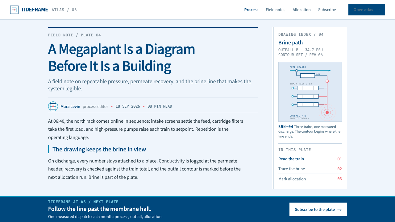
The drawing grammar comes from process engineering. Piping and instrumentation diagrams, usually called P&IDs, and process-flow drafting describe a plant as lines, valves, vessels and instruments, and the instrumentation symbols standardised by the ISA give each measuring device a consistent mark. Desalination Megaplant is a design reading of that tradition: line weight never varies, symbols are used consistently, and every colour has one job. The bilingual signage of the plant adds a final human layer, since a real facility is documented in the languages of the people who work in it.
What defines the Desalination Megaplant look?
Cool Pale Ground
The page is a cool, pale blue-white, closer to a drawing plate than to a screen background. It is bright without being stark and keeps the whole system in the temperature of water. The ground does not compete with the linework; it simply makes the navy and the two signal colours easy to see. Panels and sections are separated by thin lines or by flat blocks of ground tone rather than by shadows or glows.
One Navy Line, Never Varying
Navy is the structural colour of the system and it draws every pipe, border, vessel outline and rule at one consistent line weight. This invariance is the signature of technical drawing: the line never gets heavier to shout and never thinner to whisper, because emphasis is carried by colour and position instead. A reader soon learns that any navy stroke is structure, and that makes the diagram feel trustworthy and calm.
Colour as a Legend: Cyan and Coral
Two signal colours do all the semantic work. Cyan runs along the feed and permeate lines, the water side of the plant. Coral is reserved for brine and for salinity alerts, the concentrate side. Because each colour has exactly one meaning, a viewer can tell at a glance which stream a line carries and where a warning is. Using coral for anything else, a promotional button for instance, spends the system's most valuable signal on something it was never meant to say.
Process Lines and Instrument Marks
Membrane trains are drawn as process lines, orthogonal runs with clean junctions, flowing in a consistent direction. Instruments and valves appear as small, standardised marks in the spirit of ISA instrumentation symbology. The layout reads left to right the way the water moves, from intake to treatment to outlet. This is diagrammatic design: a page is made of connections and states, not of decorative shapes, and a reader can follow the logic by following the lines.
Dispersion Contours
The brine outfall is drawn as concentric contours that radiate and fade as concentrated water mixes into the sea. They are lines, not blurs: each contour is a crisp closed curve, and the spacing tells the reader how fast the concentrate disperses. This is the style's one organic motif, and it is still rigorously diagrammatic. It works well wherever a design needs to show influence, spread or gradual change without resorting to gradients.
Flat Zone Blocks
Water allocation, the distribution of supply among zones, is shown as flat blocks of colour with sharp edges and no gradients. Each block is a decision: this region receives this share. Flatness keeps the quantities comparable, since a gradient would blur the boundary where one allocation ends and the next begins. In interface terms, these are the style's tiles, tables and map regions, where clarity matters more than atmosphere.
Bilingual-Ready Typography
Text is set in a humanist sans-serif chosen because it covers Hebrew as well as Latin. The reason is practical: in the real plant, drawings and door signs are bilingual, so the lettering has to work in both scripts without a visible change of voice. For design, this means calm, open, readable type with generous spacing, a single family doing all the work, and layouts that tolerate mixed scripts or right-to-left lines without breaking.
Who shaped Desalination Megaplant?
Loeb is named in the source as a key figure and is associated with the membrane science that made reverse osmosis workable for desalination, working alongside Srinivasa Sourirajan. His place in this style is foundational rather than visual: he represents the moment when separating water from salt became an engineering process that could be scaled, and therefore the reason that a plant can be drawn as repeated, identical units.
Sourirajan is the second key figure from the membrane side, associated with the asymmetric membrane work done together with Loeb. The significance for design is the clarity this made possible: because the membrane does one job reliably, a plant's logic can be shown as two simple streams, and the style's visual economy, a line colour for each stream, follows directly from that scientific economy.
IDE Technologies is the firm behind the Sorek, Hadera and Carlsbad plants, and its own house system, a pale blue ground, a navy line, cyan for water and coral for brine, supplies the palette and type for Desalination Megaplant. This is unusual in a design system: the visual identity is taken from the builder's own presentation of the facilities rather than invented. As a result the style carries an engineering company's habit of communicating, plain, consistent and unadorned.
How do you use Desalination Megaplant today?
Desalination Megaplant fits infrastructure, utilities, energy, logistics and operations: any product whose job is to make a complex physical or organisational system legible. It also suits climate and water-security communication, technical documentation, and B2B tools where trust matters more than charm. It is a weaker choice for emotional lifestyle brands. Applying it well means using the grammar of the diagram, consistent lines, coded colour and flat zones, not just a blue palette.
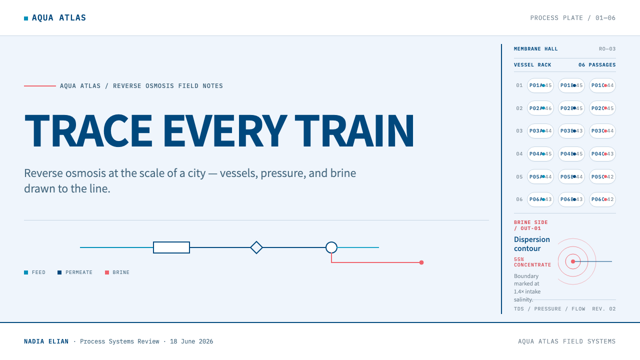
For presentation slides, a cover can look like a drawing plate: a modest title block, a thin navy frame, and a single process line crossing the page. Content slides work as flows, with boxes and lines that follow the direction of reading and carry cyan and coral only where the story is about water and brine. For data, use flat zone blocks to show allocation, concentric contours to show spread or influence, and plain linework charts. Keep every chart's colours consistent with the legend established on the first slide.
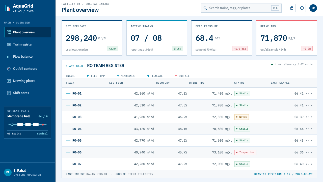
For web interfaces, the style is a natural fit for operations dashboards, monitoring consoles, utility portals and status pages. Layouts built from flat tiles with thin navy rules, status coloured only by the cyan and coral signals, and tables aligned like schedules produce an interface that feels like a control room without feeling cold. Pricing and plans can be shown as zone blocks. Navigation should be orthogonal and quiet, and loading or progress states can borrow the idea of a flow line advancing along a path.
For editorial and marketing work, the style supports annual and sustainability reports, technical explainers, investor materials for infrastructure, and long-form pieces on water. Diagrams should be treated as principal content, annotated with small, regular labels, and placed with the care given to photographs. Where photography is used, keep it documentary and let the diagram, not the picture, explain the system. Calls to action should be navy, and neutral, since the signal colours are already spoken for.
The most common mistake is to use the colours loosely: coral for a decorative accent or a sale button, cyan as a generic brand colour, or a different blue for every chart. That destroys the legend that makes the style work. Other errors are letting line weight vary for effect, filling zone blocks with gradients, and adding three-dimensional renders of the plant, which contradict the flat, drafted character. If a page feels like a generic blue technology template, it is usually because the colours have lost their single meanings.
Desalination Megaplant — FAQ
What is reverse osmosis, in plain terms?
Reverse osmosis is a way of making fresh water from seawater by pushing it, under pressure, through a membrane that lets water pass but holds most of the salt back. The fresh water that comes through is called permeate, and the more concentrated salty stream left behind is brine. A plant arranges many membranes in parallel vessels so that the same step is repeated at large scale, which is why the style can draw a whole facility with a small set of repeated marks.
Why is coral reserved for brine?
Because a signal colour only works if it has one meaning. In the plant's documentation, cyan marks the water side and coral marks the concentrate side and salinity alerts. If coral also appeared on a button, a decoration or a chart category, the reader could no longer trust it as a warning. Reserving it keeps the legend learnable in seconds, and it keeps the one place where the plant has a risk, the brine and its salinity, visually distinct from everything else.
Do I need to draw real plant diagrams to use this style?
No. The style borrows the grammar of process drawings, not their subject matter. A software product, an energy dashboard or a logistics report can all use consistent line weight, orthogonal flow, coded colour and flat zone blocks without showing a single membrane. What matters is that the page behaves like an engineering atlas: connections are visible, states are coded by colour, and each mark means one thing.
How is this different from an ordinary blue technology look?
A generic blue technology look uses blue as mood and often adds gradients, glows or soft shadows. Desalination Megaplant uses a pale ground, one navy line weight, flat fills, and two signal colours that each carry a fixed meaning. It is closer to a technical drawing than to a marketing site. The difference shows up in discipline: nothing is there for atmosphere, and the page can be decoded by reading its lines and its legend.
Can the style be used on a dark background?
Its native ground is a cool pale blue-white, like a drawing plate, and the navy line depends on that light field for contrast. A dark control-room variant is conceivable for monitoring screens, but it would have to re-establish the legend from scratch: the line colour, the cyan and the coral would all need to be rebalanced so the meanings remain obvious. For most uses, staying with the pale ground is the faithful and simpler choice.
Related design styles
 Deep Aquifer Water CourtRestraint makes the deficit undeniable. White bond, book serif, and a keyed a…
 Airport Baggage TagBuilt to be read in motion. Burned-black codes, hard rules and functional cha…
 Elemental Social HousingBuild half a good house, well. Dusty cement-grey panels, hatched bare-frame g…
 Souto de Moura GraniteArchitecture as raw matter. Dark Portuguese granite ground, board-marked conc…
 Anton Stankowski ConstructiveProcess becomes visible. Flat blue diagonals and hard square rules make chang…
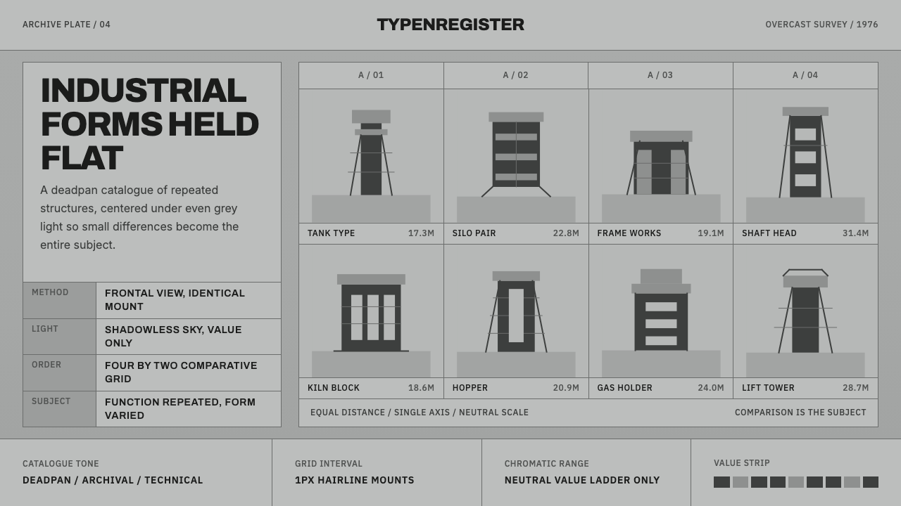 Bechers Industrial TypologyDeadpan order. Mid-grey ground, Archivo labels, and strict hairline grids rev…