What is Bechers Industrial Typology?
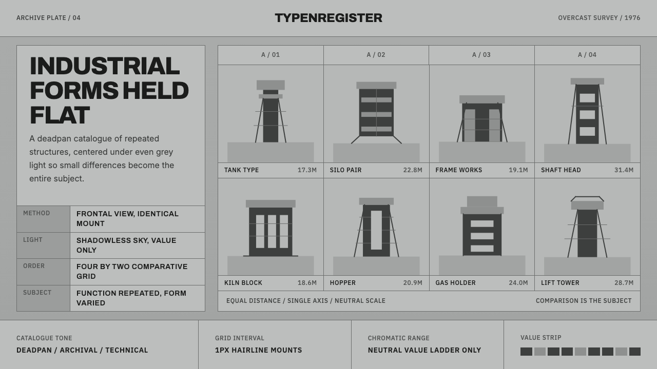
Bernd and Hilla Becher spent four decades photographing Europe's disappearing industrial architecture and arranging the results into grids precise enough to turn water towers and blast furnaces into a taxonomy.
Bechers Industrial Typology in brief
Typology photography is not simply black-and-white documentary work — it is comparison made visible. Bernd and Hilla Becher's system presents near-identical industrial structures, water towers, blast furnaces, winding towers, gas holders, side by side in a strict grid, so that the small differences between objects built for the same function become the entire subject. Nothing in the frame competes for attention: no color, no incidental shadow, no dramatic angle. The grid supplies the argument; each photograph is a piece of evidence.
The palette lives entirely in grey. Skies were deliberately shot overcast so light falls flat and even, without a directional shadow to flatter one structure over its neighbor. Every print sits within a narrow tonal band, running from a near-black structural silhouette up to a pale, faintly warm mid-grey sky, so that no single image in a grid reads as darker or brighter than the one beside it. Fair comparison, in this system, first requires that the lighting itself be standardized, almost like a laboratory condition.
Labeling stays spare and factual: a small, plain sans-serif caption noting location and structure type, set left-aligned beneath or beside the image rather than inside it. Thin hairline rules separate one cell from the next — thin enough to read as structure rather than decoration. The overall effect resembles an archive drawer pulled open: cool, exact, and faintly reverent toward objects nobody thought to call beautiful until someone arranged them this precisely.
Where does Bechers Industrial Typology come from?
Bernd Becher grew up in Siegen, a western German mining and iron-working region whose framework winding towers and half-timbered industrial buildings were being torn down through the 1950s as the local ore industry declined. He first trained as a painter and lithographer and tried, in drawings, to preserve structures he watched disappear one at a time; photography eventually replaced the pencil as a faster, more objective way to record buildings before the wrecking crews arrived. He studied at the Stuttgart art academy and then at the Kunstakademie Düsseldorf, where around 1957 he met Hilla Wobeser, a trained photographer who had left Potsdam for West Germany. The two began photographing together around 1959, married in 1961, and worked for the rest of their lives as an inseparable partnership, always crediting the images jointly.
Their method never varied: a large-format view camera, a fixed frontal viewpoint with the structure centered and the horizon level, a consistent working distance within any given typology, and overcast skies only, so that no session's light could be told apart from another's. What began as a local survey of Siegen's ore-processing towers expanded outward for four decades — across the Ruhr, into France, Belgium, and Britain, and eventually to the coal and steel country of the United States — always applying the same protocol to whichever structure type they were currently classifying, whether water towers, blast furnaces, or gas holders.
The conceptual scaffolding came from an earlier German tradition of systematic, dispassionate photography known as New Objectivity. August Sander's decades-long project to photograph a cross-section of German society by occupation and social type, and Karl Blossfeldt's close, comparative studies of plant forms, had already shown that repetition and consistent framing could turn photographs into something closer to a specimen catalogue than a set of individual pictures. The Bechers extended that logic from people and plants to industrial architecture. Their landmark 1970 book, published under a title that translates as Anonymous Sculptures: A Typology of Technical Constructions, argued that these engineer-built structures — designed with no artistic intention whatsoever — possessed a sculptural integrity equal to anything in a gallery, and that photographing them systematically was itself an act of rescue as the originals were demolished around them.
Institutional recognition followed the work rather than preceding it. In 1976 Bernd Becher became photography's first professor at the Kunstakademie Düsseldorf, and the rigorous, dispassionate method he taught there gave rise to what is now called the Düsseldorf School of Photography. Students including Andreas Gursky, Candida Höfer, Thomas Struth, and Thomas Ruff carried the discipline of the typological method into radically different subjects and became, by the 1990s and 2000s, among the most critically and commercially significant photographers of their generation. In 1990 the Bechers themselves received the Golden Lion for sculpture at the Venice Biennale — an unusual honor for photographers, and a public acknowledgment that their grids of industrial structures were doing sculpture's job by other means.
What defines the Bechers Industrial Typology look?
Grayscale Range
Color plays no role at all. Every image sits within a narrow band running from a near-black structural silhouette to a pale, faintly warm mid-grey sky, achieved by shooting only under overcast light so no session's tonality drifts from another's. The effect reads as cool and even rather than moody — a deliberately neutral register that lets the structures, not the lighting, carry the visual interest.
Grid Discipline
Every cell in a typology grid holds the same scale, the same framing, and the same distance from subject to lens, separated only by a thin hairline rule. No cell is allowed to break rank by cropping closer, tilting the horizon, or running larger than its neighbors. The rigor of the grid is what allows the eye to trust that any visible difference between cells is a difference in the real object, not a difference in how it was photographed.
Frontal Composition
The camera is always positioned dead-on and level, with the structure centered in the frame rather than caught from a flattering angle. This removes the photographer's point of view as a variable — there is no dramatic diagonal, no low angle exaggerating scale, no cropping for drama. The structure is presented the way an engineer's elevation drawing would present it: straight on, to scale, and legible as fact rather than as impression.
Factual Labels
Captions are small, plain, and set in an unfussy grotesque sans that never competes with the image for attention. They record only what a catalogue entry would record — location and structure type — left-aligned beneath or beside the frame, never overlaid on it. There is no headline voice, no adjective doing marketing work; the label's job is identification, not persuasion.
Repetition as Content
Most design instinct treats sameness as a problem to be solved with variety. This system inverts that instinct: the sameness is the content. Holding scale, angle, and lighting constant across a grid is what allows the small, real variation between objects — a slightly different silhouette, a regional construction habit — to become visible at all. Variation only reads as meaningful once everything else has been held equal.
Archival Restraint
Nothing in this system exists to be admired for its own sake. There is no ornamental border, no gradient, no glossy finish — the presentation is matte and flat, closer to a museum specimen catalogue than to a gallery print. That restraint is deliberate: any decorative flourish would reintroduce exactly the kind of subjective, persuasive gesture the typology method was built to remove.
Who shaped Bechers Industrial Typology?
Bernd Becher grew up watching Siegen's industrial architecture torn down and trained first as a painter before turning to photography as a faster way to document what was disappearing. With Hilla Becher he developed the strict frontal, overcast-light method that defines the style, and in 1976 became the first photography professor at the Kunstakademie Düsseldorf, formalizing the typological method into a teaching lineage now known as the Düsseldorf School.
Trained as a commercial photographer in Potsdam before leaving for West Germany in the 1950s, Hilla Becher brought technical photographic rigor to a partnership that Bernd approached first as a painter's preservation project. The two are credited jointly on every image; there is no meaningful way to separate their individual contributions, which is itself characteristic of how completely the typology method subordinates authorship to system.
Sander's decades-long project to photograph German society as a systematic cross-section of occupations and social types, later published as People of the Twentieth Century, established the New Objectivity principle that repetition and consistent framing can turn photography into a taxonomy rather than a collection of individual portraits — a principle the Bechers applied directly to architecture rather than people.
Blossfeldt's close, comparative photographic studies of plant forms, published as Urformen der Kunst in 1928, treated botanical specimens with the same dispassionate, isolating framing later applied to industrial structures. His work is a direct forerunner of the Bechers' method, showing that any category of object — organic or built — could be organized into a legible typology through consistent photographic treatment.
One of Bernd Becher's most commercially successful students at the Kunstakademie Düsseldorf, Gursky carried the typological discipline of scale, repetition, and dispassionate framing into large-format, often digitally composited images of stock exchanges, factories, and mass architecture, becoming, by the 2000s, one of the highest-priced living photographers and the most visible proof of the Becher method's afterlife.
How do you use Bechers Industrial Typology today?
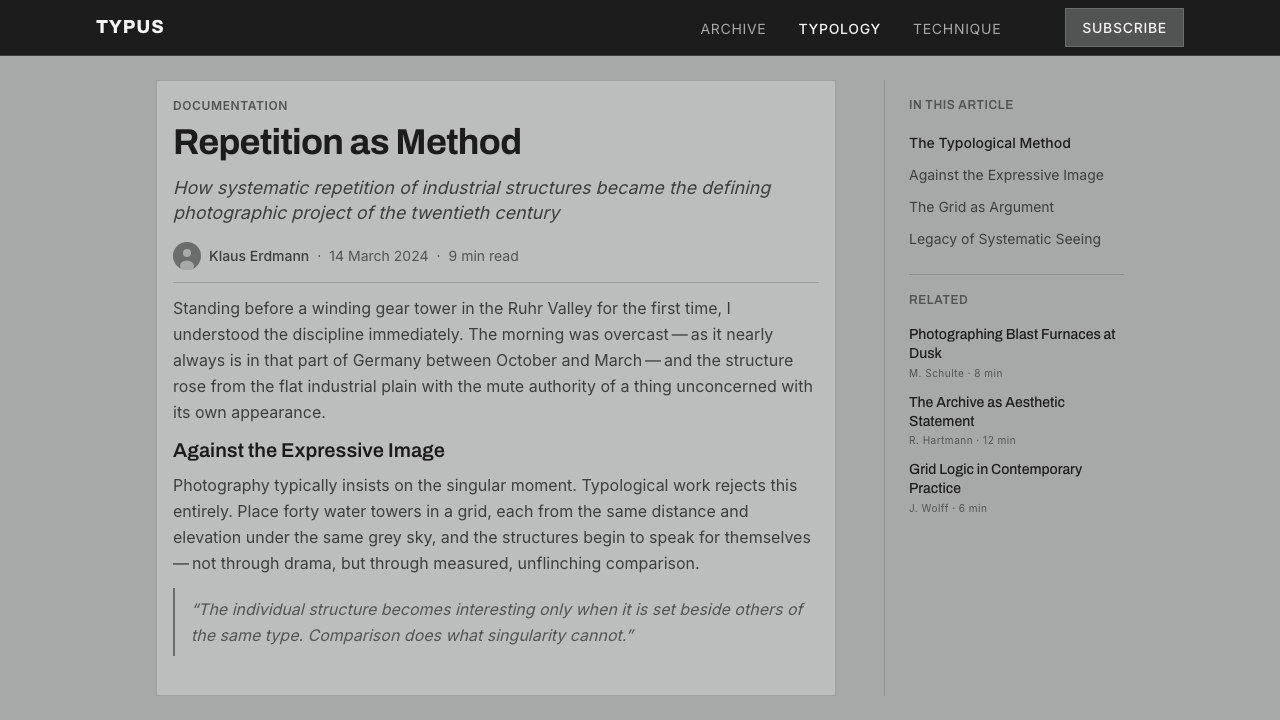
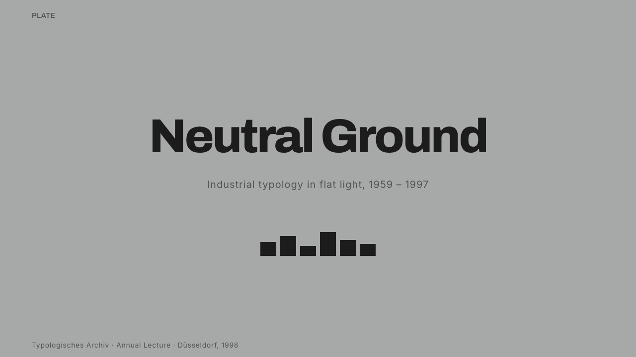
On presentation slides, the typology method is a natural fit for any content that is fundamentally comparative. A cover slide can borrow the grid itself as the hero image — a wall of near-identical thumbnails in mid-grey, one slightly larger or centered to carry the title. Content slides work best as literal grids: feature comparisons, before-and-after states, or a product line-up laid out with identical framing and spacing so the differences between items, not the layout, do the communicating.
Data slides are where the method is most literal. A comparison table or a set of small-multiple charts — the same chart type repeated once per category, at identical scale — is structurally the same object as a Becher grid. Bars and data points can be rendered in the grey palette with a single restrained accent reserved for whatever one data point the slide actually wants the audience to notice; everything else stays neutral so that accent reads as a decision rather than decoration.
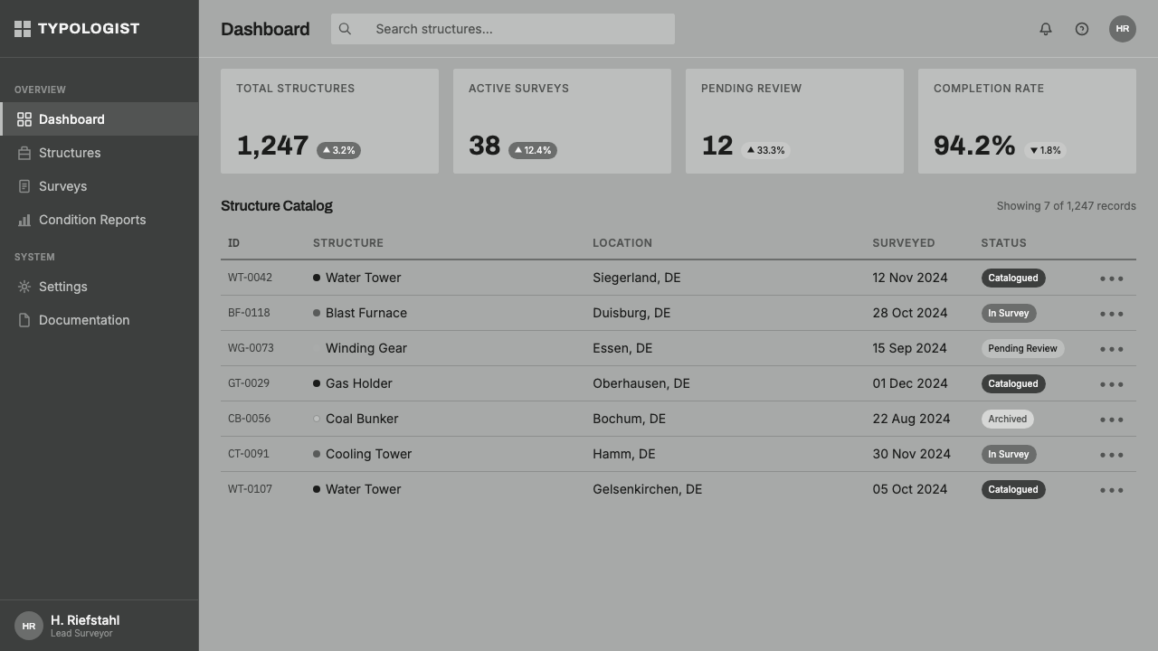
For web interfaces, the style suits dashboards and pricing pages precisely because both are, at heart, comparison tools. A dashboard built this way uses a uniform card grid, hairline dividers instead of drop shadows, and factual captions under each metric rather than celebratory microcopy. A pricing page treats its tiers as near-identical cards distinguished only by the details that actually differ, letting the comparison itself do the persuading instead of badges, color-coding, or an artificially inflated 'recommended' tier.
In editorial and marketing contexts, the method translates well to catalogues, portfolio grids, and any campaign built around 'shot under identical conditions' photography — a product line photographed against the same background at the same distance, for instance, or an editorial feature comparing several examples of the same category. The tone reads as credible and institutional rather than promotional, which makes it effective for brands trying to signal rigor, research, or archival authority rather than excitement.
The most common mistake is treating the grayscale palette as the whole style and ignoring the discipline underneath it. Converting a page to grey tones while leaving inconsistent card sizes, mismatched spacing, or varied photographic angles produces something that looks unfinished rather than austere — the entire effect depends on holding scale, framing, and spacing exactly constant across every cell. A second common mistake is adding marketing language or bright accent color across every tile; the system only works when restraint is total and any single break from it is meaningful.
Bechers Industrial Typology — FAQ
Is this the same thing as a generic black-and-white photo grid?
No. Any photo grid can be desaturated, but typology photography requires that every image in the grid share the same subject category, the same distance, the same frontal angle, and the same flat overcast light. Remove any one of those constraints and the comparison the grid is supposed to demonstrate breaks down — you get a mood board, not a taxonomy. The grayscale palette is a side effect of the method, not the method itself.
Can a typology grid ever use color?
Historically, no — the Bechers treated color as an uncontrolled variable that would make images from different sessions, seasons, or locations impossible to compare fairly. A digital adaptation could introduce color, but only if saturation and lighting are held exactly as constant across every cell as angle and distance already are; otherwise the comparison the grid depends on stops being fair, and the whole point of the method is lost.
How is this different from an ordinary Instagram-style photo grid?
An ordinary photo grid usually mixes subjects, angles, and lighting for visual variety — that variety is the appeal. A typology grid does the opposite: it deliberately removes variety from everything except the one variable it wants to study. The discipline of holding everything else constant is what turns a set of pictures into an argument rather than a mood.
Does this style work for products that aren't photography-based, like a SaaS dashboard?
Yes, and arguably better than it works for casual photography. Any interface built around comparison — a spec sheet, a pricing table, an analytics dashboard, an e-commerce catalog — benefits from the same grid discipline: identical card treatment, factual labels instead of promotional copy, and a single restrained accent reserved for whatever the interface actually wants the user to notice. It is a poor fit for storytelling or emotionally driven brand experiences, where comparison is not the point.
Why did the Bechers insist on overcast light and forbid direct sunshine?
Direct sunlight casts hard shadows that shift with the time of day and season, which would make two structures photographed months apart look lit differently even if nothing about the buildings themselves had changed. Overcast skies act as a giant diffuser, producing flat, even, repeatable light across every session over decades of work. It is the same instinct that leads a scientist to control lighting conditions before comparing two specimens under a microscope.
Related design styles
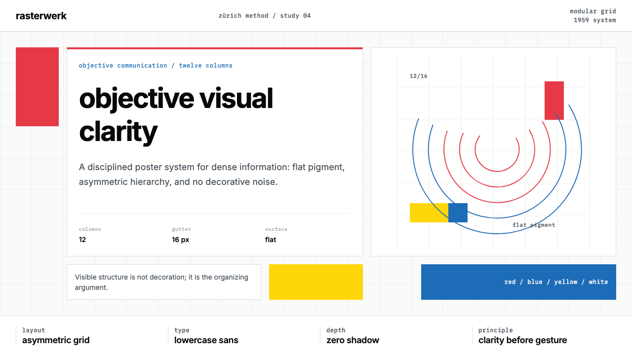 Müller-Brockmann SwissClarity is the system. Inter grids, red-blue blocks, and concentric arcs make…
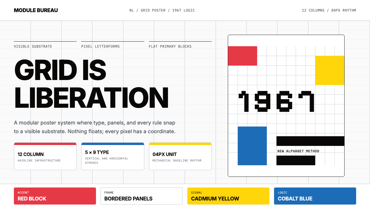 Wim Crouwel GridGrid becomes freedom. Cobalt, red and yellow blocks lock Inter type to a 12-c…
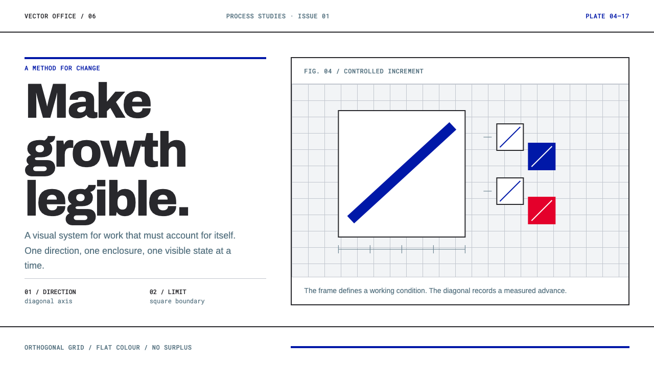 Anton Stankowski ConstructiveProcess becomes visible. Flat blue diagonals and hard square rules make chang…
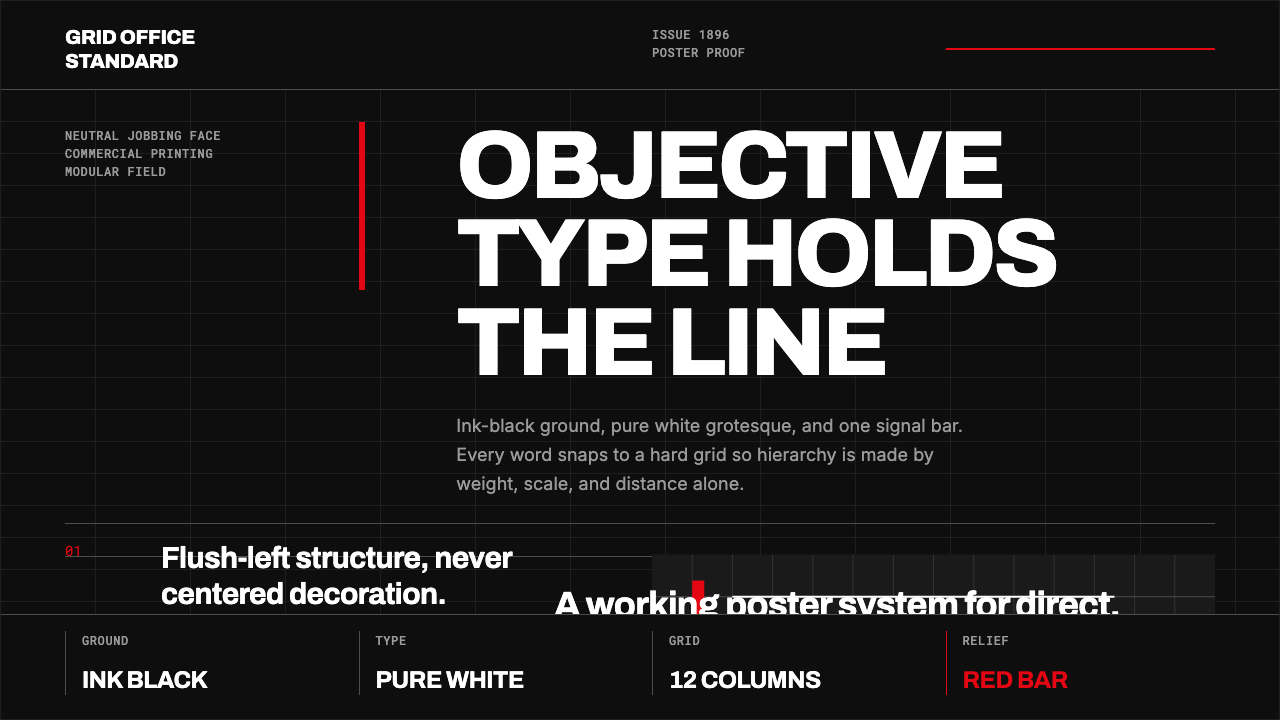 Akzidenz-Grotesk BertholdObjectivity in black ink. White grotesque type, hard grid, one rationed red b…
 Emil Ruder TypografieDiscipline makes type visible. Near-white grotesque and measured space cut th…
 Icelandic Basalt VolcanoCold geology, engineered. Basalt black, Sora type, and one magma fissure hold…