What is Akzidenz-Grotesk Berthold?
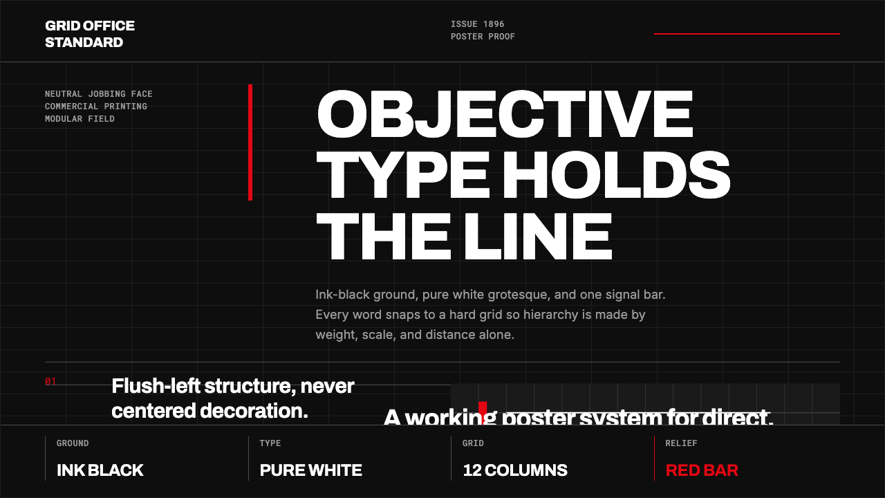
Akzidenz-Grotesk turns typography into infrastructure: white grotesque letters, black ink fields, a hard grid, and one red signal with nowhere to hide.
Akzidenz-Grotesk Berthold in brief
Akzidenz-Grotesk is a neo-grotesque sans-serif issued by H. Berthold AG in Germany around 1896. Made for commercial printing, it was conceived as a neutral working typeface rather than an expressive signature. Its authority comes from that apparent lack of personality: the letters behave like printed information, direct and unsentimental.
It is widely understood as the grandfather of Swiss typography and a direct ancestor of Helvetica and Univers. In the middle of the twentieth century, its restrained forms became inseparable from Swiss Style, also called the International Typographic Style. What began as a practical commercial face became a visual argument for order, clarity, and objective communication.
The associated visual system is severe by design. White type sits flush left on an ink-black field, arranged on a rigid modular grid. A single red bar or mark acts as the only relief. Hierarchy is created through scale, weight, alignment, and space, never through decorative flourish, soft depth, or atmospheric effects.
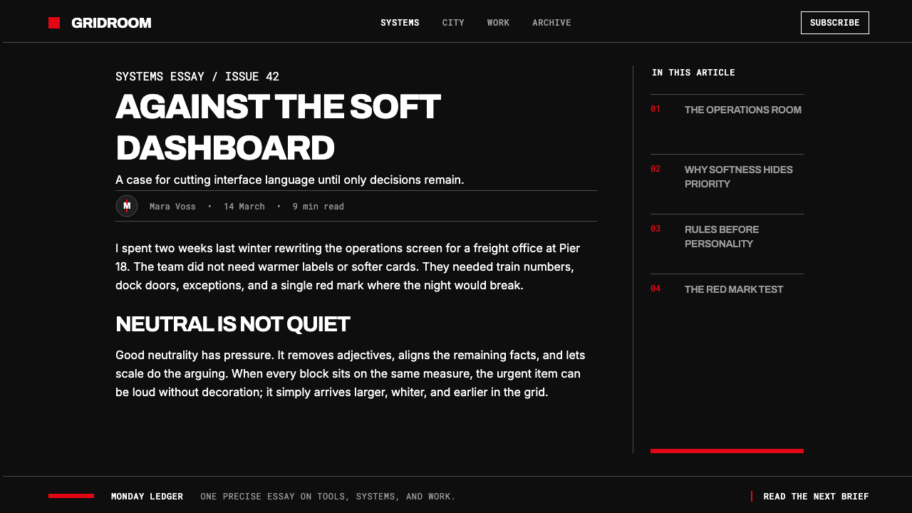
Where does Akzidenz-Grotesk Berthold come from?
Akzidenz-Grotesk was released by H. Berthold AG in Berlin around 1896 to 1898. Its name identifies its original territory: Akzidenz referred to commercial jobbing work, the everyday printed matter that needed to communicate efficiently. The typeface therefore entered the world as a tool for practical reproduction, not as a manifesto for a design movement.
That commercial origin matters to its character. The face was built to carry information without demanding attention for itself. Its neutral appearance made it adaptable across many kinds of printed matter, while its compact visual logic gave designers a dependable foundation for strong hierarchy and exact alignment.
Its later identity was formed in Switzerland during the 1950s and 1960s, when Swiss Style made the grid, sans-serif typography, and disciplined asymmetry into an international visual language. In this setting, Akzidenz-Grotesk no longer looked merely useful. It looked like the appropriate typeface for a modern culture that valued facts, systems, and public legibility.
Josef Müller-Brockmann and Emil Ruder are key figures associated with this Swiss typographic climate. Alongside the legacy of H. Berthold AG, they represent the shift from type as commercial equipment to type as a rigorous organizing system. The resulting tradition joined neo-grotesque typography, Swiss Style, and mid-century modernism into a lasting model of visual objectivity.
What defines the Akzidenz-Grotesk Berthold look?
Black Ground
The background is treated as ink rather than atmosphere: dense, flat, and absolute. White type reads with immediate force against it. Black is not used to create mood or luxury; it establishes a neutral field on which information can become sharply visible.
Grotesque Typography
The typeface is the primary image. Its neo-grotesque sans-serif forms are used without display embellishment, allowing letters, words, and lines to become the composition itself. The visual tone is neutral, but never weak: restraint makes the message more commanding.
Flush-Left Discipline
Text begins from a shared left edge and keeps its reading direction explicit. This is not a casual preference for alignment. The repeated edge acts like a structural rail, making blocks of information feel measured, related, and easy to scan.
Modular Grid
A hard grid governs placement, spacing, and proportion. Elements do not float into attractive positions; they occupy assigned relationships. The grid gives typography the precision of signage and makes even an expressive headline appear accountable to a larger system.
Rationed Red
Red is a signal, not a palette. Used as a bar, rule, marker, or compact emphasis, it interrupts the black-and-white field with intention. Because it is rationed, it can identify priority, direction, or action without competing with the typographic hierarchy.
No Cosmetic Depth
There are no ornamental shadows, decorative surfaces, or visual effects added merely to soften the result. The system relies on contrast, spacing, and geometry. Every component should read as information placed in a structure, not as an object staged for spectacle.
Who shaped Akzidenz-Grotesk Berthold?
H. Berthold AG issued Akzidenz-Grotesk in Berlin around 1896 to 1898. The company supplied the face for commercial printing, giving it a practical origin that remained visible even after it became a defining reference for Swiss typography and modern graphic design.
Müller-Brockmann is a key figure in the Swiss Style environment that made Akzidenz-Grotesk canonical. His association with the movement represents its demand for objective communication, disciplined grids, and typography that organizes public information with visible logic.
Ruder is another central figure associated with Swiss typography and the International Typographic Style. In the Akzidenz-Grotesk tradition, his significance lies in treating typography as a disciplined visual system, where legibility and structural relationship take precedence over stylistic decoration.
How do you use Akzidenz-Grotesk Berthold today?
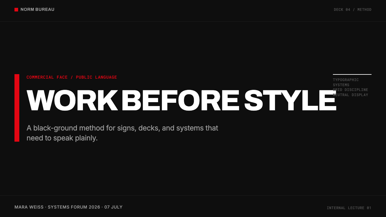
For presentation covers, let typography establish the entire image. Use an ink-black field, a flush-left title, and a single red accent that anchors the composition or indicates the subject. The cover should feel like a public notice with unusual confidence, not like a dark theme decorated with Swiss references.
For content slides, treat the grid as the speaking order. Keep headings, body text, labels, and notes aligned to shared edges, then create hierarchy through typographic scale and weight. On data slides, charts should inherit the same discipline: white information on black, restrained red for the most important comparison, and no decorative effects that obscure reading.
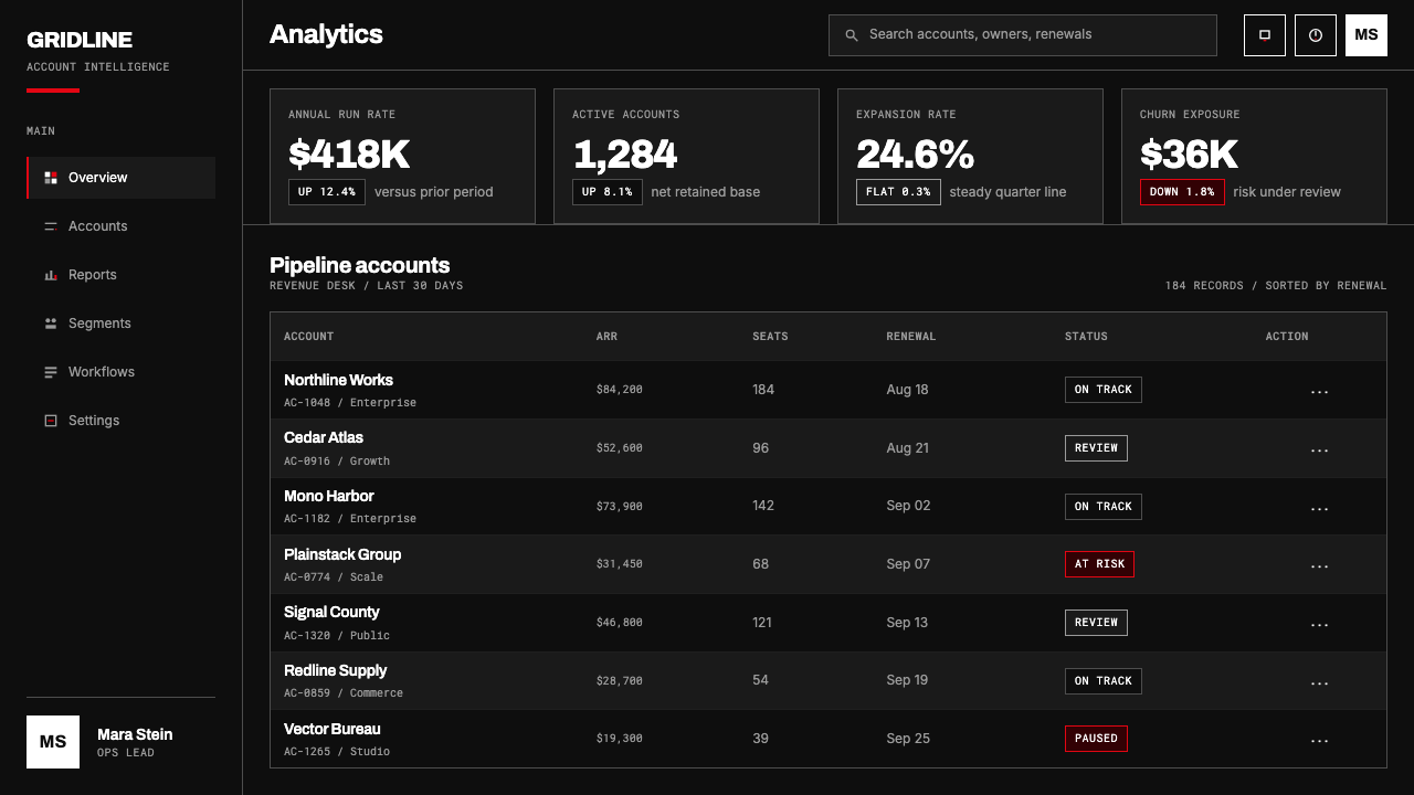
For web interfaces, this approach is especially effective in dashboards, analytical products, and pricing pages where information must feel controlled and trustworthy. Use white grotesque type for navigation and content, make boundaries explicit through alignment and rules, and reserve red for alerts, current states, or the decision that deserves immediate attention.
For editorial and marketing work, Akzidenz-Grotesk supports a poster-like voice without requiring illustration. A publication can use large headlines, compact metadata, and stark section breaks to make reading feel organized. Marketing material should let the proposition do the visual work: a clear statement, a grid, and one signal are often more persuasive than a crowded campaign surface.
The common mistake is to copy the black background and red accent while abandoning the underlying discipline. Multiple bright accents, soft cards, centered decorative text, or loose spacing turn the style into costume. The visual system works only when color is rationed and every typographic decision is accountable to hierarchy and grid.
Akzidenz-Grotesk Berthold — FAQ
Is Akzidenz-Grotesk simply another name for Helvetica?
No. They are distinct typefaces, but the source material identifies Akzidenz-Grotesk as a direct ancestor of Helvetica and Univers. Its historical role is earlier and foundational: it provided a neo-grotesque model that later became central to Swiss typographic thinking.
Why is the visual system usually dark?
The black ground recalls black ink and intensifies the objectivity of white type. It creates immediate contrast while keeping the page austere. The darkness is not an invitation to add dramatic effects; it is a flat field that makes hierarchy, alignment, and the red signal more exact.
Can more than one accent color be used?
The supplied system is built around one rationed red accent as the only relief from black and white. Adding several accents weakens its signaling function. If red is meant to identify priority, it must remain scarce enough for viewers to recognize its meaning immediately.
Where does this style work best?
It works best where clarity, hierarchy, and confidence matter more than warmth or decoration: presentation systems, dashboards, pricing pages, editorial layouts, and direct marketing statements. It is especially useful when a product needs to make complex information feel structured rather than ornamental.
Related design styles
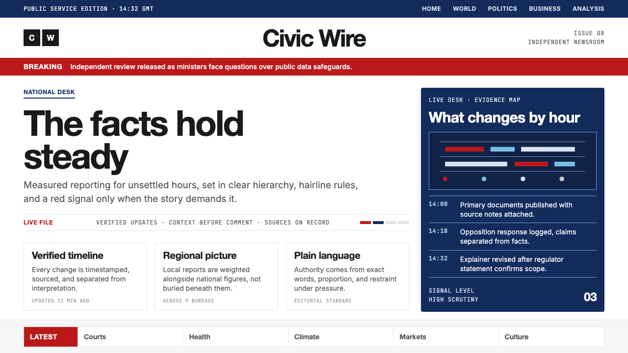 BBC NewsPublic trust, stripped bare. Red alerts, deep navy and hairline grids make ur…
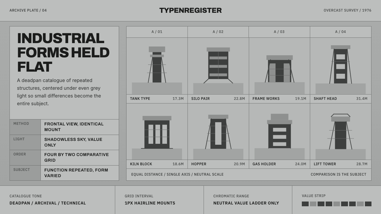 Bechers Industrial TypologyDeadpan order. Mid-grey ground, Archivo labels, and strict hairline grids rev…
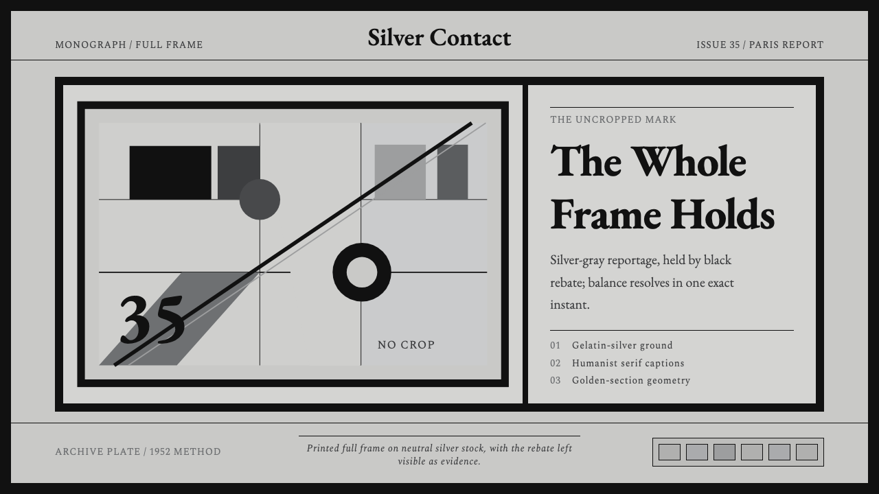 Cartier-Bresson Decisive MomentNever cropped. Silver-gray tonality is locked by a dead-black film rebate.
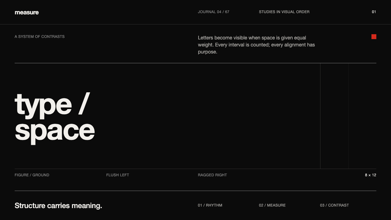 Emil Ruder TypografieDiscipline makes type visible. Near-white grotesque and measured space cut th…
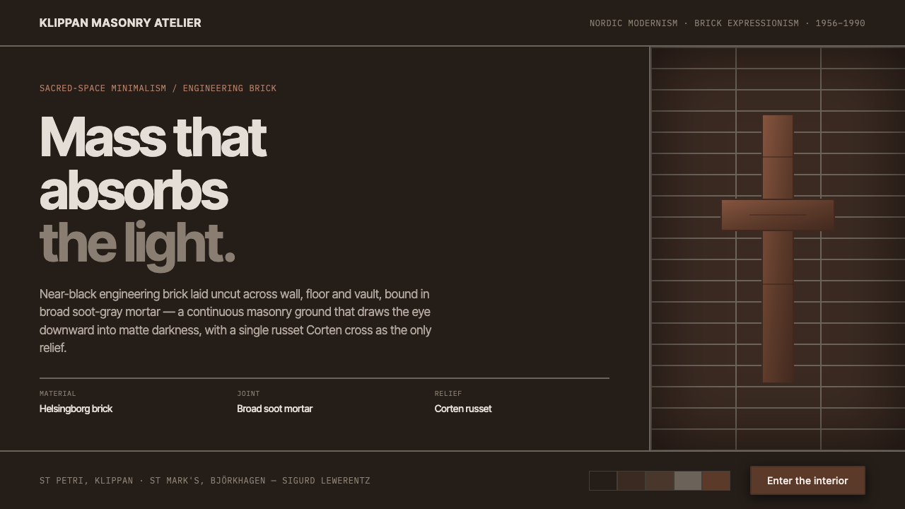 Lewerentz Dark BrickMass that absorbs light. Near-black engineering brick, broad soot mortar, one…
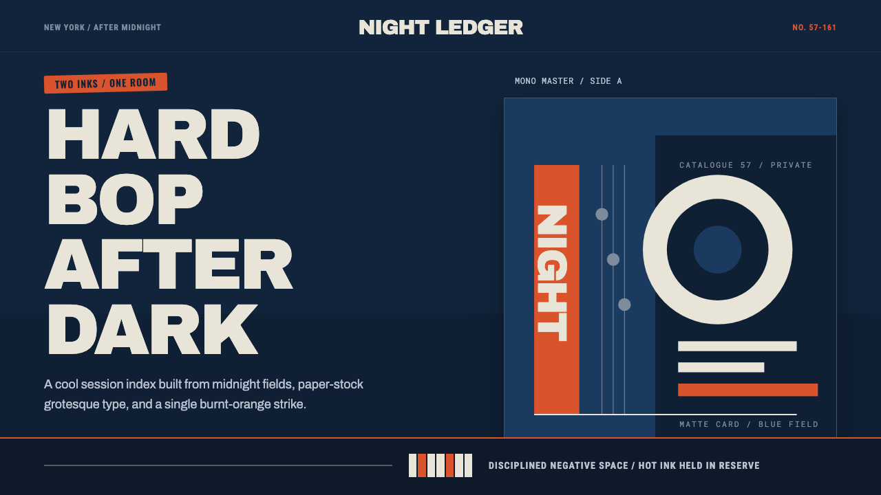 Blue Note JazzCool intelligence, printed flat. Midnight blue, paper type, and one burnt-ora…