What is Cartier-Bresson Decisive Moment?
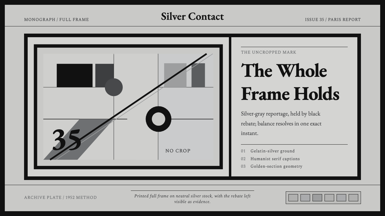
Henri Cartier-Bresson refused to crop a single frame — this style turns that refusal into a dead-black border that proves every image was caught whole, in one balanced instant.
Cartier-Bresson Decisive Moment in brief
Cartier-Bresson Decisive Moment is a design language pulled from twentieth-century humanist photojournalism, and specifically from one photographer's refusal to let a darkroom technician improve on what the lens already saw. Its most visible signature is a solid, dead-black border wrapping every image — the printed 'rebate,' the strip of film outside the exposed frame, complete with the soft curve of sprocket-hole notches on some prints. Where most photography styles crop toward an ideal, this one displays the whole negative as proof nothing was removed after the shutter closed.
The palette lives entirely in silver and graphite. There is no saturated color anywhere in the system — only the long tonal range of a gelatin-silver print, from a near-white silver highlight down through neutral mid-grays to a black so dense it reads as void rather than shadow. Warmth, when it appears at all, is a whisper of tone in the paper stock, never a hue applied on purpose.
Structure carries the same discipline as the tonality. Composition follows classical proportion — the golden section and the rule of thirds rather than a rigid modern grid — so that a headline, a portrait, or a data point sits exactly where the eye expects weight to fall. Type is a classical humanist serif, the kind associated with mid-century book printing and museum wall text, chosen because it reads as considered and permanent rather than urgent or decorative.
Where does Cartier-Bresson Decisive Moment come from?
Henri Cartier-Bresson was born in France in 1908 and trained first as a painter, studying in Paris in the early 1920s under André Lhote, a Cubist painter who ran a private studio built around rigorous geometric analysis of the picture plane. Lhote's teaching — dissecting compositions into underlying triangles, diagonals, and proportional divisions — gave Cartier-Bresson the trained eye he would later apply not to canvas but to the viewfinder, a debt he acknowledged throughout his life even after he largely set painting aside.
In the early 1930s Cartier-Bresson acquired a Leica, a small 35mm camera that let him work close to his subjects without the tripod, the flash, or the delay of the large-format press cameras that then defined photojournalism. That physical freedom produced a working method: watch, wait, and release the shutter at the single instant when the moving elements of a scene — gesture, geometry, light — snapped into balance. He named this doctrine 'the decisive moment' in the title of his 1952 book (published in France as Images à la Sauvette), which became both his manifesto and his most widely reproduced portfolio.
In 1947, with Robert Capa, David 'Chim' Seymour, George Rodger, and William Vandivert, Cartier-Bresson co-founded Magnum Photos, a cooperative agency structured so that photographers — not publishers — owned their negatives and controlled how their work was licensed and reprinted. That ownership model let Cartier-Bresson defend the print itself, including its uncropped edge, as something close to a legal and artistic statement rather than a raw material for an art director to reshape.
Photography was not his only sustained visual relationship: over several decades Cartier-Bresson repeatedly photographed the painter Henri Matisse in his studio, producing one of the most extensive and reproduced portrait series of any twentieth-century artist. The images read less like celebrity documentation and more like one visual discipline studying another — a photographer trained by a Cubist painter, observing a painter still working out color and form late in life.
What defines the Cartier-Bresson Decisive Moment look?
Framing & Border
Every finished image sits inside a full, unbroken dead-black border — the printed film rebate rather than a cropped edge. On some prints this border still shows the soft curve of sprocket-hole notches, a literal fingerprint of the negative's physical edge. In a design system, this becomes a deliberate framing device: a heavy dark surround that separates an image or a card from its background and signals, without any label, that what is inside has not been trimmed or rearranged.
Tonality
The color system is monochrome by conviction, not by limitation: a long, continuous run from near-white silver highlight to graphite mid-tone to a black dense enough to read as absence. No hue is ever introduced for emphasis — hierarchy is built entirely through value, the relative lightness or darkness of a tone, the way a printer would dodge and burn a photograph in a darkroom.
Composition
Layout follows classical proportion systems — the golden section and the rule of thirds — rather than a strict modern column grid. Focal elements land on the intersections those systems predict, so a page feels balanced and considered rather than mechanically aligned. This is composition borrowed from painting and adapted to photography, then adapted again to screens.
Typography
Type is a classical humanist serif with the proportions of mid-century book and museum typography — letterforms that feel drawn by hand and refined over centuries rather than optimized for a screen. It carries authority quietly: no bold color, no oversized display weight, just even, legible, unhurried text that assumes the reader will take their time.
Texture & Grain
Surfaces carry the faint, continuous texture of gelatin-silver printing paper — a soft grain rather than a flat digital fill. This texture is subtle enough that it reads as material quality rather than decoration, the same way a fine print feels different in the hand than a screen reproduction of it.
Restraint
The system's defining discipline is what it refuses: no saturated color, no visible cropping, no ornamental flourish competing with the image. Every choice defers to the photograph or the content at the center of the frame, treating addition as something to justify rather than something to default to.

Who shaped Cartier-Bresson Decisive Moment?
The photographer whose practice this style is drawn from. Trained as a painter, he adopted a small 35mm Leica in the early 1930s and built a working method around waiting for a single balanced instant rather than staging or cropping a scene — a doctrine he named 'the decisive moment.'
A Cubist painter who ran a private teaching studio in Paris where Cartier-Bresson studied composition in the early 1920s. Lhote's method of breaking a picture down into geometric structure — proportion, diagonal, balance — shaped how Cartier-Bresson would later see through a viewfinder.
The photographer-owned cooperative agency Cartier-Bresson co-founded in 1947 with Robert Capa, David 'Chim' Seymour, George Rodger, and William Vandivert. By keeping negatives in photographers' hands rather than publishers', Magnum let its members treat the print — uncropped edge included — as an authored, protected object.
The painter Cartier-Bresson photographed repeatedly across several decades, producing one of the most extensive portrait series of any twentieth-century artist. The relationship reflects Cartier-Bresson's continuing dialogue with painting even after he had largely stopped practicing it himself.
How do you use Cartier-Bresson Decisive Moment today?
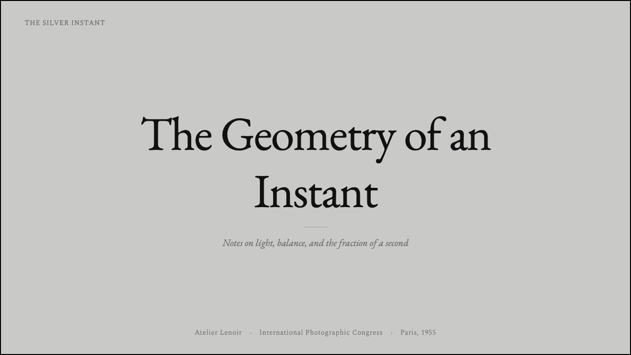
On a presentation cover, this style works as a single strong photograph — real or a placeholder treated with the same tonal discipline — framed by its dead-black border, with the title set in quiet serif type in a corner rather than stacked across the center. Content slides should keep that same restraint: one image or one idea per slide, generous negative space, and text set in a single measured column rather than competing text boxes. Data slides benefit from treating charts the way the style treats photographs — grayscale value doing the work that color usually does, with a single accent reserved for the one number that matters.
For dashboards, the style reads as calm and legible rather than decorative: a near-white or pale gray canvas, graphite-toned text and dividers, and photography or imagery — where it appears — bordered the same way a printed photograph would be, so screenshots and product shots feel curated rather than dropped in. Pricing pages benefit from the same classical proportion the style borrows from painting: plan cards positioned by considered balance rather than mechanical equal spacing, with the recommended tier distinguished by tonal weight rather than a loud color badge.
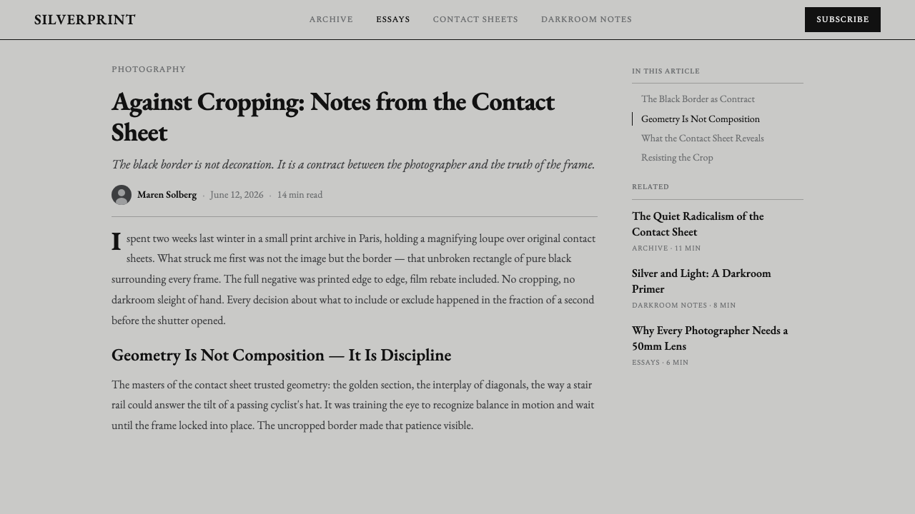
Editorial layouts are close to this style's native habitat: a narrow, readable text column, a classical serif carrying the body copy, and full-bleed black-bordered photography breaking up long-form text the way a magazine spread would. Marketing pages can lean on the same restraint to signal seriousness and craft — a single hero photograph, unaltered and fully framed, communicates more confidence than a collage of cropped, color-graded images competing for attention.
The style also suits any brand story or about page built around a single defining image or artifact, since its whole visual grammar is built to let one thing be looked at carefully rather than many things be scanned quickly.
The most common misuse is treating this as 'a black-and-white filter' applied to an otherwise ordinary layout. Desaturating photography while keeping bright accent colors, rounded soft shadows, or a casual sans-serif undercuts the discipline entirely — the tonality, the classical typography, the geometric restraint, and the uncropped framing all have to move together, or the result reads as a filtered photo rather than a coherent visual system.
Cartier-Bresson Decisive Moment — FAQ
Is this style just black-and-white photography with a filter?
No. Desaturating an image is one small part of it; the system depends equally on classical serif typography, golden-section composition, and — most distinctively — a full, uncropped dead-black border around every image. Remove any one of those and the style collapses into a generic monochrome look rather than the specific photojournalistic discipline it draws from.
Can this style ever use color?
The historical practice it is drawn from was almost entirely monochrome, since Cartier-Bresson worked in gelatin-silver print for most of his career, and the design system preserves that as a hard rule rather than a suggestion. Introducing saturated color undoes the tonal hierarchy the whole system depends on, so applications that need color are better served by a different style.
Why does the black border matter so much — isn't it just decoration?
It is the opposite of decoration: historically, it was proof. Printing the film's rebate — the strip outside the exposed frame — showed that nothing had been cropped or rearranged after the shutter closed, at a time when photojournalism was regularly accused of staging or manipulating images. In the design system, the border keeps that meaning: it signals completeness and honesty rather than adding a stylistic frame for its own sake.
What kind of content suits this style best?
Content built around a single strong subject — a portrait, a product shot, a founder story, a case study — suits it far better than content that needs to display many small elements at once. Because the system relies on negative space and considered composition rather than density, it struggles with data-heavy interfaces that need to show dozens of values simultaneously.
How does this differ from a generic 'vintage photography' aesthetic?
Generic vintage treatments usually add warmth, grain as texture-for-texture's-sake, or a nostalgic cast to the whole image. This style is not nostalgic — it is procedural, inherited from a specific documentary ethic that valued precision and restraint over mood. The result should feel considered and almost architectural in its balance, not soft or wistful.
Related design styles
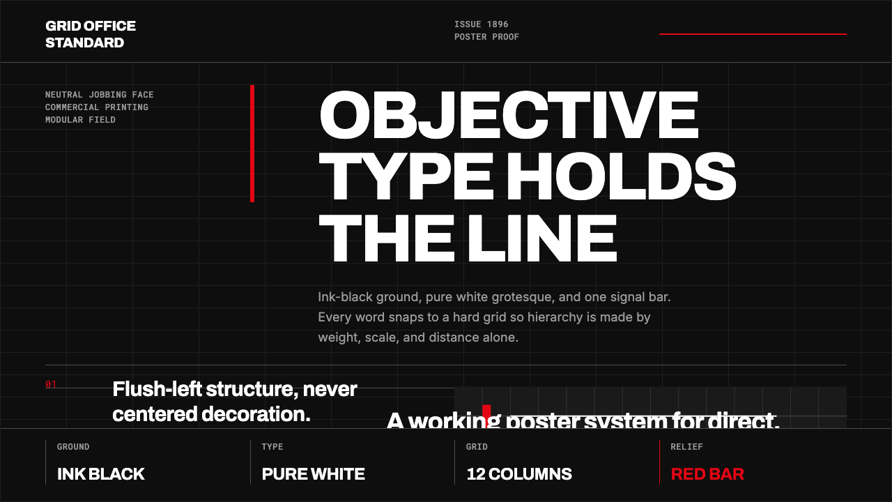 Akzidenz-Grotesk BertholdObjectivity in black ink. White grotesque type, hard grid, one rationed red b…
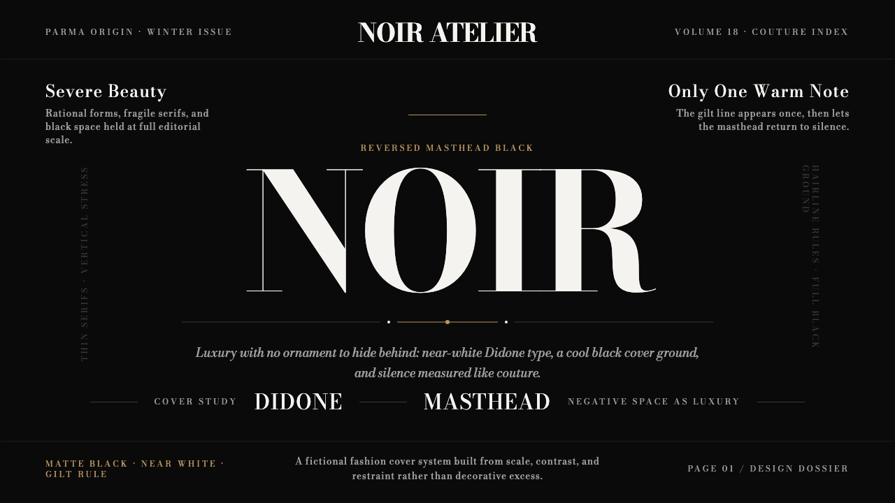 Bodoni Didone Fashion MastheadLuxury as black silence. White Bodoni, tiny coverlines, and one gilt hairline…
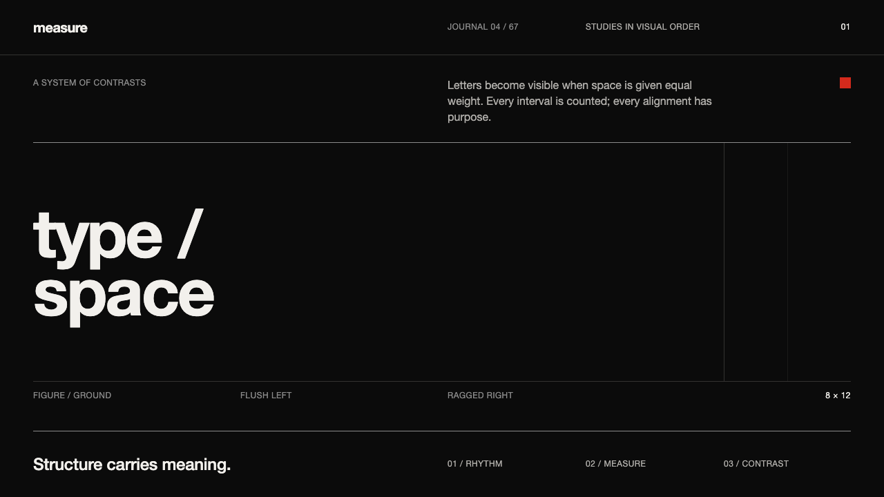 Emil Ruder TypografieDiscipline makes type visible. Near-white grotesque and measured space cut th…
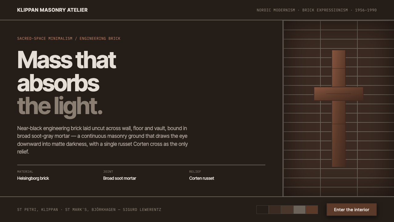 Lewerentz Dark BrickMass that absorbs light. Near-black engineering brick, broad soot mortar, one…
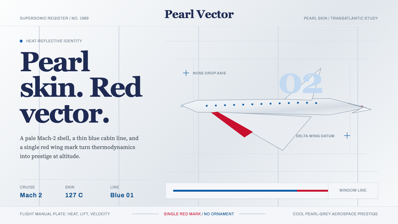 Concorde SupersonicPhysics made prestige. Pearl grey, sky-blue window line, and one red wing vec…
 Karl Gerstner ProgrammesDesign becomes a programme. Black hairlines and a strict matrix turn paramete…