What is Karl Gerstner Programmes?
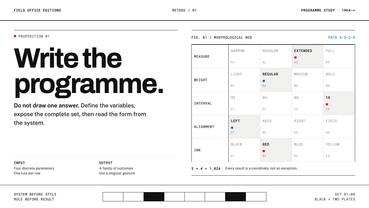
The designer's job is not to draw a solution but to write the programme that generates every solution: a strict matrix, black hairlines, one typeface family.
Karl Gerstner Programmes in brief
Karl Gerstner Programmes is the style of Programme entwerfen, a 1964 book in which Swiss typography stops being a manner and becomes a parameter system. Its claim is blunt. A designer should not deliver one finished solution but should write the programme from which the whole set of solutions can be derived. The visual language follows from that claim: a matrix of rows and columns, hairline rules that make the structure visible, a single type family, and black ink on white paper.
The instrument is the morphological box, borrowed from the physicist Fritz Zwicky. Parameters run down the left edge, discrete options are ranged across each row, and a chosen design is read off the matrix by picking one option per row. The method is applied to typography, to layout and to identity, but the form it takes on the page is always the same, a table that doubles as an argument. Every design is a path through the grid.
The book proves the method on itself. It runs in two columns, uses one typeface family from start to finish, and varies weight and scale so sparingly that every change reads as a decision. Colour is held back for inserts and two-colour plates. The effect is a page of extraordinary calm, in which nothing is improvised and everything can be explained. This is a style that does not permit a flash of inspiration; it permits a stated change to a named parameter.
Where does Karl Gerstner Programmes come from?
The book appeared in 1964 from the publisher Arthur Niggli in Teufen in the canton of Appenzell Ausserrhoden, and the milieu behind it was Basel and Zurich. That corner of Switzerland was the engine of the International Typographic Style, with its grids, its sans-serif type and its faith in objectivity. Gerstner worked inside that tradition but pushed it somewhere further. Where his contemporaries refined a way of looking, he asked what a way of looking would become if it were written down as a procedure.
The intellectual sources are two. One is Zwicky's morphological method, a technique for exploring all combinations of a problem's parameters so that nothing is left to chance. The other is concrete art, the tradition of making pictures from systems rather than from observation, in which the structure is the subject. Gerstner joined them. A page was not a composition to be balanced by eye but the output of a rule set, and the designer's real work lay in choosing the parameters and their permitted values.
The book itself is a small object. It is bound in white board and printed in black on white paper, and its two-column layout is as plain as a page can be. That plainness is the argument. If the method is sound, the book that explains it should be the simplest demonstration of it, using no more than one typeface family and the minimum of variation in weight and scale. A typeface called Gerstner-Programm, which dates from 1964 and was digitally revived in 2017, belongs to the same project of making the type itself a parameter system.
The cast around him is a Basel circle. Markus Kutter, a writer, and Gerstner worked together in the world of advertising and communication, and Arthur Niggli published a good part of the Swiss design canon. Programme entwerfen sits in the history of programmatic and generative design as an early, clear statement of an idea that is now commonplace: that a design can be a function, and that its variants are instances. Its period is short, the early 1960s, but its question has outlasted every style that came after.
What defines the Karl Gerstner Programmes look?
The morphological matrix
The matrix is both content and layout. Parameters sit in a column down the left edge, options are ranged across each row, and the design is read by choosing one cell per row. A page built this way shows its own logic at a glance. The table is not an appendix to the argument; it is the argument, and the layout simply lets it be seen.
Programme before design
Nothing is decided by inspiration. A change is made to a named parameter, and the reason is stated. To show a result, the programme prints the whole range of arrangements together, so the reader sees the chosen option in the context of its siblings. The designer's output is a structure that can generate many pages, not one page.
One family, minimal change
A single type family runs through everything. Weight and scale change so rarely that each change counts as an event. This is not poverty but economy: with so few variables, the ones that do move carry real meaning. A heading is a heading because it is heavier or larger, and for no other reason.
Two-column grid
The page divides into two columns, and everything is placed within them. The columns are not a flourish but a working structure: running text in one, matrices, captions and examples in the other or across both. The grid is strict enough to hold the argument, and plain enough that it never competes with it.
Black hairlines
Hairline rules make the scaffolding visible. They draw the edges of the matrix, separate parameters from options and tie rows together. The lines are thin, black and even, with no decorative variation. They are the visible form of the programme's structure, and a reader can follow the logic of a page by following its lines.
Black on white, colour as insert
The base is black ink on white paper. Colour is not part of the running page; it appears in inserts and two-colour plates, where it is itself shown as a parameter. That makes colour an explicit decision rather than a mood. When colour arrives, it arrives labelled, as one more option in the matrix.
Showing the whole set
A result is shown together with its alternatives. Rather than present one layout and hide the rest, the page prints the full permutation set, so that the choice is legible as a choice. This habit of showing variants side by side is the style's most useful practical lesson, and the reason it adapts so well to systems that must stay consistent across many outputs.
Who shaped Karl Gerstner Programmes?
The Basel designer and author of Programme entwerfen. His contribution is the shift from designing objects to designing the rules that produce them. He applied the idea to typography, layout and identity, and he drew the type family that bears the book's name. His legacy is the habit of asking, before drawing anything, which parameters are in play and what values each may take.
The physicist and astronomer whose morphological method supplied the book's central instrument. Zwicky developed a way of exploring a problem by listing its parameters and every admissible value of each, then examining the combinations. Gerstner's contribution was to see that this was also a way of designing, and to give the method a typographic form.
The publisher in Teufen whose house issued the book in 1964. Niggli is closely associated with the printed canon of Swiss graphic design, and the book's material form, small, white-boarded and spare, owes something to the publisher's sense of how this kind of design should reach readers. Publishing was the medium in which the programme was proved.
A Basel writer who worked alongside Gerstner in advertising and communication. He represents the verbal side of the Basel circle, the conviction that a design programme should be explainable in plain words as well as shown in plain forms. His presence is a reminder that the style was never only about type, but about disciplined thinking carried by type.
How do you use Karl Gerstner Programmes today?
Karl Gerstner Programmes is the right reference when consistency across many outputs is the goal: design systems, documentation, specification sheets, identity guidelines and any work that has to show its own logic. It rewards teams who can name their parameters and who want a page that makes the structure of a decision visible. It punishes improvisation.
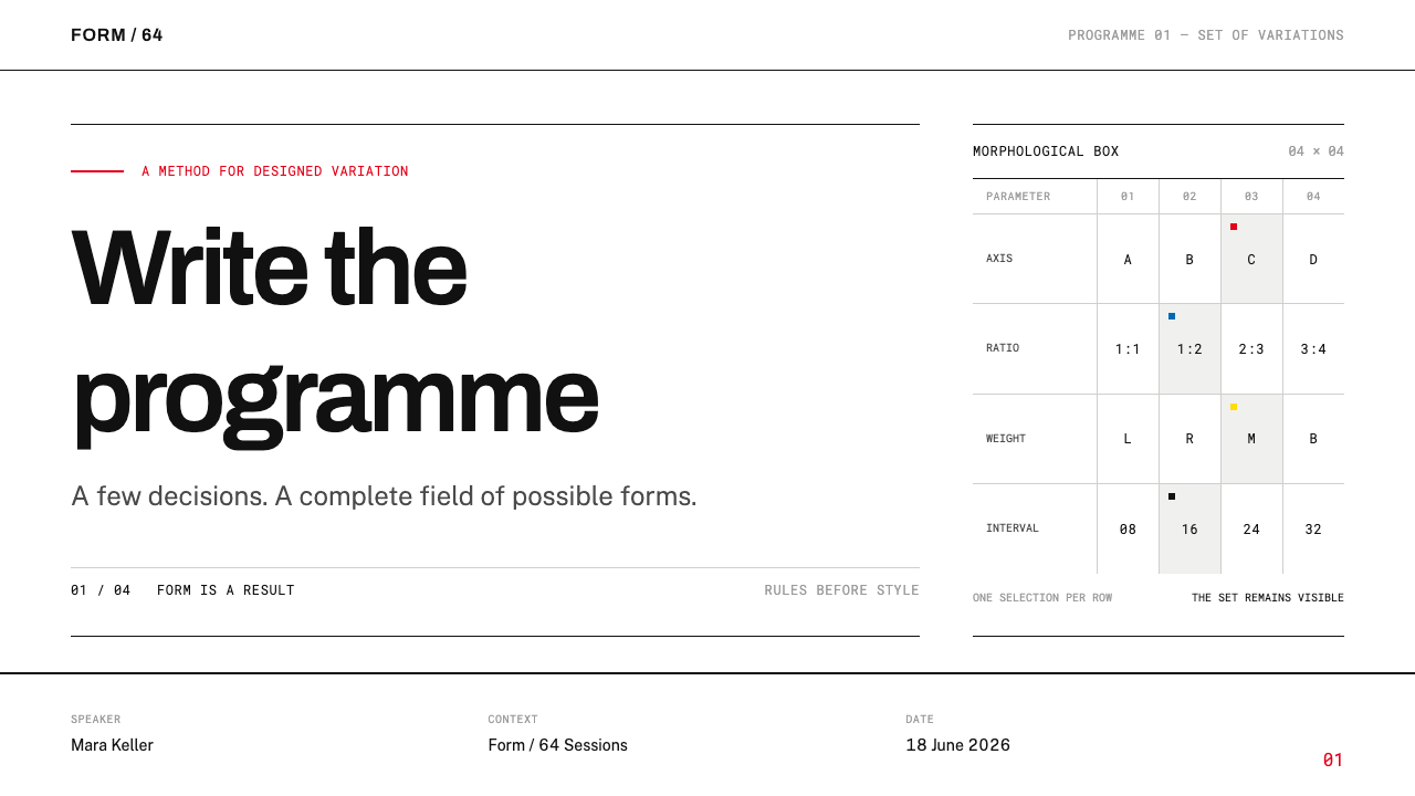
For slides, a cover can be nearly austere: a white page, a single hairline, the title in one type family, and perhaps a small matrix that hints at the logic of the deck. Content slides use two columns, with explanation on one side and a table or example on the other. Data slides are the style at its best, since a set of small, identically built charts or option rows shown together is exactly the permutation display the book models. Colour appears only as one labelled option.
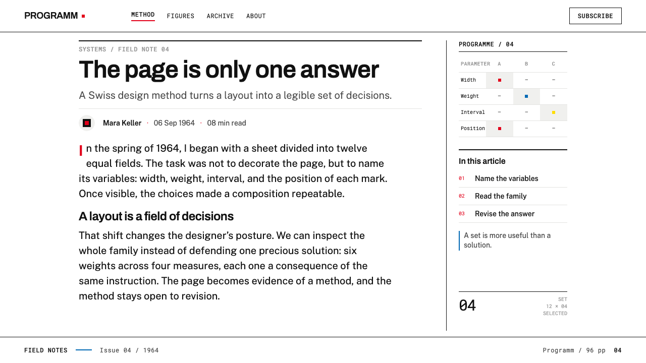
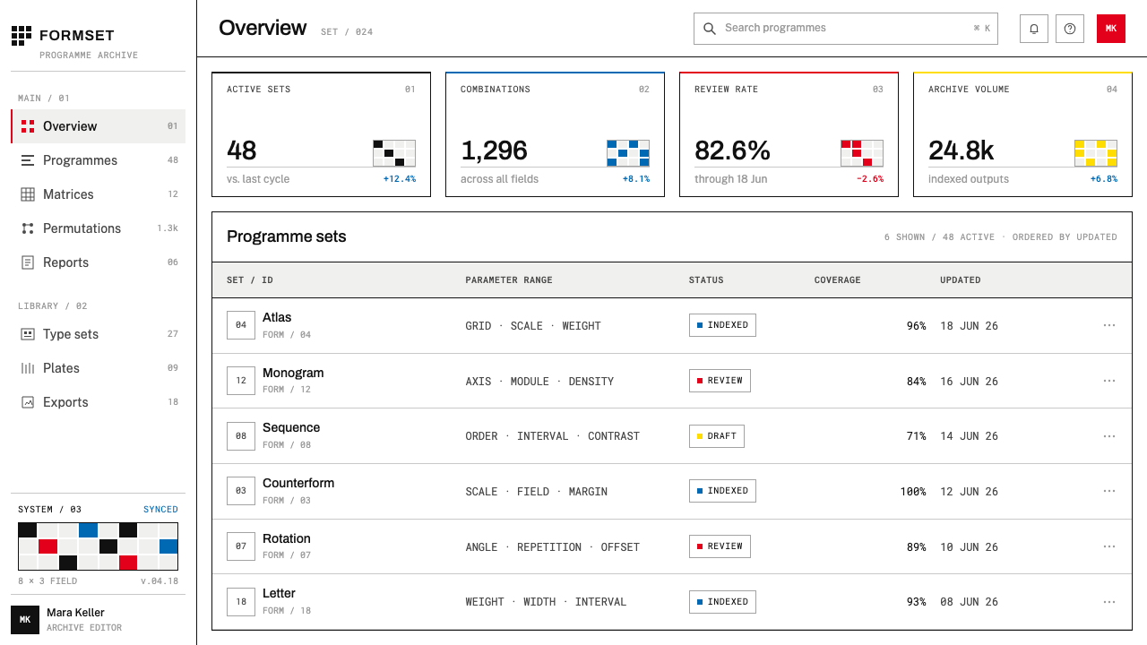
For web interfaces, the style suits design-system documentation, token tables, component-variant matrices, configuration screens and pricing or plan comparisons, which are matrices by nature, with parameters down the side and options across. Use hairline rules to draw the grid, one type family with very few weights, and keep colour as a named state. A dashboard built this way feels like an instrument rather than a poster.
For editorial and marketing work, think type specimens, portfolio sheets, catalogues, case-study write-ups and books about method. A page can state its parameters and then show the results. Marketing for tools that generate things, such as templates, design systems or AI products, can use the matrix itself as imagery: the grid of variants is the picture. Keep the white of the page and let the lines do the framing.
The common mistake is to take the surface and ignore the method, producing a generic minimalist grid with no parameters behind it. Another is to decorate the matrix, with tinted cells, shadows or icons, which hides the structure it exists to reveal. A third is to add several type families or expressive weight changes, and a fourth is to spread colour through the running page rather than holding it as a labelled option. If you cannot name the parameters, the page is not a programme.
Karl Gerstner Programmes — FAQ
Is this just Swiss International Style?
It belongs to that tradition, but it is a specific branch with a specific idea. The International Typographic Style gave Gerstner the grid, the sans-serif type and the faith in objectivity. What Programme entwerfen adds is the claim that a design is a programme, with parameters and options written out as a matrix. A page that merely looks Swiss has not yet done what this style does.
What is a morphological box, in practical terms?
It is a table in which each row is one parameter of a problem and the cells across the row are the options for that parameter. A particular design is chosen by picking one cell from each row. Used in layout, the parameters might be column count, type weight, alignment or colour use, and the finished page is one path through them. The table makes every choice visible and every alternative available.
Does this style fit AI-generated or automated design?
It fits naturally, because it treats a design as a set of parameters and permitted values, which is the form in which a generator can use it. A page described as a programme can be rebuilt consistently at any scale. The caution is that the matrix must remain real: if no one can say which parameter a change touched, the system has stopped being a programme.
Can I use colour?
Yes, but as a labelled decision rather than an atmosphere. In the book, colour lives in inserts and two-colour plates, not in the running text. In a layout today, that means one colour as a named state or option, used consistently, with the rest in black on white. If removing the colour breaks the structure, the colour was carrying too much.
Does it work in dark mode?
The reference is black ink on white paper, so light is its natural form. A dark inversion can keep the matrix and the hairlines, but it works only if the line weight stays fine, the type stays one family and the contrast stays disciplined. Avoid glow and gradient. The quality that matters is the visible logic, not the ground colour.
Related design styles
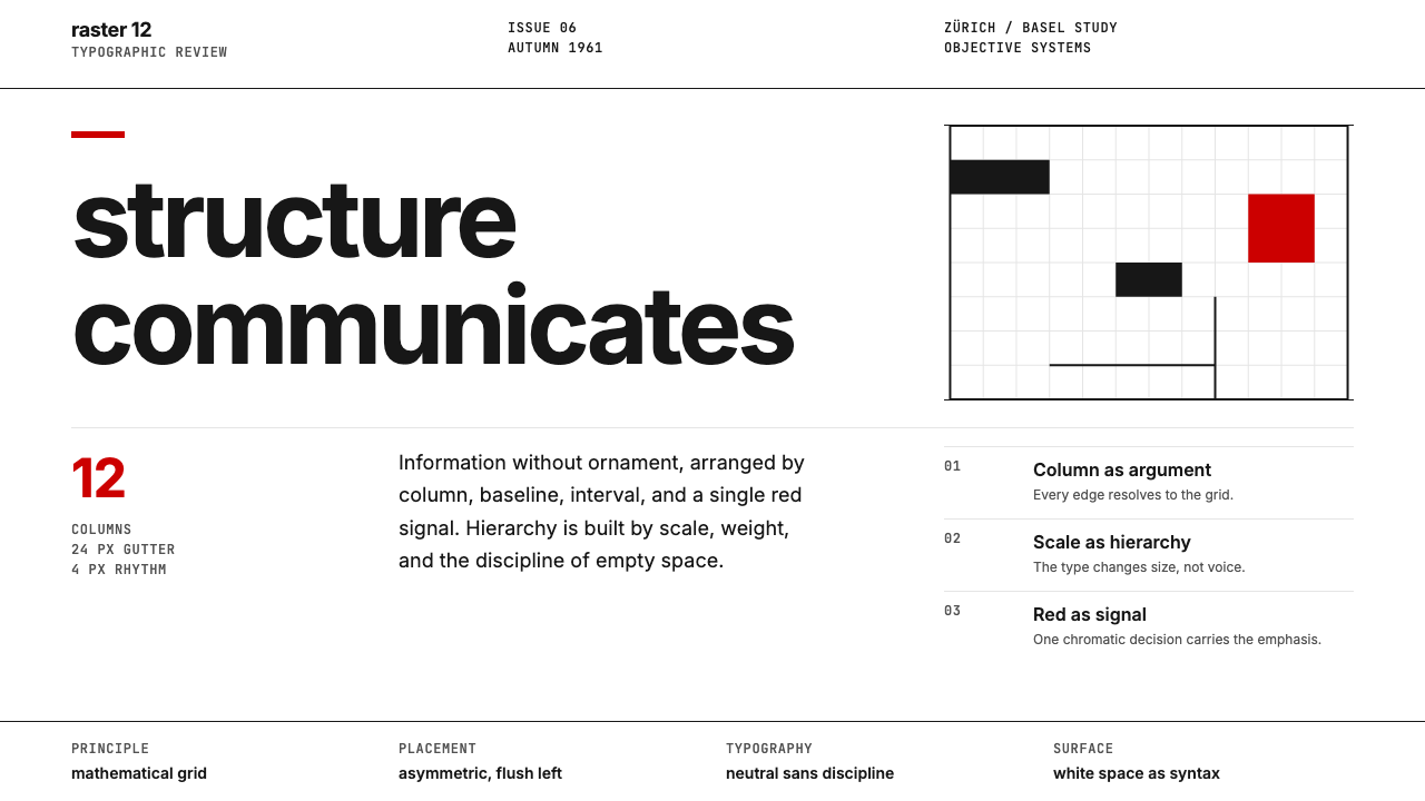 Swiss International StyleObjectivity made visible. Inter scale, white space, and one red block expose…
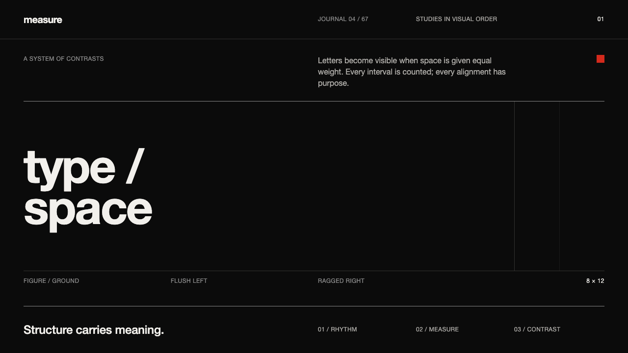 Emil Ruder TypografieDiscipline makes type visible. Near-white grotesque and measured space cut th…
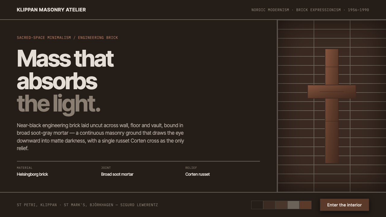 Lewerentz Dark BrickMass that absorbs light. Near-black engineering brick, broad soot mortar, one…
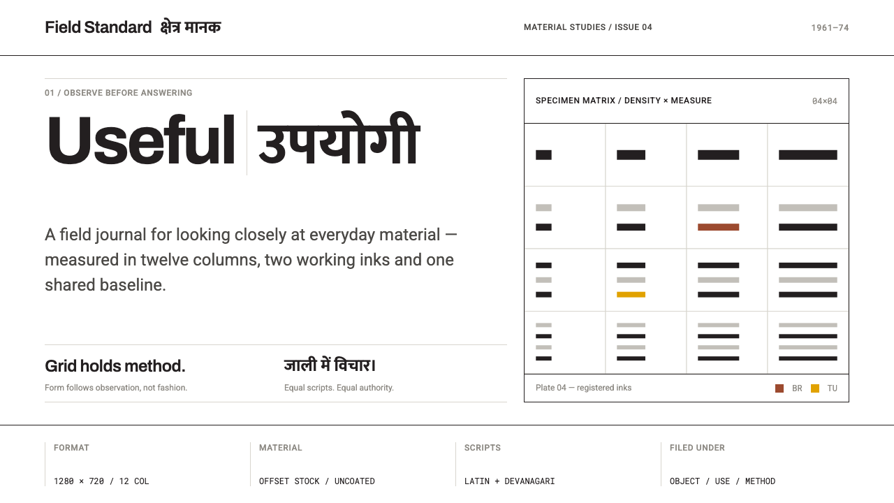 NID Ahmedabad ModernismStructure earns trust. Black rules and equal-weight scripts hold craft color…
 Sydney Opera House (Utzon, 1973)Civic restraint in harbour light. Sail-white space, cobalt type, bronze datum.
 Vitsœ 606 ShelvingQuiet form, built to endure. Brushed silver rails impose rhythm on cool plast…