What is NID Ahmedabad Modernism?
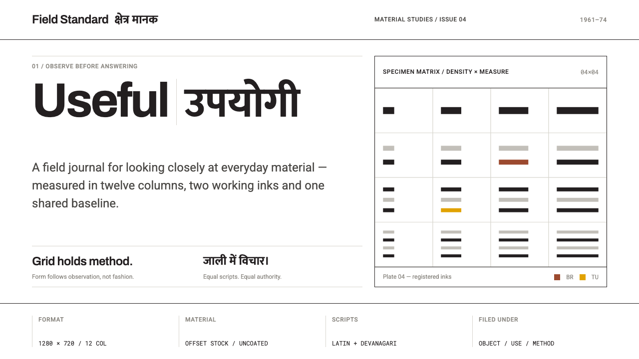
A rigid Swiss grid, Latin and Devanagari at equal weight, and Indian craft colour held inside the columns — the printed face of the National Institute of Design.
NID Ahmedabad Modernism in brief
NID Ahmedabad Modernism is the graphic and architectural language that grew around the National Institute of Design, which opened in Ahmedabad in 1961. In its mature form it is the modernism of printed matter: reports, exhibition panels and identity manuals set on white offset stock in a Swiss grid, with Latin and Devanagari scripts carrying equal optical weight and thin black rules doing the structural work.
What separates it from its European cousins is a refusal to treat India as decoration. The grid never gives way. Instead, the colours of Indian craft — the red of fired brick, the blue of the indigo vat, turmeric yellow, the deep red of madder dye — enter the page as documented material, sampled and labelled, sitting inside the columns rather than loosening them. Structure comes first, and craft is what the structure holds.
Visually the system is calm, pale and exact. Margins are wide, text is set flush left and ragged right, lines of type lock to a common baseline, and photographs always arrive with a caption and never bleed off the page. Nothing glows, nothing fades, nothing floats. The page behaves like the campus that produced it: a building in which every surface is the same module seen in a different dimension.
Where does NID Ahmedabad Modernism come from?
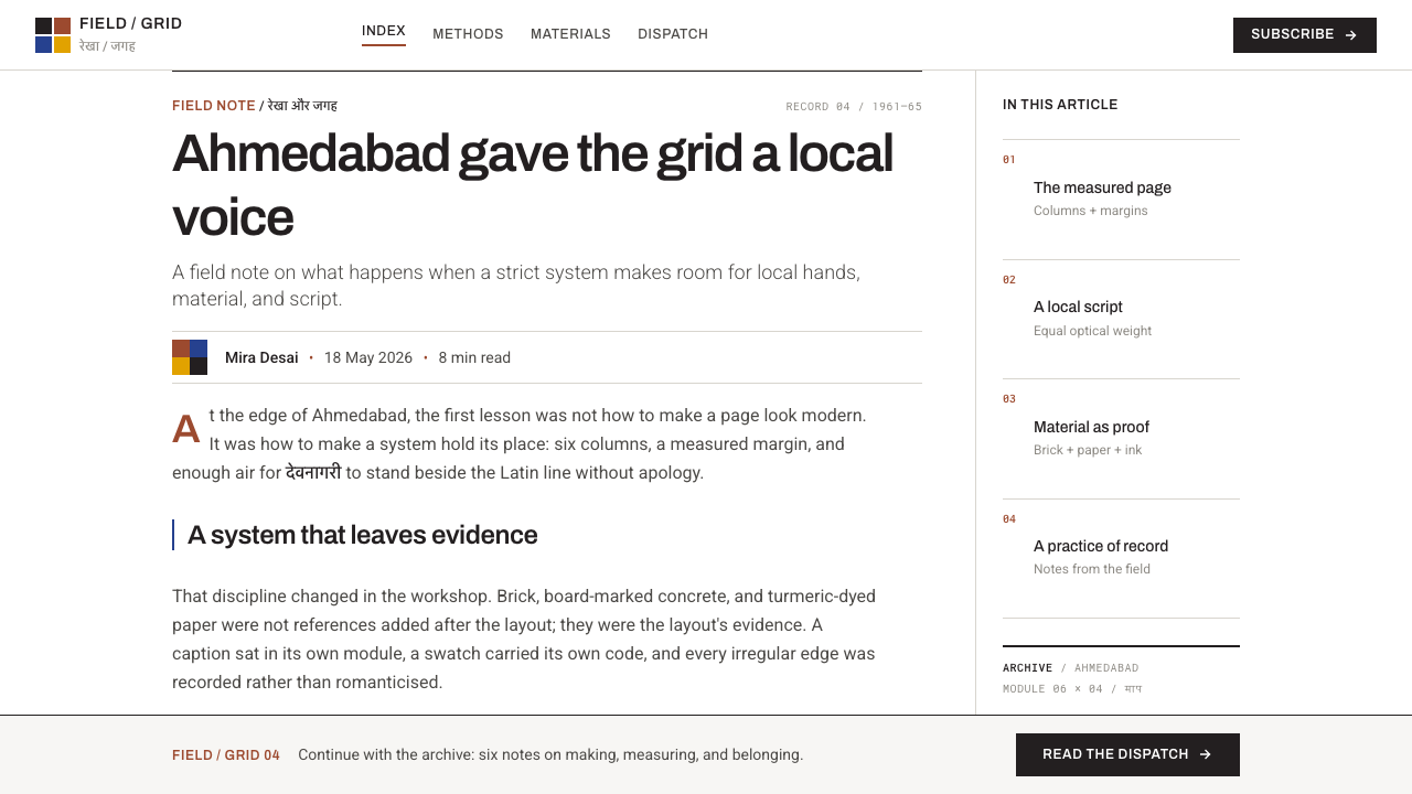
The story begins before the school. In 1958 Charles and Ray Eames wrote a report for the Government of India, remembered as the India Report, which argued that a country set on building an industrial future needed a design institute of its own. Three years later, in 1961, the National Institute of Design opened in Ahmedabad. It had, in effect, been argued into existence on paper, and its first great output was fittingly paper: the reports, panels and manuals through which a young institution explained itself to the state and to industry.
Ahmedabad was a natural home. The Sarabhai family, industrial patrons in the city, are woven through the institute's founding, and Gira Sarabhai and Gautam Sarabhai appear again and again in the story of how it got going. The campus the Sarabhai siblings built at Paldi between 1964 and 1965 is its architectural signature: exposed grey concrete and reinforced brick laid out on a modular grid, with one module governing plan and elevation alike. That building is the clearest statement of the system's idea, because it makes the grid a physical fact that students walked through every day.
The intellectual lineage is the one the record names. Bauhaus and Ulm pedagogy was carried into India: a foundation in material and form before specialisation, and workshops rather than lecture halls. The page discipline came from the International Typographic Style, with its modular grids and sans-serif clarity. The mandate came from the post-independence state, which wanted design to serve development, small industry and public information. That last point explains the content of the early work. It was not luxury brochures but institutional printed matter — the paper furniture of a country building its own infrastructure.
The most distinctive move was typographic and cultural at once. The designers inherited a Swiss grid conceived for Latin letters and met a country whose public life ran in many scripts. Rather than let one script dominate, they set Latin and Devanagari so that neither looked like a translation of the other: the same optical weight, the same baseline discipline, the same rules. The period runs from the India Report of 1958 and the founding of 1961, through the campus of 1964 and 1965, to the identity work that continued across the 1960s and 1970s. A grid that proved it could carry two writing systems at once was a harder test of the method than any single-script poster.
What defines the NID Ahmedabad Modernism look?
Rigid modular grid
Everything stands on a modular grid that does not bend. The model is the Paldi campus, where a single module governs plan and elevation; on the page the same logic fixes column widths, margins and the position of every caption. Content is arranged to fit the grid, never the grid stretched to fit content. When something must break the rule, the break is declared rather than improvised.
Equal-weight scripts
Latin and Devanagari are set at equal optical weight, each treated as a first-class script. Neither is a footnote to the other: sizes are matched by eye so the two read as one voice, share a baseline, and sit side by side in headings, labels and running text. The pairing is the system's signature and the hardest part to fake.
Black rules
Thin black rules do the structural work that colour fills do elsewhere. They separate columns, close tables, mark section heads and tie captions to their images. The line is always a plain, even black. It divides without decorating, and a page can be understood from its rules alone, the way an architect reads a plan.
Craft colour as specimen
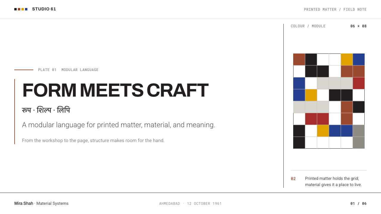
Colour comes from craft: brick, indigo, turmeric and madder, the pigments of the kiln, the dye vat and the spice market. They appear as documented material — a swatch, a header band, one labelled chart series — held inside a column. They are never washed across a page or run as a full-bleed field, because the grid, not the colour, is the argument.
White offset ground
The ground is plain white offset paper, uncoated and matte. Margins are generous, text runs flush left and ragged right, and lines lock to a shared baseline across columns. The white is not emptiness but working space: it gives the two scripts room and lets black rules read as drawn lines rather than borders.
Captioned photography
Photographs are treated as evidence. They sit inside the grid, never bleed off the edge, and always carry a caption saying what they show. Cropping is square-edged and quiet, with no text laid over the image and no tinted wash. A photograph of a craft process or an object is filed in the layout with the same rigour as a table.
Material honesty
The campus is exposed grey concrete and reinforced brick, with no cladding to hide how it is made. The graphic system carries the same attitude: flat colour, no shadow, no simulated texture, no gradient. Surfaces show what they are, and whatever warmth the page has comes from the craft pigments, not from effects.

Who shaped NID Ahmedabad Modernism?
The American designers whose 1958 report for the Government of India is the starting point of the institute. Their argument gave a young state a reason to build a design school of its own, and shaped its early outlook. Their own practice, rigorous yet warm toward everyday objects and craft, makes them fitting godparents for a system that holds craft inside a strict structure.
Siblings from the Ahmedabad Sarabhai family whose patronage and design work run through the founding of the National Institute of Design. The Paldi campus completed in 1964 and 1965 is the architectural expression of the idea: exposed concrete, brick, and a module that stays constant from plan to elevation. The printed page borrows its logic.
A designer and image-maker tied to the institute's formative years, whose practice crossed graphics, photography and the crafts. He represents the first generation of teacher-practitioners, for whom looking at material and process was part of design rather than something outside it. His kind of seeing is what the system's captioned, evidence-like photography descends from.
The Swiss type designer behind Univers and the airport-signage face that bears his name. His name belongs in this story as shorthand for the Swiss typographic tradition the institute's printed matter drew on: sans-serif type engineered for legibility under real conditions, with an even texture and no mannerism. It is the standard against which the Latin half of the pairing is measured.
Associated with the institute's leadership and with the argument that design in India should serve craft, small industry and public life. He stands for the institutional side of the story: the administrators and advocates who turned a report and a campus into a standing practice of reports, manuals and identity programmes.
How do you use NID Ahmedabad Modernism today?
NID Ahmedabad Modernism suits work that has to earn trust through structure rather than through charm: research reports, institutional decks, documentation, catalogues, identity manuals. It is the right choice when the reader should feel that every element has been placed deliberately and nothing is trying to sell them anything. Its quiet authority transfers well to interfaces and slides because the system is a method of organising information, not a costume.
For slides, a cover works best as a mostly white field with the title set flush left, a single thin black rule, and one craft colour appearing as a small band or swatch beside a caption. If the audience reads two scripts, set both titles at equal weight on one baseline. Content slides should be treated as column layouts: a clear column structure, a captioned photograph held inside the grid, and no full-bleed imagery. Data slides are where the style is strongest. Tables are closed with plain rules, charts take one craft colour for the main series with the rest in black and grey, and sources sit beneath as captions.
For web interfaces the system suits dashboards, documentation sites, research portals and pricing pages. Build a visible column structure, divide rows with thin black rules instead of shadowed cards, and reserve the craft colours for status, categories or a single primary action. Forms read well with ruled inputs and generous label space. If the product is multilingual, a language switcher that lists both scripts at the same weight is a small gesture that restates the whole system.
For editorial and marketing work, think annual reports, exhibition panels, museum and university sites, craft and heritage organisations, NGOs and public bodies. Long text takes a narrow measure with a wide margin for notes and captions; section breaks are a rule and a number rather than an ornament. Hero images are captioned and sit inside the grid. The restraint also works commercially for brands that want to show craft without sentimentality, because the craft appears as evidence rather than as folklore.
The commonest mistake is to read the craft colours as an Indian palette and flood backgrounds with them, or to add ornamental motifs to prove the origin. That inverts the system, whose whole point is that the grid stays rigid and colour is held inside it. Other errors include using the second script as decoration rather than as a working language, letting a hero photograph bleed to the edge, mixing several type families, and softening rules into shadows. If a page feels warm because of its colours alone, it has drifted from the method.
NID Ahmedabad Modernism — FAQ
Is this the same as Swiss International Style?
It is a close relative, not a copy. Both share the modular grid, the sans-serif clarity and the flush-left, ragged-right setting. What NID Ahmedabad Modernism adds is a second script held at equal weight, a palette taken from documented Indian craft materials, and an architectural anchor in exposed concrete and brick. Swiss style tends to use colour sparingly and neutrally; here colour is a specimen from a craft tradition, kept strictly inside the columns.
Why do Latin and Devanagari get equal weight, and does it matter if my product is English only?
Equal weight is the system's way of saying that no script is a translation of another. If you only need Latin, you do not have to invent a second script, and you should not add one for flavour. What carries over is the discipline behind it: consistent optical sizing, a shared baseline, and a refusal to rank elements by decoration. In an English-only layout, that shows up as rigorous type scale, strict alignment and rules that do real work.
How much colour can I use, and where does it go?
Very little, and always inside the structure. Brick, indigo, turmeric and madder work as a swatch, a header band, a status marker or one chart series. They should not become page backgrounds, full-width hero blocks or gradient fills. A good test: if you remove the colour, does the page still read as a complete, ordered layout? In this style the answer should be yes.
Can it work as a dark theme?
It is designed around white offset paper, so the natural form is light. A dark inversion is possible for screens, but it loses much of what makes the system legible: the thin black rules, the quiet paper tone, and the way craft colours sit as documented samples. If you invert, keep one accent only, keep rules fine and light, and avoid glow or gradient. Otherwise stay with the light ground.
Is this just an Indian theme, or a general modernist system?
It is a modernist system with an Indian provenance, not an ethnic theme. Its logic is the grid, the equal treatment of scripts and the honesty of materials, and those travel anywhere. The craft colours name an origin but do not decorate. Used well, it suits any context where credibility comes from order, including contexts that have nothing to do with India.
Related design styles
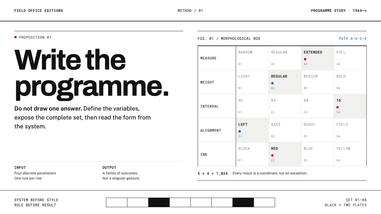 Karl Gerstner ProgrammesDesign becomes a programme. Black hairlines and a strict matrix turn paramete…
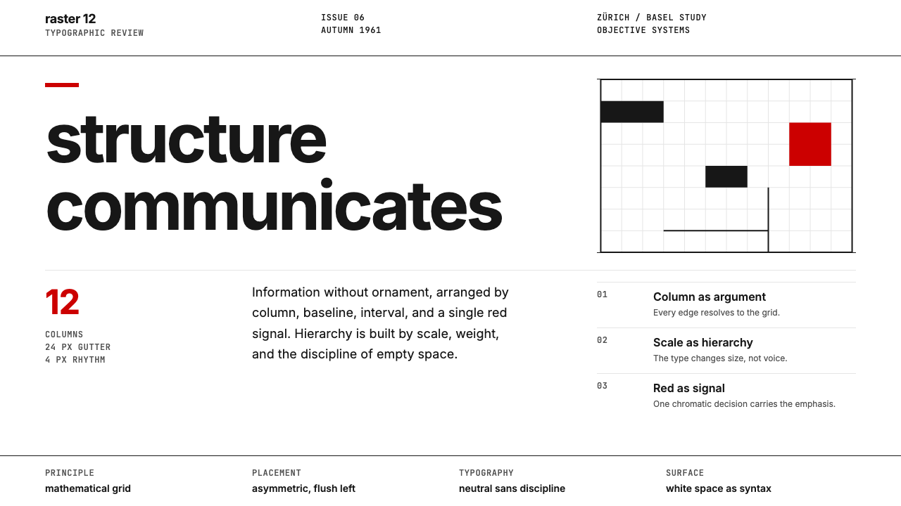 Swiss International StyleObjectivity made visible. Inter scale, white space, and one red block expose…
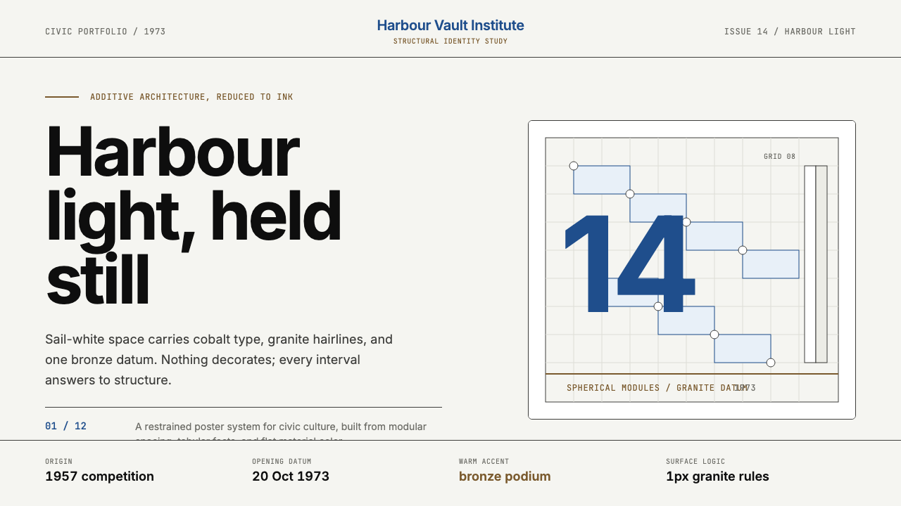 Sydney Opera House (Utzon, 1973)Civic restraint in harbour light. Sail-white space, cobalt type, bronze datum.
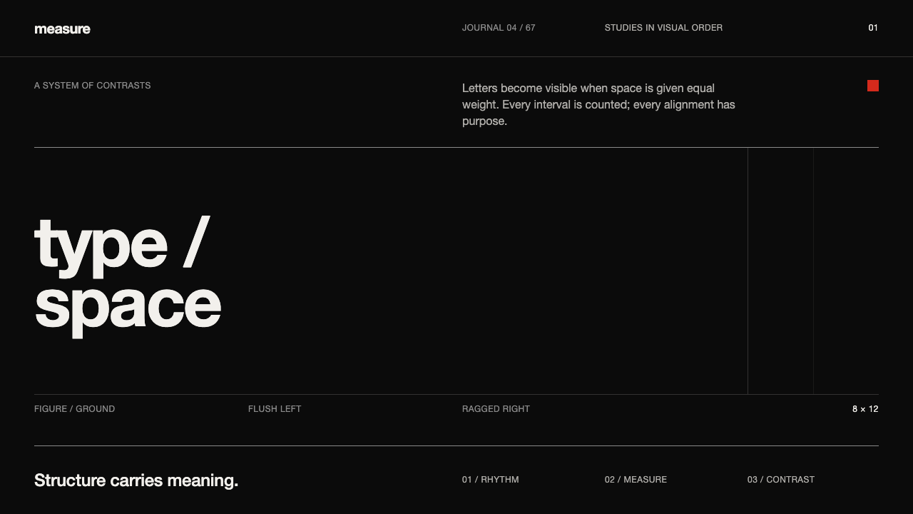 Emil Ruder TypografieDiscipline makes type visible. Near-white grotesque and measured space cut th…
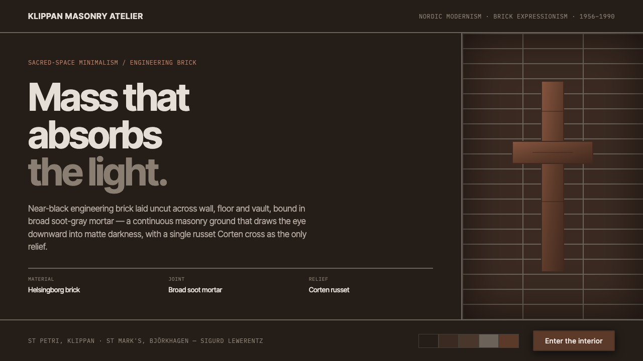 Lewerentz Dark BrickMass that absorbs light. Near-black engineering brick, broad soot mortar, one…
 Vitsœ 606 ShelvingQuiet form, built to endure. Brushed silver rails impose rhythm on cool plast…