What is Lewerentz Dark Brick?
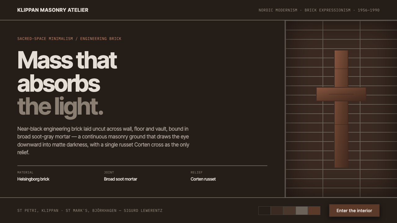
Lewerentz Dark Brick turns the interface into a chamber of masonry — near-black brick, broad soot-gray joints, matte depth, and one russet steel cross where light is allowed to return.
Lewerentz Dark Brick in brief
Lewerentz Dark Brick translates the late church architecture of Swedish architect Sigurd Lewerentz into a digital material language. Its ground is not simply dark: it is an almost-black brown-gray brick body whose mass appears to absorb light. Broad soot-gray mortar joints remain visible, forming a strong masonry grid rather than disappearing into the background.
The system is severe, quiet, and deliberately restricted. Brick is allowed to continue across the implied walls, floors, and vaulted surfaces of the interface, so the page feels assembled from one continuous substance rather than from separate decorative panels. Surfaces stay flat and matte. Depth comes from mass, repetition, and contrast between brick and mortar, not from gloss, atmospheric effects, or ornamental layering.
Against this darkness, a single russet Corten-steel cross provides relief. It is not a general-purpose accent color scattered across every control; it is a symbolic interruption in an otherwise restrained field. The resulting mood belongs to Nordic modernism, brick expressionism, and sacred-space minimalism: weighty, inward, material, and almost monastic.
Where does Lewerentz Dark Brick come from?
The source of this design language is Sigurd Lewerentz's late church architecture in Sweden. The relevant period sits within the broader era from 1950 to 1990, with St Mark's in Björkhagen built from 1956 to 1960 and St Petri in Klippan built from 1962 to 1966. These buildings belong to a lineage identified here through three related descriptions: Nordic modernism, brick expressionism, and sacred-space minimalism.
St Mark's in Björkhagen, in Stockholm, and St Petri in Klippan share an unusually complete commitment to dark engineering brick. The brick is near-black and is laid uncut, continuing across walls, floors, and vaulted ceilings. That continuity matters more than the individual unit. It makes the building read as a single masonry mass rather than as a surface decorated with brick.
The mortar joints are equally important. Their broad soot-gray presence binds the brickwork while keeping the underlying order legible. Instead of treating mortar as a technical remainder, the architecture makes the joint part of the visual field. In digital translation, this becomes a visible rhythm of dark units and gray seams: a ground with structure already embedded in it.
The system's russet Corten-steel cross is the designated release from that darkness. It takes its character from the contrast between oxidized red-brown metal and near-black masonry, not from a broad multicolor palette. The digital interpretation therefore preserves the source material's discipline: one dominant substance, one legible binding grid, matte surfaces, and a singular warm interruption.
What defines the Lewerentz Dark Brick look?
Absorbing Mass
The dominant visual impression is weight. Near-black brown-gray brick should feel dense and settled, as if the interface has architectural thickness behind it. Darkness is not used merely to create contrast for bright content; it establishes a continuous body that absorbs attention and makes every interruption deliberate.
Uncut Brick Continuity
Brick is treated as an uninterrupted architectural field. The implied material can run across walls, floors, and vaulted ceilings without changing identity. Components should therefore feel embedded in a larger masonry body, not floated as unrelated objects above it.
Soot-Gray Mortar Grid
Broad soot-gray joints are structural and graphic at once. They divide the dark body into a legible rhythm while preserving the sense of one assembled mass. The grid should remain prominent enough to be perceived, yet quiet enough that it does not compete with primary information.
Matte Surface
Surfaces are flat and matte, with no visual suggestion of polish or reflective coating. The material gains authority from its lack of spectacle. Contrast comes from the meeting of brick, mortar, type, and the russet accent rather than from simulated sheen.
Monastic Darkness
The darkness carries an inward, contemplative mood. It is closer to a quiet sacred interior than to a theatrical black interface. Content should emerge with composure, leaving enough darkness around it to preserve silence, focus, and a sense of enclosure.
Russet Corten Relief
The russet Corten-steel cross is the only explicit relief from the masonry field. Its warmth should feel oxidized, mineral, and materially grounded rather than bright or digital. Because it is singular, repetition weakens its meaning; it works best when reserved for a decisive symbol, focal marker, or exceptional action.
Sacred Restraint
Every element must justify its presence within the quiet masonry system. Decoration, extra accents, and effects that do not clarify structure should be removed. The result is not empty minimalism but concentrated material discipline: fewer gestures, each carrying more weight.
Who shaped Lewerentz Dark Brick?
Sigurd Lewerentz is the central architectural figure behind this system. His late churches provide the material and atmospheric source: dark engineering brick, uncut continuity across architectural surfaces, broad soot-gray joints, and a severe interior presence. The digital style borrows this disciplined relationship between mass, seam, and light rather than copying a decorative motif.
St Mark's Church in Björkhagen, Stockholm, was built from 1956 to 1960 and belongs to Lewerentz's late church work. Within this reference system, it represents the Nordic setting in which near-black brick and sacred-space minimalism become one continuous architectural experience.
St Petri Church in Klippan was built from 1962 to 1966. It reinforces the system's defining idea: masonry is not a finish applied to structure but the visual and spatial body itself, with mortar, darkness, and continuity carrying as much identity as the brick units.
How do you use Lewerentz Dark Brick today?
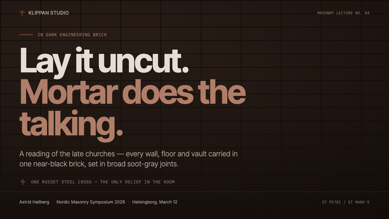
For presentation slides, use the style as a chamber-like sequence. A cover can place the title or a single symbol within a large uninterrupted field of dark brick, allowing the russet cross to establish the visual point of entry. Content slides should preserve the mortar rhythm and keep text blocks calm, legible, and surrounded by darkness. Data slides should treat charts as masonry diagrams: repeated units, sober labels, and the russet accent reserved for the one conclusion or condition that matters most.
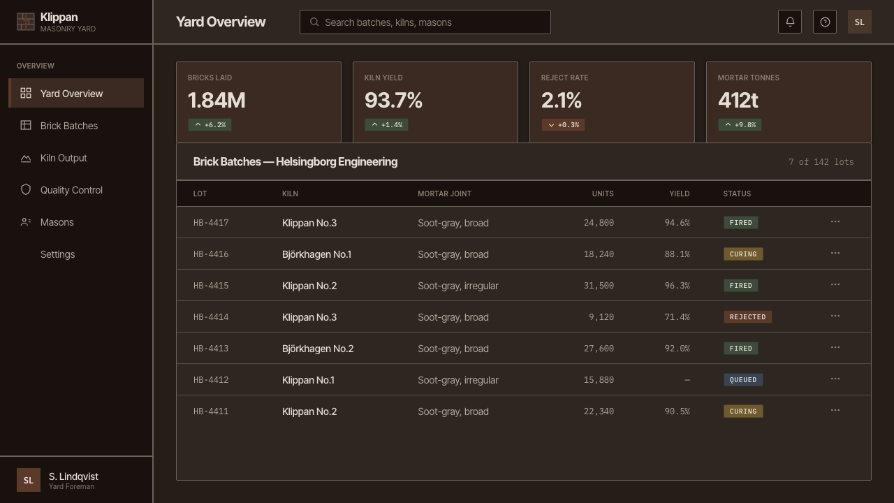
For web interfaces, the system suits dashboards, monitoring tools, pricing pages, and other products that need authority and concentration. The dark brick ground can establish the shared environment, while the mortar grid separates functional regions without making them feel like glossy cards. Panels should remain matte and materially related to the page. On pricing pages, the Corten accent can identify the recommended tier or decisive action, but the rest of the hierarchy should come from placement, contrast, and restraint.
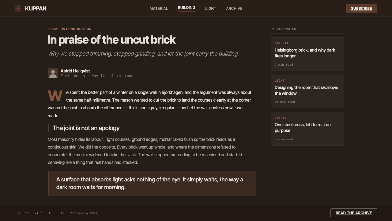
For editorial and marketing work, Lewerentz Dark Brick creates a strong sense of seriousness and place. Long-form articles can use the visible joint pattern as a quiet organizing field, with headings and metadata emerging from the masonry rather than sitting in decorative containers. Campaign pages can pair a restrained statement with one russet symbol, treating the accent as a memorable mark. The style is especially effective when the message depends on endurance, craft, gravity, or considered conviction.
The common mistake is to interpret the style as permission to make everything black, textured, and dramatic. Excessive brick pattern, too many floating panels, glossy surfaces, bright interface accents, or repeated russet marks destroy the sense of mass. Another mistake is to hide the mortar grid because it feels visually busy; the joints are what give the darkness order. The right application keeps the material field continuous, lets the grid remain legible, and makes every exception rare.
Lewerentz Dark Brick — FAQ
Is Lewerentz Dark Brick simply a dark mode theme?
No. Dark mode usually changes the background and text contrast for comfort or preference. Lewerentz Dark Brick begins with a material idea: the interface should feel like a continuous near-black masonry mass, organized by visible soot-gray joints and relieved by one russet Corten accent. Its darkness carries atmosphere, structure, and restraint, not just inversion.
Why are the mortar joints so important?
The joints prevent the dark field from becoming an undifferentiated void. Their broad soot-gray presence makes the masonry legible and gives the page a measured rhythm. They also preserve the central architectural idea that the material is assembled, not merely painted onto a surface. Removing them leaves darkness but removes the system's order.
Can the russet Corten accent be used for every button and link?
It should not be treated as a routine utility color. The source system gives the russet accent the role of singular relief against the masonry. Use it for a decisive symbol, a focal action, or a meaningful state, while ordinary navigation and supporting controls remain quiet. If everything is russet, nothing feels like a release from the dark mass.
What kinds of products are a good fit for this style?
It fits products that benefit from gravity, focus, and a strong sense of material identity: dashboards, analytical tools, pricing experiences, cultural platforms, and editorial or marketing work centered on craft and endurance. It is less suitable when the product depends on cheerfulness, softness, bright variety, or a deliberately lightweight mood. The style works when the product's values can withstand its silence and weight.
Related design styles
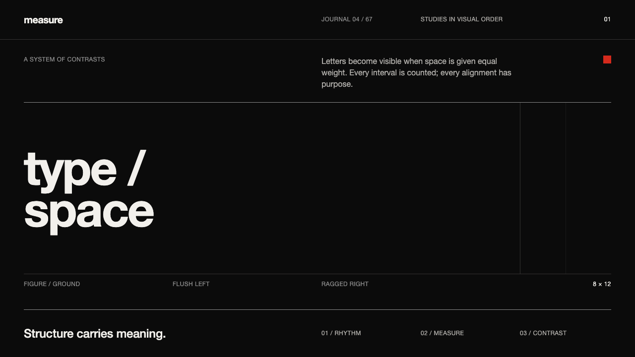 Emil Ruder TypografieDiscipline makes type visible. Near-white grotesque and measured space cut th…
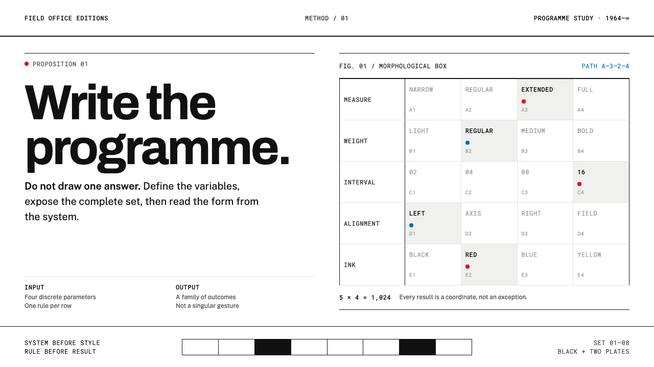 Karl Gerstner ProgrammesDesign becomes a programme. Black hairlines and a strict matrix turn paramete…
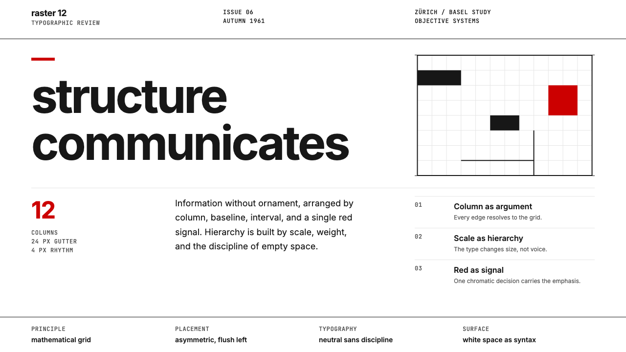 Swiss International StyleObjectivity made visible. Inter scale, white space, and one red block expose…
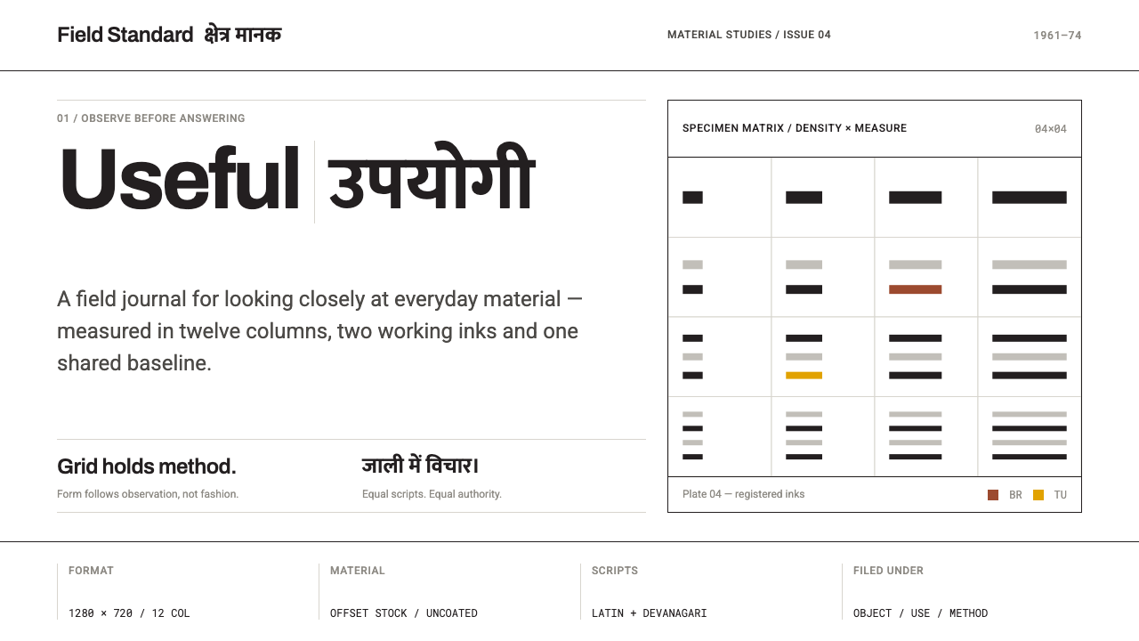 NID Ahmedabad ModernismStructure earns trust. Black rules and equal-weight scripts hold craft color…
 Sydney Opera House (Utzon, 1973)Civic restraint in harbour light. Sail-white space, cobalt type, bronze datum.
 Vitsœ 606 ShelvingQuiet form, built to endure. Brushed silver rails impose rhythm on cool plast…