What is Emil Ruder Typografie?
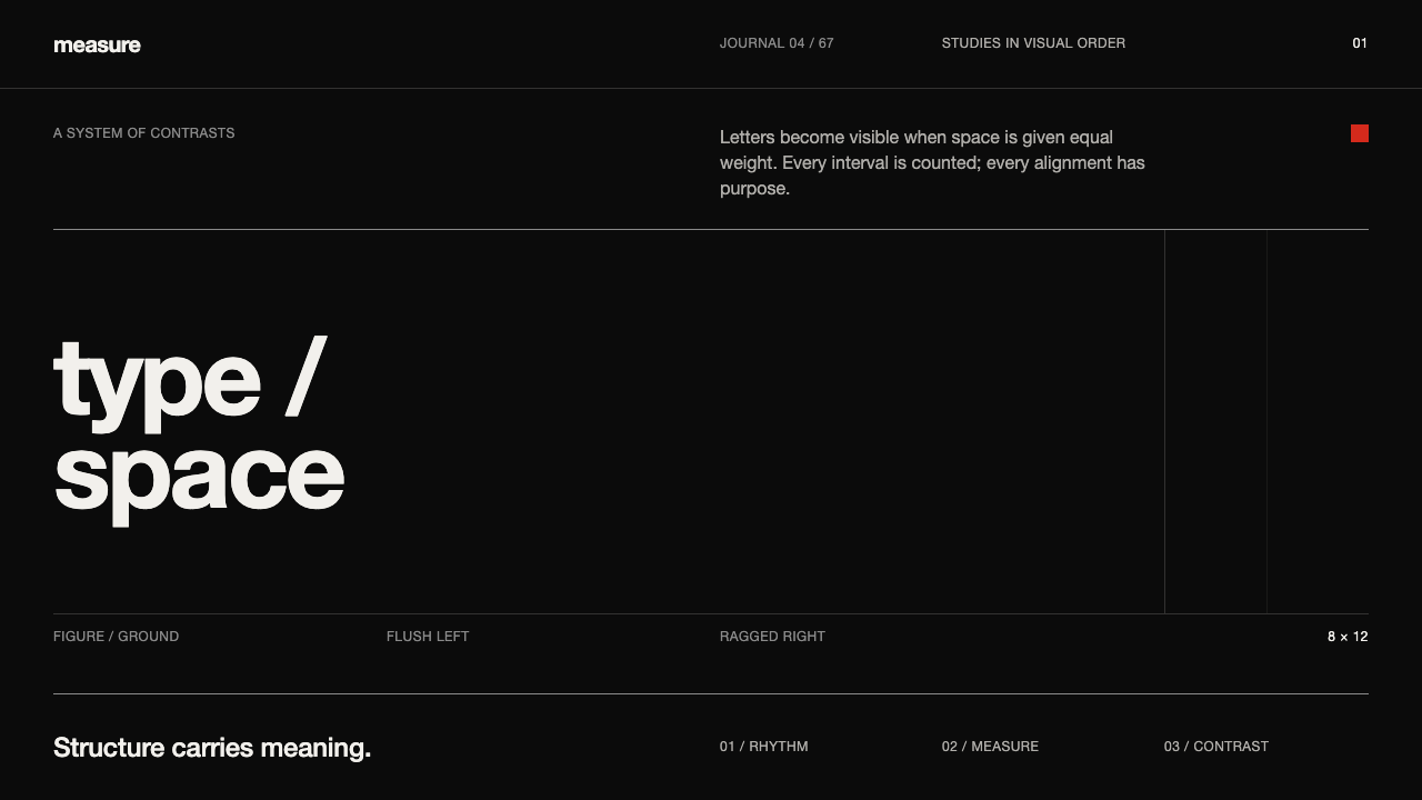
Emil Ruder made discipline visible — near-white grotesque type, ink-black ground, and measured space arranged so structure carries every meaning.
Emil Ruder Typografie in brief
Emil Ruder Typografie is the dark, typographic expression of the Basel School of Design, rooted in Swiss modernism of the 1950s and 1960s and codified in Ruder’s 1967 manual Typographie. Its visual language is built from grotesque type, flush-left composition, rigorous alignment, and a saturated black ground. Near-white Univers and Helvetica appear as luminous figures against that ground, making reading feel less like decoration and more like an act of exposure.
The system treats design as an exercise in attention. Negative space is not an unused remainder around the text; it is an active compositional force that separates, pauses, emphasizes, and gives language room to be seen. Every measure is counted, every rule is restrained, and every line exists because it clarifies structure. Ornament is excluded not because the work fears expression, but because the system believes typography already contains sufficient expressive power.
Color is deliberately scarce. Red, yellow, and blue may appear as isolated studio-study spots, but they never form a decorative rainbow or compete with the typographic field. The dominant relationship remains near-white against ink-black: figure and ground, signal and silence, printed mark and surrounding space. The result is severe without being empty, because each absence makes the remaining element more legible.

Where does Emil Ruder Typografie come from?
Emil Ruder Typografie takes its name and governing logic from Emil Ruder’s 1967 manual Typographie. The book stands within the Basel School of Design and the wider International Typographic Style, but its character is more tactile and pedagogical than a generic corporate modernism. Its imagined surface is the ink-black letterpress plate: a dense ground from which near-white grotesque letters emerge with unusual authority. The darkness is therefore not a mood applied after the fact; it is the condition that makes the type visible.
The system is rooted in Swiss modernism of the 1950s and 1960s, a period associated here with exact alignment, disciplined grids, and the belief that typography should organize information before it decorates a page. Ruder’s contribution is presented through method rather than flourish. Flush-left setting establishes a stable reading edge, measured space separates levels of information, and a rigorous grid prevents composition from drifting into expressive improvisation. The page becomes an ordered field in which every decision can be inspected.
The Basel School’s emphasis on training is central to the style’s identity. A studio study does not seek visual abundance; it isolates a relationship and tests it. A typographic contrast, a line, a field of black, or a rare primary-color spot can carry the entire exercise. Red, yellow, and blue remain available as controlled observations, but the work returns repeatedly to black, near-white, and space. This discipline makes the system feel analytical while preserving the physical intensity of print.
Ruder and Armin Hofmann are identified as key figures of the source tradition. Within this account, Ruder represents the system’s typographic codification through Typographie, while Hofmann anchors its connection to the Basel School and its studio culture. Together, their names point toward a practice in which design is learned through reduction, comparison, and exact observation. The style’s historical force comes from that method: structure is not a surface effect but the visible consequence of disciplined thought.
What defines the Emil Ruder Typografie look?
Ink-Black Ground
The saturated black ground is the style’s primary atmosphere and structural field. It does not behave like a neutral backdrop; it gives the page density, silence, and visual pressure. Near-white type becomes sharply legible against it, while every gap around the letters acquires weight. The black should feel printed and absolute rather than glossy, luminous, or theatrical.
Grotesque Typography
Grotesque type carries the voice of the system. Univers and Helvetica are the clearest reference points: neutral enough to remain readable, but firm enough to hold their shape against black. Letterforms are not softened by ornament, expressive flourishes, or simulated texture. Typographic contrast comes from scale, density, placement, and spacing rather than from decorative font variety.
Flush-Left Order
Flush-left setting creates a dependable vertical edge and gives the reading process a clear point of entry. The opposite edge is allowed to remain irregular, preserving the rhythm of language instead of forcing text into a rigid block. This asymmetry is controlled rather than casual: the left edge establishes order, while the ragged edge records the natural movement of words.
Measured Negative Space
Space is an active component, not the residue left after type has been placed. Generous fields of black can isolate a heading; tighter intervals can bind related lines into a unit; a pause between blocks can signal a change in thought. The style measures space with the same seriousness as type, making silence part of the composition and preventing the dark ground from becoming mere emptiness.
Rigorous Grid
The grid is felt through alignment rather than displayed as a visible scaffold. Text blocks, rules, headings, and empty fields share an underlying order, so the page reads as a coordinated system instead of a collection of placed objects. The grid disciplines the composition without making it mechanical; variation remains possible, but it must emerge from the structure.
Hairline Rules
Rules are used as structural punctuation. They divide information, establish alignment, and mark transitions without becoming borders or ornaments. Their presence is quiet, but their placement is exact. A rule should feel like a measured incision through the black field: thin, purposeful, and subordinate to the typographic hierarchy.
Sparse Primary Color
Primary red, yellow, and blue appear as rare accents associated with studio study, not as a complete decorative palette. A single spot can interrupt the black-and-white field and draw attention to a structural relationship. The colors should remain isolated and intentional. Their power depends on scarcity, because abundance would turn an analytical signal into visual noise.

Who shaped Emil Ruder Typografie?
Emil Ruder is the central figure of this system and the author of the 1967 manual Typographie. His role is represented through codification: grotesque type, flush-left setting, rigorous grids, measured space, and the conviction that structure should carry meaning. Ruder’s name therefore stands for a practice in which typography is not a decorative layer but the primary architecture of the page.
Armin Hofmann is identified in the source as a key figure connected with the Basel tradition. In this article’s account, his name represents the studio-based culture behind the style: disciplined exercises, reduction, comparison, and close attention to visual relationships. He belongs to the same intellectual field in which restraint is not a lack of imagination but a way of making perception more exact.
The Basel School of Design is the institutional context that gives Emil Ruder Typografie its character. It frames typography as a disciplined study of structure, space, and visual order. The school is not treated here as a decorative historical label; it is the source of the style’s practical attitude, where every compositional decision is tested through use, alignment, and observation.
The International Typographic Style provides the wider movement context. Its presence is felt through order, clarity, grid discipline, and the refusal of unnecessary ornament. Emil Ruder Typografie gives that modernist discipline a darker and more tactile register, concentrating attention on the contrast between near-white type and an ink-black field.
How do you use Emil Ruder Typografie today?
For slide covers, use the black ground as a decisive field rather than a decorative backdrop. Place a short title in near-white grotesque type with a strong flush-left edge, then let a large area of uninterrupted darkness carry the tension. A rare red, yellow, or blue spot can mark the subject or establish a point of entry, but the cover should remain primarily a relationship between type, black, and space. Content slides should preserve the same discipline: stable alignment, restrained hierarchy, and rules used only where they clarify a transition.
For data slides, treat information as typography before treating it as visualization. Tables, labels, and figures should share the same underlying alignment, with space separating groups more strongly than decorative containers do. Charts can work when their structure is quiet and their labels remain fully legible against the dark field. A single primary-color accent may identify a meaningful category or change, but color should never become the main explanation. The system is strongest when the arrangement makes the data readable before the accent attracts attention.
For web interfaces, the style suits dashboards, monitoring tools, analytical products, and pricing pages that need authority and scannability. Use near-white grotesque type for the main information, keep the black ground continuous, and establish hierarchy through placement, density, and measured space. Cards should feel like organized fields rather than soft floating surfaces. Controls can use hairline rules and clear alignment; primary colors should be reserved for states or signals that deserve immediate attention. A pricing page benefits from this restraint because the comparison becomes structural instead of promotional.
For editorial and marketing work, Emil Ruder Typografie supports a severe but memorable voice. Articles can use a narrow reading measure, a strong left edge, generous dark intervals, and thin rules to separate sections. Pull quotes or campaign statements should appear as typographic events rather than decorative callouts. Marketing pages can use the near-white and black contrast to make a proposition feel direct, while a single red, yellow, or blue mark gives the message a controlled point of emphasis. The result is especially effective when the subject values precision, expertise, or disciplined judgment.
The most common mistake is confusing austerity with simply making everything black and white. The style depends on relationships: measured space, rigorous alignment, typographic contrast, and purposeful rules. Removing color while allowing loose spacing or inconsistent edges produces an empty imitation. The opposite mistake is equally damaging: adding every primary color, multiple type voices, decorative panels, or soft visual effects until the analytical field becomes noisy. Begin with structure, then permit only the accents that the structure can justify.

Emil Ruder Typografie — FAQ
Is Emil Ruder Typografie the same as Swiss International Style?
It belongs to the same wider modernist field, but this treatment is more specific. The International Typographic Style provides the context of grids, clarity, alignment, and restrained ornament. Emil Ruder Typografie concentrates those principles into the Basel School tradition and gives them a dark printed character: near-white grotesque type against an ink-black ground, with negative space treated as an active element.
Why is the background so dark?
The black ground is part of the system’s logic, not merely a dramatic color choice. It evokes the ink-black letterpress plate described in the source material and makes near-white type appear as a figure emerging from density. The contrast gives every letter and every gap around it greater presence. A pale background can be used in an adaptation, but it changes the style’s central figure-ground relationship.
How should red, yellow, and blue be used?
Use them as rare, isolated studio-study spots rather than as a complete palette. A color can identify a structural signal, interrupt a field of black, or direct attention toward a particular relationship. It should not create a rainbow, fill every component, or compete with the typography. Their meaning depends on restraint: scarcity makes a primary color feel intentional.
Does the style require Univers or Helvetica?
They are the clearest typographic references in the source material, because their near-white grotesque forms become the figure against black. The deeper requirement is not a particular typeface name but a disciplined grotesque voice: clear, unornamented, structurally firm, and capable of carrying hierarchy through placement, density, and space. Replacing the typeface is possible if those qualities remain intact.
What makes the style different from ordinary minimalist design?
Its restraint is procedural rather than merely visual. Ordinary minimalism may reduce the number of elements, but Emil Ruder Typografie asks how each remaining element is aligned, separated, weighted, and justified. Negative space must work, rules must clarify, and type must carry the message. The result is not simply a sparse composition; it is a visible system of disciplined relationships.
Related design styles
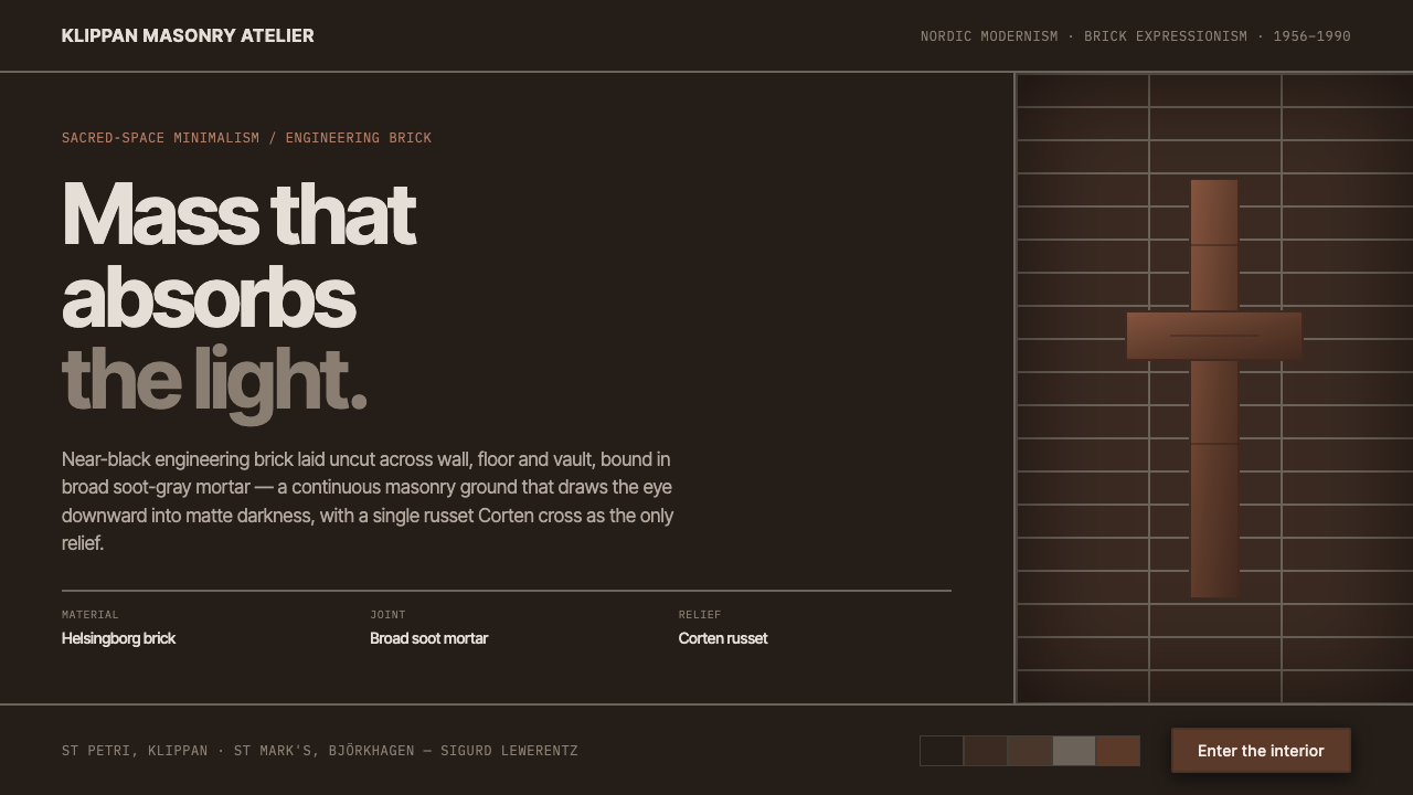 Lewerentz Dark BrickMass that absorbs light. Near-black engineering brick, broad soot mortar, one…
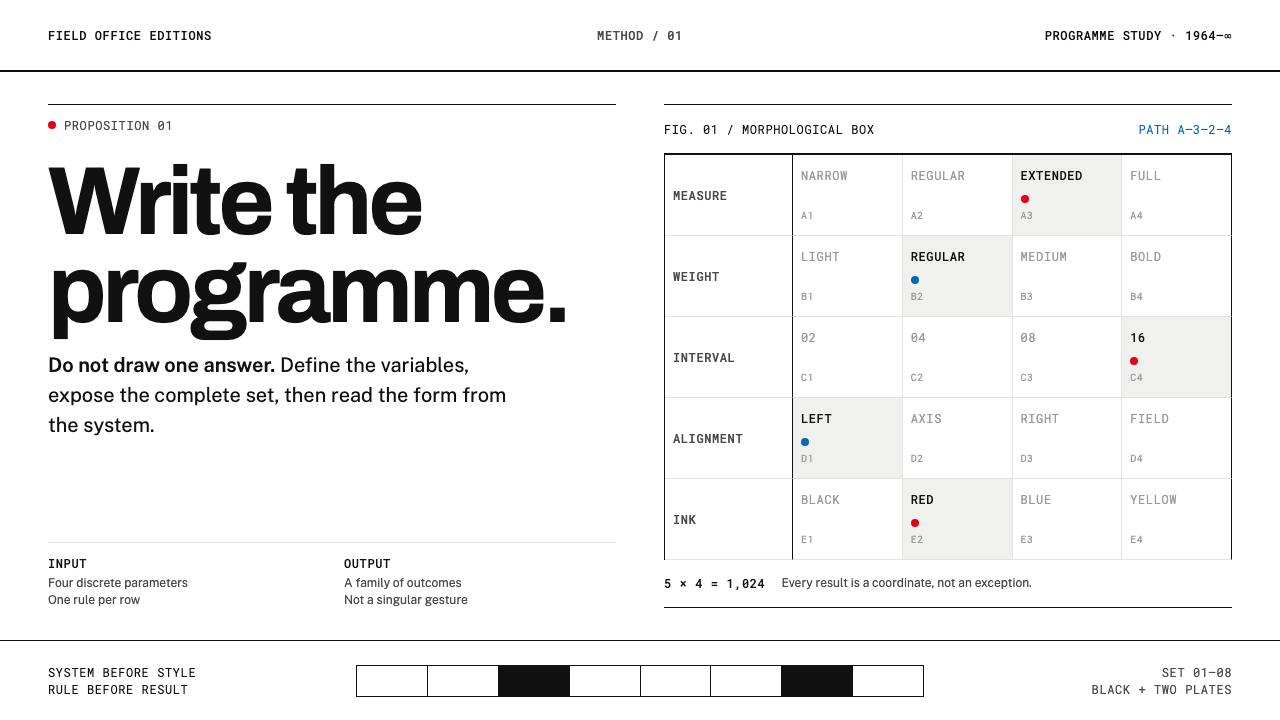 Karl Gerstner ProgrammesDesign becomes a programme. Black hairlines and a strict matrix turn paramete…
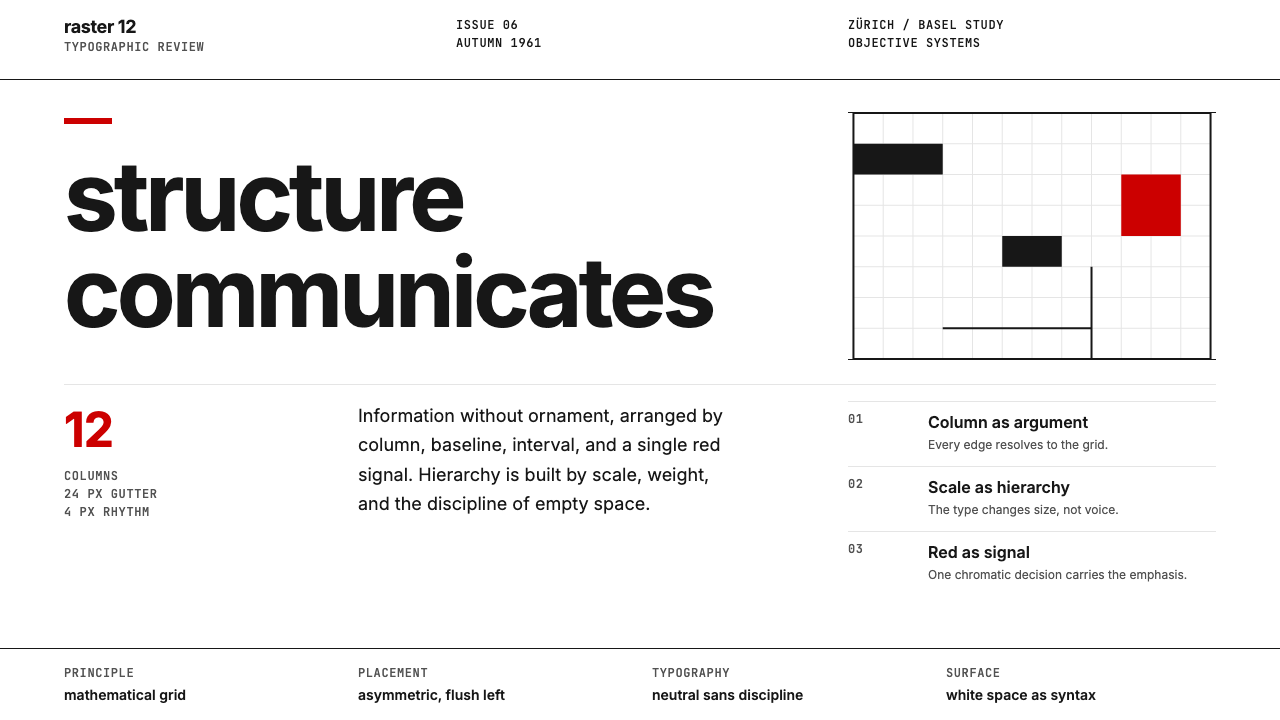 Swiss International StyleObjectivity made visible. Inter scale, white space, and one red block expose…
 NID Ahmedabad ModernismStructure earns trust. Black rules and equal-weight scripts hold craft color…
 Sydney Opera House (Utzon, 1973)Civic restraint in harbour light. Sail-white space, cobalt type, bronze datum.
 Vitsœ 606 ShelvingQuiet form, built to endure. Brushed silver rails impose rhythm on cool plast…