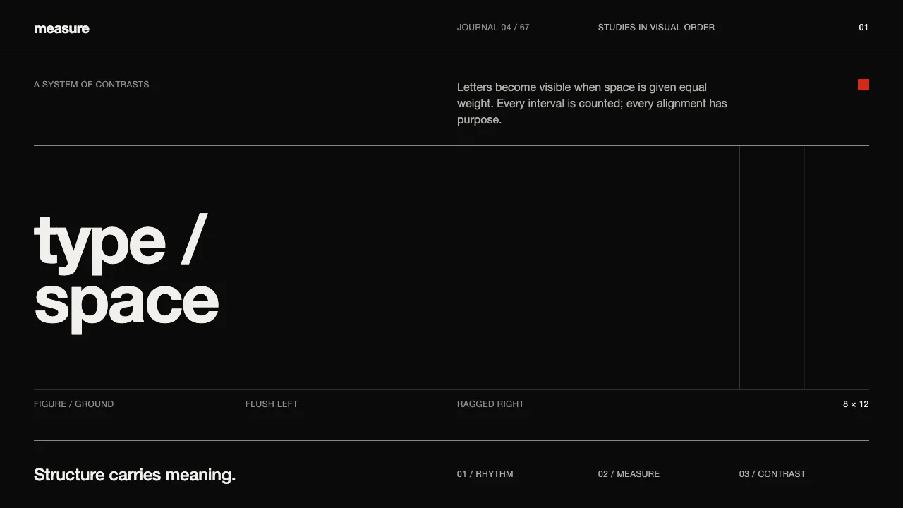
About Emil Ruder Typografie
Emil Ruder's 1967 manual *Typographie* codified the Basel School — grotesque type set flush-left on a rigorous grid, where negative space is an active compositional force, not leftover. This system reads the book's ink-black letterpress plates: near-white Univers and Helvetica become figure against a saturated black ground.
Discipline is the point. Structure carries the meaning; ornament is absent. Primary red, yellow and blue appear only as rare studio-study spots — never a rainbow, never decoration. Every rule is a hairline, every measure counted.
- Origin
- Basel, Switzerland
- Era
- 1967 (published); rooted in 1950s–60s Swiss modernism
- Key figures
- Emil Ruder · Armin Hofmann
- Movements
- International Typographic Style · Basel School of Design
Emil Ruder Typografie design spec
Colors
Typography
The other 11 sections — buttons, cards, spacing, motion, techniques and more — open once you unlock. Download the DESIGN.md or send it to your AI in one click. Unlock once, yours forever.
Sign up nowStyles similar to Emil Ruder Typografie
Also inspired by design movements, with a close feel.
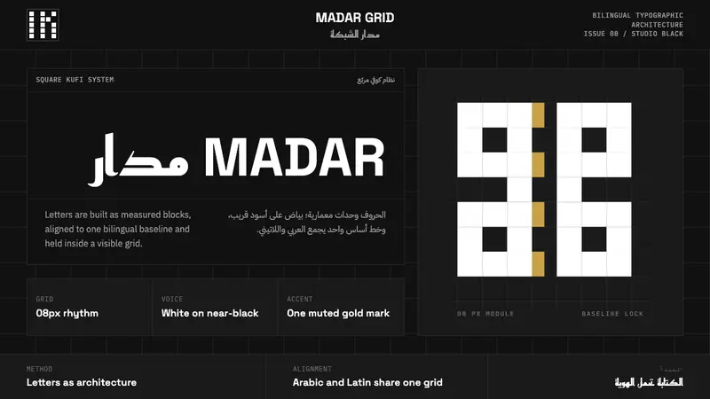 Modern Kufi BrandingRestraint becomes architecture. White Kufi blocks on near-black obey a bilingual grid.
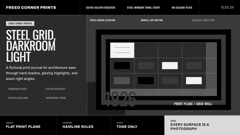 Dessau GrayscaleAustere monochrome authority. Darkroom black, glazing gray, and a steel-window grid.
 Cli-Fi 2050Pragmatic after the flood. Concrete blue-gray, muted teal, and one amber alert line.
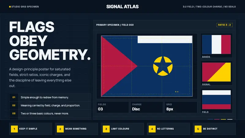 Vexillology Flag DesignDiscipline made visible. Old Glory blue, red and yellow sit on a strict dark grid.