Design style guide设计风格指南
What is Sydney Opera House (Utzon, 1973)?什么是 Sydney Opera House (Utzon, 1973)?
The Sydney Opera House gave the world its most recognizable harbour silhouette — and a design language of sail-white calm, harbour-blue precision, and warm bronze restraint that continues to set the standard for civic cultural identity.悉尼歌剧院赋予世界最具辨识度的港湾轮廓,也留下了一套以帆白宁静、港湾蓝精准与温润青铜克制为核心的设计语言,至今仍是市民文化形象的标杆。
Sydney Opera House (Utzon, 1973) in briefSydney Opera House (Utzon, 1973) 速览
The Sydney Opera House design system is a civic visual identity rooted in one of the twentieth century's most audacious works of architecture. Its language — sail-white expanses, a deep harbour cobalt, and restrained bronze warmth — is inseparable from the building's own material palette: the glazed white shell tiles catching morning light on Bennelong Point, the grey-green harbour water below, and the ochre warmth of the Tarana granite podium that anchors the whole composition to its peninsular site.悉尼歌剧院设计体系是一套扎根于二十世纪最大胆建筑之一的市民视觉识别系统。其语言——帆白色的广阔留白、深沉的港湾钴蓝与克制的青铜暖调——与建筑自身的材料色彩密不可分:贝尼朗角捕捉晨光的釉面白色壳瓦、壳体下方灰绿色的港湾海水,以及将整座建筑锚定于半岛基地的塔拉纳花岗岩基座的赭石温度。
What distinguishes this system from generic modernism is its structural logic. Every choice derives from the architecture itself. The sail-white is not decorative blankness but the direct transposition of Jørn Utzon's shell surfaces — pre-cast concrete ribs clad in over a million Swedish-glazed tiles — into a two-dimensional field. The cobalt ink is the harbour. The bronze warmth is the podium's stone. This is a design language that earns its elements through architectural necessity rather than stylistic choice.将这套体系与泛泛的现代主义区别开来的,是其内在的结构逻辑。每一个选择都源自建筑本身。帆白并非装饰性的空白,而是乌松壳体表面的直接转化——预制混凝土肋骨覆盖着逾百万块瑞典釉面瓷砖——落入二维平面的投影。钴蓝油墨是港湾。青铜温暖是基座的石材。这是一套以建筑必然性而非风格选择赢得自身每个元素的设计语言。
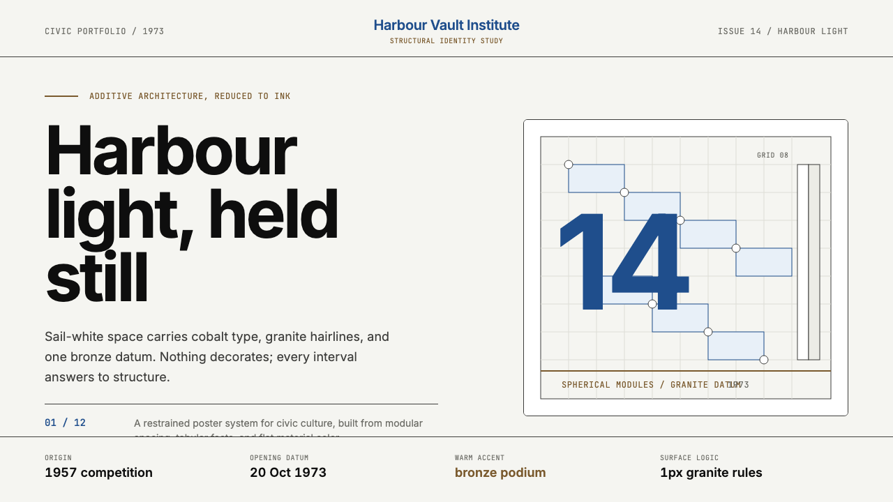
The system crystallized through the 2013 Frost*Collective brand refresh, which drew on Akzidenz-lineage sans-serif typography and grid logic inspired by Utzon's additive architecture — the principle that complex forms arise from the disciplined repetition of a simple geometric module. The result is a visual identity that feels both monumental and quietly restrained, as suited to a programme brochure as to a façade banner twenty metres tall.这套体系在2013年Frost*Collective品牌焕新中得以凝固成形,以Akzidenz谱系无衬线字体为骨架,以乌松「加法建筑」理念构建网格逻辑——这一原则认为,复杂形态源于对简单几何模块的有纪律的重复。最终呈现的视觉识别系统既有纪念碑式的庄重,又有悄然的克制,无论用于节目册还是二十米高的建筑立面横幅,都同样妥帖。
See the Sydney Opera House (Utzon, 1973) design system →查看 Sydney Opera House (Utzon, 1973) 完整设计系统 →
Where does Sydney Opera House (Utzon, 1973) come from?Sydney Opera House (Utzon, 1973) 从何而来?
The story of the Sydney Opera House begins not with a completed building but with a competition. In 1957, the New South Wales government invited international entries for a new performing arts facility on Bennelong Point, a spit of land jutting into Sydney Harbour that had served variously as a tram depot, a fort, and the site of an earlier government house. The brief was ambitious; the budget was modest; the judges were divided. Among the late entries that almost did not make the preliminary cut was a set of sketches by Jørn Utzon, a Danish architect then largely unknown outside Scandinavia. The competition judge Eero Saarinen, arriving late to the review process, retrieved Utzon's submission from the rejected pile and declared it the only scheme that genuinely responded to the site. Utzon won.悉尼歌剧院的故事并非始于一座落成的建筑,而是始于一场竞赛。1957年,新南威尔士州政府就贝尼朗角——一片伸入悉尼港的狭长陆地,曾先后作为电车车库、要塞和旧政府大楼——向国际社会征集新表演艺术设施方案。任务书雄心勃勃,预算却捉襟见肘,评委意见也不统一。在几乎未能通过初审的晚交方案中,有一套来自约恩·乌松——一位当时在斯堪的纳维亚以外几乎无人知晓的丹麦建筑师——的草图。评审委员埃罗·沙里宁姗姗来迟,从落选方案堆中翻出乌松的投稿,宣称这是唯一一个真正回应场地的方案。乌松获胜。
Utzon's concept — a series of interlocking shell vaults rising from a massive podium — was visionary but, at the time of submission, structurally unbuildable. The geometry of the shells could not be resolved using the engineering tools available in 1957. The solution came through Utzon's collaboration with the structural engineering firm Ove Arup and Partners: a decade of iterative calculation eventually revealed that all the shell surfaces could be derived from a single sphere of constant radius. This insight — that the apparently free-form shells were in fact parametric fragments of one pure geometric solid — transformed the project from an artistic gesture into a buildable system, and it also became the conceptual foundation of the design language: complex forms arising from a single generative rule.乌松的构想——一组从巨大基座升起的交错壳拱——极具远见,但在提交之时,以当时的工程技术根本无法实现。壳体的几何形态无法用1957年可用的工程工具加以解决。解决方案来自乌松与奥雅纳结构工程事务所长达十年的合作与迭代计算,最终发现所有壳面都可以从一个等半径的单一球体派生。这一洞见——表面上自由形态的壳体实际上是同一纯几何体的参数化切片——将这个项目从艺术姿态转化为可建造的体系,也成为设计语言的概念基础:复杂形态由单一生成规则而来。
Construction spanned from 1959 to 1973, but the building's political history is at least as turbulent as its engineering. Utzon resigned from the project in 1966 following conflicts with the incoming state government minister over costs, timelines, and professional authority. He never returned to see the completed building. The interior work was taken over by a team of Australian architects led by Peter Hall, who completed the project to a different interior standard than Utzon had envisioned. The building opened on 20 October 1973, inaugurated by Queen Elizabeth II. Utzon was awarded the Pritzker Architecture Prize in 2003 — the selection committee noted that there was no doubt the Opera House was one of the great buildings of the twentieth century — but he died in 2008 without ever revisiting Sydney.建设工期从1959年延续至1973年,但这座建筑的政治史至少与其工程史一样跌宕。1966年,乌松因与新任州政府部长在造价、工期和专业权限上的冲突而辞职。他此后从未回来见证建筑落成。室内工程由以彼得·霍尔为首的澳大利亚建筑师团队接管完成,内部设计水准与乌松的构想存在差距。建筑于1973年10月20日由英国女王伊丽莎白二世主持揭幕。乌松于2003年荣获普利兹克建筑奖,评选委员会指出,这座歌剧院无疑是二十世纪最伟大的建筑之一——但他在2008年辞世时,终未再踏上悉尼的土地。
The visual identity's later development reflects a deliberate act of cultural consolidation. By the 2000s, the Opera House had become not just an Australian landmark but a global shorthand for Sydney itself. The 2007 appointment of a dedicated design director and the 2013 Frost*Collective brand refresh codified the informal visual language that had accumulated around the building into a systematic identity. The designers worked from the architecture outward: the sail-white, the harbour palette, and the parametric grid were not invented for the rebrand but extracted from what the building already was. This fidelity to source material — treating the architecture as the primary design brief — distinguishes the system from generic institutional identities.视觉识别系统的后期发展,折射出一次刻意的文化整合行动。到2000年代,歌剧院已不仅是澳大利亚的地标,更成为悉尼这座城市在全球的简写符号。2007年专设设计总监一职,以及2013年Frost*Collective品牌焕新,将围绕这座建筑自然累积的非正式视觉语言整理成系统性识别体系。设计师们从建筑向外推演:帆白、港湾色调与参数化网格并非为品牌重塑而发明,而是从建筑已经呈现的形态中提取出来。这种对源材料的忠实——将建筑本身视为首要设计简报——将这套体系与一般机构视觉识别区别开来。
What defines the Sydney Opera House (Utzon, 1973) look?Sydney Opera House (Utzon, 1973) 的视觉特征是什么?
Sail White帆白
The dominant field colour is a warm, luminous white — not the clinical white of a laboratory or the cold white of a blank screen, but the slightly sun-warmed tone of the Opera House's Swedish-glazed tile cladding seen in harbour light. This sail-white functions as generous negative space rather than absence: it gives surrounding elements room to breathe and carries the same sense of expansive calm that the building's shell forms project across the waterfront. When used at scale — on a full-bleed cover, an exhibition backdrop, or a large-format banner — it reads as both civic confidence and democratic openness.主导底色是一种温暖而明亮的白——不是实验室的冷白,也不是空白屏幕的刺目白,而是歌剧院瑞典釉面瓷砖在港湾光线下呈现的那种略带日晒温度的色调。这种帆白作为慷慨的负空间而非虚无发挥作用:它给周围元素以喘息空间,携带着壳体形态投射在海滨的同一种开阔宁静感。当大面积运用时——满版封面、展览背景板或大幅横幅——它既传递市民的自信,也散发民主的开放感。
Harbour Cobalt港湾钴蓝
The primary accent is a deep, saturated blue drawn directly from Sydney Harbour's characteristic colour under full afternoon sun — neither the navy of corporate authority nor the bright cyan of digital interfaces, but the specific intensity of deep salt water in strong southern-hemisphere light. This cobalt is used with discipline: headlines, structural dividers, wayfinding, and key interactive elements, but never as a background fill at full saturation. Its function is directional and architectural — it marks where the eye should go, in the same way the harbour itself provides the dominant visual anchor for the entire city.主要强调色是一种深沉而饱满的蓝,直接取自悉尼港在午后阳光下的典型色调——既非企业权威的深蓝,也非数字界面的明亮青,而是南半球强光下深盐水特有的那种强度。这种钴蓝被有纪律地使用:标题、结构分隔线、导向标识与关键交互元素——但绝不以满饱和度铺作背景底色。它的功能是方向性与建筑性的:标示眼睛应当去往何处,一如港湾本身为整座城市提供主导的视觉锚点。
Bronze Warmth青铜暖调
A restrained warm accent — derived from the ochre tones of the Tarana granite podium that forms the building's base — provides grounding and human warmth within the otherwise cool harbour palette. This bronze register appears in tertiary roles: captions, metadata, decorative rules, and the warm mid-tones of print stock. It prevents the system from reading as cold or institutional and subtly connects the visual language back to the earthbound materiality of the podium: the building's structural foundation expressed as a chromatic one.一种克制的暖色强调——源自构成建筑基座的塔拉纳花岗岩的赭石色调——在整体偏冷的港湾色调中提供重量感与人文温度。这种青铜调出现在次级角色中:图注、元数据、装饰性细线,以及印刷纸张的温暖中间调。它防止整套体系被读作冰冷或机构化,并将视觉语言悄然引回基座朴素的物质性:建筑的结构基础,化作一种色彩上的基底。
Parametric Grid参数化网格
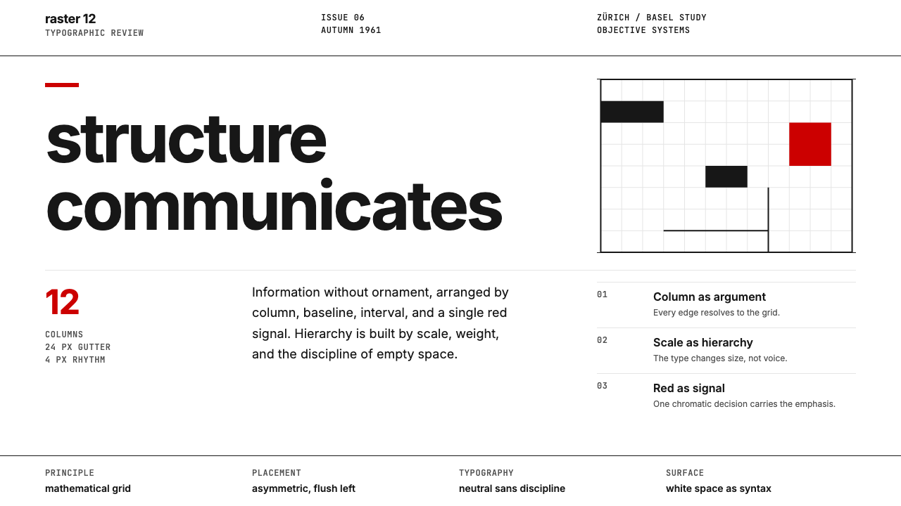
The grid logic is drawn from Utzon's architectural method — the additive principle by which each shell vault is a variation of the same underlying geometric module. Layouts are built on a strict modular column system where the unit of measurement is consistent but the arrangement shifts: wide columns for primary content, narrow columns for supplementary information, generous gutters that echo the breathing room between the building's shell forms. Nothing is arbitrary; every proportional decision has a generative rule behind it, even if that rule is invisible to the reader.网格逻辑取自乌松的建筑方法——加法原则,即每一片壳拱都是同一底层几何模块的变体。版面建立在严格的模块化分栏系统之上:测量单位一致,但排列方式随需而变——宽栏承载主要内容,窄栏容纳辅助信息,慷慨的栏间距呼应建筑壳体之间的呼吸空间。没有任何随意性;每一个比例决定背后都有一条生成规则,即便那条规则对读者而言是隐形的。
Akzidenz-Lineage TypographyAkzidenz谱系字体排印
The typographic approach follows the Akzidenz-Grotesk lineage of humanist sans-serif letterforms — rational but not mechanical, precise but not cold. Type is set with substantial contrast between hierarchical levels: a heading carries considerable weight and scale, while body text retreats to a quiet, unhurried register. All-capitals settings appear in display contexts for titles and institutional names, reinforcing the formal civic register. Letterspacing is generous in display settings and tighter in text settings, following the building's own logic of grand gesture at distance and refined material detail at close range.字体排印遵循Akzidenz-Grotesk谱系的人文主义无衬线字形——理性但不机械,精准但不冰冷。各层级之间以显著的对比处理字体:标题拥有充分的字重与字号,正文则退至安静从容的调性。在展示场景中,标题与机构名称采用全大写设置,强化正式的市民格调。字距在展示设置中慷慨开阔,在文本设置中收紧,契合建筑自身的逻辑:远处的宏大姿态,近处的精炼材质细节。
Structural Ornament Prohibition结构性无装饰原则
Like the building itself — where every visual element is either structural concrete, glazed tile, granite, or glass, with no applied decoration — the design system permits no ornamental additions that lack functional justification. There are no decorative borders, no illustrative flourishes, no gradient overlays applied for visual richness. Where a line appears, it is a structural divider. Where a shape appears, it carries semantic meaning. The absence of ornament is not austerity but rigour: the discipline that makes the whole system readable at multiple scales, from a stamp to a billboard.一如建筑本身——每一个视觉元素不是结构性混凝土、釉面瓷砖、花岗岩,就是玻璃,没有任何附加装饰——这套设计体系不允许任何缺乏功能依据的装饰性添加。没有装饰边框,没有花饰笔触,没有为丰富视觉而叠加的渐变。出现的线条,是结构性分隔线;出现的形态,承载语义意义。无装饰不是克苦,而是严格:正是这种自律使整套体系在从邮票到广告牌的各种尺寸下都能清晰可读。
Harbour-Light Photography港湾光摄影
Photography within the system is treated as architectural documentation rather than lifestyle illustration: sharp focus, clean angles, strong contrast between the building's luminous white shells and the deep blue of sky or water. The camera finds the geometry — the curves of the vaulting, the texture of the tile grid, the relationship between podium and waterline. People, when they appear, are placed within the architectural frame rather than in front of it, suggesting that the building is the primary subject and human presence confirms its civic scale rather than personalizing it.体系内的摄影被当作建筑记录而非生活方式图解:锐利的焦距,干净的角度,建筑明亮白色壳体与天空或海水深蓝之间的强烈对比。镜头寻找几何——穹拱的曲线,瓷砖网格的肌理,基座与海岸线的关系。人物出现时,被置于建筑框架之内而非其前方,暗示建筑是主要主体,人的存在确认其市民尺度而非将其私人化。

See the Sydney Opera House (Utzon, 1973) design system →查看 Sydney Opera House (Utzon, 1973) 完整设计系统 →
Who shaped Sydney Opera House (Utzon, 1973)?谁塑造了 Sydney Opera House (Utzon, 1973)?
The Danish architect who conceived the Sydney Opera House's shell-vault form after winning the 1957 international competition. Utzon's design thinking drew on Danish Functionalism, Japanese temple platforms, Mayan ceremonial architecture, and his own research into organic and parametric form. His resolution of the shell geometry — deriving all surfaces from a single sphere — was as much a philosophical breakthrough as an engineering one. Although he resigned from the project in 1966 and never saw the completed building, his influence on the visual identity is total: the system's sail-white, the parametric grid logic, and the structural-ornament prohibition all derive from his architectural principles.设计悉尼歌剧院帆拱形态的丹麦建筑师,赢得1957年国际竞赛后开始这一工作。乌松的设计思维融合了丹麦功能主义、日本神殿台基、玛雅礼仪建筑,以及他对有机形态与参数化形态的自身研究。他对壳体几何问题的解决——从单一球体派生所有曲面——既是哲学突破,也是工程突破。尽管他于1966年辞职并从未见证建筑落成,但他对视觉识别体系的影响是全面的:帆白、参数化网格逻辑与结构性无装饰原则,全部源自他的建筑思想。
The Danish-British structural engineer whose firm, Ove Arup and Partners, solved the geometric and structural challenge that made Utzon's shell vaults buildable. Arup's team worked with Utzon from 1957 to 1966 on the shell geometry, eventually discovering the sphere-of-constant-radius solution that allowed the apparently free-form surfaces to be realized as a repeating parametric system. The Arup-Utzon collaboration is one of the most celebrated partnerships in twentieth-century construction history and established structural engineering as a genuinely creative discipline alongside architecture.丹麦裔英国结构工程师,其事务所奥雅纳解决了使乌松壳拱得以建造的几何与结构难题。奥雅纳团队与乌松从1957年合作至1966年,最终发现了等半径球面解法,使表面上自由形态的曲面得以作为重复的参数化体系实现。奥雅纳与乌松的合作是二十世纪建筑史上最著名的伙伴关系之一,确立了结构工程作为与建筑并列的真正创意学科的地位。
The Australian architect who led the team completing the Sydney Opera House's interiors after Utzon's resignation in 1966. Hall's contribution is complex and often undervalued: he inherited an unfinished building whose structural shell was complete but whose acoustic, mechanical, and interior systems were largely unresolved. Working under intense political and schedule pressure, his team completed the concert hall, opera theatre, drama theatre, and playhouse to functional standards. The interiors departed from Utzon's original vision, and Hall carried the professional burden of that departure for decades, though subsequent historical reassessment has recognized the difficulty of his position.1966年乌松辞职后,主持团队完成悉尼歌剧院室内工程的澳大利亚建筑师。霍尔的贡献复杂而长期被低估:他接手了一座结构壳体已完成但声学、机械与室内系统基本未解决的未竣工建筑。在巨大的政治与工期压力下,他的团队将音乐厅、歌剧院、戏剧院与剧场完成至可运营的标准。室内设计偏离了乌松的原始构想,霍尔为此承担了数十年的职业压力——尽管后来的历史重估已承认他所处位置的困难。
The Australian graphic designer whose studio Frost*Collective led the 2013 brand refresh that codified the Opera House's visual identity into a contemporary system. Frost's approach was archaeological rather than inventive: working outward from the architecture's own material palette — the sail-white tiles, the harbour cobalt, the granite ochre — and using Utzon's parametric grid logic as the organizing principle for the typographic system. The 2013 refresh is widely cited in brand and identity circles as an exemplary case of institution-led identity renewal that serves the source material rather than overlaying it with contemporary trends.澳大利亚平面设计师,其事务所Frost*Collective主导了2013年品牌焕新,将歌剧院的视觉识别体系整理为当代系统。弗罗斯特的方式是考古式而非发明式的:从建筑自身的材料色调向外推演——帆白瓷砖、港湾钴蓝、花岗岩赭石——并以乌松的参数化网格逻辑作为字体系统的组织原则。2013年品牌焕新在品牌与识别界被广泛援引为机构主导型识别更新的典范案例,其服务于源材料而非以当代潮流覆盖它的方式,尤受推崇。
How do you use Sydney Opera House (Utzon, 1973) today?今天怎么用 Sydney Opera House (Utzon, 1973)?
The Sydney Opera House design language transfers well to any context that combines civic authority with cultural warmth — performing arts, education, public institutions, premium cultural festivals, and architectural practices. It is equally legible at intimate scale and monumental scale, which reflects the building's own condition: a structure that reads as a unified composition from the harbour and as a finely detailed surface at arm's length. This scalability is the system's most practically useful quality.悉尼歌剧院设计语言适用于任何将市民权威与文化温度结合的场景——表演艺术、教育机构、公共机构、高端文化节庆与建筑实践。它在私密尺度与宏大尺度下同样清晰可读,这正映照了建筑自身的状态:从港湾远眺是统一的构图,近在咫尺则是精炼的细部。这种跨尺度的适应性是这套体系最实用的特质。
For presentation slides, the system works best when the sail-white field is used generously. A cover page functions like a performance programme: the institution name in the Akzidenz-lineage type at a large scale, the harbour cobalt used for the title, a restrained single-line rule separating header from descriptor, and the warm bronze register used only for the date or secondary metadata. Content slides should follow the parametric grid principle — proportional columns with consistent gutters — and use the cobalt accent exclusively for structural emphasis: section titles, data highlights, call-out quotes. The temptation to fill every slide with colour should be resisted; generous sail-white is where the authority lives.在演示文稿中,体系最适合慷慨运用帆白底色。封面页的功能如同演出节目册:以Akzidenz谱系字体大字号呈现机构名称,以港湾钴蓝书写标题,以一条克制的单线分隔标题与副题,以温暖的青铜调仅用于日期或次要元数据。内容页应遵循参数化网格原则——比例一致、栏间距统一——仅将钴蓝强调色用于结构性强调:段落标题、数据要点、引言摘录。填满每张幻灯片的冲动应当抵制;充裕的帆白,正是权威感所在。
For web interfaces and digital products, the system is particularly well suited to cultural portals, festival websites, and institutional platforms where the hierarchy between featured content and navigational support needs to be immediately clear. The approach: a near-white background field, cobalt used for primary navigation and interactive states, bronze warmth for tertiary elements and footer registers, and photography treated as architectural documentation — full-bleed, high-contrast, focused on form rather than lifestyle. Dashboard views within cultural platforms benefit from the parametric grid's modularity: card components that are proportionally consistent but can accommodate content of varying density without breaking the overall structure.对于网页界面与数字产品,这套体系尤其适合文化门户、节庆网站与机构平台——在这些场景中,特色内容与导航辅助之间的层级需要立即清晰。方法如下:近白色的背景底色,钴蓝用于主导航与交互状态,青铜暖调用于三级元素与页脚,摄影以建筑记录的方式处理——满版出血、高对比度、聚焦于形态而非生活方式。文化平台内的仪表板视图受益于参数化网格的模块性:比例一致的卡片组件,可以容纳不同密度的内容而不破坏整体结构。
For editorial design and printed materials — programme notes, annual reports, exhibition catalogues — the system rewards commitment to the restrained palette. A programme cover in sail-white with cobalt type and a single bronze horizontal rule reads as both contemporary and classic, suitable for a production that will be performed once and referenced for decades. The system's resistance to ornament means that all hierarchy must be achieved through typographic means: size contrast, weight contrast, and spatial interval. This is demanding but consistently produces work that ages well, because the hierarchy logic rather than a trend is doing the work.对于编辑设计与印刷物料——节目注释、年度报告、展览图录——这套体系奖励对克制色调的承诺。帆白封面加钴蓝字体与单条青铜水平线,既当代又经典,适合一部只演一次却被参阅数十年的演出节目册。体系对装饰的抵制意味着所有层级必须以字体排印手段实现:尺寸对比、字重对比与空间间隔。这要求很高,但始终产出经得起时间的作品,因为完成这项工作的是层级逻辑,而非某种潮流。
The most common application error is treating the cobalt and bronze as interchangeable accent roles. They are not: the cobalt is directional and structural, always carrying the reader toward primary meaning; the bronze is grounding and supplementary, always placed in supporting positions. Using the cobalt for decorative purposes — background fills, hover states that have no semantic meaning — empties it of its functional charge. A second common mistake is introducing a fourth colour outside the system's three-register palette. The system's authority depends on restraint; every additional colour competes with the harbour itself.最常见的应用错误是将钴蓝与青铜当作可互换的强调角色来处理。它们并不互换:钴蓝是方向性与结构性的,始终引导读者走向主要意义;青铜是稳定性与辅助性的,始终置于支撑位置。将钴蓝用于装饰目的——背景色铺底、没有语义意义的悬停状态——会抽空它的功能电荷。第二个常见错误是在体系三色调色板之外引入第四种颜色。这套体系的权威感依赖克制;每一种额外的颜色都在与港湾本身竞争。
See the Sydney Opera House (Utzon, 1973) design system →查看 Sydney Opera House (Utzon, 1973) 完整设计系统 →
Sydney Opera House (Utzon, 1973) — FAQSydney Opera House (Utzon, 1973) · 常见问题
Is the Sydney Opera House style suitable for private commercial brands, or is it inherently institutional?悉尼歌剧院风格适用于私人商业品牌吗,还是它本质上是机构性的?
The system's civic register is strong, but it is not exclusive to institutions. Premium cultural brands — independent theatres, concert promoters, high-end architectural firms, serious editorial publishers, and cultural foundations — can adopt the system's logic without appropriating the Opera House's own identity. The key is understanding what drives the civic feeling: the generous white field, the restrained accent palette, and the typographic hierarchy derived from scale rather than colour. A private brand that commits to those structural principles will read as authoritative and culturally serious, which is a premium positioning in many markets. Brands seeking warmth, playfulness, or lifestyle associations should look elsewhere.这套体系的市民格调很强烈,但并非机构专属。高端文化品牌——独立剧院、音乐会主办方、高水准建筑事务所、严肃的编辑出版机构与文化基金会——可以采用这套体系的逻辑,而不必挪用歌剧院本身的识别。关键在于理解市民感的来源:慷慨的白色底色、克制的强调色调与以尺寸而非色彩建立的字体层级。一个承诺这些结构原则的私人品牌,将被读作权威且文化上严肃的,这在许多市场中是一种高端定位。寻求温暖感、玩趣性或生活方式联想的品牌,应当寻找其他风格。
How should the system handle dark-mode or dark-background contexts?这套体系应当如何处理深色模式或深色背景场景?
A true dark inversion of the Sydney Opera House system is structurally possible but requires care. The sail-white field becomes a deep charcoal — close to but not quite pure black, maintaining the warmth of the original — while the cobalt transitions to a lighter, more luminous blue that can hold legibility against the dark ground. The bronze warmth is the register most difficult to preserve in dark mode: it tends to lose its grounding quality and can begin to read as gold, which shifts the system's cultural associations significantly. A practical approach for dark contexts is to use the cobalt as the dominant mid-tone rather than an accent, and reserve the warm register for small-scale typographic details only.悉尼歌剧院体系的真正深色反转在结构上是可行的,但需要谨慎处理。帆白底色变为深炭灰——接近但不是纯黑,保留原有的温度感——钴蓝则过渡为更浅、更明亮的蓝,以在深色底面上保持可读性。青铜暖调是深色模式中最难保留的色调:它容易失去稳定感,开始被读作金色,这会显著改变体系的文化联想。深色场景的实用方法是将钴蓝作为主导中间调而非强调色,仅在小尺寸字体细节中保留暖色调。
What is the relationship between this design language and other Australian cultural institutions?这套设计语言与其他澳大利亚文化机构之间有何关联?
The Sydney Opera House identity is specific enough to be distinctive, but its underlying principles — restrained palette, typographic hierarchy, respect for architectural context — have influenced the broader register of Australian civic and cultural design. Institutions such as the National Gallery of Australia, the Museum of Contemporary Art, and various state gallery systems have adopted complementary rather than identical approaches: warm ground colours, humanist sans-serif typography, and an emphasis on photographic documentation of collection works. The Opera House system sits at the apex of this broader family — more architecturally specific and more formally restrained than most of its peers — but the family resemblance is real and reflects a shared cultural commitment to civic seriousness without austerity.悉尼歌剧院的识别体系足够独特,但其底层原则——克制的色调、字体层级、对建筑语境的尊重——已影响了澳大利亚市民与文化设计的更广泛格调。国家美术馆、当代艺术博物馆及各州立画廊体系采用了互补而非相同的方式:温暖的底色调、人文主义无衬线字体,以及对馆藏作品摄影记录的强调。歌剧院体系处于这一更广泛家族的顶端——比大多数同类机构更具建筑特定性,形式上也更为克制——但家族相似性是真实的,折射出一种对市民严肃性的共同文化承诺:无苦涩,有格调。
Does the style age well, or does it risk looking dated?这种风格经得起时间考验吗,还是有过时的风险?
The system ages extremely well for a straightforward structural reason: its palette is derived from fixed physical phenomena — the colour of rendered tile in harbour light, the colour of deep salt water, the colour of a specific granite — rather than from the cultural associations of a particular moment. Trend-sensitive design ages when the trend recedes; this system has no trend dependence to recede. The Frost*Collective 2013 refresh looks as contemporary in the late 2020s as it did at launch, which is a reliable indicator of structural rather than fashionable decision-making. The risk of dating exists only if the system's principles are abandoned in favour of period-specific additions — gradients, expressive typography, texture overlays — applied in the name of freshening the brand.这套体系经得起时间考验,原因在于一个直接的结构性事实:它的色调源自固定的物理现象——渲染瓷砖在港湾光线下的颜色、深盐水的颜色、特定花岗岩的颜色——而非某一特定时刻的文化联想。依赖潮流的设计会随潮流退去而老化;这套体系没有任何潮流依赖可以退去。Frost*Collective 2013年焕新在2020年代末与发布之时同样当代,这是结构性而非时尚性决策的可靠指标。过时的风险只在一种情况下存在:以「品牌焕新」为名,放弃体系原则,转而加入特定时期的元素——渐变、表达性字体、纹理叠加。
How does this style differ from other great-building-derived design systems, such as those of the Guggenheim or the Centre Pompidou?这种风格与其他源自伟大建筑的设计体系(如古根海姆或蓬皮杜中心)有何不同?
Each great-building design system reflects the architectural logic of its source. The Guggenheim Bilbao's identity draws on the titanium-clad biomorphic form that defines Frank Gehry's building — curvilinear, reflective, and sculptural. The Centre Pompidou identity references the exposed structural and mechanical systems of Piano and Rogers — industrial, colour-coded by function, deliberately anti-monumental. The Sydney Opera House system is fundamentally different from both: it derives from a building whose visual logic is tectonic and parametric rather than biomorphic or industrial. Its restraint — sail-white field, two accent registers, no ornament — reflects a building that achieves drama through structural purity rather than expressive complexity. It is the most formally austere of the three, which is also why it transfers most cleanly to non-architectural contexts.每一套源自伟大建筑的设计体系都映照其源建筑的建筑逻辑。毕尔巴鄂古根海姆的识别取自弗兰克·盖里建筑的钛金属包覆仿生形态——曲线、反光、雕塑性。蓬皮杜中心的识别援引皮阿诺与罗杰斯裸露结构与机械系统——工业性、按功能色彩编码、刻意反纪念碑。悉尼歌剧院体系与二者根本不同:它源自一座视觉逻辑是构造性与参数化而非仿生或工业的建筑。它的克制——帆白底色、两种强调调性、无装饰——折射出一座以结构纯粹性而非表现复杂性实现戏剧感的建筑。它是三者中形式上最素朴的,这也正是它最干净地迁移至非建筑语境的原因。
Related design styles相关设计风格
 Swiss International StyleObjectivity made visible. Inter scale, white space, and one red block expose…客观性可见:Inter 尺度、留白与单一红块显露网格。
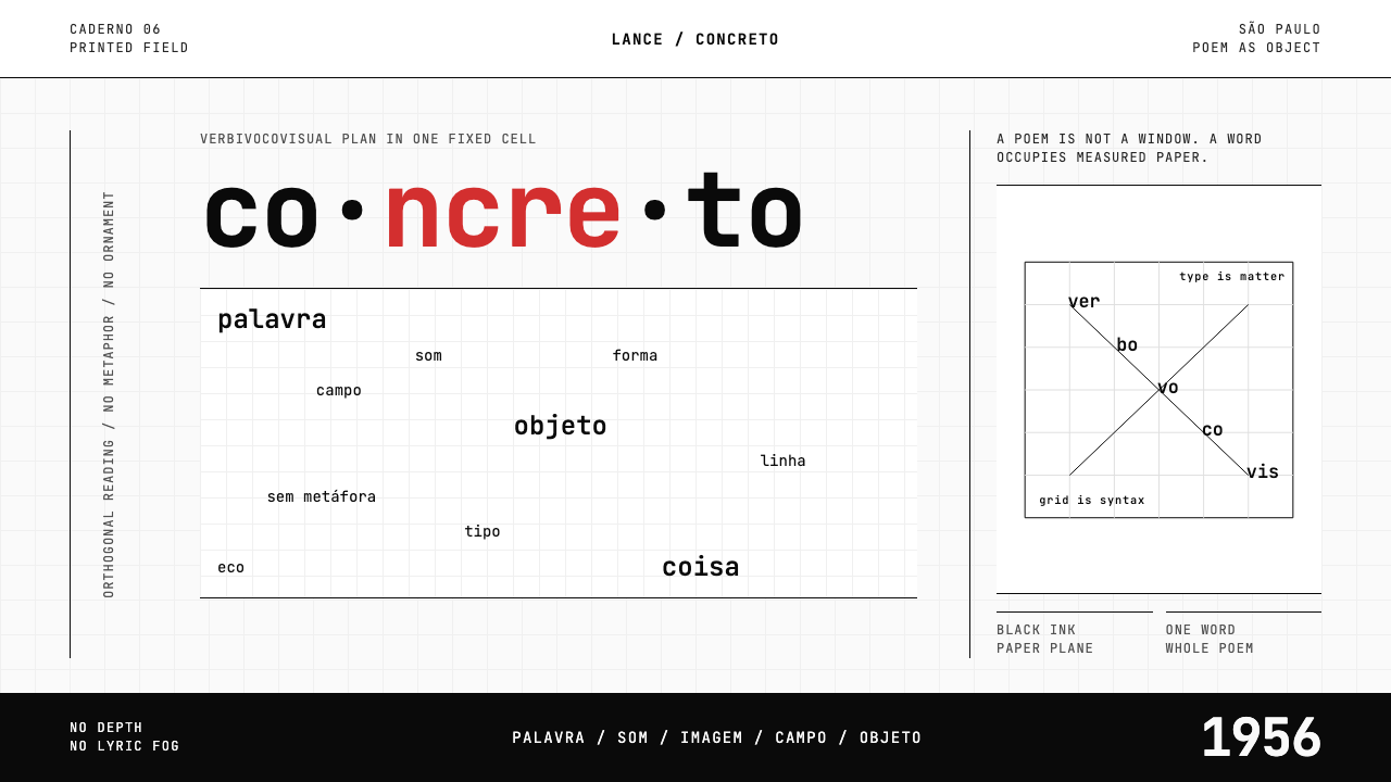 Brazilian Concrete PoetryWords become objects. Monospace cells, black-white paper, one cadmium red rup…字成为物。等宽格、黑白纸面,一处镉红断裂。
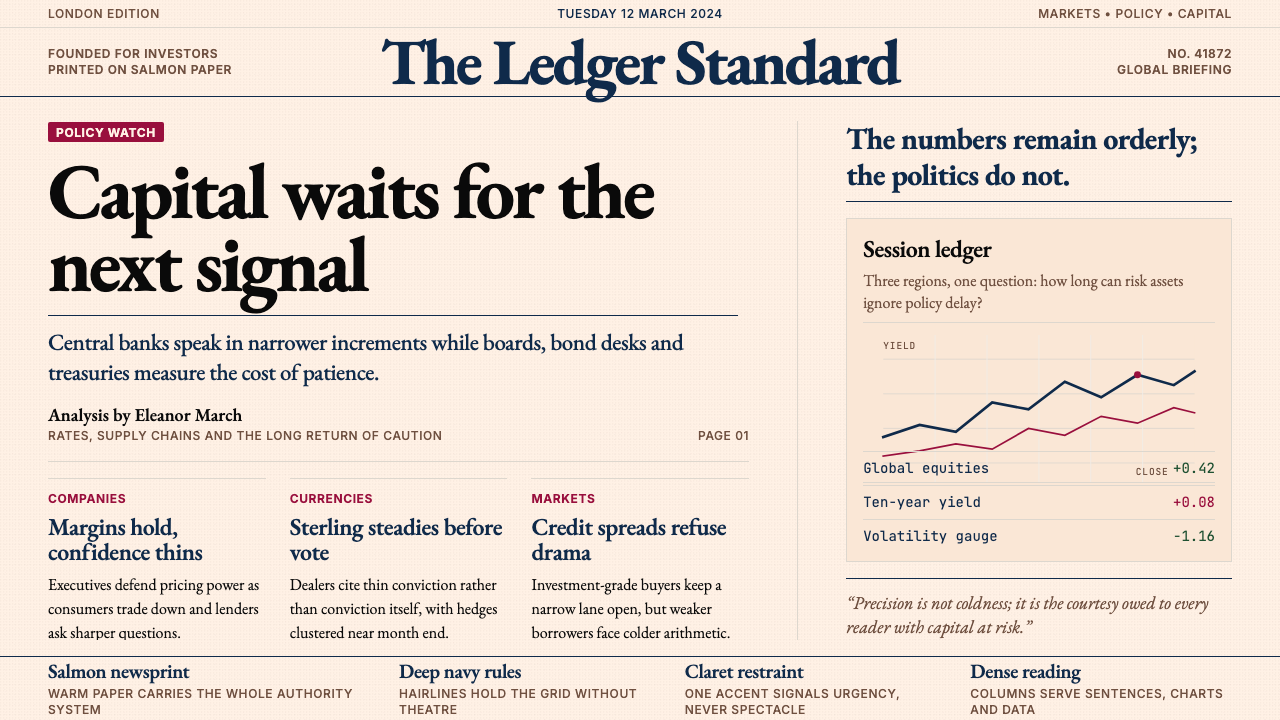 Financial Times (Pink Paper)Authority on salmon paper. Deep navy rules and claret accents discipline dens…三文鱼粉纸上的权威:深海军蓝细线与酒红点缀,约束密集衬线栏。
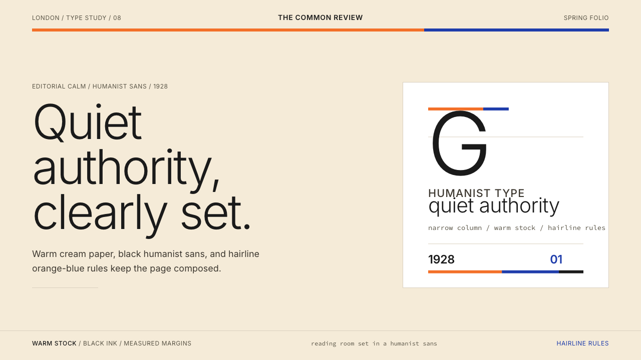 Gill Sans (BBC, 1928)Quiet authority, clearly set. Warm cream, black humanist sans, and hairline o…安静而权威。奶油底、黑色人文无衬线与橙蓝细线。
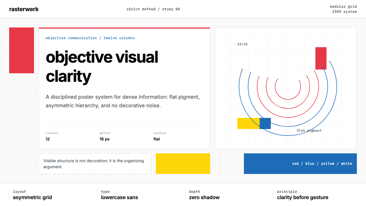 Müller-Brockmann SwissClarity is the system. Inter grids, red-blue blocks, and concentric arcs make…清晰即系统:Inter网格、红蓝色块与同心弧显露结构。
 Penguin Classics OrangePaperback authority. Orange tri-bands, serif title panel, and flat ink enforc…平装书的权威感:橙色三段、衬线标题与平面油墨建立克制秩序。