What is Gill Sans (BBC, 1928)?什么是 Gill Sans (BBC, 1928)?
Gill Sans is the voice of British institutions — classical, unhurried, and unmistakably authoritative.Gill Sans 是英国机构的声音——古典、从容,权威感不可误认。
Gill Sans (BBC, 1928) in briefGill Sans (BBC, 1928) 速览
Gill Sans is a humanist sans-serif typeface designed by sculptor and letter-cutter Eric Gill for the Monotype Corporation, released commercially in 1928. Unlike the geometric sans-serifs emerging from continental Europe at the same moment, Gill Sans draws its proportions and stroke modulation from Roman inscriptional capitals and the calligraphic tradition, producing letterforms that feel warm and hand-considered rather than mechanically derived. Its lowercase letters in particular carry a subtle variation in stroke weight — thicker at the curves, tapering toward the joins — that the purely geometric typefaces of the same era deliberately eliminated.Gill Sans 是由雕塑家兼刻字师埃里克·吉尔为蒙纳公司设计的人文主义无衬线字体,于1928年正式发行。与同时期从欧洲大陆涌现的几何无衬线字体不同,Gill Sans 的字母比例和笔画调制源自罗马碑刻大写字母与书法传统,使字形呈现出一种温暖、经过手工推敲的质感,而非机械推导的结果。尤其是小写字母,笔画粗细带有微妙的变化——曲线处略粗,向连接处收细——这正是同时代纯几何字体刻意消除的特征。
The typeface occupies a singular position in British visual culture. The BBC adopted it as a cornerstone of its corporate identity; Penguin Books used it on the iconic three-color series covers from the 1930s onward; the Church of England employed it on liturgical publications; and the London and North Eastern Railway had already featured a close precursor on station signage before Gill's commercial release. This accumulation of institutional use gave Gill Sans an authority that no amount of deliberate branding could manufacture — it carries the cultural weight of a tradition.这款字体在英国视觉文化中占据独特地位。BBC 将其作为企业形象的基石;企鹅出版社从1930年代起将它用于标志性的三色系列封面;英格兰教会在礼拜出版物上采用它;伦敦和东北铁路甚至在吉尔正式发行商业版本之前,就已在车站标牌上使用了与之高度相近的前身字体。这种累积式的机构使用赋予了 Gill Sans 一种任何刻意品牌化都无法制造的权威感——它承载着传统的文化分量。
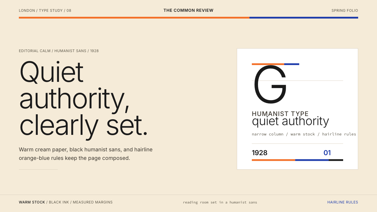
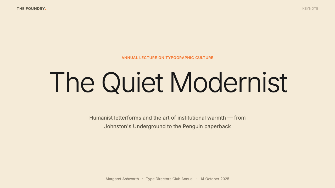
Visually, the style built around Gill Sans is one of editorial restraint. The ground is warm cream rather than stark white, softening the reading experience without sacrificing legibility. Type is set in pure black, allowing the humanist letterforms to register fully. Structural dividers — when they appear — are hairline thin, functioning as pauses in the composition rather than declarations. The accent colors associated with this system are a citrus orange and a deep, composed blue, borrowed from the Penguin series covers: vivid enough to orient the reader, restrained enough not to overwhelm the typography.围绕 Gill Sans 构建的视觉风格,是一种编辑式克制的美学。底色是温暖的奶油色,而非冷峻的纯白,在不牺牲易读性的前提下柔化了阅读体验。字体以纯黑色设置,让人文主义字形得以充分呈现。结构性分割线——当它出现时——是细如发丝的,在构图中充当停顿,而非宣示。与这套系统相关联的强调色是柑橘橙和沉稳的深蓝,借自企鹅系列封面:鲜亮到足以引导读者视线,克制到足以不压过字体本身。
See the Gill Sans (BBC, 1928) design system查看 Gill Sans (BBC, 1928) 完整设计系统
Where does Gill Sans (BBC, 1928) come from?Gill Sans (BBC, 1928) 从何而来?
Eric Gill was commissioned to design a typeface for Monotype following a direct lineage from Edward Johnston's typeface created for London Underground in 1916. Johnston's Underground type had demonstrated that a sans-serif could carry the clarity demanded by public signage while remaining legible, dignified, and free of the mechanical coldness that characterized many nineteenth-century grotesques. Gill had worked as a student under Johnston and absorbed the older craftsman's conviction that letterforms should descend from the Roman tradition, however radically simplified. Gill Sans inherits Johnston's underlying logic and pushes it into a form suitable for book setting and general typography.埃里克·吉尔受蒙纳公司委托设计这款字体,其渊源可直追爱德华·约翰斯顿1916年为伦敦地铁创作的字体。约翰斯顿的地铁字体证明了:无衬线字体能够兼顾公共标识所要求的清晰度,同时保持易读、庄重,并摆脱许多十九世纪怪诞体所带有的机械冷感。吉尔曾师从约翰斯顿,深受这位老工匠的影响——后者坚信字形应当根植于罗马传统,无论如何激进地加以简化。Gill Sans 继承了约翰斯顿的底层逻辑,并将其推进为适合书籍排版与通用字体设计的形态。
Stanley Morison, Monotype's typographic advisor, recognized that British publishing lacked a credible modern sans-serif rooted in the humanist tradition. German publishers and advertisers were embracing Futura, released the previous year; American work was gravitating toward the updated gothic grotesques. Britain risked being typographically caught between an exhausted Victorian grotesque tradition and foreign imports that felt culturally alien. Gill Sans arrived at precisely the right moment: modern enough to signal the new century, classical enough to satisfy the conservative institutions that represented the bulk of British publishing.蒙纳公司的字体顾问斯坦利·莫里森意识到,英国出版界缺少一款植根于人文主义传统的可信赖现代无衬线字体。德国出版商与广告商正在拥抱前一年发布的 Futura;美国作品则向更新后的哥特式怪诞体靠拢。英国面临在已精疲力竭的维多利亚怪诞传统与文化上令人感到陌生的外国输入之间进退两难的字体困境。Gill Sans 在恰当的时刻出现:足够现代,能够宣示新世纪;足够古典,能够满足代表英国出版主流的保守机构。
The LNER — London and North Eastern Railway — was among the first major clients, beginning to use Gill Sans for its timetables, posters, and station name boards from around 1929, providing the typeface with one of the most prominent early deployments in British public life. This railway association established an enduring link between the typeface and reliable public service: by the time the BBC began formalizing its own corporate identity in subsequent decades, Gill Sans carried an already deep institutional endorsement.伦敦和东北铁路是最早的重要客户之一,约从1929年起开始将 Gill Sans 用于时刻表、海报及车站名牌,为这款字体提供了英国公共生活中最早、最瞩目的大规模应用场景之一。这种铁路关联在字体与可靠公共服务之间建立了一种持久的连接:当 BBC 在此后数十年间开始将自身企业形象正式化时,Gill Sans 已经积累了深厚的机构背书。
The BBC's corporate adoption, solidified during the 1980s and continuing through various identity revisions into the present, gave Gill Sans its most visible modern platform. The corporation's reach — broadcasting into tens of millions of British homes, with a visual identity appearing on screen, in print, and on signage across the country — transformed the typeface from a distinguished publishing choice into a daily presence in British life. The effect is one that designers call 'cultural saturation': the typeface became inseparable from the idea of authoritative, public-service communication in the British context.BBC 的企业化采用在1980年代得到巩固,并延续至此后数次形象修订直至今日,为 Gill Sans 提供了其最具能见度的现代舞台。这家机构的覆盖范围——向数千万英国家庭广播,视觉形象出现在全国各地的屏幕、印刷品和标识上——将这款字体从一个出色的出版选择转变为英国日常生活的恒常存在。设计师将这种效果称为「文化饱和」:该字体与英国语境中权威、公共服务式传播的观念变得不可分割。
What defines the Gill Sans (BBC, 1928) look?Gill Sans (BBC, 1928) 的视觉特征是什么?
Humanist Stroke Modulation人文主义笔画调制
Unlike geometric sans-serifs that maintain uniform stroke width throughout, Gill Sans exhibits subtle variation derived from the broad-nib pen tradition. Curves swell slightly at their midpoints and thin toward the joins, a quality inherited from Roman inscriptional practice. This modulation is restrained enough to read as clean and modern at a glance, yet distinctive enough to give the typeface its characteristic warmth — preventing the coldness that afflicts strictly mechanical letterforms.与笔画粗细始终均匀的几何无衬线字体不同,Gill Sans 呈现出源自宽笔尖书写传统的微妙变化。曲线在中点处略微加粗,向连接处收细,这种品质继承自罗马碑刻实践。这种调制克制到足以令人一眼读出清洁与现代感,同时又足够独特,赋予了字体标志性的温度——避免了纯机械字形所带有的冷漠感。
Warm Cream Ground温暖奶油底色
The canonical ground for this style is not pure white but a warm, slightly yellowed cream — the color of aged laid paper. This choice is not decorative but functional: it reduces the stark contrast between background and black type, making sustained reading less fatiguing. The cream ground also anchors the palette's accent colors — a citrus orange and a composed deep blue — making them feel vivid without appearing aggressive. The warmth of the background communicates age and reliability, appropriate to the institutional character the style conveys.这种风格的标准底色不是纯白,而是温暖、略带黄调的奶油色——陈年纹纸的颜色。这一选择并非装饰性的,而是功能性的:它降低了背景与黑色字体之间过于强烈的对比,使持续阅读不那么令人疲倦。奶油底色也为调色板的强调色——柑橘橙和沉稳的深蓝——提供了锚点,使它们显得鲜亮而不至于咄咄逼人。背景的温度传递出历史感与可靠性,契合这种风格所传达的机构性格。
Editorial Restraint in Accent Color强调色的编辑式克制
The accent palette — citrus orange and deep blue — is used with the discipline of a skilled editor: sparingly, purposefully, and never simultaneously at high saturation. Orange anchors structural elements such as category labels, rules, or active states; blue serves for secondary hierarchy, links, or informational tags. The two colors are not used as decoration but as orientating signals. This restraint is borrowed directly from Penguin Books' series color-coding system, where a single accent stripe was sufficient to classify an entire volume at a glance.强调色调——柑橘橙与深蓝——以一位熟练编辑的自律使用:克制、有目的,且绝不在高饱和度下同时出现。橙色锚定结构性元素,如分类标签、分割线或活跃状态;蓝色用于次级层级、链接或信息标签。这两种颜色不作装饰之用,而是定向信号。这种克制直接借鉴自企鹅出版社的系列颜色编码系统——在那里,一条单一的强调色色带足以让读者一眼辨认出一整个系列。
Generous Margins and Hairline Dividers宽裕留白与发丝分割线
Layouts in this style breathe through generous surrounding margins. White space is not treated as unused area but as an active structural element that gives letterforms room to register and prevents the composition from becoming crowded. Where separation between sections is needed, the divider is a hairline — the thinnest visible rule — rather than a heavy bar or a colored band. This hairline functions as a pause, not a wall: it indicates a transition without interrupting the visual flow.这种风格的版面通过宽裕的四周留白来呼吸。空白不被视为未使用的区域,而是一种主动的结构性元素,给字形提供充分呈现的空间,防止构图变得拥挤。当需要区隔章节时,分割线是细如发丝的——最细的可见线条——而非粗重的色条或彩带。这条发丝线充当的是停顿,而非墙壁:它标示过渡,却不打断视觉流动。
Typographic Hierarchy Through Scale and Weight Alone仅以字号与字重构建排版层级
Information hierarchy in this system is established almost entirely through contrasts of type size and weight rather than through color, decoration, or structural framing. A principal heading is set large and moderately weighted; a subheading is set smaller, sometimes in a lighter cut of the same face; body text drops to a comfortable reading size and weight. The lack of decorative differentiation forces the typographic system to carry all the organizational work — and it succeeds precisely because the humanist letterforms remain legible and tonally consistent across the full range of sizes.在这套系统中,信息层级几乎完全通过字号和字重的对比来建立,而非依赖色彩、装饰或结构框架。主标题设置得大而适度粗重;副标题设置得小些,有时采用同一字面的较细字重;正文降至舒适的阅读字号与字重。装饰性差异化的缺席迫使排版系统承担所有组织性工作——而它之所以能够成功,正是因为人文主义字形在全部尺寸范围内都保持着易读性与一致的基调。
Institutional Quietness机构式静默感
The overriding aesthetic quality of this style is quietness: it does not shout, seek to impress, or attempt novelty. It communicates as British public institutions historically communicated — by assuming authority rather than performing it. This quality comes partly from the typeface itself, which sits comfortably at any size without demanding attention, and partly from the palette, which is warm and composed rather than bright and urgent. The intended effect is that the reader trusts the content without first being startled by the presentation.这种风格压倒一切的美学品质是静默:它不喧嚣,不寻求给人留下深刻印象,也不追求新奇。它以英国公共机构历史上惯常的方式进行传播——通过假定权威,而非表演权威。这种品质一半来自字体本身——它在任何字号下都安坐如常,不主动争夺注意力;一半来自调色板——温暖而沉着,而非明亮而急迫。预期的效果是:读者在被版面呈现方式惊吓到之前,就已经信任了内容本身。
Classical Proportion Without Ornamentation无装饰的古典比例
Gill Sans letterforms observe the proportions of classical Roman capitals: the O is nearly circular, the M is wide-set, the I is narrowly upright. These proportions create an underlying order that feels neither cramped nor extravagant — they have the natural authority of forms refined over centuries. Yet the typeface carries none of the serif additions or swash alternatives that historicist revival faces typically accumulate. It is, in this sense, a distillation: classical proportion without historical costume.Gill Sans 的字形遵循古典罗马大写字母的比例:O 几近正圆,M 宽阔舒展,I 窄而挺直。这些比例创造了一种底层秩序,感觉既不局促也不张扬——它们拥有经过数百年打磨的形态所带来的自然权威。然而这款字体没有携带历史主义复兴字体通常积累的衬线附件或花体替换字形。从这个意义上说,它是一种提炼:古典比例,没有历史服装。

See the Gill Sans (BBC, 1928) design system查看 Gill Sans (BBC, 1928) 完整设计系统
Who shaped Gill Sans (BBC, 1928)?谁塑造了 Gill Sans (BBC, 1928)?
Eric Gill was a sculptor, printmaker, and type designer whose understanding of letterforms came from stone carving rather than from typesetting or commercial art. He had studied under Edward Johnston and developed a conviction that type design should be rooted in the physical act of incising letters into material. Gill Sans emerged from this background: its forms are those of a letter-cutter who has internalized Roman proportion and then worked toward simplicity, not a geometric constructor who has worked backward from a circle and a straight line. Gill's simultaneous work on the sculptures for the BBC's Broadcasting House in London in the early 1930s created a biographical link between the designer and the institution that would later become his typeface's most prominent patron.埃里克·吉尔是一位雕塑家、版画家兼字体设计师,他对字形的理解来自石刻,而非排版或商业美术。他曾师从爱德华·约翰斯顿,并形成了一个信念:字体设计应植根于将字母刻入材料的身体性行为。Gill Sans 正是从这一背景中涌现:它的字形属于一位已内化罗马比例、而后走向简洁的刻字师,而非一位从圆形和直线出发逆向推导的几何构造者。吉尔在1930年代初同时承接了 BBC 伦敦广播大厦雕塑创作,这在设计师与机构之间建立了一种传记式的关联——而这家机构后来成为他的字体最重要的赞助人。
Johnston was the calligrapher and lettering artist who taught Eric Gill and whose 1916 commission for a new London Underground typeface established the foundational principles that Gill Sans later inherited and extended. Johnston's typeface — known as Johnston Sans or Underground — demonstrated that a sans-serif could be both rigorously clean and deeply humane, by anchoring its proportions in classical Roman letterform study rather than in geometric construction. His influence on British typography extends far beyond the Underground: the tradition of humanist sans-serif type design that Johnston inaugurated, and that Gill continued, remains the dominant strand of British letterform thinking across the twentieth century.约翰斯顿是一位书法家与刻字艺术家,埃里克·吉尔曾师从于他。他在1916年受委托为伦敦地铁设计的新字体,奠定了 Gill Sans 后来继承并延展的基础原则。约翰斯顿的字体——以 Johnston Sans 或 Underground 字体著称——证明了无衬线字体可以同时做到严格整洁与深具人文气息,方法是将比例锚定于古典罗马字形研究,而非几何构造。他对英国字体排印的影响远超地铁系统:约翰斯顿开创、吉尔延续的人文主义无衬线字体设计传统,在整个二十世纪始终是英国字形思维的主导脉络。
Morison served as typographic advisor to the Monotype Corporation and was the strategic intelligence behind many of the type revivals and new commissions that defined British typography in the early twentieth century, including the commissioning of Times New Roman for The Times of London in 1931. His role in championing Gill Sans was partly editorial — recognizing the cultural gap the typeface could fill — and partly commercial, understanding that a British humanist sans-serif would find institutional clients that the German geometric imports could not reach. Morison's broader influence on typographic taste in Britain gave Gill Sans the institutional endorsement it needed to become a standard.莫里森担任蒙纳公司的字体排印顾问,是二十世纪初期定义英国字体排印的许多字体复兴与新委托背后的战略智慧,包括1931年为《泰晤士报》委托设计 Times New Roman。他在推介 Gill Sans 中扮演的角色一半是编辑性的——洞察到这款字体能够填补的文化空缺;一半是商业性的——理解一款英国人文主义无衬线字体将赢得德国几何输入品无法触及的机构客户。莫里森在英国字体品味上更广泛的影响力,赋予了 Gill Sans 成为行业标准所需的机构背书。
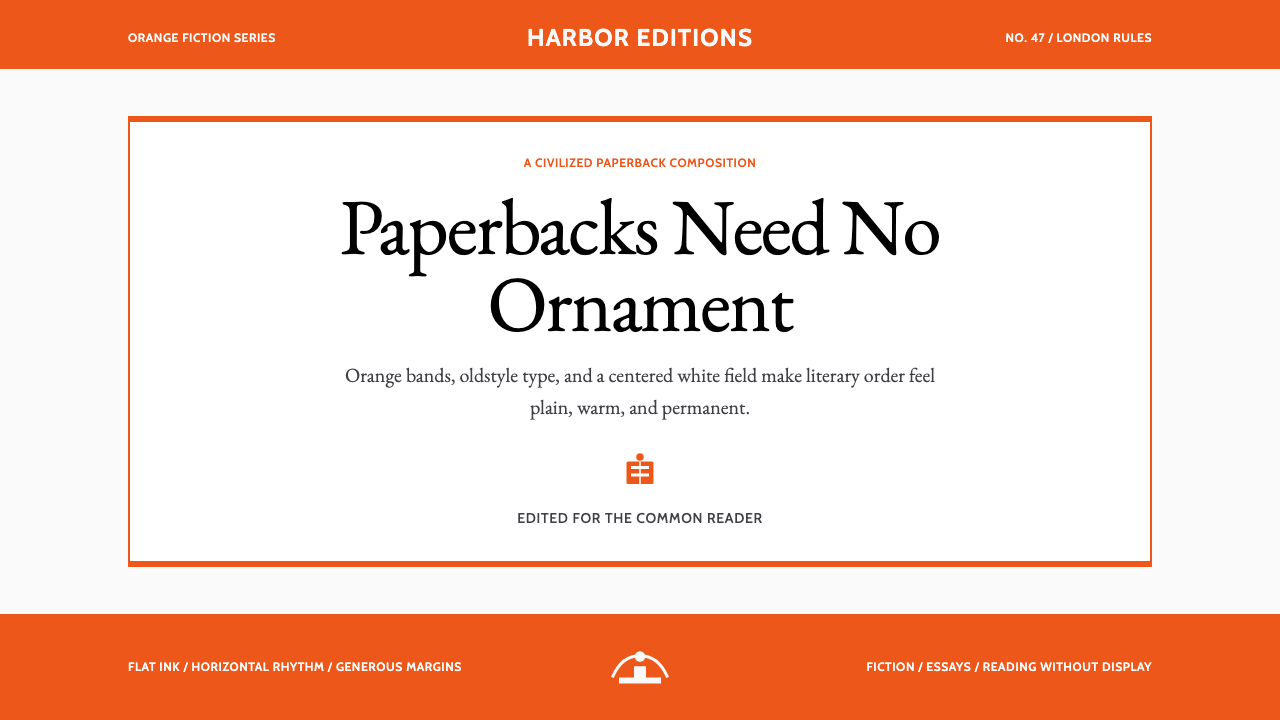
When Allen Lane founded Penguin Books in 1935, the decision to use Gill Sans across the now-famous three-color series covers — orange for general fiction, green for crime, blue for biography — created the most publicly visible sustained deployment of the typeface outside of signage and broadcasting. The Penguin system demonstrated that Gill Sans could anchor a highly systematic visual identity across thousands of titles while remaining legible, dignified, and recognizably consistent. This long association between the typeface and the world's most respected mass-market publishing imprint did more to cement Gill Sans's cultural authority in Britain than any single institutional adoption.艾伦·莱恩于1935年创立企鹅出版社时,决定在如今声名显赫的三色系列封面上全程使用 Gill Sans——橙色用于通俗小说,绿色用于犯罪小说,蓝色用于传记——由此在标识和广播领域之外,创造了这款字体在公众层面持续时间最长、能见度最高的大规模应用。企鹅系统证明,Gill Sans 能够在数千个书名中锚定一套高度系统化的视觉识别,同时保持易读、庄重和可辨认的一致性。这款字体与世界上最受尊敬的大众市场出版品牌之间的漫长关联,比任何单一机构的采用都更能巩固 Gill Sans 在英国的文化权威。
The BBC's sustained adoption of Gill Sans — formalized in its corporate identity work from the 1980s onward and revised but not abandoned through subsequent rebrands — represents the typeface's longest and most culturally significant institutional use. Because the BBC's visual identity appears on broadcasts viewed by millions daily, on the BBC website, on physical signage, and in print publications, Gill Sans gained a frequency of exposure that no other British institution could match. The effect has been to make the typeface a kind of ambient cultural reference: viewers who could not name the typeface nonetheless associate its visual quality with reliability, public service, and a particular kind of British institutional seriousness.BBC 对 Gill Sans 的持续采用——从1980年代起在企业形象建设中正式确立,并经历后续品牌更新但从未放弃——代表了这款字体使用时间最长、文化意义最深远的机构应用。由于 BBC 的视觉形象每日出现在数百万人观看的广播节目中,出现在 BBC 网站、实体标识以及印刷出版物上,Gill Sans 获得了其他任何英国机构都无法比肩的曝光频次。其效果是让这款字体成为一种弥漫性的文化参照物:即便叫不出字体名字的观众,也将其视觉品质与可靠性、公共服务精神,以及一种特定的英国机构严肃性联系在一起。
How do you use Gill Sans (BBC, 1928) today?今天怎么用 Gill Sans (BBC, 1928)?
The Gill Sans style is among the most transferable institutional aesthetics in contemporary design work, because its authority is earned rather than performed. Applying it well requires internalizing what the system is actually doing: using a humanist typeface with classical proportions to communicate reliability, using a warm ground to soften without weakening, and using accent color with the restraint of an editorial system rather than the exuberance of a brand campaign. The result should feel like something that has existed for a long time and does not need to announce itself.Gill Sans 风格是当代设计实践中可移植性最强的机构美学之一,因为它的权威是挣来的,而非表演出来的。正确应用它,需要内化这套系统实际上在做什么:用具有古典比例的人文主义字体传达可靠性,用温暖的底色在不削弱力量的前提下软化视觉,以及以编辑系统而非品牌推广的克制态度使用强调色。最终结果应该感觉像是一种已经存在了很长时间、无需自我宣示的东西。
For presentation slides, this system works with particular clarity on cover pages and structured content layouts. A cover page benefits from the straightforward approach: title in the largest type size the layout permits, set flush left or centered against a cream field, with a hairline rule and a small orange or blue element providing the only structural accent. The composition should feel unforced — no dramatic geometric overlaps, no heavy frames. Content slides are best treated as simple hierarchies: one clear heading, body text at a comfortable size, and any structural divisions indicated by hairline rules alone. Data slides take on a diagrammatic character when charts and figures are presented in the accent palette against cream grounds, with generous surrounding space.在演示文稿中,这套系统在封面页与结构化内容版面上表现尤为清晰。封面页适合采用直接的处理方式:标题以版面允许的最大字号,靠左对齐或居中置于奶油色底面上,配以一条发丝线和一个小面积橙色或蓝色元素作为唯一的结构性强调。构图应感觉自然——无戏剧性的几何叠压,无沉重的框架。内容页最好被当作简单的层级处理:一个清晰的标题,正文以舒适字号排版,任何结构性区隔仅以发丝线标示。数据页在将图表和数字以强调色调呈现于奶油底面、并配以宽裕四周空间时,呈现出清晰的示意图式性格。
For web interfaces, this style is well suited to dashboards, documentation pages, and pricing layouts where clarity and authority are the primary communication goals. The recommended approach is a clean grid with generous column gutters, a near-cream background for content areas, black for all body copy, and the accent colors reserved exclusively for interactive states, status indicators, or tier differentiation. Navigation should be typographic, relying on clear labeling and size contrast rather than iconographic decoration. Card components, where used, should have clean borders without soft drop shadows — the style's vocabulary is precise edges, not diffuse lighting effects.对于网页界面,这种风格尤其适合以清晰度和权威感为首要传播目标的仪表板、文档页面和定价版面。推荐的方法是:采用具有宽裕列间距的整洁网格,内容区域使用接近奶油色的背景,所有正文以黑色排版,强调色专门保留给交互状态、状态指示器或等级区分。导航应当是字体性的,依赖清晰的标签与字号对比,而非图标化装饰。卡片组件(如使用)应有整洁的边框,不加软投影——这种风格的词汇是精确的边缘,而非漫射的光照效果。
For editorial and marketing work, the style supports strong, uncluttered information hierarchy. An article or report layout works well with a moderately narrow text measure for body copy, a wider margin for pull quotes or annotation, and section breaks indicated by horizontal hairline rules rather than colored bands or ornamental dividers. Marketing pages can use the style's natural poster-like quality: alternating full-width content blocks between cream-on-black and black-on-cream, with orange or blue used consistently as a single call-to-action accent. The palette and typeface combination is particularly effective for content that needs to establish trust quickly — financial communications, institutional reports, public-service announcements — because the aesthetic carries its own credibility.对于编辑与营销内容,这种风格支持强劲而整洁的信息层级。文章或报告版面在正文采用适度窄行宽、较宽留白用于引用语或注释、章节分隔以水平发丝线而非彩色色带或装饰分割线标示时,效果最佳。营销页面可以利用这种风格自然的海报式品质:全宽内容区块在奶油底黑字与黑底奶油字之间交替,以橙色或蓝色作为唯一的行动号召强调色,始终一致地使用。这种调色板与字体的组合对于需要迅速建立信任的内容特别有效——金融通讯、机构报告、公共服务公告——因为这种美学本身就携带着可信度。
The most common mistake when applying this style is reaching for the accent colors too eagerly. Authentic institutional typography of this kind uses orange and blue sparingly — as signals, not decoration. When both accent colors appear simultaneously in significant quantities, the composition loses its composed character and begins to look like a branded consumer product rather than an institutional publication. A second common error is replacing the cream ground with stark white in the belief that this looks more modern; in practice, it eliminates the warmth that distinguishes this system from generic sans-serif minimalism and makes the typography appear colder and less inviting than the style intends.应用这种风格时最常见的错误,是过于急切地伸手使用强调色。这类真正的机构排印只会克制地使用橙色和蓝色——作为信号,而非装饰。当两种强调色以显著数量同时出现时,构图失去了其沉稳的性格,开始看起来像一个有品牌感的消费品,而非一份机构出版物。第二个常见错误是用纯白替代奶油底色,误以为这样看起来更现代;实际上,这消除了将这套系统与通用无衬线极简主义区别开来的温度,使排印显得比这种风格本意更冷漠、更不宜人。
See the Gill Sans (BBC, 1928) design system查看 Gill Sans (BBC, 1928) 完整设计系统
Gill Sans (BBC, 1928) — FAQGill Sans (BBC, 1928) · 常见问题
How is Gill Sans different from other humanist sans-serifs like Johnston or Optima?Gill Sans 与 Johnston 或 Optima 等其他人文主义无衬线字体有何不同?
Johnston Sans and Gill Sans share a common parent: Eric Gill learned letterform construction from Edward Johnston, and the two typefaces share underlying proportional logic derived from Roman inscriptions. Johnston is slightly wider and more openly spaced, and carries a stronger sense of calligraphic origin. Optima, designed by Hermann Zapf in the late 1950s, is a different tradition entirely — it has flared stroke terminals that give it a semi-serif quality, and its stroke modulation is more pronounced. Gill Sans sits between these poles: more refined than Johnston, less flared than Optima, and deliberately stripped of overt calligraphic detail while retaining the humanist proportion that makes it readable and warm.Johnston Sans 与 Gill Sans 有共同的源头:埃里克·吉尔从爱德华·约翰斯顿那里学习了字形构造,两款字体共享源自罗马碑刻的底层比例逻辑。Johnston 稍宽一些,字距更为开阔,带有更强的书法起源感。Optima 由赫尔曼·察普夫在1950年代末设计,属于完全不同的传统——它拥有向外张开的笔画末端,赋予其半衬线的品质,笔画调制也更为明显。Gill Sans 处于这两极之间:比 Johnston 更为精炼,比 Optima 更少张扬,并在保留使其易读而温暖的人文主义比例的同时,刻意去除了明显的书法细节。
Can this style work in a dark-background layout, or is cream ground essential?这种风格能用在深色背景版面上吗?还是奶油底色是不可或缺的?
The cream ground is not absolutely mandatory, but it is load-bearing: it is what distinguishes this style from cold, generic sans-serif minimalism and gives the palette its editorial warmth. A dark inversion is possible — black ground with cream or off-white type and single accent color — but it changes the character of the style significantly, shifting it from quietly authoritative to more dramatically emphatic. If a dark variant is needed, the approach that preserves the most of the original system's character is to use the deep blue as the ground rather than pure black, which retains a sense of depth without the severity of maximum contrast. Both accent colors active simultaneously on a dark ground is strongly inadvisable.奶油底色并非绝对不可缺少,但它承担着重要功能:正是它将这种风格与冷漠的通用无衬线极简主义区别开来,赋予调色板编辑式的温度。深色反转版本是可能的——黑底配奶油色或近白色字体及单一强调色——但它会显著改变风格的性格,从安静权威转向更具戏剧性的强调感。如果确实需要深色变体,最能保留原始系统性格的方法是以深蓝作为底色,而非纯黑——这保留了一种深度感,而不带最大对比度所产生的严峻感。在深色底面上同时激活两种强调色,是强烈不建议的做法。
How do I avoid the style looking stiff or old-fashioned?如何避免这种风格看起来僵硬或过时?
The risk of stiffness comes from over-applying the institutional seriousness without the corresponding elegance. Two practical correctives: first, ensure the layout breathes — generous margins and spacing are not optional details but core structural elements of the style, and cramped Gill Sans layouts read as merely old-fashioned rather than classically restrained. Second, keep accent color use genuinely sparse. When orange or blue appears too frequently, it signals effort rather than confidence, which undermines the effortless authority the style depends on. The style looks contemporary when it is used with real restraint and proportion; it looks dated when those proportions are pushed into fussiness.僵硬感的风险来自过度应用机构严肃性,而缺乏相应的优雅。两个实际的纠正方法:首先,确保版面能够呼吸——宽裕的留白与间距不是可选的细节,而是这种风格的核心结构性元素,局促的 Gill Sans 版面给人的感觉只是过时,而非古典式克制。其次,让强调色的使用真正稀少。当橙色或蓝色出现过于频繁时,它传递的是刻意努力而非自信,这会破坏这种风格所依赖的轻松权威感。当以真正的克制和比例使用时,这种风格看起来当代;当这些比例被推向繁琐时,它才显得陈旧。
Is this style appropriate for consumer-facing products, or is it better suited to institutional contexts?这种风格适合面向消费者的产品吗?还是更适合机构性语境?
The style is genuinely institutional in character and communicates best in contexts where trust, authority, and a sense of established reliability are the primary values. It is well suited for financial services, publishing, public-sector communications, educational platforms, and professional tools — any context where the user should feel they are in the hands of a capable, experienced institution rather than a brand seeking their enthusiasm. For consumer products that require warmth, playfulness, or cultural specificity — food, entertainment, lifestyle, youth-oriented applications — the style will typically feel too composed and will struggle to generate the approachability or emotional excitement those categories require. The litmus test is whether the product's values align with the typeface's established cultural associations: authority, seriousness, and quiet confidence.这种风格在性格上是真正机构性的,在信任、权威和已建立的可靠感是首要价值的语境中传播效果最好。它非常适合金融服务、出版、公共部门传播、教育平台和专业工具——任何应该让用户感觉自己置身于一家有能力、有经验的机构手中,而非一个寻求他们热情的品牌的语境。对于需要温暖感、趣味性或文化特殊性的消费品——食品、娱乐、生活方式、面向年轻人的应用——这种风格通常会显得过于沉稳,难以产生这些品类所需要的亲和力或情感兴奋感。检验标准是:产品的价值观是否与这款字体已建立的文化关联相契合——权威、严肃和安静的自信。
How should images and photography be handled within this style?在这种风格中,图像与摄影应当如何处理?
Photography in this system should be treated editorially rather than decoratively. The approach is close to that of classic British magazine and book publishing: images cropped tightly to their essential content, presented with clear borders or generous surrounding space, and never bleeding decoratively into the typography. Warm-toned or sepia-inflected photography sits most naturally within the cream-and-black palette; high-saturation or heavily color-graded imagery tends to disrupt the tonal consistency the style depends on. Where illustration is used, it should be linear and considered rather than filled and exuberant — fine-line diagrams, simple maps, or editorial spot illustrations in the accent palette sit well within the system. Decorative stock photography or complex image compositing is not native to this aesthetic.这套系统中的摄影应当以编辑而非装饰的方式处理。这种方法接近于经典英国杂志与书籍出版的做法:图像紧密裁切至其核心内容,以清晰的边框或宽裕的四周留白呈现,绝不装饰性地出血融入排版。暖调或带有棕褐色倾向的摄影最自然地融入奶油色与黑色调色板;高饱和度或经过大量调色的图像往往会破坏这种风格所依赖的色调一致性。当使用插图时,应当是线性的、经过推敲的,而非填色丰富的——细线图示、简单地图,或以强调色调制作的编辑点缀插图,都能自然融入这套系统。装饰性商业摄影或复杂的图像合成,不属于这种美学的原生词汇。
Related design styles相关设计风格
 Penguin Classics OrangePaperback authority. Orange tri-bands, serif title panel, and flat ink enforc…平装书的权威感:橙色三段、衬线标题与平面油墨建立克制秩序。
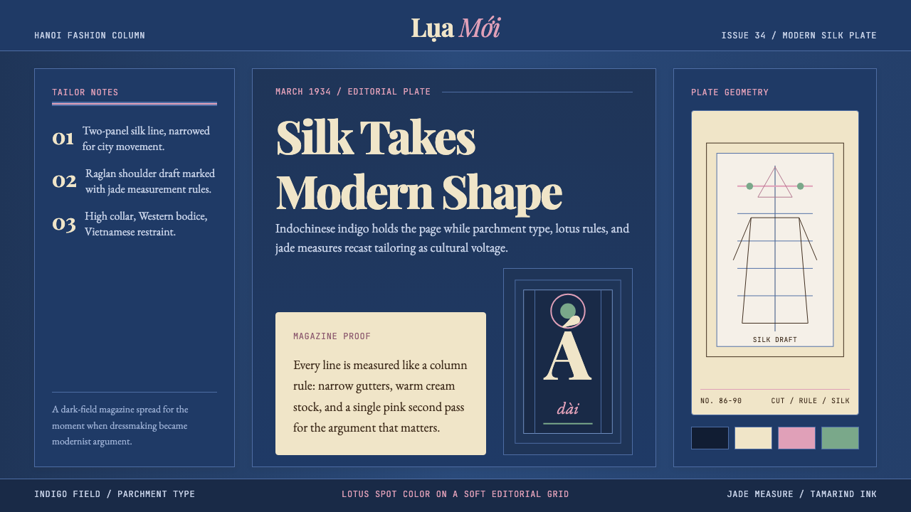 Vietnamese Áo Dài 1934 (Cát Tường)Indigo editorial poise. Parchment serif columns and lotus-pink rules frame th…靛蓝编辑气质。羊皮纸衬线栏与莲粉细线,框住1934服饰转折。
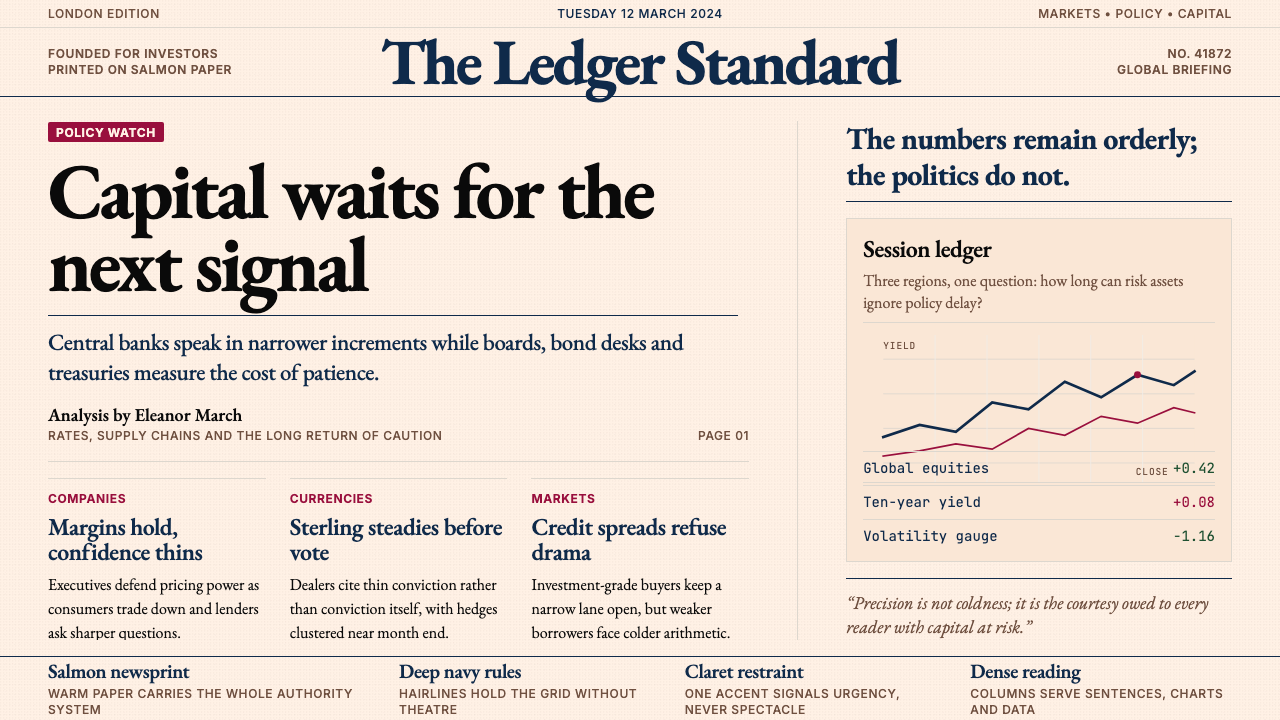 Financial Times (Pink Paper)Authority on salmon paper. Deep navy rules and claret accents discipline dens…三文鱼粉纸上的权威:深海军蓝细线与酒红点缀,约束密集衬线栏。
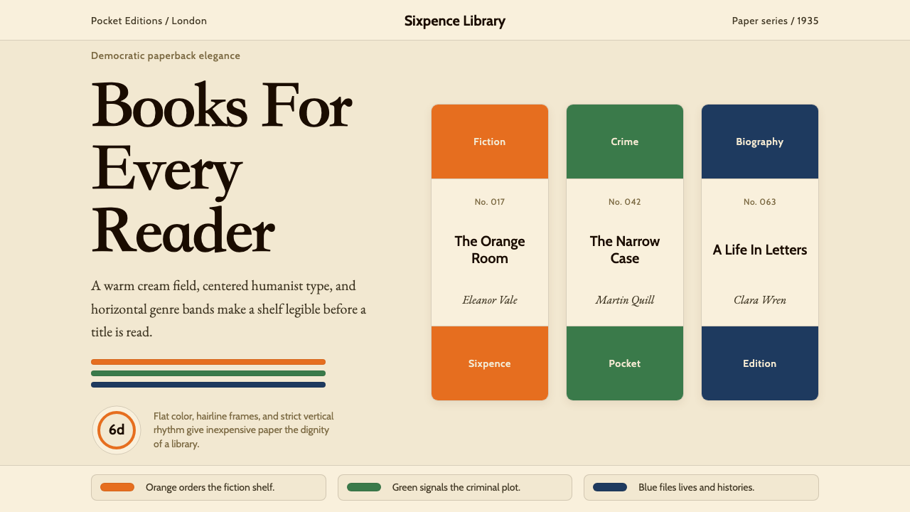 Penguin Books (1935)Paperback democracy. Cream stock, Cabin type, and orange-green-blue bands mak…平装书的民主美学:奶油纸、Cabin 字体与橙绿蓝横带让秩序成标识。
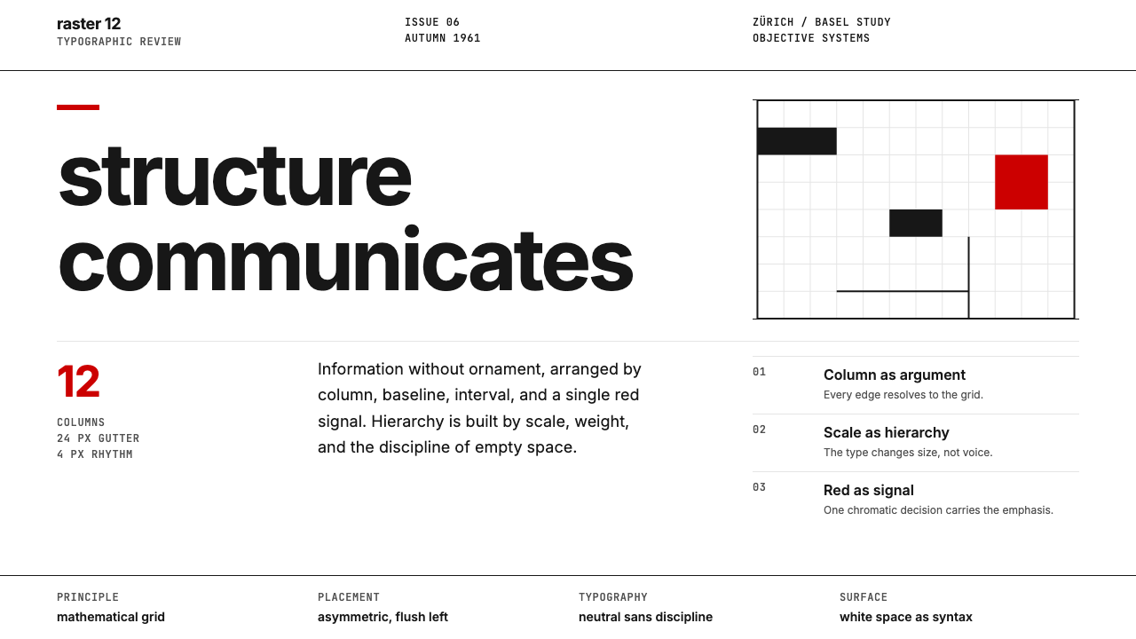 Swiss International StyleObjectivity made visible. Inter scale, white space, and one red block expose…客观性可见:Inter 尺度、留白与单一红块显露网格。
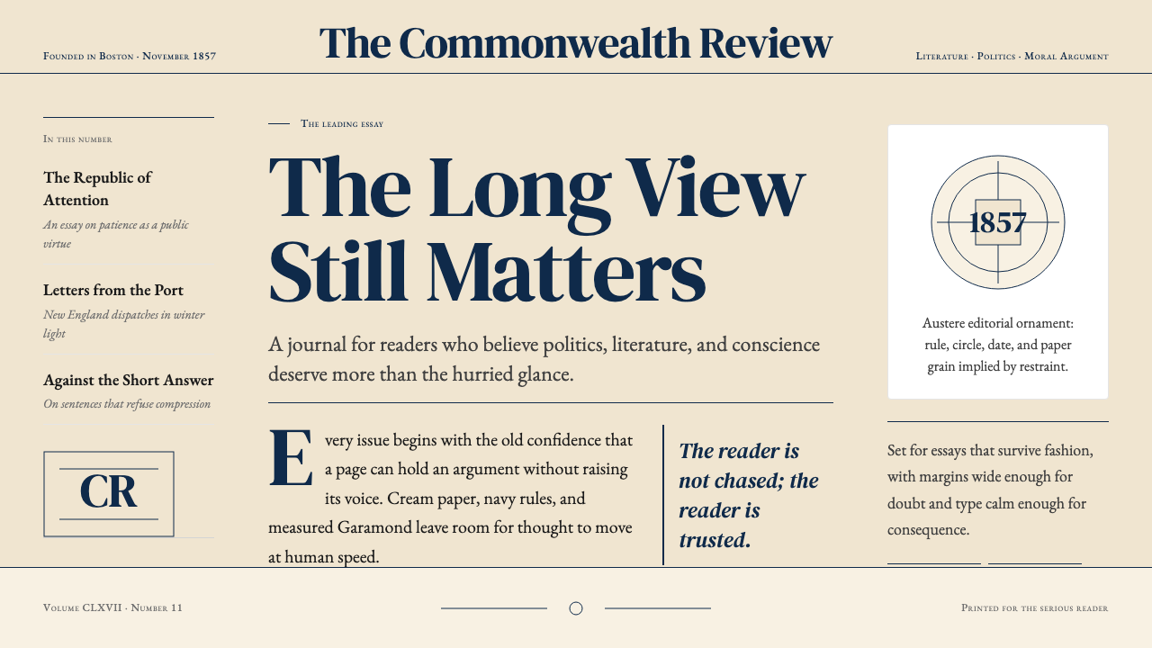 The Atlantic MonthlyAuthority slows down. Navy Garamond on warm cream, ruled like an essay page.权威主动放慢:米色纸底、海军蓝Garamond与细栏线。