What is The Atlantic Monthly?什么是 The Atlantic Monthly?
Deep navy, warm cream, and classical serifs — The Atlantic Monthly's visual restraint has been the face of American intellectual authority since 1857.深海军蓝、米色书纸与经典衬线体——《大西洋月刊》的视觉克制,自 1857 年起便是美国知识权威的面孔。
The Atlantic Monthly in briefThe Atlantic Monthly 速览
The Atlantic Monthly is America's longest-running literary-political journal, and its design language is one of the most recognizable in publishing: a cool, deep navy paired with warm cream paper stock, classical Garamond-style serifs setting long-form essays, generous margins, and hairline dividers that rule the page like the lines of a leather-bound ledger. The overall effect is one of measured intellectual authority — a visual system that does not try to seduce the reader into clicking but invites them to settle in and read.《大西洋月刊》是美国历史最悠久的文学与政论期刊,其设计语言在出版界具有高度辨识度:深沉海军蓝与温暖米色书纸的组合,经典 Garamond 风格衬线体承载长篇散文,宽裕的版心边距,以及像皮面账册横线般将页面划分有序的纤细栏线。整体效果传递出一种沉稳的知识权威感——这套视觉体系不试图诱惑读者点击,而是邀请他们安顿下来,认真阅读。
Unlike design movements born in art schools or manifestos, this aesthetic emerged from editorial practice: from the needs of a journal that has always published dense, serious, long-form writing and needed its pages to serve that writing rather than compete with it. The result is a design that trusts the reader. No saturated accent colors to signal urgency, no sans-serif boldness to project modernity — only a quiet insistence on the primacy of the sentence.与诞生于艺术学院或宣言的设计运动不同,这套美学源于编辑实践:源于一本始终刊发深刻、严肃的长篇写作的期刊的内在需要——它的版面服务于文字,而非与文字竞争。这套设计信任读者。没有高饱和强调色来制造紧迫感,没有无衬线字体来彰显现代感,只有一种对句子优先性的静默坚守。
The style has evolved across eras and ownership changes but has retained its essential commitments. Color is used with restraint and purpose, not as decoration. Type is set to be read, not scanned. Space is not empty — it is where the reader breathes between ideas. These commitments give the Atlantic aesthetic a timelessness that makes it feel equally at home in a nineteenth-century reading room and in a contemporary digital feature.这套风格历经时代更迭与所有权更替,但始终保持核心承诺。色彩的使用是克制而有目的的,而非装饰性的。字体的设定是为了阅读,而非扫视。留白不是空洞——那是读者在思想之间喘息的空间。这些承诺赋予了《大西洋》美学一种跨越时代的质感,使其在十九世纪的书房与当代数字长文中同样自然。
See the The Atlantic Monthly design system查看 The Atlantic Monthly 完整设计系统
Where does The Atlantic Monthly come from?The Atlantic Monthly 从何而来?
The Atlantic Monthly was founded in Boston in November 1857, at a literary dinner that brought together some of the most distinguished minds of New England: Ralph Waldo Emerson, Henry Wadsworth Longfellow, Oliver Wendell Holmes, and James Russell Lowell, who became the magazine's first editor. The founding group was not primarily concerned with design — they were concerned with ideas. But the visual form that the magazine took from its earliest issues reflected the typographic conventions of serious Boston publishing: classical Roman typefaces, well-leaded columns, and a dignified restraint that signaled the journal's intellectual seriousness to its readers.《大西洋月刊》于 1857 年 11 月创刊于波士顿,诞生于一场聚集了新英格兰最杰出智识人物的文学晚宴:爱默生、朗费罗、霍姆斯,以及成为杂志首任主编的詹姆斯·罗素·洛厄尔。创始群体最关心的不是设计,而是思想。但杂志从最早几期所呈现的视觉形态,已折射出波士顿严肃出版业的排印传统:古典罗马字体、行距宽松的文字列、以及一种向读者传递期刊知识分量的庄重克制。
Throughout the nineteenth century, the magazine published writers who defined American literary culture — Harriet Beecher Stowe, Mark Twain, Henry James, and Frederick Douglass among them. The design remained anchored in the traditions of letterpress typography: high-quality paper, generous margins, and type set with the patience that only hand-composition demanded. These were not aesthetic choices in a contemporary sense; they were the natural outcome of a craft tradition in which the printer and the editor shared a common understanding of what a serious publication looked like.整个十九世纪,杂志先后发表了定义美国文学文化的重要作家——斯托、马克·吐温、亨利·詹姆斯、弗雷德里克·道格拉斯等人。设计始终扎根于活字印刷的传统:高质量纸张、宽裕边距,以及只有手工排版才能带来的耐心字体设定。这些在当代意义上并非审美选择,而是一种工艺传统的自然结果——印刷工与编辑共享着对严肃出版物应当是何种面貌的共同理解。
The twentieth century brought successive redesigns as the magazine changed ownership and navigated the economic pressures of a mass-market publishing industry, but it consistently returned to its core visual vocabulary. The deep navy that became the signature cover color, the warm cream of the interior paper stock, and the classical serif that carried the body text all persisted through these evolutions as markers of editorial identity. By the time the Emerson Collective acquired the magazine in 2017 under Laurene Powell Jobs, the aesthetic had been distilled into something approaching a canonical form: austere, confident, and instantly legible as a journal that has outlived presidents.二十世纪,随着杂志数度易主并应对大众市场出版业的经济压力,设计经历了多次改版,但始终回归其核心视觉词汇。深海军蓝标志性封面色、温暖米色内页纸张、以及承载正文的古典衬线体,在这些演变中作为编辑身份的标记持续存在。到 2017 年劳伦·鲍威尔·乔布斯旗下的爱默生集体收购杂志时,这套美学已被提炼为接近典范的形态:素朴、自信,一眼即可辨认为一本比无数届总统存活更久的期刊。
The contemporary visual identity, which took shape most fully in the period around 2020 to 2024, reflects both the magazine's historical inheritance and the demands of digital publishing. The navy and cream palette translates naturally to screen, where it reads as cool and authoritative against the bright, saturated competition of the social feed. The Garamond-influenced serif typeface, with its long ascenders and classical proportions, performs the same function online that it did in print: it tells the reader that what follows is worth slowing down for. The hairline rules and generous white space, once necessitated by the physical constraints of the printed column, now serve as deliberate signals of restraint in a media environment that rewards density and noise.当代视觉识别体系——在 2020 年至 2024 年前后最终成形——既继承了杂志的历史遗产,也回应了数字出版的需求。海军蓝与米色的色板在屏幕上自然过渡,在社交媒体信息流的鲜艳饱和竞争中呈现出冷静权威的气质。受 Garamond 影响的衬线字体,以其修长上伸笔和古典比例,在线上履行着与印刷时代同样的功能:它告诉读者,接下来的内容值得放慢脚步。纤细栏线与充裕留白,昔日是印刷版面物理约束的产物,如今在一个奖励密度与喧嚣的媒体环境中,成为刻意传递克制的符号。
What defines the The Atlantic Monthly look?The Atlantic Monthly 的视觉特征是什么?
Color Palette色彩体系
The Atlantic palette is built on a dialogue between two anchors: a deep, authoritative navy that carries covers and primary accents, and a warm cream that serves as the ground for interior pages and digital backgrounds. Against these two, black carries all body type and structural rules. The navy reads as institutional and serious — closer to the blue of a banker's binding than the blue of a corporate brand — while the cream prevents the palette from feeling clinical or cold. Accent colors appear rarely, and when they do, they are desaturated and warm rather than bright and assertive.《大西洋》的色板建立在两个锚点的对话之上:深沉权威的海军蓝承载封面与主要强调色,温暖米色作为内页与数字背景的底色。在此之上,黑色承载所有正文与结构线条。海军蓝传递出一种机构性的严肃感——更接近银行精装本的蓝,而非企业品牌的蓝——而米色则防止整套色板流于冷漠或临床感。强调色极少出现,一旦出现也是去饱和的暖调,而非明亮张扬的色彩。
Typography字体排印
Classical serif letterforms in the Garamond tradition are the typographic backbone of the Atlantic aesthetic. These typefaces are chosen for their long history of use in scholarly and literary publishing, their legibility in long-form reading, and their unmistakable association with a certain quality of intellectual attention. Headlines are set in the same serif family as body text, distinguished by scale and weight rather than by switching to a contrasting face. The result is a typography that feels continuous and composed — every word on the page coming from the same considered source.Garamond 传统的古典衬线字形是《大西洋》美学的排印骨架。这类字体被选用,因为其在学术与文学出版领域的悠久历史、在长篇阅读中的出色可读性,以及与某种知识专注品质的不可混淆的关联。标题与正文使用同一衬线字体家族,以字号和字重区分,而非切换至形成对比的字体。结果是一套连贯而沉着的排印体系——页面上每一个词汇都来自同一个深思熟虑的来源。
Space and Measure版心与空白
Generosity with white space is a defining commitment of the Atlantic aesthetic. Margins are wide enough to breathe, columns are set at a measure that supports comfortable long-form reading, and section breaks are given room to register rather than being crammed into the flow of text. This approach signals — deliberately — that the reader is not being rushed. The space is not decorative; it is structural, holding the text in a frame that slows reading to a pace at which ideas can be absorbed rather than merely processed.对留白的慷慨是《大西洋》美学的定义性承诺。边距足够宽裕以供呼吸,文字列的行宽设定支持舒适的长篇阅读,段落分隔有足够空间显现,而非被硬塞进文字流中。这种处理方式刻意传递出一个信号:读者不必被催促。空白不是装饰性的,而是结构性的,它将文字托举在一个框架之中,将阅读速度放慢至思想得以被吸收而非仅仅被处理的节奏。
Hairline Rules and Dividers纤细栏线与分隔
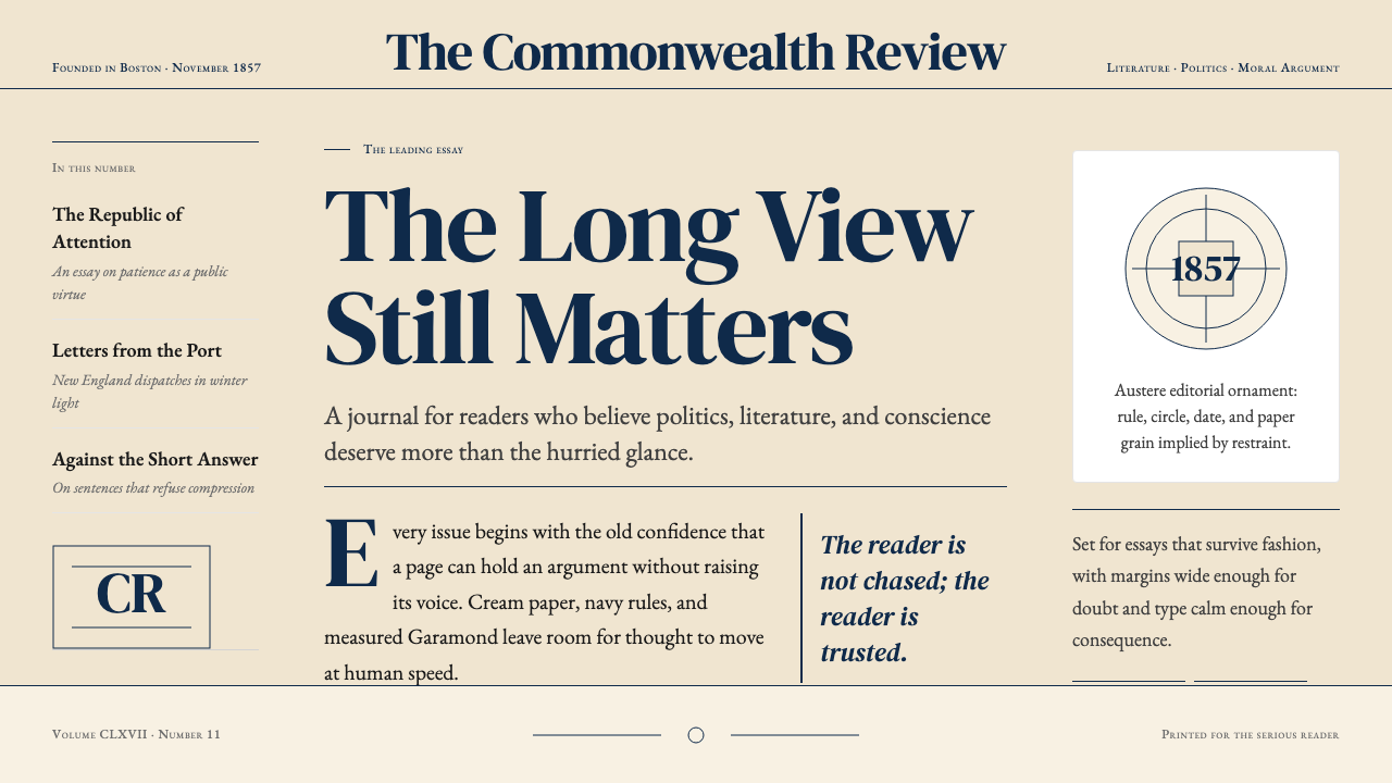
Thin horizontal rules — the typographic equivalent of a quiet clearing of the throat — are used throughout the Atlantic design to organize content without asserting hierarchy loudly. These dividers are fine enough to feel structural rather than decorative, marking the boundary between a headline and a deck, between a pull quote and surrounding text, or between sections within a long feature. They carry the logic of the ruled essay page: a gentle insistence on order that never competes with the content they organize.纤细水平线——排印领域相当于轻声清喉的动作——贯穿《大西洋》设计,在不大声主张层级的前提下组织内容。这些分隔线细到足以让人感受到结构性而非装饰性,标记出标题与副题之间、引用块与周围文字之间、或长篇报道各段落之间的边界。它们承载着有横线散文纸的逻辑:对秩序的温和坚持,从不与它所组织的内容争夺注意力。
Illustrative Restraint插图的克制
Photography in the Atlantic tradition is used to illuminate, not to lure. Images are typically chosen for their compositional seriousness and their relevance to the argument of the text, not for visual excitement or emotional manipulation. Portrait photography favors direct, unguarded compositions; documentary photography is presented without decorative cropping or filter treatments. When illustration is used, it tends toward the classical and the figurative — editorial drawings with line and wash that complement a literary tradition rather than competing with its seriousness.《大西洋》传统中的摄影是为了阐明,而非诱惑。图片的选择通常以构图的严肃性及其与文章论证的相关性为标准,而非视觉刺激或情绪操纵。人像摄影倾向直接、不加修饰的构图;纪实摄影不做装饰性裁切或滤镜处理。使用插图时,倾向于古典与具象——以线条与渲染绘制的编辑配图,与文学传统互补,而非与其严肃性竞争。
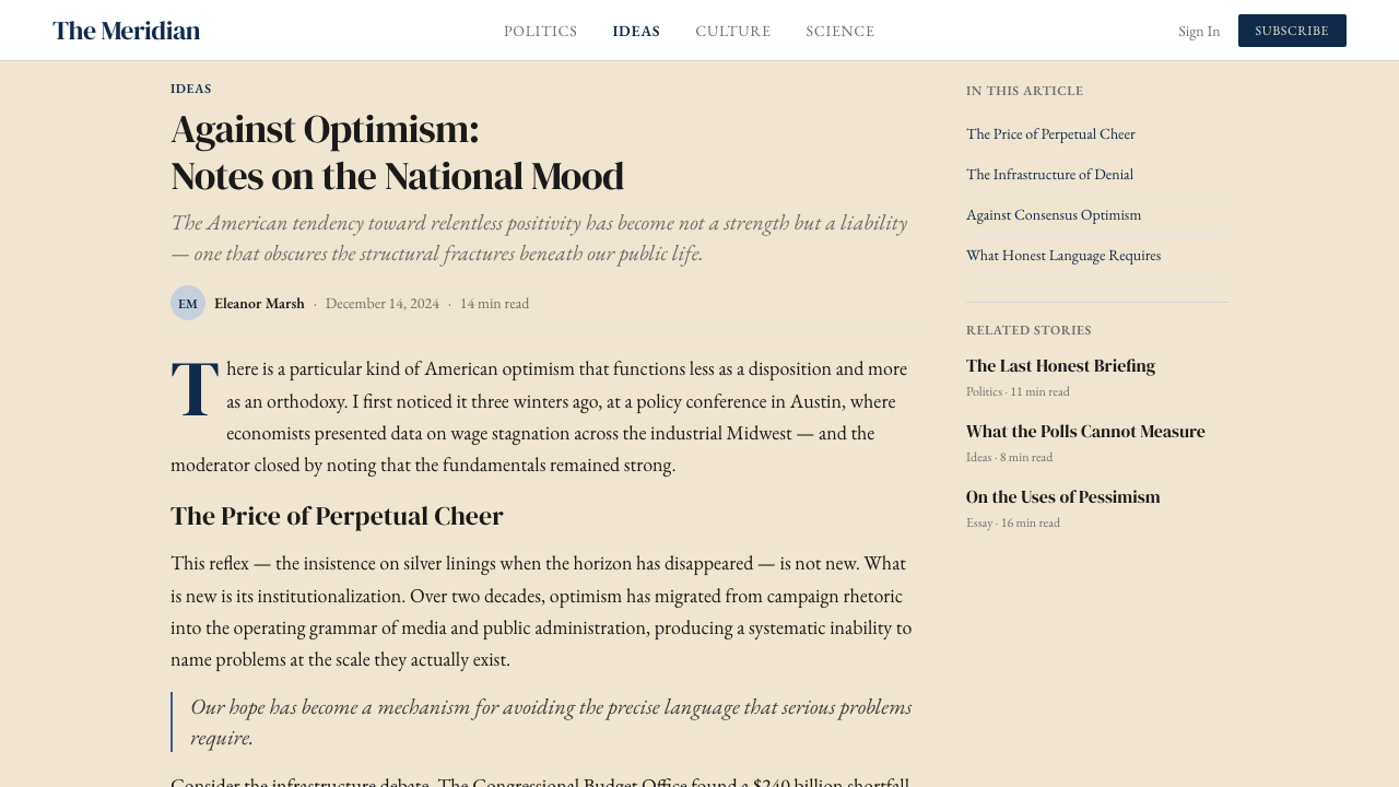
Editorial Hierarchy编辑层级
The Atlantic design supports a clear but understated hierarchy: the headline states the subject, the deck qualifies or complicates it, the byline credits the authority, and the body text makes the argument. Each level is visually distinct through size, weight, and sometimes color, but the distinctions never feel aggressive. The hierarchy is legible to anyone who has read a serious magazine — it does not need to be decoded. This is design in service of editorial logic, not design as a performance of itself.《大西洋》的设计支撑着一套清晰而低调的层级体系:标题陈述主题,副题限定或深化主题,署名赋予权威,正文展开论证。各层级通过字号、字重,有时辅以色彩加以区分,但这些区分从不显得咄咄逼人。层级对任何有严肃杂志阅读经验的人都清晰可读——无需解码。这是为编辑逻辑服务的设计,而非以自身为表演对象的设计。
Tonal Register调性基调
The Atlantic aesthetic is austere without being cold, authoritative without being aggressive, classical without being archaic. This tonal balance is achieved through the warmth of the cream ground, the humanist qualities of the serif letterforms, and a consistency of treatment that never surprises the reader with an unexpected visual gesture. Everything on the page feels considered and intentional. The experience of reading The Atlantic — whether in print or on screen — is designed to feel like consulting a trusted, senior source rather than consuming a product.《大西洋》的美学素朴而不冷漠,权威而不咄咄逼人,古典而不陈腐。这种调性平衡通过米色底的温暖感、衬线字形的人文主义气质,以及从不以意外视觉动作惊扰读者的一致性处理得以实现。页面上的每一个元素都令人感受到深思熟虑与刻意为之。阅读《大西洋》的体验——无论是纸质版还是数字版——在设计上感觉像是在请教一位可信赖的资深来源,而非消费一件产品。
See the The Atlantic Monthly design system查看 The Atlantic Monthly 完整设计系统
Who shaped The Atlantic Monthly?谁塑造了 The Atlantic Monthly?
Lowell served as the founding editor of The Atlantic Monthly from 1857 to 1861, setting the editorial and visual standards that would define the magazine for generations. A poet, critic, and Harvard professor, he understood the magazine as a vehicle for serious literary and political thought, and his editorial decisions shaped the tone — measured, authoritative, unhurried — that the visual design would come to embody. Under Lowell, the Atlantic established its identity as a journal that could be trusted precisely because it never pandered.洛厄尔担任《大西洋月刊》创刊主编,自 1857 年至 1861 年,奠定了影响杂志数代的编辑与视觉标准。身为诗人、评论家与哈佛教授,他将杂志视为严肃文学与政治思想的载体,他的编辑决策塑造了那种沉稳、权威、从容的基调——而这正是视觉设计最终将具体呈现的气质。在洛厄尔主导下,《大西洋》建立了一个可被信赖的期刊身份,恰恰因为它从不迎合。
Emerson was among the founding circle of The Atlantic Monthly and a regular contributor throughout the magazine's early decades. His philosophical influence — the primacy of individual thought, the moral seriousness of the examined life, the trust in the reader's intelligence — pervades the editorial sensibility that the Atlantic design came to express. The magazine's visual restraint can be read as a kind of Emersonian refusal: if the ideas are strong enough, they do not need decorative assistance.爱默生是《大西洋月刊》创刊圈的核心成员,在杂志早期数十年间持续供稿。他的哲学影响——个体思想的优先性、经过省察之生命的道德严肃性、对读者智识的信任——渗透于《大西洋》设计所表达的编辑气质之中。杂志的视觉克制可以被读作一种爱默生式的拒绝:如果思想足够有力,它不需要装饰性的辅助。
Holmes, the physician, poet, and essayist who coined the term 'Boston Brahmin,' was one of the most prominent voices in the Atlantic's early years and is credited with naming the magazine at its founding dinner. His presence among the founders established the journal's connection to a Boston intellectual tradition that prized clarity, wit, and the well-constructed sentence above all else. The Atlantic's typographic emphasis on readability and its commitment to long-form prose both reflect this founding literary ethic.霍姆斯——医生、诗人与散文家,创造了「波士顿婆罗门」一词——是《大西洋》早期最重要的声音之一,并被认为是在创刊晚宴上为杂志命名的人。他在创始群体中的存在,确立了期刊与波士顿知识传统的连接——这一传统将清晰、机智与精心构建的句子视为最高价值。《大西洋》在排印上对可读性的强调,以及对长篇散文的承诺,都映射着这种创刊文学伦理。
Goldberg became editor-in-chief of The Atlantic in 2016, presiding over the magazine's most consequential digital transformation and the period in which its current visual identity was consolidated. Under his editorial leadership, the magazine expanded its digital presence while maintaining the visual and editorial standards that distinguished it from the faster, lighter media of the social web. The contemporary Atlantic aesthetic — the navy and cream digital palette, the serif-forward typographic system, the commitment to long-form feature design — took its current form during his tenure.戈德堡于 2016 年出任《大西洋》总编辑,主持了杂志最具决定性意义的数字转型,以及当代视觉识别最终确立的时期。在他的编辑主导下,杂志扩展了数字业务,同时维持着使其有别于社交网络快速轻量媒体的视觉与编辑标准。当代《大西洋》美学——数字界面的海军蓝与米色色板、以衬线体为主导的排印体系、对长篇报道设计的承诺——在其任期内形成了当前的面貌。
The Emerson Collective's acquisition of The Atlantic in 2017 provided the financial stability that allowed the magazine to invest in its design identity rather than compromise it under commercial pressure. Under Emerson Collective ownership, the Atlantic redesigned its digital platform, refined its visual system, and expanded its editorial ambitions — all while holding to the aesthetic commitments that had defined it for over a century. The ownership transition represents the most recent chapter in a long history of the magazine's visual identity being shaped by editorial values rather than market trends.爱默生集体于 2017 年收购《大西洋》,提供了财务稳定性,使杂志得以投资其设计身份,而非在商业压力下妥协。在爱默生集体的所有权下,《大西洋》重新设计了数字平台,精炼了视觉体系,扩展了编辑抱负——同时坚守着定义自身逾百年的美学承诺。这次所有权更迭代表了杂志视觉身份由编辑价值而非市场趋势所塑造的悠久历史中最近的一章。
How do you use The Atlantic Monthly today?今天怎么用 The Atlantic Monthly?
The Atlantic Monthly aesthetic is among the most directly transferable editorial styles to contemporary design work precisely because it is not built on novelty. Its visual commitments — classical serifs, a restrained navy-and-cream palette, generous space, and hairline rules — translate across media because they are rooted in the functional demands of long-form reading rather than in a particular decade's taste. Applying this style correctly requires understanding what it is actually doing: signaling authority through restraint, building trust through consistency, and slowing the reader down through space.《大西洋月刊》的美学是当代设计实践中可移植性最强的编辑风格之一,恰恰因为它并非建立在新奇性上。其视觉承诺——古典衬线体、克制的海军蓝与米色色板、充裕的空间与纤细栏线——能够跨媒介迁移,因为它们根植于长篇阅读的功能性需求,而非某一特定年代的品味。正确应用这套风格,需要理解它实际上在做什么:通过克制传递权威,通过一致性建立信任,通过空间放慢读者的节奏。
For presentation slides, the Atlantic aesthetic works best when the goal is to be taken seriously rather than to dazzle. Cover slides benefit from the palette's natural formality: a deep navy field with cream type and a thin horizontal rule produces a cover that reads as authoritative without resorting to visual aggression. Content slides should be treated as essay pages — wide margins, a single column of text set in a classical serif, and section breaks marked by hairline rules rather than decorative motifs. Data slides can carry the same typographic system, with charts and tables inheriting the navy-and-cream palette and relying on weight and scale rather than multiple colors to convey hierarchy.对于演示文稿,《大西洋》美学在目标是被认真对待而非令人目眩时效果最佳。封面页受益于色板天然的正式感:深海军蓝底面上的米色文字与一条细水平线,产生出一种无需诉诸视觉攻击性便显得权威的封面。内容页应被当作散文页面处理——宽裕边距,一列以古典衬线体排印的文字,以纤细栏线而非装饰母题标记段落分隔。数据页可以沿用同一排印体系,图表继承海军蓝与米色色板,依靠字重和尺度而非多种颜色来传递层级。
For web interfaces and dashboards, the style is particularly well suited to contexts where trust and credibility are the primary values to communicate — financial services, research platforms, institutional publications, or any product positioning itself as thoughtful and authoritative. The approach: set body text in a humanist serif that recalls the Garamond tradition, maintain a warm off-white background throughout, reserve the deep navy for primary navigation, headers, and key interactive elements, and use black for all body content. Component borders should be fine rather than heavy; spacing should feel deliberate and open rather than tight. Pricing pages and feature comparisons benefit from the style's clarity — the hierarchy does the work that flashy visuals often obscure.对于网页界面与仪表板,这套风格尤其适合以信任与公信力为主要传递价值的场景——金融服务、研究平台、机构出版物,或任何将自身定位为深思熟虑且权威的产品。方法如下:以一种唤起 Garamond 传统的人文主义衬线体设置正文,全程保持温暖的近白色背景,将深海军蓝保留给主导航、标题与关键交互元素,用黑色承载所有正文内容。组件边框应细而非粗,间距应显得刻意而开阔,而非紧凑。定价页面与功能对比页面受益于这套风格的清晰度——层级完成了华丽视觉往往遮蔽的工作。
For editorial and marketing work, the Atlantic aesthetic supports long-form content above all else. An article or report designed in this style uses a narrow, comfortable measure for body text, a wider margin for pull quotes and annotations, and a typographic scale that distinguishes headline from deck from body without relying on weight contrast alone. Marketing materials can borrow the style's poster-like formal quality: full-width blocks alternating navy-on-cream and cream-on-navy, with body copy set in the same serif and calls to action handled through type alone — never through buttons shaped like visual novelties. The overall impression should be that of a serious institution communicating confidently, not a brand trying to attract attention.对于编辑与营销内容,《大西洋》美学最支持长篇写作。以这种风格设计的文章或报告,为正文使用舒适的窄行宽,为引用语和注释保留更宽的边距,排印比例在标题、副题和正文之间建立区分,而不仅依赖字重对比。营销材料可以借用这套风格的海报式正式感:全宽区块在深蓝底米字与米底深蓝字之间交替,正文使用同一衬线体,行动号召仅通过文字处理——而非形状新奇的按钮。整体印象应当是一家严肃机构在自信地沟通,而非一个品牌试图吸引注意力。
A common mistake when applying this aesthetic is over-darkening or over-saturating the navy, which tips the palette from authoritative to oppressive, or using an overly bright white instead of a warm cream, which strips the warmth from the system and makes it feel clinical. A second mistake is mixing the classical serif of the body with a contrasting display typeface for headlines — this breaks the tonal unity of the system. The Atlantic aesthetic earns its authority through consistency: every typographic decision should feel as if it came from the same considered editorial sensibility, not from a desire to make each section feel distinct.应用这套美学时最常见的错误,是将海军蓝调得过深或过于饱和——这会将色板从权威感推向压迫感——或是用过于明亮的纯白代替温暖的米色,从而剥夺整套系统的温度,使其流于冷漠。第二个错误是将正文的古典衬线体与标题的对比展示字体混用——这打破了系统的调性统一。《大西洋》美学的权威感来自一致性:每一个排印决策都应感觉出自同一个深思熟虑的编辑感知,而非出自想让每个部分各显特色的欲望。
See the The Atlantic Monthly design system查看 The Atlantic Monthly 完整设计系统
The Atlantic Monthly — FAQThe Atlantic Monthly · 常见问题
How does The Atlantic Monthly style differ from other editorial design traditions?《大西洋月刊》风格与其他编辑设计传统有何不同?
The Atlantic aesthetic is most usefully distinguished from the two editorial traditions it is most often compared to: The New Yorker and the Swiss International Style. The New Yorker shares the commitment to classical serifs and long-form reading, but its palette is cooler and more neutral, its illustration tradition is richer and more whimsical, and its overall register is more literary and less institutional. The Swiss International Style shares the commitment to grid and typographic clarity, but is far more geometric, uses sans-serif type exclusively, and replaces the Atlantic's warmth with a more clinical precision. The Atlantic occupies a middle position: warmer than Swiss, more institutional than The New Yorker, and uniquely anchored in a specifically American literary-political tradition.《大西洋》美学最有价值的区分,是与它最常被比较的两个编辑传统:《纽约客》与瑞士国际主义风格。《纽约客》同样致力于古典衬线体与长篇阅读,但色板更冷调、更中性,插图传统更丰富、更富奇趣,整体基调更文学性、较少机构感。瑞士国际主义风格同样致力于网格与排印清晰度,但几何感更强,完全使用无衬线字体,以更临床式的精确取代了《大西洋》的温度。《大西洋》居于中间位置:比瑞士风格更温暖,比《纽约客》更具机构感,并独特地扎根于一种特定的美国文学—政治传统。
Can this aesthetic work for digital-first products, or is it inherently print-oriented?这套美学能适用于数字优先的产品吗,还是它本质上是印刷导向的?
The Atlantic itself is the best evidence that this aesthetic translates well to digital contexts. The navy-and-cream palette performs excellently on screen, where the warm cream background reduces eye fatigue in long-form reading and the deep navy provides strong contrast without the harshness of pure black on white. Classical serifs, once thought to be a print-only choice, have become increasingly legible on high-resolution screens, and the editorial hierarchy of the Atlantic system — headline, deck, byline, body — maps naturally to the structural conventions of web content. The main adaptation required for digital is attention to line length and leading, which need to be calibrated for screen reading rather than the physical constraints of a printed column.《大西洋》本身就是这套美学能良好迁移至数字语境的最佳证明。海军蓝与米色色板在屏幕上表现出色,温暖的米色背景在长篇阅读中减少眼睛疲劳,深海军蓝提供强烈对比而不似纯黑在白底上般刺眼。古典衬线体,曾被认为是仅适于印刷的选择,在高分辨率屏幕上已日益可读,《大西洋》体系的编辑层级——标题、副题、署名、正文——也自然映射至网页内容的结构惯例。数字化所需的主要调整是对行长与行距的关注,需针对屏幕阅读而非印刷版面的物理约束重新校准。
Is the Atlantic aesthetic suitable for non-English or non-Western content?《大西洋》美学适合非英语或非西方内容吗?
The classical serif forms at the heart of the Atlantic aesthetic are rooted in the Latin typographic tradition, which means they apply most naturally to content in Latin-script languages. However, the broader design principles — the restrained palette, the commitment to generous space, the hierarchy that serves reading rather than spectacle, the tonal register of quiet authority — are culturally translatable. In Chinese, Japanese, Korean, or other non-Latin typographic contexts, the approach can be adapted by choosing typefaces that carry equivalent associations of classical authority in their own traditions and by maintaining the same spatial and hierarchical commitments. The palette translates without adjustment.《大西洋》美学核心的古典衬线字形植根于拉丁排印传统,这意味着它最自然地适用于拉丁字母语言的内容。然而,更广泛的设计原则——克制的色板、对充裕空间的承诺、服务于阅读而非奇观的层级体系、静默权威的调性基调——在文化上是可迁移的。在中文、日文、韩文或其他非拉丁排印语境中,可以通过选择在各自传统中承载等效古典权威联想的字体、并保持同样的空间与层级承诺来进行调适。色板则无需调整即可直接迁移。
What types of products or brands should avoid this aesthetic?哪些类型的产品或品牌应当避免使用这套美学?
The Atlantic aesthetic is poorly suited to contexts that depend on warmth, sensory richness, spontaneity, or youth appeal. Consumer brands in food, fashion, wellness, or entertainment will find the style's institutional formality works against the emotional accessibility their products require. Startups and challenger brands looking to signal disruption or energy will find the aesthetic too establishment — it reads as authority earned over time, not authority claimed in the moment. Children's products, social applications, gaming interfaces, and any design context where playfulness or community are primary values will also find the style too severe. The style's power is inseparable from its austerity; any attempt to warm it up significantly will dissolve the qualities that make it useful.《大西洋》美学不适合依赖温暖感、感官丰富性、自发性或年轻吸引力的场景。食品、时尚、健康或娱乐领域的消费者品牌会发现,这套风格的机构性正式感有悖于其产品所需的情感亲近性。寻求传递颠覆性或活力的初创品牌与挑战者品牌会发现这套美学过于建制——它传递的是历经时间积累的权威,而非即时宣示的权威。儿童产品、社交应用、游戏界面,以及任何以趣味性或社群感为主要价值的设计语境,也会发现这套风格过于严肃。这套风格的力量与其素朴性不可分割;任何试图将其显著暖化的努力都会消解使其有用的那些品质。
How should imagery be selected and treated within this aesthetic?在这套美学框架下,应如何选择和处理图像?
Imagery in the Atlantic tradition is selected for intellectual seriousness rather than visual impact. Portrait photography should feel unguarded and direct — the subject is engaged with ideas, not posed for the camera. Documentary and reportorial photography should be presented without decorative cropping or processing, allowing the subject to carry the weight rather than the treatment. When illustration is used, it should complement the literary tradition: classical line work, editorial drawing, or figurative imagery handled with restraint. What to avoid: stock photographs with obvious staging, highly processed or filtered imagery, photography chosen primarily for emotional manipulation, and any illustration style that reads as playful or decorative rather than thoughtful and considered.《大西洋》传统中的图像选择以知识严肃性而非视觉冲击力为标准。人像摄影应感觉自然不做作且直接——被摄者沉浸于思想之中,而非为镜头摆姿势。纪实与报道摄影应在不做装饰性裁切或处理的情况下呈现,让主题而非处理手法承载分量。使用插图时,应与文学传统相契合:古典线条、编辑绘画,或以克制手法处理的具象图像。应当避免的是:摆拍痕迹明显的库存照片、经过大量处理或加滤镜的图像、主要以情绪操纵为目的选取的摄影,以及任何读来显得俏皮或装饰性而非深思熟虑的插图风格。
Related design styles相关设计风格
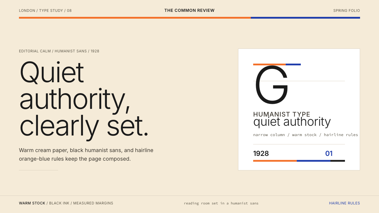 Gill Sans (BBC, 1928)Quiet authority, clearly set. Warm cream, black humanist sans, and hairline o…安静而权威。奶油底、黑色人文无衬线与橙蓝细线。
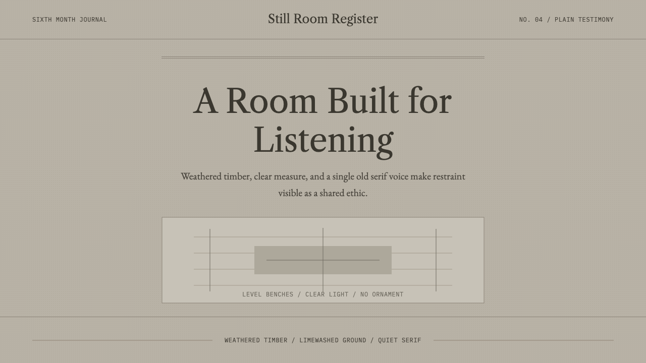 Quaker Plain StyleSilence made visible. Timber gray, Caslon serif, and bench-rule spacing leave…让静默可见:木灰色、卡斯隆衬线与长凳横线,只留下用途。
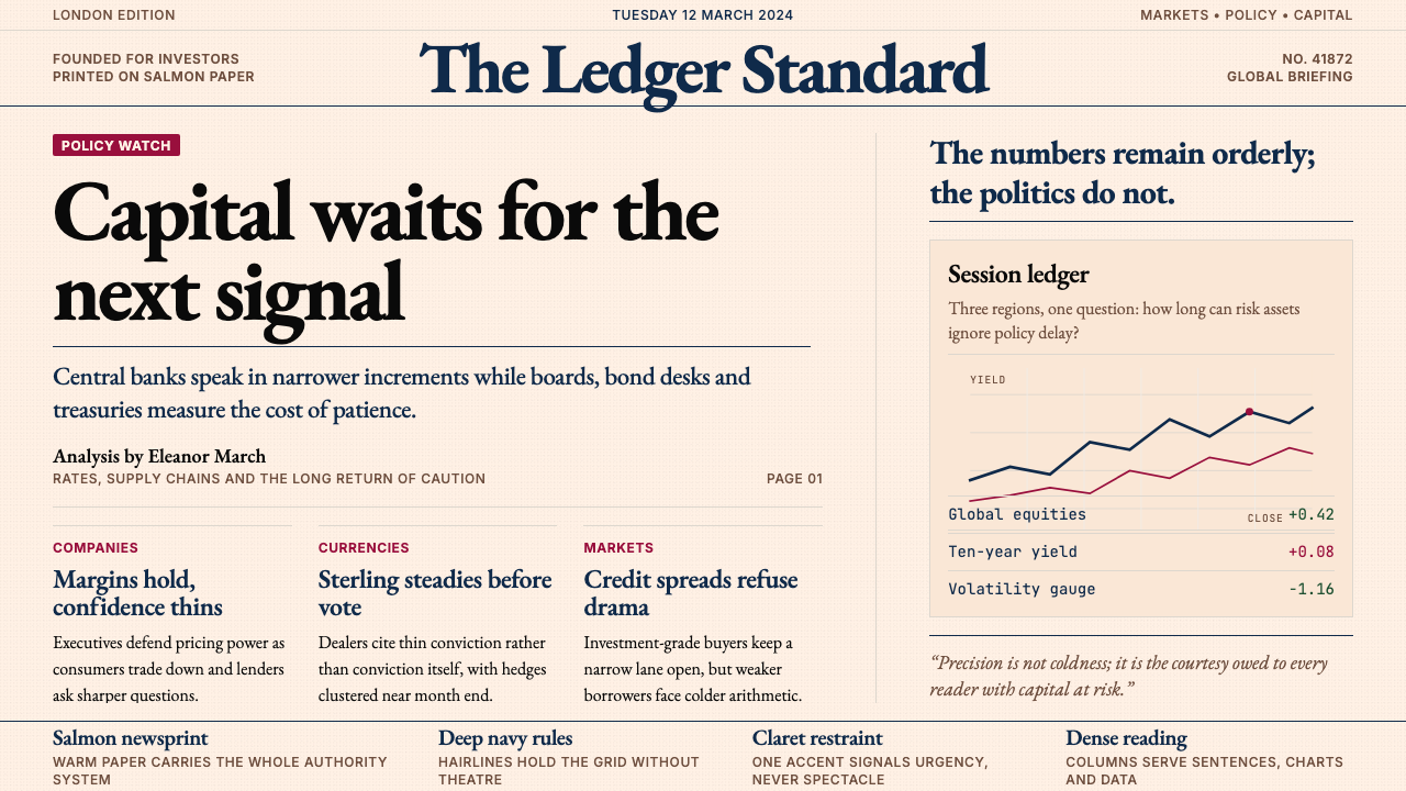 Financial Times (Pink Paper)Authority on salmon paper. Deep navy rules and claret accents discipline dens…三文鱼粉纸上的权威:深海军蓝细线与酒红点缀,约束密集衬线栏。
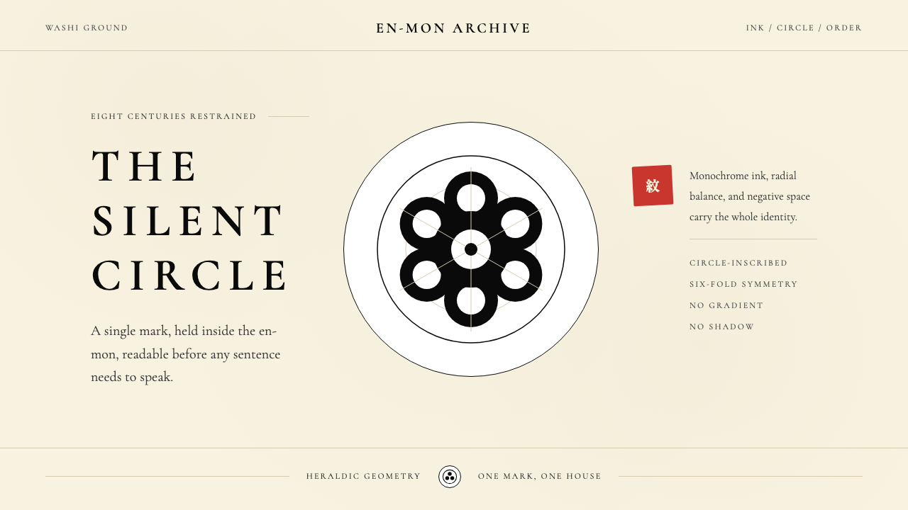 Japanese Mon (Family Crest)Authority in one circle. Sumi ink on washi cream, radial symmetry doing all t…一圆即权威。和纸米底与墨黑放射对称,让留白发声。
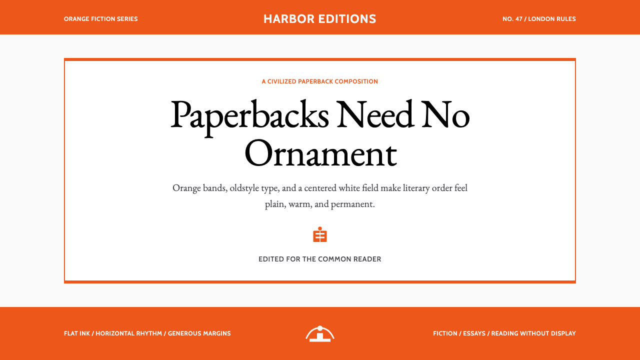 Penguin Classics OrangePaperback authority. Orange tri-bands, serif title panel, and flat ink enforc…平装书的权威感:橙色三段、衬线标题与平面油墨建立克制秩序。
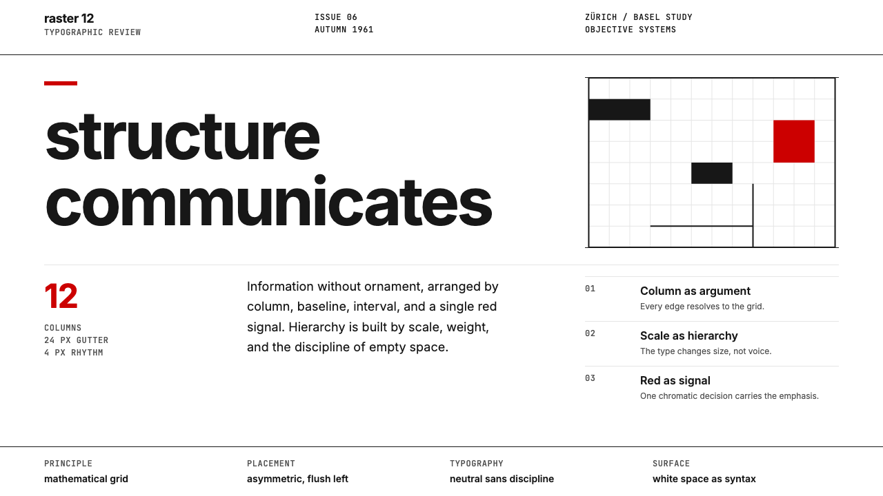 Swiss International StyleObjectivity made visible. Inter scale, white space, and one red block expose…客观性可见:Inter 尺度、留白与单一红块显露网格。