What is Financial Times (Pink Paper)?什么是 Financial Times (Pink Paper)?
For over a century, a warm salmon-pink ground and hairline-ruled columns have made the Financial Times the most visually distinctive publication in global business journalism.一个多世纪以来,温润的三文鱼粉底色与发丝般纤细的栏线,让《金融时报》成为全球财经新闻中辨识度最高的出版物。
Financial Times (Pink Paper) in briefFinancial Times (Pink Paper) 速览
The Financial Times visual identity is a typographic and chromatic system built entirely in service of dense, data-rich reading. At its centre sits a warm salmon-pink ground — neither orange nor peach, but a hue unique to the paper — paired with a bespoke serif typeface commissioned from a New Zealand type foundry, deep navy structural elements, and a restrained claret used as a secondary accent. The result is an immediately recognizable visual voice that requires no logo to identify itself.《金融时报》的视觉识别系统,是一套完全服务于密集、数据丰富阅读体验的字体与色彩体系。其核心是那抹温润的三文鱼粉底色——既非橙色也非桃色,而是这份报纸所独有的色调——搭配委托新西兰字体工坊定制的衬线字族、深海军蓝的结构性元素,以及克制使用的酒红色点缀。这一组合构成了一个无需标志便可自我识别的视觉声音。
This is not a decorative style. Every decision in the FT system is governed by editorial utility: hairline horizontal rules divide columns to guide the eye without consuming space; the custom serif typeface separates into a display variant for headlines and a text variant for body copy, each tuned to its precise reading distance; navy headers orient the reader within section and hierarchy; claret accents punctuate only those elements demanding immediate attention. Nothing competes with the sentence.这不是一种装饰性风格。FT系统中的每一个决定都受制于编辑实用性:发丝般纤细的水平分割线引导目光穿越栏间,而不占用宝贵空间;定制衬线字族分为用于标题的展示体与用于正文的文本体,各自针对精确的阅读距离调校;海军蓝标题栏在版块与层级中定向读者;酒红色强调仅落在那些需要立即引起注意的元素上。没有任何东西与句子本身相争。
The FT aesthetic belongs to a broader British broadsheet tradition — long-form text culture, restrained palette, authority through density rather than showmanship — but it is distinguished from its peers by the pink ground and by the discipline of its typographic system. Where other financial publications lean on photography and infographic spectacle, the FT trusts the column and the serif to carry weight.FT美学属于更广泛的英国大报传统——长篇文字文化、克制色板、以密度而非炫技建立权威——但它凭借粉色底面与其字体系统的纪律性,从同类中脱颖而出。当其他财经出版物依赖摄影与信息图表的视觉奇观时,FT信任栏式排版与衬线字体来承载分量。
See the Financial Times (Pink Paper) design system查看 Financial Times (Pink Paper) 完整设计系统
Where does Financial Times (Pink Paper) come from?Financial Times (Pink Paper) 从何而来?
The Financial Times was founded in London in 1888 by a group of financial journalists who wanted a daily record of Stock Exchange transactions and commercial news. The paper launched in the heady atmosphere of Victorian capitalism, when London was still the world's financial centre and the City's appetite for reliable market information was insatiable. In its earliest years, the FT was a conventional broadsheet printed on white stock, competing directly with the older Financial News. The two papers would eventually merge in 1945.《金融时报》由一批财经记者于1888年在伦敦创刊,初衷是提供股票交易所逐日记录与商业资讯。报纸在维多利亚资本主义的喧嚣氛围中创立——那时伦敦仍是世界金融中心,金融城对可靠市场信息的渴求几乎无法满足。创刊初期,FT是一份印在白色纸张上的普通大报,直接与历史更久的《金融新闻》竞争。两家报纸最终于1945年合并。
The salmon-pink paper stock was adopted in 1893, and while the exact reasoning behind the decision has never been fully documented, contemporaneous accounts suggest it was a combination of commercial differentiation and practical advantage. The distinctive color immediately separated the FT from the sea of white-paper competitors on the newsstand. Printers of the period also noted that the unbleached or lightly dyed salmon stock was marginally cheaper than fully bleached white newsprint — a not-inconsiderable factor for a publication operating on thin margins. Whatever the original logic, the color's unintended consequence was identity permanence: within a generation, pink became synonymous with financial authority in the British press.三文鱼粉纸张于1893年被采用,尽管这一决定背后的确切逻辑从未得到完整记录,但同时代的记述显示,它兼具商业差异化与实用优势的双重考量。这种与众不同的颜色立即使FT从报摊上白色封面竞争者的汪洋中脱颖而出。当时的印刷商也注意到,未经漂白或轻度染色的三文鱼色纸张比完全漂白的白色新闻纸略为廉价——对于利润率微薄的出版物而言,这并非微不足道的因素。无论最初的逻辑如何,这种颜色的意外后果是身份的永久性:不到一代人,粉色便在英国新闻界成为财经权威的同义词。
For most of the twentieth century, the FT's typography evolved incrementally through successive hot-metal and cold-type technologies but retained a fundamentally conservative broadsheet character — dense serif columns, minimal white space, news-wire efficiency. The paper's international expansion accelerated after it was acquired by Pearson in 1957, and by the 1990s the FT had grown into a global publication with simultaneous printing sites across Europe, the United States, and Asia. This scale demanded a more rigorously unified visual identity than the incrementally evolved system could provide.在二十世纪的大部分时间里,FT的字体排印经由铅字到照排技术的历次更迭而渐进演化,但始终保持着根本上保守的大报风格——密集衬线栏、极少留白、通讯稿式的效率。该报的国际扩张在1957年被培生集团收购后加速,到1990年代,FT已发展为在欧洲、美国和亚洲多地同步印刷的全球性出版物。这一规模要求的视觉统一性,远超渐进演化的系统所能提供的范围。
The decisive typographic modernisation came in 2014, when the FT commissioned Kris Sowersby of the Klim Type Foundry in Wellington, New Zealand, to design a bespoke typeface family called Financier. Sowersby's brief was to create a serif rooted in the classical tradition of British and Dutch punchcutters — legible at the small sizes demanded by dense column text — while carrying enough typographic personality to anchor the paper's identity at display sizes. The resulting family, with its open apertures, restrained contrast, and slightly bracketed serifs, achieved precisely that balance. Financier gave the FT's visual system a typographic anchor that the salmon ground alone could not provide, and the combination has remained the foundation of the identity through subsequent redesigns and the paper's continued digital transformation.决定性的字体现代化发生于2014年:FT委托新西兰惠灵顿Klim Type Foundry的Kris Sowersby设计了一套名为Financier的定制字族。Sowersby的设计简报要求创造一款植根于英国与荷兰活字刻制经典传统的衬线字体——在密集栏式文本所要求的小字号下清晰可读——同时又在展示尺寸上具有足够的排印个性,能够锚定报纸的身份。最终的字族以其开放的孔径、克制的笔画对比与略带弧线的衬角,恰到好处地实现了这种平衡。Financier为FT的视觉系统提供了单凭三文鱼粉底色所无法给予的字体锚点,这一组合历经此后的多次改版与报纸持续的数字化转型,始终是视觉识别的基础。
What defines the Financial Times (Pink Paper) look?Financial Times (Pink Paper) 的视觉特征是什么?
The Salmon Ground三文鱼粉底色
The FT's warm salmon-pink ground is the most recognizable single element in financial journalism. It is not a vivid or saturated color — it reads as warm, slightly dusty, and authoritative rather than bright or energetic. On screen, the digital equivalent preserves this quality: warm but muted, never competing with the ink above it. The ground functions simultaneously as brand identifier, reading comfort layer, and perceptual anchor that separates editorial content from advertising.FT温润的三文鱼粉底色是财经新闻业中辨识度最高的单一视觉元素。它不是鲜艳或高饱和度的颜色——它读起来温暖、略带陈旧感、充满权威性,而非明亮或充满活力。在屏幕上,其数字等价物保留了这种质感:温暖而低调,从不与其上方的文字相争。这一底色同时承担着品牌识别、阅读舒适度基底与感知锚点三重功能,将编辑内容与广告区分开来。
Bespoke Serif Typography定制衬线字体排印
The FT's typographic system is built around a custom serif typeface with two distinct optical variants — one tuned for the large scale of headlines and section titles, another engineered for the demanding conditions of small-body column text. The display variant carries more personality and optical tension; the text variant prioritises even colour on the page and low fatigue at sustained reading distances. This dual-variant approach is a mark of serious typographic investment, distinguishing the FT's system from publications that rely on off-the-shelf type families.FT的字体排印系统围绕一套定制衬线字族构建,该字族有两种截然不同的光学变体——一种针对标题与版块标题的大尺寸调校,另一种专为小字号栏式正文的苛刻条件工程化设计。展示变体承载更多个性与视觉张力;文本变体则优先保证页面上均匀的墨色密度,以及在持续阅读距离上的低疲劳感。这种双变体方式是严肃字体投资的标志,使FT的系统有别于依赖现成字族的出版物。
Deep Navy Headers and Rules深海军蓝标题栏与分割线
Where other broadsheets might use pure black or a neutral dark for structural elements, the FT employs a deep navy that reads as slightly warmer and more deliberate against the salmon ground. Section headers, masthead elements, and the rules that divide columns all live in this navy register. The color carries connotations of institutional gravity — naval uniform, corporate suiting, official documentation — that reinforce the paper's positioning as a publication of record.其他大报可能使用纯黑或中性深色作为结构性元素,而FT采用的深海军蓝在三文鱼粉底色上读起来略显温暖、更具考量感。版块标题、报头元素以及分割栏间的细线,都存在于这一海军蓝的调性中。这种颜色承载着机构庄重感的联想——海军制服、企业西装、官方文件——强化了报纸作为档案性出版物的定位。
Column Grid and Hairline Rules栏式网格与发丝分割线
The FT's layout discipline is rooted in a tight, multi-column grid inherited from broadsheet tradition but executed with unusual precision. Columns are separated by hairline rules — lines so thin they register as texture rather than boundary, guiding the eye without asserting themselves. This restraint in rule weight is characteristic: every structural element does its job at the minimum necessary weight, preserving the page's overall tonal evenness and preventing any grid artifact from competing with editorial content.FT的版面纪律植根于继承自大报传统的紧凑多栏网格,但以不寻常的精度执行。栏间由发丝般纤细的分割线隔开——细到作为质感而非边界被感知,引导目光而不主张自身。这种对线条粗细的克制是其特征之一:每个结构性元素以完成任务所需的最低笔画重量发挥作用,保持页面整体的色调均匀,防止任何网格痕迹与编辑内容相争。
Claret as Accent酒红色点缀
The FT-claret — a deep, wine-adjacent red — functions as the system's third chromatic voice after salmon and navy. It appears sparingly: in bylines, in certain data visualisation elements, in selected navigation markers. Its rarity is part of its function; a color that appears everywhere loses the ability to signal importance. Claret is the FT's typographic italics — used to denote, not to decorate.FT酒红色——一种深沉的、接近葡萄酒色调的红——在三文鱼粉与海军蓝之后,充当系统的第三个色彩声部。它惜墨如金地出现:在作者署名中、某些数据可视化元素中、部分导航标记中。它的稀少性本身就是其功能的一部分;一种随处出现的颜色会失去标示重要性的能力。酒红色是FT的视觉斜体——用于指示,而非装饰。
Informational Data Graphics信息性数据图表
FT data visualisation is governed by the same editorial values as its prose: clarity over spectacle, precision over decoration. Charts use a limited palette drawn from the core system, with gridlines kept light and axis labels set small. The FT's charting conventions — flat fills, clean axes, minimal annotation — have become influential enough that the newspaper's data team has published its own visual vocabulary guide, which is widely referenced in the data journalism and business intelligence communities.FT的数据可视化受与其文字相同的编辑价值观支配:清晰优先于奇观,精确优先于装饰。图表使用从核心系统提取的有限色板,网格线保持轻盈,坐标轴标签字号设置较小。FT的图表惯例——平面填色、干净坐标轴、极简注释——已具有足够的影响力,以至于报纸的数据团队发布了自己的视觉词汇指南,在数据新闻与商业智能社群中被广泛引用。
Restraint Over Decoration克制优先于装饰
Perhaps the most defining characteristic of the FT system is what it refuses to do. There are no decorative borders framing content, no drop shadows adding false depth, no gradient treatments on headers, no illustrative ornament filling white space. Where a lesser-confident publication might fear the blank column inch, the FT treats white space — or salmon space — as a breathing room earned by editorial economy. The aesthetic confidence required to leave space empty is inseparable from the publication's editorial confidence.FT系统最具定义性的特征,也许正是它拒绝做什么。没有装饰性边框框住内容,没有阴影添加虚假深度,没有标题上的渐变处理,没有填充留白的插图装饰。缺乏自信的出版物可能会恐惧空白的栏寸,FT却将留白——或粉色空间——视为由编辑经济性所赚取的呼吸空间。让空间保持空白所需要的审美自信,与出版物的编辑自信不可分割。
See the Financial Times (Pink Paper) design system查看 Financial Times (Pink Paper) 完整设计系统
Who shaped Financial Times (Pink Paper)?谁塑造了 Financial Times (Pink Paper)?
Sowersby is the Wellington-based type designer who, through his Klim Type Foundry, designed the Financier typeface family commissioned by the Financial Times in 2014. His brief was to create a serif rooted in classical British and Dutch punchcutting traditions while meeting the demanding requirements of a modern, multi-platform publication. The resulting family — with separate optical variants for display and text use — is considered one of the most accomplished bespoke newspaper typeface commissions of the twenty-first century. Sowersby's other notable designs include Tiempos, Domaine, and National, all of which show his characteristic attention to historical derivation and contemporary utility.Sowersby是总部位于惠灵顿的字体设计师,其Klim Type Foundry于2014年接受《金融时报》委托,设计了Financier字族。他的设计简报要求创造一款植根于英国与荷兰古典活字刻制传统的衬线字体,同时满足现代多平台出版物的苛刻要求。最终的字族——设有独立的展示与正文光学变体——被认为是二十一世纪最出色的定制报纸字体委托之一。Sowersby的其他代表作包括Tiempos、Domaine和National,均体现了他对历史渊源与当代实用性的一贯关注。
Bottomley was among the entrepreneurial figures associated with the early Financial Times, which emerged from the volatile world of Victorian financial journalism where newspapers served as much as promotional vehicles for stock promotions as they did as editorial records. His involvement reflects the paper's origins in a period when the boundary between financial reporting and financial promotion was considerably more porous than it later became. The FT's subsequent evolution into a publication of record — and the visual seriousness that identity entails — represents in part a deliberate distancing from that early promotional character.Bottomley是与早期《金融时报》相关的创业人物之一。FT脱胎于维多利亚时代喧嚣的财经新闻业,在那个年代,报纸在充当编辑记录的同时,往往也充当股票推广的宣传载体。他的参与折射出报纸诞生于一个时代——那时财经报道与财经促销之间的边界,比后来宽松得多。FT此后演变为一份档案性出版物——以及这一身份所蕴含的视觉严肃性——在一定程度上代表了对那种早期促销性格的刻意疏离。
Khalaf became editor of the Financial Times in 2020, the first woman to hold the position in the paper's history. Her editorship has overseen the continued evolution of the FT's visual and editorial identity during a period of significant digital transformation. Under her leadership, the paper has deepened its investment in data journalism and visual storytelling while preserving the core typographic and chromatic discipline that defines the FT's identity. Her presence at the head of the masthead is itself part of the visual identity — the editor's authority is encoded in the paper's restrained confidence.Khalaf于2020年出任《金融时报》主编,成为报纸历史上首位担任该职务的女性。她的主编任期见证了FT视觉与编辑身份在数字化深度转型期间的持续演进。在她的领导下,报纸在数据新闻与视觉叙事上加大了投入,同时保持了定义FT身份的核心字体排印与色彩纪律。她坐镇报头本身就是视觉身份的一部分——主编的权威被编码进这份报纸克制的自信之中。
Klim Type Foundry, established by Kris Sowersby in Wellington, New Zealand, has become one of the most respected independent type foundries in the world. Its practice is notable for combining deep historical research — particularly into Dutch and British type history — with rigorous contemporary design standards. The Financier commission brought Klim to wide international attention and positioned it alongside other storied institutional type commissions. The foundry's public retail catalogue, which includes Tiempos, Calibre, and Domaine, is widely used in editorial design and has influenced the broader direction of contemporary serif typography.Klim Type Foundry由Kris Sowersby在新西兰惠灵顿创立,已跻身世界上最受尊敬的独立字体铸造厂之列。其实践以深度历史研究——尤其是荷兰与英国字体史——与严格的当代设计标准相结合而著称。Financier委托将Klim带入广泛的国际视野,使其与其他声誉卓著的机构字体委托并列。铸造厂的公开零售目录(包括Tiempos、Calibre和Domaine)在编辑设计中被广泛使用,并对当代衬线字体排印的整体方向产生了影响。
The Financial Times data journalism and visualisation team — contributors include John Burn-Murdoch among others — has become internationally recognised for its data graphics standards. Working within the paper's established chromatic and typographic system, the team has developed charting conventions notable for their editorial clarity: minimal chartjunk, consistent axes, plain annotation, and a limited color vocabulary derived from the core FT palette. Their work during the COVID-19 pandemic in particular drew global attention and established the FT's data visualisation style as a benchmark in journalism.《金融时报》数据新闻与可视化团队——成员包括John Burn-Murdoch等——已在国际上因其数据图表标准而获得认可。团队在报纸既有的色彩与字体系统框架内工作,发展出以编辑清晰性著称的图表惯例:最少的图表垃圾、统一的坐标轴、简洁的注释,以及从FT核心色板中提取的有限色彩词汇。他们在新冠疫情期间的作品尤其引发全球关注,确立了FT数据可视化风格作为新闻业基准的地位。
How do you use Financial Times (Pink Paper) today?今天怎么用 Financial Times (Pink Paper)?
The FT visual language is one of the most directly applicable historical editorial styles for contemporary professional design work, because its principles are practical rather than symbolic. Applying it correctly requires internalising what the system values: authority through restraint, hierarchy through typographic weight rather than color saturation, and the willingness to leave space empty when content does not fill it.FT视觉语言是当代专业设计实践中可直接移植的历史编辑风格之一,因为它的原则是实用性的而非象征性的。正确应用它,需要内化这套系统所珍视的价值观:通过克制建立权威,通过字体字重而非色彩饱和度建立层级,以及在内容不填满空间时愿意让空间保持空旷。
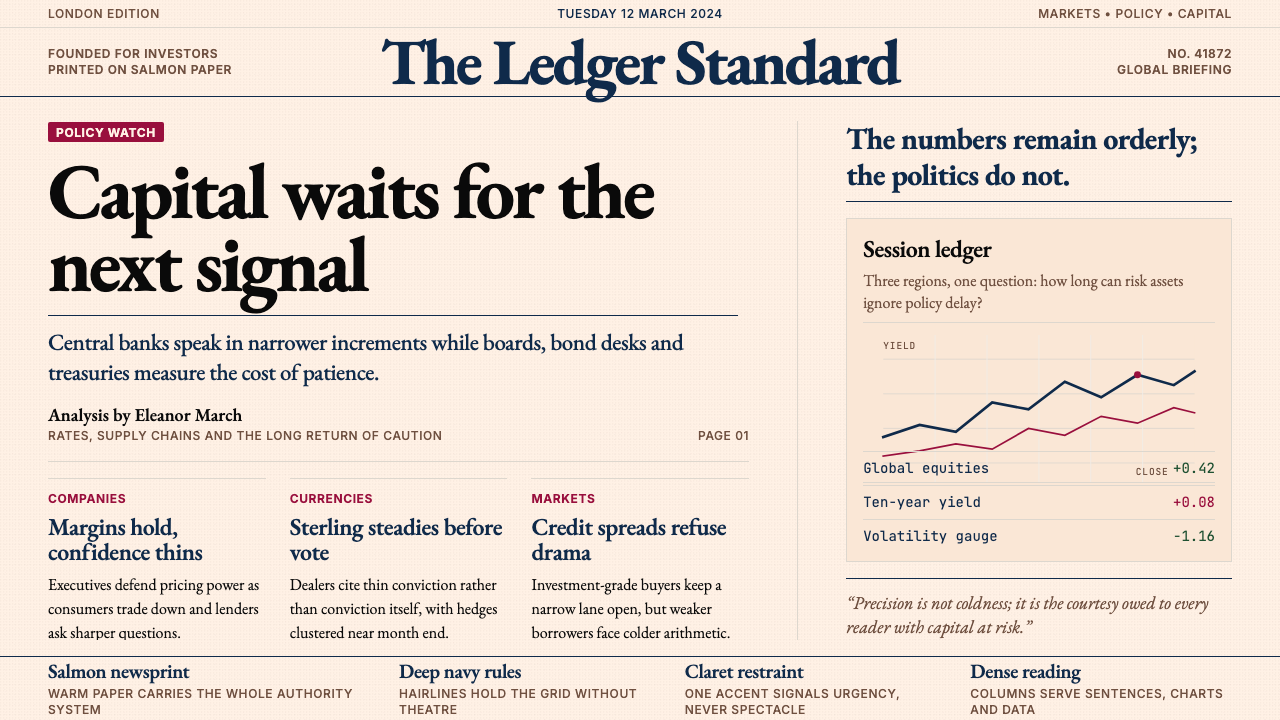
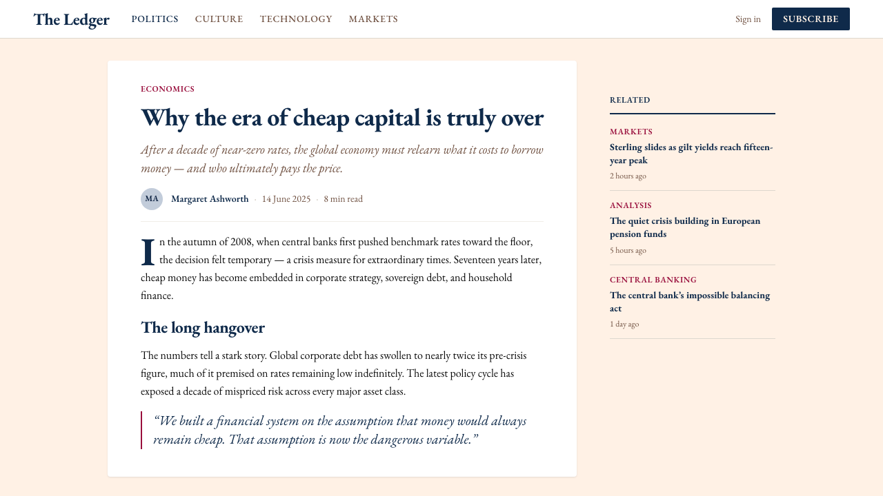
For presentation slides — both cover and content — the FT approach transforms decks from fragmented slide-by-slide experiences into something resembling a designed publication. A cover page works well with a warm light ground, a bold editorial headline set in a strong serif, and a subtle horizontal rule beneath the title — no photography, no illustration, no decorative border. Content slides should treat each page as a newspaper layout: body text in a readable serif at a measured weight, data labels set small and consistently, charts that use the warm ground rather than a white box inset. Section-break slides can simply carry a large display-weight title and a deep navy rule, with nothing else. Data slides deserve particular attention: choose one or two colors drawn from the navy-claret-salmon family to distinguish data series, keep axis labels minimal, and let the grid lines be nearly invisible.对于演示文稿——无论封面还是内容页——FT方法将幻灯片从碎片化的逐页体验转化为类似于设计出版物的东西。封面页适合使用温润的浅色底面、以粗重衬线字体排印的编辑性大标题,以及标题下方一条细致的水平线——不用摄影、不用插图、不用装饰性边框。内容页应将每一页作为报纸版面来处理:以适当字重排印在可读衬线字体中的正文、字号小而统一的数据标签、使用温润底面而非嵌入白色方框的图表。章节分割页可以只承载一个大展示字重的标题与一条深海军蓝横线,别无其他。数据页值得特别关注:从海军蓝、酒红色、三文鱼粉色系中选择一到两种颜色区分数据序列,保持坐标轴标签极简,让网格线几乎不可见。
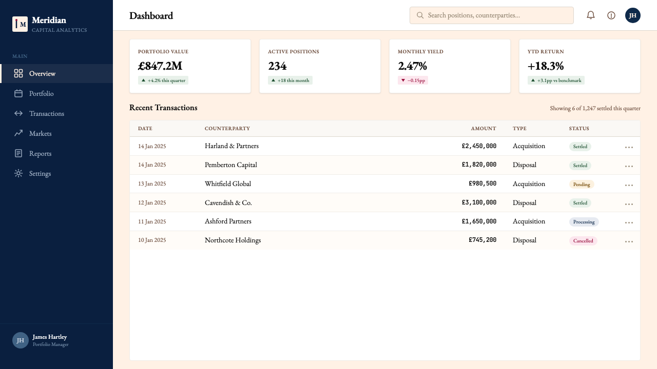
For web interfaces — dashboards, pricing pages, and analytics tools — the FT system offers a powerful alternative to the default light-grey-and-blue corporate web aesthetic. The approach: set the page background to a very warm near-white that references but does not copy the salmon tone, use deep navy for primary navigation, reserve claret for calls to action or alert states, and keep typography in a confident serif for titles and a well-spaced system-level sans for data labels and UI text. Table components should use alternating warm tints on rows rather than grey stripes. Card components work without soft drop shadows — a thin navy border and a slightly deeper warm ground read as more considered than shadow.对于网页界面——仪表板、定价页面与分析工具——FT系统提供了一个强有力的替代方案,以对抗默认的浅灰加企业蓝网页美学。方法如下:将页面背景设为非常温润的近白色,参照而非照搬三文鱼粉色调;用深海军蓝作为主导航;将酒红色保留给行动号召或警示状态;标题排印在自信的衬线字体中,数据标签与界面文本使用间距良好的系统级无衬线字体。表格组件应在行间使用交替的温润浅色调而非灰色条纹。卡片组件无需柔和投影——一条纤细的海军蓝边框加上略深一分的温润底色,读起来比阴影更具考量感。
For editorial and marketing materials — reports, white papers, newsletters, social cards — the FT register communicates financial seriousness and institutional weight. An annual report or research publication in this style would use the warm ground throughout, place charts on the same ground rather than reversing them to white, and trust the typography to carry chapter breaks rather than relying on large imagery. Marketing materials can use the system's poster-like quality: a high-contrast serif headline against the warm ground, a single claret accent on a key phrase or data point, and generous white — or salmon — space around the text block.对于编辑与营销材料——报告、白皮书、通讯、社交卡片——FT调性传达出财经严肃性与机构分量感。这种风格的年度报告或研究出版物会在全文中使用温润底色,将图表置于同样底色上而非反转为白色,并信任字体排印来承担章节分隔,而不是依赖大幅图像。营销材料可以利用该系统的海报式特质:高对比度衬线大标题置于温润底面上,一个酒红色强调落在关键短语或数据点,文字块周围保留充裕的空间——无论是白色还是粉色。
The most common mistake when working in this style is misreading the salmon ground as a dominant brand color and extending it aggressively — pushing it toward orange, oversaturating it, or using it as a design element rather than a ground. The FT's pink is effective because it recedes: it is a field on which ink sits, not a color that competes with the typography above it. A second frequent error is treating the navy and claret as interchangeable; they have distinct roles — navy for structure, claret for emphasis — and using claret for structural elements destroys the hierarchy the system depends on. Finally, the style fails quickly when a decorative illustrative layer is added, however tasteful: the system's authority comes precisely from its refusal to illustrate.在这种风格中工作时最常见的错误,是将三文鱼粉底色误读为主导品牌色并激进延伸——将其推向橙色,过度饱和,或作为设计元素而非底面使用。FT的粉色之所以有效,恰恰是因为它退后:它是承载墨迹的底场,而非与其上方字体排印相争的颜色。第二个常见错误是将海军蓝与酒红色视为可互换;它们承担着截然不同的角色——海军蓝用于结构,酒红色用于强调——将酒红色用于结构性元素会摧毁系统所依赖的层级秩序。最后,这种风格在添加装饰性插图层后会迅速失效,无论多么有品位:系统的权威恰恰来自它对插图的拒绝。
See the Financial Times (Pink Paper) design system查看 Financial Times (Pink Paper) 完整设计系统
Financial Times (Pink Paper) — FAQFinancial Times (Pink Paper) · 常见问题
Is the FT style actually usable for digital products, or is it too print-rooted?FT风格真的适用于数字产品吗,还是它太根植于印刷?
The FT style is highly effective for digital products, and the FT itself has demonstrated this through its own digital transformation over the past decade. The salmon ground translates well to screen: it reduces eye strain in extended reading sessions in ways that pure white cannot, which is why several digital reading apps have adopted warm-tinted reading modes. The typographic hierarchy — display serif for titles, text serif for body, restrained palette for data — maps cleanly onto web and app patterns. The main adjustment required is scaling the hairline rules up slightly for screen resolution, since a print hairline at web pixel density can become invisible.FT风格对数字产品极为有效,FT自身在过去十年的数字化转型中已经证明了这一点。三文鱼粉底色在屏幕上表现良好:它在长时间阅读中减轻眼疲劳的方式是纯白色无法做到的,这也是为什么几款数字阅读应用采用了暖色调阅读模式。字体层级——标题用展示衬线体、正文用文本衬线体、数据使用克制色板——能清晰映射到网页与应用的设计模式中。主要需要调整的是将发丝分割线略微加粗以适应屏幕分辨率,因为印刷发丝线在网页像素密度下可能变得几乎不可见。
How does the FT style differ from other broadsheet editorial styles, like The Economist or The New York Times?FT风格与其他大报编辑风格——如《经济学人》或《纽约时报》——有何不同?
The most obvious distinction is the salmon ground, which exists nowhere else in broadsheet journalism at scale. Beyond color, The Economist uses a more aggressively typographic approach with very tight leading and smaller type, while the FT allows more air in its column text. The New York Times digital visual identity is considerably more photography-driven and uses a much wider color vocabulary, including a bold use of black and significant white space, giving it a different tonal register — more magazine-like, less data-dense. The FT's particular combination of warm ground, restrained palette, and typographic seriousness positions it closest to a data-publication aesthetic — something between a newspaper and a financial terminal.最明显的区别是三文鱼粉底色,在大报新闻业中别无仅有。除色彩之外,《经济学人》采用更为强势的字体排印方式,行距极紧、字号较小;而FT在栏式正文中保留了更多呼吸空间。《纽约时报》的数字视觉身份在很大程度上以摄影为驱动,使用更宽广的色彩词汇,包括大胆使用黑色与大量留白,赋予其不同的调性——更像杂志,数据密度较低。FT温润底色、克制色板与字体排印严肃性的特定组合,使其最接近数据出版物美学——某种介于报纸与金融终端之间的存在。
Can this style work for a startup or small company, or does it only suit established institutions?这种风格适合初创公司或小型企业吗,还是它只适合成熟机构?
The FT style can work for smaller organisations, but it requires confidence to carry. The risk for a startup is that the style's institutional gravity can read as pretension if the product behind it does not yet match the implied authority. The style works best for B2B products in financial services, professional analytics, legal technology, or any domain where the user's primary expectation is reliability and precision rather than warmth or creativity. Used in the right context — a fintech dashboard, a data subscription product, an investor relations site — the FT register immediately communicates seriousness in a way that takes years of conventional design to achieve.FT风格可以适用于规模较小的机构,但需要自信来驾驭。对初创公司而言,风险在于:如果其背后的产品尚未匹配所暗示的权威感,这种风格的机构庄重感可能被读作矫饰。这种风格最适合金融服务、专业分析、法律科技领域的B2B产品,或任何用户首要期望是可靠性与精确性而非温暖感或创造力的领域。用于正确的场景——金融科技仪表板、数据订阅产品、投资者关系网站——FT调性立即传达出严肃性,而这种效果通过常规设计需要数年才能积累。
Does the style support dark mode?这种风格支持深色模式吗?
A dark-mode inversion of the FT system is possible but requires careful thought. The challenge is that the salmon ground — the system's defining element — does not simply invert to a usable dark equivalent. A true dark mode in this register would not be a salmon-on-dark composition; it would shift the ground to a very deep navy and bring the salmon in as a warm accent, allowing claret to disappear and reintroducing it only for very specific states. The typographic system carries over cleanly to dark — strong serif on deep ground is a traditional book-printing technique — but the color relationships need complete reconsideration rather than mechanical inversion. The FT's own dark mode on its digital platforms reflects exactly this complexity.FT系统的深色模式反转是可能的,但需要仔细思考。挑战在于:三文鱼粉底色——系统的定义性元素——并不能简单地反转为可用的深色等价物。这一调性的真正深色模式不会是深色底上的三文鱼粉构图;而是将底面转移至非常深的海军蓝,将三文鱼粉作为温润的强调色引入,让酒红色淡出,仅在非常特定的状态下重新引入它。字体排印系统可以干净地迁移到深色模式——强衬线字体置于深色底面是传统书籍印刷技法——但色彩关系需要完全重新考量,而非机械反转。FT在其数字平台上的深色模式正是反映了这种复杂性。
How should data visualisation be handled within this style?在这种风格中应如何处理数据可视化?
Data visualisation within the FT register should treat the chart as an editorial element rather than a decorative one. This means: charts sit directly on the warm ground rather than in a white container; color in charts is drawn from the system palette — navy for primary series, claret for a secondary series, and warmer or cooler tints of these for additional series if required; gridlines are set to barely-visible rather than prominent; and titles and annotations are typeset consistently with the surrounding body text rather than in a different face or size. The FT's own chart style avoids the over-annotated, legend-heavy approach common in business intelligence tools; instead, important values are labeled directly on the chart elements themselves, and the surrounding prose carries contextual explanation.FT调性中的数据可视化应将图表视为编辑性元素而非装饰性元素。这意味着:图表直接置于温润底色上,而非放入白色容器中;图表中的颜色从系统色板中提取——海军蓝用于主系列,酒红色用于次要系列,如需更多系列则使用这些颜色的暖调或冷调变体;网格线设置为几乎不可见而非突出;标题与注释与周围正文排印保持一致,而非使用不同的字体或字号。FT自身的图表风格回避了商业智能工具中常见的过度注释、图例繁重的方式;重要数值被直接标注在图表元素本身上,周围的文字承担情境性解释。
Related design styles相关设计风格
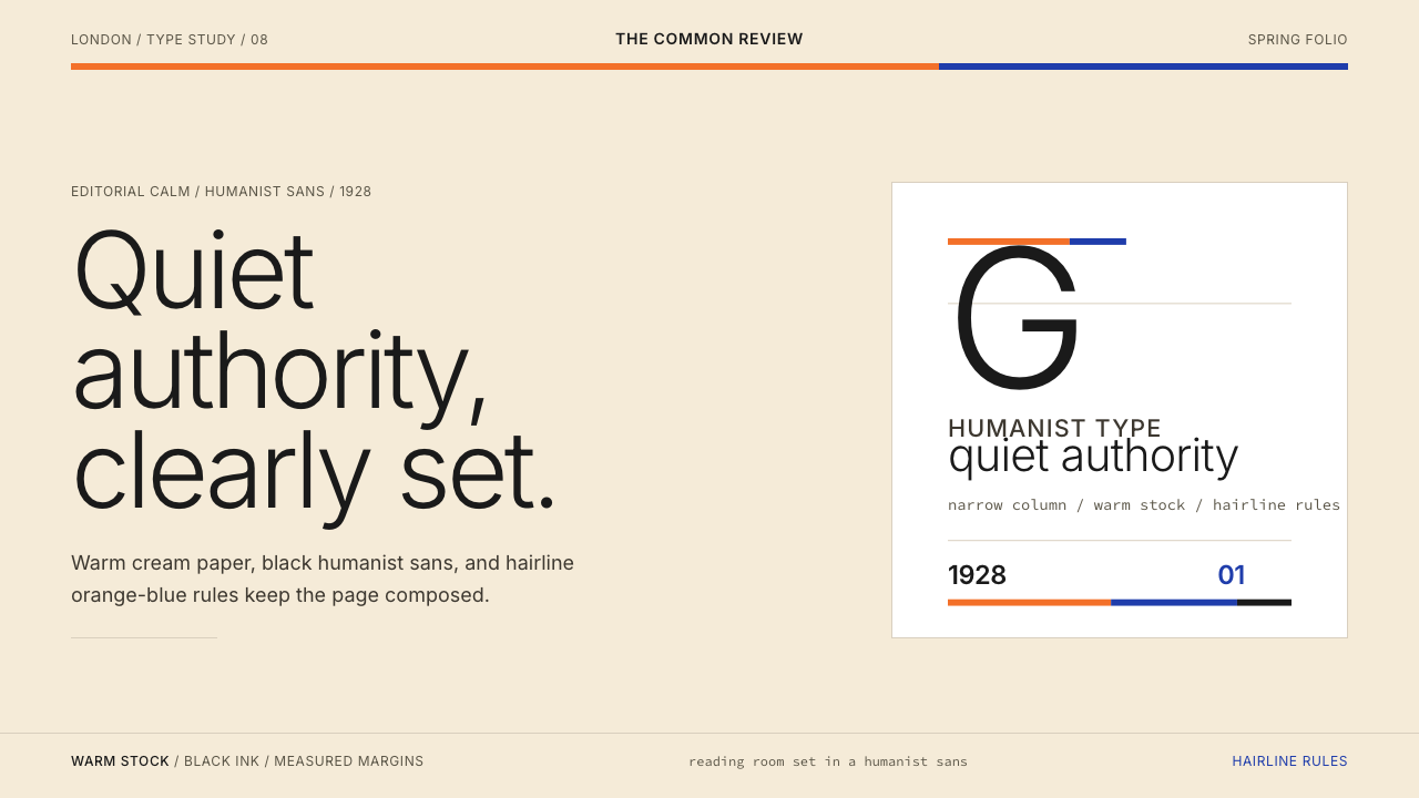 Gill Sans (BBC, 1928)Quiet authority, clearly set. Warm cream, black humanist sans, and hairline o…安静而权威。奶油底、黑色人文无衬线与橙蓝细线。
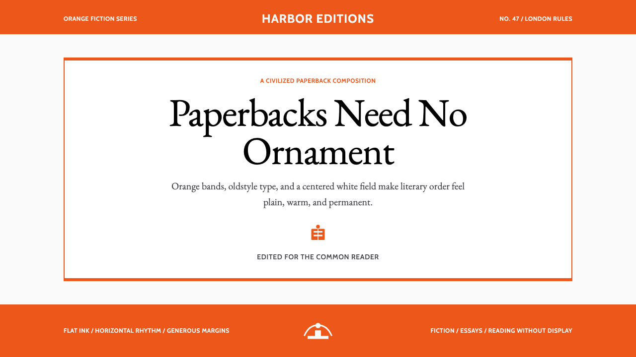 Penguin Classics OrangePaperback authority. Orange tri-bands, serif title panel, and flat ink enforc…平装书的权威感:橙色三段、衬线标题与平面油墨建立克制秩序。
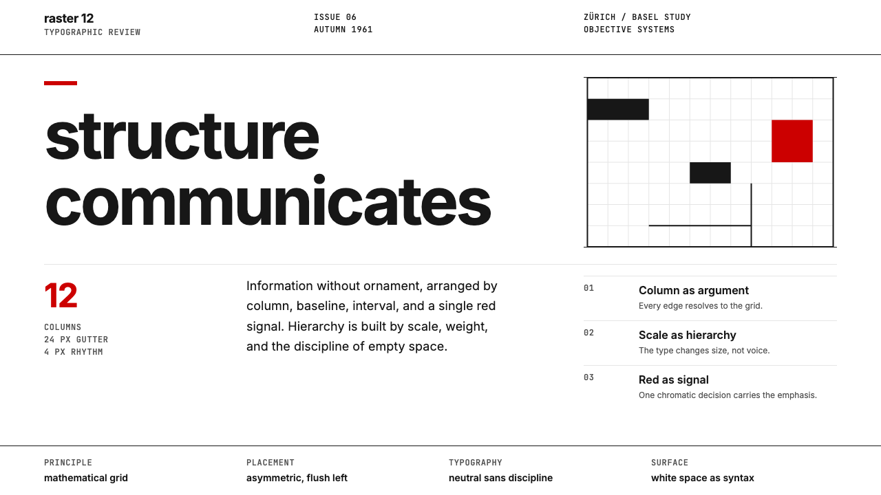 Swiss International StyleObjectivity made visible. Inter scale, white space, and one red block expose…客观性可见:Inter 尺度、留白与单一红块显露网格。
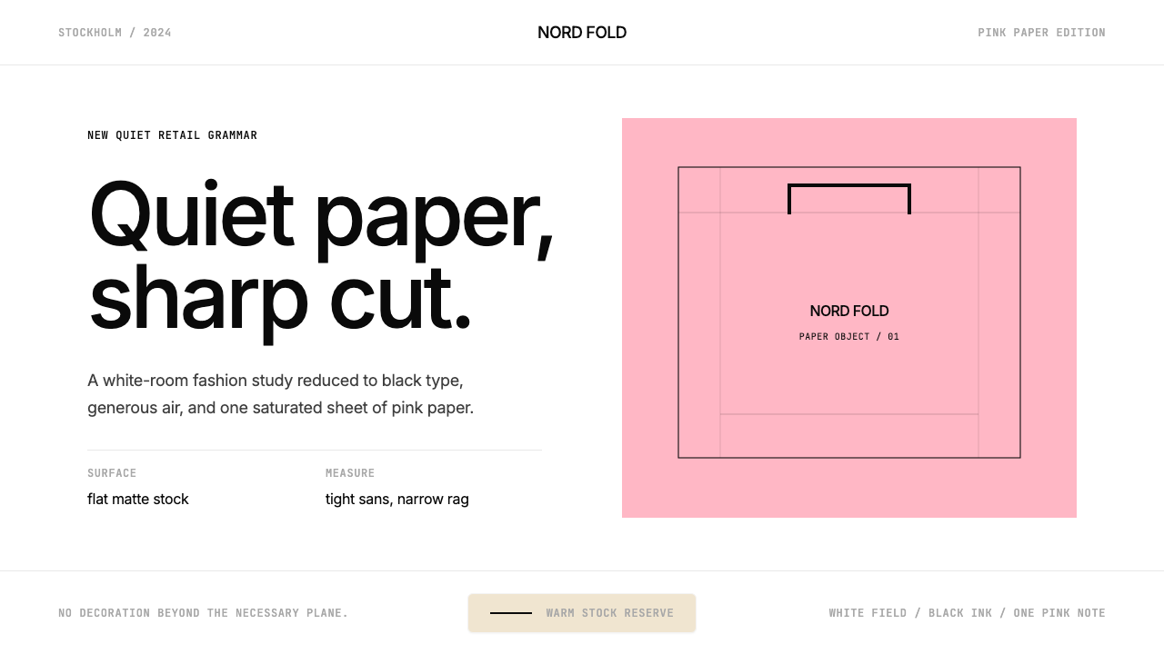 Acne Studios Pink-PaperQuiet luxury in one pink plane. Inter type floats on white with a bag-like re…粉色平面定义安静奢华:Inter 黑字漂浮于白场,像一只纸袋。
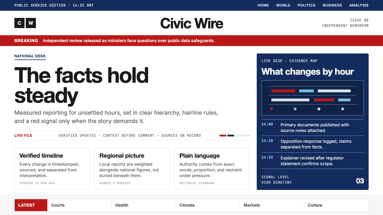 BBC NewsPublic trust, stripped bare. Red alerts, deep navy and hairline grids make ur…公共信任被剥至纯粹:红色警示、深海军蓝与发丝网格,让紧迫保持事实感。
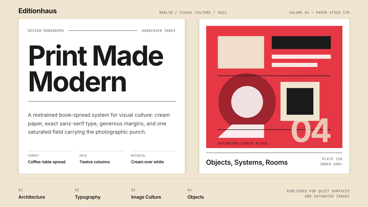 Gestalten Design BookCoffee-table calm. Cream paper, tight sans, one saturated block, and a strict…咖啡桌式冷静。奶油纸、紧凑无衬线、单一高饱和色块与严格网格。