What is Acne Studios Pink-Paper?什么是 Acne Studios Pink-Paper?
Acne Studios built a global luxury identity from a single iconic object — a saturated bubblegum-pink paper shopping bag that turned restraint into desire.Acne Studios 用一只泡泡糖粉色纸袋,将克制转化为欲望,构建起全球奢侈品牌的视觉身份。
Acne Studios Pink-Paper in briefAcne Studios Pink-Paper 速览
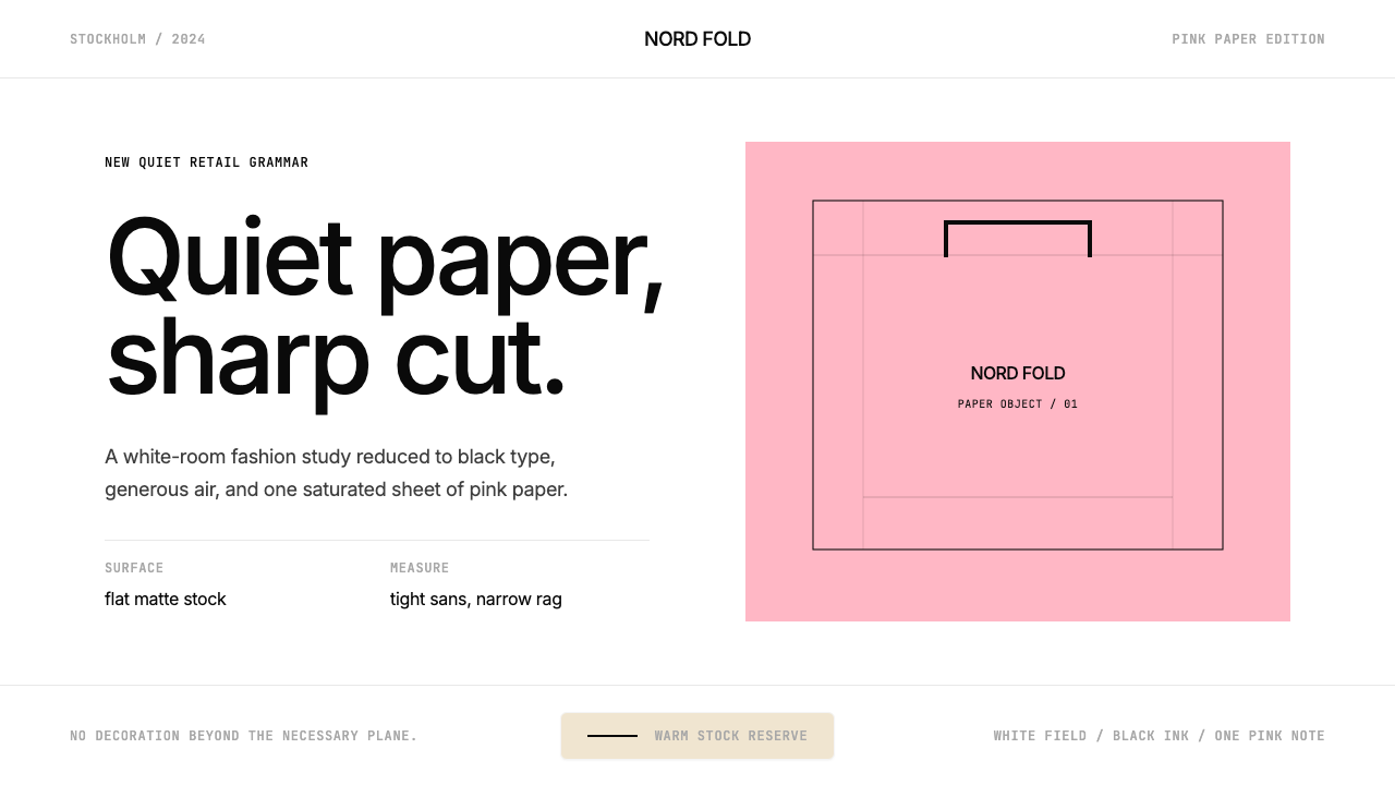
Acne Studios Pink-Paper is the visual design system distilled from Acne Studios' brand identity — a Swedish luxury fashion house whose entire aesthetic language orbits a single tactile artifact: the saturated pink paper shopping bag. The system pairs that iconic pink with generous white space, deep-black modernist sans-serif type, and a quiet boutique atmosphere that feels simultaneously minimal and sensuous.Acne Studios 粉纸风格是从 Acne Studios 品牌视觉体系中提炼出来的设计语言——这家瑞典奢侈时装屋的全部美学都围绕一件触感实物展开:那只饱和泡泡糖粉色的纸质购物袋。系统将标志性粉色与慷慨留白、深黑色现代无衬线字体相结合,营造出一种安静精品店的氛围,既极简又感性。
Where many luxury brands signal prestige through gilded ornament or maximalist imagery, Acne Studios signals it through conspicuous restraint. The palette is reduced to three anchors — the signature bubblegum pink, pure white or near-white, and a deep near-black — deployed with an almost surgical economy. Every element on the page earns its placement; whatever cannot justify its presence has already been removed.许多奢侈品牌以镀金装饰或极繁图像来传递地位,Acne Studios 则以显著的克制来表达同样的意图。色板被简化为三个锚点——标志性泡泡糖粉、纯白或近白、以及深近黑色——以近乎外科手术式的经济性加以调度。页面上的每个元素都必须自证其存在的必要性;无法自证的,早已被移除。
The system belongs to the contemporary 'quiet luxury' movement — a sensibility that rejects logomania and visual noise in favor of understatement, material quality, and the confidence of a brand that does not need to announce itself. Applied to digital and print contexts, it reads as a minimalist Stockholm boutique translated into pixels and paper: clean walls, a single pink accent, black type, and the kind of silence that only expensive things can afford.这套系统属于当代「安静奢华」运动——一种拒绝商标崇拜与视觉噪音、转而推崇低调、材质品质和不需要自我宣告的品牌自信的感性。应用于数字与印刷场景时,它读起来像是一间斯德哥尔摩极简精品店的像素与纸张转译:洁净的白墙、一抹粉色点缀、黑色字体,以及只有昂贵的事物才负担得起的那种静默。
See the Acne Studios Pink-Paper design system查看 Acne Studios Pink-Paper 完整设计系统
Where does Acne Studios Pink-Paper come from?Acne Studios Pink-Paper 从何而来?
Acne Studios was founded in Stockholm in 1996 by Jonny Johansson and three collaborators. The name is an acronym: Ambition to Create Novel Expressions. The brand began not as a fashion house in the conventional sense but as a creative collective producing films, furniture, and magazines alongside clothing. This multidisciplinary origin is visible in the design system's intelligence — it carries the sensibility of a studio that thinks across media rather than a marketing department executing brand guidelines.Acne Studios 于 1996 年由 Jonny Johansson 与三位合伙人在斯德哥尔摩共同创立。品牌全名 ACNE 取自首字母缩写,意为「创造新颖表达的雄心」。品牌最初并非传统意义上的时装屋,而是一个同时生产电影、家具、杂志与服装的创意集体。这一跨媒介起源在设计系统的智识性中清晰可见——它携带着一个横跨媒介思考的工作室的感性,而非一个执行品牌规范的市场部。
The pink shopping bag emerged as the brand's most powerful visual asset over the course of the 2000s and 2010s. Its specific hue — a warm, high-saturation pink that sits between bubblegum and rose, with a softness that prevents it from reading as aggressive — became instantly recognizable on the streets of Stockholm, Paris, New York, and Tokyo. In an era when luxury brands competed through heritage and monogram, Acne Studios competed through a single chromatic gesture so distinctive it needed no logo to identify it.那只粉色购物袋在 2000 至 2010 年代间逐渐成为品牌最强大的视觉资产。它特有的色相——一种介于泡泡糖粉与玫瑰粉之间的温暖高饱和粉色,带有一种防止其显得攻击性的柔和质感——在斯德哥尔摩、巴黎、纽约与东京的街头变得一眼可辨。在奢侈品牌以传承与字母组花相互竞争的时代,Acne Studios 以一个单一的色彩姿态胜出,那种姿态独特到无需 Logo 便能自证身份。
The visual identity as a coherent digital and print system solidified primarily through the 2010s, running through 2024 and beyond. In 2014, the LVMH group acquired a stake in Acne Studios, bringing the brand into the orbit of the world's largest luxury conglomerate while leaving its creative direction largely intact. The Scandinavian modernist roots — spare geometry, confident whitespace, distrust of ornament — remained the structural foundation even as the brand scaled internationally.视觉识别作为一套连贯的数字与印刷系统,主要在 2010 年代成形,延续至 2024 年及以后。2014 年,LVMH 集团收购了 Acne Studios 的股份,将品牌纳入全球最大奢侈品集团的版图,同时基本保留了其创意方向。斯堪的纳维亚现代主义的根基——简约几何、自信留白、对装饰的警惕——即使在品牌国际化扩张的过程中,依然是其结构性基础。
The Musubi knotted-bag silhouette, introduced as a product and later absorbed as a graphic motif, added a second visual signature alongside the pink bag. Both forms — the pink rectangle of the shopping bag and the looped knot of the Musubi — function as icons in the design system: simple, geometric, and legible at any scale. Together they illustrate how the Acne Studios visual language converts physical product forms into graphic vocabulary, collapsing the boundary between fashion object and brand mark.Musubi 结绳手袋的剪影作为产品推出,后被吸收为图形母题,在粉色购物袋之外增添了第二个视觉签名。两种形态——购物袋的粉色矩形与 Musubi 的环形结——在设计系统中均作为图标运作:简单、几何、在任意尺寸下均清晰可读。它们共同展示了 Acne Studios 视觉语言如何将实体产品形态转化为图形词汇,消弭时尚物件与品牌标志之间的边界。
What defines the Acne Studios Pink-Paper look?Acne Studios Pink-Paper 的视觉特征是什么?
The Signature Pink标志粉色
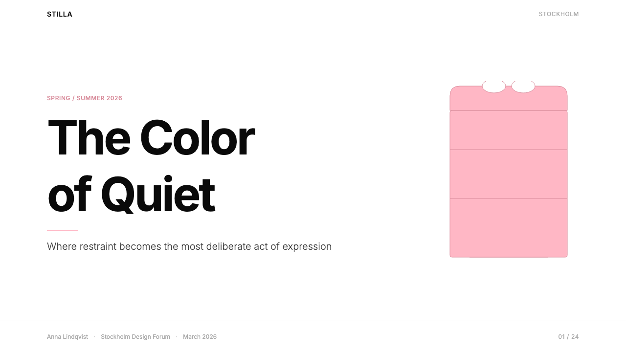
The bubblegum pink is the system's defining anchor — a warm, fully saturated pink that is bold enough to command attention from across a room yet soft enough to avoid aggression. It reads as neither candy nor blush, occupying a precise chromatic territory that feels simultaneously playful and considered. In the system, this pink functions as a primary accent: it colors the bag-form motif, appears as a background wash on select surfaces, and signals the brand without additional language.泡泡糖粉色是整个系统的定义性锚点——一种温暖、充分饱和的粉色,足够大胆到从房间对面就能夺人眼球,却又足够柔和以避免攻击性。它既不像糖果,也不像腮红,占据着一个同时令人感到俏皮与考究的精确色彩领地。在系统中,这种粉色作为主要强调色运作:为袋形母题着色,在特定表面作背景色铺陈,无需额外语言便能传递品牌信息。
Whitespace as Material留白作为材质
Whitespace in the Pink-Paper system is not passive emptiness — it is the primary material through which luxury is communicated. Margins are wide, line spacing generous, and text blocks deliberately small relative to the available field. This spatial generosity mimics the experience of a high-end retail environment where objects are given room to breathe, where crowding would signal discount rather than desire. The white ground is never filled for the sake of filling.粉纸系统中的留白不是被动的空洞——它是传递奢华感的主要材质。页边距宽阔,行间距慷慨,文字块相对于可用空间刻意保持小巧。这种空间上的慷慨模拟了高端零售环境的体验:物件被给予呼吸的空间,拥挤会暗示折扣而非欲望。白色底面从不为填满而填满。
Deep-Black Modernist Typography深黑色现代主义字体排印
Type in the system is set in a clean, contemporary geometric sans-serif — tightly tracked, deeply black, and given significant size contrast between hierarchy levels. Headlines sit at a commanding scale; body text is small and precise. There are no decorative letterforms, no script accents, no serifs. The typographic voice is confident and Nordic — spare rather than warm, exact rather than expressive. Uppercase settings appear for brand-level communication; mixed case governs editorial body text.系统中的字体设置为干净、当代的几何无衬线字体——字距收紧、颜色深黑,不同层级之间有显著的字号对比。标题以具有权威感的大字号居于版面;正文小而精确。没有装饰性字形,没有手写体点缀,没有衬线。字体排印的腔调自信而北欧——简约而非温润,精确而非表现性。全大写用于品牌级别的传播;混合大小写管理编辑性正文。
The Bag-Form Motif袋形母题
The pink shopping bag silhouette — a simple, upright rectangle with a pair of handles — recurs as a graphic element throughout the system. Rendered flat, it functions as both a brand icon and a compositional anchor. When deployed as a full-bleed background or a cropped foreground element, it transforms from a commercial object into an abstract geometric form: a pink rectangle, vertically oriented, floating on white. The Musubi knot-form offers a complementary organic counterpoint to this geometric purity.粉色购物袋的剪影——一个简单、竖立的矩形加一对提手——作为图形元素贯穿整个系统。以平面方式呈现时,它既是品牌图标,也是构图锚点。当作为满版背景或被裁剪的前景元素使用时,它从商业物件转化为抽象几何形态:一个竖向的粉色矩形,漂浮于白色之上。Musubi 结形则为这种几何纯粹性提供了互补的有机对位。
Restrained Color Economy克制的色彩经济
Beyond the signature pink, near-white, and near-black, the system admits almost no additional color. When a secondary tone appears — perhaps a muted warm gray or a soft neutral — it plays a purely structural role, demarcating zones or softening transitions. No gradients introduce new hues; no photographic color palettes expand the range. This monastic color discipline is what separates the system from ordinary pink-and-white schemes: the pink operates as a singular chromatic event in an otherwise achromatic field.除了标志性粉色、近白与近黑之外,系统几乎不引入任何额外色彩。当次级色调出现时——也许是一种低饱和的暖灰或柔和中性色——它扮演的是纯粹的结构性角色,用于划定区域或柔化过渡。没有渐变引入新色相;摄影色彩也不扩展色彩范围。这种修道士式的色彩纪律,正是将该系统与普通粉白配色方案区别开来的关键:粉色在一个基本上无彩色的场域中,作为一个单一的色彩事件运作。
Minimal Surface, Maximum Tension极简表面,最大张力
Compositions in the Pink-Paper system achieve their visual energy not through density but through precise tension between elements. A single pink block against a white field, a lone line of text in a sea of margin, a bag form cropped at the edge — each creates a charged relationship between positive and negative space. The eye is guided by implied geometry rather than explicit rules, by weight and placement rather than arrows or decorative pointers.粉纸系统的构图获得视觉能量,不是通过密度,而是通过元素间精确的张力。白色场域中的一个粉色色块、大片页边距中的一行孤独文字、从边缘裁切的袋形——每一个都在正形与负形之间创造出充电般的关系。目光受隐含几何而非显式规则的引导,受重量与位置而非箭头或装饰性指示符的引导。
Tactile Quietude触感式的静默
The system's emotional register is quiet, not cold. Where Scandinavian modernism can sometimes feel clinical, the bubblegum pink introduces warmth and a subtle playfulness that prevents the system from becoming severe. This balance — between the rational clarity of Nordic design and the soft femininity of the pink accent — is the system's most distinctive tonal achievement. It feels premium without feeling intimidating, minimal without feeling bare.系统的情感基调是安静,而非冷漠。斯堪的纳维亚现代主义有时可能显得临床化,而泡泡糖粉色引入了温暖与微妙的俏皮感,防止系统走向严苛。这种平衡——北欧设计的理性清晰与粉色点缀的柔和女性气质之间——是系统最独特的调性成就。它感觉高级却不令人生畏,极简却不显裸露。
See the Acne Studios Pink-Paper design system查看 Acne Studios Pink-Paper 完整设计系统
Who shaped Acne Studios Pink-Paper?谁塑造了 Acne Studios Pink-Paper?
Johansson co-founded Acne Studios in Stockholm in 1996 and has served as creative director throughout the brand's history. His vision fused Scandinavian modernist restraint with an irreverence that prevented the brand from calcifying into mere minimalism. The decision to anchor the brand's identity in a physical object — the pink shopping bag — rather than a conventional logo or wordmark reflects his understanding that in contemporary luxury, the most powerful brand signals are experiential and chromatic rather than symbolic. Johansson's multidisciplinary background, spanning film, furniture, and publishing, gave the brand's visual language a studiousness rare in fashion.Johansson 于 1996 年在斯德哥尔摩共同创立 Acne Studios,并在品牌发展全程担任创意总监。他的愿景将斯堪的纳维亚现代主义的克制与一种不羁精神相融合,防止品牌僵化为单纯的极简主义。他选择以一件实体物件——粉色购物袋——而非传统 Logo 或文字标志来锚定品牌身份,这反映出他对当代奢侈品的洞察:最强大的品牌信号是体验性和色彩性的,而非符号性的。Johansson 跨越电影、家具与出版的多学科背景,赋予了品牌视觉语言一种时装界罕见的思考深度。
Unlike many luxury brands that outsource visual identity to external agencies, Acne Studios has maintained an in-house creative studio responsible for developing and stewarding its visual language. This arrangement has produced a consistency rare in contemporary fashion: the same tonal and compositional sensibility runs through campaign photography, retail environments, editorial content, packaging, and digital platforms. The studio's work demonstrates that a coherent visual system, maintained over time by a dedicated internal team, can itself become a form of brand equity — something that accumulates value precisely because it does not change.与许多将视觉识别外包给外部机构的奢侈品牌不同,Acne Studios 维持着一个负责开发和守护其视觉语言的内部创意工作室。这种安排造就了当代时装界罕见的一致性:同样的调性与构图感性贯穿于活动摄影、零售空间、编辑内容、包装与数字平台。工作室的工作证明:一套连贯的视觉系统,由专注的内部团队长期维护,本身就能成为一种品牌资产形式——其价值之所以积累,恰恰因为它不轻易改变。
While not a single person, the broader tradition of Scandinavian modernism — encompassing mid-century Swedish, Danish, and Finnish design — provides the ideological skeleton on which the Pink-Paper system is built. Scandinavian modernism championed the belief that good design should be democratic, functional, and free of ornament that serves no purpose. Applied to fashion and brand identity, this tradition produces work that is confident without being aggressive, sophisticated without being exclusive in its visual language. Acne Studios channels this legacy through its spatial generosity, typographic precision, and the refusal to compete through decorative complexity.尽管不是一个具体的人,但斯堪的纳维亚现代主义的广泛传统——涵盖中世纪瑞典、丹麦与芬兰的设计——为粉纸系统提供了意识形态骨架。斯堪的纳维亚现代主义倡导这样的信念:好的设计应当是民主的、功能性的,并且不含任何无目的的装饰。应用于时尚与品牌识别时,这一传统产生的作品自信而不攻击性,精致而在视觉语言上并不排外。Acne Studios 通过其空间上的慷慨、字体排印的精确,以及拒绝以装饰复杂度竞争,传承了这一遗产。
LVMH acquired a stake in Acne Studios in 2014, providing the brand with resources to scale internationally while leaving its creative apparatus largely independent. The acquisition is significant in the context of the visual system because it marks the moment Acne Studios' design language was validated as a global luxury proposition — one that could compete in the same tier as Maison Margiela, Celine, and other houses with deeply considered visual identities. The LVMH relationship also accelerated the brand's retail expansion, which in turn multiplied the exposure of its distinctive pink bag and quiet boutique aesthetic across global markets.LVMH 于 2014 年收购 Acne Studios 的股份,为品牌提供了国际化扩张的资源,同时基本保持其创意机制的独立性。这次收购在视觉系统的语境中意义重大,因为它标志着 Acne Studios 的设计语言被认可为一种全球奢侈品主张——能够与 Maison Margiela、Celine 等拥有深思熟虑视觉识别的品牌并肩竞争。LVMH 关系同时也加速了品牌的零售扩张,进而在全球市场上倍增了其标志性粉袋与安静精品店美学的曝光。
How do you use Acne Studios Pink-Paper today?今天怎么用 Acne Studios Pink-Paper?
Acne Studios Pink-Paper translates remarkably well to presentation design when its underlying logic is understood: this is a system built on the supremacy of negative space and a single chromatic event, not on the busyness of decoration. A slide deck built in this style should feel like walking through a quiet gallery — each slide a composed moment, not a packed information delivery system. Cover slides work best with a near-full-bleed pink background or a large pink rectangle against white, the presentation title set in a tightly tracked, bold, deep-black sans-serif at a generous scale. The composition should have one clear visual focal point, surrounded by space.Acne Studios 粉纸风格在理解其底层逻辑后,能够出色地迁移至演示文稿设计:这是一套建立在负空间至上与单一色彩事件之上的系统,而非装饰繁忙。以这种风格制作的幻灯片组,应该让人感觉像在穿越一间安静的画廊——每张幻灯片都是一个有构图的时刻,而非一个拥挤的信息传递容器。封面页最适合采用接近全版的粉色背景,或白色底面上的一个大粉色矩形,演示标题以字距收紧的粗体深黑色无衬线字体在较大字号下设置。构图应有一个清晰的视觉焦点,被空间所包围。
Content slides in the Pink-Paper system carry text at restraint. Body copy is kept small and tight; a single statement or headline occupies the dominant size. Section dividers use a spare horizontal rule or a shift in background — pink section, white section — rather than decorative graphic elements. Data slides present charts and graphs with the same discipline: bars and lines in the signature pink against white, labels in deep black, no gridlines unless structurally necessary. The data becomes part of the visual system rather than an interruption of it.粉纸系统的内容页以克制的方式承载文字。正文保持小而紧凑;一个单一的陈述或标题占据主导字号。章节分隔使用简约的水平线,或背景的转换——粉色区段、白色区段——而非装饰性图形元素。数据页以同样的纪律呈现图表:白底上的粉色条形与折线,深黑色的标签,除非结构性必要否则不显示网格线。数据成为视觉系统的一部分,而非对它的打断。
For web interfaces — particularly dashboards, pricing pages, and editorial platforms — the Pink-Paper approach demands a strong typographic grid and serious restraint in color use. The background should read as white or very near-white; the pink appears sparingly as an interactive highlight, a selected-state indicator, a badge, or a call-to-action surface. Navigation is typographic rather than icon-heavy. Cards and containers use fine borders or the faintest drop shadows rather than soft-glow effects; borders in near-black feel consistent with the system's precision. The entire interface should feel like it costs something to look at — not through ornamentation, but through the confidence of its emptiness.对于网页界面——尤其是仪表板、定价页面与编辑平台——粉纸方法要求强劲的字体排印网格以及在色彩使用上的严肃克制。背景应读起来是白色或非常接近白色;粉色则节制地作为交互高亮、选中状态指示、徽标或行动呼召表面出现。导航是字体性的,而非图标密集型的。卡片与容器使用细边框或最淡的投影,而非柔光效果;近黑色的边框与系统的精确感保持一致。整个界面应该感觉看起来「有代价」——不是通过装饰,而是通过其空洞的自信。
In editorial and marketing contexts, the system supports strong headline-led layouts where the visual hierarchy is established by type scale alone. A feature article opening in this style might pair a near-full-bleed pink-tinted image or a white page with a single large headline in black, body text beginning in a narrow column far below it. Marketing pages benefit from alternating sections — white on pink, pink on white — with copy kept brief and headlines doing the persuasive work. Campaign imagery should be treated with a clean, high-contrast edit rather than richly saturated or mood-lit photography; the images should feel Swedish, not tropically colorful.在编辑与营销场景中,系统支持以标题为主导的版面,视觉层级仅通过字号建立。以这种风格开篇的特稿,可能将接近全版的粉色调图像或白色页面,与单个大字号黑色标题相配,正文在远低于标题处以窄栏开始。营销页面受益于交替的版块——白底粉字、粉底白字——文案保持简短,标题承担说服性工作。活动图像应以干净、高对比度的后期处理呈现,而非色彩浓郁或情绪灯光摄影;图像应该感觉斯堪的纳维亚式,而非热带色彩风。
The most common mistake when applying Pink-Paper is treating the pink as a background color to be used generously across the entire composition. Deployed at full field, the pink ceases to be an accent and becomes wallpaper — losing its power as a chromatic event. The pink should appear where it will be noticed, which means it needs adjacent white space to activate it. A second common mistake is introducing warmth through additional colors — peach, coral, blush — which dilute the system's chromatic precision. The signature pink does all the warmth-carrying; everything else should be cold and achromatic.应用粉纸风格时最常见的错误,是将粉色视为可以在整个构图中慷慨使用的背景色。满铺使用时,粉色不再是强调色,而变成了壁纸——作为色彩事件的力量随之丧失。粉色应出现在会被注意到的地方,这意味着它需要相邻的白色空间来激活它。第二个常见错误是通过引入额外色彩——桃色、珊瑚色、胭脂粉——来增添温暖感,这会稀释系统的色彩精确性。标志性粉色承担了所有的温暖传递功能;其余一切都应是冷静的、无彩色的。
See the Acne Studios Pink-Paper design system查看 Acne Studios Pink-Paper 完整设计系统
Acne Studios Pink-Paper — FAQAcne Studios Pink-Paper · 常见问题
What makes Acne Studios Pink-Paper different from other pink design systems?Acne Studios 粉纸风格与其他粉色设计系统有何不同?
Most pink design systems use pink as a mood — feminine, playful, energetic — combined with other accent colors and rich imagery. The Pink-Paper system uses pink as a singular, almost architectural event: one specific shade, deployed sparingly, against an otherwise achromatic palette of white and near-black. The pink carries the entire chromatic identity of the system; nothing else competes with it. This restraint transforms the pink from a decorative choice into a structural one, which is why it reads as luxury rather than as sweetness.大多数粉色设计系统将粉色作为一种情绪使用——女性化、俏皮、充满活力——并与其他强调色和丰富图像结合。粉纸系统则将粉色作为一个单一的、近乎建筑性的事件:一种特定色调,节制地部署于一个其余皆为白色和近黑的无彩色色板之上。粉色承载了系统的全部色彩身份;没有任何其他元素与之竞争。这种克制将粉色从装饰性选择转化为结构性选择,这正是它读起来像奢华而非甜美的原因。
Can this style work for brands that are not in fashion or luxury?这种风格适用于时尚或奢侈品以外的品牌吗?
Yes, with appropriate calibration. The Pink-Paper system's core values — restraint, spatial confidence, tonal precision — translate well to any brand that wants to communicate quality without ostentation. It is particularly effective for creative agencies, design studios, premium software products, editorial publications, and cultural institutions. It works less well for brands that need to communicate warmth, accessibility, or emotional expressiveness as primary values — the system's quietness can read as coolness or even aloofness in those contexts. The key question is whether 'quiet confidence' aligns with the brand's core communication objective.可以,但需要适当的校准。粉纸系统的核心价值——克制、空间自信、调性精确——能够迁移到任何想要不事张扬地传递品质的品牌。它对创意机构、设计工作室、高端软件产品、编辑出版物和文化机构特别有效。对于需要将温暖感、亲近感或情感表现力作为主要价值传递的品牌则表现欠佳——在那些场景中,系统的安静可能被解读为冷漠甚至疏离。关键问题是「安静的自信」是否与品牌的核心传播目标相吻合。
How should the pink be proportioned in a layout?粉色在版面中应该占多大比例?
The pink should be a minority element by area — typically covering far less of the total composition than white or near-black. Think of it as a single stroke of color in a composition that is otherwise mostly empty. When the pink does cover a large area — a full-bleed cover, for instance — the typographic and compositional elements that sit on top of it should be minimal, letting the pink itself carry the page. The moment the pink competes with other colors or dense content, its function as a singular chromatic event breaks down.粉色在面积上应该是少数元素——通常占整个构图的比例远少于白色或近黑色。把它想象成一幅构图中基本是空的画面上的一笔色彩。当粉色确实覆盖较大面积时——例如满版封面——叠于其上的排印与构图元素应该极为简约,让粉色本身承载整个页面。一旦粉色开始与其他色彩或密集内容竞争,它作为单一色彩事件的功能便随之瓦解。
Does the system work on dark backgrounds?这套系统适用于深色背景吗?
The Pink-Paper system is fundamentally a light-ground system — white and near-white backgrounds are canonical. A dark-mode inversion is technically possible but requires significant recalibration. On a dark background, the bubblegum pink typically becomes too luminous and risks losing its measured, considered quality — it can shift from elegant accent to glowing neon. If a dark variant is required, the pink is best used at a reduced surface area with careful attention to how it interacts with the dark ground. The near-black type characteristic of the light system becomes near-white in the dark variant, which can work, but the tonal discipline must be maintained.粉纸系统从根本上是一套浅色底面系统——白色和近白背景是其规范形态。深色模式的反转在技术上是可行的,但需要大幅重新校准。在深色背景上,泡泡糖粉色通常会变得过于发光,并有失去其有节制、经过考量的品质的风险——它可能从优雅的强调色转变为发光的霓虹色。若确实需要深色变体,粉色最好以较小的覆盖面积使用,并仔细关注它与深色底面的互动方式。浅色系统中的近黑色字体在深色变体中变为近白色,这可以奏效,但调性纪律必须保持。
How do you prevent the style from feeling cold or clinical?如何防止这种风格显得冷漠或临床化?
The pink itself is the primary warmth provider — used intentionally, it introduces enough sensory temperature to prevent the system from feeling sterile. The risk of coldness increases when the pink is used too sparingly or when the white space is so vast that the composition feels unfinished rather than composed. Warmth can also be managed through the tone of the photography or imagery: images with human presence, skin tones, and soft natural light work with the system rather than against it. What should be avoided is trying to add warmth through additional warm colors — that disrupts the system's chromatic logic and typically reads as inconsistency rather than humanization.粉色本身是主要的温暖提供者——有意识地使用时,它引入了足够的感官温度,防止系统感觉无菌。冷漠感的风险在粉色使用过于节制时,或白色空间过于宽阔以至于构图感觉未完成而非有意为之时,会随之增加。温暖感也可以通过摄影或图像的调性来管理:含有人物、肤色和柔和自然光的图像与系统配合而非抗争。应该避免的是试图通过增加额外暖色来添补温暖感——那会打乱系统的色彩逻辑,通常读起来像是不一致性,而非人性化。
Related design styles相关设计风格
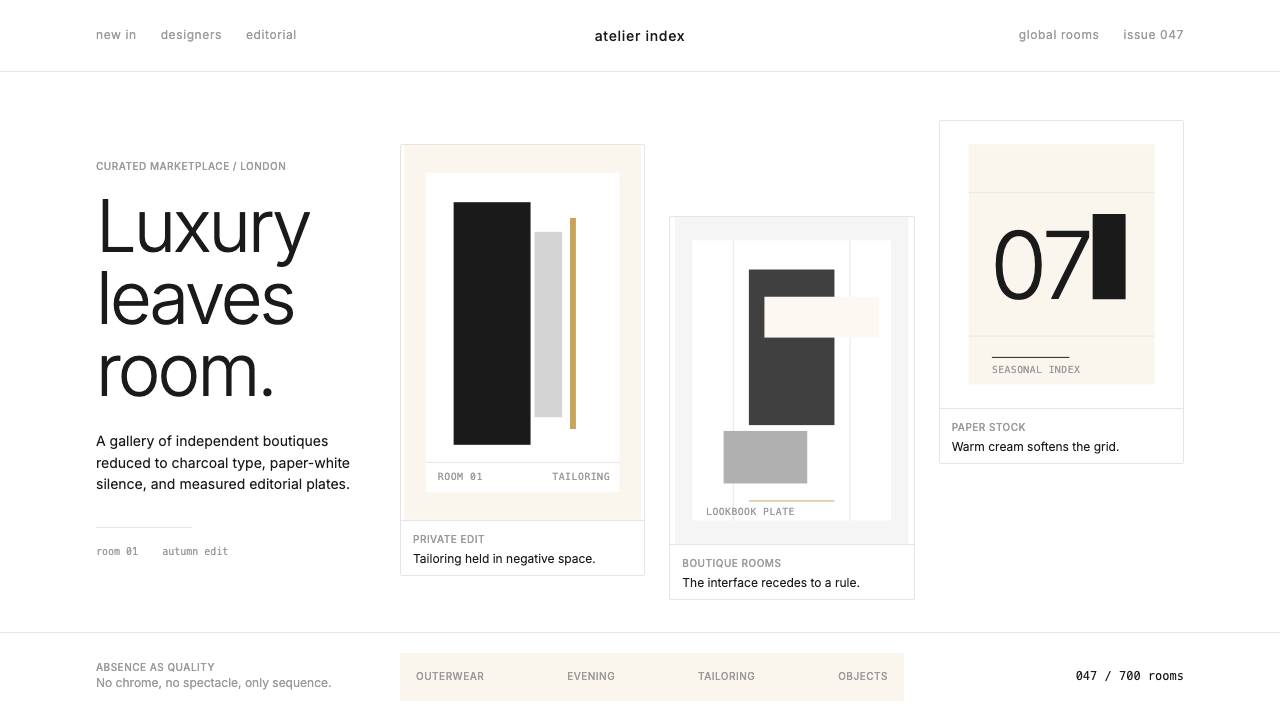 FarfetchLuxury as absence. Charcoal type, white canvas, and hairline editorial plates.奢华即留白。炭灰字、纯白画布与发丝线编辑图版。
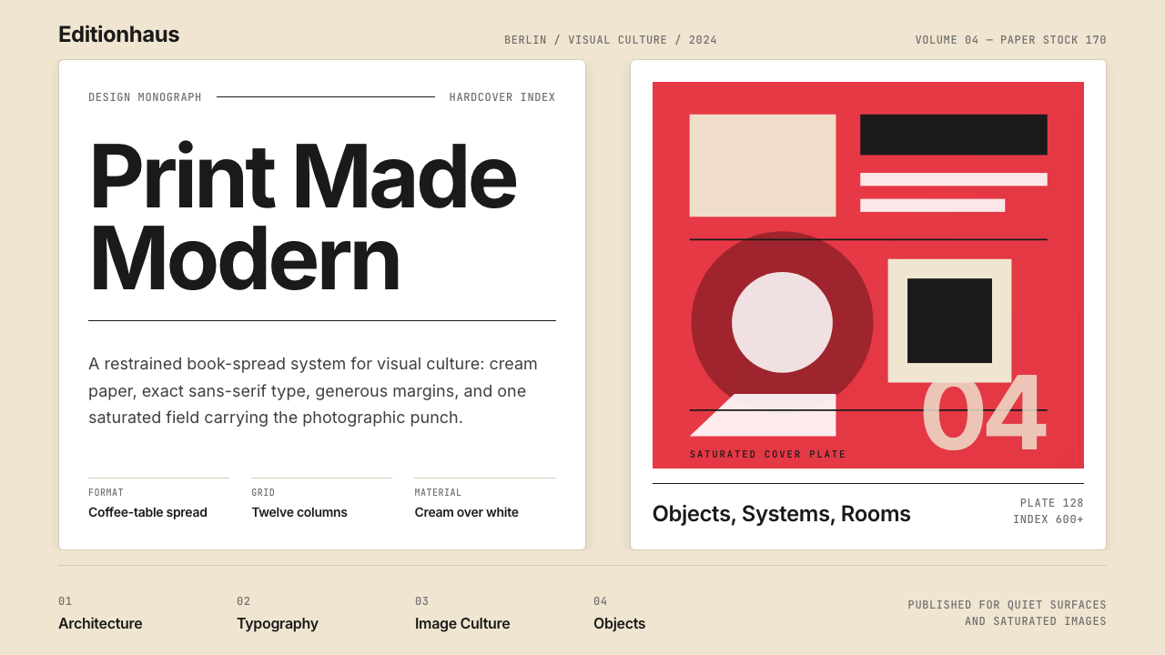 Gestalten Design BookCoffee-table calm. Cream paper, tight sans, one saturated block, and a strict…咖啡桌式冷静。奶油纸、紧凑无衬线、单一高饱和色块与严格网格。
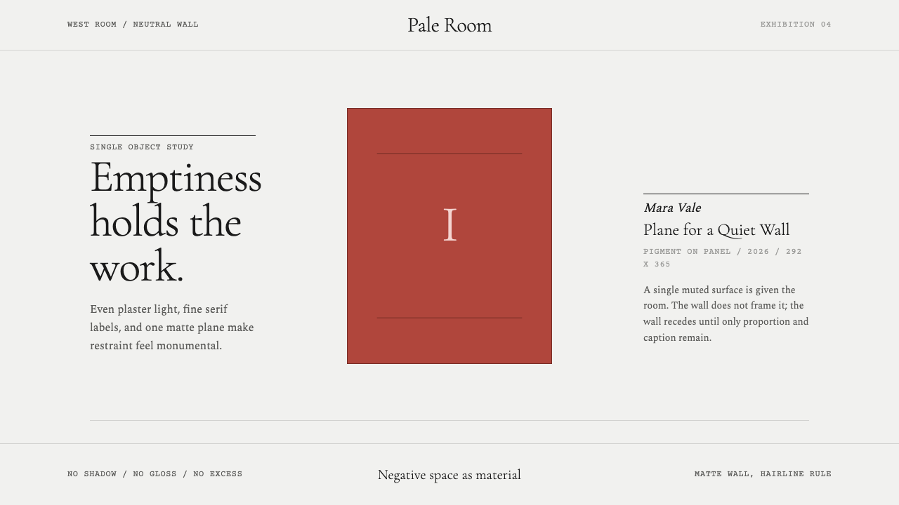 White Cube GalleryEmptiness is the medium. Cormorant labels and one terracotta plane hold the w…留白即媒介。Cormorant 标签与赭红平面撑起冷白墙。
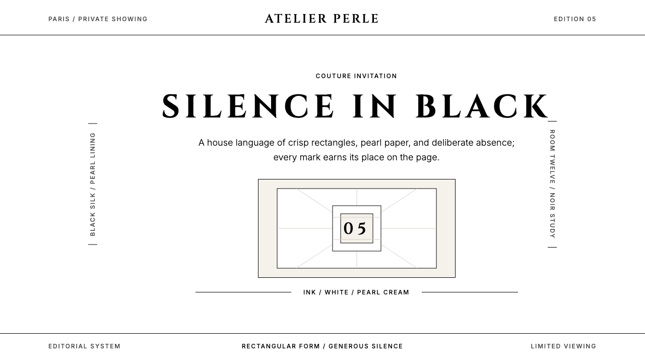 ChanelLuxury needs no color. Black on white, pearl-cream warmth, geometric capitals…百年宣言:真正的奢华无需色彩。纯黑配纯白,唯一的偏移是珍珠乳白——克制即气场。
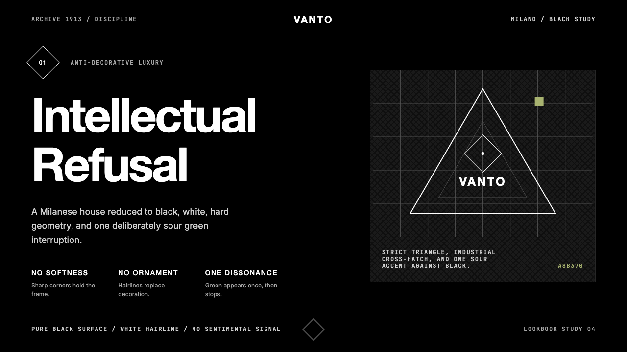 Prada Milan MinimalistLuxury refuses ornament. Pure black, austere sans, and one sour green hairlin…奢华拒绝装饰:纯黑、冷峻无衬线与一根涩绿细线。
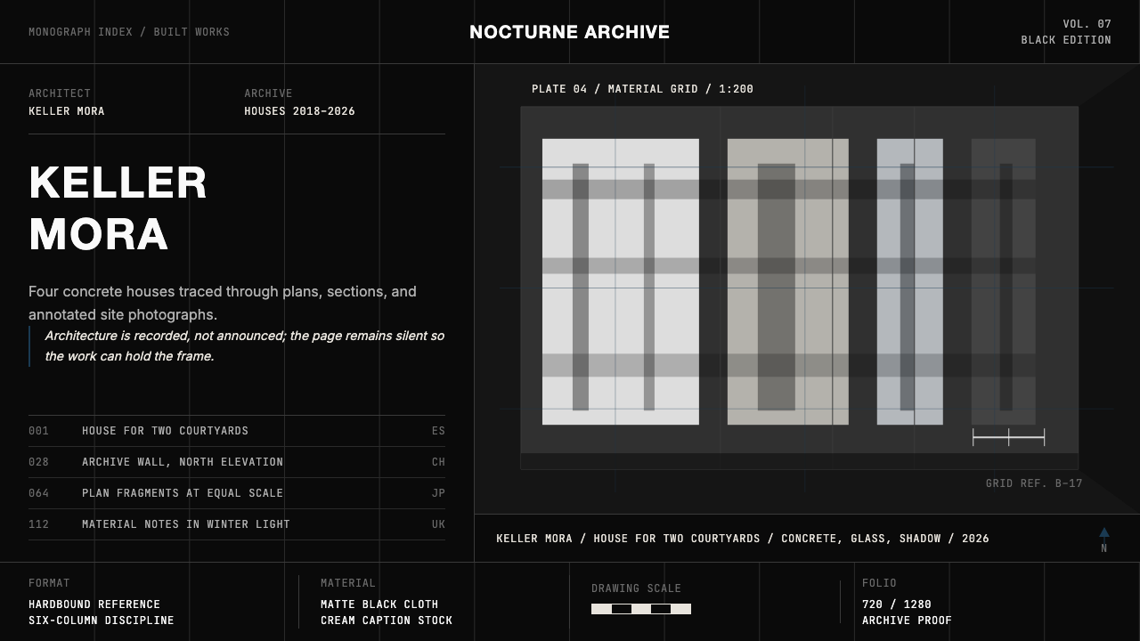 Architect Monograph (Black Edition)Architecture stays sovereign. Matte black, Helvetica caps, hairline grids, bl…建筑始终为主:哑光黑、Helvetica 大写、发丝网格与蓝图蓝。