What is Farfetch?什么是 Farfetch?
Farfetch turned luxury e-commerce into a whisper — pure-white canvas, charcoal letterforms, and full-bleed lookbook photography that makes every boutique feel like a private gallery.Farfetch 将奢侈品电商化为一声低语——纯白画布、炭灰字形、全出血时装大片,令每一家精品买手店都如同私人画廊。
Farfetch in briefFarfetch 速览
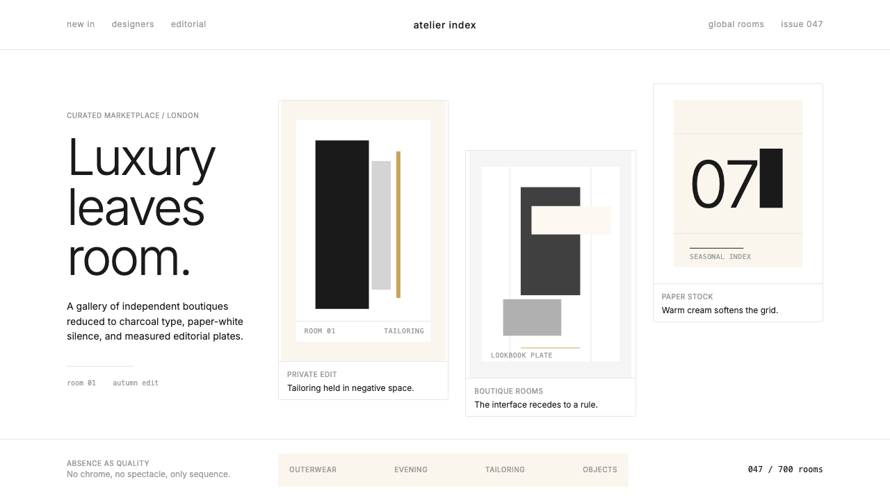
Farfetch is a global luxury-fashion marketplace whose visual identity is built on deliberate restraint: a canvas of pure white or near-white, charcoal sans-serif type scaled with editorial precision, full-bleed lookbook photography that fills the frame entirely, and hairline rules that divide sections without intruding on them. The platform treats over seven hundred independent boutiques as gallery rooms, giving each collection generous breathing space rather than stacking merchandise in dense grids.Farfetch 是一个全球性奢侈时装市场平台,其视觉识别建立在刻意的克制之上:纯白或近白的画布底色、以编辑精准度加以缩放的炭灰无衬线字体、充满整个画面的全出血时装大片,以及不侵扰版面而只是轻轻划分区块的发丝细线。平台将七百余家独立精品买手店呈现为画廊展厅,给每个系列以慷慨的呼吸空间,而非将商品密集堆砌于格栅之中。
The aesthetic is best described as editorial luxury at digital scale. It borrows the visual grammar of high-fashion print magazines — tiny lowercase navigation, slim rule lines, occasional warm-cream sections that evoke the feel of uncoated editorial paper — and applies that grammar consistently across every screen state, from product listing to checkout. Nothing shouts; everything is implied. Color is near-absent by design, allowing the fashion photography itself to carry all emotional and chromatic weight.这种美学最贴切的描述是:数字尺度上的编辑式奢华。它借鉴高级时装印刷杂志的视觉语法——微小的小写导航、细线规则、偶尔出现的暖奶油色区块唤起未涂布编辑纸的质感——并将这套语法一致地贯穿于每一个屏幕状态,从商品列表到结账页面。没有什么在喧嚷;一切皆是暗示。色彩几乎被设计性地剔除,让时装摄影本身承载所有情感与色彩的重量。
What separates Farfetch's visual system from conventional e-commerce is its understanding of luxury as the experience of removal. The interface withholds the typical signals of retail urgency — no countdown timers, no starburst sale badges, no crowded product carousels — and replaces them with space, quietude, and a typographic hierarchy so measured that navigating the site feels closer to reading a well-edited magazine than to shopping online.Farfetch 的视觉系统与常规电商的本质区别,在于它对奢华的理解——奢华即是减法的体验。界面刻意收回了一切零售紧迫感的惯常信号:没有倒计时、没有星爆形促销标签、没有拥挤的商品轮播——取而代之的是空间、静默,以及一套节制到使人在浏览时感觉更像在读一本编排精良的杂志、而非在网上购物的字体层级体系。
Where does Farfetch come from?Farfetch 从何而来?
Farfetch was founded in London in 2007 by José Neves, a Portuguese entrepreneur and fashion technologist who had previously built software for the footwear industry. Neves observed that the world's finest independent fashion boutiques — in Milan, Paris, Tokyo, São Paulo — each held irreplaceable inventory and cultural authority, but lacked the digital infrastructure to reach a global audience. His solution was a marketplace that would preserve each boutique's editorial identity while connecting it to buyers anywhere on earth. The founding insight was curatorial rather than commercial: the platform's value would come from selection and trust, not from price competition.Farfetch 由葡萄牙企业家、时尚科技人士若泽·内维斯于2007年在英国伦敦创立。内维斯此前曾为制鞋行业开发软件,他观察到:世界各地最优秀的独立时装精品买手店——米兰、巴黎、东京、圣保罗的那些——各自拥有无可替代的库存与文化权威,却缺乏触达全球受众的数字基础设施。他的解决方案是建立一个市场平台,在保留每家买手店编辑身份的同时,将它们与世界任何角落的买家相连接。这一创始洞察是策展性而非商业性的:平台的价值来自选择与信任,而非价格竞争。
The visual language that defines Farfetch today took shape progressively through the platform's evolution, with the most coherent iteration of its current identity emerging between roughly 2018 and 2024. During this period, the design team moved decisively away from the busy, feature-heavy interfaces common to mainstream e-commerce and toward something that consciously referenced high-fashion print. The shift was both aesthetic and strategic: as the platform grew to represent hundreds of luxury brands, the interface itself needed to recede, becoming a neutral gallery wall rather than a competing visual presence.今日定义 Farfetch 的视觉语言是随平台演进逐步成形的,其当前识别最为连贯的形态大约在2018年至2024年间浮现。在这一时期,设计团队果断地从主流电商惯用的繁忙、功能堆砌的界面转向一种有意识地参照高级时装印刷的语言。这一转变既是美学上的,也是战略上的:随着平台逐渐代理数百个奢侈品牌,界面本身需要退场,成为中性的画廊墙面,而非另一个相互竞争的视觉存在。
The editorial references are legible in specific formal choices. The use of full-bleed imagery — photographs that run edge to edge with no margin or border — comes directly from the tradition of fashion magazine spreads, where the page disappears and only the image remains. The preference for lowercase in navigation and supporting text has roots in avant-garde print typography of the twentieth century, where lowercase was associated with modernism and the rejection of hierarchical formality. The hairline rule — a line so thin it reads as a whisper rather than a barrier — appears throughout luxury print publishing as a device for organizing without imposing.这些编辑参照在具体的形式选择中清晰可读。全出血图像的运用——照片从边到边铺满、无留白无边框——直接源自时装杂志大图的传统,在那里页面消失,只剩图像本身。导航与辅助文字偏爱小写字母的做法,根植于二十世纪先锋派印刷排版传统,在那里小写字母与现代主义和对等级形式主义的拒绝相关联。发丝细线——细到读起来如低语而非屏障的线条——在奢侈品印刷出版中普遍出现,是在不施压的情况下组织版面的惯用装置。
Key figures in shaping Farfetch's commercial and cultural identity include Holli Rogers, the former President of Browns Fashion whose curatorial sensibility influenced how the platform positioned itself relative to the traditional luxury establishment; Stephanie Phair, a former Chief Customer Officer who emphasized editorial storytelling as a driver of brand differentiation; and Bom Suk Kim, whose work on the platform's technology infrastructure helped enable the seamless visual experience the design language depends on. Together, they represented the convergence of fashion editorial culture, luxury retail authority, and technology platform thinking that made Farfetch's particular aesthetic possible.在塑造 Farfetch 商业与文化身份方面,几位关键人物功不可没:霍利·罗杰斯,前 Browns Fashion 总裁,其策展感性深刻影响了平台相对于传统奢侈品建制的自我定位;斯蒂芬妮·费尔,前首席客户官,强调编辑叙事是品牌差异化的驱动力;以及博姆·苏克·金,其在平台技术基础设施方面的工作帮助实现了设计语言所依赖的流畅视觉体验。他们共同代表了时装编辑文化、奢侈零售权威与科技平台思维的汇流,正是这种汇流使 Farfetch 特有的美学成为可能。
What defines the Farfetch look?Farfetch 的视觉特征是什么?
White Canvas纯白画布
The foundation of the Farfetch visual system is near-absolute whiteness. Backgrounds are pure white or within a hair's breadth of it; no off-white warm tones intrude except in deliberate editorial accent sections. This whiteness is not emptiness — it is the primary expressive device, conferring on every product image the same neutral reverence that a gallery wall confers on a painting. The absence of background color is itself a statement about the primacy of the fashion objects being presented.Farfetch 视觉系统的基础是接近绝对的白色。背景为纯白或与纯白毫厘之差;除刻意为之的编辑强调区块外,无任何偏暖的米白色调介入。这种白色并非空洞——它是最主要的表达装置,赋予每张商品图像与画廊白墙赋予画作同等的中立敬意。背景色的缺席本身即是一种关于被呈现时装对象之至高地位的宣言。
Charcoal Editorial Type炭灰编辑字体
Type throughout the Farfetch interface is set in a restrained sans-serif at a color closer to deep charcoal than to pure black, softening the typographic presence without reducing legibility. Navigation uses a notably small scale, often in lowercase, which signals editorial restraint rather than conventional retail communication. Hierarchy is achieved almost entirely through scale and weight contrast — headlines are significantly larger than body text, but neither color nor ornament is used to reinforce the distinction. The typographic voice is quiet and authoritative simultaneously.Farfetch 界面中的字体通体以克制的无衬线字体排设,颜色更接近深炭灰而非纯黑,在不损失可读性的前提下柔化了排版的存在感。导航采用明显偏小的字号,常以小写字母呈现,这传递的是编辑克制而非惯常零售沟通的信号。层级几乎全凭尺度与字重对比实现——标题比正文大出许多,但既无色彩也无装饰用来强化这一区别。排版的声调同时是安静的与权威的。
Full-Bleed Photography全出血摄影
Lookbook and campaign photography occupies the full visual frame with no bordering, no caption overlays at the image edge, and no container shape constraining the image. This full-bleed treatment is borrowed directly from high-fashion print editorial practice, where the photograph is treated as the primary content — not an illustration of a product description, but the thing itself. The photography is typically high-production, with attention to lighting that reads as natural or studio-precise rather than commercial-bright. Product photography against white backgrounds is equally rigorous: no cast shadows, no environmental props that distract from the object.时装大片与广告活动图像占满整个视觉画面,无边框、无覆盖于图像边缘的说明文字、无任何容器形状约束图像。这种全出血处理直接借鉴自高级时装印刷编辑的惯例,在那里照片被视为主要内容本身——不是商品描述的插图,而是事物本身。摄影通常是高制作水准的,布光趋向自然或摄影棚精准,而非商业化的强亮。白底商品摄影同样严苛:无投射阴影,无会分散对象注意力的环境道具。
Hairline Rules and Minimal Structure发丝细线与极简结构
Section dividers throughout the interface are rendered as lines so thin they register as texture rather than boundary. These hairline rules — inherited from luxury print publishing — perform a structural function without acquiring visual weight of their own. They separate without asserting. Similarly, the overall layout structure is felt rather than seen: columns align, spacing is consistent, and the eye is guided through the page by proportional logic rather than explicit visual signposting. Navigation and filtering elements are reduced to the minimum marks necessary to communicate their function.界面中的区块分隔线细到被感知为质感而非边界。这些发丝细线——继承自奢侈品印刷出版——履行结构功能,却不为自身获取任何视觉重量。它们分隔而不主张。同样,整体版面结构是被感受到的而非被看见的:栏目对齐,间距一致,眼睛被比例逻辑而非明确的视觉路标引导穿越页面。导航与筛选元素被简化至传达其功能所必需的最少标记。
Cream Accent Sections暖奶油色强调区块
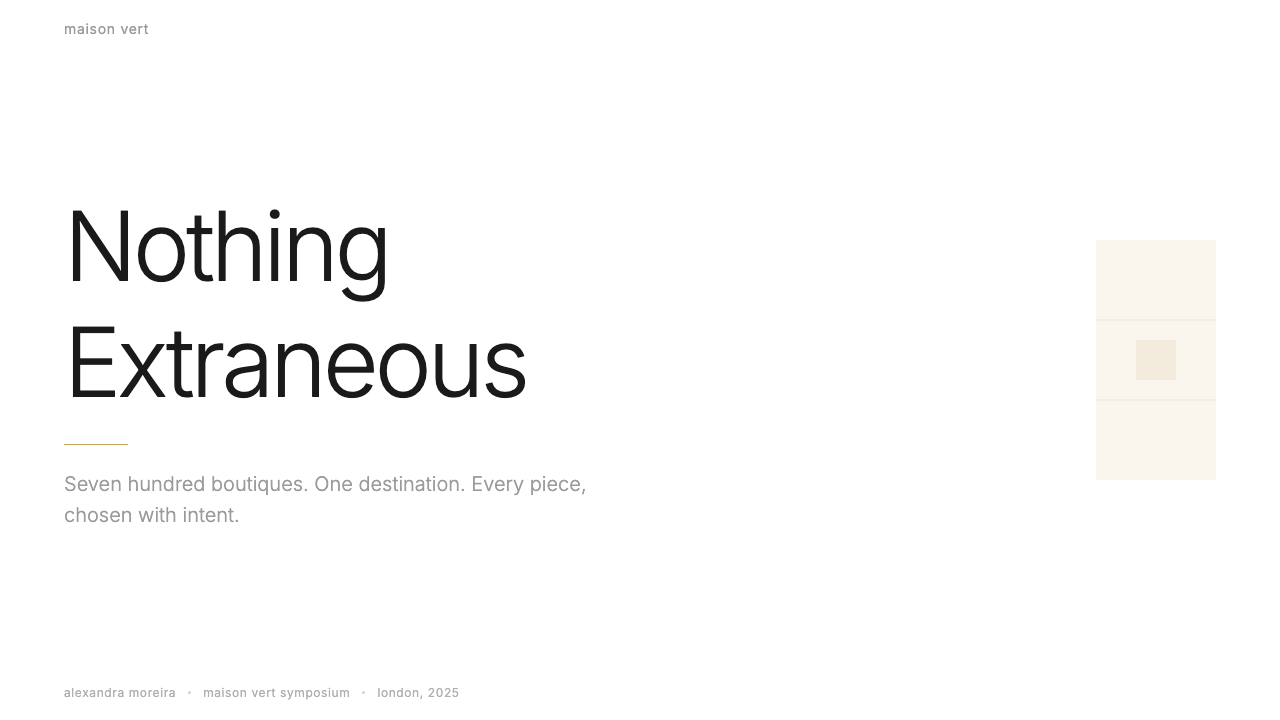
Against the prevailing white, Farfetch deploys occasional warm-cream background sections — typically used for editorial content, brand storytelling, or curatorial features. These sections evoke the feel of uncoated paper stock, immediately shifting the register from digital interface to print publication. The cream is not a brand color in the conventional sense; it is a contextual signal, indicating that the content within is editorial rather than transactional. It appears sparingly and always purposefully, never as decorative filler.在主导性的白色之间,Farfetch 间或部署暖奶油色背景区块——通常用于编辑内容、品牌叙事或策展专题。这些区块唤起未涂布纸张的质感,将语境即时从数字界面切换至印刷出版物。奶油色在常规意义上并非品牌色;它是一种语境信号,表明其中内容是编辑性而非交易性的。它出现得极为节制,且总是有目的的,从不作为装饰性填充。
Generous Negative Space慷慨的负空间
The spacing between elements on the Farfetch platform is deliberately expanded beyond what standard e-commerce conventions would allow. Product grids are open rather than dense, with significant space between cards. Product pages give images room to dominate without competing with adjacent information. This commitment to negative space communicates a specific luxury signal: scarcity and attention. In conventional retail, density implies abundance and value; in luxury, spaciousness implies that each object deserves individual consideration.Farfetch 平台中元素之间的间距被刻意扩展至超出标准电商惯例所允许的程度。商品格栅是开放而非密集的,卡片之间保有显著的空间。商品页面给予图像主导的空间,而不与相邻信息形成竞争。这种对负空间的坚持传递出一种特定的奢侈信号:稀缺与专注。在常规零售中,密度意味着丰裕与价值;在奢侈品中,宽敞意味着每件对象都值得被单独审视。
Suppressed E-commerce Chrome隐抑的电商界面元素
Farfetch's design actively removes or visually demotes the standard signals of online retail: promotional banners, urgency indicators, badge overlays on product images, and heavy call-to-action buttons. Where other platforms amplify conversion-focused elements, Farfetch suppresses them to the point of near-invisibility. Purchase actions are available but understated — buttons are outlined or text-only rather than filled and dominant. The effect is that the commercial act of buying is subordinated to the aesthetic experience of looking, consistent with how luxury is sold in physical boutiques where sales staff are present but never aggressive.Farfetch 的设计主动移除或在视觉上降低了在线零售标准信号的地位:促销横幅、紧迫感提示、商品图像上的徽章覆盖层,以及厚重的行动号召按钮。当其他平台放大以转化为导向的元素时,Farfetch 将它们压制到几乎不可见。购买操作可用但低调——按钮是描边或纯文字而非实心填充且占主导。效果是:购买的商业行为被从属于观看的审美体验,这与奢侈品在实体精品店中的销售方式一致——销售人员在场但从不咄咄逼人。
Who shaped Farfetch?谁塑造了 Farfetch?
The founder and long-time CEO of Farfetch, Neves brought both technical and fashion credentials to the company's creation. His background in building software for the footwear industry gave him an understanding of the operational complexity boutiques faced, while his genuine engagement with fashion culture gave him credibility with the independent retailers who formed the platform's early supply base. The founding vision — that the world's best boutiques should function as a single interconnected marketplace without losing their individual identities — reflects a curatorial sensibility that directly shaped the platform's editorial visual language.作为 Farfetch 的创始人和长期首席执行官,内维斯兼具技术与时尚双重背景。他在制鞋行业软件开发方面的经历使他深刻理解精品买手店面临的运营复杂性,而他对时装文化真实的投入则赋予他与构成平台早期供应基础的独立零售商打交道的可信度。这一创始愿景——世界上最好的买手店应当作为单一互联市场运作,同时不失去各自的独立身份——折射出一种策展感性,直接塑造了平台的编辑视觉语言。
Rogers joined Farfetch as CEO of Browns Fashion, the storied London boutique that Farfetch acquired in 2015. Browns had been a cornerstone of London fashion culture for decades, credited with introducing numerous designers to the British market. Rogers brought with her a deeply editorial understanding of how luxury fashion should be presented — not as product inventory, but as a curated cultural proposition. Her influence on how Farfetch positioned its content and editorial programming helped establish the platform's tone as something closer to a fashion publication than a retailer.罗杰斯以 Browns Fashion 首席执行官的身份加入 Farfetch——这家声誉卓著的伦敦精品店于2015年被 Farfetch 收购。Browns 数十年来一直是伦敦时装文化的基石,被誉为将众多设计师引入英国市场的重要推手。罗杰斯带来了深刻的编辑式理解——奢侈时装应如何呈现:不是作为产品库存,而是作为策展性的文化命题。她对 Farfetch 内容定位与编辑项目的影响,帮助确立了平台更接近时装出版物而非零售商的整体基调。
As Chief Customer Officer and later Chair, Phair was instrumental in articulating Farfetch's identity as a luxury destination rather than a transactional marketplace. Her emphasis on editorial storytelling, brand narrative, and the elevation of the customer relationship beyond the purchase moment shaped how the platform's design was asked to behave — as an environment for sustained engagement with fashion culture, not simply as a point of sale. This orientation toward experience over transaction is visible throughout the Farfetch visual system.作为首席客户官、后来的董事会主席,费尔在将 Farfetch 定义为奢侈目的地而非交易性市场方面发挥了关键作用。她对编辑叙事、品牌故事与将客户关系提升至购买时刻之外的强调,塑造了对平台设计行为方式的要求——作为与时装文化持续接触的环境,而非单纯的销售节点。这种以体验而非交易为导向的取向在 Farfetch 整个视觉系统中清晰可见。
As a key technology leader within the Farfetch organization, Kim's work on the platform's underlying infrastructure helped ensure that the seamless, performance-optimized experience the visual design required could actually be delivered at scale. Luxury e-commerce makes particular demands of technology: high-resolution imagery must load quickly, transitions must be smooth, and the interface must never feel labored or commercial in its loading behavior. The design language's dependence on generous imagery and open space is only viable when the technology beneath it performs without friction.作为 Farfetch 组织内的关键技术领导者,金在平台底层基础设施方面的工作帮助确保了视觉设计所要求的流畅、性能优化体验能够真正在规模上实现。奢侈品电商对技术提出了特殊要求:高分辨率图像必须快速加载,过渡必须流畅,界面在加载行为上绝不能给人费力或商业化的感觉。设计语言对慷慨图像和开放空间的依赖,只有当其下方的技术无摩擦地运行时才是可行的。
How do you use Farfetch today?今天怎么用 Farfetch?
The Farfetch visual language translates most naturally to contexts where the goal is to present objects — products, projects, artworks, or ideas — with authority and cultural seriousness. Applying it correctly requires resisting the instinct to fill space. The style's expressive power comes from what is absent: no promotional urgency, no color noise, no typographic decoration. Before placing any element, the right question is whether it serves the content or merely occupies the canvas.Farfetch 视觉语言最自然地转化于以权威感和文化严肃性呈现对象——商品、项目、艺术品或理念——的语境中。正确应用它需要抵制填满空间的本能。这种风格的表达力量来自缺席之物:没有促销紧迫感,没有色彩噪声,没有字体装饰。在放置任何元素之前,正确的问题是:它是否服务于内容,或仅仅占据画布。
For presentation slides, the Farfetch approach works best when photography or imagery is the primary content. Cover slides should use a single full-bleed image — occupying the entire slide area — with a title in small, restrained type positioned in a lower corner or along a narrow lower band. Content slides should be treated as editorial spreads: one or two images at generous scale, minimal text set in a single typeface at two or three sizes, no decorative borders or background fills. Data slides benefit from the same restraint — charts and graphs should be simple, isolated against white, with labels set in the same typeface family as body text. Avoid infographic embellishments; let the numbers occupy the same quiet visual field as the surrounding text.在演示文稿中,Farfetch 方式在摄影或图像是主要内容时效果最佳。封面页应使用一张全出血图像——占据整个幻灯片区域——标题以小号克制字体置于下方角落或沿着一条窄幅底部色带排列。内容页应被当作编辑跨页处理:一两张大幅图像,以同一字体两到三个尺寸排设的极简文字,无装饰边框或背景填充。数据页同样受益于这种克制——图表应简洁、隔离于白色底面,标签以与正文相同的字体家族排设。避免信息图表式的装饰;让数字与周围文字占据同一安静的视觉场域。
For web interfaces and digital dashboards, the style is well suited to product showcases, portfolio sites, editorial platforms, and any context where the object being displayed should dominate the visual field. The implementation principle is aggressive whitespace: margins wider than standard, padding between elements expanded beyond convention, and a content column narrow enough that the surrounding white reads as intentional rather than wasted. Navigation should be typographic and recessive — small scale, lightweight, positioned to be found rather than to announce itself. For interactive states, avoid color fills on buttons; instead, use border transitions or subtle scale changes that signal response without introducing chromatic noise.对于网页界面与数字仪表板,这种风格非常适合商品展示、作品集网站、编辑平台,以及任何被展示对象应主导视觉场域的语境。实施原则是激进的留白:边距宽于标准,元素间的内边距扩展至超出惯例,内容栏足够窄使周围的白色被解读为刻意为之而非浪费。导航应是字体性的且退隐的——小尺寸、轻量,定位于被发现而非自我宣告。对于交互状态,避免按钮上的色彩填充;改用边框过渡或细微的缩放变化来传达响应,而不引入色彩噪声。
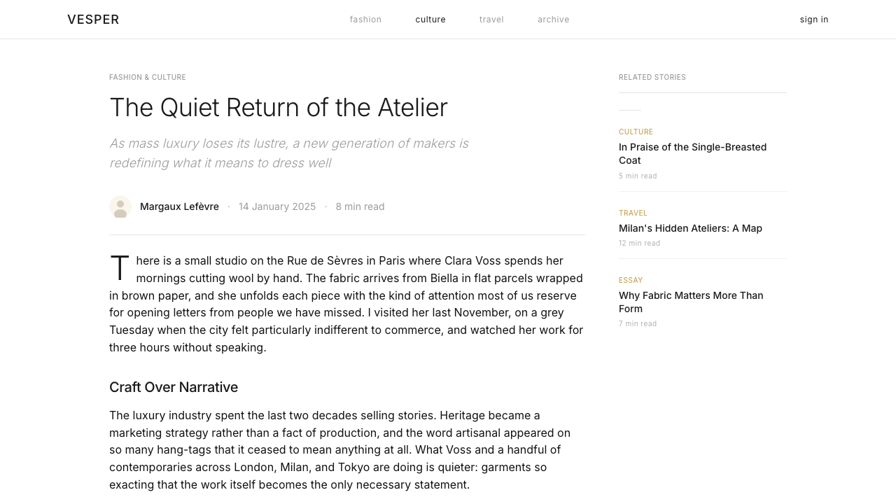
For editorial and marketing applications, the Farfetch visual language supports longform content as well as advertising. An editorial article layout should use a narrow body text column with an expansive outer margin — the margin can hold pull quotes, image captions, or simply remain empty as a breathing zone. Section breaks are marked by horizontal hairline rules rather than headline-sized dividers. Marketing pages and campaign materials work well with alternating background sections: white followed by cream, with full-bleed imagery anchoring each section. Campaign type should be set large, in a single weight, against a clean field, with no layering of text over complex photography — or, if text must overlay an image, position it against the image's most neutral region.对于编辑与营销应用,Farfetch 视觉语言既支持长篇内容,也支持广告。编辑文章版面应使用窄幅正文栏与宽阔的外侧留白——留白可承载引用语、图像说明,或简单地保持为呼吸地带。区块分隔以水平发丝细线而非标题级分隔符标记。营销页面与活动物料适合交替背景区块:白色接奶油色,全出血图像锚定每个区块。活动字体应以大号单一字重排设于干净的底面上,文字不与复杂摄影叠加——若文字必须覆盖图像,将其置于图像最中性的区域之上。
A common mistake when applying the Farfetch visual language is confusing editorial restraint with visual emptiness. The style requires that every element placed on the canvas earn its position through content relevance, not spatial necessity. Layouts that are simply sparse — few elements, no clear grid, inconsistent spacing — do not achieve the Farfetch aesthetic; they achieve vacancy. The correct interpretation is proportional discipline: spacing that is generous but consistent, type that is small but deliberately scaled, imagery that is large but purposefully selected. The second common error is breaking the chromatic silence with conventional e-commerce color conventions — colored call-to-action buttons, colored category labels, colored notification badges. When any of these appear in a Farfetch-influenced design, they immediately signal retail anxiety, which is precisely the register the style works to suppress.应用 Farfetch 视觉语言时最常见的错误,是将编辑克制与视觉空洞混为一谈。这种风格要求画布上放置的每个元素通过内容相关性而非空间必要性来赢得其位置。仅仅稀疏——元素少、无清晰网格、间距不一致——的版面并不能实现 Farfetch 美学,只会实现空洞。正确的诠释是比例纪律:慷慨但一致的间距,小但经过刻意缩放的字体,大但经过有目的筛选的图像。第二个常见错误是用常规电商色彩惯例打破色彩上的沉默——有色彩的行动号召按钮、有色彩的品类标签、有色彩的通知徽章。当这些出现在受 Farfetch 启发的设计中时,它们立即传递出零售焦虑的信号,而这恰恰是这种风格致力于压制的语调。
Farfetch — FAQFarfetch · 常见问题
Is the Farfetch style just minimalism with luxury photography?Farfetch 风格只是带着奢侈摄影的极简主义吗?
Minimalism is a useful shorthand but it misses the specificity of what Farfetch does. Contemporary minimalism in digital design often produces clean but affectless interfaces — functional, but without a point of view. The Farfetch visual system is shaped by a very particular cultural reference: high-fashion print editorial. The choices it makes — hairline rules, lowercase navigation, cream sections, full-bleed photography — are all borrowed from a specific publishing tradition with its own history and connotations. The result reads differently from generic minimalism: it carries the authority and cultural weight of fashion publishing, not just the aesthetic of reduction.极简主义是一个有用的简称,但它遗漏了 Farfetch 所做之事的特殊性。当代数字设计中的极简主义往往产生干净但缺乏情感的界面——功能性的,但没有立场。Farfetch 视觉系统由一个非常特定的文化参照塑造:高级时装印刷编辑。它所做出的选择——发丝细线、小写导航、奶油色区块、全出血摄影——都借鉴自一种有其自身历史与内涵的特定出版传统。结果的阅读感与通用极简主义截然不同:它承载了时装出版的权威与文化重量,而不仅仅是减法的美学。
Can this style work for non-fashion brands?这种风格能用于非时装品牌吗?
Yes, but the fit depends on whether the brand's core value proposition involves quality, curation, or cultural authority — not price efficiency or convenience. The Farfetch visual system works well for independent jewelry and watch brands, high-end hospitality and residential real estate, premium beauty and fragrance, and any direct-to-consumer brand positioning itself as an alternative to mass-market equivalents. It struggles for brands whose primary messaging is about accessibility, abundance, or affordability. The visual language communicates that what is being offered is rare, carefully chosen, and worth sustained attention — if the product does not support that claim, the style creates dissonance rather than authority.可以,但契合度取决于品牌的核心价值主张是否涉及品质、策展性或文化权威——而非价格效率或便利性。Farfetch 视觉系统适合独立珠宝与腕表品牌、高端酒店与住宅地产、高端美妆与香氛,以及任何将自身定位为大众市场同类产品替代选择的直营品牌。它不适合主要信息关于可及性、丰裕感或实惠价格的品牌。这套视觉语言传达的是:所提供之物是稀缺的、经过精心甄选的、值得持续关注的——如果产品不支持这一主张,风格会制造失调而非权威。
How should color be introduced into a Farfetch-influenced design without breaking the system?如何在不破坏系统的前提下,在受 Farfetch 启发的设计中引入色彩?
Color, when introduced, should enter through the photography and imagery rather than through the interface itself. The interface palette — backgrounds, type, rules, buttons — should remain in the white-charcoal-cream range, allowing whatever chromatic richness the fashion imagery contains to provide all the color the design needs. If interface color is required — for example, to signal an error state, a sale event, or a category distinction — it should appear once, in a single restrained tone, and be removed from every other context where it is not strictly necessary. The moment color begins to accumulate in the interface layer, the editorial register dissolves into conventional retail.引入色彩时,应通过摄影与图像进入,而非通过界面本身。界面色板——背景、字体、细线、按钮——应保持在白色-炭灰-奶油的范围内,让时装图像所含有的任何色彩丰富性提供设计所需的全部颜色。如果需要界面色彩——例如,用于传达错误状态、促销活动或品类区分——它应只在一处出现,以单一克制的色调呈现,并从所有非严格必要的其他语境中移除。一旦色彩开始在界面层积聚,编辑语调便会溶解为常规零售。
What is the difference between the Farfetch aesthetic and the Net-a-Porter aesthetic?Farfetch 美学与 Net-a-Porter 美学有何不同?
Both platforms operate in luxury fashion e-commerce and both use restrained palettes, but their visual languages have distinct personalities. Net-a-Porter is more structured and graphic: its black-and-white editorial identity is harder-edged, with stronger typographic contrast and a more magazine-grid sensibility. It is luxury as editorial authority — precise, formatted, controlled. Farfetch, by contrast, is softer and more gallery-like in its spatial treatment: the warmth of the cream sections, the open spacing, and the full-bleed photography approach create something closer to an immersive browsing experience than a structured editorial page. Net-a-Porter tells you what to pay attention to; Farfetch invites you to wander.两个平台都在奢侈时装电商领域运营,都使用克制的色板,但它们的视觉语言有着截然不同的个性。Net-a-Porter 更具结构感与平面感:其黑白编辑身份边缘更硬朗,字体对比更强,更具杂志网格的感性。这是一种以编辑权威定义的奢华——精确、格式化、受控。Farfetch 则相反,在空间处理上更柔和、更接近画廊风格:奶油区块的温暖感、开放的间距与全出血摄影方式共同创造出一种更接近沉浸式浏览体验而非结构化编辑页面的东西。Net-a-Porter 告诉你该关注什么;Farfetch 则邀请你漫游。
Does the Farfetch visual language translate well to mobile?Farfetch 视觉语言能很好地转化为移动端体验吗?
The core principles — whitespace, typographic restraint, image primacy — translate to mobile naturally, but the implementation requires adjustments. On a narrow screen, the generous margins that define the desktop experience must be reconsidered: what reads as luxuriously spacious at large scale can read as wasted real estate at small scale. The solution is to preserve the proportional logic rather than the literal spacing values — margins should still feel intentional and wide relative to the content column, even if the absolute measure is smaller. Full-bleed photography works even more powerfully on mobile, where the narrow viewport forces images to fill the entire visual field. Typography must be set with particular care: at small sizes, the restrained lowercase aesthetic can cross from editorial elegance into illegibility if not tuned for the medium.核心原则——留白、字体克制、图像优先——自然地转化为移动端,但实施需要调整。在窄屏上,定义桌面体验的慷慨边距必须重新考量:在大尺寸下读来奢华宽敞的留白,在小尺寸下可能被读为浪费的屏幕空间。解决方案是保留比例逻辑而非字面的间距值——相对于内容栏,边距仍应感觉是刻意为之且宽阔的,即使绝对尺寸更小。全出血摄影在移动端效果甚至更为有力,窄视口迫使图像填满整个视觉场域。字体必须特别精心地排设:在小尺寸下,克制的小写美学若不针对媒介进行调整,可能从编辑优雅跨越为不可读。
Related design styles相关设计风格
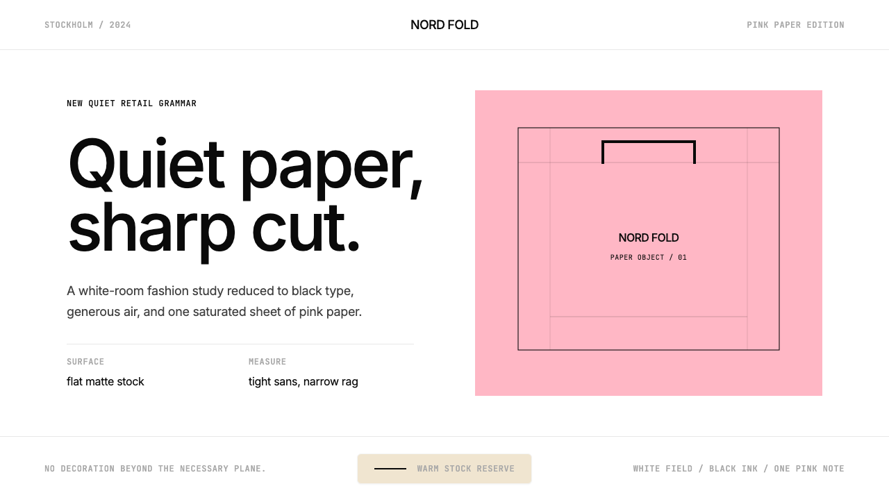 Acne Studios Pink-PaperQuiet luxury in one pink plane. Inter type floats on white with a bag-like re…粉色平面定义安静奢华:Inter 黑字漂浮于白场,像一只纸袋。
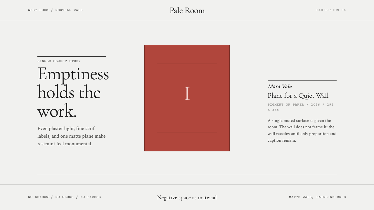 White Cube GalleryEmptiness is the medium. Cormorant labels and one terracotta plane hold the w…留白即媒介。Cormorant 标签与赭红平面撑起冷白墙。
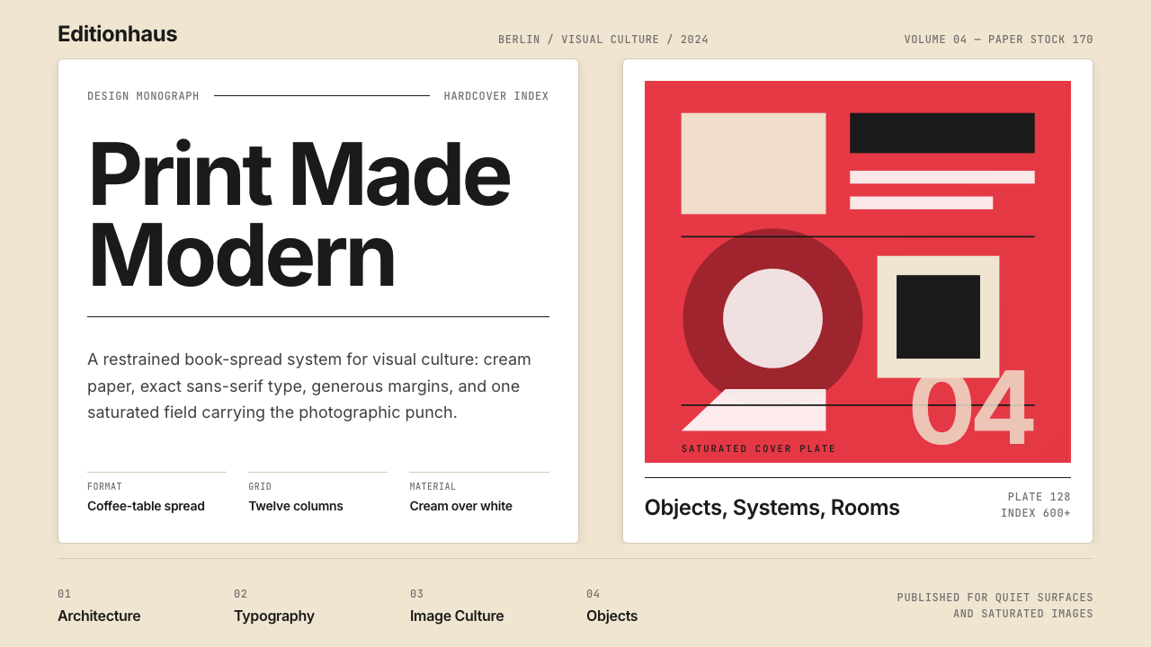 Gestalten Design BookCoffee-table calm. Cream paper, tight sans, one saturated block, and a strict…咖啡桌式冷静。奶油纸、紧凑无衬线、单一高饱和色块与严格网格。
 ChanelLuxury needs no color. Black on white, pearl-cream warmth, geometric capitals…百年宣言:真正的奢华无需色彩。纯黑配纯白,唯一的偏移是珍珠乳白——克制即气场。
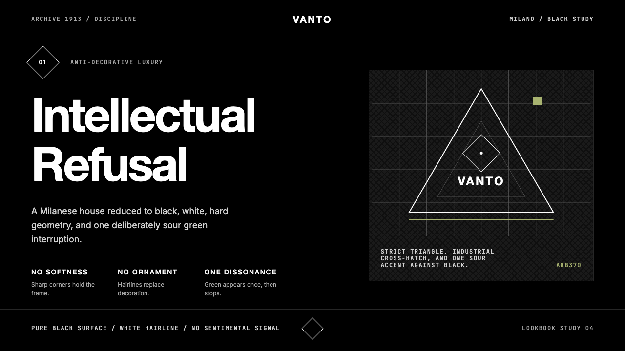 Prada Milan MinimalistLuxury refuses ornament. Pure black, austere sans, and one sour green hairlin…奢华拒绝装饰:纯黑、冷峻无衬线与一根涩绿细线。
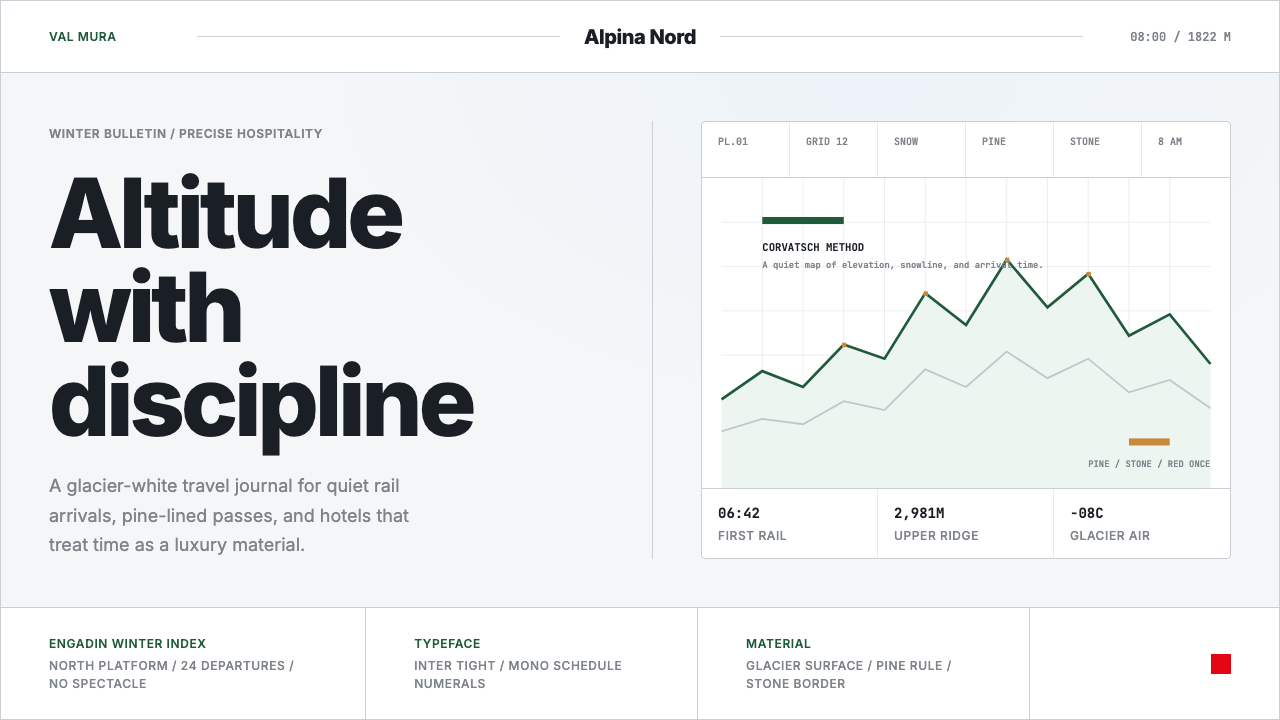 Swiss Alps GraubündenAlpine precision, restrained. Glacier white, pine rules, and tight Inter grid…阿尔卑斯式克制精确。冰川白、松绿线与紧排Inter构成静默网格。