Design style guide设计风格指南
What is Swiss Alps Graubünden?什么是 Swiss Alps Graubünden?
Swiss Alps Graubünden distills a century of Swiss typographic discipline into a tourism aesthetic as precise as an alpine timetable — every element earning its place through clarity, never decoration.瑞士阿尔卑斯格劳宾登将一个世纪的瑞士排版纪律凝练为旅游视觉美学,精准如高山时刻表——每个元素凭借清晰立足,而非装饰。
Swiss Alps Graubünden in briefSwiss Alps Graubünden 速览
The Swiss Alps Graubünden design system is a tourism visual identity rooted in a century of Swiss graphic discipline, applied with the restraint and precision that the alpine landscape itself seems to demand. It draws on the formal logic of Swiss International Style — the strict grid, the preference for generous whitespace, and the conviction that visual communication should function first and impress second — while grounding that logic in the specific geography and cultural identity of Switzerland's largest canton.瑞士阿尔卑斯格劳宾登设计系统是一套根植于瑞士百年平面规范的旅游视觉识别体系,以阿尔卑斯山地景观所要求的那种克制与精确加以运用。它汲取瑞士国际主义风格的形式逻辑——严格的网格、充裕留白的偏好,以及视觉传达应首先有效、其次印象深刻的信念——同时将这一逻辑扎根于瑞士最大州格劳宾登的独特地理与文化身份之中。
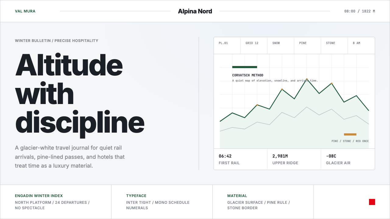
The system is built around a palette drawn directly from the landscape: glacier whites that feel luminous rather than sterile, a pine-green derived from the larch forests of the Engadin valley, and a red that echoes the Swiss national flag — used with the restraint of a brand that knows when to reach for its most powerful signal and when to hold back. The overall effect is one of legibility at altitude: information that reads clearly against snow glare, against mountain light, and against the visual complexity of a dramatic natural setting.这套系统围绕直接提炼自自然景观的色彩建立:冰川般的白色,光亮而不冰冷;源自恩加丁谷地落叶松林的松绿色;以及呼应瑞士国旗的红色——以一个清楚知道何时使用最强信号、何时保持克制的品牌所特有的方式来运用。整体效果是一种「高海拔可读性」:信息在雪光折射、山地光线与壮美自然背景的复杂视觉环境中都能清晰呈现。
What separates this system from a generic 'clean Swiss' aesthetic is its insistence on earned restraint. The whitespace is not emptiness — it is the compositional equivalent of a mountain plateau, a deliberate opening that gives every remaining element room to breathe and weight to carry. The system does not compete with the landscape it represents; it frames it.这套系统与泛泛的「干净瑞士」美学的区别,在于它对「克制需要被赚取」的坚持。留白不是空洞——它是山间高地的构图等价物,一种刻意的开放,让每个剩余元素都有呼吸的空间与承载重量的能力。这套系统并不与它所代表的景观竞争,而是为其提供画框。
See the Swiss Alps Graubünden design system →查看 Swiss Alps Graubünden 完整设计系统 →
Where does Swiss Alps Graubünden come from?Swiss Alps Graubünden 从何而来?
Graubünden — known in German, Italian, and Romansh respectively as Graubünden, Grigioni, and Grischun — is Switzerland's largest canton by area and its most linguistically complex, home to three official cantonal languages. This multilingual character shaped its communication culture: from early Alpine signage to modern tourism materials, clarity and legibility across language groups has always been a structural requirement, not merely an aesthetic preference. The design tradition that emerged from this necessity aligns naturally with the Swiss International Style that Josef Müller-Brockmann and his contemporaries formalized in Zurich and Basel during the 1950s and 1960s.格劳宾登——德语、意大利语和罗曼什语分别称之为Graubünden、Grigioni和Grischun——是瑞士面积最大的州,也是语言最为复杂的州,拥有三种官方州语言。这种多语言特性塑造了当地的传播文化:从早期的阿尔卑斯标识到现代旅游材料,跨语言群体的清晰可读性始终是结构性要求,而非单纯的美学偏好。从这一需求中产生的设计传统,与约瑟夫·穆勒-布罗克曼及其同代人在1950至60年代于苏黎世和巴塞尔系统化的瑞士国际主义风格自然契合。
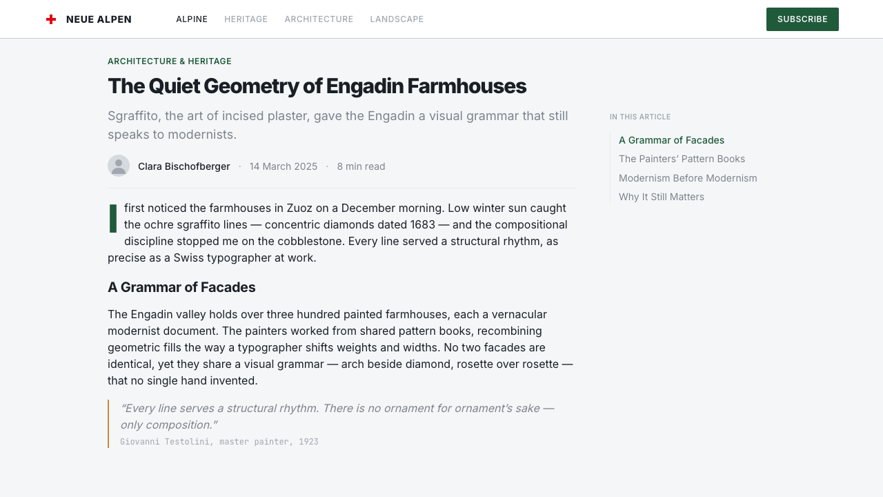
The visual heritage of the region runs deeper than the twentieth century. The Engadin villages — Sils Maria, St. Moritz, Pontresina — developed a distinctive architectural and decorative tradition called sgraffito, in which patterns are scratched through colored plaster to reveal a contrasting layer beneath. This technique, which flourished from the sixteenth to nineteenth centuries, produced geometric and floral motifs of considerable refinement on the facades of Engadin farmhouses and merchant homes. Sgraffito is not a direct ancestor of the modern Graubünden visual identity, but it speaks to a regional aesthetic sensibility that has long found beauty in the relationship between surface and structure, between restraint and precision.该地区的视觉传承远比二十世纪更为深远。恩加丁的村庄——锡尔斯玛利亚、圣莫里茨、蓬特雷西纳——发展出一种独特的建筑与装饰传统,称为「斯格拉菲托」(sgraffito),即在彩色灰泥上刻划图案,露出下层对比色彩。这种技艺在十六至十九世纪间蓬勃发展,在恩加丁农舍与商人宅邸的外立面上产生了相当精炼的几何与花卉纹样。斯格拉菲托并非现代格劳宾登视觉识别的直接祖先,但它揭示了一种地域性美学感受力——长久以来在表面与结构、克制与精确的关系中发现美。
The modern Swiss tourism brand and its associated visual standards emerged through the twentieth century alongside the professionalization of Swiss graphic design. Figures central to that professionalization — Adrian Frutiger, who designed typefaces for maximum legibility at varying scales; Max Bill, the Zurich-based artist and designer who argued that concrete visual form could be derived from objective principles; and Josef Müller-Brockmann, whose grid systems became the backbone of rational Swiss typography — all contributed to an aesthetic climate in which the Graubünden tourism identity could take root. The canton's visual identity absorbed this tradition without copying it wholesale, adapting the grid logic and typographic discipline of Swiss Style to the specific registers of hospitality and place-making.现代瑞士旅游品牌及其相关视觉标准伴随瑞士平面设计的专业化,在二十世纪逐步形成。这场专业化进程的核心人物——阿德里安·弗鲁提格(设计出在各种尺寸下最大化可读性的字体)、苏黎世艺术家与设计师马克斯·比尔(主张可从客观原则推导出具体视觉形式)、以及约瑟夫·穆勒-布罗克曼(其网格系统成为理性瑞士排版的骨干)——共同营造了一种美学氛围,格劳宾登旅游识别在其中得以生根。这个州的视觉识别吸收了这一传统而非照单全收,将瑞士风格的网格逻辑与排版纪律调适为款待业与地方营造的特有语境。
The Belle Époque played an important role in establishing the international reputation of the Graubünden Alps as a destination. Caspar Badrutt, the St. Moritz hotelier who in 1864 famously wagered his British summer guests that they would enjoy a winter stay and won, effectively invented the European winter resort culture. The visual communication of this era — printed on posters, in railway timetables, across hotel stationery — set an early tone of precision and elegance that later Swiss typographers would inherit and systematize. The SBB timetable, itself one of the great achievements of information design, provided a functional model for how complexity could be organized through typographic clarity alone.美好年代(Belle Époque)在确立格劳宾登阿尔卑斯山作为国际目的地的声誉方面发挥了重要作用。圣莫里茨酒店主卡斯帕·巴德鲁特于1864年打赌——承诺如果英国夏季客人冬季留下来不满意就赔偿全程费用——实际上发明了欧洲冬季度假村文化。这个时代的视觉传播——印在海报上、铁路时刻表里、酒店信纸上——奠定了精确与优雅的早期基调,后来的瑞士排版师继承并系统化了这一基调。瑞士联邦铁路时刻表本身作为信息设计的伟大成就之一,为如何仅凭排版清晰度组织复杂性提供了一个功能性范本。
What defines the Swiss Alps Graubünden look?Swiss Alps Graubünden 的视觉特征是什么?
Palette Restraint色板克制
The color system uses three anchors — glacier white as the dominant ground, pine green as a single organic accent, and Swiss-flag red held in reserve for moments of genuine communicative necessity. The white is not blank; it carries the luminous quality of alpine light at altitude. The green is cool and specific, evoking resin and altitude rather than vegetation in general. The red is never decorative — it appears only where brand authority or urgency must be signaled. This disciplined three-color logic prevents the palette from drifting into postcard sentimentality or tourist-brochure brightness.色彩系统使用三个锚点——冰川白作为主导底色,松绿色作为单一有机强调色,瑞士国旗红则保留用于真正需要传播权威的时刻。这里的白色不是空白,它承载着高海拔阿尔卑斯光线的光亮品质。绿色清冷而具体,唤起松脂与海拔高度,而非泛泛的植被。红色从不充当装饰——它仅在必须传递品牌权威或紧迫感时才出现。这种严格的三色逻辑防止色板滑向明信片式的伤感或旅游手册式的鲜艳。
Grid Discipline网格纪律
Every layout is governed by a consistent underlying grid that organizes content into clear vertical columns with defined horizontal intervals. Headlines align to the grid's left edge as a rule; centered composition is avoided except where ceremonial formality demands it. The grid is never visible — it operates as infrastructure, not decoration — but its presence is legible in the consistent spatial relationships between every element on the page. This approach is directly inherited from the Müller-Brockmann tradition, where the grid was understood as a rational solution to the problem of organizing multiple pieces of information without arbitrary visual noise.每一种版面都受一套一致的基础网格支配,将内容组织成具有明确水平间距的清晰垂直栏。标题原则上左对齐网格边缘;除非礼仪性正式场合要求,否则避免居中构图。网格从不显形——它作为基础设施而非装饰运作——但其存在通过页面每个元素之间一致的空间关系清晰可读。这一方法直接继承自穆勒-布罗克曼传统,在那个传统中,网格被理解为无需任意视觉噪音即可组织多项信息问题的理性解决方案。
Typographic Precision排版精确
The typographic system is set tight — letterforms at close intervals, tracking compressed enough to evoke the condensed information on a mountain-station signboard or an SBB departure board. This tightness is not claustrophobic; it is counterbalanced by the generous whitespace that surrounds type blocks and by a clear size hierarchy that distinguishes headlines, subheadings, body text, and captions as functionally distinct levels rather than stylistic variations. Left alignment is maintained as a structural default; justified text, which creates irregular word spacing, is avoided.排版系统以紧凑方式呈现——字形间距收紧,字距压缩到足以令人联想到山站指示牌或瑞士联邦铁路发车板上密集信息的程度。这种紧凑并不令人窒息,它被包围文字块的充裕留白以及清晰的尺寸层级所平衡——后者将标题、副标题、正文与图注区分为功能上不同的层次,而非风格上的变体。左对齐作为结构性默认值被保持;产生不规则字间距的两端对齐被回避。
Whitespace as Material留白作为材料
Whitespace in this system is not absence — it is the primary compositional material. Margins are wide enough to function as breathing zones, not merely as frame boundaries. The space between a photograph and its caption, between a section heading and the paragraph below it, is calibrated rather than defaulted. This approach treats the empty surface the same way the Engadin landscape treats open snow fields: as something that has presence and communicative weight, not as background waiting to be filled.在这套系统中,留白不是缺席——它是主要的构图材料。页边距足够宽阔,能作为呼吸区域发挥作用,而不仅仅是画框边界。照片与图注之间、段落标题与其下正文之间的空间,是被校准的而非默认的。这种方法对待空白表面的方式,如同恩加丁景观对待开阔雪原:它有存在感与传播重量,而非等待被填满的背景。
Photographic Integration摄影整合
Landscape photography is used as a structural element rather than wallpaper. Images are cropped to foreground compositional geometry — the diagonal of a ridgeline, the horizontal band of a treeline, the vertical plane of a granite face — rather than to center a postcard-perfect panorama. Where photography and type coexist on the same surface, the typographic grid determines the crop, not the other way around. Full-bleed images appear only where the spatial scale of the landscape justifies the format; otherwise, images are bounded by the grid's column structure.山地摄影作为结构性元素而非壁纸使用。图像的裁切强调构图几何——山脊的对角线、树线的水平带、花岗岩面的垂直平面——而非居中呈现明信片式的完美全景。摄影与文字共存于同一表面时,排版网格决定裁切,而非反过来。全幅出血图像仅在景观的空间尺度能支撑该格式时才出现;否则,图像受网格的栏结构所约束。
Multilingual Clarity多语言清晰
Because Graubünden operates across German, Italian, and Romansh, the visual system must support multilingual communication without privileging one language visually over another. This requirement reinforces the typographic discipline: when the same information must be set in three scripts of varying length, arbitrary decorative variation becomes impossible. The grid is the only fair arbiter. This constraint, far from being a limitation, is a structural generator — it is one reason the system defaults to left-aligned, size-differentiated, grid-anchored typography rather than the centered, ornamented alternatives that monolingual systems can more easily afford.由于格劳宾登跨越德语、意大利语和罗曼什语三种语言运作,视觉系统必须支持多语言传播,同时不在视觉上偏袒任何一种语言。这一要求强化了排版纪律:当同样的信息必须以三种长度不同的文字设置时,任意的装饰性变体变得不可能。网格是唯一公平的仲裁者。这种约束远非局限,而是一种结构性生成力——这正是系统默认采用左对齐、尺寸差异化、网格锚定排版而非居中、装饰性替代方案的原因之一,后者只有单语言系统才能较为轻松地负担。
Environmental Legibility环境可读性
The system is calibrated for contexts where ambient conditions challenge ordinary visual communication: mountain light that is both brilliant and directionally harsh, snow fields that flatten contrast, altitudes where signage must be readable at speed from a moving vehicle or cable car. This environmental grounding produces design choices that translate well to screen: high contrast between text and ground, clear size differentiation between information levels, and a color logic that works even when viewed through glare. The constraints of the alpine environment have made the system more robust, not more specialized.这套系统为环境条件对普通视觉传播构成挑战的场景而校准:既明亮又方向性强烈的山地光线、使对比度趋于平坦的雪原、需要在移动的车辆或缆车中高速阅读标识的海拔高度。这种环境性扎根产生了在屏幕上同样表现良好的设计决定:文字与底面之间的高对比度、信息层级之间清晰的尺寸差异、以及即便在眩光中也能有效运作的色彩逻辑。阿尔卑斯山环境的约束使这套系统更为稳健,而非更为专门化。
See the Swiss Alps Graubünden design system →查看 Swiss Alps Graubünden 完整设计系统 →
Who shaped Swiss Alps Graubünden?谁塑造了 Swiss Alps Graubünden?
Müller-Brockmann was the Swiss graphic designer whose grid systems, typographic rigour, and advocacy for objective visual communication became the intellectual backbone of the Swiss International Style that directly influenced Graubünden's design identity. His poster work for the Zurich Tonhalle, his books on grid systems, and his theoretical writing about the moral dimension of clear communication — the idea that honesty in visual language is an ethical commitment, not merely an aesthetic preference — established a standard against which all Swiss institutional communication, including alpine tourism, continues to be measured.穆勒-布罗克曼是瑞士平面设计师,其网格系统、排版严谨性与对客观视觉传播的倡导,成为直接影响格劳宾登设计身份的瑞士国际主义风格的智识骨干。他为苏黎世音乐厅创作的海报、关于网格系统的著作,以及关于清晰传播的道德维度的理论写作——视觉语言的诚实是一种伦理承诺而非单纯的美学偏好这一理念——确立了衡量所有瑞士机构传播(包括阿尔卑斯旅游)的标准。
Frutiger was the Swiss typeface designer whose work on legibility at varying scales, in varying light conditions, and at varying distances was directly applied in wayfinding systems, airport signage, and public information environments across Europe. His approach — that a typeface should efface itself in service of its content, performing reliably without drawing attention to its own form — shaped the typographic sensibility that Graubünden's communication standards inherited. His thinking about how letterforms must function in environmental contexts influenced the system's preference for clean, open type that reads under difficult lighting.弗鲁提格是瑞士字体设计师,他关于在不同尺寸、不同光线条件与不同距离下可读性的研究,被直接应用于欧洲各地的寻路系统、机场标识与公共信息环境。他的方法——字体应在服务于内容时消隐自身,可靠运作而不引起对自身形态的注意——塑造了格劳宾登传播标准所继承的排版感受力。他关于字形如何必须在环境语境中运作的思考,影响了这套系统对干净、开放型字形的偏好,使其在困难光线条件下仍可阅读。
Max Bill was a Zurich-based artist, architect, and designer who argued that visual form could be derived from objective, mathematical principles — a position he called 'concrete art.' Trained at the Bauhaus in Dessau, he transplanted that school's structural discipline into Swiss design culture, where it merged with the local tradition of precision craftsmanship. His influence on Swiss graphic and product design established a cultural expectation that design should be demonstrably rational — that choices should be justifiable, not merely pleasing — which underlies the Graubünden system's commitment to functional legibility over atmospheric effect.马克斯·比尔是苏黎世艺术家、建筑师与设计师,他主张视觉形式可从客观的数学原则推导——他称之为「具体艺术」。在德绍包豪斯接受训练后,他将那所学校的结构纪律移植进瑞士设计文化,在那里与当地精密工艺的传统相融合。他对瑞士平面与产品设计的影响确立了一种文化期待:设计应当明显合乎理性——选择应能被证明是正当的,而不仅仅是令人愉悦的——这是格劳宾登系统对功能性可读性而非氛围效果的承诺之所在。
Badrutt was the St. Moritz hotelier who established the Engadin as an international winter destination in the 1860s, in doing so creating the context within which a distinctive alpine visual communication culture had to develop. His bet with British guests that they would enjoy winter in the Alps — and his subsequent success in making good on it — transformed the local economy and made high-end alpine tourism a category requiring sophisticated visual representation. The posters, publications, and way-finding materials produced for the Belle Époque winter season in Graubünden established the earliest formal standards for the region's visual identity.巴德鲁特是圣莫里茨酒店主,在1860年代将恩加丁确立为国际冬季目的地,由此创造了一种独特阿尔卑斯视觉传播文化必须在其中发展的语境。他与英国客人打赌他们会在阿尔卑斯山享受冬季——以及随后实现诺言的成功——改变了当地经济,使高端阿尔卑斯旅游成为一个需要精致视觉表现的类别。为格劳宾登美好年代冬季所制作的海报、出版物与寻路材料,确立了这一地区视觉识别的最早正式标准。
Segantini was the Italian-Swiss painter who spent his final years in Maloja in the Engadin, producing monumental canvases of the alpine landscape that fundamentally shaped how the region was visually understood and internationally communicated. His paintings — their extraordinary luminosity, their attention to the quality of alpine light at different hours and seasons, their treatment of the mountain environment as both physically real and symbolically charged — gave Graubünden its first sustained visual identity as a landscape with particular spiritual and aesthetic qualities. Tourism posters and publications of the early twentieth century drew directly on the visual register he established.塞甘蒂尼是在恩加丁马洛亚度过晚年的意大利裔瑞士画家,创作了描绘阿尔卑斯山景观的宏大画作,从根本上塑造了这一地区被视觉理解和国际传播的方式。他的画作——极致的光亮、对不同时刻与季节阿尔卑斯光线品质的关注、对山地环境既物理真实又象征充盈的处理——赋予了格劳宾登最初持续的视觉身份:一种拥有特定精神与美学品质的景观。二十世纪初的旅游海报与出版物直接借鉴了他所确立的视觉语境。
How do you use Swiss Alps Graubünden today?今天怎么用 Swiss Alps Graubünden?
Swiss Alps Graubünden is a system that rewards application in contexts where authority, trustworthiness, and environmental clarity are the dominant values — places where the user is navigating decisions, planning journeys, or evaluating options, and where visual noise would undermine confidence rather than add interest. Its discipline is architectural rather than decorative; applying it correctly means understanding what each element is structurally doing before deciding how it looks.瑞士阿尔卑斯格劳宾登是一套在权威性、可信赖性与环境清晰度是主导价值的场景中优势显著的系统——用户在其中进行决策导航、规划旅程或评估选项,而视觉噪音在这些场景中会削弱信心而非增加趣味。它的纪律是建筑性的而非装饰性的;正确应用它意味着在决定每个元素的外观之前,先理解它在结构上做什么。
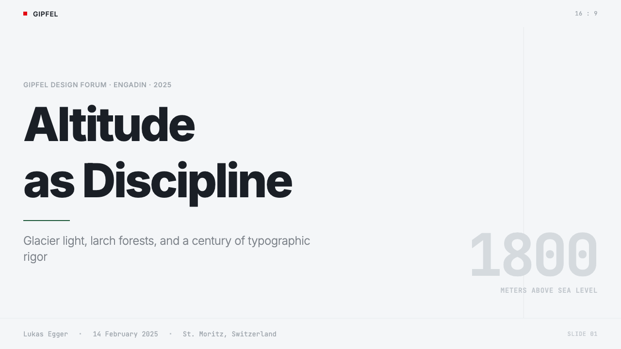
For presentation slides, the system excels at both cover compositions and information-dense content pages. A cover should be built on the three-color anchor logic: a near-white field as ground, a headline in a weight that reads at distance, and a single accent color used for a geometric element or underline rather than for background fills. Content slides should be treated as grids: content organized in clear columns, type differentiated only by size and weight, data visualizations rendered as clean geometric objects with bars and areas colored according to the primary palette. The system does not support ornamental slide transitions or gradient backgrounds — if those feel necessary, the system is being misapplied.对于演示文稿,这套系统在封面构图与信息密集内容页上都表现出色。封面应建立在三色锚定逻辑上:以接近白色的底面为地,以在一定距离可读的字重设置标题,以单一强调色用于几何元素或下划线而非背景填充。内容页应当被当作网格处理:内容组织于清晰的栏中,文字仅通过尺寸与字重加以区分,数据可视化以干净的几何对象呈现,柱条与区域按主色板着色。这套系统不支持装饰性幻灯片过渡或渐变背景——如果觉得这些有必要,说明系统正在被误用。
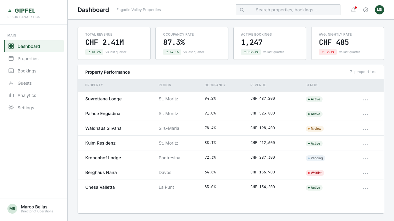
For web interfaces — dashboards, booking flows, pricing pages, information-dense navigation — the system performs exceptionally well. The approach: establish a strict column grid, maintain a near-white or glacier-white ground throughout, use the pine green for interactive states and positive confirmations, reserve the red for alerts and critical notifications. Card components should carry enough visual separation to read clearly without relying on colored borders; the system favors subtle elevation over line-based separation. Navigation should prioritize typographic clarity — labels that are unambiguous and sized for legibility — over icon-heavy shorthand that requires visual decoding.对于网页界面——仪表板、预订流程、定价页面、信息密集导航——这套系统表现尤为出色。方法如下:建立严格的栏网格,全程维持接近白色或冰川白的底面,将松绿色用于交互状态与积极确认,将红色保留给警示与关键通知。卡片组件应具有足够的视觉分离,无需依赖彩色边框即可清晰阅读;这套系统偏好微妙的层次感而非基于线条的分隔。导航应优先考虑排版清晰度——标签明确、尺寸便于阅读——而非需要视觉解码的图标密集速记。
For editorial and marketing applications — printed materials, travel guides, campaign pages — the system supports strong compositional hierarchy and benefits from the full integration of landscape photography. Images should be selected and cropped for geometric quality rather than panoramic completeness: the geometry of a ridgeline, the texture of snow shadow across a slope, the compression of a long telephoto shot across a valley. Type should sit on photographs only where contrast is sufficient and where the grid can be maintained; overlaying type on complex photographic backgrounds without a clear structure produces exactly the visual noise the system is designed to eliminate.对于编辑与营销应用——印刷材料、旅行指南、活动专页——这套系统支持强劲的构图层级,并受益于山地摄影的完整整合。图像应为几何品质而非全景完整性而选择与裁切:山脊的几何形态、坡面雪影的纹理、跨越山谷的长焦压缩感。文字仅在对比度足够且能维持网格的前提下才置于照片上;在没有清晰结构的复杂摄影背景上叠加文字,恰恰产生了这套系统旨在消除的视觉噪音。
A common mistake when applying this system is reading its restraint as a license for generic minimalism — swapping out the specific three-color logic for a neutral gray scale, or using excessive whitespace without maintaining the underlying grid structure. The system's whitespace is precise, not merely generous; the grid is what makes the whitespace legible as intentional. Similarly, the system's photographic integration is structural, not atmospheric: photographs selected purely for mood rather than for compositional contribution will produce results that look pleasant but feel disconnected from the system's underlying logic.应用这套系统时最常见的错误,是将其克制解读为通用极简主义的许可——用中性灰色调替换特定的三色逻辑,或使用大量留白却不维持底层网格结构。这套系统的留白是精确的,而非仅仅是充裕的;是网格使留白作为刻意之举可读。同样,这套系统的摄影整合是结构性的,而非氛围性的:纯为情绪而非为构图贡献而选择的照片,会产生看起来令人愉悦却与系统底层逻辑相脱节的结果。
See the Swiss Alps Graubünden design system →查看 Swiss Alps Graubünden 完整设计系统 →
Swiss Alps Graubünden — FAQSwiss Alps Graubünden · 常见问题
How does Swiss Alps Graubünden differ from Swiss International Style?瑞士阿尔卑斯格劳宾登与瑞士国际主义风格有何不同?
Swiss International Style (developed in Zurich and Basel from the 1950s onward) is a broader, more abstract formal system concerned with universal communicability — it was applied to corporate identity, cultural institutions, and global brands as much as to regional tourism. Graubünden inherits the same typographic discipline and grid logic but grounds them in a specific landscape and regional identity. Where Swiss Style uses photography as a formal element treated with graphic abstraction, Graubünden uses landscape photography with more direct environmental presence. The color logic is also more specific: rather than the full-spectrum neutrality of canonical Swiss Style, Graubünden commits to three landscape-derived anchors. Think of it as Swiss Style applied with geographical affection rather than universal ambition.瑞士国际主义风格(从1950年代起在苏黎世和巴塞尔发展)是一套更宏观、更抽象的形式系统,关注普遍可传播性——它被同等地应用于企业识别、文化机构与全球品牌。格劳宾登继承了同样的排版纪律与网格逻辑,但将它们扎根于特定的景观与地区身份之中。典范瑞士风格将摄影作为以平面抽象手法处理的形式元素,格劳宾登则以更直接的环境存在感使用山地摄影。色彩逻辑也更为具体:相较于经典瑞士风格的全色谱中立,格劳宾登固守三个源自景观的锚点。可以这样理解:这是以地理情感而非普遍抱负应用的瑞士风格。
Can this system work for a dark-mode interface?这套系统能用于深色模式界面吗?
The system's canonical form is light-ground — glacier white surfaces are central to its identity. A dark inversion is possible, but it requires careful recalibration. On a dark ground, the pine green needs to shift toward a brighter, more luminous register to maintain its legibility and to avoid reading as muddy. The red remains usable for alerts but should be used even more sparingly than in the light variant, since it draws disproportionate visual weight in low-light contexts. The most successful dark adaptations tend to replace the glacier white with a deep cool near-black — not a warm charcoal — maintaining the color temperature relationship of the original palette rather than simply inverting it.这套系统的标准形态是浅色底面——冰川白色表面是其身份的核心。深色反转版本是可能的,但需要谨慎重新校准。在深色底面上,松绿色需要转向更明亮、更光亮的色调,以维持其可读性并避免显得浑浊。红色在警示中仍可使用,但应比浅色变体更加节制,因为在低明度语境中它会获得不成比例的视觉重量。最成功的深色适配版本往往将冰川白替换为深冷的近黑色——而非温暖的炭色——维持原始色板的色温关系,而非简单反转。
Is this system appropriate for non-tourism applications?这套系统适合非旅游类应用吗?
The system transfers well to any application where environmental clarity, precision, and trustworthiness are primary values — financial services, healthcare navigation, transport information, educational platforms, and any product where the user is making decisions in complex or high-stakes contexts. It performs less well for products that depend on warmth, cultural specificity beyond Switzerland, sensory richness, or playfulness. A children's platform, a food brand, a creative portfolio tool, or an entertainment product would find the system's severity working against rather than for its communication goals. The question to ask is whether the product's values align with the system's core register: clear, trustworthy, precise, and environmentally grounded.这套系统可以很好地迁移到环境清晰度、精确性与可信赖性是主要价值的任何应用——金融服务、医疗导航、交通信息、教育平台,以及任何用户在复杂或高风险场景中做决策的产品。它在依赖温暖感、超越瑞士之外的文化特殊性、感官丰富性或趣味性的产品中表现欠佳。儿童平台、食品品牌、创意作品集工具或娱乐产品会发现这套系统的严肃性在对抗而非辅助其传播目标。要问的问题是:产品的价值观是否与这套系统的核心语域对齐——清晰、可信、精确、具有环境扎根性。
How should the sgraffito tradition inform contemporary applications?斯格拉菲托传统应如何影响当代应用?
Sgraffito is a historical regional decorative tradition, not a formal model for the contemporary system. The relevance is tonal rather than visual: the tradition demonstrates that the Engadin region has a long history of finding beauty in the relationship between surface and structure, between geometric pattern and material constraint. That sensibility — design as the revelation of underlying structure rather than as applied ornament — aligns with the modern system's own logic. The practical takeaway is not to use sgraffito motifs in contemporary applications; it is to understand that the restraint and precision the system values are culturally rooted, not merely fashionable.斯格拉菲托是一种历史性的地区装饰传统,而非当代系统的形式范本。其相关性是语调上的而非视觉上的:这一传统表明恩加丁地区长期以来在表面与结构、几何纹样与材料约束的关系中发现美。这种感受力——设计作为底层结构的揭示而非应用装饰——与现代系统自身的逻辑契合。实际的启示不是在当代应用中使用斯格拉菲托纹样,而是理解这套系统所珍视的克制与精确是有文化根基的,而非单纯时髦的。
How does the system handle multilingual content in practice?这套系统在实践中如何处理多语言内容?
The grid is the solution. When the same information must appear in German, Italian, and Romansh — which vary significantly in character count for equivalent meanings — the only design decision that holds across all three is the one governed by structure rather than by line count. This means: establish the grid first, let content fill its designated columns, and trust that clear size hierarchy and generous line spacing will maintain legibility regardless of which language is running long. The system avoids justified alignment specifically because it breaks down under variable-length multilingual content. Left alignment, with consistent left-margin anchoring, is the single most important structural decision for a multilingual implementation of this system.网格是解决方案。当同样的信息必须以德语、意大利语和罗曼什语出现——三者在等效含义上字符数差异显著——唯一在三种语言中都成立的设计决定,是由结构而非行数支配的决定。这意味着:先建立网格,让内容填充其指定的栏,并相信清晰的尺寸层级与充裕的行距将在任何语言拉长运行时都维持可读性。这套系统特别回避两端对齐,因为它在可变长度的多语言内容下会失效。左对齐,配合一致的左边距锚定,是这套系统多语言实施中最重要的单一结构性决定。
Related design styles相关设计风格
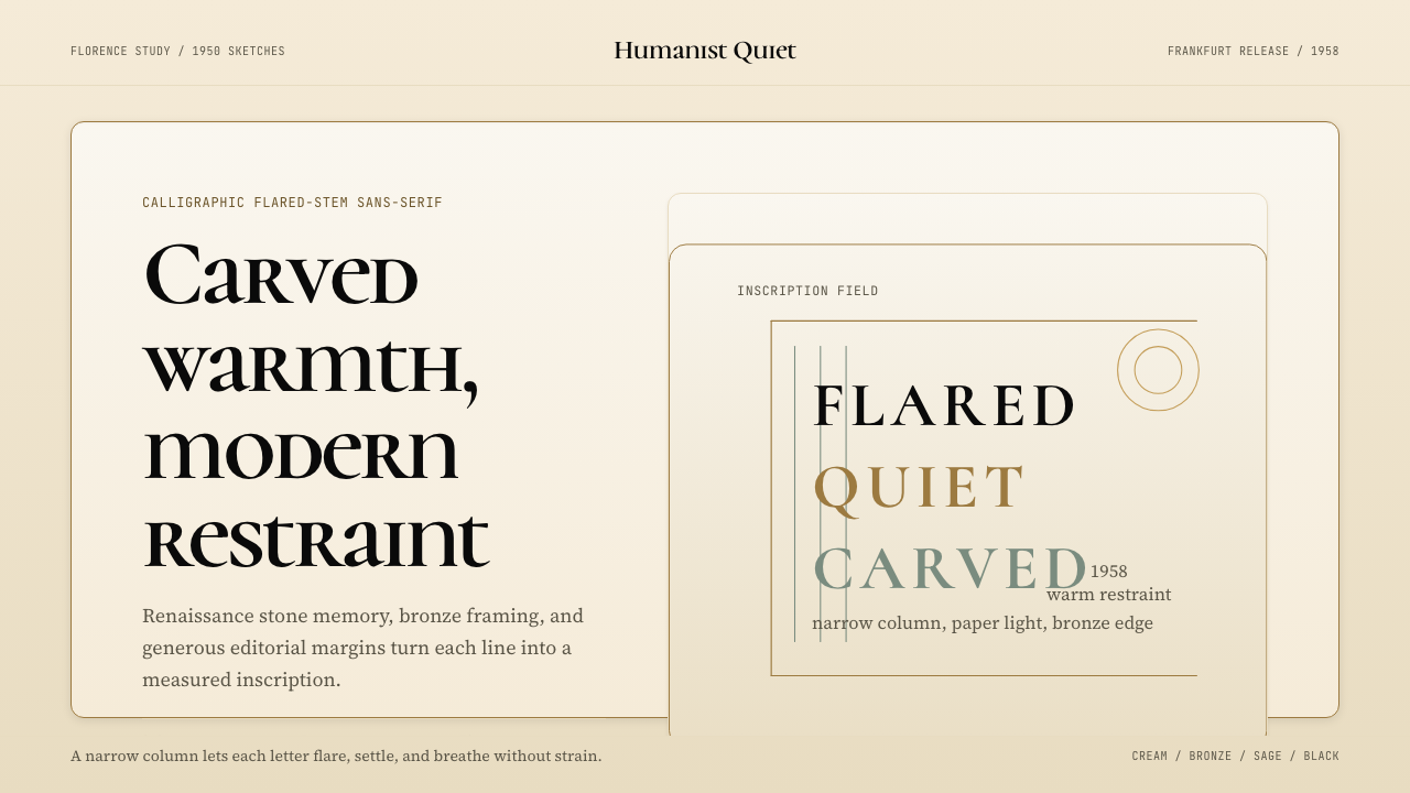 Optima (Hermann Zapf, 1958)Calligraphic calm, cut in cream and bronze. Narrow margins let the letters br…书法般的宁静。奶油底、青铜点缀、窄栏留白让字形呼吸。
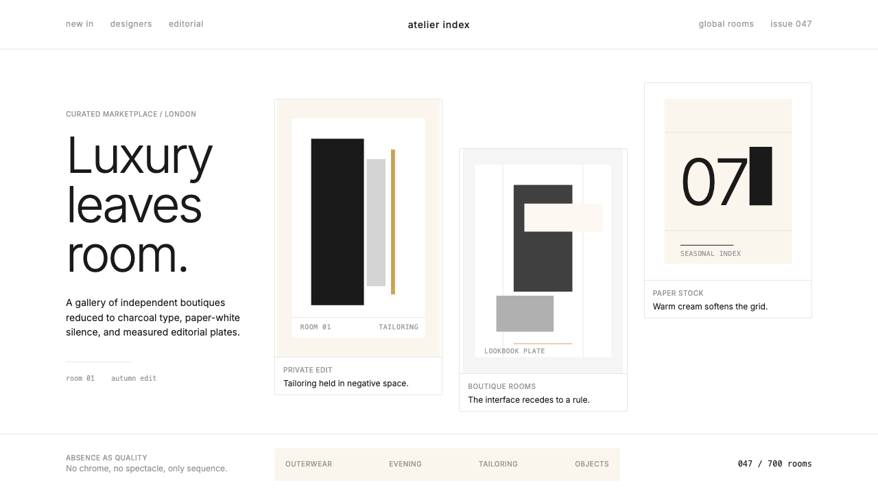 FarfetchLuxury as absence. Charcoal type, white canvas, and hairline editorial plates.奢华即留白。炭灰字、纯白画布与发丝线编辑图版。
 Wallpaper* ArchitecturePhotography does the speaking. Gallery-white grid, Inter captions, and hairli…让摄影发声。画廊白网格、Inter 小标题与细线退后。
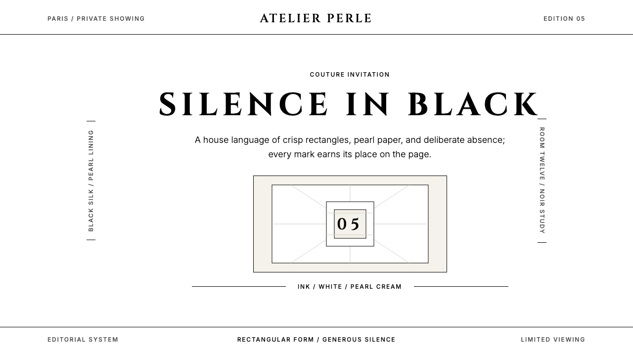
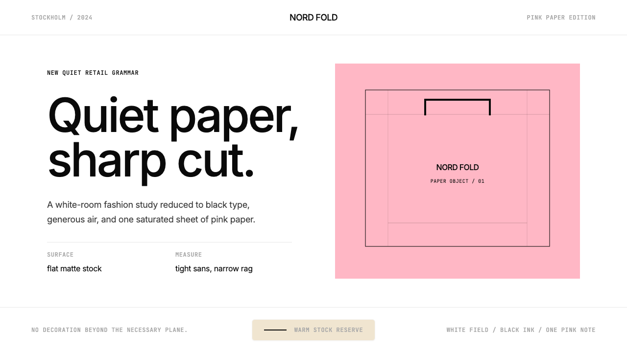 Acne Studios Pink-PaperQuiet luxury in one pink plane. Inter type floats on white with a bag-like re…粉色平面定义安静奢华:Inter 黑字漂浮于白场,像一只纸袋。
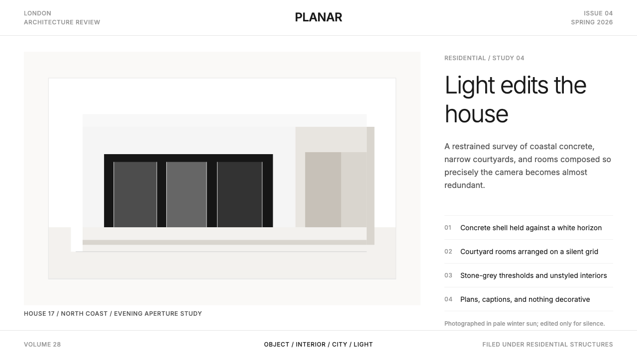
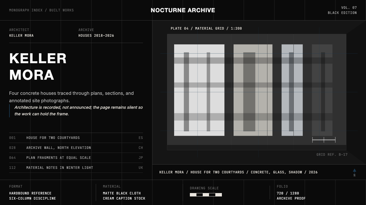 Architect Monograph (Black Edition)Architecture stays sovereign. Matte black, Helvetica caps, hairline grids, bl…建筑始终为主:哑光黑、Helvetica 大写、发丝网格与蓝图蓝。
 ChanelLuxury needs no color. Black on white, pearl-cream warmth, geometric capitals…百年宣言:真正的奢华无需色彩。纯黑配纯白,唯一的偏移是珍珠乳白——克制即气场。