What is Wallpaper* Architecture?什么是 Wallpaper* Architecture?
Wallpaper* Architecture trusts the photograph completely — everything else on the page steps back so the image can fill the room.Wallpaper* 建筑风格将一切信任交给照片——页面上的其他一切都退后,让影像填满整个空间。
Wallpaper* Architecture in briefWallpaper* Architecture 速览
Wallpaper* Architecture is the editorial design language codified by Wallpaper*, the British architecture and design magazine founded in London in 1996 by Tyler Brûlé. Its defining proposition is disarmingly simple: photography is the subject matter, and everything else on the page — type, rule lines, whitespace, caption blocks — exists only to hold the photograph in the most dignified possible frame. The aesthetic is not minimalism for its own sake; it is minimalism in service of the image.Wallpaper* 建筑风格,是由英国建筑与设计杂志《Wallpaper*》所确立的编辑设计语言。该杂志于1996年在伦敦由泰勒·布吕勒(Tyler Brûlé)创办。其核心主张简单而彻底:摄影是内容本身,页面上的其他一切——文字、分割线、留白、图注区块——只为以最庄重的方式托住照片而存在。这种美学并非为克制而克制,它是以克制服务于影像。
The visual system is built on three interlocking commitments. First, the ground is gallery-white — a shade of white associated not with sterility but with the museum wall, the neutral field against which curators have always chosen to present objects of consequence. Second, type is reduced to a single sans-serif voice deployed at modest scale, so that labels and captions function as quiet attendants rather than competing voices. Third, dividers and structural lines are hairline-weight — present enough to organize the page, invisible enough to vanish from memory.这套视觉系统建立在三项相互咬合的承诺之上:其一,底面是画廊白——这种白色关联的不是无菌感,而是博物馆的墙面,那片策展人历来选择用于呈现重要物件的中性底场;其二,字体被压缩为单一无衬线声音,以低调的尺度出现,使标签与图注作为安静的服务者而非竞争性的声音;其三,分隔线与结构线均为发丝般的细线——细到足以组织页面,又细到足以从记忆中消失。
The result is a visual register that reads as both authoritative and aspirational: the page looks expensive because it refuses to be busy. This is the aesthetic of the international design quarterly, of the architecture monograph, of the luxury brand campaign that trusts its product enough to show it against nothing. Wallpaper* did not invent restraint, but it defined precisely how restraint should feel in print and on screen for the design-literate global audience that emerged in the late 1990s and 2000s.其结果是一种既权威又令人向往的视觉语调:页面看起来昂贵,是因为它拒绝繁忙。这是国际设计季刊、建筑专著、以及那些足够信任自身产品、敢于将其置于虚空之中的奢侈品牌广告所共享的美学。《Wallpaper*》并非克制的发明者,但它为1990年代末与2000年代兴起的全球设计读者群,精确地定义了克制在印刷与屏幕上应有的感受。
See the Wallpaper* Architecture design system查看 Wallpaper* Architecture 完整设计系统
Where does Wallpaper* Architecture come from?Wallpaper* Architecture 从何而来?
Wallpaper* was founded in London in 1996 by Tyler Brûlé, a Canadian journalist and creative director who had previously worked at the BBC and launched the magazine while recovering from a gunshot wound sustained while reporting in Afghanistan. The magazine's founding premise was that architecture, interiors, travel, fashion, and product design belonged in the same conversation — that there was a single globally mobile audience of design-literate professionals who moved between cities, ate in the same restaurants, stayed in the same hotels, and wanted a publication that reflected that world back at them.《Wallpaper*》于1996年在伦敦由加拿大记者及创意总监泰勒·布吕勒创办。此前布吕勒曾供职于BBC,这本杂志在他赴阿富汗战地报道时中弹养伤期间诞生。杂志的创刊前提是:建筑、室内、旅行、时尚与产品设计属于同一场对话——存在着一批在全球各城市之间流动、出入同一批餐厅、入住同一批酒店的设计素养精英读者,他们需要一本能将那个世界映射给他们看的出版物。
The visual language Brûlé and his art directors developed was inseparable from this editorial mission. An international design audience was assumed to be visually sophisticated and hostile to clutter. Where other lifestyle magazines of the era used heavily styled type treatments and decorative page furniture to signal excitement, Wallpaper* used their absence to signal confidence. The gallery-white page, the single typeface, the oversized photograph — these choices communicated that the content was so strong it required no packaging. The design became the brand.布吕勒与他的艺术总监们所发展出的视觉语言,与这一编辑使命不可分割。国际设计读者被预设为视觉上成熟、对繁乱天然排斥。同时代其他生活方式杂志大量使用精心设计的字体处理与装饰性版面元素来传递活力,《Wallpaper*》则以这些元素的缺席来传递自信。画廊白页面、单一字体、超大尺寸的照片——这些选择传递出一个信号:内容足够强大,无需包装。设计本身成为了品牌。
The magazine's timing coincided with a significant shift in architectural photography. The 1990s saw the emergence of photographers such as Hélène Binet, Todd Eberle, and others who approached architecture with the same compositional seriousness as fine art photographers approached their subjects. Wallpaper* provided an ideal vehicle for this work: its pages were wide, its paper quality high, its commitment to full-bleed and near-full-bleed imagery absolute. The magazine and the photography evolved together, each raising the standard for the other.杂志问世的时机恰好与建筑摄影的一场重要转变重合。1990年代,埃莱娜·比内(Hélène Binet)、托德·埃伯尔(Todd Eberle)等摄影师开始以纯艺术摄影师对待被摄主题的构图严肃性来面对建筑。《Wallpaper*》为这类作品提供了理想的载体:页面宽阔,纸张品质卓越,对满版与近满版图像的承诺毫不妥协。杂志与摄影在彼此的激发中共同演进,互相拉高标准。
By the early 2000s, the Wallpaper* aesthetic had become sufficiently influential that it began to define a broader category: the international design quarterly. Publications from Tokyo to Milan to New York adopted its grammar — white ground, serif-free type, photography-led composition — and a visual standard that had once been specific to one London magazine became the baseline expectation for design publishing worldwide. The digital era did not displace the aesthetic; it transposed it. Website layouts for architecture firms, luxury hotel brands, and high-end product companies adopted the same principles, creating a seamless visual continuum between the printed page and the screen.进入2000年代初期,Wallpaper* 美学的影响力已足够深远,以至于它开始定义一个更宽泛的类别:国际设计季刊。从东京到米兰,从纽约到首尔,出版物纷纷采用它的语法——白色底面、无衬线字体、以摄影为主导的构图——那套曾专属于某本伦敦杂志的视觉标准,成为全球设计出版物的基础期待。数字时代并未淘汰这套美学,而是将其移调换位。建筑事务所、奢侈酒店品牌、高端产品公司的网站版面采用了相同的原则,在印刷页面与屏幕之间创造出一条无缝的视觉连续体。
What defines the Wallpaper* Architecture look?Wallpaper* Architecture 的视觉特征是什么?
Gallery-White Ground画廊白底面
The background is not simply white — it is the specific white of the contemporary art gallery, a shade associated with neutral authority rather than clinical blankness. This ground performs a curatorial function: it brackets the photograph as an object of deliberate presentation rather than casual illustration. Compared with the warm cream grounds of editorial traditions such as Bauhaus or Arts and Crafts revivals, the Wallpaper* white is cooler and more recessive, designed to disappear entirely behind the image.底面并非简单的白色,而是当代艺术画廊特有的那种白——与中性权威感相关联,而非临床的空洞感。这片底面执行的是策展功能:它将照片括入一个经过刻意呈现的对象框架,而非随意的插图位置。与包豪斯或工艺美术复兴等编辑传统所用的温暖奶油底相比,Wallpaper* 的白色更冷、更收敛,设计的目的是完全消失在影像背后。
Photography as Primary Carrier摄影作为主要载体
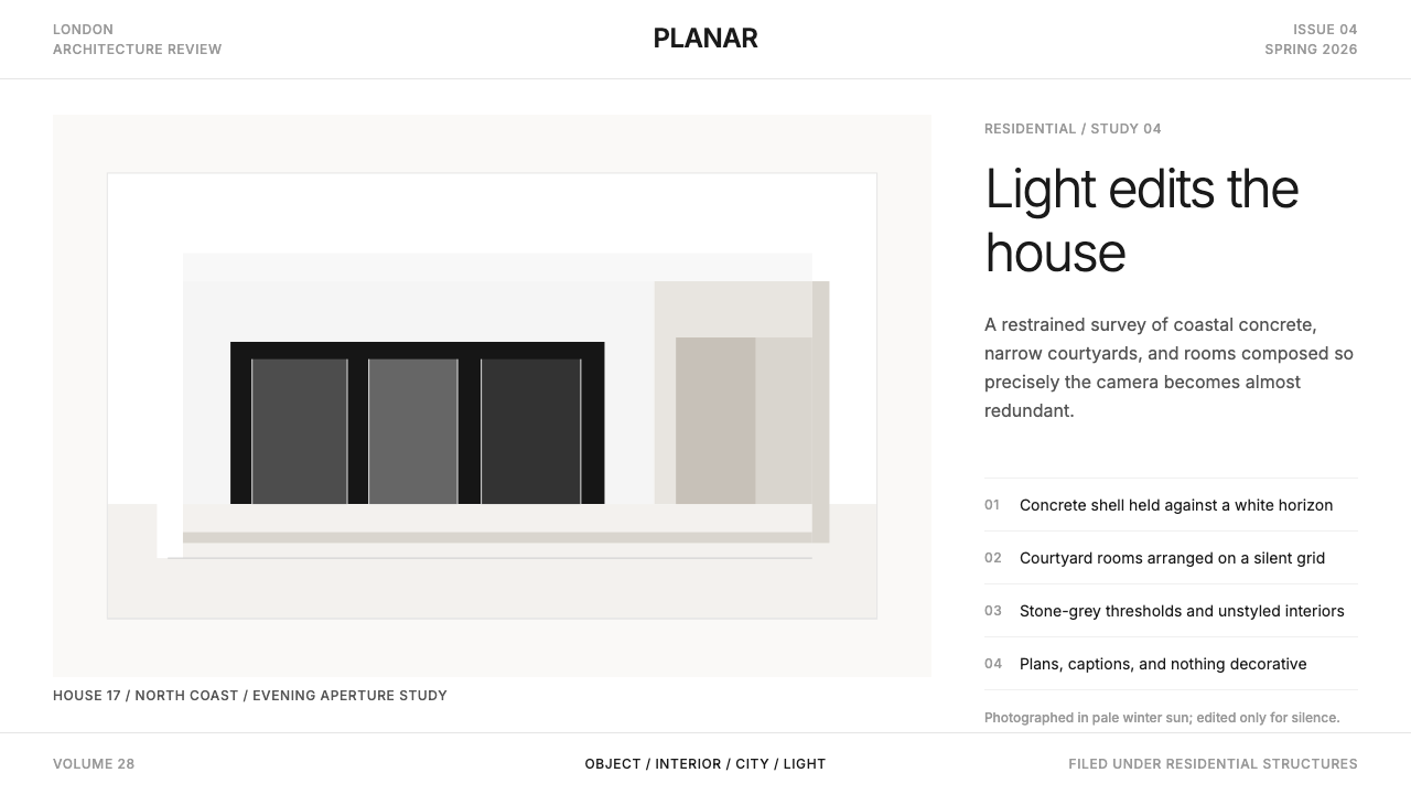
In most editorial systems, photography illustrates text. In Wallpaper* Architecture, this relationship is inverted: text annotates the photograph. Images occupy the dominant share of page or screen real estate, often running to the very edge of the format with no margin relief. The photograph is expected to carry narrative, mood, and argument — the type is there to identify, not to explain. This demands photography of the highest compositional quality, which is why the style has remained inseparable from architectural and product photography of a particular seriousness.在大多数编辑体系中,摄影是文字的插图。在 Wallpaper* 建筑风格中,这一关系被倒置:文字为照片作注脚。图像占据页面或屏幕绝大部分空间,往往延伸至版面边缘,没有留白的缓冲。照片被期待承载叙事、情绪与论点——文字在场的目的是标识,而非解释。这对摄影的构图品质提出了极高的要求,也正因此,这种风格始终与具有特定严肃性的建筑及产品摄影不可分割。
Single Typeface, Hairline Scale单一字体,发丝尺度
The typographic voice is deliberately monolithic: one sans-serif family used at a narrow range of weights and sizes, kept small enough to perform a labelling function without attracting attention. Headlines, if they appear as text rather than as image overlays, are set with restraint — the scale hierarchy between heading and caption is compressed compared with the dramatic contrasts typical of other editorial styles. The guiding principle is that type should be noticeable only when sought, and invisible when the photograph is demanding attention.字体排印的声音刻意保持单一:一套无衬线字体家族,在窄幅的字重与尺寸范围内使用,保持足够小的尺度以执行标签功能,而不吸引注意力。标题若以文字而非图像叠加的形式出现,则以克制的方式设置——标题与图注之间的尺度层级是压缩的,不同于其他编辑风格中惯用的戏剧性对比。指导原则是:字体只在被寻找时才可被察觉,在照片要求注意力时则应隐形。
Hairline Dividers and Structural Silence发丝分割线与结构性寂静
When structural lines appear to organize sections or separate caption blocks from image areas, they are drawn at the thinnest weight that the medium can faithfully reproduce. They function as almost-invisible scaffolding — present to the eye that looks for them, absent to the eye absorbed by the image. Borders, rules, and frames never thicken into visual weight of their own. Decorative page furniture — ornamental dividers, pull-quote punctuation, icon clusters — is entirely absent.当结构性线条用于组织版块或将图注区与图像区分隔时,它们被绘制在媒介能够忠实再现的最细线宽。它们如同几近隐形的脚手架——寻找它们的眼睛能察觉到,被图像吸引的眼睛则不会注意到。边框、分隔线与外框从不加粗为具有自身视觉重量的元素。装饰性版面家具——装饰性分割线、引言标点符号、图标集群——完全缺席。
Expansive Negative Space扩张性留白
Negative space in Wallpaper* Architecture is not the residue left after content is placed — it is itself a design decision with positive intent. Large areas of unoccupied white ground signal that the content has been selected with enough confidence that it does not need to be supplemented. Margins are generous, spacing between caption and image is deliberate, and content density is kept low relative to format size. The spaciousness communicates the same values as the gallery wall: what is here has been chosen; nothing has been added to fill a gap.在 Wallpaper* 建筑风格中,留白不是内容放置后剩下的残余——它本身就是一个带有积极意图的设计决定。大面积未被占用的白色底面传递出一种信号:此处的内容是以足够的自信筛选出来的,无需补充。页边距宽阔,图注与图像之间的间距经过刻意考量,内容密度相对于版面尺寸保持在较低水平。这种宽绰感传达的价值观与画廊墙面相同:在场的一切都经过了选择,没有任何东西是为了填补空白而添加的。
Restrained, Monochromatic Palette克制的单色色调
Outside the photography itself, color is nearly absent. Text is set in near-black or a very dark neutral. Structural lines share that same dark tone or are rendered in mid-grey. Accent colors — if used at all — are drawn from a single, muted tone applied only to functional elements such as active navigation states or linked text. The palette does not compete with the photograph; its job is to recede completely. Where Bauhaus uses color symbolically and boldly, Wallpaper* treats color as a distraction to be managed rather than a message to be sent.在摄影本身之外,色彩几乎缺席。文字以近黑色或极深的中性色设置。结构线条共享同一深色调,或以中灰色呈现。强调色——如果存在——仅从单一的低饱和色调中提取,只用于功能性元素,如活跃导航状态或链接文字。色调不与照片竞争;它的职责是完全隐退。包豪斯以象征性的大胆方式使用色彩,Wallpaper* 则将色彩视为需要管理的分神,而非需要发送的信息。
Architectural Composition Logic建筑式构图逻辑
Layouts in this style borrow from architectural spatial thinking rather than from the conventions of magazine grid systems. The page or screen is treated as a space to be inhabited by the image, with type positioned relationally — attached to the corner of a photograph, tucked into a margin, or dropped to a footer zone — rather than organized into autonomous text columns. This produces a layout logic that feels considered rather than templated: each arrangement responds to the proportions and focal points of the specific photograph it accompanies.这种风格的版面借鉴的是建筑空间思维,而非杂志网格系统的惯例。页面或屏幕被视为图像栖居的空间,文字以关系性的方式定位——依附于照片的角落,嵌入页边空白,或沉入页脚区域——而非被组织进自主的文字栏。这产生了一种感觉经过深思熟虑而非套用模板的版面逻辑:每一种排列都回应着它所陪伴的特定照片的比例与焦点。
See the Wallpaper* Architecture design system查看 Wallpaper* Architecture 完整设计系统
Who shaped Wallpaper* Architecture?谁塑造了 Wallpaper* Architecture?
Brûlé founded Wallpaper* in London in 1996 and served as its editor until 2002, then returned as editor-in-chief in 2007 after selling the magazine to Time Inc. and later reacquiring it. As the magazine's founding creative force, he established the gallery-white, photography-first visual language that became its signature. Brûlé's broader influence extends to the brand consultancy Winkreative and to Monocle, the magazine he founded in 2007, which applied a related but warmer and more illustrative approach to international affairs and culture.布吕勒于1996年在伦敦创办《Wallpaper*》,担任主编至2002年,将杂志出售给时代公司后又于2007年回归担任主编。作为杂志的创办创意力量,他建立了以画廊白与摄影优先为特征的视觉语言,成为该杂志的标志性风格。布吕勒更广泛的影响延伸至品牌咨询公司 Winkreative,以及他于2007年创办的《Monocle》——后者将一种相关但更温暖、更重插图的方式应用于国际事务与文化报道。
Binet is a Swiss-French architectural photographer whose work, particularly her images of buildings by Zaha Hadid, Daniel Libeskind, and Peter Zumthor, defined the kind of photography that Wallpaper* Architecture was built to present. Her photographs treat architecture as a terrain of light, shadow, and material texture rather than as a set of objects to be documented. The relationship between Binet's compositional approach — close, abstract, light-focused — and the restraint of the Wallpaper* page layout created a visual standard for how serious architectural photography looks in print.比内是一位瑞士裔法国建筑摄影师,她尤其是拍摄扎哈·哈迪德、丹尼尔·里伯斯金与彼得·卒姆托建筑的作品,定义了 Wallpaper* 建筑风格所承载的那类摄影。她的照片将建筑视为光线、阴影与材料质感的地形,而非需要被记录的一组对象。比内的构图方式——近距离、抽象、以光为焦点——与《Wallpaper*》页面版面的克制之间的关系,共同建立了严肃建筑摄影在印刷中应有形态的视觉标准。
Vibskov, the Danish designer and artist, represents the kind of creative figure that Wallpaper* has consistently championed: someone whose practice spans fashion, installation, and performance in ways that resist categorical classification. His association with the magazine is emblematic of its editorial stance — that design is not a sub-discipline but a way of approaching the world, and that the most interesting work happens at the borders between fields. The Wallpaper* visual language was developed precisely to present this kind of practice without reducing it to a single category.丹麦设计师与艺术家维布斯科夫代表了《Wallpaper*》始终力挺的那类创作者:实践横跨时尚、装置与表演,以难以被单一分类界定的方式展开。他与这本杂志的关联象征着其编辑立场——设计不是一个子学科,而是一种面对世界的方式,最有趣的工作发生在各领域的边界之处。Wallpaper* 视觉语言被开发出来,正是为了呈现这类实践而不将其简化为某个单一类别。
Crawford, the British designer known for interiors that emphasize human experience and sensory richness over spectacle, served as a contributing editor and reference point for Wallpaper* during its formative years. Her approach — that good design should be felt before it is seen, and that the most sophisticated interiors are those where the photography requires a second look to reveal their intelligence — aligned precisely with the magazine's editorial philosophy. Crawford's presence helped shape the standard of interior photography and presentation that Wallpaper* Architecture still models.英国设计师克劳福德以强调人类体验与感官丰富性、而非奇观的室内设计著称,在《Wallpaper*》的成型期担任特约编辑与参照坐标。她的理念——好的设计应在被看见之前先被感受到,最成熟的室内空间是那些照片需要被二次凝视才能揭示其智识深度的空间——与杂志的编辑哲学高度契合。克劳福德的存在帮助塑造了 Wallpaper* 建筑风格至今所参照的室内摄影与呈现标准。
How do you use Wallpaper* Architecture today?今天怎么用 Wallpaper* Architecture?
Wallpaper* Architecture translates to digital and print contexts where the visual asset — a photograph, a product render, an architectural image — is the primary argument and everything else is infrastructure. Applying it correctly means making an honest assessment of whether your visual assets are strong enough to carry the weight of this system. If they are not — if the photography is stock, generic, or compositionally weak — no amount of white space or restrained type will rescue the result. The style demands images that can stand alone.Wallpaper* 建筑风格适用于视觉素材——照片、产品渲染图、建筑影像——是主要论点、其他一切都是基础设施的数字与印刷场景。正确应用它,意味着诚实地评估你的视觉素材是否足够强大,能够承担这套系统的重量。如果不够强——如果摄影是库存图片、泛泛之辈或构图薄弱——再多的留白或克制的字体都无法挽救结果。这种风格要求能够独立存在的图像。
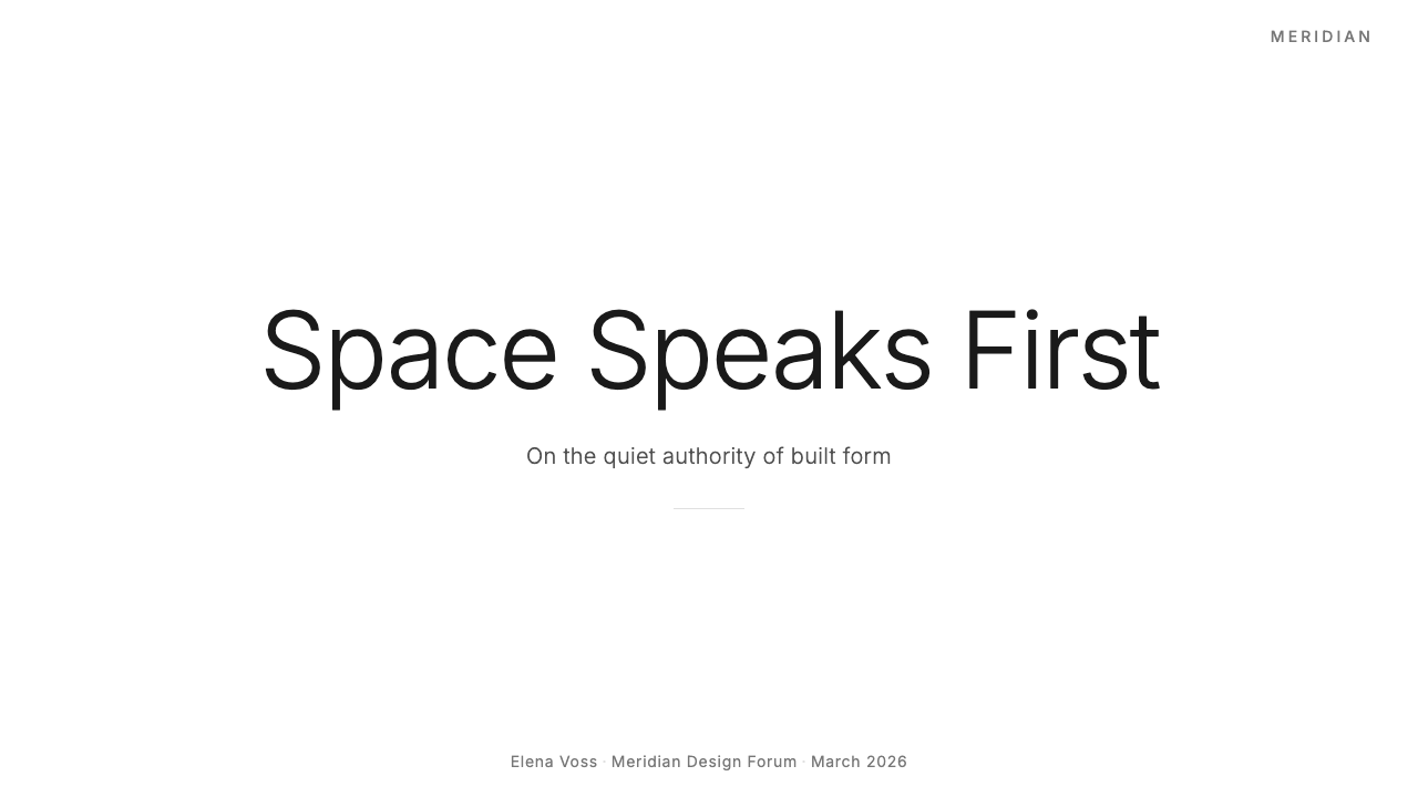
For presentation slides, the style works best on covers and section dividers rather than content-heavy pages. A cover slide using this approach places one full-bleed or near-full-bleed architectural or product photograph on the slide, with a project name set in restrained sans-serif type at a small size in one corner. No tagline, no logo cluster, no color band. Content slides that need to carry this language should treat the slide as a diptych: one side photograph, one side text, with type kept to a minimum and all metadata — date, location, attribution — reduced to the smallest legible size. Data slides are the hardest challenge; consider using the photograph as a background at reduced opacity and overlaying the data as type, keeping chart elements to a single muted tone.在演示文稿中,这种风格最适合用于封面与章节分隔页,而非信息密集的内容页。使用这种方式的封面页,将一张满版或近满版的建筑或产品照片置于幻灯片上,项目名称以克制的无衬线字体小字排印于某个角落。无副标题,无标志组合,无色带。需要承载这种语言的内容页应将幻灯片视为双联画:一侧照片,一侧文字,字体保持在最小量,所有元数据——日期、地点、署名——压缩至最小可读尺寸。数据页是最大的挑战;考虑将照片以降低透明度的方式作为背景,以文字形式叠加数据,图表元素保持单一的低饱和色调。
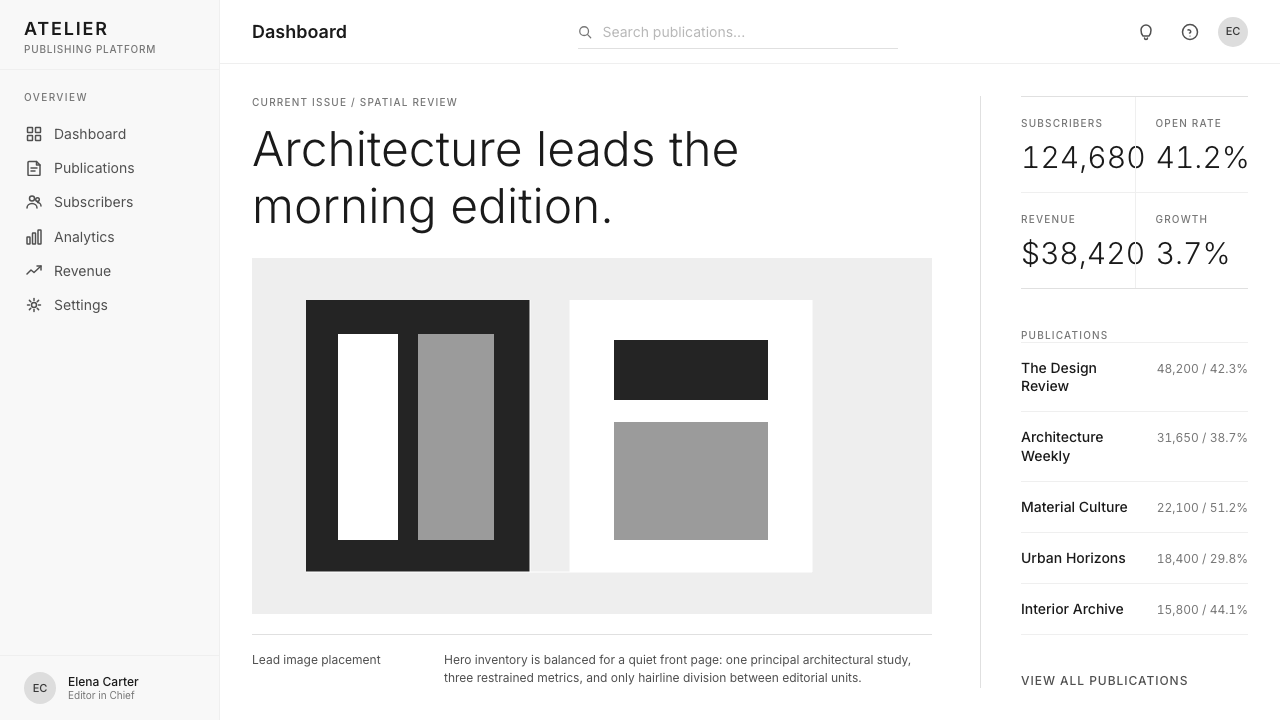
For web interfaces, the style is ideally suited to architecture firm websites, luxury product pages, portfolio platforms, and any interface where the primary conversion goal is established credibility rather than immediate action. The implementation pattern: a navigation bar that is typographic only, with no icon decoration; full-viewport hero images with a single line of type; generous vertical spacing between sections; a footer that is spare and informational. Dashboard and pricing contexts are a harder fit — the style's low information density works against the need for rapid scanning — but can be adapted by using generous whitespace to separate pricing tiers and letting feature lists breathe rather than packing them into comparison tables.在网页界面中,这种风格最理想地适用于建筑事务所网站、奢侈品产品页面、作品集平台,以及任何主要转化目标是建立可信度而非促成即时行动的界面。实施模式:纯字体导航栏,无图标装饰;全视口英雄图像配单行文字;各版块之间宽裕的纵向间距;简洁的信息性页脚。仪表板与定价场景是更难适配的场合——这种风格的低信息密度与快速扫描的需求相悖——但可以通过运用宽裕的留白来分隔定价层级、让功能列表得以呼吸而非将其压入比较表格来加以调适。
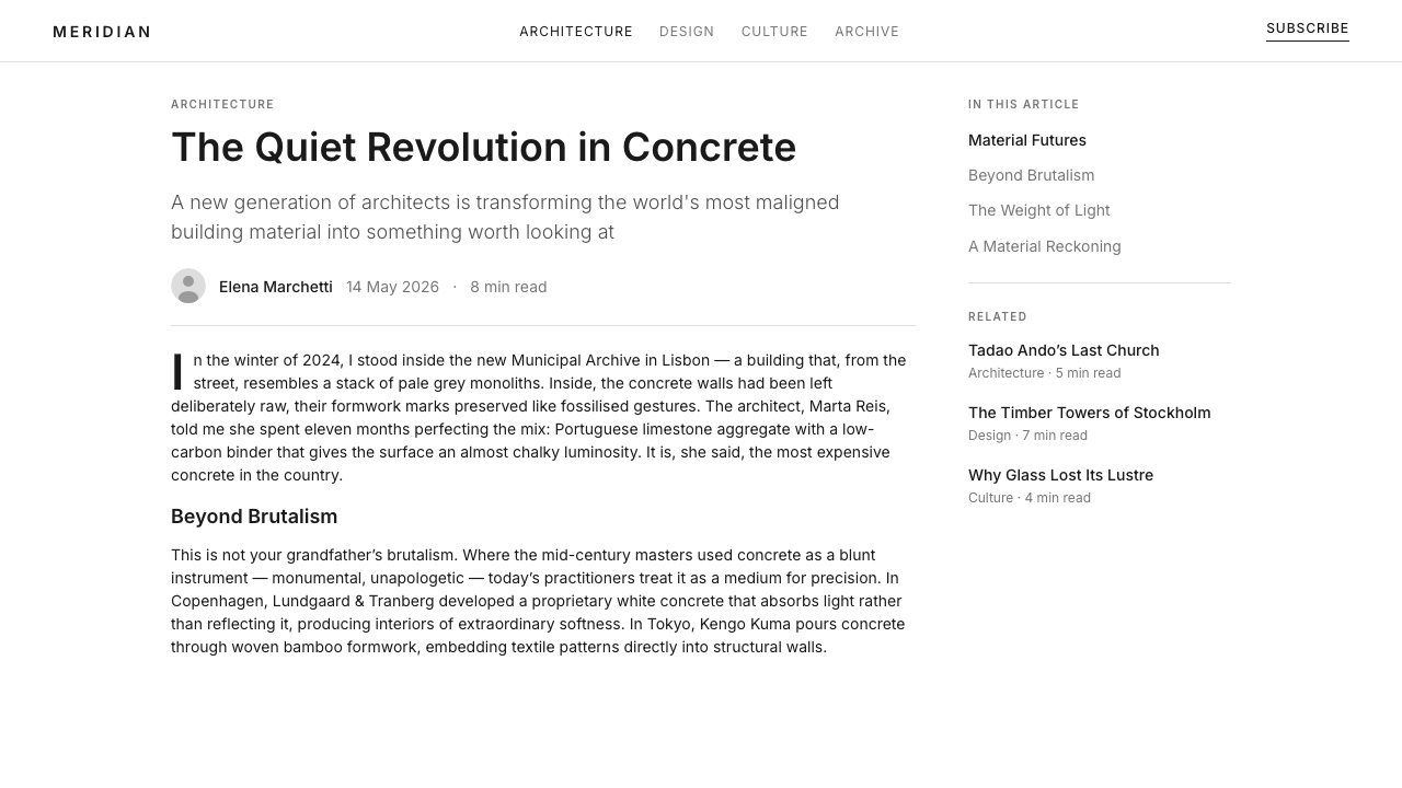
For editorial and marketing work, the style supports long-form architecture journalism, brand books, and property marketing. A Wallpaper*-derived editorial layout places the photograph in full-bleed across a spread and reserves a narrow strip at the bottom or a single outer column for caption and attribution. Body text, where it appears, is set in a narrow measure against a wide margin. Section breaks are marked by whitespace alone — no decorative rule, no ornamental drop capital. Marketing applications work well for brands with strong visual identity and product photography: a campaign page alternates between full-screen image moments and spare text screens, never placing a product name over a photograph and always letting the image precede the word.在编辑与营销工作中,这种风格支持长篇建筑新闻报道、品牌手册与房产营销。Wallpaper* 衍生的编辑版面将照片满版铺展于跨页,在底部保留一条窄带或单侧外边栏用于图注与署名。正文在出现时,以窄行宽相对于宽阔页边距排布。版块分隔仅通过留白标记——无装饰性分割线,无装饰性首字下沉。营销应用对具有强烈视觉识别度与产品摄影的品牌效果出色:活动页面在全屏图像时刻与简洁的文字屏幕之间交替,从不将产品名称叠加于照片之上,始终让影像先于文字出现。
The most common mistake when applying this style is mistaking quantity for quality — filling the white space with more images rather than fewer, better ones. A second common error is compensating for weak photography with elaborate type treatments or graphic overlays; this directly contradicts the system's logic, which assumes the image is already doing the work. A third error is importing warmth through color: adding a warm accent tone to soften the austerity results in a hybrid that satisfies neither the credibility register of the original style nor the warmth goals of the designer. If warmth is genuinely required by the context, this may not be the right system.应用这种风格时最常见的错误是以数量代替质量——用更多图像填充留白,而非选择更少、更好的图像。第二个常见错误是用精心设计的字体处理或图形叠加来弥补薄弱的摄影;这与系统的逻辑直接矛盾,该逻辑假设图像已经在自行完成工作。第三个错误是通过色彩引入温暖感:添加温暖的强调色调以软化严肃感,结果产生一个两头落空的混合体——既未达到原始风格的可信度语调,也未实现设计师所期望的温暖目标。如果语境确实需要温暖感,这套系统可能并非正确的选择。
See the Wallpaper* Architecture design system查看 Wallpaper* Architecture 完整设计系统
Wallpaper* Architecture — FAQWallpaper* Architecture · 常见问题
How is Wallpaper* Architecture different from general editorial minimalism?Wallpaper* 建筑风格与一般的编辑极简主义有何不同?
General editorial minimalism reduces visual noise in service of readability or a clean brand feel. Wallpaper* Architecture does something more specific: it subordinates every non-photographic element — type, rule, whitespace, color — to the singular purpose of presenting the photograph at maximum integrity. The hierarchy is not between headline and body text, or between primary and secondary information; it is between the image and everything else. This makes the style legible only in contexts where the visual asset genuinely deserves that priority. Applied to mediocre photography, it reads as empty rather than confident.一般的编辑极简主义是为了可读性或干净的品牌感而减少视觉噪音。Wallpaper* 建筑风格做的是更具体的事:它将每一个非摄影元素——字体、分割线、留白、色彩——都从属于以最大完整性呈现照片这一单一目的。层级关系不存在于标题与正文之间,也不存在于主要信息与次要信息之间;它存在于图像与其他所有一切之间。这使得这种风格只在视觉素材真正值得这种优先级的场景中才清晰可读。应用于平庸的摄影,它读起来是空洞的,而非自信的。
Can this style work for brands that are not in architecture or luxury?这种风格能用于非建筑或非奢侈品品牌吗?
Yes, but the translation requires careful judgment about what the style communicates. Wallpaper* Architecture signals authority, restraint, and confidence in the primacy of the visual. These are valuable signals for any brand whose credibility depends on being perceived as selective, expert, or ahead of trend — including technology companies with strong hardware aesthetics, premium food and beverage brands with serious product photography, and cultural institutions presenting curated programming. It is a poor fit for brands whose equity is built on accessibility, playfulness, or populist warmth, because the style's very austerity communicates exclusivity, whether intended or not.可以,但这种移植需要仔细判断这种风格所传达的含义。Wallpaper* 建筑风格传递的是权威、克制与对视觉优先性的自信。这些信号对任何品牌可信度依赖于被感知为精挑细选、专业权威或引领潮流的品牌都是有价值的——包括具有强烈硬件美学的科技公司、拥有严肃产品摄影的高端食品与饮料品牌,以及呈现精选节目的文化机构。对于品牌价值建立在亲切感、趣味性或大众温度之上的品牌,它是糟糕的选择,因为这种风格的严肃感本身传递的就是排他性,无论是否有意为之。
How do you handle navigation and UI elements without breaking the aesthetic?如何在不破坏美学的情况下处理导航与界面元素?
The key is to make all functional UI elements typographic rather than iconographic or decorative. Navigation labels are set in the same typeface as captions, at a similarly modest size. Interactive states — hover, active, selected — are communicated through weight shift or underline rather than color change. Buttons, if they must exist, are either borderless type links or simple bordered rectangles with no fill, no shadow, and no radius. The discipline is to ask, for every UI element: can this be achieved with type alone? If the answer is yes, use type alone. Icons should appear only when the function genuinely cannot be communicated through words.关键是让所有功能性界面元素以字体方式而非图标或装饰方式呈现。导航标签以与图注相同的字体、相似的低调尺寸排布。交互状态——悬停、激活、选中——通过字重变化或下划线而非色彩变化来传达。按钮如果必须存在,则要么是无边框的文字链接,要么是没有填充、没有阴影、没有圆角的简单带框矩形。这种自律要求对每一个界面元素追问:这能仅靠字体实现吗?如果答案是肯定的,则仅使用字体。图标只应在功能真正无法通过文字传达时才出现。
Does the style work on dark backgrounds?这种风格适用于深色背景吗?
Wallpaper* Architecture is fundamentally a light-ground system: the gallery-white background is not incidental but structural, carrying the curatorial associations the style depends on. A dark inversion is possible — some architecture and product brands use a near-black ground with white type — but it fundamentally changes the register. Dark grounds read as dramatic and editorial-evening rather than pristine and gallery-morning. If a dark version is pursued, the same principles apply: single typeface, hairline rules, maximum image real estate, zero decorative elements. The most common failure in dark inversions is compensating for the lost airiness with additional graphic elements — which directly contradicts the system.Wallpaper* 建筑风格从根本上是一个浅色底系统:画廊白底面不是偶然的,而是结构性的,承载着这种风格所依赖的策展联想。深色反转版本是可能的——一些建筑与产品品牌使用近黑底面配白色字体——但这从根本上改变了语调。深色底面读起来是戏剧性的、编辑性的夜晚感,而非纯净的、画廊清晨感。如果追求深色版本,同样的原则适用:单一字体、发丝线条、最大化的图像空间、零装饰元素。深色反转中最常见的失败是用额外的图形元素来弥补失去的通透感——这与这套系统直接矛盾。
How does Wallpaper* Architecture relate to Swiss International Style?Wallpaper* 建筑风格与瑞士国际主义风格有何关系?
Both systems use sans-serif type, rigorous grids, and restrained color. But their hierarchies are different. Swiss International Style organizes information; Wallpaper* Architecture presents images. Swiss Style treats typography as the primary organizational system, with photography as one content type among several. Wallpaper* inverts this: photography is the system's reason for being, and typography is infrastructure. Swiss Style can handle complex, multi-variable information elegantly — it was designed for it. Wallpaper* Architecture struggles with information density but excels at making a single image feel inevitable. Choosing between them is a question of what your content actually is: structured information, or a visual argument.两套系统都使用无衬线字体、严格网格与克制的色彩。但它们的层级关系不同。瑞士国际主义风格组织信息;Wallpaper* 建筑风格呈现图像。瑞士风格将排版视为主要的组织系统,摄影只是多种内容类型之一。Wallpaper* 将此倒置:摄影是这套系统存在的理由,排版是基础设施。瑞士风格能够优雅地处理复杂的多变量信息——它本就是为此而设计的。Wallpaper* 建筑风格在信息密度方面力不从心,但在使单一图像感觉不可避免方面表现卓越。在两者之间作出选择,是一个关于你的内容究竟是什么的问题:结构化信息,还是视觉论点。
Related design styles相关设计风格
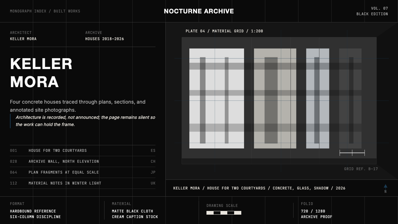 Architect Monograph (Black Edition)Architecture stays sovereign. Matte black, Helvetica caps, hairline grids, bl…建筑始终为主:哑光黑、Helvetica 大写、发丝网格与蓝图蓝。
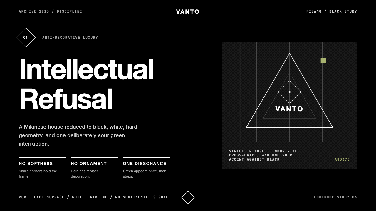 Prada Milan MinimalistLuxury refuses ornament. Pure black, austere sans, and one sour green hairlin…奢华拒绝装饰:纯黑、冷峻无衬线与一根涩绿细线。
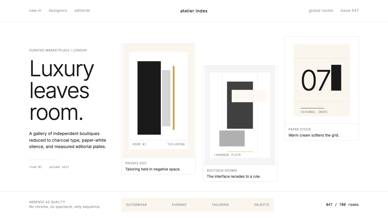 FarfetchLuxury as absence. Charcoal type, white canvas, and hairline editorial plates.奢华即留白。炭灰字、纯白画布与发丝线编辑图版。
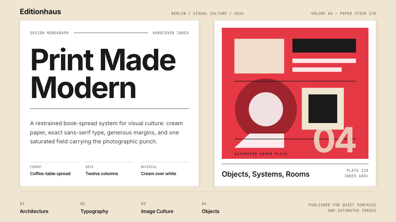 Gestalten Design BookCoffee-table calm. Cream paper, tight sans, one saturated block, and a strict…咖啡桌式冷静。奶油纸、紧凑无衬线、单一高饱和色块与严格网格。
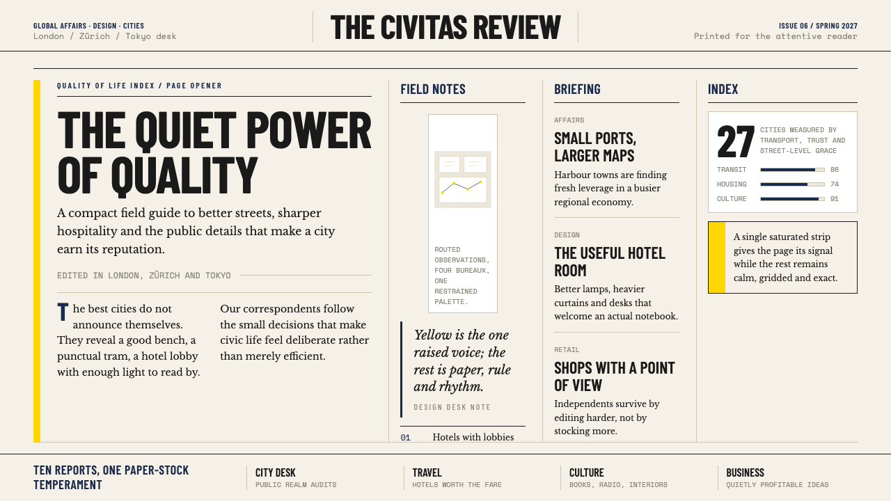 Monocle MagazineQuiet authority. Yellow spine, warm paper and dense ruled columns speak at li…安静的权威。黄色书脊、暖纸色与密集栏线,低声建立品味。
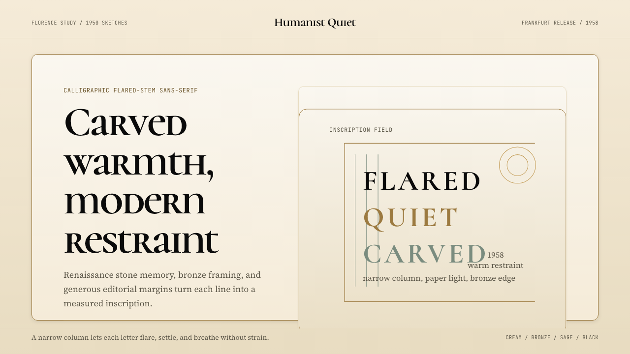 Optima (Hermann Zapf, 1958)Calligraphic calm, cut in cream and bronze. Narrow margins let the letters br…书法般的宁静。奶油底、青铜点缀、窄栏留白让字形呼吸。