What is Architect Monograph (Black Edition)?什么是 Architect Monograph (Black Edition)?
Architect Monograph channels the sovereign authority of El Croquis and Phaidon hardbacks — matte black, hairline grids, and full-bleed photography that insists architecture is the only subject worth looking at.「建筑师专著」汲取 El Croquis 与 Phaidon 精装本的威权气质——哑光黑、发丝网格与全出血摄影,宣告建筑是唯一值得凝视的主体。
Architect Monograph (Black Edition) in briefArchitect Monograph (Black Edition) 速览
Architect Monograph is a design system distilled from the visual language of the world's most prestigious architecture publications — the matte-cloth hardbacks, the blueprint-blue plan sheets, and the austere catalog pages that define how serious architectural thought is presented to the world. It takes the editorial conventions of print monographs, which evolved over decades in Madrid, Barcelona, Zurich, and Tokyo, and translates them into a rigorous digital framework.「建筑师专著」是从世界最权威建筑出版物的视觉语言中提炼出的设计系统——哑光布封面精装书、蓝图底图纸与冷静目录页,定义了严肃建筑思考呈现于世界的方式。它将印刷专著的编辑惯例(这些惯例历经数十年在马德里、巴塞罗那、苏黎世与东京演化成型)转化为严格的数字框架。
The palette is built around the deepest possible blacks and an off-white that reads almost like uncoated stock. A single accent — a cool, drafting-table blue borrowed from architectural blueprints — provides the only moment of color. Everything else is controlled by tone, by the weight of hairline rules against dark grounds, and by the spatial logic of full-bleed photography. There are no decorative elements; the photography itself, uncropped and unapologetic, carries all the visual energy.色调围绕最深的黑色与近似未涂布纸的暖白色建立。唯一的彩色——一种来自建筑蓝图的冷调制图蓝——是整套系统中仅有的色彩时刻。其余一切由色调控制:发丝细线在深色底面上的分量,全出血摄影图像的空间逻辑。没有任何装饰元素;摄影本身,未经裁切、毫无妥协,承载了全部视觉能量。
What separates Architect Monograph from generic dark-mode design is its insistence on catalog-page discipline. Every typographic choice — the tight, all-caps headers, the mono-spaced captions beneath plan drawings, the restrained italic pull-quotes — comes from a functional publishing tradition. The aesthetic is not darkness for atmosphere; it is darkness as the natural condition for examining work that must be seen in its own terms.将「建筑师专著」与普通深色模式设计区分开来的,是它对目录页纪律的坚持。每一个字体选择——紧凑的全大写标题、平面图下方的等宽字体图注、克制的斜体引语——都来自具体的出版传统。这种美学不是为氛围而生的黑暗,而是审视必须在自身条件下被看见的作品时,黑暗作为自然状态的必然呈现。
Where does Architect Monograph (Black Edition) come from?Architect Monograph (Black Edition) 从何而来?
The architectural monograph as a serious publishing form took shape in the early twentieth century but reached its definitive visual canon in the 1970s and 1980s. Yukio Futagawa's GA (Global Architecture) series, launched in Tokyo in the early 1970s, established several conventions that persist today: the near-total dedication of the page to plans, sections, and full-bleed photographs; the elimination of anything that competes with the architecture itself; and a production quality that treated the book as a material object worthy of the buildings it documented.建筑专著作为一种严肃出版形式,在二十世纪初便已成形,但在1970至80年代才确立了其决定性的视觉范式。二十世纪七十年代初,二川幸夫在东京创办的GA(Global Architecture)系列奠定了延续至今的数项惯例:将页面几乎完全献给平面图、剖面与全出血摄影;消除一切与建筑本身竞争的元素;以及将书籍当作配得上其所记录建筑的物质对象来对待的制作品质。
El Croquis, founded in Madrid in 1982 by Fernando Márquez Cecilia and Richard Levene, brought a new graphic intensity to the form. Where earlier monographs had been sober and institutional, El Croquis introduced a more dynamic tension between text and image — long critical essays running in tight columns alongside architect interviews, drawings at varying scales intercut with atmospheric photography. The distinctive matte-black cloth cover, a consistent feature from early issues onward, became one of the most recognized objects in architectural offices worldwide. The cover's severity was not accidental: it signaled that the contents required serious attention.1982年由费尔南多·马尔克斯·塞西利亚与理查德·莱文在马德里创办的El Croquis,为这一形式带来了新的图形强度。早期专著素朴而机构化,El Croquis则在文本与图像之间引入了更为动态的张力——长篇批评文章以紧凑栏宽排布,与建筑师访谈并行;不同比例的图纸与氛围摄影穿插编排。标志性的哑光黑布封面,从早期刊号起便保持一贯,成为世界各地建筑事务所中最具辨识度的实物之一。封面的严肃感并非偶然:它传达了一个信号——内容需要认真对待。
The Swiss editorial tradition contributed the hairline rule and the precision grid. Publishers in Zurich and Baden had long applied the rigorous typographic discipline of Swiss International Style to cultural and academic publishing, and architecture provided an ideal subject — a field already committed to the grid as a fundamental intellectual tool. The meeting of Swiss editorial precision and the photographic ambition of Japanese and Spanish architecture publishing produced the hybrid visual language that Architect Monograph codifies.瑞士编辑传统贡献了发丝细线与精准网格。苏黎世与巴登的出版商长期将瑞士国际主义风格的严格字体纪律应用于文化与学术出版,而建筑提供了理想的对象——这是一个早已将网格作为基本智识工具的领域。瑞士编辑精确性与日本、西班牙建筑出版的摄影野心相遇,产生了「建筑师专著」所编码的混合视觉语言。
Mònica Gili's 2G, published in Barcelona between 1996 and 2014, refined the form further toward restraint. Where El Croquis could be expressively dense, 2G committed to economy: fewer images, more considered placement, a quieter relationship between text and photograph. The magazine's design demonstrated that the monograph format's authority came not from abundance but from the confidence to leave space empty. This lesson — that negative space in an architecture publication is an editorial statement, not a failure of content — is central to the Architect Monograph system.莫妮卡·吉利主持的2G(1996—2014年,巴塞罗那)将这一形式进一步推向克制。El Croquis可以富于表现性的密度,2G则致力于经济性:更少的图像,更审慎的编排,文字与照片之间更安静的关系。这本杂志的设计证明了专著格式的权威感来自充裕而非丰盈——来自留下空白的信心。这一教训——建筑出版物中的负空间是编辑声明而非内容匮乏——是「建筑师专著」系统的核心。
What defines the Architect Monograph (Black Edition) look?Architect Monograph (Black Edition) 的视觉特征是什么?
Matte Black Ground哑光黑底面
The foundational surface is a deep, light-absorbing black — not the glossy black of consumer electronics but the matte finish of cloth-covered hardbacks. This ground functions as both context and container: it makes white type and hairline rules appear to float, and it gives full-bleed photography a cinematic presence that brighter backgrounds cannot achieve. The darkness is not atmospheric decoration; it is a publishing convention that signals the seriousness of the content inside.基础底面是一种深沉、吸光的黑色——不是消费电子产品的光泽黑,而是布面精装书的哑光质感。这种底面同时充当语境与容器:它使白色字体与发丝细线看起来悬浮于空中,并赋予全出血摄影一种更明亮底色所无法企及的电影感存在。这种黑暗不是氛围性装饰,而是一种出版惯例——它传递了内部内容严肃性的信号。
Hairline Grid and Blueprint Blue发丝网格与蓝图蓝
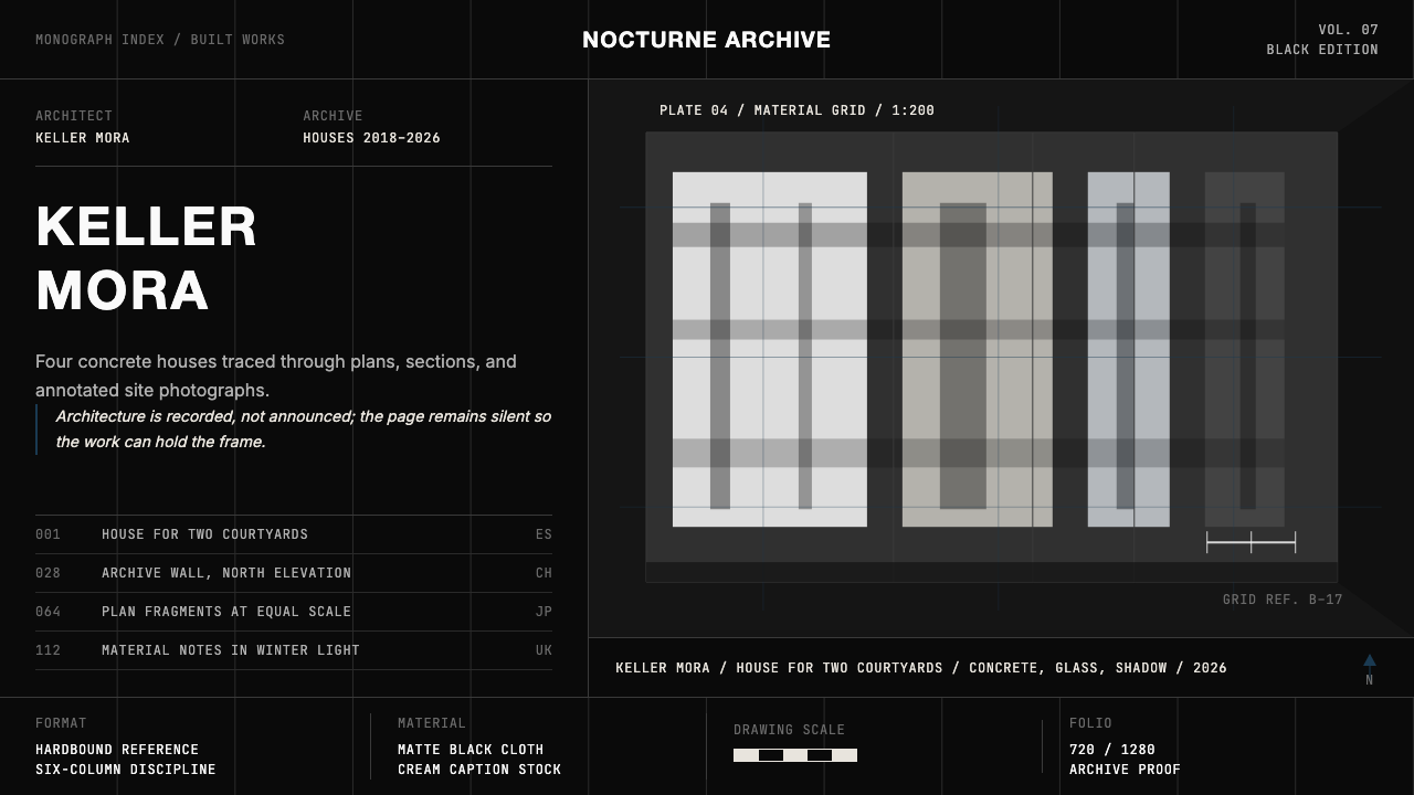
Thin, precise rules — barely visible at normal reading distance but structurally present — divide the composition into the six-column cadence of a catalog page. The grid is not decorative but documentary: it performs the same organizing function as the registration lines on a set of architectural drawings. The single chromatic accent, a cool mid-range blue referencing the diazo prints of architectural blueprints, is reserved for data elements, active states, and the finest category labels — always used sparingly enough that its appearance reads as precision rather than color.细如发丝的精准线条——在正常阅读距离下几乎不可见,却具有结构性存在——将版面划分为目录页的六栏节奏。网格并非装饰性的,而是记录性的:它执行与一套建筑图纸上的对齐线相同的组织功能。唯一的彩色强调——一种冷调中明度蓝,引用建筑蓝图的晒图印刷色——被保留用于数据元素、激活状态与最精细的类别标签,始终足够克制,使其出现被解读为精确而非色彩。
Tight All-Caps Headers紧凑全大写标题
Section headings are set in compressed uppercase with tight letter-spacing — the typographic convention of the architectural index and the museum exhibition label. Capitalization is not for emphasis; it is for categorization. In the monograph tradition, all-caps headers mark the shift from reading to consulting: you scan them to navigate rather than read them for meaning. The compression and tightness signal that every square millimeter of the page is purposefully allocated.章节标题以压缩字距的全大写字母排布——这是建筑索引与博物馆展览标牌的排印惯例。大写不是为了强调,而是为了分类。在专著传统中,全大写标题标志着从阅读到查阅的转换:你扫视它们来导航,而非阅读它们来理解含义。压缩与紧凑传达了一个信号:页面的每一平方毫米都被有目的地分配。
Monospaced Captions and Italic Pull-Quotes等宽字体图注与斜体引语
Technical annotations — plan references, project dates, material notes, coordinates — appear in a monospaced type that echoes architectural drawing notation. The fixed-width rhythm of these characters gives numerical data a measured, impartial quality. Against this, the occasional italic pull-quote — used to excerpt an architect's statement or a critical observation — introduces a different register: personal, argumentative, provisional. The contrast between the two type voices encodes the distinction between documentation and interpretation.技术性注释——平面图索引、项目日期、材料备注、坐标——以等宽字体呈现,呼应建筑图纸的标注惯例。这些字符固定宽度的节奏赋予数字数据一种被测量过的、不偏不倚的品质。与之对照,偶尔出现的斜体引语——用于摘引建筑师陈述或批评性观察——引入了另一种语调:个人的、论辩的、暂定的。两种字体声音的对比编码了记录与诠释之间的区别。
Full-Bleed Photography as Primary Element全出血摄影作为主要元素
Images in Architect Monograph do not sit inside frames or float as insets — they extend to the edges of the composition and command the full width or height of the space. This is a direct inheritance from GA Houses and El Croquis, where the photograph was treated as primary evidence rather than illustration. The consequence is that type, grids, and captions must function on top of imagery rather than beside it, requiring careful tonal judgment: text anchors at the darker regions, key structural information clears the image entirely.「建筑师专著」中的图像不是置于边框内或作为嵌入图浮现的——它们延伸至版面边缘,占据空间的全部宽度或高度。这是对GA Houses与El Croquis的直接继承,在那里,摄影被当作主要证据而非插图对待。其结果是,文字、网格与图注必须在图像之上运作而非并排,需要审慎的色调判断:文本锚定于较暗区域,关键结构信息则完全清空图像空间。
Structural Negative Space结构性负空间
Empty space in this system is not absence — it is the equivalent of the unbuilt margin on an architectural site plan, a deliberate reservation. Wide margins, generous interline spacing, and spare column arrangements give each element room to be examined individually rather than consumed as part of a continuous visual flow. This discipline resists the natural pull of digital design toward information density; it insists that the reader pause.这套系统中的空白不是缺席——它等同于建筑总平面图上未建设的边缘,是刻意的保留。宽阔的页边距、充裕的行间距与简省的分栏安排,给每个元素以被单独审视的空间,而非作为连续视觉流的一部分被消费。这种纪律抵抗数字设计向信息密度倾斜的自然引力;它坚持要求读者停顿。
Material Austerity材料克制
No gradients, no soft shadows, no ambient glow, no surface texture beyond the implied weave of the matte black ground. Interactions, if present, are indicated by crisp tonal shifts — a slightly lighter value on hover, a blue rule appearing at the active edge — not by animation or decorative transition. This austerity mirrors the architectural ethos of documenting buildings rather than selling them: the system trusts its content to hold attention without embellishment.无渐变,无柔和阴影,无环境光晕,无超出哑光黑底面隐含编织感以外的表面肌理。交互(若有)通过清晰的色调偏移来标示——悬停时轻微提亮,激活边缘出现蓝色细线——而非通过动画或装饰性过渡。这种克制呼应了记录建筑而非销售建筑的建筑学伦理:系统相信其内容无需点缀便能维持注意力。
Who shaped Architect Monograph (Black Edition)?谁塑造了 Architect Monograph (Black Edition)?
Futagawa founded the GA (Global Architecture) series in Tokyo in the early 1970s, establishing the full-bleed, plan-centric monograph format that became the international standard for serious architecture documentation. His work as photographer and publisher demonstrated that the architecture book could be both a rigorous technical record and a visually powerful object. GA Houses, GA Document, and GA Architect collectively shaped the visual expectations of three generations of architects and, by extension, the design language that Architect Monograph systematizes.二川幸夫于二十世纪七十年代初在东京创办GA(Global Architecture)系列,建立了全出血、以平面图为核心的专著格式,使其成为严肃建筑文献记录的国际标准。他作为摄影师与出版人的工作证明,建筑图书可以同时是严格的技术记录与具有视觉力量的物质对象。GA Houses、GA Document与GA Architect共同塑造了三代建筑师的视觉期待,并由此塑造了「建筑师专著」所系统化的设计语言。
Co-founders of El Croquis in Madrid in 1982, Cecilia and Levene developed the magazine's distinctive editorial identity: the matte black cover as signal of authority, the monographic issue structure dedicated to a single architect or studio, the long critical essay intercut with drawings and photographs. Their design and editorial choices were closely collaborative with the architects featured, producing a format that felt like a direct extension of each subject's working method. El Croquis issues have become primary reference objects in architecture education worldwide.塞西利亚与莱文于1982年在马德里共同创办El Croquis,发展出该杂志独特的编辑身份:哑光黑封面作为权威信号,专题期刊结构专注于单一建筑师或事务所,长篇批评文章与图纸和照片穿插编排。他们的设计与编辑决策与被收录的建筑师紧密协作,产生了一种感觉像是每位主角工作方法直接延伸的格式。El Croquis的各期刊物已成为全球建筑教育中的主要参考实物。
As founding editor of 2G, published in Barcelona from 1996 to 2014, Gili refined the monograph format toward maximum restraint. Where El Croquis embraced visual density, 2G committed to economy: fewer but more considered images, generous empty space treated as an editorial argument, and a quieter typographic register that foregrounded the architecture over the publication's own design identity. 2G's back issues remain influential for demonstrating that authority in architecture publishing comes from confidence in content rather than visual insistence.作为2G的创刊编辑(巴塞罗那,1996—2014年),吉利将专著格式精炼至最大限度的克制。El Croquis拥抱视觉密度,2G则致力于经济性:更少但更审慎的图像,宽阔的空白被当作编辑论点对待,以及更安静的字体语调——将建筑置于出版物自身设计身份之上。2G的历期刊物至今仍具影响力,因为它证明了建筑出版的权威感来自对内容的信心,而非视觉上的坚持。
The publishers and art directors working in Zurich and Baden from the mid-twentieth century onward — associated with houses including Lars Müller Publishers and Birkhäuser — applied the rigorous grid discipline and typographic precision of Swiss International Style to architecture books. Their contribution to the Architect Monograph visual language is the hairline rule, the mathematically specified column structure, and the insistence on a typeface used consistently at strict hierarchical intervals. The Swiss editorial tradition made the grid a philosophical as well as a practical tool.二十世纪中叶以来在苏黎世与巴登工作的出版商与艺术指导——与Lars Müller Publishers、Birkhäuser等出版社相关联——将瑞士国际主义风格的严格网格纪律与字体精确性应用于建筑图书。他们对「建筑师专著」视觉语言的贡献是:发丝细线、经过数学规定的分栏结构,以及坚持在严格层级间隔上一贯使用字体的原则。瑞士编辑传统使网格成为哲学工具,而不仅仅是实用工具。
How do you use Architect Monograph (Black Edition) today?今天怎么用 Architect Monograph (Black Edition)?
Architect Monograph is best understood as a system of documentary authority — it communicates that the content being presented has been selected, considered, and arranged with the rigor of a reference publication. Applying it correctly requires internalizing this purpose rather than simply replicating its surface characteristics. A dark background and a tight sans-serif header do not make something feel like El Croquis; the discipline of empty space, the restraint of color, and the structural logic of the grid are what produce the effect.「建筑师专著」最好被理解为一套记录性权威系统——它传达出被呈现的内容是以参考出版物的严谨性被选择、考量与编排的。正确应用它需要内化这一目的,而非简单复制其表面特征。深色背景加紧凑无衬线标题,并不会让作品感觉像El Croquis;产生这种效果的,是空白的纪律、色彩的克制与网格的结构逻辑。
For presentation slides, the style excels on both cover and content pages but demands a different approach to each. Cover pages work as architectural plates: a single full-bleed photograph occupies the majority of the surface, with the title set in tight all-caps at the lower left or lower right, anchored above a hairline rule. Project or company identification appears in monospaced type at the smallest legible size. Content slides should resist the impulse to fill — one key visual per slide, supporting text as a column of no more than three or four short lines, and data presented as clean ruled tables rather than styled charts. The blue accent, when it appears, should mark a single element per slide: an active figure, a key data point, a category header.在演示文稿中,这种风格在封面页与内容页上都表现出色,但对两者的处理方式截然不同。封面页作为建筑图版来运作:单张全出血摄影占据大部分画面,标题以紧凑全大写字母置于左下或右下,锚定于发丝细线之上。项目或公司标识以等宽字体呈现,字号为最小可读尺寸。内容页应当抵抗填满的冲动——每页一个核心视觉元素,辅助文本为不超过三四行短句的栏目,数据以简洁的线条表格而非经过风格化的图表呈现。蓝色强调色出现时,每页应仅标示一个元素:一个激活数字、一个关键数据点,或一个类别标题。
For web interfaces, Architect Monograph is well suited to portfolios, documentation hubs, and analytical dashboards where precision and authority are the primary values. The approach: a near-black background for the base layer, off-white for primary text, and the blue accent reserved for interactive affordances and status indicators. Navigation should be minimal and typographic — tight all-caps labels, no icons beyond the simplest geometric indicators. Card components sit flush against the dark ground with no box shadows; their boundaries are implied by the hairline grid rather than made explicit by borders or shadow.对于网页界面,「建筑师专著」非常适合作品集、文档中心与分析仪表板——精确性与权威感是这些场景的首要价值。方法如下:近黑色作为基础层底色,暖白色用于主要文本,蓝色强调色保留给交互可供性与状态指示器。导航应当简省且字体化——紧凑全大写标签,除最简单的几何指示符外无图标。卡片组件贴附于深色底面,无阴影;它们的边界由发丝网格暗示,而非由边框或投影明确标示。
For editorial and marketing applications, the style supports strong typographic hierarchy and is particularly effective for case studies, long-form articles, and formal reports. An Architect Monograph editorial layout uses a wide outer margin for figure numbers, captions, or marginalia; the body text column is measured and unhurried; section breaks are marked by a full-width hairline rule rather than decorative ornaments. Marketing applications should be used sparingly: the style communicates seriousness and can feel cold in contexts that require warmth or urgency. It is most persuasive when the proposition is one of quality and long-term value rather than immediacy.对于编辑与营销应用,这种风格支持强劲的字体层级,对案例研究、长篇文章与正式报告尤为有效。「建筑师专著」的编辑版面在外侧保留宽阔页边距用于图号、图注或旁注;正文栏有节奏、不急迫;段落分隔以全宽发丝细线而非装饰元素标记。营销应用应当慎重使用:这种风格传递严肃感,在需要温度或紧迫感的语境中可能显得冷漠。当主张是关于品质与长期价值而非即时性时,它最具说服力。
A common mistake when applying this style is treating the dark background as an invitation to add more visual elements — colored callouts, glowing accents, layered overlays — to compensate for the austerity. This reverses the logic of the system entirely. The dark ground in an architectural monograph is austere because the architecture fills it; in a digital application, the equivalent is content of genuine weight and visual quality. If the content does not justify the silence the style demands, the result will feel empty rather than authoritative. The other frequent error is breaking the single-accent rule: the blueprint blue works because it appears rarely; introducing a second accent color immediately undoes the precision the system is built on.应用这种风格时最常见的错误,是将深色背景理解为添加更多视觉元素的邀请——彩色标注、发光强调、分层叠加——以弥补其克制感。这完全颠倒了系统的逻辑。建筑专著中深色底面之所以克制,是因为建筑本身填充了它;在数字应用中,等价物是具有真实分量与视觉品质的内容。如果内容无法支撑这种风格所要求的沉默,结果会显得空洞而非权威。另一个频繁出现的错误是打破单一强调色规则:蓝图蓝之所以有效,是因为它极少出现;引入第二种强调色会立刻瓦解系统赖以建立的精确性。
Architect Monograph (Black Edition) — FAQArchitect Monograph (Black Edition) · 常见问题
How does Architect Monograph differ from other dark design systems?「建筑师专著」与其他深色设计系统有何不同?
Most dark design systems treat darkness as atmosphere — a mood choice that makes interfaces feel premium or dramatic. Architect Monograph treats darkness as a publishing convention inherited from a specific cultural tradition: the matte-cloth hardback architecture monograph. The difference shows in the details. Where consumer dark modes typically use soft gradients, glowing accents, and layered depths to create richness, this system insists on a flat, non-luminous surface, a single non-warm accent, and structure derived from hairline rules rather than shadow or blur. The austerity is specific, not generic.大多数深色设计系统将黑暗视为氛围——一种让界面感觉高端或戏剧性的情绪选择。「建筑师专著」则将黑暗视为从特定文化传统继承的出版惯例:哑光布面精装建筑专著。差异体现在细节中。消费类深色模式通常使用柔和渐变、发光强调与层叠深度来制造丰富感,而这套系统坚持平坦、非发光的底面,单一非暖色调强调,以及从发丝细线而非阴影或模糊中推导出的结构。这种克制是具体的,不是泛泛的。
Can this style work for consumer-facing products, or is it limited to professional and institutional contexts?这种风格能用于面向消费者的产品吗,还是仅限于专业与机构场景?
The style is most naturally at home in professional, institutional, and B2B contexts — architecture firms, engineering practices, design studios, high-end real estate, financial services positioning toward sophistication, and cultural institutions. It can work in consumer contexts, but only when the product itself carries the weight the style implies. A luxury goods brand, a serious cultural platform, or an enthusiast community with demanding aesthetic standards can carry it. It will feel inappropriate — cold, distant, inaccessible — for products that depend on warmth, playfulness, or a wide demographic reach.这种风格在专业、机构与B2B语境中最为自然——建筑事务所、工程实践、设计工作室、高端房地产、以精致感为定位的金融服务,以及文化机构。它可以用于消费者场景,但前提是产品本身能承载这种风格所暗示的分量。奢侈品品牌、严肃的文化平台,或有着高要求审美标准的爱好者社区都可以驾驭它。对于依赖温暖感、趣味性或广泛受众覆盖的产品,它会显得不合适——冷漠、疏离、难以亲近。
Why is the blue accent specifically described as blueprint blue, and does the exact shade matter?为什么蓝色强调被特别描述为「蓝图蓝」,具体色调重要吗?
The blueprint reference is semantic as well as visual. Diazo blueprints — the cyan-on-white or white-on-blue reproduction method used for architectural drawings before digital plotting — carry an association with technical precision, working documents, and the gap between a design and its realization. Using a blue in this register rather than a warmer or more saturated alternative maintains the system's documentary character. The shade should read as cool and measured — neither the vivid blue of a digital interface accent nor the deep navy of a corporate palette, but something closer to the color of a working drawing. Qualitatively: precise without being aggressive, technical without being cold.「蓝图」的指涉既是语义的,也是视觉的。晒图蓝图——数字出图之前建筑图纸所使用的青色印白或白色印蓝的复制方式——承载着与技术精确性、工作文件以及设计与实现之间的距离相关联的涵义。使用这个语域的蓝色,而非更暖或更饱和的替代,维持了系统的记录性格。这个色调应当读来冷静而有节制——既非数字界面强调色的鲜亮蓝,也非企业色板的深海军蓝,而是更接近工作图纸色彩的某种存在。定性地说:精确而不攻击性,技术性而不冷漠。
How should data visualization be handled in this system?在这套系统中如何处理数据可视化?
Data visualization should be treated as an extension of the architectural drawing tradition: ruled, precise, and economical. Tables are preferable to charts wherever the exact value matters more than the pattern. When charts are necessary, they should use as few visual variables as possible — line charts with a single line, bar charts in a single tone with the blue accent reserved for a highlighted value, scatter plots without fill. Axes should be marked with hairline rules, labels in monospaced type. Avoid rounded bar corners, gradient fills, drop shadows on data elements, and any animation beyond the minimum needed for orientation. The guiding principle is that a chart should feel like it was designed by the same intelligence that produces engineering drawings.数据可视化应当被视为建筑图纸传统的延伸:有规则、精确、经济。当精确数值比趋势模式更重要时,表格优于图表。当必须使用图表时,应尽可能减少视觉变量——单线折线图,单色调柱状图(蓝色强调保留给高亮数值),无填充散点图。坐标轴以发丝细线标注,标签使用等宽字体。避免圆角柱条、渐变填充、数据元素上的投影阴影,以及超过定向所需最低限度的任何动画。指导原则是:一张图表应当感觉像是由制作工程图纸的同一种智性所设计。
Is it appropriate to mix this style with warmer or more expressive design elements for variety?为了增加变化,将这种风格与更温暖或更具表现力的设计元素混合是否合适?
Mixing is the most common way that applications of this style fail. The authority of an architectural monograph comes from its consistency — the matte black cover is the same whether the building inside is in Switzerland or Japan, whether the architect is established or emerging. Introducing warmer tones, decorative typefaces, illustrated elements, or soft-shadow cards for variety signals that the system does not fully commit to its own logic. When variety is genuinely needed, it should be achieved through typographic contrast, tonal shifts within the dark palette, and the controlled use of full-bleed imagery rather than by importing elements from a different visual register. A layout that feels same on every page is not boring; it is reliable.混合是这种风格应用中最常见的失败方式。建筑专著的权威感来自其一致性——无论内部建筑位于瑞士还是日本,无论建筑师是成熟的还是新兴的,哑光黑封面始终如一。为了增加变化而引入更暖的色调、装饰性字体、插图元素或柔和阴影卡片,传递出系统并不完全信守其自身逻辑的信号。当真正需要变化时,应当通过字体对比、深色色板内的色调偏移,以及对全出血图像的受控使用来实现,而非从不同视觉语域引入元素。每页感觉相同的版面不是无聊的;它是可信赖的。
Related design styles相关设计风格
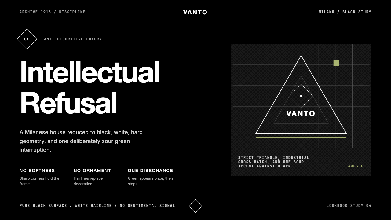 Prada Milan MinimalistLuxury refuses ornament. Pure black, austere sans, and one sour green hairlin…奢华拒绝装饰:纯黑、冷峻无衬线与一根涩绿细线。
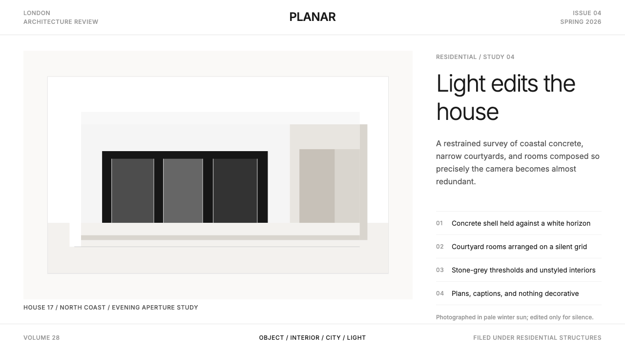 Wallpaper* ArchitecturePhotography does the speaking. Gallery-white grid, Inter captions, and hairli…让摄影发声。画廊白网格、Inter 小标题与细线退后。
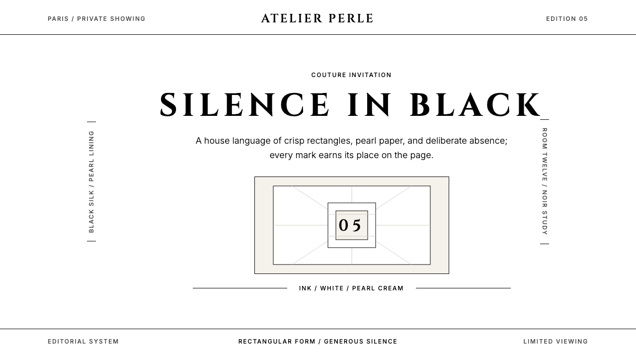 ChanelLuxury needs no color. Black on white, pearl-cream warmth, geometric capitals…百年宣言:真正的奢华无需色彩。纯黑配纯白,唯一的偏移是珍珠乳白——克制即气场。
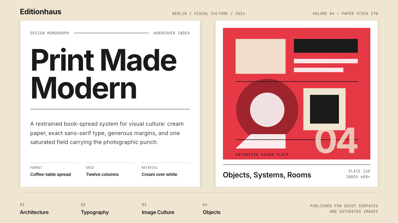 Gestalten Design BookCoffee-table calm. Cream paper, tight sans, one saturated block, and a strict…咖啡桌式冷静。奶油纸、紧凑无衬线、单一高饱和色块与严格网格。
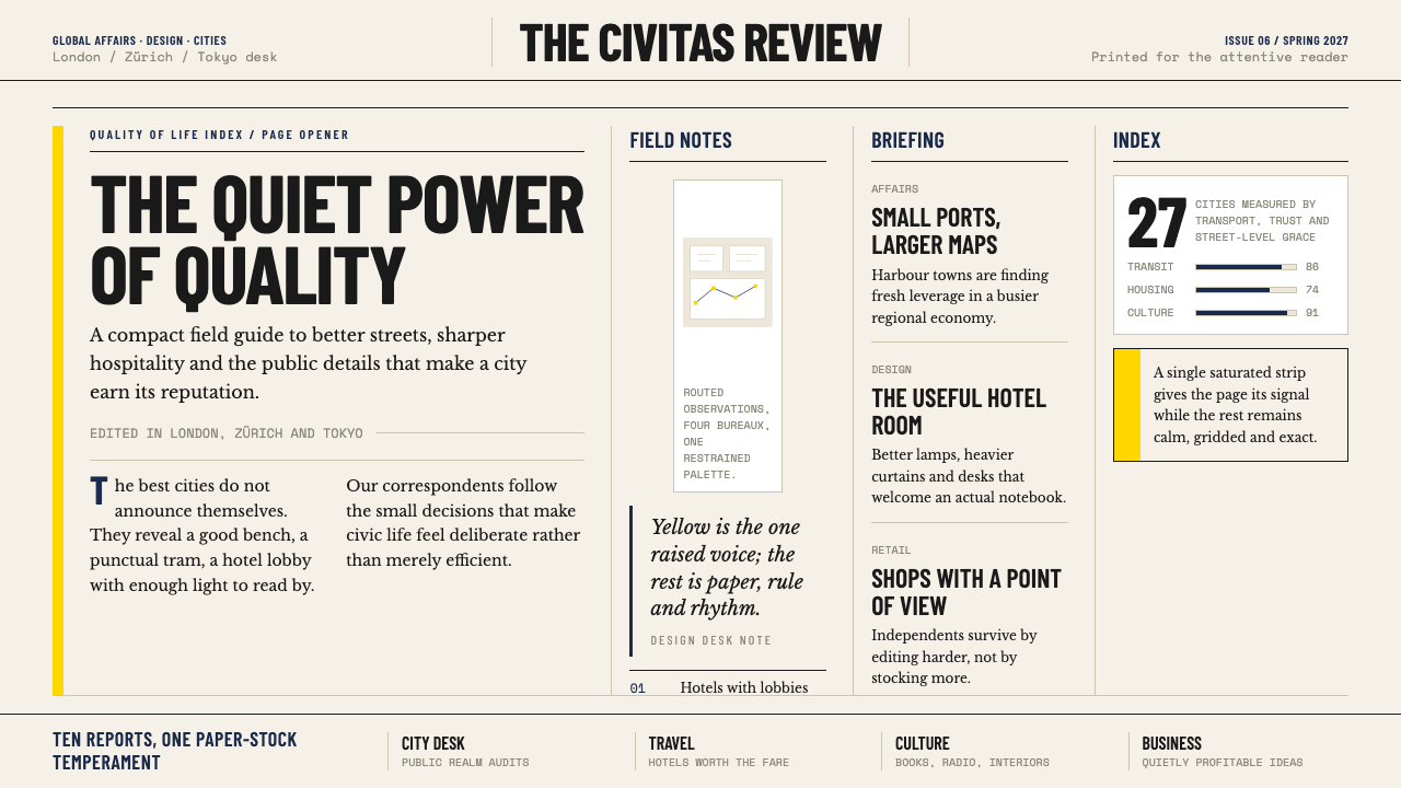 Monocle MagazineQuiet authority. Yellow spine, warm paper and dense ruled columns speak at li…安静的权威。黄色书脊、暖纸色与密集栏线,低声建立品味。
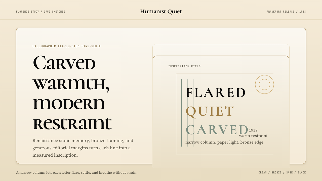 Optima (Hermann Zapf, 1958)Calligraphic calm, cut in cream and bronze. Narrow margins let the letters br…书法般的宁静。奶油底、青铜点缀、窄栏留白让字形呼吸。