What is Prada Milan Minimalist?什么是 Prada Milan Minimalist?
Prada built a luxury empire on refusal — no ornament, no warmth, no apology, just pure black, austere geometry, and a single deliberately ugly accent that makes you think.Prada 用拒绝构建了一个奢华帝国——拒绝装饰、拒绝温情、拒绝讨好,只剩纯黑、严峻的几何,以及一抹故意「丑」得让人回味的点缀色。
Prada Milan Minimalist in briefPrada Milan Minimalist 速览
Prada Milan Minimalist is the visual language of one of fashion's most intellectually rigorous houses — a system built on disciplined restraint, cool geometric precision, and what Miuccia Prada herself has called 'the beauty of the ugly.' Where most luxury brands reach for warmth, gold, and softness to signal value, Prada reaches in the opposite direction: deep black grounds, pure white negative space, stark geometric sans-serif letterforms, and accents in colors that feel slightly wrong — a sour military green, a chalky dusty pink, a flat mustard yellow.「Prada 米兰极简」是时尚界最具知识分子气质的品牌之一的视觉语言——一套建立在严格克制、冷静几何精度,以及 Miuccia Prada 本人所称「丑之美」之上的体系。大多数奢侈品牌以温暖、金色与柔软来传递价值感,Prada 则走向另一端:深邃的黑色底面、纯粹的白色负空间、冷峻的几何无衬线字体,以及几抹「略感不适」的点缀——略带涩感的军绿、粉质的灰粉、哑光的芥末黄。
The aesthetic is not cold for the sake of coldness, nor minimal for the sake of minimalism. It is, in Miuccia Prada's framing, an intellectual argument: that genuine luxury is legible only to those willing to think rather than those who merely want to be impressed. The visual system earns its authority through what it withholds. A page, a facade, a garment — each is a composition from which every comfortable element has been deliberately removed, leaving only what is structurally necessary and conceptually precise.这种美学并非为冷漠而冷漠,为极简而极简。以 Miuccia Prada 的阐释,它是一个知识上的论点:真正的奢华只对愿意思考的人可读,而非只想被震撼的人。这套视觉体系的权威感,正来自它所克制的一切。一张页面、一道立面、一件服装——每一个让人感到舒适的元素都被刻意移除,只留下结构上必要、概念上精确的部分。
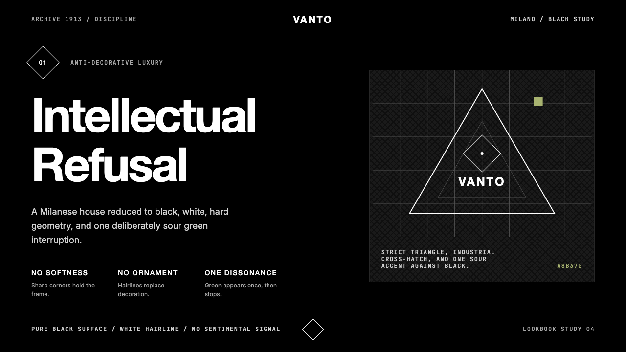
In practical visual terms, the system is recognizable by its locked-down palette of near-absolute black and white, the sharp angles that refuse any corner rounding, the generous negative space that makes even a single word feel monumental, and the Saffiano leather cross-hatch texture that occasionally appears as a background field. Typography is geometric without being playful, austere without being neutral. The triangle logo badge — a recurring motif in Prada's physical and print identity — acts as a visual seal: small, dense, unmovable.在具体视觉层面,这套体系以几个特征辨识:近乎绝对的黑白色域、拒绝任何圆角的锋利直角、令哪怕单个词语都显得庄重的宽阔留白,以及偶尔作为背景肌理出现的 Saffiano 十字纹皮革纹路。字体排印具有几何感而不显活泼,严峻而不失特征。三角形 logo 徽章——在 Prada 实体与印刷形象中反复出现的母题——充当视觉印章:小巧、紧密、不可撼动。
See the Prada Milan Minimalist design system查看 Prada Milan Minimalist 完整设计系统
Where does Prada Milan Minimalist come from?Prada Milan Minimalist 从何而来?
The Prada house was founded in 1913 by Mario Prada, who opened a leather goods shop in Milan's Galleria Vittorio Emanuele II — that glass-vaulted nineteenth-century arcade that is itself a monument to ornamental excess. Mario sold fine luggage, handbags, and accessories to a clientele of aristocrats and the upper bourgeoisie, and the brand's early identity was that of a well-made, traditionally crafted Milanese house with no particular visual philosophy beyond quality and heritage.Prada 由马里奥·普拉达于 1913 年创立,他在米兰的维托里奥·埃马努埃莱二世王廊——那座十九世纪玻璃拱顶商业拱廊,本身就是繁复装饰的纪念碑——开设了一家皮具店。马里奥向贵族与上层资产阶级顾客销售精致的行李箱、手袋与配件,品牌早期的形象是一家工艺优良、传统精湛的米兰名店,除品质与传统外并无特别的视觉哲学主张。
The transformation came in 1978, when Miuccia Prada — Mario's granddaughter and a doctorate holder in political science who had also trained at Milan's Piccolo Teatro as a mime — took over the business alongside her partner (and eventual husband) Patrizio Bertelli, who handled commercial operations. Miuccia brought to the brand something most luxury houses actively avoid: a genuine conceptual stance. Influenced by feminist theory, Marxist critique, and her own ambivalent relationship to the conventions of femininity and beauty, she began systematically stripping the brand of everything that felt decorative, reassuring, or conventionally pretty. The result was a visual and material language that felt almost confrontational: nylon backpacks rather than leather handbags, industrial fabrics rather than sumptuous ones, colors chosen for their psychological discomfort rather than their aesthetic appeal.转折发生在 1978 年。马里奥的孙女 Miuccia Prada——政治科学博士,曾在米兰小剧院接受哑剧训练——与她的伴侣(后来的丈夫)帕特里齐奥·贝尔泰利(负责商业运营)共同接掌品牌。Miuccia 为品牌带来了大多数奢侈品牌刻意回避的东西:一个真正的概念立场。受女性主义理论、马克思主义批判,以及她自身对女性气质与美的传统规范的矛盾态度影响,她开始系统性地剥除一切装饰性的、让人安心的、约定俗成的漂亮元素。结果是一种几乎带有对抗性的视觉与材料语言:尼龙双肩包而非皮革手袋,工业面料而非华美织物,色彩的选择依据心理上的不适感而非美学吸引力。
The visual identity crystallized through Prada's collaborations with architects and designers who shared its anti-ornamental sensibility. The most significant was the ongoing relationship with Rem Koolhaas and his firm OMA, which designed Prada's Epicenter flagship stores — in New York in 2001, in Los Angeles in 2004, and in Tokyo in 2003 in collaboration with Herzog and de Meuron. These stores applied the Prada aesthetic to architectural scale: raw concrete and resin floors, exposed structural elements, industrial lighting, display systems that refused the soft theatrical lighting typical of luxury retail. The stores were, in Koolhaas's framing, an attempt to rethink what a retail space could be — and in doing so, they gave the brand's visual system a spatial vocabulary that has influenced Prada's print and digital work ever since.视觉形象通过 Prada 与建筑师和设计师的合作逐渐结晶,这些合作者共享其反装饰的感性。最重要的是与雷姆·库哈斯及其事务所 OMA 的持续合作——后者设计了 Prada 的 Epicenter 旗舰店:2001 年纽约店、2004 年洛杉矶店,以及 2003 年与赫尔佐格和德梅隆合作的东京店。这些店铺将 Prada 美学推至建筑尺度:裸露的混凝土与树脂地面、外露的结构构件、工业照明、拒绝奢侈零售惯用柔和戏剧性灯光的展示系统。在库哈斯的阐述中,这些店铺是对零售空间可能性的重新思考——同时也为品牌的视觉体系赋予了空间词汇,至今持续影响着 Prada 的印刷与数字作品。
The aesthetic reached its current form across the 1990s and 2000s, as Miuccia consolidated the house's identity around a small set of recurring devices: the inverted triangle logo (itself a minimalist geometric form), the Saffiano leather texture, the restricted palette, and the deliberate deployment of 'ugly-beautiful' accent colors. Raf Simons joined as co-creative director in 2020, bringing a background in youth culture, subcultural reference, and Belgian conceptualism that deepened rather than redirected the house's intellectual posture. The visual language today is recognizably the same system Miuccia built across four decades — refined but not softened, legible but never comfortable.这套美学在 1990 年代至 2000 年代间逐渐定型,Miuccia 将品牌形象凝聚于一组反复出现的装置之上:倒三角形 logo(本身就是一个极简几何形)、Saffiano 皮革纹理、受限的色板,以及「丑美」点缀色的刻意运用。拉夫·西蒙斯于 2020 年以联合创意总监身份加入,他在青年文化、亚文化参照与比利时概念主义方面的背景,深化而非转向了这个品牌的知识分子姿态。今天的视觉语言,仍是 Miuccia 历经四十年构建的同一套体系——精炼而未曾软化,清晰而从不令人感到舒适。
What defines the Prada Milan Minimalist look?Prada Milan Minimalist 的视觉特征是什么?
Color System色彩体系
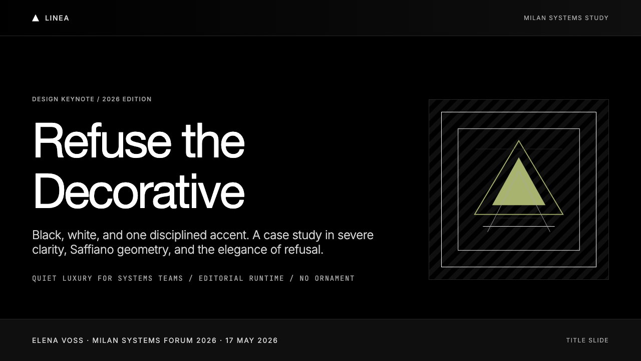
The palette is anchored by near-absolute black and pure white, deployed in high-contrast opposition with no gradation between them. Accent colors are chosen not for conventional beauty but for a quality Miuccia Prada has described as 'ugly-beautiful' — a military green with a slightly sour, desaturated cast; a chalky pink that reads as faded rather than feminine; a mustard yellow so flat it borders on industrial. These accents appear sparingly and never in combination with one another. The effect is that each accent feels like a decision rather than a decoration — a single deliberate note in an otherwise monochrome composition.色板以近乎绝对的黑色与纯白为锚点,以高对比度的方式对立部署,两者之间不存在过渡。点缀色的选择不以传统意义上的美为标准,而依据 Miuccia Prada 所描述的「丑美」品质——略带涩感、去饱和的军绿;读起来像褪色而非女性化的粉质灰粉;哑光到近乎工业感的芥末黄。这些点缀色出现时极为克制,从不相互组合。效果是每一抹点缀都像是一个决定,而非一处装饰——在一片单色构图中的一个刻意音符。
Typography字体排印
Type in the Prada system is geometric and strictly sans-serif — letterforms that are structurally clean without any calligraphic warmth or humanist irregularity. The weight contrast is extreme: display text is set at a scale that feels almost aggressive, while body copy is set small and tight, creating a compositional tension between mass and detail. Tracking is wide on headline text, creating a sense of airy authority; body text is set with minimal spacing, dense and deliberate. Capitalization is used architecturally — full caps for labels and product names, mixed case for editorial text — as a hierarchy signal rather than an emphasis device.Prada 体系中的字体排印为几何无衬线——字形结构清晰,没有书法的温度,也没有人文主义的不规整。字重对比极为悬殊:展示性文字以近乎咄咄逼人的尺度呈现,而正文则紧密而细小,在体量与细节之间制造出构图张力。标题文字字距宽阔,透出一种通透的权威感;正文排印间距极小,密集而刻意。大写字母被建筑性地使用——标签与产品名称全部大写,编辑性文字使用混合大小写——作为层级信号而非强调手段。
Geometry and Edge几何与边线
Every form in the Prada visual system has a sharp, uncompromised edge. Corners do not round; shapes do not soften; elements do not blend into one another. This commitment to the hard edge is what gives the system its characteristic feeling of industrial precision — it reads as measured and intentional rather than crafted and warm. The inverted triangle logo, the rectangular framing of product imagery, the straight horizontal rules that divide sections — all operate as geometric decisions that reinforce the system's architectural logic. Nothing is gestural; everything is resolved.Prada 视觉体系中的每一个形态都拥有锋利、不妥协的边线。角不圆润,形态不柔化,元素之间不融合渗透。对硬边的坚守赋予这套体系标志性的工业精度感——读来像是测量与刻意为之,而非手工制作与有温度的。倒三角形 logo、产品图像的矩形框架、分隔段落的笔直水平线——全部作为几何决定运作,强化体系的建筑逻辑。没有任何手势性的元素;一切都是被解决掉的。
Negative Space负空间
Negative space in the Prada system is not merely absence — it is the primary material of the composition. A single word set in a field of black; a product floating in an expanse of white; a logo placed in the lower corner of an otherwise empty page. This use of space communicates that each element is important enough to be alone, that the brand's authority does not need to be demonstrated through density or richness. The space is not relaxing — it is pressurized. The emptiness is what creates the feeling that something significant is being withheld, and that the viewer must bring their own interpretation to complete the meaning.Prada 体系中的负空间不仅仅是缺席——它是构图的首要材料。一个单词置于黑色的广阔之中;一件产品漂浮于白色的延伸之上;一个 logo 落在几乎空白页面的角落。这种空间的运用传达出:每一个元素都重要到足以独处,品牌的权威感不需要通过密度或丰富性来证明。这种空间并不令人放松——它是加压的。正是这种空旷制造出一种感觉:某种重要的东西被克制着,观看者必须带入自己的诠释才能完成意义。
Texture as Structure肌理作为结构
Unlike most minimalist systems that insist on absolute flatness, the Prada aesthetic incorporates one specific texture as a structural signature: the Saffiano cross-hatch pattern derived from the brand's iconic leather finish. When this texture appears in two-dimensional work — as a background field, a framing device, or a material reference — it functions as a tonal element rather than a decorative one. It adds density and tactility without introducing color or softness. This is the system's one concession to material richness, and its restraint is what keeps it from feeling ornamental.不同于大多数坚持绝对平面性的极简主义体系,Prada 美学将一种特定肌理作为结构性签名:源自品牌标志性皮革工艺的 Saffiano 十字纹图案。当这种肌理出现于二维作品中——作为背景底面、框架元素或材料参照——它以色调性而非装饰性的方式运作。它增添了密度与触感,而不引入色彩或柔软度。这是整套体系对材料丰富性唯一的让步,而其克制程度,恰恰使它免于滑向装饰感。
Deliberate Discomfort刻意的不适
Perhaps the most distinctive and difficult-to-replicate quality of the Prada aesthetic is its cultivation of deliberate discomfort — the sense that nothing has been arranged to make the viewer feel immediately welcome or at ease. Accent colors that are slightly off, compositions that are slightly too bare, proportions that are slightly too extreme. This is not carelessness; it is one of the most controlled qualities in the system. Miuccia Prada has spoken of wanting to make things that initially seem ugly but reveal their intelligence over time. The visual system embeds this principle: it rewards sustained attention and resists quick consumption.Prada 美学中最具辨识性、也最难复制的品质,或许是其对刻意不适的培育——那种没有任何东西被安排得让观看者立刻感到受欢迎或自在的感觉。略微偏调的点缀色,略微过于空旷的构图,略微过于极端的比例。这不是粗心,而是整套体系中管控最精密的品质之一。Miuccia Prada 曾谈及她想要创造那些初看似乎有些丑陋、但随时间展露出其智识的东西。视觉体系将这一原则内嵌其中:它奖励持续的注意,抵制快速的消费。
Zero Sentimentality零感伤
The Prada system contains no soft gradients, no rounded forms, no warm-toned neutrals, no imagery that invites the viewer to feel comforted or nostalgic. This total elimination of sentimental visual cues is what separates it from other luxury aesthetics that use restraint as a signal of refinement while still allowing warmth. Prada's restraint is colder: it is the visual equivalent of a critical essay rather than a beautifully bound book. The system's authority comes not from invitation but from withholding — and that withholding is total, systematic, and entirely deliberate.Prada 体系中没有柔和的渐变、没有圆润的形态、没有暖调的中性色、没有任何邀请观看者感到慰藉或怀旧的图像。对感伤性视觉线索的彻底清除,使它区别于其他以克制作为精致信号、同时仍然允许温度存在的奢华美学。Prada 的克制更为冰冷:它在视觉上等同于一篇批评性文章,而非一本装帧精美的书。这套体系的权威不来自邀请,而来自克制——而这种克制是彻底的、系统性的、完全刻意的。
See the Prada Milan Minimalist design system查看 Prada Milan Minimalist 完整设计系统
Who shaped Prada Milan Minimalist?谁塑造了 Prada Milan Minimalist?
Miuccia Prada is the architect of the brand's intellectual and visual identity. Trained in political science and mime performance, she took over the family business in 1978 and spent the following decades dismantling every assumption about what luxury should look and feel like. Her concept of 'ugly-beautiful' — the deliberate use of colors and forms that resist immediate appeal — gave the brand its most distinctive quality and continues to be the animating principle of its visual language. She is widely regarded as one of the most conceptually rigorous designers working in fashion.Miuccia Prada 是品牌知识与视觉形象的真正建筑师。她拥有政治科学博士学位,曾接受哑剧训练,1978 年接掌家族企业,此后数十年间系统性地瓦解了关于奢华应当如何呈现和感受的一切假设。她的「丑美」概念——刻意使用抵制即时吸引力的色彩与形态——赋予品牌最鲜明的特质,至今仍是其视觉语言的驱动原则。她被普遍视为时尚界概念上最为严谨的设计师之一。
The Dutch architect and OMA founder Rem Koolhaas has been Prada's most significant collaborator outside of fashion. His Epicenter store designs — beginning with the New York flagship in 2001 — translated the brand's visual principles into architectural form: raw materiality, exposed structure, anti-theatrical retail environments that refused the seductive softness of conventional luxury spaces. Koolhaas and Prada share a commitment to design as intellectual argument, and his influence is visible not just in Prada's physical spaces but in the brand's broader treatment of visual space as something to be thought rather than merely experienced.荷兰建筑师、OMA 创始人雷姆·库哈斯是 Prada 在时尚领域之外最重要的合作者。他设计的 Epicenter 旗舰店——从 2001 年纽约旗舰店开始——将品牌的视觉原则转化为建筑语言:裸露的材料性、外显的结构、拒绝传统奢侈零售空间诱惑性柔软感的反戏剧性零售环境。库哈斯与 Prada 同样将设计视为知识论点,他的影响不仅体现在 Prada 的实体空间中,也体现在品牌将视觉空间视为需要被思考而非仅仅被体验的东西这一更广泛的态度上。
As Miuccia Prada's partner and the business chief executive of the Prada Group, Patrizio Bertelli was instrumental in ensuring that the brand's intellectual and aesthetic commitments were commercially viable without being compromised. His aggressive expansion strategy — including the Epicenter store program, global retail growth, and the acquisition of other houses including Helmut Lang and Jil Sander in the late 1990s — gave the Prada aesthetic a global platform while maintaining the brand's refusal of mainstream luxury conventions. The tension he managed between commercial ambition and conceptual integrity is itself part of the Prada story.作为 Miuccia Prada 的伴侣与 Prada 集团的商业首席执行官,帕特里齐奥·贝尔泰利在确保品牌的知识与美学承诺保持商业可行性而不受妥协方面发挥了关键作用。他激进的扩张战略——包括 Epicenter 旗舰店项目、全球零售扩张,以及 1990 年代末对 Helmut Lang 和 Jil Sander 等品牌的收购——为 Prada 美学提供了全球舞台,同时维护着品牌对主流奢华传统的拒绝。他在商业野心与概念完整性之间所管理的张力,本身就是 Prada 故事的一部分。
Belgian designer Raf Simons joined Prada as co-creative director alongside Miuccia in 2020. His background encompasses youth subculture, Belgian conceptualism, and a career at Dior and Calvin Klein that demonstrated his ability to work within established visual systems while deepening their intellectual content. At Prada, his contribution has been less a redirection of the aesthetic than a layering of additional conceptual references — subcultural energy, archival tension — onto the system Miuccia built. The dual-creative-director model itself reflects the brand's interest in dialogue and argument as design methods.比利时设计师拉夫·西蒙斯于 2020 年与 Miuccia 共同担任 Prada 联合创意总监。他的背景涵盖青年亚文化、比利时概念主义,以及他在 Dior 和 Calvin Klein 的职业生涯——那段经历展示了他在成熟视觉体系内工作同时深化其知识内容的能力。在 Prada,他的贡献与其说是对美学的转向,不如说是在 Miuccia 构建的体系上叠加了额外的概念参照——亚文化能量、档案性张力。这种双创意总监模式本身,也折射出品牌将对话与论辩视为设计方法的兴趣。
Mario Prada founded the original leather goods house in Milan's Galleria Vittorio Emanuele II in 1913, establishing the brand's Milanese identity and its association with fine craft. His contribution to the current visual language is indirect but significant: his choice to locate the shop in one of Milan's most ornate architectural spaces — that cathedral of nineteenth-century commercial decoration — created the origin point against which Miuccia's later anti-decorative stance can be understood as a deliberate and transgressive inversion. The brand's current aesthetic only makes full sense when read against the decorative excess of its founding context.马里奥·普拉达于 1913 年在米兰维托里奥·埃马努埃莱二世王廊创立了原始的皮具店,奠定了品牌的米兰身份及其与精湛工艺的关联。他对当前视觉语言的贡献是间接但重要的:他选择将店铺开设于米兰最具装饰性的建筑空间之一——那座十九世纪商业装饰的大教堂——创造了起点,使 Miuccia 后来的反装饰立场得以被理解为一种刻意且带有越界意味的反转。品牌当前的美学,只有放在其创始语境的装饰过剩之中对读,才能获得完整的意义。
How do you use Prada Milan Minimalist today?今天怎么用 Prada Milan Minimalist?
Prada Milan Minimalist is among the most demanding historical style systems to apply correctly in contemporary design work, because its power comes entirely from what is withheld rather than what is shown. Applying it well requires discipline at every decision point: the willingness to leave a layout emptier than feels comfortable, to choose an accent color that is slightly wrong rather than conventionally right, and to resist the impulse to add anything that might make the composition more immediately legible or welcoming. The style rewards confidence and punishes decoration.「Prada 米兰极简」是当代设计实践中最难正确应用的历史风格体系之一,因为它的力量完全来自所克制的,而非所展示的。正确应用它,需要在每一个决策点保持纪律:愿意让版面留白到超出舒适感的程度,愿意选择略显「不对」而非约定俗成之「正确」的点缀色,并抵制添加任何可能使构图更即时易读或更易亲近的元素的冲动。这种风格奖励信心,惩罚装饰。
For presentation slides, the system works most powerfully on covers that commit fully to high-contrast austerity. A cover slide might set a single phrase in large-scale geometric type against an absolute black ground, with the event or company name set small in a corner in a slightly unsettling accent — a muted green or flat pink — and nothing else. Content slides should be treated as architectural drawings: a strict grid, two type sizes maximum, no decorative rules, no background color variations within a section. Data visualizations become geometric objects in their own right — bar charts rendered in the accent color against a black or white field, with values labeled in small tight type and no chart gridlines. The data should feel as deliberate as a Prada product shot.在演示文稿中,这套体系在完全投身于高对比度严峻感的封面页上最为有力。一张封面幻灯片或许只在纯黑底面上以大尺度几何字体设置单个短语,配合在某个角落以小字排印的活动或公司名称——采用略显不安的点缀色,如哑光绿或灰粉——此外别无一物。内容页应被当作建筑图纸处理:严格网格,最多两个字体尺寸,无装饰性线条,段落内无背景色变化。数据可视化成为几何对象本身——柱状图以点缀色在黑色或白色底面上呈现,数值以细小紧密的字体标注,无任何图表网格线。数据应当拥有与 Prada 产品摄影同等的刻意感。
For web interfaces — particularly dashboards, pricing pages, and product detail pages at the premium end of the market — the system excels when used for brands positioned around authority, intelligence, and intentional exclusivity. The approach: absolute black navigation bars, white content fields with generous top and bottom margins that exceed typical conventions, type at small sizes with very generous line height so that each word feels considered rather than crowded. Interactive states use the accent color sparingly — a single underline, a color change on a key call-to-action — rather than multiple highlight colors competing for attention. Card components have sharp borders and no shadows; dividers are fine single lines rather than colored bands. Mobile layouts are treated with the same severity as desktop: the system does not relax at smaller viewport sizes.对于网页界面——尤其是市场高端定位的仪表板、定价页面与产品详情页——这套体系在围绕权威性、智识感与刻意排他性进行品牌定位的场景中表现出色。方法:绝对黑色的导航栏,带有超出常规惯例的宽阔上下边距的白色内容区域,文字以小字号排印但行高充裕,使每个词语都感觉被思量过而非被压缩。交互状态极为克制地使用点缀色——关键行动号召处的一条下划线或一次颜色变化——而非多种高亮色彩争夺注意力。卡片组件有锋利的边框,无投影;分割线是细单线而非彩色色带。移动端版面与桌面端同等严肃:这套体系不会在较小的视口尺寸下放松。
For editorial design and luxury marketing — campaign pages, lookbooks, print advertisements, and brand identity applications — the Prada aesthetic supports a vertical approach to hierarchy that feels more like architecture than graphic design. Full-bleed black sections alternate with full-bleed white sections, each containing a single dominant element: one image, one headline, one product. The Saffiano texture can appear as a background field to introduce material density without color. Pull-quotes are set large and tight at the edge of the layout rather than centered; captions are set very small and at a distance from the image they describe. The pacing is deliberately slow — the reader is expected to spend time with each element before moving forward.对于编辑设计与奢侈品营销——campaign 页面、lookbook、平面广告与品牌形象应用——Prada 美学支持一种更接近建筑而非平面设计的垂直层级处理方式。全出血黑色区块与全出血白色区块交替呈现,每个区块包含单一主导元素:一张图像,一个标题,一件产品。Saffiano 纹理可作为背景底面出现,在不引入色彩的前提下增添材料密度。引用文字大字号紧排于版面边缘而非居中;图注文字极小,与它所描述的图像保持距离。节奏刻意缓慢——读者被期待在每个元素上停留足够时间再向前移动。
The most common mistake when applying this aesthetic is treating it as generic dark-mode minimalism — using black backgrounds, white type, and calling it done. Authentic Prada-inflected work is distinguished not by its darkness but by its specificity: the particular quality of its accent colors (muted and slightly wrong, never vibrant), the extreme scale contrast between type elements, the commitment to leaving space that feels uncomfortably empty, and the total absence of anything designed to create visual comfort. A second common error is adding multiple accent colors — the system is built around one accent at a time. A third is using rounded corners, soft shadows, or smooth gradients anywhere in the composition. These three additions — multiple accents, rounding, and softness — collectively destroy the system's authority.应用这种美学时最常见的错误,是将其视为普通的暗色调极简主义——使用黑色背景、白色文字,便宣告完成。真正具有 Prada 气质的作品,其区别不在于它的黑暗,而在于它的特殊性:点缀色的特定品质(哑光且略显「不对」,绝非鲜亮)、字体元素之间的极端尺度对比、对留白到令人不适之空旷程度的坚守,以及对任何旨在制造视觉舒适感的元素的彻底排除。第二个常见错误是添加多种点缀色——这套体系每次只围绕一种点缀色构建。第三个错误是在构图中任何位置使用圆角、柔和投影或平滑渐变。这三种添加——多重点缀、圆润感与柔和度——合力摧毁这套体系的权威感。
See the Prada Milan Minimalist design system查看 Prada Milan Minimalist 完整设计系统
Prada Milan Minimalist — FAQPrada Milan Minimalist · 常见问题
How is Prada Milan Minimalist different from generic luxury minimalism?Prada 米兰极简与一般性的奢华极简有何不同?
Most luxury minimalism uses restraint to signal refinement while still maintaining visual comfort — soft neutrals, elegant curves, warm lighting, refined textures that invite touch. Prada's minimalism is fundamentally different: it is built on deliberate discomfort, the refusal of warmth, and the use of accent colors chosen precisely because they resist immediate appeal. Where generic luxury minimalism says 'we are refined enough not to need decoration,' Prada minimalism says 'we are rigorous enough not to need your approval.' The underlying attitude is confrontational rather than welcoming, and that confrontation is visible in every element of the visual system.大多数奢华极简主义以克制来传递精致感,同时维持视觉舒适度——柔和的中性色、优雅的曲线、温暖的光线、邀请触摸的精致肌理。Prada 的极简主义有根本性的不同:它建立在刻意的不适之上,建立在对温度的拒绝之上,建立在精确地因为抵制即时吸引力而被选中的点缀色之上。一般性奢华极简主义的潜台词是「我们精致到不需要装饰」,而 Prada 极简主义的潜台词是「我们严谨到不需要你的认可」。其底层态度是对抗性而非欢迎性的,而这种对抗性在视觉体系的每一个元素中都清晰可见。
Can this style work for a light-background or brand-color layout, or does it require black?这种风格能用于浅色背景或品牌色版面吗?还是必须要黑色底面?
The Prada aesthetic does function on white or near-white grounds — in fact, much of Prada's editorial and product photography uses a pure white field as the primary background. What the system requires is not black specifically but high-contrast absolute opposition between ground and figure, and total elimination of any warmth or softness in how that contrast is constructed. A white-ground version of the system uses absolute black for all type and structural elements, reserves one muted accent for selective use, keeps all edges hard, and treats negative space with the same severity as the dark-ground version. What the system cannot tolerate is a warm beige, a soft gray, or any neutral that introduces atmospheric comfort.Prada 美学确实可以在白色或接近白色的底面上运作——事实上,Prada 大量的编辑与产品摄影都以纯白底面作为主要背景。这套体系所要求的不是黑色本身,而是底面与图形之间高对比度的绝对对立,以及彻底消除这种对比的构建方式中任何温度或柔软感。浅色底面版本的体系,将绝对黑色用于所有文字与结构性元素,将一种哑光点缀色保留供选择性使用,保持所有边线的锋利,并以与深色底面版本同等的严峻感处理负空间。这套体系无法容忍的,是温暖的米色、柔和的灰色,或任何带入大气舒适感的中性色。
What kinds of products or brands should avoid this aesthetic?哪类产品或品牌应该避免这种美学?
The Prada aesthetic is unsuitable for any context where the primary desired response is warmth, approachability, sensory pleasure, or cultural connection. Food and beverage brands need to stimulate appetite — the Prada palette is anti-appetizing by design. Children's products, parenting platforms, and wellness applications depend on emotional warmth that this system systematically removes. Consumer finance products aimed at first-time users benefit from friendliness that this aesthetic refuses. Any brand positioning itself around community, belonging, or shared joy will find that the style's fundamental attitude of intellectual exclusivity directly contradicts those values. The system is best reserved for contexts where authority, intelligence, and intentional distance are genuinely aligned with the brand's positioning.Prada 美学不适用于任何主要期望反应是温度、亲近感、感官愉悦或文化连接的场景。食品与饮料品牌需要激发食欲——Prada 色板在设计上具有反食欲性。儿童产品、育儿平台与健康应用依赖于这套体系系统性移除的情感温度。面向初级用户的消费金融产品受益于这种美学所拒绝的友好感。任何围绕社群、归属感或共同喜悦进行品牌定位的产品,都会发现这种风格的知识性排他态度与那些价值观直接矛盾。这套体系最适合保留给权威性、智识感与刻意距离感与品牌定位真正契合的场景。
How do you handle imagery and photography within this system?在这套体系中如何处理图像与摄影?
Photography in the Prada system is used as a geometric element rather than a narrative one. Product shots are typically set against absolute white or black, cropped to remove all environmental context, and treated with a level of precision that makes the object feel archeological — as if it is being documented rather than sold. Editorial photography follows the same logic: subjects are shot in ways that emphasize structural and geometric qualities over human warmth, often using high-contrast lighting, unexpected angles, or framing that places the figure at the edge of the composition. The system strongly resists lifestyle photography where objects or people appear in ambient, emotionally warm settings. When a human figure appears, it is as formal as a diagram.在 Prada 体系中,摄影被作为几何元素而非叙事元素使用。产品图像通常设置于绝对白色或黑色背景之上,裁切掉所有环境语境,以一种使物体感觉像考古文物的精确度处理——仿佛它在被记录,而非被销售。编辑摄影遵循同样的逻辑:拍摄对象的方式强调结构与几何品质而非人文温度,常用高对比度照明、意想不到的角度,或将主体置于构图边缘的框架方式。这套体系强烈抵制物体或人物出现在有氛围感、情感温暖场景中的生活方式摄影。当人物出现时,它的姿态如同图表一般正式。
Is the 'ugly-beautiful' accent color concept something that can be learned, or does it require subjective judgment?「丑美」点缀色的概念是可以学习的,还是需要主观判断?
It can be learned through principle, even if its execution always requires judgment. The key quality to look for in a Prada-appropriate accent is what might be called perceptual friction — a color that registers as slightly unexpected or slightly wrong in the context it occupies, without being garish or arbitrary. In practice, this means favoring colors that are desaturated or shifted slightly toward grey or brown compared to their 'correct' chromatic position — a green that reads as military rather than fresh, a pink that reads as dusty rather than feminine, a yellow that reads as mustard rather than sunny. The test is: does this color create a moment of slight pause? Does it reward attention rather than providing immediate satisfaction? If yes, it has the right quality. The specific color is less important than the quality of the pause it creates.通过原则是可以学习的,即便其执行始终需要判断力。在 Prada 适用的点缀色中需要寻找的关键品质,或许可以称为「感知摩擦」——一种在其所处语境中略感意外或略显「不对」的颜色,而非俗艳或任意的。在实践中,这意味着偏向于相较于其「正确」的色彩位置,在去饱和度或略向灰色、棕色偏移方面更进一步的颜色——读起来像军绿而非清新的绿,读起来像灰粉而非女性化的粉,读起来像芥末而非阳光感的黄。检验标准是:这种颜色是否制造出轻微停顿的瞬间?它是否奖励注意力而非提供即时满足感?如果是,它就拥有正确的品质。具体的颜色不如它制造的停顿品质重要。
Related design styles相关设计风格
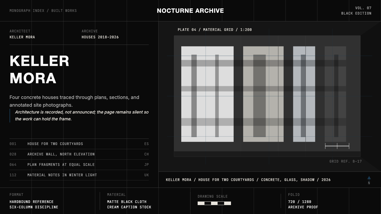 Architect Monograph (Black Edition)Architecture stays sovereign. Matte black, Helvetica caps, hairline grids, bl…建筑始终为主:哑光黑、Helvetica 大写、发丝网格与蓝图蓝。
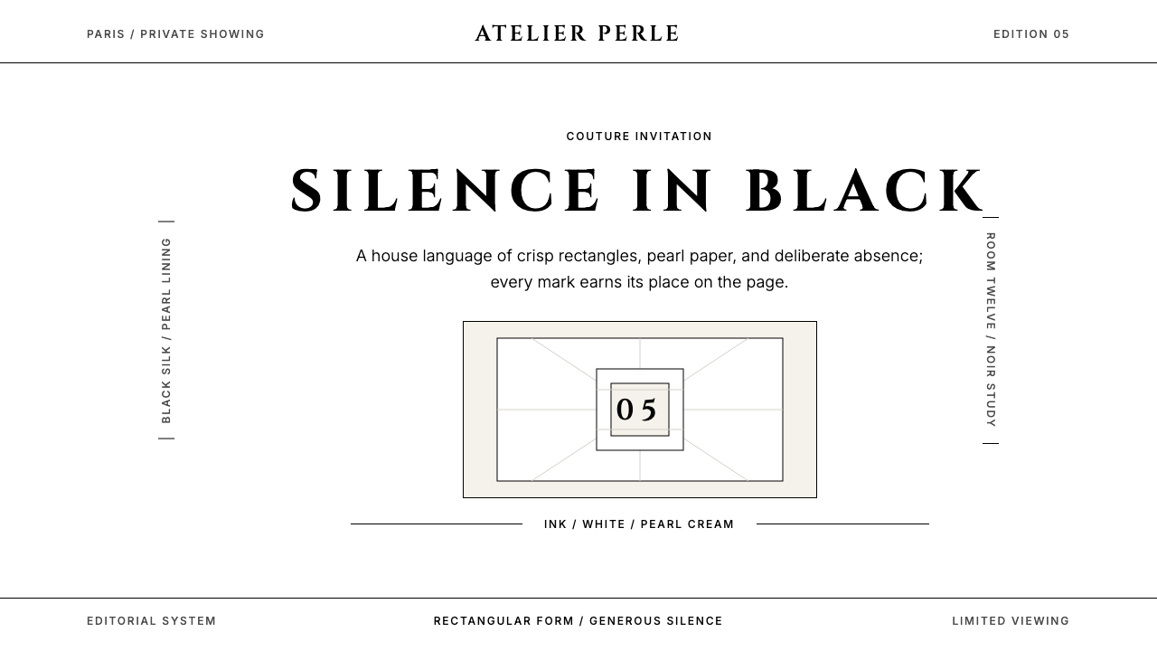 ChanelLuxury needs no color. Black on white, pearl-cream warmth, geometric capitals…百年宣言:真正的奢华无需色彩。纯黑配纯白,唯一的偏移是珍珠乳白——克制即气场。
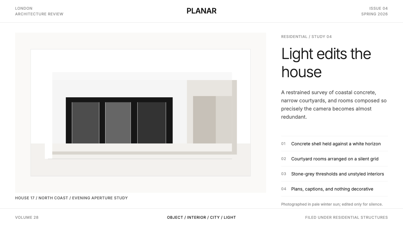 Wallpaper* ArchitecturePhotography does the speaking. Gallery-white grid, Inter captions, and hairli…让摄影发声。画廊白网格、Inter 小标题与细线退后。
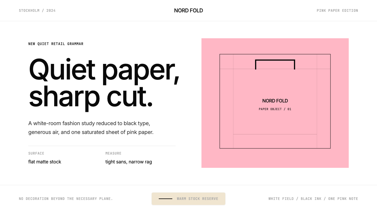 Acne Studios Pink-PaperQuiet luxury in one pink plane. Inter type floats on white with a bag-like re…粉色平面定义安静奢华:Inter 黑字漂浮于白场,像一只纸袋。
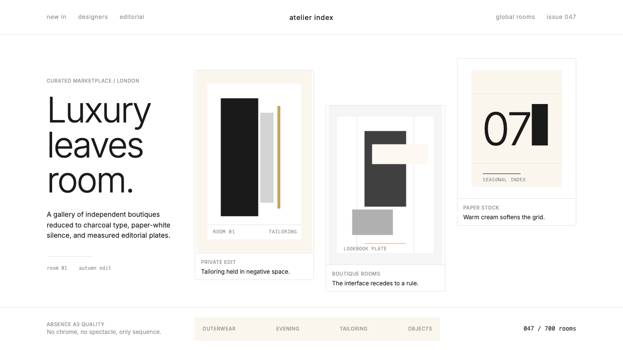 FarfetchLuxury as absence. Charcoal type, white canvas, and hairline editorial plates.奢华即留白。炭灰字、纯白画布与发丝线编辑图版。
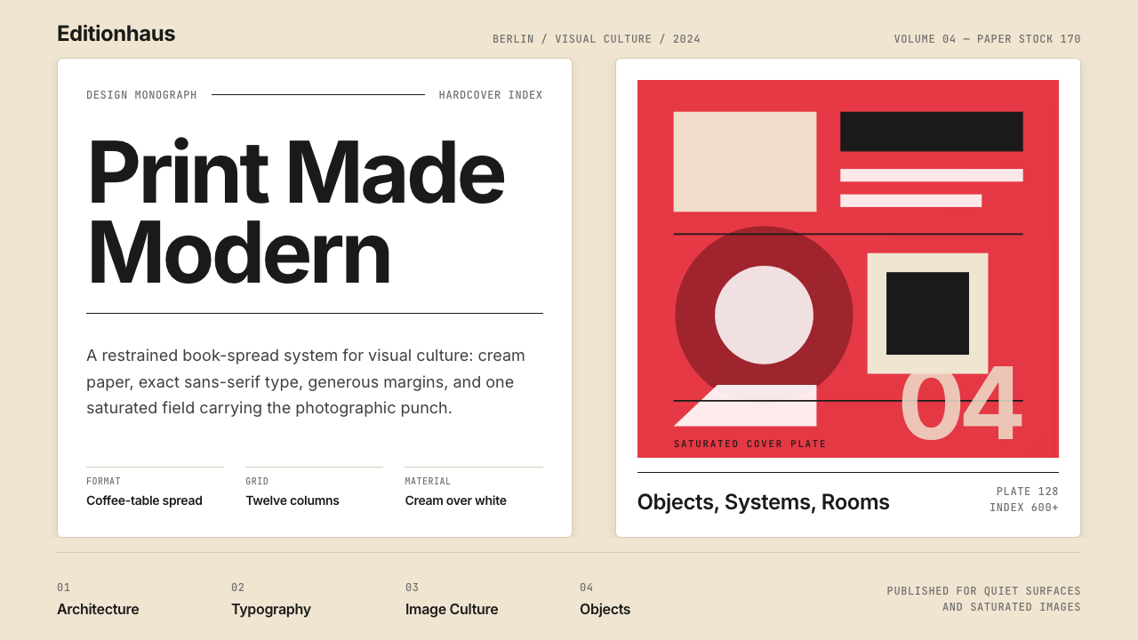 Gestalten Design BookCoffee-table calm. Cream paper, tight sans, one saturated block, and a strict…咖啡桌式冷静。奶油纸、紧凑无衬线、单一高饱和色块与严格网格。