What is Chanel?什么是 Chanel?
For over a century, Chanel has argued in pure black and white that restraint is the most powerful form of luxury.逾百年来,香奈儿以纯粹的黑与白坚持一个主张:克制,才是最有力的奢华形式。
Chanel in briefChanel 速览
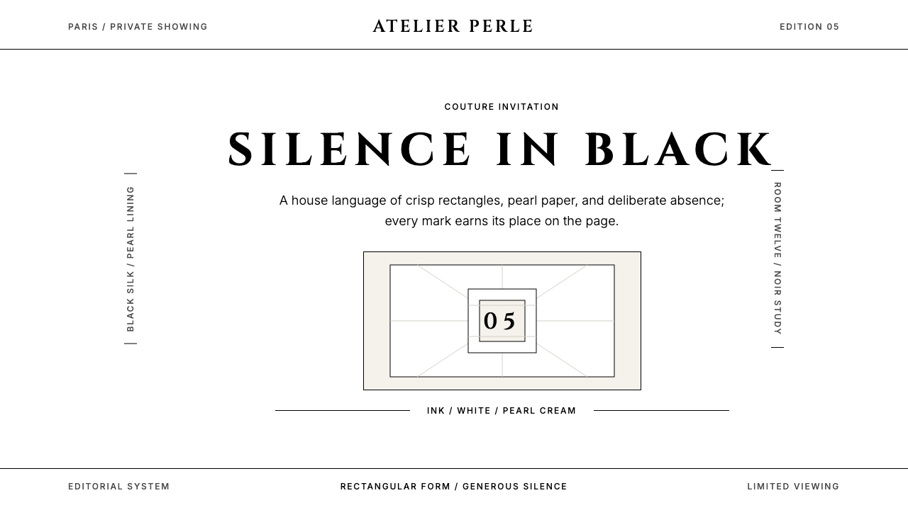
Chanel's visual language is one of the most recognizable and least imitated design systems in the world — not because it is complex, but because its discipline is genuinely difficult to maintain. The house operates in a near-monochromatic palette: pure black, pure white, and the warm, slightly off-white glow of pearl-cream. Every other color is a guest, and guests rarely arrive. Geometric sans-serif capitals carry an air of aristocratic distance, spaced generously so that each letter breathes. Rectangular forms rule the composition; rounded corners and soft edges are refused as a matter of principle.香奈儿的视觉语言是世界上辨识度最高、却最难被真正仿效的设计体系之一——并非因为它复杂,而是因为维持这种自律本身极为困难。品牌运作于近乎单色的色板之中:纯黑、纯白,以及珍珠乳白那温润而微微偏暖的光晕。其他任何颜色都是过客,而过客极少登门。几何无衬线大写字母带着一种贵族式的疏离感,字间距宽裕,让每一个字母都能呼吸。矩形轮廓主宰构图;圆角与柔化边缘被作为原则性问题拒之门外。
The system's power comes from what it withholds. Vast areas of white or cream are not empty — they are active. They give black-and-white fashion photography the room it needs to carry full emotional weight. They make a single interlocked double-C monogram feel like a statement rather than a logo. The restraint is not poverty of imagination; it is the cultivation of silence so that whatever does speak, speaks with absolute authority.这套体系的力量来自它的克扣。大面积的白色或乳白并非空洞——它们是主动的。它们给黑白时装摄影留出承载全部情感重量所需的空间,让一个相互交扣的双C标志感觉像宣言而非标识。这种节制不是想象力的匮乏,而是对沉默的培育——好让任何开口之物,以绝对的权威发声。
Unlike many luxury houses whose visual identity has drifted or been reinvented across decades, Chanel's aesthetic has remained structurally continuous since Gabrielle Chanel established it in the early twentieth century. The house treats its visual grammar as a heritage document: it can be refined, but not overwritten. This continuity is itself a form of confidence — the visual equivalent of never raising one's voice.与许多奢侈品牌在数十年间发生视觉漂移或经历重新定义不同,香奈儿的美学自加布里埃尔·香奈儿于二十世纪初建立以来,始终保持着结构上的连贯性。品牌将其视觉语法视为一份遗产文件:可以精炼,但不可被覆写。这种连贯性本身就是一种自信——如同从不提高嗓门的视觉表达。
Where does Chanel come from?Chanel 从何而来?
Gabrielle Bonheur Chanel, known universally as Coco, opened her first millinery shop in Paris in 1910 at 21 Rue Cambon, then relocated to the address that would become synonymous with the house: 31 Rue Cambon. Her earliest visual instincts ran directly counter to the Edwardian fashion environment she entered — an era of elaborate lace, heavy ornamentation, and corsetry that treated the female body as an armature for decoration. Chanel stripped away the excess. She borrowed from men's workwear and sportswear, introduced jersey fabric to haute couture, and established the foundational principle that elegance is refusal.加布里埃尔·博纳尔·香奈儿,举世皆知的「可可」,于1910年在巴黎康朋街21号开设了她的第一间帽品店,后迁至那个将与品牌名称合而为一的地址:康朋街31号。她最初的视觉直觉与她所进入的爱德华时代时尚环境直接抗衡——那是一个蕾丝繁复、装饰沉重、紧身胸衣将女性身体当作装饰支架的年代。香奈儿剥去了一切多余。她从男装工装与运动服中借鉴灵感,将针织面料引入高定时装,并确立了那个根本性原则:优雅即是拒绝。
The black-and-white palette was not accidental. In 1926, American Vogue published Chanel's little black dress — a simple, calf-length sheath in black crepe — and compared it to the Ford Model T: democratic, functional, and destined to be universal. Black had been associated with mourning; Chanel reclaimed it as the color of absolute modernity. White, specifically the creamy white of gardenia petals and freshwater pearls, served as its counterpoint — warm where black was absolute, yielding where black was final. The pairing became the house's visual signature and has never been abandoned.黑白色板并非偶然。1926年,美国《Vogue》刊登了香奈儿的小黑裙——一件简洁的黑色绉纱及腿肚长裙——并将其比作福特T型车:民主的、功能性的,注定要成为普世之物。黑色曾与哀悼相关联;香奈儿将其重新占领为绝对现代性的颜色。白色,尤其是栀子花瓣与淡水珍珠那种乳白,作为黑色的对位出现——黑色绝对之处,白色温润;黑色终结之处,白色舒展。这一配对成为品牌的视觉签名,从未被放弃。
The launch of Chanel No. 5 perfume in 1921 established another pillar of the visual identity: the bottle. Where competitors produced perfume in ornate, jewel-encrusted flacons, Chanel commissioned a design of almost architectural severity — a clear rectangular vessel with minimal stopper, its only decoration the name printed in unadorned capitals. The bottle made the perfume's invisible quality (scent) legible through the most visible quality of its container (form). This logic — that the container should argue for the contents through structural honesty rather than decorative elaboration — runs through every subsequent Chanel design decision.1921年,香奈儿5号香水的发布确立了视觉形象的另一支柱:瓶身。当竞品将香水装入繁复镶宝的华丽瓶中,香奈儿委托设计了一款近乎建筑般严峻的容器——透明的矩形玻璃瓶配以极简瓶塞,唯一的装饰是以朴素大写字母印就的品牌名。瓶身让香水那不可见的品质(气味)通过其容器最可见的品质(形态)得以传达。这一逻辑——容器应以结构的诚实而非装饰的繁复来为内容物背书——贯穿了此后香奈儿的每一个设计决策。
Karl Lagerfeld, who became creative director in 1983 and held the role until his death in 2019, did not invent the Chanel visual system but proved its extraordinary durability. He worked within the existing grammar while amplifying certain elements — the oversized logotype, the high-contrast campaign photography, the use of tweed texture as a visual motif in print collateral — in ways that made the system feel contemporary without departing from its foundations. Virginie Viard, who succeeded Lagerfeld, has continued in the same spirit of custodianship. The lesson of this continuity is not that the system is inflexible, but that it is so precisely calibrated that departures are immediately legible as errors.卡尔·拉格斐于1983年出任创意总监,并在2019年辞世前一直担任这一职位。他并非发明了香奈儿视觉体系,而是证明了它非凡的耐久性。他在现有语法框架内工作,同时放大了某些元素——超大号标志字体、高对比度广告摄影、将花呢质感作为印刷物料的视觉母题——以让这套体系在不偏离基础的情况下保持当代感。接替拉格斐的维珍妮·薇亚,延续了同样的守护精神。这种连贯性的启示并不在于体系缺乏弹性,而在于它被如此精确地校准,以至于任何偏离都会立刻显露为错误。
What defines the Chanel look?Chanel 的视觉特征是什么?
Palette色板
The Chanel palette is perhaps the most disciplined in luxury fashion: pure black and pure white are the two poles, with pearl-cream occupying the only permitted middle ground. Black carries authority and finality; white provides the silence in which black can resonate; pearl-cream introduces just enough warmth to prevent the system from feeling cold or clinical. No other color holds a structural role. When color does appear — a camellia in red, a chain in gold — it functions as an object within the composition, not as a system element.香奈儿色板或许是奢侈时尚中最自律的一套:纯黑与纯白构成两极,珍珠乳白占据唯一被允许的中间地带。黑色承载权威与终结感;白色提供让黑色得以共鸣的沉默;珍珠乳白引入恰到好处的温润,以防体系显得冷漠或临床化。没有其他颜色承担结构性角色。当颜色偶尔出现时——一朵红色山茶花、一条金色链条——它作为构图中的对象存在,而非作为体系元素。
Typography字体排印
Chanel's typographic sensibility is geometric and capital-dominant. Letterforms are wide, upright, and without decorative flourishes — the kind of typeface that reads as an engraved inscription rather than a printed word. Letter-spacing is wide by convention, creating the effect of letters presented individually rather than running together in a hurry. This spacing, combined with the all-caps setting, produces the air of a declaration rather than communication. Body text, when it appears in editorial contexts, is treated with the same economy: generous line height, restrained measure, nothing competing with the imagery.香奈儿的字体排印感性以几何形态和大写字母为主导。字形宽阔、竖直、无任何装饰花饰——这类字体读来如同铭刻的碑文,而非印刷的文字。字间距按惯例保持宽裕,产生字母各自独立呈现而非匆忙连流的效果。这种间距与全大写排版相结合,营造出宣言式的气质,而非单纯的信息传递。正文在编辑语境中出现时,以同样的经济原则处理:宽裕的行高,克制的行宽,没有任何元素与图像争夺注意力。
Geometric Restraint几何克制
Every structural element in the Chanel visual system tends toward the rectangle and the straight line. The double-C logo itself is an exception — two interlocking curves — but it functions as a monogram-object, not as a shaping influence on the broader layout system. Compositions favor horizontal and vertical axes. Diagonal elements are rare, and when they appear they carry deliberate tension rather than dynamism. The absence of rounded corners is consistent and principled: softness would imply approachability, and Chanel's visual posture is that of reserve, not invitation.香奈儿视觉体系中的每一个结构元素都倾向于矩形与直线。双C标志本身是个例外——两道相互交扣的曲线——但它作为一个专名对象存在,而非对更广泛版面体系产生形态影响。构图偏好水平与垂直轴。斜向元素罕见,一旦出现,传递的是刻意的张力而非活力。对圆角的回避是一贯且有原则的:柔化意味着亲和,而香奈儿的视觉姿态是矜持,而非邀请。
Whitespace as Voice留白即声音
No element of the Chanel aesthetic is more distinctive or more difficult to replicate than its use of whitespace. Margins are wide — sometimes occupying more area than the content they frame. A single garment on a white ground, a single line of type on a cream field: the space around the subject is understood as part of the composition, not as unused area. This editorial generosity is inseparable from the brand's authority. Crowding implies urgency or insecurity; Chanel's whitespace implies that the subject needs no context to justify itself.香奈儿美学中没有任何元素比其留白的运用更具辨识度,也更难被复制。页边距宽阔——有时占据的面积超过它所框定的内容本身。白色底面上的一件单品,乳白色域上的一行文字:主体周围的空间被理解为构图的一部分,而非未被使用的区域。这种编辑式的慷慨与品牌的权威感密不可分。拥挤意味着紧迫或不安;香奈儿的留白意味着主体无需任何语境来证明自身的价值。
Photography and the Monochromatic Image摄影与单色图像
Chanel's campaign photography has historically favored high-contrast black-and-white imagery, even when color photography became the industry standard. When color appears, it is typically limited to the garment or the product against a neutral ground — the image is constructed so that the subject is the only saturated element. This treatment elevates the product to the status of a specimen: isolated, studied, iconic. The photographic style reinforces the palette's logic: maximum contrast between subject and ground, with nothing in between competing for attention.香奈儿的广告摄影历来偏向高对比度的黑白影像,即便在彩色摄影成为行业标准之后亦然。当颜色出现时,通常仅限于服装或产品本身,以中性底面相衬——图像被构建为主体是唯一饱和的元素。这种处理将产品提升至标本的地位:隔离的、被审视的、标志性的。摄影风格强化了色板的逻辑:主体与背景之间最大化的对比,中间没有任何元素争夺注意力。
The Ornament of Objects对象的装饰性
Where the Bauhaus achieved zero ornament through geometric abstraction, Chanel achieves restraint through a more selective method: all decoration is concentrated into specific signature objects — the camellia flower, the interlocked CC, the quilted leather pattern, the chain strap — which then carry all the decorative weight of the system. Outside these objects, the visual environment is stripped clean. The result is a paradox: a system that feels simultaneously austere and richly associated, because the few ornamental elements it permits are so precisely chosen and so consistently deployed.包豪斯通过几何抽象实现零装饰,香奈儿则通过更具选择性的方式达到克制:所有装饰性被集中于特定的签名对象之中——山茶花、相互交扣的CC、菱格纹皮革图案、链条肩带——由这些对象承载整套体系的全部装饰重量。在这些对象之外,视觉环境被清除干净。结果是一个悖论:一套体系同时感觉朴素却又联想丰富,因为它所允许的少数装饰性元素被如此精确地选取,如此一贯地部署。
Scale and the Editorial Gesture尺度与编辑姿态
Chanel compositions are acutely sensitive to scale. A headline might occupy the full width of a spread while the body text sits in a narrow column, creating a deliberate ratio between what commands and what explains. Objects photographed at monumental scale against plain grounds take on a gravity that smaller, busier compositions cannot achieve. This is the visual grammar of the maison's editorial output: choose the single most important element, give it the most space, let everything else serve. Scale differentials are decisions, not defaults.香奈儿的构图对尺度极为敏感。标题可能占据对开页的全部宽度,而正文置于窄栏之中,在命令与解释之间形成刻意的比例关系。以纪念碑式比例在纯净背景前拍摄的对象,获得了更小、更繁忙的构图所无法企及的分量感。这是品牌编辑输出的视觉语法:选取唯一最重要的元素,给它最多的空间,让其他一切服务于它。尺度差异是决定,而非默认。
Who shaped Chanel?谁塑造了 Chanel?
Chanel founded her first shop in 1910 and over the following decades dismantled the prevailing conventions of women's dress — eliminating the corset, introducing jersey to couture, and establishing black as the color of modernity rather than mourning. Her instinct for visual restraint was inseparable from her social positioning: she moved in aristocratic circles and absorbed their preference for understatement over display. The visual system she established — monochromatic, geometric, spacious — was a direct expression of her belief that a woman who needed ornament to attract attention had already lost the argument.香奈儿于1910年开设第一间店铺,并在此后数十年间瓦解了当时女装的主流惯例——废除紧身胸衣,将针织面料引入高定,并确立黑色为现代性而非哀悼的颜色。她对视觉克制的直觉与她的社交定位密不可分:她活动于贵族圈子,并从中汲取了对低调胜于炫耀的偏好。她建立的视觉体系——单色、几何、空旷——是她信念的直接表达:一个需要借助装饰来吸引注意力的女人,已经输掉了这场论争。
Lagerfeld assumed creative direction of Chanel in 1983, at a moment when the house had been commercially and creatively dormant since Coco Chanel's death in 1971. He restored the brand to cultural primacy without departing from its foundational visual system, instead finding ways to amplify and contemporize the grammar — enlarging the logo, sharpening the contrast in campaigns, and demonstrating that the austere Chanel aesthetic could absorb the energy of each successive cultural decade without losing its core character. His tenure of over three decades is the most sustained argument for the system's durability.拉格斐于1983年接掌香奈儿创意总监一职,彼时品牌在可可·香奈儿1971年辞世后已在商业与创意上沉寂多年。他在不偏离品牌基础视觉体系的前提下恢复了其文化主导地位,而是寻找方式放大并当代化这套语法——放大标志、锐化广告的对比度,并证明香奈儿朴素的美学可以吸纳每个接续文化年代的能量而不失其核心性格。他逾三十年的任期,是对这套体系耐久性最持久的论证。
Viard worked alongside Lagerfeld for decades as his closest collaborator before succeeding him as creative director in 2019. Her approach represents the principle of custodianship made explicit: the visual and design language she has stewarded is immediately recognizable as Chanel while demonstrating a quieter, more intimate interpretation of the house codes. Her tenure has clarified something important about the system — that it is robust enough to carry different personalities without losing coherence, provided the underlying grammar is respected.薇亚在接替拉格斐出任创意总监之前,作为其最亲密的合作者共事数十年。她的方式将守护原则明确化:她所主理的视觉与设计语言一眼即可辨认为香奈儿,同时呈现出对品牌规范更安静、更内敛的诠释。她的任期阐明了关于这套体系的重要一点——只要底层语法得到尊重,它足够强健,可以承载不同的个性而不失去连贯性。
Monroe's 1952 declaration that she wore 'Chanel No. 5 to bed' — and nothing else — is among the most economically effective pieces of brand communication in the history of luxury. It required no advertisement, no visual asset, no designed artifact: a single sentence, reported and repeated, attached the fragrance permanently to the idea of intimate glamour. The anecdote illustrates something central to the Chanel visual system's power — that restraint, strategically deployed, generates more attention than elaboration.梦露1952年宣称她睡觉时只穿「香奈儿5号」——别无其他——是奢侈品史上经济效益最高的品牌传播之一。它不需要任何广告、视觉资产或设计物:一句话,经报道与传播,将这款香水永久地与私密魅力的概念绑定。这则轶事揭示了香奈儿视觉体系力量的核心所在——克制,被策略性地部署,比繁复更能引发关注。
Newton's photography for Chanel across several decades is among the most definitive visual expressions of the house's aesthetic — not despite its provocations, but partly because of them. His images occupied the black-and-white vocabulary, the extreme contrast ratios, and the compositional severity that the brand's visual system demanded, while introducing a psychological tension that made the restraint feel charged rather than cold. Newton demonstrated that the Chanel visual system was capable of containing strong content without needing to become more decorative to do so.牛顿数十年间为香奈儿拍摄的摄影作品,是品牌美学最具决定性的视觉表达之一——并不是尽管其挑衅性,部分上正是因为这种挑衅。他的影像占据了品牌视觉体系所要求的黑白词汇、极端对比度与构图严峻感,同时引入了一种心理张力,让克制感觉充满电荷而非冰冷。牛顿证明,香奈儿视觉体系能够容纳强烈的内容,而无需为此变得更具装饰性。
How do you use Chanel today?今天怎么用 Chanel?
The Chanel aesthetic is among the most demanding historical design languages to apply correctly, precisely because its power derives from discipline rather than from any single visual element. Anyone can use black and white. The challenge is applying them with the proportion, spacing, and editorial commitment that make the system work. Before applying this style, ask what the work is arguing: Chanel's visual language is an argument for absolute confidence, and that argument only holds if the execution is itself confident.香奈儿美学是最难被正确应用的历史性设计语言之一,恰恰因为其力量来自自律,而非任何单一的视觉元素。任何人都可以使用黑与白。挑战在于以让体系奏效所需的比例、间距与编辑承诺来运用它们。在应用这种风格之前,先问问这件作品在论证什么:香奈儿的视觉语言是一个关于绝对自信的论证,而这个论证只有在执行本身也充满自信时才能成立。
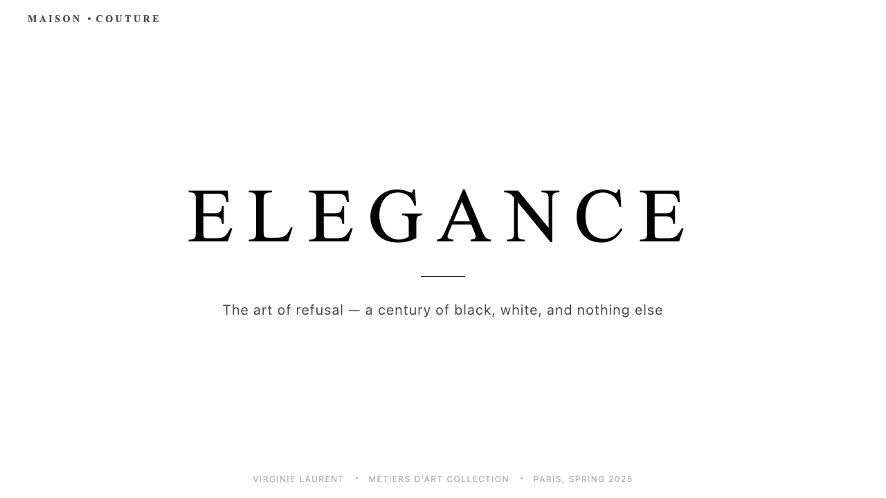
For presentation slides, the style works best when it is allowed to be genuinely spare. A cover slide should commit to a single image — high-contrast, close-cropped, ideally monochromatic — with a short title in wide-tracked capitals and nothing else. Content slides should establish a strict horizontal rhythm: a narrow rule across the top, type aligned to a consistent left margin, and a content area that never feels crowded. Data slides work well when charts are treated as compositional objects — stripped of grid lines and axis decoration, with bars or lines in pure black against a cream ground, and a single accent element to mark the key data point.对于演示文稿,当这种风格被允许真正地简省时效果最佳。封面页应当只呈现单一图像——高对比度、近景裁切、理想情况下单色——配以宽字间距大写字母的简短标题,别无其他。内容页应建立严格的水平节奏:顶部一条细横线,文字对齐一致的左边距,内容区域从不显得拥挤。数据页在图表被当作构图对象处理时效果最佳——去除网格线与坐标轴装饰,柱条或折线以纯黑呈现于乳白底面,以单一强调元素标记关键数据点。
For web interfaces, the style suits premium landing pages, editorial product pages, and any context where the brand's authority needs to be established before the user scrolls. The approach: near-white or cream background throughout, black for all text, generous padding around every element, and no color in the interface itself except for a single accent used sparingly for hover states or calls to action. Navigation should be typographic, with generous letter-spacing on wordmarks and labels. Avoid icon libraries entirely — if iconography is necessary, use custom geometric forms at monumental scale rather than small decorative icons.对于网页界面,这种风格适合高端落地页、编辑式产品页,以及任何需要在用户向下滚动之前先建立品牌权威感的场景。方法如下:全程接近白色或乳白的背景,所有文字用黑色,每个元素周围留有充裕的内边距,界面本身无色彩,仅以单一强调色稀疏地用于悬停状态或行动号召。导航应当是字体性的,文字标识与标签保持宽裕的字间距。完全回避图标库——若必须使用图形符号,以纪念碑式比例的定制几何形代替细小的装饰性图标。
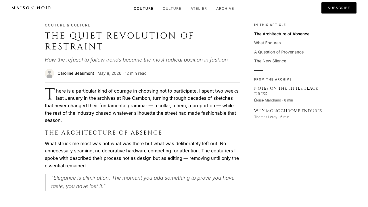
For editorial and marketing work, the style supports long-format layouts where quality of reading is more important than density of information. A Chanel-derived editorial page uses a wide outer margin reserved for a single pull quote or image caption, a body column that occupies roughly half the page width, and section breaks marked by a fine horizontal rule rather than ornamental dividers. Marketing pages work well with the style's poster sensibility: a full-width image block, a centered headline in capitals with extreme letter-spacing, and a body paragraph that is intentionally brief — saying less to imply more. Campaign imagery should ideally be shot specifically for the layout, or sourced from high-contrast black-and-white archives.对于编辑与营销内容,这种风格支持阅读质量比信息密度更重要的长版式排版。香奈儿衍生的编辑页面使用宽阔的外侧页边距,保留给单一引用语或图片说明;正文栏约占页面宽度的一半;段落分隔以细横线标记,而非装饰性分割符。营销页面适合这种风格的海报感:一个全宽图像区块,一个居中的极宽字间距大写标题,以及一段刻意简短的正文——少说,以暗示更多。广告图像理想情况下应当专门为版面拍摄,或从高对比度黑白档案中取用。
The most common mistake when applying this style is filling the whitespace. The instinct to add a second color, a texture, a decorative border, or additional type elements is almost always wrong. The whitespace is not silence waiting to be filled — it is an active part of the visual argument. A second common error is using the black-and-white palette as a shortcut to elegance without committing to the typographic standards: loose letter-spacing, inconsistent type hierarchy, or mixed typeface families immediately break the system's logic. The style requires that every detail be a decision, and that every decision be the same decision.应用这种风格时最常见的错误是填充留白。想要添加第二种颜色、一种纹理、一道装饰边框或额外文字元素的冲动,几乎总是错误的。留白不是等待被填充的沉默——它是视觉论证的主动组成部分。第二个常见错误是以黑白色板作为通往优雅的捷径,却不承担相应的排印标准:松散的字间距、不一致的字体层级,或混用多种字体家族,都会立刻破坏体系的逻辑。这种风格要求每一个细节都是一个决定,而且每一个决定都是同一个决定。
Chanel — FAQChanel · 常见问题
How is Chanel's visual style different from generic minimalism?香奈儿的视觉风格与普通的极简主义有何不同?
Generic minimalism is defined by reduction — removing elements until the design is as simple as possible. Chanel's aesthetic is defined by authority — a specific argument that the subject is important enough to need no justification. The difference is visible in the details: Chanel compositions use specific type treatments (wide-tracked, all-caps, geometric), specific palette relationships (warm cream, not cool grey), and specific spatial decisions (editorial-scale margins, not merely adequate ones). Minimalism can be tentative; Chanel's system never is. Applying generic minimalism produces designs that feel clean; applying the Chanel system correctly produces designs that feel inevitable.普通的极简主义以削减为定义——去除元素,直至设计尽可能简单。香奈儿的美学以权威感为定义——一个特定的论证,主张主体重要到无需任何辩白。差异体现在细节中:香奈儿的构图使用特定的字体处理(宽字间距、全大写、几何字形)、特定的色板关系(温润的乳白,而非冷灰)、以及特定的空间决定(编辑级别的页边距,而非仅仅够用的边距)。极简主义可能是试探性的;香奈儿体系从不如此。应用普通极简主义产生感觉干净的设计;正确应用香奈儿体系产生感觉不可避免的设计。
Can this style work with color photography or illustration?这种风格能与彩色摄影或插图搭配使用吗?
Yes, but with significant constraints. Color photography can work within the system if the image is composed so that its dominant tones are near-neutral — skin, stone, cream, grey — with the garment or product as the only saturated element. The image then reads almost as a monochromatic field with a single colored object, which is consistent with the system's logic. Fully saturated color photography — bright backgrounds, multiple competing hues — is incompatible with the system and will overwhelm the typographic and spatial discipline the style depends on. Illustration is more difficult: the Chanel visual language has almost no illustrative tradition, and introducing illustration typically introduces a visual warmth or idiosyncrasy that the system actively refuses.可以,但有重大约束。彩色摄影可以在这套体系内运作,前提是图像的主导色调接近中性——皮肤色、石材色、乳白色、灰色——服装或产品作为唯一的饱和元素。图像因此读来几乎像一片单色域中的单一彩色对象,与体系的逻辑一致。完全饱和的彩色摄影——明亮的背景、多种竞争色相——与这套体系不兼容,会压倒这种风格所依赖的排印与空间自律。插图则更为困难:香奈儿视觉语言几乎没有插图传统,引入插图通常会带来一种视觉温度或个人特质,而这正是体系主动拒绝的。
How does this style handle digital dark mode?这种风格如何处理数字深色模式?
The Chanel system is fundamentally light-ground: cream and white backgrounds are not stylistic preferences but structural commitments, because the warm-cool dynamic between pearl-cream and pure black is central to how the palette feels. A true dark inversion — black backgrounds with cream or white type — is possible and produces a different but coherent reading of the system. The risk is that on a dark ground, the pearl-cream accent disappears as a meaningful distinction from white, collapsing the palette to a starker black-and-white that reads more like newspaper print than couture. If dark mode is required, a warm dark ground — very deep charcoal with a slight warm undertone — preserves more of the original palette's character than a pure black.香奈儿体系从根本上是浅色底面的:乳白与白色背景不是风格偏好,而是结构性承诺,因为珍珠乳白与纯黑之间的冷暖动态是色板感觉的核心。真正的深色反转——黑色背景配乳白或白色文字——是可能的,产生对这套体系不同但连贯的读解。风险在于,在深色底面上,珍珠乳白与白色之间作为有意义区分的感觉会消失,将色板压缩为更强硬的黑白两极,读来更像报纸印刷而非高定时装。若深色模式为必须,一个温暖的深色底面——非常深的炭灰色,带有略微温暖的底色调——比纯黑更能保留原始色板的性格。
Does Chanel's visual style suit brands outside the luxury sector?香奈儿的视觉风格适合奢侈品行业以外的品牌吗?
The style transfers most successfully to contexts where authority, precision, and a degree of exclusivity are genuine brand values — not performed, but structurally true. Premium financial services, architectural practices, independent publishers, high-end hospitality, and certain categories of professional tools can all carry the aesthetic convincingly. It fails where warmth, accessibility, or democratic inclusivity are primary values: a community platform, a children's brand, a mass-market consumer product. The tell is whether the whitespace feels confident or cold to the target audience. If the user's instinct upon seeing the design is that it is 'not for them,' the style has successfully communicated exclusivity — which is the point for a luxury house, but may be a liability for brands with different ambitions.这种风格在权威感、精确度与某种程度的排他性是真实品牌价值观——而非表演出来——的场景中转移效果最佳。高端金融服务、建筑事务所、独立出版机构、高端酒店业,以及特定类别的专业工具,都能有说服力地承载这种美学。在温暖感、可及性或民主包容性是首要价值观的场景中则行不通:社区平台、儿童品牌、大众消费品。判断标准在于:留白对目标受众感觉是自信还是冷漠。如果用户看到设计的直觉反应是「这不是为我准备的」,那么这种风格已成功传达了排他性——这对奢侈品牌而言正是目的所在,但对有不同抱负的品牌而言可能是一种负担。
What is the single most important thing to get right when using this style?使用这种风格时,最重要的是把握哪一点?
Proportion. The Chanel system's authority depends on every element being given exactly the space it deserves — not more, not less. A headline that is slightly too small fails to command; a margin that is slightly too narrow reads as hesitant; a logo placed too centrally feels corporate rather than confident. The proportional relationships between type sizes, between content and margin, between the subject and the ground it occupies — these are where the style either holds together or falls apart. Unlike some historical design systems where a strong color palette or bold geometric forms can carry an otherwise weak composition, Chanel's system offers no such crutches. The proportions are the style.比例。香奈儿体系的权威感依赖于每个元素被赋予恰好它所配得的空间——不多也不少。略微太小的标题无法发号施令;略微太窄的页边距读来犹豫;过于居中放置的标志感觉公司化而非自信。字体尺寸之间、内容与页边距之间、主体与其所占底面之间的比例关系——这些是这种风格或保持凝聚或分崩离析的所在。与某些历史性设计体系不同,那些体系中强烈的色板或大胆的几何形态可以撑起一个否则孱弱的构图,香奈儿体系不提供此类拐杖。比例即风格。
Related design styles相关设计风格
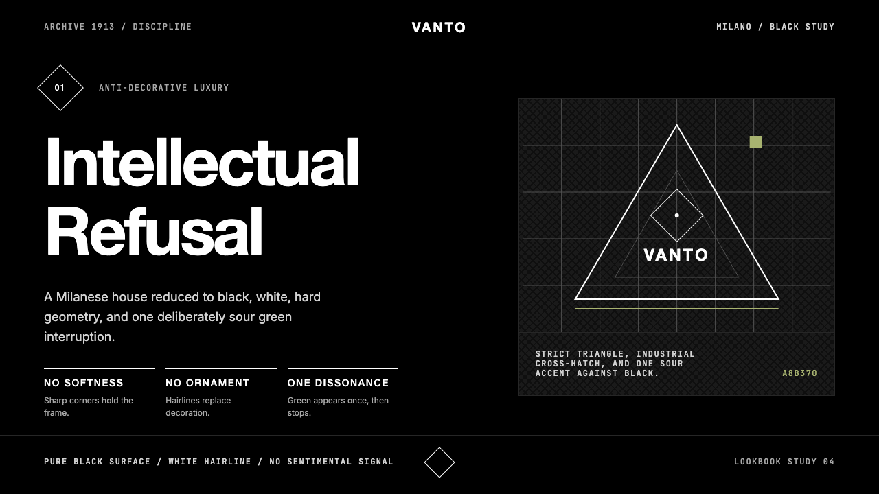 Prada Milan MinimalistLuxury refuses ornament. Pure black, austere sans, and one sour green hairlin…奢华拒绝装饰:纯黑、冷峻无衬线与一根涩绿细线。
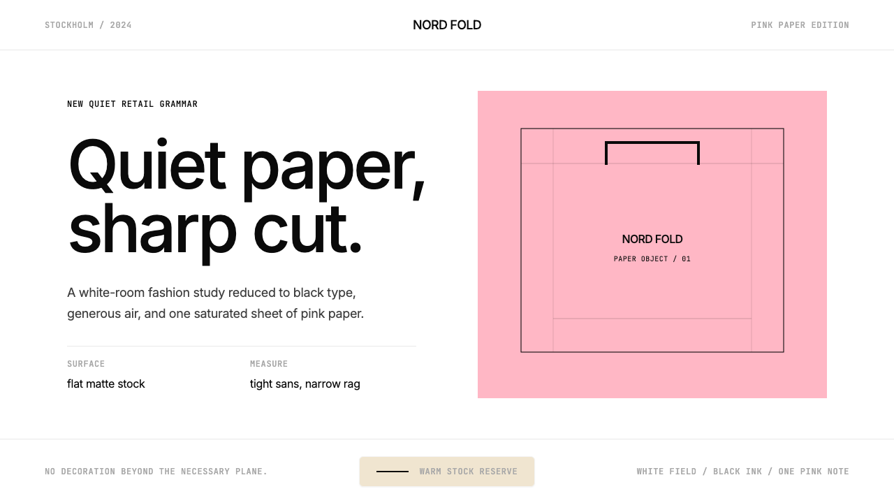 Acne Studios Pink-PaperQuiet luxury in one pink plane. Inter type floats on white with a bag-like re…粉色平面定义安静奢华:Inter 黑字漂浮于白场,像一只纸袋。
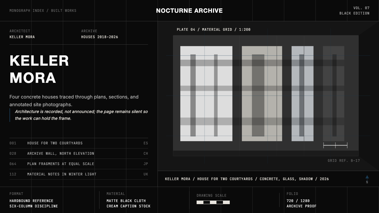 Architect Monograph (Black Edition)Architecture stays sovereign. Matte black, Helvetica caps, hairline grids, bl…建筑始终为主:哑光黑、Helvetica 大写、发丝网格与蓝图蓝。
 FarfetchLuxury as absence. Charcoal type, white canvas, and hairline editorial plates.奢华即留白。炭灰字、纯白画布与发丝线编辑图版。
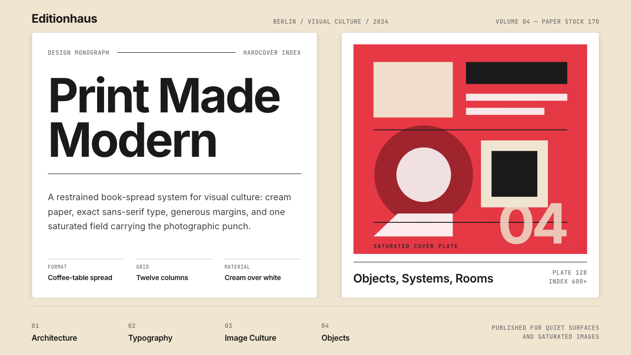 Gestalten Design BookCoffee-table calm. Cream paper, tight sans, one saturated block, and a strict…咖啡桌式冷静。奶油纸、紧凑无衬线、单一高饱和色块与严格网格。
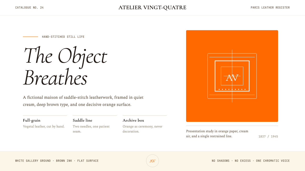 HermèsTwo centuries of restraint in orange. Brown serif on cream, gallery-quiet, ne…近两个世纪的巴黎皮革工艺:标志性的爱马仕橙、深棕衬线落于乳白纸底——产品如美术…