What is Gestalten Design Book?什么是 Gestalten Design Book?
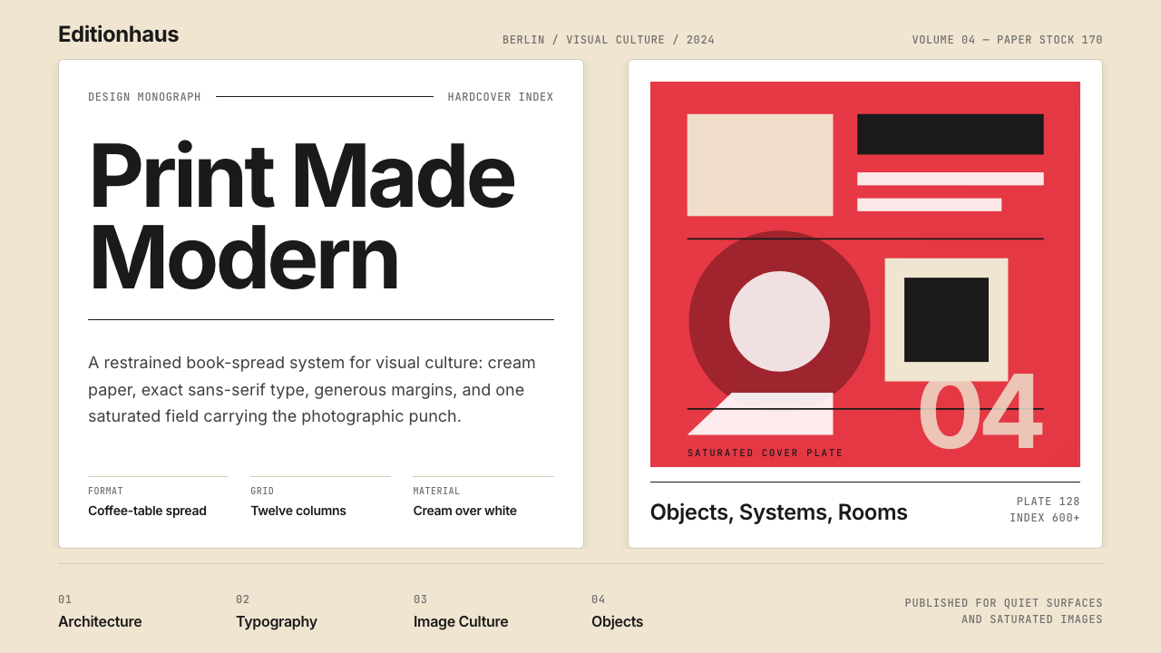
Gestalten turns the design book itself into a designed object — cream paper, restrained sans-serif type, saturated photography, and a strict editorial grid that treats every spread as a composition.Gestalten 把设计书本身变成一件设计作品——奶油纸、克制的无衬线字体、饱和摄影与严格的编辑网格,让每一个跨页都成为一幅构图。
Gestalten Design Book in briefGestalten Design Book 速览
Gestalten Design Book style describes the visual language developed by Gestalten, the Berlin-based contemporary design and visual-culture publisher founded by Robert Klanten in 1995. Over six hundred titles, Gestalten refined a house aesthetic that is immediately recognizable: cream or warm white paper grounds, clean Berlin-modernist sans-serif typography set with generous letterspacing, full-bleed saturated photography on covers, and a layout grid disciplined enough to make complex visual content feel inevitable rather than arranged.Gestalten 设计书风格,描述的是由柏林当代设计与视觉文化出版社 Gestalten 所发展出的视觉语言。该出版社由 Robert Klanten 于 1995 年创立,历经逾六百部作品,逐渐打磨出一套极具辨识度的品牌美学:奶油色或暖白色的纸张底面、带有宽松字距的柏林现代主义无衬线字体、封面上满铺的高饱和度摄影,以及一套严整的版面网格——让复杂的视觉内容看起来是自然生长于页面上,而非人为摆布的结果。
What distinguishes this aesthetic from generic editorial minimalism is its combination of luxury material signals with rigorous typographic restraint. The style is never austere — it is warmly confident. Cream paper reads differently from stark white; it carries an association with quality printing and considered production. Saturated photography in this system is not decoration but punctuation: a single full-bleed image anchors an entire section, and the color temperature of that image is allowed to dominate the spread without competition from ornamental page furniture.这套美学与普通编辑极简主义的区别,在于它将奢侈的材质信号与严格的字体克制融为一体。它从不显得简陋——它是温暖而自信的。奶油色纸张与冷峻的纯白截然不同;它传递着与优质印刷和精心制作相关联的质感。在这套体系中,高饱和度摄影不是装饰,而是标点:一张满铺的图像锚定一整个章节,那张图像的色彩温度被允许主导整个跨页,无需与任何装饰性页面元素竞争。
The overall effect is what might be called coffee-table modernism: a visual system designed to sit comfortably in a design-aware home or studio, signal cultural seriousness without academic stiffness, and make the act of browsing feel curated. Unlike strictly historical movements, the Gestalten aesthetic is living and contemporary — it continues to evolve through current publishing practice while remaining anchored to its founding sensibility of order, quality paper, and the primacy of the image.整体效果可以称之为"咖啡桌式现代主义":一套专为摆放在设计自觉的家居或工作室中而设计的视觉系统,在不带学术拘谨的前提下传递文化严肃性,并让随手翻阅的行为本身产生一种被精心策划过的感觉。与严格的历史运动不同,Gestalten 美学是活着的、当代的——它随出版实践持续演进,同时始终锚定于秩序、优质纸张与图像优先性这一创始感性。
See the Gestalten Design Book design system查看 Gestalten Design Book 完整设计系统
Where does Gestalten Design Book come from?Gestalten Design Book 从何而来?
Gestalten was founded in Berlin in 1995, a moment when reunified Germany was rebuilding its cultural identity and Berlin was becoming the center of a new European creative scene. Robert Klanten, who had studied at the Hochschule für Gestaltung in Hamburg, established the publisher with an editorial philosophy rooted in the Berlin modernist tradition: seriousness about craft, suspicion of decoration, and the conviction that design was a legitimate subject for high-quality bookmaking. The name Gestalten — the German word for forms, shapes, or the act of shaping — signals from the outset that the publisher's subject is design itself, treated as a first-order cultural concern.Gestalten 于 1995 年在柏林创立,彼时两德统一后的德国正在重建文化身份,柏林也正成为新欧洲创意场景的中心。曾就读于汉堡造型艺术学院(Hochschule für Gestaltung)的 Robert Klanten,以根植于柏林现代主义传统的编辑哲学创立了这家出版社:对工艺的严肃态度、对装饰的审慎质疑,以及设计是高质量书籍制作的合法主题这一信念。"Gestalten"这个名字——德语中意为形态、形式或塑造行为——从一开始便宣告:这家出版社的主题是设计本身,被视作一项头等重要的文化关切。
The visual identity of Gestalten's books did not arrive fully formed but was refined through early series that established the template. The Los Logos series, which documented contemporary logo and brand mark design, became a landmark title in design publishing and established the formula: rigorous curatorial selection, restrained typography that never competed with the content, generous white and cream space, and photographic or illustrative material reproduced at the quality the subject deserved. By the mid-2000s, Gestalten had published titles covering typography, illustration, urban culture, architecture, and food — each volume adapting the house style to its subject without abandoning the underlying system.Gestalten 书籍的视觉身份并非一蹴而就,而是通过早期系列的出版逐渐确立了模板。《Los Logos》系列——记录当代标志与品牌标志设计——成为设计出版领域的里程碑作品,也确立了这一范式:严格的策展选择、从不与内容竞争的克制字体、慷慨的白色与奶油色留白,以及以内容本身应得的品质印刷的摄影或插画素材。到 2000 年代中期,Gestalten 已出版涵盖字体、插画、城市文化、建筑与食物的书目——每册作品都在不放弃底层系统的前提下,将品牌风格调适于其特定主题。
The typographic sensibility draws explicitly on the Berlin modernist tradition that stretches from the Bauhaus through post-war German graphic design to the international corporate style of the 1970s and 1980s. Berlin has historically been a city where sans-serif type is taken seriously as a vehicle for cultural authority — from institutional signage to transit system wayfinding — and Gestalten absorbed this sensibility into its editorial voice. The choice of clean, geometrically structured sans-serif letterforms, set with disciplined spacing and clear hierarchical contrast, positions the books as objects that belong to a tradition of considered European modernist publishing.这套字体感性明确地延续了柏林现代主义传统,这一传统从包豪斯延伸经战后德国平面设计,直至 1970 至 80 年代的国际企业风格。在历史上,柏林是一座将无衬线字体视为文化权威载体的城市——从机构标识到公共交通导向系统——Gestalten 将这种感性内化为自己的编辑声音。选择清晰、几何结构的无衬线字形,以严谨的字距和清晰的层级对比排版,将书籍定位为属于深思熟虑的欧洲现代主义出版传统的对象。
By the 2010s and into the current era, Gestalten had expanded into lifestyle, travel, and illustrated cultural documentation, and the visual language evolved accordingly. Cover photography became more saturated and graphic — often isolating a single object or environment against a strongly colored or textured background — while interior layouts maintained the grid discipline and typographic restraint of the earlier period. The current aesthetic, crystallized roughly between 2022 and 2024, represents the mature form of thirty years of editorial refinement: a system that can absorb any visual subject and return it organized, legible, and presented with the quiet confidence of a publisher that understands that the container shapes the content.进入 2010 年代乃至当前时期,Gestalten 扩展至生活方式、旅行与插画式文化记录领域,视觉语言也随之演进。封面摄影变得更加饱和与图形化——通常将单一物体或环境置于强烈色彩或质感背景前加以突出——而内页版面则保持了早期的网格纪律与字体克制。大约在 2022 至 2024 年间定型的当前美学,代表了三十年编辑提炼的成熟形态:一套能够吸收任何视觉主题并将其有序、清晰地呈现的系统,带着一个深知容器塑造内容的出版社所特有的沉静自信。
What defines the Gestalten Design Book look?Gestalten Design Book 的视觉特征是什么?
Cream and White Paper Grounds奶油与白色纸张底面
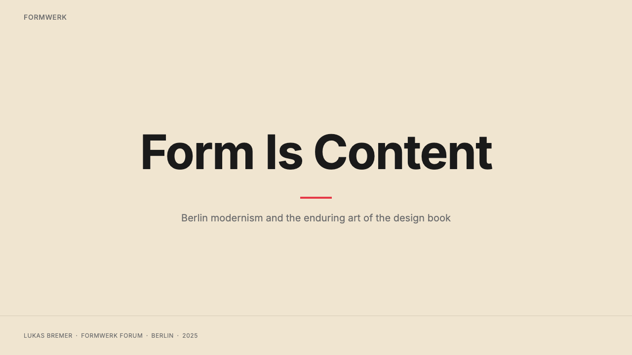
The foundation of the Gestalten palette is warm — cream rather than cool white. This choice is both aesthetic and material: cream paper reads as a deliberate production decision, associated with quality offset printing and books designed to last. Against this ground, black type achieves high contrast without the clinical sharpness of stark white, and photography is allowed to breathe without its edges becoming hard and institutional. The warmth of the ground calibrates the entire tonal register of a spread upward, making even austere layouts feel inviting rather than forbidding.Gestalten 色板的基础是温暖的——是奶油色,而非冷调的白色。这一选择兼具美学与材质双重考量:奶油色纸张被视作一种刻意的制作决定,与高质量胶版印刷和经久耐用的书籍相关联。在这一底面上,黑色字体获得高对比度,却没有纯白底面的冰冷锐利感;摄影图像得以呼吸,边缘不会变得生硬而机构化。底面的温暖感将整个跨页的色调基准上调,使即便是简朴的版面也显得亲切而非拒人于千里之外。
Restrained Sans-Serif Typography克制的无衬线字体排印
Gestalten's typographic voice is rooted in the clean, geometrically structured sans-serif tradition of Berlin modernism. Type is used with deliberate economy: a clear hierarchy of three or four scales — headline, subhead, body, caption — defined by size and weight contrast rather than by decorative flourish. Letterspacing is generous at display sizes, giving the text a composed, unhurried quality. Body text runs in a comfortable measure that never feels compressed. The type system recedes enough to make the images the primary experience, but asserts itself clearly enough to be authoritative when the reader does engage.Gestalten 的字体声音根植于柏林现代主义的清晰几何无衬线传统。字体的使用刻意节制:以尺寸与字重对比而非装饰花饰定义清晰的三到四级层级——标题、副标题、正文、图注。展示性文字的字距宽松,赋予文本从容而不慌不忙的气质。正文行宽舒适,从不显得局促。字体系统足够退隐,让图像成为主要体验;但当读者真正阅读时,又足够清晰而具权威感。
Saturated Full-Bleed Photography饱和满铺摄影
The most immediately striking quality of Gestalten covers — and of key interior spreads — is the use of photography at high color saturation, printed full-bleed to the edge of the page. This is not Instagram-style oversaturation but a controlled richness: colors are deeply rendered and true to the subject's inherent palette, whether that is the warm amber of a craftsman's workshop or the cold electric blue of a city at night. The full-bleed format treats the photograph as an architectural element, a wall of color and form rather than an illustration set into a field of text.Gestalten 封面乃至关键内页跨页最直接打动人的品质,是以高色彩饱和度将摄影图像满铺至页面边缘。这不是 Instagram 式的过饱和,而是一种受控的丰富感:色彩被深度呈现,忠实于主题本身固有的色调——无论是工匠工作室的暖琥珀色,还是入夜城市的冷蓝电光。满铺格式将照片视为建筑性元素——一堵色彩与形态的墙,而非嵌入文字域中的插图。
Disciplined Editorial Grid严整的编辑网格
Every Gestalten interior is governed by a grid that is felt rather than seen — a consistent set of margins, column widths, and vertical rhythm units that make the variety of content across hundreds of pages feel coherent. Images do not float arbitrarily; they occupy grid-aligned positions that create a sense of structural inevitability. Text columns align precisely with image edges. Generous outer margins are maintained even when images are large, giving the page a bordered, considered quality. The grid discipline is what separates a Gestalten spread from a casually art-directed magazine page.每一本 Gestalten 内页都被一套被感知而非被看见的网格所支配——一致的页边距、栏宽与垂直节奏单位,使跨越数百页的多样内容呈现出整体一致的感觉。图像不会任意浮动;它们占据对齐网格的位置,制造一种结构上的必然感。文字栏与图像边缘精确对齐。即便图像尺寸较大,也保持慷慨的外侧页边距,赋予页面一种有边框、有考量的品质。网格纪律正是 Gestalten 跨页与随意美术编辑的杂志页面之间的分野。
Generous White Space慷慨的留白
Negative space in the Gestalten system is not empty space waiting to be filled — it is an active compositional element that gives every image and text block room to register before the eye moves on. Spreads where a single photograph occupies two-thirds of the visible area and text occupies a disciplined column in the remaining third are common. This proportion makes the reading experience feel deliberate: each element is given its due. White space also performs a luxury signal — it communicates that no page has been crammed, that production cost was not a constraint, that the publisher's editorial confidence was sufficient to leave things out.在 Gestalten 的系统中,负空间不是等待被填充的空白——它是一个主动的构图元素,让每张图像与每块文字在视线移动之前都有空间被充分感知。单张照片占据可见区域三分之二、文字占据其余三分之一的严整栏位,这样的跨页构图十分常见。这种比例使阅读体验显得刻意而为:每个元素都得到了应有的重视。留白同时也传递奢侈感——它表明没有任何页面是被塞满的,制作成本不是制约因素,出版社的编辑自信足以让某些东西缺席。
Curated Cover Identity精选的封面身份
Gestalten covers function as objects before they function as titles. A typical cover commits to a single dominant image — often a photograph cropped to emphasize graphic rather than narrative content — paired with a logotype and title that are typeset with precision and placed with spatial intention. The cover does not summarize the interior; it establishes a mood and communicates the publisher's editorial confidence. The result is a cover that works as a small poster: graphic, immediately readable as to genre and register, and satisfying as a composition independent of its informational content.Gestalten 的封面首先是作为物件而存在,其次才是作为书名。典型的封面专注于一张主导图像——通常是一张裁切以强调图形感而非叙事性内容的照片——配以精准排版、位置经过空间深思的字标与书名。封面不是对内页的总结;它建立一种氛围,并传递出版社的编辑自信。结果是一个像小幅海报一样运作的封面:图形化,在类型与格调上立刻可读,作为构图本身——独立于其信息内容——令人满足。
Absence of Decorative Ornament装饰元素的缺席
Gestalten pages contain no decorative borders, no ornamental rules, no illustrative flourishes between sections, no drop shadows on images, no gradient overlays. Dividers between sections are either invisible — managed by spatial rhythm alone — or marked by a simple typographic change or a horizontal line of minimal weight. This restraint is not poverty of imagination but editorial discipline: every centimeter of the page is in service of either the image or the text, and anything that serves neither has been removed. The discipline creates a visual environment where content carries its full weight without competing with the container.Gestalten 的页面不含装饰边框、无装饰性分隔线、无章节间的插图花饰、无图像上的投影、无渐变叠加。章节之间的分隔要么是不可见的——仅靠空间节奏来管理——要么以简单的字体变化或一条极细的水平线来标记。这种克制不是想象力的贫乏,而是编辑纪律:页面的每一厘米都服务于图像或文字,两者皆不服务的元素已被移除。这种纪律创造了一个内容得以充分承载自身重量的视觉环境,无需与容器竞争。
See the Gestalten Design Book design system查看 Gestalten Design Book 完整设计系统
Who shaped Gestalten Design Book?谁塑造了 Gestalten Design Book?
Klanten founded Gestalten in Berlin in 1995 after studying at the Hochschule für Gestaltung Hamburg and is the primary architect of its editorial and visual identity. His approach positioned Gestalten as a publisher operating at the intersection of fine-art bookmaking and commercial design culture — high enough in production quality to sit alongside art monographs, broad enough in subject matter to reach working designers and culturally curious non-specialists. Under his direction, the publisher grew from a small Berlin operation into an internationally distributed house with a catalog spanning typography, illustration, architecture, urban culture, lifestyle, and travel. The visual language associated with Gestalten books — the cream paper, the restrained type, the full-bleed saturated covers — represents thirty years of consistent editorial vision executed under his oversight.Klanten 在汉堡造型艺术学院求学后,于 1995 年在柏林创立了 Gestalten,是其编辑与视觉身份的主要设计者。他的方式将 Gestalten 定位为一家在精装书艺术制作与商业设计文化交汇处运营的出版社——制作品质高到足以与艺术专论并肩,主题范围又广到能够触达一线设计师与具有文化好奇心的非专业读者。在他的主导下,这家出版社从柏林的小型运营机构发展为在国际发行的出版社,书目涵盖字体、插画、建筑、城市文化、生活方式与旅行。与 Gestalten 书籍相关联的视觉语言——奶油色纸张、克制字体、满铺饱和封面——代表了在他监督下执行的三十年一贯编辑愿景。
The visual consistency of Gestalten's output across hundreds of titles and dozens of categories is attributable not to a single designer but to a collaborative editorial and art-direction team that has maintained the house style across decades of expansion. This team manages the curatorial logic of what enters the frame — which images, which designers, which projects — and the spatial logic of how those elements are organized on the page. The team's work represents a sustained institutional practice of design editing: the application of typographic and compositional principles consistently enough to create a recognizable visual voice, flexibly enough to accommodate the full range of human visual culture as subject matter.Gestalten 跨越数百部作品与数十个品类的视觉一致性,不归功于单一设计师,而是归功于一个协作性编辑与艺术指导团队——正是他们在数十年扩张中维护了品牌风格。这个团队既管理着策展逻辑——哪些图像、哪些设计师、哪些项目进入视野——也管理着这些元素如何在页面上被组织的空间逻辑。团队的工作代表了设计编辑的持续制度化实践:以足够一贯的方式应用字体与构图原则以创造可识别的视觉声音,又以足够灵活的方式容纳人类视觉文化的全部范围作为主题。
Gestalten's visual language is inseparable from the graphic culture of Berlin, which developed a distinct strain of modernist typography and layout through the twentieth century. From the influence of the Bauhaus — whose Berlin period under Mies van der Rohe in the early 1930s coincided with the city's peak cultural ambition before the Nazi closure — through post-war institutional design, West Berlin's counter-cultural publishing, and reunified Germany's reassertion of design as cultural identity, Berlin maintained a typographic seriousness that distinguishes it from the more decorative traditions of Munich, Vienna, or Paris. Gestalten absorbed and extended this tradition into the digital era, making it available to contemporary audiences through high-quality physical publishing at a moment when physical books were becoming increasingly premium objects.Gestalten 的视觉语言与柏林的图形文化密不可分——这座城市在整个二十世纪发展出一种独特的现代主义字体与版面传统。从包豪斯的影响——其在密斯·凡德罗领导下的柏林时期,与纳粹关闭前这座城市文化雄心的顶峰时刻相重合——经由战后机构设计、西柏林的反文化出版,到两德统一后德国将设计重新确立为文化身份的努力,柏林始终保持着一种字体上的严肃性,这将其与慕尼黑、维也纳或巴黎更具装饰性的传统区别开来。Gestalten 将这一传统吸收并延伸入数字时代,在实体书日益成为溢价物品的时刻,通过高质量的实体出版将其呈现给当代读者。
The Los Logos series — Gestalten's ongoing documentation of contemporary logo and brand mark design — represents the title that established the publisher's international reputation and crystallized its visual approach. Beginning in the early 2000s, each volume in the series collected hundreds of examples of contemporary identity design and presented them according to the Gestalten formula: systematic curatorial organization, precise typographic labeling, and a production quality that treated graphic design artifacts as objects worthy of museum-grade reproduction. The series demonstrated that design publishing could be simultaneously reference material for practitioners and coffee-table objects for design-curious audiences, a positioning that shaped the entire subsequent Gestalten catalog.《Los Logos》系列——Gestalten 对当代标志与品牌标志设计的持续记录——是使这家出版社建立国际声誉并具体化其视觉方式的作品。从 2000 年代初开始,该系列每册收录数百件当代视觉识别设计案例,并按照 Gestalten 范式呈现:系统化的策展组织、精准的字体标注,以及将平面设计作品视为值得博物馆级别复制的对象的制作品质。该系列证明了设计出版可以同时成为从业者的参考资料与设计爱好者的咖啡桌读物——这一定位塑造了 Gestalten 此后全部书目的走向。
How do you use Gestalten Design Book today?今天怎么用 Gestalten Design Book?
The Gestalten aesthetic is highly transferable to designed outputs beyond the physical book because its core principles — cream-warm grounds, restrained sans-serif type hierarchy, saturated image punctuation, and generous negative space — are compositional rather than medium-specific. Applying it correctly requires understanding that the style's authority comes from restraint and proportion, not from any individual element. Adding a saturated photograph to a layout does not make it Gestalten; the photograph must be allowed to dominate a compositional zone while everything else recedes. The discipline of knowing what to leave out is as important as knowing what to include.Gestalten 美学高度可移植至实体书以外的设计输出,因为其核心原则——奶油暖调底面、克制的无衬线字体层级、饱和图像的标点式功能与慷慨的负空间——是构图性的,而非媒介特定的。正确应用它,需要理解这种风格的权威感来自克制与比例,而非任何单一元素。将一张饱和照片加入版面,并不能使其成为 Gestalten 风格;那张照片必须被允许主导一个构图区域,而其他所有元素退居其后。知道该省略什么,与知道该包含什么,同等重要。
For presentation slides, the Gestalten approach works particularly well on covers and section-opening pages. A cover slide benefits from a full-bleed photograph or a large image block occupying the majority of the frame, with the title set in clean, generously spaced type against a cream or near-white ground — or reversed out of the image itself if the image provides sufficient contrast. Content slides should be treated as disciplined grids: no more than two or three type sizes in play at once, all aligned to a consistent column structure, with body text set at a comfortable size and line length. Data slides take on an almost editorial quality — charts and diagrams become graphic objects, styled according to the Gestalten principle that the visual encoding of information should be legible and beautiful in equal measure, with no decorative embellishment beyond what the data itself requires.对于演示文稿,Gestalten 方式在封面与章节开页幻灯片上尤为有效。封面幻灯片适合使用一张满铺照片或占据画面大部分区域的大图块,标题以清晰、字距宽松的字体排列于奶油色或接近白色的底面上——或若图像本身提供足够对比度,可直接从图像中反白显示。内容幻灯片应被当作严整网格处理:同时出现的字号不超过两到三种,全部对齐于一致的栏位结构,正文以舒适的字号与行宽设置。数据幻灯片呈现出近乎编辑性的品质——图表与示意图成为图形对象,按照 Gestalten 的原则设计:信息的视觉编码应在可读性与美感上同等出色,除数据本身所要求的之外,不添加任何装饰性修饰。
For web interfaces, the style is especially effective on portfolio pages, editorial product listings, and luxury or premium brand contexts where the user is expected to slow down and engage rather than scan and convert. The approach: establish a warm near-white or cream background, use a single clean sans-serif with three or four clearly differentiated scales, and give images significant spatial authority — large, unhurried, with generous margins on all sides. Navigation should be typographic and minimal, relying on scale and placement rather than iconographic decoration. Pricing and feature-comparison pages in this register work by treating each tier as an editorial card: disciplined internal layout, restrained use of color differentiation, no visual noise between tiers.对于网页界面,这种风格在作品集页面、编辑性产品陈列以及用户被期望放慢节奏、深度参与而非快速扫描与转化的奢侈或溢价品牌场景中尤为有效。方法如下:建立暖调近白或奶油色背景,使用单一清晰的无衬线字体,配以三到四个清晰区分的尺度层级,并赋予图像显著的空间权威——大、从容,四周配以慷慨的页边距。导航应当是字体化的、极简的,依赖尺度与位置而非图标装饰。这种格调下的定价与功能对比页面,以将每个等级视为编辑卡片的方式运作:严整的内部版面、克制的色彩区分,等级之间无视觉噪音。
For editorial and marketing work, the Gestalten sensibility supports strong information hierarchy without resorting to decorative scaffolding. A long-form article layout in this style uses a carefully measured body text column, a wider outer margin for pull quotes and annotations, and section breaks indicated by spatial breathing room rather than ornamental dividers. Marketing one-pagers and brochures work well with the style's poster-like compositional logic: a dominant image establishes the page's visual center of gravity, and all type and supporting elements are organized in deliberate relationship to that center. Email newsletters and digital editorial can adapt the aesthetic by maintaining the white-space discipline and type hierarchy even when image scale is constrained by the medium.对于编辑与营销内容,Gestalten 感性支持强劲的信息层级,而无需借助装饰性框架。这种风格下的长篇文章版面,使用一个经过仔细丈量的正文栏,配以更宽的外侧页边距用于引用语与注释,以空间留白而非装饰性分隔符标记章节分隔。营销单页与宣传册适合这种风格的海报式构图逻辑:一张主导图像确立页面的视觉重心,所有字体与辅助元素围绕这一重心有意识地组织。电子邮件通讯与数字编辑内容,即便在图像尺寸受媒介限制的情况下,也可以通过维持留白纪律与字体层级来移植这套美学。
A common mistake when applying the Gestalten aesthetic is mistaking its warmth for permissiveness. The style is warm but not casual — every element of a Gestalten page is precisely placed, and the sense of ease comes from that precision, not from looseness. Introducing multiple type families, misaligning text and image edges, or filling negative space with additional content elements breaks the system immediately. Similarly, using desaturated or low-contrast photography undermines the punctuation logic that the style depends on: images in this system need to carry visual weight commensurate with the space they occupy. When the style is reduced to its surface markers — cream background, a sans-serif — without the underlying compositional discipline, the result looks like an approximation rather than the thing itself.应用 Gestalten 美学时最常见的错误,是将其温暖误解为随意。这种风格是温暖的,但不是随便的——Gestalten 页面上的每个元素都被精确放置,那种轻松感来自这种精准,而非来自松散。引入多种字体家族、文字与图像边缘不对齐,或用更多内容元素填充负空间,都会立即破坏这套系统。同样,使用去饱和或低对比度的摄影,会削弱这种风格所依赖的标点式逻辑:在这套系统中,图像需要承载与其所占空间相称的视觉重量。当这种风格被简化为其表面标志——奶油色背景加一种无衬线字体——而缺乏底层的构图纪律时,结果看起来像是近似物,而非原物本身。
See the Gestalten Design Book design system查看 Gestalten Design Book 完整设计系统
Gestalten Design Book — FAQGestalten Design Book · 常见问题
How is Gestalten style different from generic editorial minimalism?Gestalten 风格与普通编辑极简主义有何不同?
Generic editorial minimalism typically means reduction — removing elements until only functional essentials remain, often resulting in a cool, neutral, slightly sterile aesthetic. Gestalten style is minimalist in its restraint but not in its temperature. The cream grounds, the saturated photography, and the spatial generosity all introduce warmth and material richness that pure minimalism avoids. The key difference is that Gestalten uses negative space to amplify what is present, whereas generic minimalism often uses it to imply that nothing more needed to be said. The result is a style that feels confident and curated rather than stripped and cautious.普通的编辑极简主义通常意味着削减——去除元素直至只剩下功能性的必需品,结果往往是一种冷调、中性、略显无菌的美学。Gestalten 风格在克制上是极简主义的,但在温度上不是。奶油色底面、饱和摄影与空间慷慨,都引入了纯粹极简主义刻意回避的温暖感与材质丰富性。关键区别在于:Gestalten 用负空间来放大当下存在的事物,而普通极简主义往往用负空间暗示没有更多需要说的了。结果是一种让人感觉自信而精心策划的风格,而非被剥除殆尽且谨慎保守的风格。
Can the Gestalten aesthetic work for digital-first products without high-quality photography?在没有高质量摄影的情况下,Gestalten 美学能用于数字优先产品吗?
It can, but it requires rethinking the image role rather than simply omitting photography. In the Gestalten system, photography functions as a structural element — a field of color and form that anchors the composition. Without it, that structural role must be performed by another element: a large typographic display, a strongly colored geometric block, or a high-quality illustration treated with the same spatial authority a photograph would receive. The cream ground and typographic discipline can carry the system even in image-light contexts, but the composition must still contain one element of sufficient visual weight to create the center of gravity the style depends on. A page of only body text and captions, however well typeset, does not read as Gestalten.可以,但需要重新思考图像的角色,而非简单地省略摄影。在 Gestalten 体系中,摄影作为结构性元素发挥作用——一块锚定构图的色彩与形态场域。没有摄影时,这一结构性角色必须由另一元素承担:一段大尺度的字体展示,一块强烈色彩的几何色块,或者一幅被赋予与照片同等空间权威的高质量插画。即便在图像稀少的场景中,奶油色底面与字体纪律也能支撑这套系统,但构图中仍必须包含一个具有足够视觉重量的元素,以创造这种风格所依赖的视觉重心。一页仅有正文与图注的内容,无论排版多么精良,都不会被读解为 Gestalten 风格。
Is the style appropriate for dark-mode interfaces?这种风格适合深色模式界面吗?
The canonical Gestalten aesthetic is a light-ground system — the cream and white paper grounds are central to its character — and a strict dark inversion loses the warmth that defines the style. A dark adaptation is possible but should be approached as a related variant rather than a direct translation. The most successful dark interpretations maintain the typographic discipline and the single-dominant-image compositional logic while shifting the background to a deep warm neutral — charcoal with a slight amber undertone rather than pure black — and the type to cream or warm white rather than pure white. Saturated photography continues to work in this context; if anything, it gains impact against the darker ground. The critical failure mode in dark adaptation is introducing too many competing light elements, which collapses the spatial hierarchy the style depends on.Gestalten 美学的标准形态是浅色底面系统——奶油色与白色纸张底面是其特性的核心——严格的深色反转会失去定义这种风格的温暖感。深色改编是可行的,但应被视为相关变体而非直接翻译。最成功的深色诠释,在将背景移至深暖中性色——带有轻微琥珀底色的木炭色,而非纯黑——以及将字体改为奶油色或暖白色而非纯白的同时,保持字体纪律与单一主导图像的构图逻辑。饱和摄影在这一场景中依然有效;甚至在更深的底面衬托下,视觉冲击力有所增强。深色改编中最关键的失败模式,是引入过多相互竞争的亮色元素,从而瓦解这种风格所依赖的空间层级。
How many typefaces should a Gestalten-influenced design use?受 Gestalten 影响的设计应该使用几种字体?
One typeface, used at multiple weights and scales, is the correct answer. The Gestalten typographic system achieves all its hierarchy through size contrast and weight contrast within a single family — the gap between a headline set very large and light and body text set modestly in regular weight can be dramatic enough to create strong visual structure without any second typeface. A second typeface is occasionally warranted when distinguishing between the publisher's voice and quoted or cited material, but it should be introduced with caution and used sparingly. Three or more typefaces competing on the same page is incompatible with the system's logic: the discipline that makes the style feel authoritative depends on typographic consistency, and inconsistency is immediately legible as a lapse in editorial control.一种字体,以多个字重和尺寸使用,是正确答案。Gestalten 字体系统通过单一字体家族内的尺寸对比与字重对比实现所有层级——一个以极大号轻字重设置的标题与一个以适中大小常规字重设置的正文之间的落差,已足够戏剧化,无需第二种字体便能创造强劲的视觉结构。当需要区分出版社声音与被引用或引述的内容时,第二种字体偶尔是有必要的,但应谨慎引入、节制使用。三种或更多字体在同一页面上竞争,与这套系统的逻辑不相容:使这种风格显得权威的纪律依赖于字体一致性,而不一致性会被立即读解为编辑控制的失误。
What kinds of projects are a poor fit for the Gestalten aesthetic?哪些类型的项目不适合 Gestalten 美学?
Projects that depend on sensory abundance, playful unpredictability, or strong cultural warmth are a poor fit. Children's products, highly saturated and decorative brand identities, gaming interfaces, food and beverage marketing that relies on organic texture and appetite appeal, and fast-paced e-commerce conversion flows all operate on principles that conflict with the Gestalten register. The style's editorial confidence and spatial discipline communicate seriousness and considered production, which is precisely wrong for contexts where the user needs to feel energized, delighted, or impulsively engaged rather than thoughtfully engaged. The aesthetic also struggles in contexts where dense information must be presented quickly — the generous negative space that defines the style is a liability in data-heavy dashboards or feature comparison tables with dozens of rows.依赖感官丰盛感、俏皮的不可预测性或强烈文化温暖感的项目,并不适合这套美学。儿童产品、高饱和度且装饰性强的品牌视觉、游戏界面、依赖有机质感与食欲唤起的食品饮料营销,以及节奏快速的电商转化流程,都遵循着与 Gestalten 格调相悖的原则。这种风格的编辑自信与空间纪律传递的是严肃性与精心制作,而在用户需要感到振奋、愉悦或冲动参与而非深思熟虑参与的场景中,这恰恰是错误的。这套美学在需要快速呈现密集信息的场景中也力不从心——定义这种风格的慷慨负空间,在数据繁重的仪表板或拥有数十行的功能对比表格中反而成为负担。
Related design styles相关设计风格
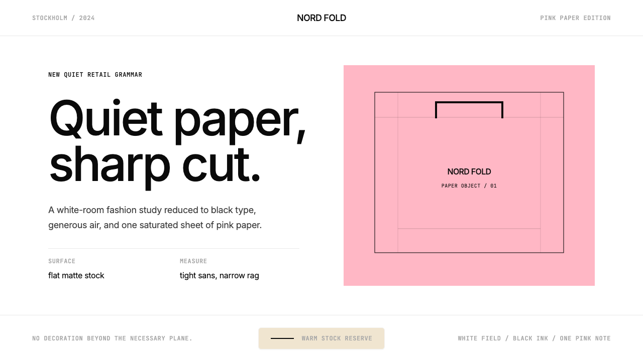 Acne Studios Pink-PaperQuiet luxury in one pink plane. Inter type floats on white with a bag-like re…粉色平面定义安静奢华:Inter 黑字漂浮于白场,像一只纸袋。
 FarfetchLuxury as absence. Charcoal type, white canvas, and hairline editorial plates.奢华即留白。炭灰字、纯白画布与发丝线编辑图版。
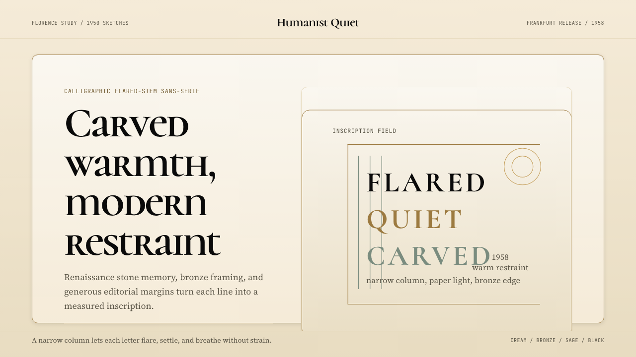 Optima (Hermann Zapf, 1958)Calligraphic calm, cut in cream and bronze. Narrow margins let the letters br…书法般的宁静。奶油底、青铜点缀、窄栏留白让字形呼吸。
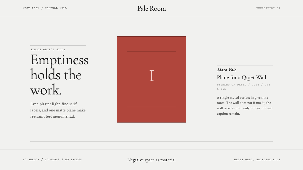 White Cube GalleryEmptiness is the medium. Cormorant labels and one terracotta plane hold the w…留白即媒介。Cormorant 标签与赭红平面撑起冷白墙。
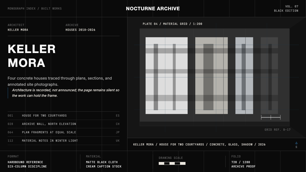 Architect Monograph (Black Edition)Architecture stays sovereign. Matte black, Helvetica caps, hairline grids, bl…建筑始终为主:哑光黑、Helvetica 大写、发丝网格与蓝图蓝。
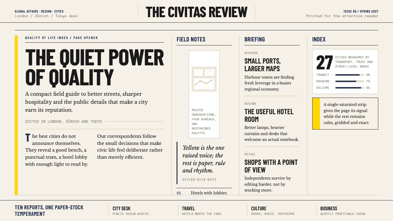 Monocle MagazineQuiet authority. Yellow spine, warm paper and dense ruled columns speak at li…安静的权威。黄色书脊、暖纸色与密集栏线,低声建立品味。