What is White Cube Gallery?
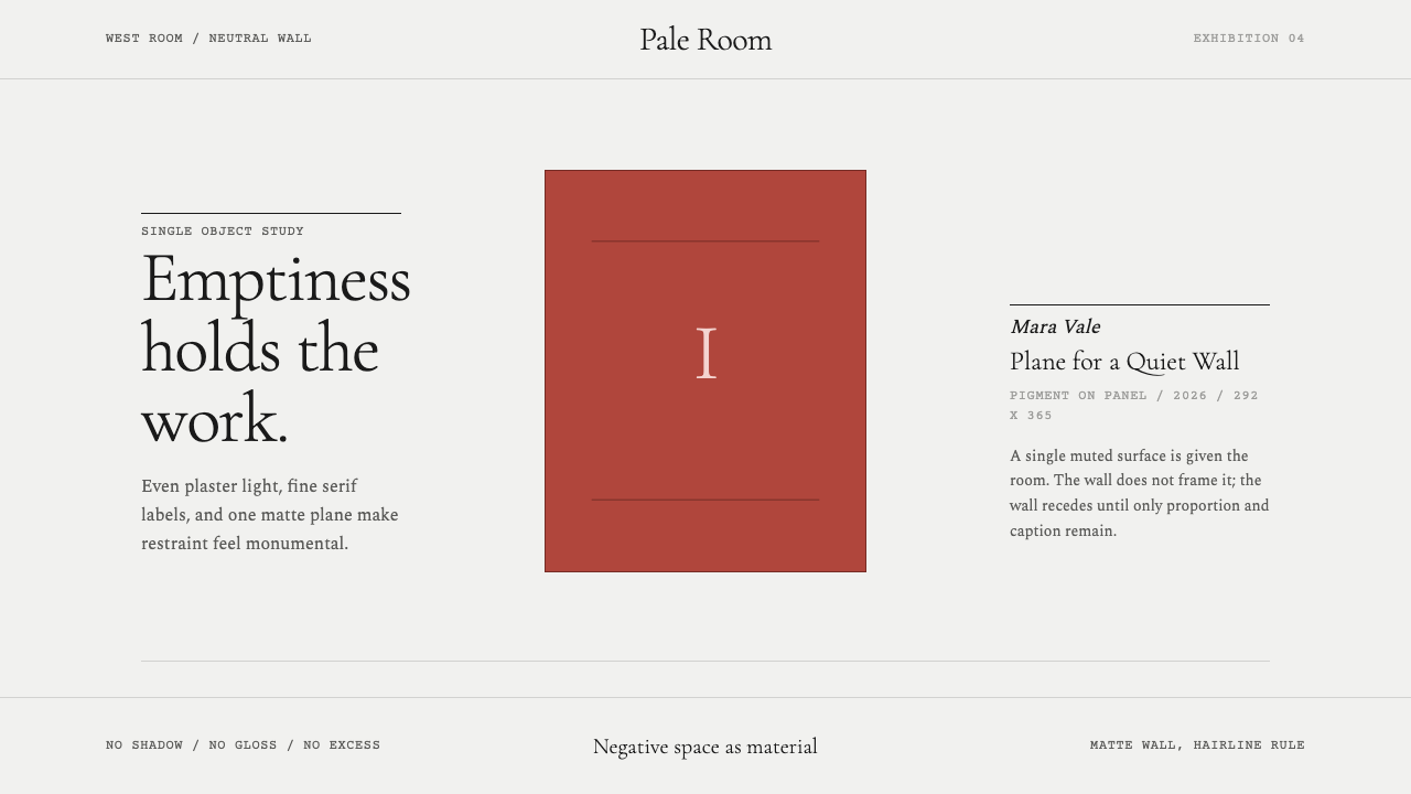
The white cube gallery treats emptiness itself as the design material — a neutral, even-lit void built to disappear so a single object can command the room.
White Cube Gallery in brief
White Cube is less a decorative style than an institutional condition: an even, neutral-cool plaster wall, museum-flat lighting, and matte surfaces that refuse to compete with whatever is being shown. Nothing glints, nothing casts a dramatic shadow, nothing draws the eye except the work on the wall and the small type identifying it. The system's entire ambition is to get out of the way.
This is a style built on subtraction. Where most design languages add — texture, color, ornament, motion — the white cube removes until only the object and its label remain legible. Margins run generous, dividing rules are hairline, and a single muted terracotta plane stands in for the artwork itself, functioning less as a color choice than as a placeholder for whatever real content will eventually occupy that space.
Typography carries almost the entire expressive burden that color and texture handle in other systems. Fine, restrained serif labels — quiet, small, precisely placed — do the work that a logo or a hero image might do elsewhere. The result reads as authoritative without ever raising its voice: the visual vocabulary of an institution that trusts its contents enough to say almost nothing around them.
Where does White Cube Gallery come from?
The phrase "white cube" was codified by the Irish artist and critic Brian O'Doherty in a series of essays for Artforum in 1976, later collected as the book Inside the White Cube: The Ideology of the Gallery Space. O'Doherty's argument was not aesthetic but political: he observed that the modern gallery's studied neutrality — its white walls, its absence of windows, its refusal to acknowledge the world outside — was not a neutral choice at all. It was a highly constructed environment designed to present the art object as timeless, sacred, and cut off from history, commerce, and daily life. What looked like an empty room was, in his phrase, a kind of ideology built out of paint and light.
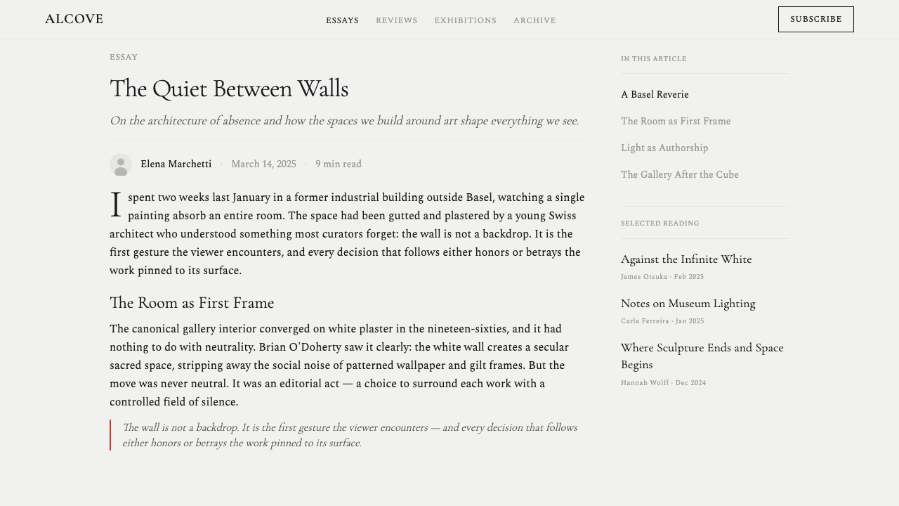
O'Doherty was writing about a display convention that had already existed for decades, rooted in the installation practices of early modernist exhibitions of the 1920s and 1930s. As painting and sculpture moved away from representing the world and toward abstraction, exhibition design followed: cluttered, richly decorated nineteenth-century salon hangs — canvases stacked frame to frame on patterned wallpaper — gave way to isolated works on bare walls, spaced to let each piece breathe. The empty wall became a precondition for taking abstract art seriously as an autonomous object rather than as one more ornament in a room.
The convention hardened into an industry standard over the second half of the twentieth century and became inseparable from the commercial gallery system as it professionalized. Among the defining spaces of this era was White Cube, the London gallery founded by Jay Jopling in 1993, whose very name treated O'Doherty's critical term as a badge rather than an indictment — a signal that the gallery understood, and was willing to lean into, the theatrical neutrality of its own walls. By the 2010s the aesthetic had become the default global vocabulary for contemporary art display, instantly recognizable from Chelsea to Hong Kong.
What makes the white cube durable as a design reference is precisely the tension O'Doherty identified: it presents itself as an absence of style while being, in fact, an extremely specific and disciplined one. Its coldness, its evenness, its refusal of ornament are not neutral defaults — they are choices that signal seriousness, value, and institutional authority, which is exactly why the vocabulary has migrated so easily from museum walls to the language of luxury retail, editorial minimalism, and premium digital products.
What defines the White Cube Gallery look?
Wall and Ground
The defining surface is an even, neutral-cool near-white, applied without visible texture or variation. It is deliberately cooler and flatter than a warm off-white — closer to gallery plaster than to paper — so that it reads as architectural rather than decorative. This ground never competes for attention; its entire function is to recede so completely that a viewer stops perceiving it as a color choice at all.
The Single Accent
Against the near-white ground sits one muted, earthen accent — a dusty terracotta — used sparingly and almost always in the position where an actual artwork or key visual would hang. It functions less as an ornamental color choice than as a placeholder for content: a stand-in mass that establishes scale and position without pretending to be anything more than a frame for something else. Because it is the only saturated note in the system, it carries disproportionate visual weight whenever it appears.
Typography
Labels are set in a fine, restrained serif — the kind of typeface associated with museum wall text and auction catalogues rather than advertising. Letterforms stay small, quiet, and precisely kerned; there is no bold display headline competing with the work itself. The typographic black used for these labels is the closest thing the system has to a second color, and its restraint is what separates an authentic white-cube treatment from a generic minimalist one: the type informs, it does not perform.
Negative Space as Material
Margins and clearances are generous well beyond what a typical layout would allow, and this emptiness is treated as a primary material rather than as leftover background. The amount of nothing surrounding an object is itself a signal of value — the more space a single piece is given, the more important it is understood to be. Crowding is the single fastest way to break the system's logic; density reads as retail, not gallery.
Line Work
Where dividing lines appear at all, they are hairline — thin enough to function as a quiet boundary marker rather than a graphic element in their own right. These rules separate label from label, section from section, without ever becoming decorative borders or frames. A thick or heavy rule anywhere in this system reads as a mistake; the line should almost disappear into the wall it sits on.
Light and Surface
Illumination is treated as museum-flat and even — the visual opposite of dramatic, directional lighting that throws long shadows or hot highlights. Surfaces are matte throughout; nothing gleams, nothing reflects, nothing suggests glossy commercial polish. This flatness of light reinforces the sense that the space itself has been neutralized precisely so that judgment can fall entirely on the object being displayed.
Composition and Placement
Objects — or, in a digital adaptation, key content blocks — are placed with the precision of a curator hanging a single painting: centered or deliberately off-center within a generous field, never crowded against an edge, never doubled up. Placement decisions look considered rather than filled-in, because in this system every element is understood to be alone in the room, even when it technically shares the page with others.
Who shaped White Cube Gallery?
The Irish artist, critic, and sometime physician O'Doherty wrote the 1976 Artforum essays that named and dissected the white cube as an ideology rather than a neutral backdrop. His argument — that the gallery's studied emptiness is itself a constructed, historically specific way of telling viewers how to value what they see — turned a display convention into a subject of serious critical inquiry and gave designers and curators alike the vocabulary to discuss it deliberately rather than take it for granted.
Jopling founded the London gallery White Cube in 1993, becoming one of the most influential dealers associated with the Young British Artists generation. By naming his gallery directly after O'Doherty's critical term, Jopling effectively converted a piece of institutional critique into a commercial brand — an acknowledgment that the neutral-seeming white room was itself a recognizable, marketable aesthetic that collectors and artists alike had come to associate with seriousness and market value.
As the founding director of the Museum of Modern Art in New York from 1929, Barr was among the earliest curators to systematically strip exhibition walls of the dense, ornamental hangs inherited from nineteenth-century salons, spacing paintings widely on plain walls to let modern and abstract works be read as autonomous objects. His installation practices at MoMA are widely credited with helping establish the bare, evenly lit gallery wall as the default setting for exhibiting serious modern art.
The American minimalist sculptor was, alongside his own austere geometric work, an outspoken theorist of exhibition space itself — insisting that the placement, spacing, and permanence of an installation were inseparable from the meaning of the object on display. His writings and his permanent installations in Marfa, Texas argued that a minimal object demands an equally disciplined, unornamented space around it, reinforcing the white cube's core premise that emptiness is not a void to be filled but a condition to be protected.
How do you use White Cube Gallery today?
White Cube is one of the most legible historical references for any product that wants to signal curation, authority, and restraint — but applying it requires resisting the urge to add. The style's power comes entirely from what is withheld, so the first design decision is almost always about how much can be removed rather than what can be included.
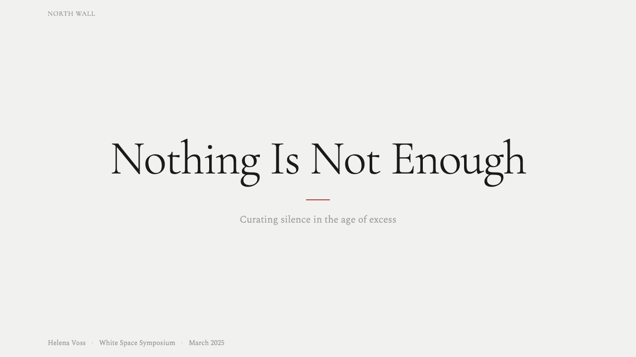
For presentation slides, the white cube treats the cover as a gallery wall: an oversized near-white field with the title set small and precisely placed, off-center, in the fine serif register — resisting the instinct to make a cover 'bold' in the conventional sense. Content and data slides should isolate one idea per slide with generous surrounding space; a single chart or statistic, set alone against the neutral ground with a quiet caption beneath it, reads as more authoritative than a slide crowded with several data points competing for attention. Any accent color should appear no more than once per slide, exactly where the eye is meant to land.
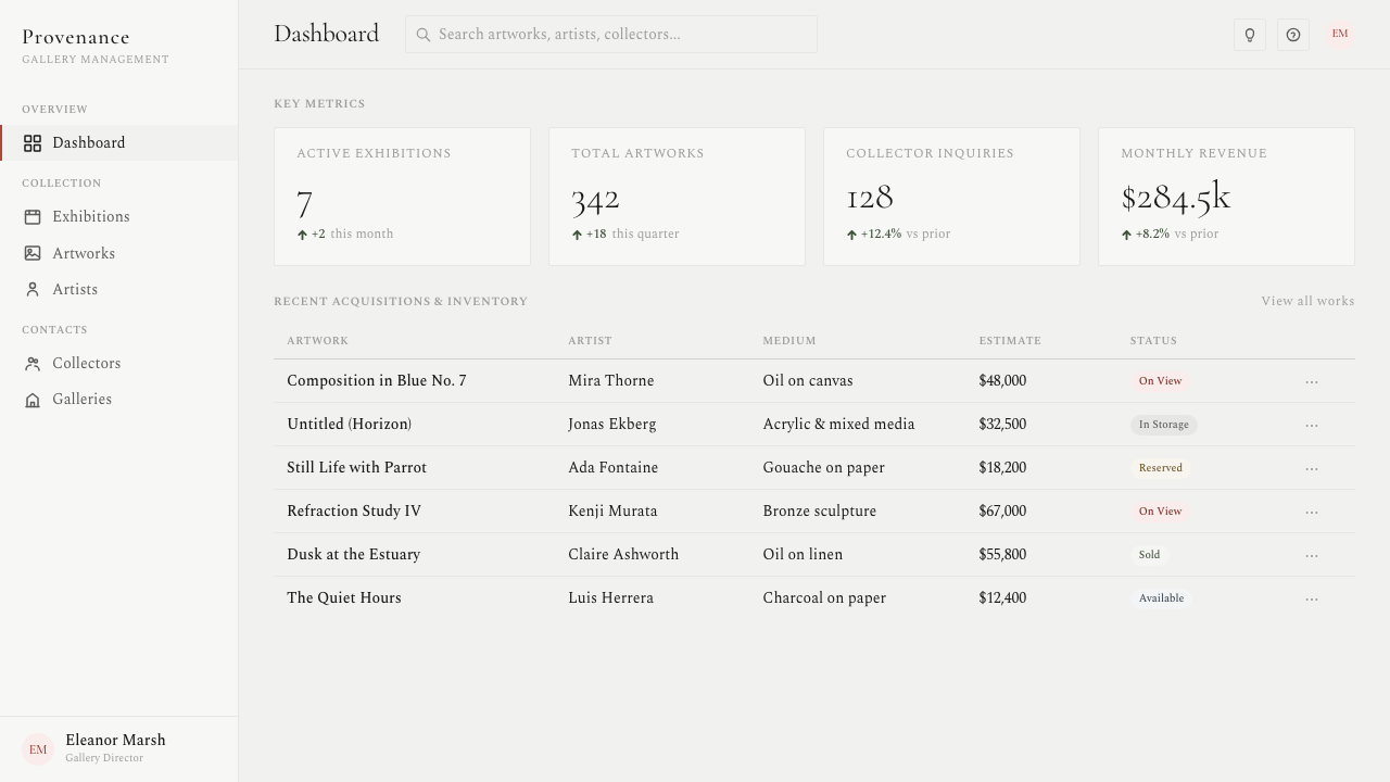
For web interfaces, the aesthetic suits dashboards and pricing pages that want to feel curated and premium rather than busy or feature-stuffed. Backgrounds stay near-white and even, card surfaces avoid heavy shadowing or gradient fills, and hierarchy is carried by spacing and fine typography rather than by color-coding or iconography. A pricing page benefits especially: presenting fewer tiers with more space around each one, and reserving the single accent color exclusively for the recommended plan, mimics the gallery's trick of making restraint itself feel like a value signal.
For editorial and marketing work, the style supports a slow, confident reading rhythm — wide margins, a narrow text measure, and section breaks marked by nothing more than a hairline rule and a shift in white space rather than a decorative divider. Marketing pages built this way tend to favor a single striking image or product shot per screen, given as much room as a gallery would give a painting, rather than tiled grids of smaller images competing for the same attention.
A common mistake when applying White Cube is treating 'minimal' as synonymous with 'plain,' and filling the resulting emptiness with generic gray placeholder tones instead of a considered neutral. The wall must be a specific, cool, even near-white — not an off-the-shelf light gray — and the single accent color must be genuinely singular. The moment a second bright color, a drop shadow, or a decorative icon set creeps in, the system stops reading as a gallery and starts reading as an ordinary minimalist template.
White Cube Gallery — FAQ
Is White Cube the same thing as generic minimalism?
They overlap but are not identical. Generic minimalism is often just an absence of decoration; White Cube is a specific institutional convention with its own rules — a particular cool near-white ground, museum-flat lighting, fine serif labeling, and a single restrained accent standing in for content. Where generic minimalism can feel merely empty or unfinished, White Cube feels curated, because every element that remains has been deliberately placed and given room, and the emptiness itself is understood as a signal of value rather than an oversight.
Why does the white cube use one accent color instead of none at all?
A completely colorless field would have nothing to anchor the eye and would read as unfinished rather than restrained. The single muted accent — traditionally standing in for the artwork itself — gives the composition a focal point and a sense of scale without introducing competition. Because it is the only saturated element in an otherwise neutral field, it automatically becomes the place the eye lands first, which is precisely the discipline the style depends on: one focal point, protected by everything around it staying quiet.
Can White Cube work with a dark background instead of near-white?
The white cube's entire premise is built on the near-white, evenly lit wall — a dark inversion works against the historical logic, because museum-flat lighting and matte pale plaster are what create the sense of neutral, sacred space in the first place. A dark version tends to read as a different lineage entirely, closer to theatrical spotlighting than gallery neutrality. If a dark treatment is required, it is more honest to look toward a style built around dramatic, directional light than to force this one into an inversion it was never designed for.
How much text or content can a white-cube layout actually hold?
Less than most layouts, by design. The style is optimized for a small number of carefully chosen elements given generous room, not for dense information delivery. It suits a single hero product shot, a short pricing table, a small set of curated highlights — anything where the content genuinely deserves to be treated as singular. Forcing a content-heavy page, a long form, or a data-dense dashboard into this vocabulary usually breaks it, because the discipline collapses the moment the page can no longer afford the emptiness the style requires.
Does White Cube suit every kind of product, or does it have limits?
It is not universal. White Cube works best for products that want to signal curation, premium value, and quiet confidence — portfolios, high-end e-commerce, pricing pages, and any brand positioning itself around taste rather than volume. It struggles wherever a product needs to feel warm, playful, or densely useful: community platforms, feature-rich utility tools, or contexts where users expect abundant information at a glance. In those settings, the generous emptiness that reads as 'curated' in a gallery context can instead read as sparse, cold, or even unfinished.
Related design styles
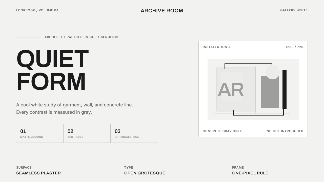 COS Gallery MinimalSilence has structure. Cool gallery white, Archivo uppercase, and concrete-gr…
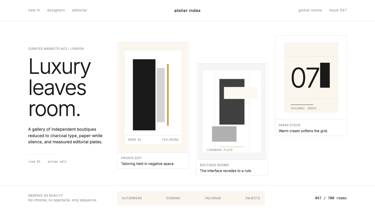 FarfetchLuxury as absence. Charcoal type, white canvas, and hairline editorial plates.
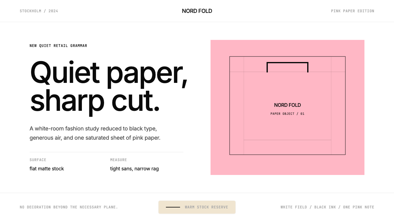 Acne Studios Pink-PaperQuiet luxury in one pink plane. Inter type floats on white with a bag-like re…
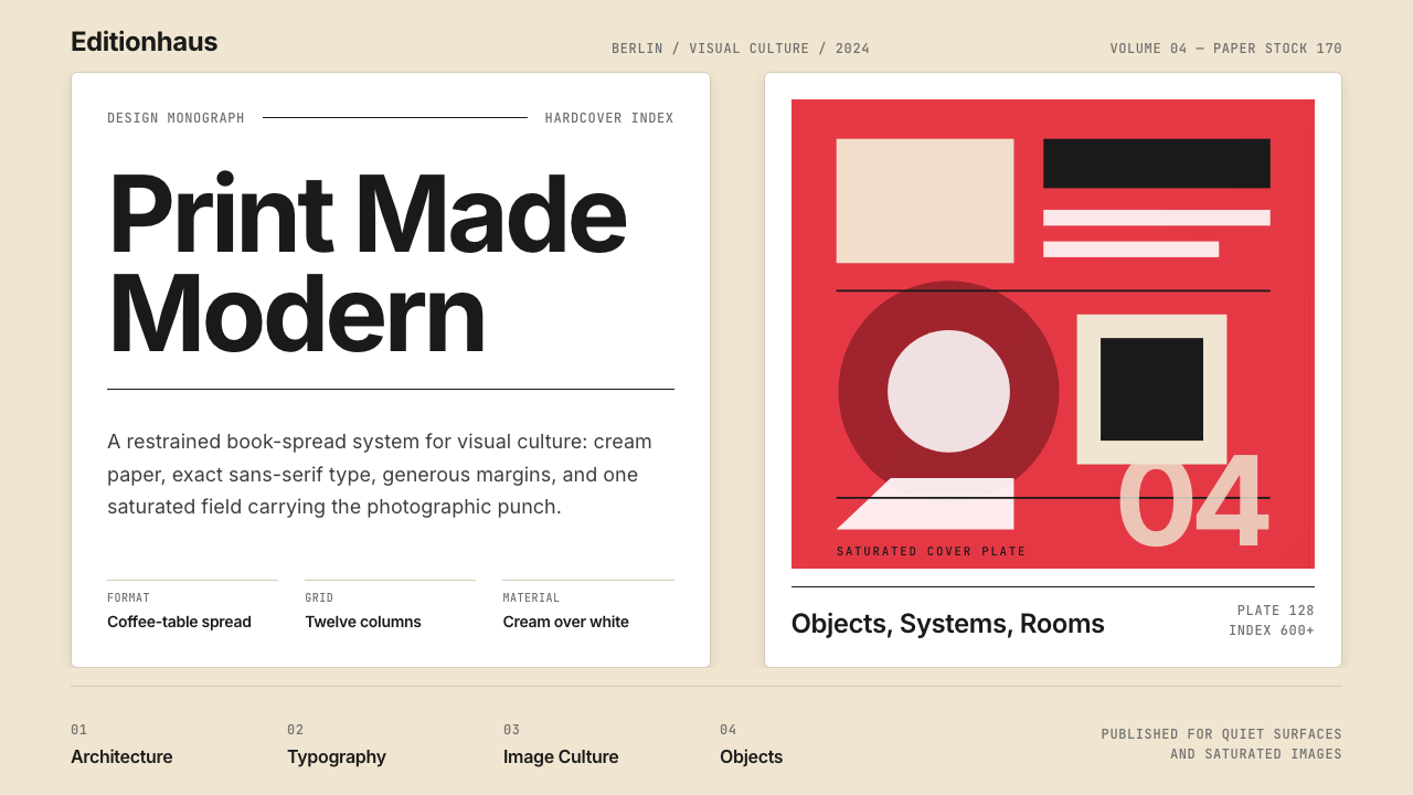 Gestalten Design BookCoffee-table calm. Cream paper, tight sans, one saturated block, and a strict…
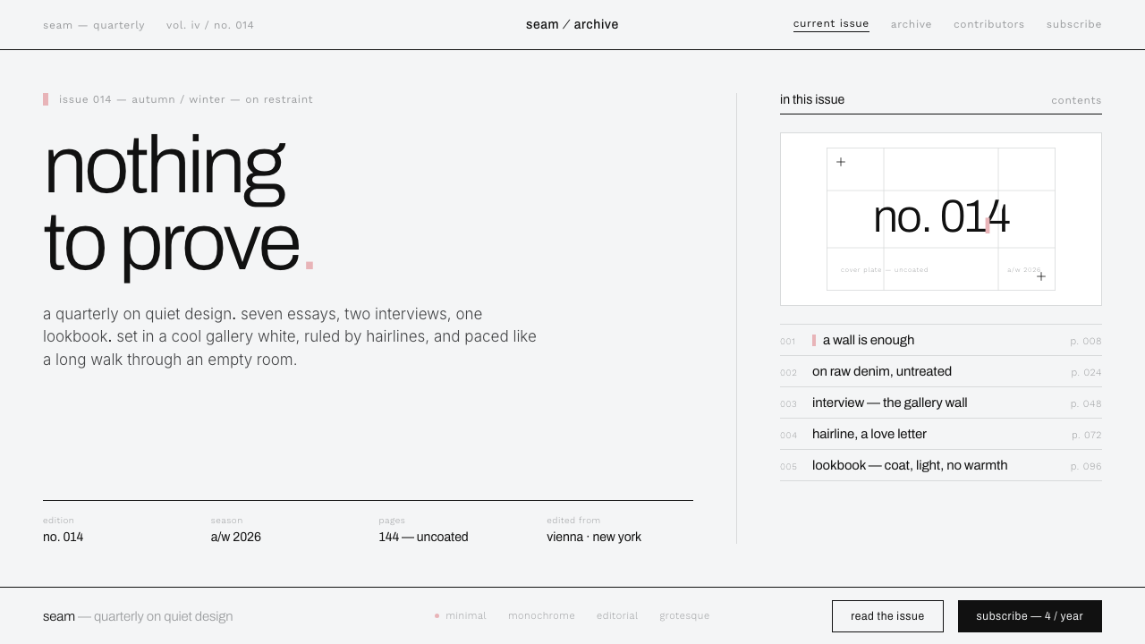 Helmut Lang MinimalismNothing to prove. Cool gallery white, 1px black hairlines, lowercase Archivo…
 Criterion ArthouseThe case disappears. Charcoal field, off-white Archivo, hairline rules, one r…