What is Monocle Magazine?什么是 Monocle Magazine?
Monocle built a global design authority on a single chromatic wager — one signature yellow against warm paper, dense columns, and the quiet confidence of a publication that never had to shout.《Monocle》以一场色彩赌注构建起全球设计权威——一抹标志性的黄,衬着暖纸色、密排栏目与从不需要高声的低调自信。
Monocle Magazine in briefMonocle Magazine 速览
Monocle Magazine's visual identity is one of the most precisely maintained editorial design systems of the twenty-first century. At its core, the language is defined by restraint: warm, uncoated paper tones, dense multi-column text grids, fine ruling lines that separate content zones without interrupting reading flow, and a single high-saturation yellow that functions as the publication's chromatic signature. Everything else — body text, headlines, captions, column markers — is held in a disciplined palette of deep black, navy, and warm grey.《Monocle》杂志的视觉识别是二十一世纪被维护得最为精确的编辑设计体系之一。其核心语言由克制构成:暖调哑光纸色、密集多栏文字网格、在不打断阅读节奏的前提下划分内容区域的细线,以及作为刊物色彩签名的唯一高饱和黄色。其余一切——正文、标题、图说、栏目标记——都被约束在深黑、海军蓝与暖灰的有纪律色板之中。
What separates Monocle's aesthetic from generic editorial minimalism is its density. Where many premium publications use generous white space as a signal of luxury, Monocle reads almost like a broadsheet folded into perfect-bound form: columns are narrow and tightly spaced, text is set at a moderate size, and layouts assume a reader who is willing to work — who finds the act of close reading itself pleasurable. The design rewards attention rather than rewarding scrolling.《Monocle》的美学区别于泛泛的编辑极简主义,在于其密度。许多高端出版物以大面积留白作为奢华信号,而《Monocle》读起来更像一份折叠成精装本形态的宽幅报纸:栏目窄而紧凑,正文字号适中,版面假设读者愿意投入——愿意在专注阅读这件事本身中找到乐趣。这套设计奖励注意力,而非奖励滑动翻页。
The style belongs to a tradition of European premium editorial design that treats the printed page as a serious object. Paper stock is tactile and warm-toned rather than bright white and glossy. Images are reproduced with journalistic fidelity — cropped tightly, captioned precisely, never styled into atmosphere. Typography is classical in rhythm but modern in construction, avoiding both the fussiness of purely decorative historical type and the blankness of purely utilitarian grotesque faces.这种风格归属于一个将印刷页面视为严肃对象的欧洲高端编辑设计传统。纸张质感触手可及,色调温暖而非明亮光泽。图像以新闻摄影的忠实度呈现——紧凑裁切、精确图说,从不被造型成氛围感。字体排印在节奏上是古典的,在构造上是现代的,既回避了纯装饰性历史字体的繁琐,也回避了纯功能主义无衬线字体的空洞。
See the Monocle Magazine design system查看 Monocle Magazine 完整设计系统
Where does Monocle Magazine come from?Monocle Magazine 从何而来?
Monocle was founded in London in 2007 by Tyler Brûlé, the Canadian-Swiss journalist and creative director who had previously launched Wallpaper* magazine in 1996. Wallpaper* had established Brûlé's instinct for high-production editorial design, but its acquisition by Time Warner led to creative tensions that eventually prompted his departure. Monocle was conceived as an independent response: a magazine that would handle global affairs, design, and urbanism with the same visual seriousness it applied to fashion and interiors, and that would be owned and operated without compromise from a media conglomerate.《Monocle》于2007年由加拿大裔瑞士记者兼创意总监泰勒·布吕莱(Tyler Brûlé)在伦敦创刊。布吕莱此前于1996年创办了《Wallpaper*》杂志,并借此确立了他对高制作水准编辑设计的直觉。然而《Wallpaper*》被时代华纳收购后,创意层面的张力日益累积,最终促使他离开。《Monocle》由此被构想为一份独立的回应:一本以同等视觉严肃性处理全球事务、设计与城市议题的杂志——就像它处理时尚与室内设计那样——且不受媒体集团妥协地独立运营。
The publication launched from Midori House in London's Marylebone neighbourhood, which functions not only as editorial headquarters but as a physical brand experience — housing a shop, a café, and a radio studio. This integration of content, retail, and place was deliberate. Brûlé and his co-founders were arguing that quality journalism and quality design were not in tension with commercial viability; they were themselves a form of product, one that deserved a correspondingly coherent physical presence. The Midori House model has since been replicated in bureau offices in Zürich, Tokyo, Toronto, and Hong Kong.这份杂志从伦敦马里波恩区(Marylebone)的 Midori House 起步。这里不仅是编辑总部,也是一个实体品牌体验场所——内设书店、咖啡馆与广播录音室。内容、零售与空间的整合是刻意为之的。布吕莱和他的联合创始人在论证:优质新闻与优质设计与商业可行性并不矛盾;它们本身就是一种产品,理应拥有与之相称的、连贯的实体存在。Midori House 模式此后被复制到苏黎世、东京、多伦多与香港的分社办公室。
The magazine's visual identity was developed by Brûlé alongside creative director Richard Spencer Powell, who has overseen the design system since the early years. The Monocle yellow — applied to the spine, section tabs, and key typographic accents — was chosen not as a trend but as an ownership mark: a colour specific enough to be immediately recognizable on a newsstand, restrained enough to coexist with the warm paper tones and editorial density of the interior pages. It functions in much the same way a colophon or a publisher's device did in the era of fine printing: as an emblem of deliberate, consistent identity.杂志的视觉识别由布吕莱与创意总监理查德·斯宾塞·鲍威尔(Richard Spencer Powell)共同建立,后者自创刊初期便掌舵这套设计体系至今。《Monocle》黄——施用于书脊、栏目标签与关键排印强调——的选取并非出于潮流,而是作为一个所有权标记:足够独特、在报摊上一眼可辨,又足够克制、能与内页暖调纸色及编辑密度和谐共存。它的功能与精印时代的版权花饰或出版商标记如出一辙:作为蓄意、持续身份的徽章。
The design philosophy drew from the heritage of European quality press — the dense, well-proportioned columns of publications like the Neue Zürcher Zeitung, the tactile confidence of Scandinavian annual reports, and the measured elegance of mid-century Swiss editorial design — without copying any of them directly. Monocle synthesized these influences into something that felt neither nostalgic nor aggressively contemporary: a publication designed to be kept, to be read slowly, and to feel equally at home on an architect's desk or in a business-class seat.这套设计哲学汲取了欧洲高端媒体的传统——《新苏黎世报》(Neue Zürcher Zeitung)密集、比例精当的栏目,斯堪的纳维亚年报的触感自信,以及二十世纪中叶瑞士编辑设计的节制典雅——但并不直接复制其中任何一种。《Monocle》将这些影响综合成某种既不怀旧、也不激进当代的东西:一份被设计成可以留存的刊物,供人缓慢阅读,放在建筑师的书桌上或商务舱的座椅旁,同样自然得体。
What defines the Monocle Magazine look?Monocle Magazine 的视觉特征是什么?
The Signature Yellow标志性黄色
Monocle's single saturated yellow is the most recognisable element of the design system — applied to the magazine's spine, section dividers, and key typographic accents. It operates as an ownership mark rather than a decorative flourish: precise enough to be immediately identifiable, rare enough within each spread to retain its signal value. The yellow never spreads across large surface areas; it punctuates. Everything surrounding it is held in warm neutrals, deep black, and navy blue, which allows the accent to function at maximum contrast without overwhelming the editorial content.《Monocle》唯一的高饱和黄色是这套设计体系中最具辨识度的元素——施用于书脊、栏目分隔与关键排印强调。它作为所有权标记而非装饰点缀存在:精确到足以立即被识别,在每个跨页中又稀少到足以保持其信号价值。这抹黄色从不铺展于大面积区域;它只做标点。围绕它的一切——暖调中性色、深黑与海军蓝——使这一强调色在最大对比度下发挥作用,而不会淹没编辑内容。
Warm Paper Tones and Uncoated Feel暖调纸色与哑光质感
The Monocle palette is built around the warmth of premium uncoated paper stock — a slightly cream, off-white field that reads as considered rather than clinical. This warm ground softens what might otherwise be a severe editorial system, giving it a tactile intimacy that coated, bright-white printing cannot replicate. In digital applications of the style, this warmth is preserved through off-white and warm parchment backgrounds rather than pure stark white, ensuring that the palette reads as cultivated rather than sterile.《Monocle》的色板以优质哑光纸张的暖意为基础——一种略带奶油色的米白底面,读来是经过斟酌的,而非临床冷漠的。这一暖调底色柔化了原本可能过于严肃的编辑体系,赋予其光泽亮白印刷无法复制的触感亲密感。在这种风格的数字应用中,这种暖意通过米白和暖羊皮纸背景(而非纯正的刺眼白色)得以保留,确保整体色板被感知为有教养的,而非无菌的。
Dense Multi-Column Grid密集多栏网格
Monocle's layouts are structured around a tight, multi-column grid that accommodates substantial text volumes without sacrificing proportion. Column gutters are narrow, paragraph spacing is disciplined, and the overall impression is of a page that is fully in use — not empty-feeling, not crowded, but committed. Fine horizontal rules separate sections rather than white space alone, giving the layout a precision that references the traditions of quality newspaper and reference-book design. This density is itself a design statement: it assumes a reader who values content over atmosphere.《Monocle》的版面以紧凑的多栏网格为结构,在不牺牲比例的前提下容纳大量文字。栏间距窄,段落间距有纪律,整体印象是一个被充分利用的页面——不显空洞,不显拥挤,但充满投入感。细水平线与留白共同分隔章节,赋予版面一种参照优质报纸与参考书设计传统的精确性。这种密度本身就是一种设计声明:它假设读者重视内容胜过氛围。
Typographic Hierarchy by Weight and Scale以字重与尺度建立排印层级
The publication's type system creates hierarchy almost entirely through scale and weight contrasts, with colour entering only as a secondary marker. Section labels and standfirsts sit at a noticeably different visual temperature from body text — bolder, sometimes set in navy or warm grey rather than black — but the primary organizing principle is always size. This approach produces a reading experience that is navigable without being decorative: a reader can scan a spread and immediately identify the hierarchy without any element feeling like a design intervention rather than an editorial decision.刊物的字体系统几乎完全通过尺度与字重对比建立层级,色彩仅作为次要标记介入。栏目标签与导言与正文处于明显不同的视觉温度——更粗,有时以海军蓝或暖灰而非黑色排印——但主要组织原则始终是大小。这种方式产生了可导航但不装饰化的阅读体验:读者扫视一个跨页即可立刻识别层级,而不会让任何元素感觉像是设计介入而非编辑决定。
Journalistic Image Treatment新闻式图像处理
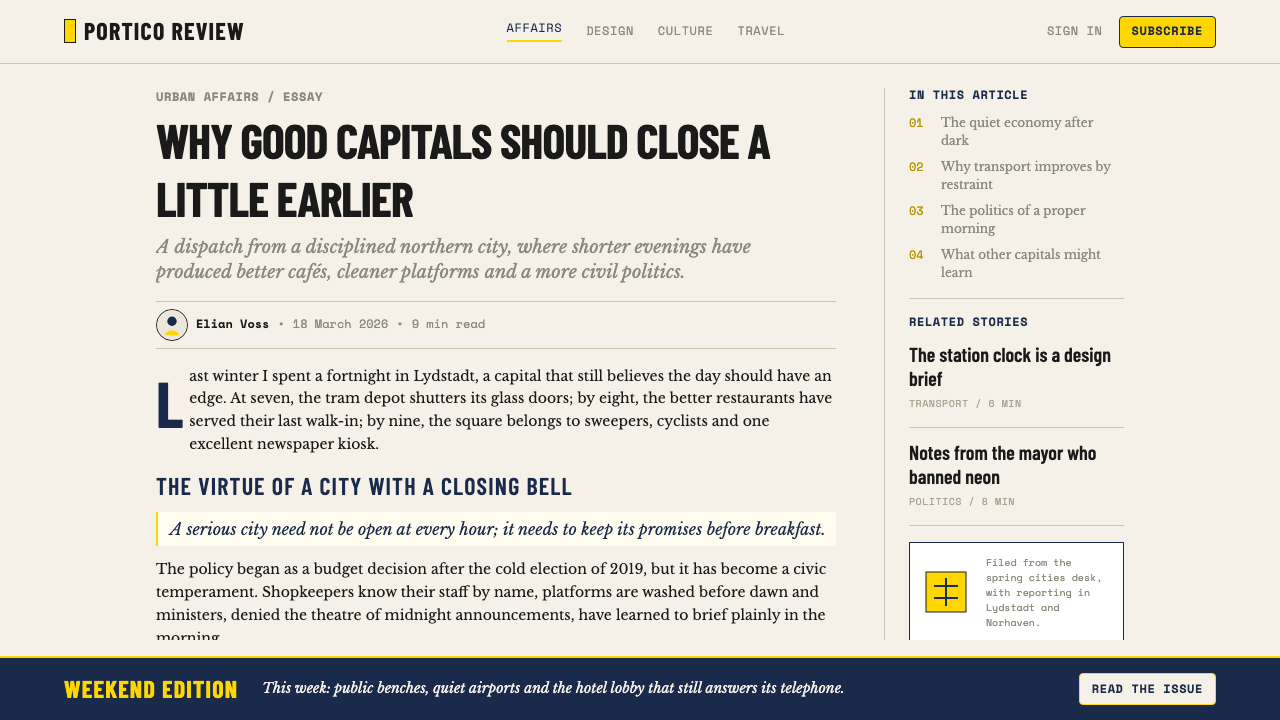
Photography in Monocle is treated with journalistic discipline rather than art-direction excess. Images are cropped tightly to subject, reproduced with accurate colour rather than stylised toning, and captioned with the precision of a wire service. There is no soft-focus atmosphere, no heavy post-processing, no full-bleed atmospheric spreads used as design wallpaper. Each image earns its space by carrying information. This restraint makes the layout feel authoritative — the design signals that the editorial content is the point, and visual styling exists to serve it rather than to substitute for it.《Monocle》中的摄影以新闻纪律处理,而非过度的美术指导。图像被紧凑裁切至主体,以准确色彩而非风格化色调还原,配图说明精确得如同通讯社标准。没有失焦氛围感,没有重度后期处理,没有被用作设计壁纸的满版大气跨页。每张图像靠携带信息来争取自己的版面空间。这种克制使版面感觉权威——设计在传递信号:编辑内容才是重点,视觉造型存在于服务它,而非替代它。
Navy and Warm Grey as System Colours海军蓝与暖灰作为系统色
Beyond black body text and the signature yellow, the Monocle palette relies on navy blue and warm grey as its supporting system colours. Navy appears in section headings, running titles, and typographic markers — it reads as authoritative without the starkness of black used at lighter weights. Warm grey handles captions, secondary labels, and metadata, functioning as a subordinate layer that is clearly differentiated from primary content without creating harsh visual contrast. Together, these four values — warm off-white, black, navy, warm grey, and yellow — constitute the complete editorial palette.除黑色正文与标志性黄色之外,《Monocle》的色板依赖海军蓝与暖灰作为支撑系统色。海军蓝出现于栏目标题、页眉与排印标记——以较细字重使用时,读来权威而无纯黑的生硬感。暖灰处理图说、次要标签与元数据,作为从属层次运作,与主要内容清晰区分,却不制造生硬的视觉对比。这四组色值——暖米白、黑、海军蓝、暖灰,加上黄色——共同构成完整的编辑色板。
Restrained Decorative Vocabulary克制的装饰词汇
Monocle's design almost entirely eschews decorative elements. There are no illustrative flourishes, no complex border treatments, no ornamental dividers. The ruling line is the sole structural decoration — a device with clear functional purpose. Pull quotes are differentiated by scale and weight rather than by enclosing boxes or graphic devices. This restraint is not bareness; it is the confidence of a design system that trusts its proportions and typographic logic to create visual interest without requiring supplementary ornamentation. The aesthetic communicates taste through the quality of its decisions rather than their quantity.《Monocle》的设计几乎完全回避装饰性元素。没有插图式花饰,没有复杂边框处理,没有装饰性分隔符。细线是唯一的结构性装饰——一种具有明确功能目的的手段。引用语通过尺度与字重区分,而非通过包围框或图形元素。这种克制不是单薄;它是一套设计系统的自信——相信自身的比例与排印逻辑足以创造视觉趣味,无需借助补充性装饰。这套美学通过决定的质量而非数量传递品味。
See the Monocle Magazine design system查看 Monocle Magazine 完整设计系统
Who shaped Monocle Magazine?谁塑造了 Monocle Magazine?
The Canadian-Swiss founder and editor-in-chief of Monocle, Brûlé had previously launched Wallpaper* magazine in 1996 before founding Monocle in 2007. His creative vision established the publication's core proposition: that rigorous global journalism and premium editorial design were not opposing impulses but a single coherent offer to a specific, discerning readership. Brûlé also founded the design and communications agency Winkreative, which has applied the Monocle visual sensibility to brand identities, airline liveries, and retail environments for international clients.《Monocle》的加拿大裔瑞士创始人兼主编,布吕莱于1996年创办了《Wallpaper*》,后于2007年创立《Monocle》。他的创意愿景确立了刊物的核心主张:严格的全球新闻报道与高端编辑设计并非相悖的冲动,而是向特定、有鉴赏力读者群体提供的单一连贯产品。布吕莱还创办了设计与传播机构 Winkreative,将《Monocle》的视觉感性应用于国际客户的品牌识别、航空公司涂装与零售空间设计。
Powell has served as Monocle's creative director since the publication's early years, making him the principal custodian of its visual identity. His work on the magazine's design system — the column grid, the typographic hierarchy, the management of the signature yellow, and the overall visual standards — has kept the publication's aesthetic unusually consistent for an independent title across nearly two decades. Powell's approach demonstrates that editorial design systems can maintain integrity over long periods when guided by a single, committed creative director rather than cycled through frequent rebranding.鲍威尔自刊物创刊初年起担任《Monocle》创意总监,是其视觉识别的主要守护者。他对杂志设计体系的工作——栏目网格、排印层级、标志性黄色的管理以及整体视觉标准——使这份独立刊物的美学在近二十年间保持了异乎寻常的一致性。鲍威尔的实践证明:当编辑设计体系由单一、有承诺的创意总监长期引导,而非频繁更换品牌风格,它便能在漫长时间中维持其完整性。
Giles has contributed to Monocle's expansion as a media brand beyond the print magazine — into radio, books, and seasonal specials — helping maintain the consistent application of the visual and editorial language across formats. His work illustrates the challenge of extending a tightly controlled print design system into other media, where different production constraints require interpretation rather than direct translation. Monocle's success in this expansion is partly attributable to the clarity of the underlying design principles, which can be adapted without being diluted.贾尔斯为《Monocle》作为媒体品牌超越印刷杂志的扩张做出贡献——延伸至广播、书籍与季节性特刊——协助在不同格式中保持视觉与编辑语言的一致应用。他的工作说明了将严格控制的印刷设计体系延伸至其他媒介时面临的挑战:不同的生产限制要求的是诠释而非直接翻译。《Monocle》在这一扩张中的成功,部分归功于底层设计原则的清晰度——这些原则可以被适配而不被稀释。
The creative agency founded by Tyler Brûlé has functioned as an extended laboratory for the Monocle visual sensibility, applying its principles to clients in aviation, hospitality, retail, and city branding. Winkreative's work with carriers such as Finnair and Swiss International Air Lines demonstrates how the Monocle design logic — warm neutrals, disciplined typography, restrained colour usage, and premium material quality — can translate from editorial pages to three-dimensional environments and brand communications. The studio has effectively exported the Monocle aesthetic into a broader commercial design language.这家由泰勒·布吕莱创办的创意机构,充当了《Monocle》视觉感性的延伸实验室,将其原则应用于航空、酒店、零售与城市品牌领域的客户。Winkreative 与芬兰航空(Finnair)和瑞士国际航空(Swiss International Air Lines)等航空公司的合作,展示了《Monocle》的设计逻辑——暖调中性色、有纪律的排印、克制的色彩使用与优质材料质感——如何从编辑页面转译为三维空间与品牌传播。这家机构实际上将《Monocle》美学输出成了更广泛的商业设计语言。
How do you use Monocle Magazine today?今天怎么用 Monocle Magazine?
The Monocle editorial style is among the most transferable premium print aesthetics for digital applications, because its core principles — typographic hierarchy, disciplined colour restraint, journalistic image treatment, and grid density — address problems that exist equally in web design, presentation decks, and data dashboards. Applying it correctly requires understanding that the system's authority comes from its consistency and proportion, not from any single element. The yellow accent, taken alone and applied generously, produces generic warmth rather than Monocle's specific quality.《Monocle》编辑风格是最易于在数字应用中移植的高端印刷美学之一,因为其核心原则——排印层级、有纪律的色彩克制、新闻式图像处理与网格密度——在网页设计、演示文稿与数据仪表板中同样存在。正确应用它,需要理解这套体系的权威来自其一致性与比例,而非任何单一元素。黄色强调色若被单独提取并大面积使用,产生的是泛泛的温暖感,而非《Monocle》特有的品质。
For presentation slides, the style works particularly well in business contexts where authority and credibility are primary requirements. Cover slides should treat the warm off-white or cream field as the dominant surface, with the title set in deep black at large scale and a single yellow element — a rule, a category label, a spine stripe down one edge — providing the chromatic signature. Content slides should be approached as column grids: text is set at consistent hierarchical scales, supporting data appears in clearly labelled tables or charts, and section breaks are marked by fine horizontal rules rather than decorative dividers or gradient backgrounds. Data visualisations should use the signature yellow for the primary data series, with navy and warm grey for secondary and tertiary series, keeping the overall visual temperature consistent with the editorial palette.对于演示文稿,这种风格在权威性与可信度是主要需求的商业场景中尤为出色。封面页应以暖米白或奶油色底面作为主导表面,标题以深黑大字排印,一个单一的黄色元素——一条线、一个类目标签、沿一侧边缘的书脊色条——提供色彩签名。内容页应以栏目网格来处理:文字以一致的层级尺度排印,支撑性数据出现于清晰标注的表格或图表中,章节分隔以细水平线标记,而非装饰性分割线或渐变背景。数据可视化应将标志性黄色用于主要数据系列,海军蓝与暖灰用于次要和第三系列,保持整体视觉温度与编辑色板一致。
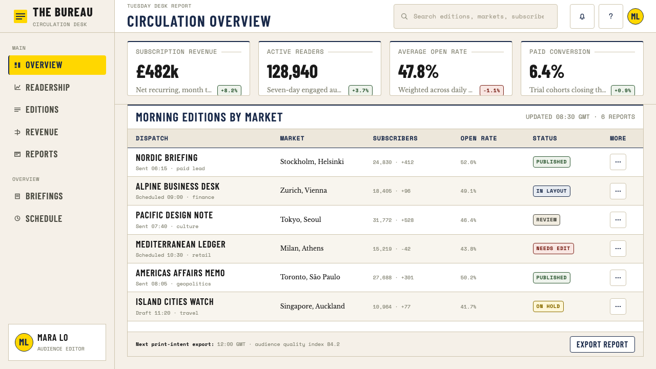
For web interfaces and digital dashboards, the Monocle aesthetic is well-suited to intelligence products, financial platforms, media brands, and any context where a tone of informed authority is desired. The approach: establish a warm off-white or light parchment background across the primary content surface; use deep black for all body copy; reserve the signature yellow for interactive states, notification badges, active navigation indicators, or tier differentiation in pricing tables. Navigation should be typographic — wordmarks, section labels, and breadcrumbs styled at measured weights — without icon decoration beyond simple geometric indicators. Card components should use fine borders rather than soft box shadows; inputs should have visible borders rather than ghost styling.对于网页界面与数字仪表板,《Monocle》美学非常适合情报产品、金融平台、媒体品牌,以及任何期望呈现博识权威基调的场景。方法如下:在主要内容表面建立暖米白或浅羊皮纸背景;所有正文使用深黑色;将标志性黄色保留给交互状态、通知徽章、活跃导航指示符,或定价表中的等级区分。导航应是字体性的——字标、栏目标签与面包屑导航以适度字重排印——除简单几何指示符外无图标装饰。卡片组件应使用细边框而非柔和盒阴影;输入框应有可见边框而非幽灵样式。
For editorial and marketing contexts — branded reports, white papers, event programmes, annual reviews — the style translates directly. Body text should use a moderate column width that produces comfortable reading measure rather than the full-width paragraphs common in marketing copy. Generous left or right margins accommodate pull quotes, annotations, and metadata. Section introductions benefit from a standfirst or deck set at a larger scale than body text, differentiated by weight rather than colour. Marketing pages and campaign assets can use the style's poster-like directness: large typographic statements in deep black against warm white grounds, with yellow used sparingly for a single call-to-action accent per visual unit.对于编辑与营销场景——品牌报告、白皮书、活动节目册、年度回顾——这种风格可以直接移植。正文应使用适中的栏宽,形成舒适的阅读行宽,而非营销文案中常见的全宽段落。宽阔的左侧或右侧留白容纳引用语、注释与元数据。章节导言受益于以比正文更大尺度排印的导读段落,以字重而非色彩区分。营销页面与活动物料可以运用这种风格的海报式直接感:深黑大型排印声明配暖白底面,黄色仅在每个视觉单元中用于单一行动号召强调。
The most common mistake when applying the Monocle style is treating the signature yellow as a general-purpose warm accent and using it across multiple elements on a single surface. In the source material, yellow is rare enough to carry genuine signal value; overuse converts it from a precise mark of identity into background decoration. A related error is choosing backgrounds that are either stark pure white or yellow-tinted to excess — both lose the specific warmth of the uncoated-paper reference that anchors the palette. A third common failure is substituting decorative image treatments — vignetted edges, warm filter overlays, lifestyle-catalogue styling — for the plain, journalistic image handling that gives the aesthetic its authority.应用《Monocle》风格时最常见的错误,是将标志性黄色视为通用暖色调强调色,在单个页面上跨多个元素使用。在原始素材中,黄色足够稀少才得以承载真正的信号价值;过度使用将它从精确的身份标记转变为背景装饰。相关的错误是选择纯白或过度偏黄的背景——两者都丢失了锚定色板的哑光纸张参照的特定暖意。第三种常见失误是以装饰性图像处理——渐晕边缘、暖色滤镜叠加、生活方式目录造型——替代赋予这套美学权威性的朴素新闻式图像处理。
See the Monocle Magazine design system查看 Monocle Magazine 完整设计系统
Monocle Magazine — FAQMonocle Magazine · 常见问题
Is the Monocle style the same as editorial minimalism?《Monocle》风格与编辑极简主义是同一回事吗?
They share restraint but differ in density and intent. Contemporary editorial minimalism typically uses large white space, generous margins, and sparse text to signal luxury and slowness — the design itself performs leisureliness. Monocle's style is denser and more purposeful: the grid is tight, columns are narrow, and the page is fully inhabited. The restraint is in ornamentation and colour, not in content quantity. Monocle assumes an engaged, attentive reader who wants information, whereas pure editorial minimalism often prioritises mood over content. The difference is between a well-designed reference publication and a beautifully produced lifestyle object.两者共享克制,但在密度与意图上有所不同。当代编辑极简主义通常使用大面积留白、宽阔留边与稀疏文字来传递奢华与缓慢的信号——设计本身在表演闲适。《Monocle》的风格更密集、更目的性:网格紧凑,栏目窄,页面被充分利用。克制体现在装饰与色彩上,而非内容数量上。《Monocle》假设一个投入、专注、渴望获取信息的读者,而纯粹的编辑极简主义往往将氛围置于内容之上。两者的区别在于:一份设计精良的参考类刊物,与一件制作精美的生活方式对象。
Can this style work in dark mode or on dark backgrounds?这种风格能在深色模式或深色背景下使用吗?
With significant adaptation. The Monocle palette is fundamentally anchored to the warmth of uncoated paper — a light, warm ground is not merely a preference but a structural assumption of the entire colour system. A dark inversion is possible, but it requires rebuilding the palette around the new ground: the signature yellow, which works as a precise accent against warm white, can become overpowering on black. A workable dark variant uses deep charcoal or very dark navy as the primary surface rather than pure black, maintains cream or warm off-white for primary type, and treats the yellow as an even more restrained accent than in the light version. The result will be tonally consistent but should not be presented as a direct equivalent of the original — it is an adaptation, and the density principles need re-evaluation.需要大幅度适配。《Monocle》色板从根本上锚定于哑光纸张的暖意——浅暖底面不仅是偏好,更是整个色彩系统的结构性假设。深色反转是可能的,但需要围绕新底面重建色板:标志性黄色在暖白底面上作为精确强调色发挥作用,在黑色底面上则可能变得压迫性地主导。一个可行的深色变体以深炭灰或极深海军蓝作为主要表面(而非纯黑),以奶油色或暖米白用于主要字体,将黄色处理为比浅色版本更克制的强调色。结果在色调上会保持一致,但不应被呈现为原版的直接等价物——它是一种适配,密度原则也需重新评估。
How does the Monocle style handle data and information graphics?《Monocle》风格如何处理数据与信息图形?
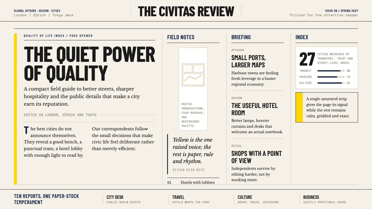
With the same journalistic discipline applied to photography. Charts and data graphics in the Monocle tradition are treated as informational objects, not visual entertainment: axes are clearly labelled, scales are honest, chart types are chosen for clarity rather than novelty, and the colour palette is restricted to the editorial system rather than expanded with additional hues for visual variety. The signature yellow serves as the primary data accent; navy and warm grey handle secondary series and supporting elements. The result is a data graphic that reads as part of the editorial whole rather than as a separately designed element. Infographics and illustrated explainers — common in other magazine traditions — are rare in Monocle's visual language.以同样用于摄影的新闻纪律处理。《Monocle》传统中的图表与数据图形被视为信息性对象,而非视觉娱乐:坐标轴清晰标注,比例尺诚实,图表类型为清晰度而非新颖性而选取,色板严格限于编辑系统,而非为了视觉丰富性而扩展更多色调。标志性黄色作为主要数据强调色;海军蓝与暖灰处理次要系列与支撑性元素。结果是一张数据图形读来像编辑整体的一部分,而非一个单独设计的元素。信息图与插图说明——在其他杂志传统中很常见——在《Monocle》的视觉语言中是罕见的。
What kinds of brands and products align well with the Monocle aesthetic?哪类品牌和产品与《Monocle》美学契合?
Products and brands that want to signal informed sophistication rather than aspirational luxury. The Monocle style works well for financial services with a global perspective, architecture and urban design firms, quality hospitality brands, business intelligence platforms, independent publishers, and premium mobility brands — airlines, rail, automotive — that position quality and considered design as primary values. It also suits professional services firms — consultancies, law firms, talent agencies — where credibility and international orientation are core to the brand proposition. It is less suited to consumer brands that depend on sensory warmth, playfulness, or cultural specificity, and to technology products positioning themselves on speed and disruption rather than considered quality.那些希望传递博识精致感而非向往性奢华的产品与品牌。《Monocle》风格适合具有全球视野的金融服务、建筑与城市设计公司、优质酒店品牌、商业情报平台、独立出版商,以及将品质与用心设计作为核心价值的高端出行品牌——航空公司、铁路、汽车。它也适合专业服务公司——咨询机构、律师事务所、人才机构——在这些领域,公信力与国际导向是品牌主张的核心。它较不适合依赖感官温暖、趣味感或文化特殊性的消费品牌,以及将自身定位于速度与颠覆而非用心品质的科技产品。
Why does Monocle maintain such consistent design across nearly two decades?《Monocle》为何在近二十年间保持如此一致的设计?
For two structural reasons. First, the publication has maintained the same creative director — Richard Spencer Powell — since its early years, providing continuity that is rare in magazine publishing, where design rebrands are often used to signal editorial change or advertising strategy shifts. Second, the design system itself is built on principles rather than trends: the warm paper reference, the typographic hierarchy, the restrained colour palette, and the grid density are not styles that date quickly because they are not responses to contemporary fashion. They are derived from the traditions of quality European press design, which evolved over decades to solve real problems of legibility, authority, and reproduction quality. A system built on enduring principles requires fewer updates than one built on current aesthetics.有两个结构性原因。第一,这份刊物自创刊初年起保持了同一位创意总监——理查德·斯宾塞·鲍威尔——提供了杂志出版界罕有的连续性,在那里品牌重塑往往被用来传递编辑方向或广告策略的转变。第二,这套设计体系建立在原则而非潮流之上:暖色纸张参照、排印层级、克制的色板与网格密度并非容易过时的风格,因为它们不是对当代时尚的回应。它们源自欧洲优质媒体设计传统,那些传统历经数十年演进,解决了可读性、权威性与印刷质量的真实问题。建立在持久原则之上的体系,比建立在当下美学之上的体系需要更少的更新。
Related design styles相关设计风格
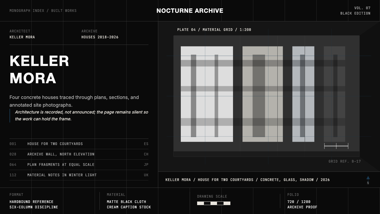 Architect Monograph (Black Edition)Architecture stays sovereign. Matte black, Helvetica caps, hairline grids, bl…建筑始终为主:哑光黑、Helvetica 大写、发丝网格与蓝图蓝。
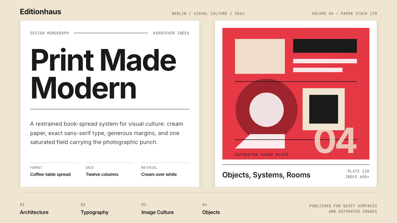 Gestalten Design BookCoffee-table calm. Cream paper, tight sans, one saturated block, and a strict…咖啡桌式冷静。奶油纸、紧凑无衬线、单一高饱和色块与严格网格。
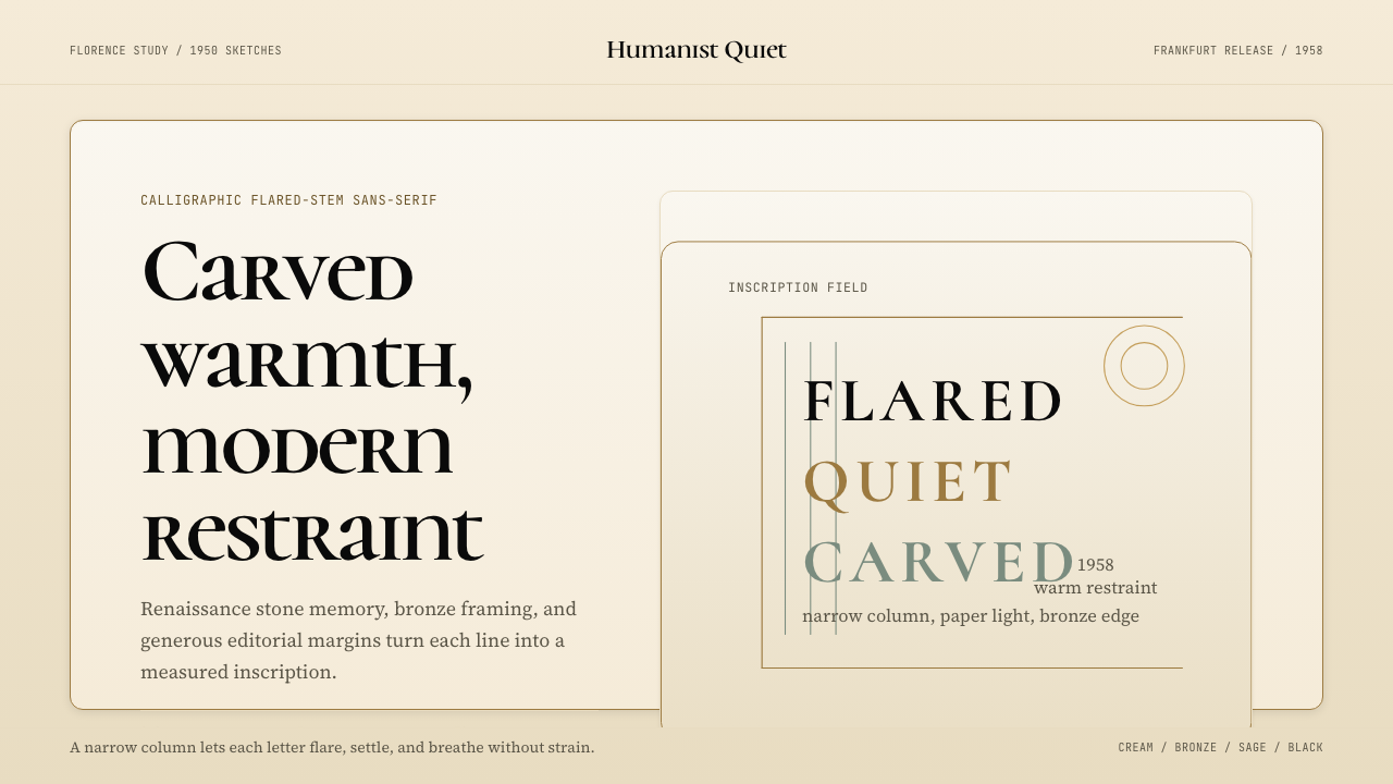 Optima (Hermann Zapf, 1958)Calligraphic calm, cut in cream and bronze. Narrow margins let the letters br…书法般的宁静。奶油底、青铜点缀、窄栏留白让字形呼吸。
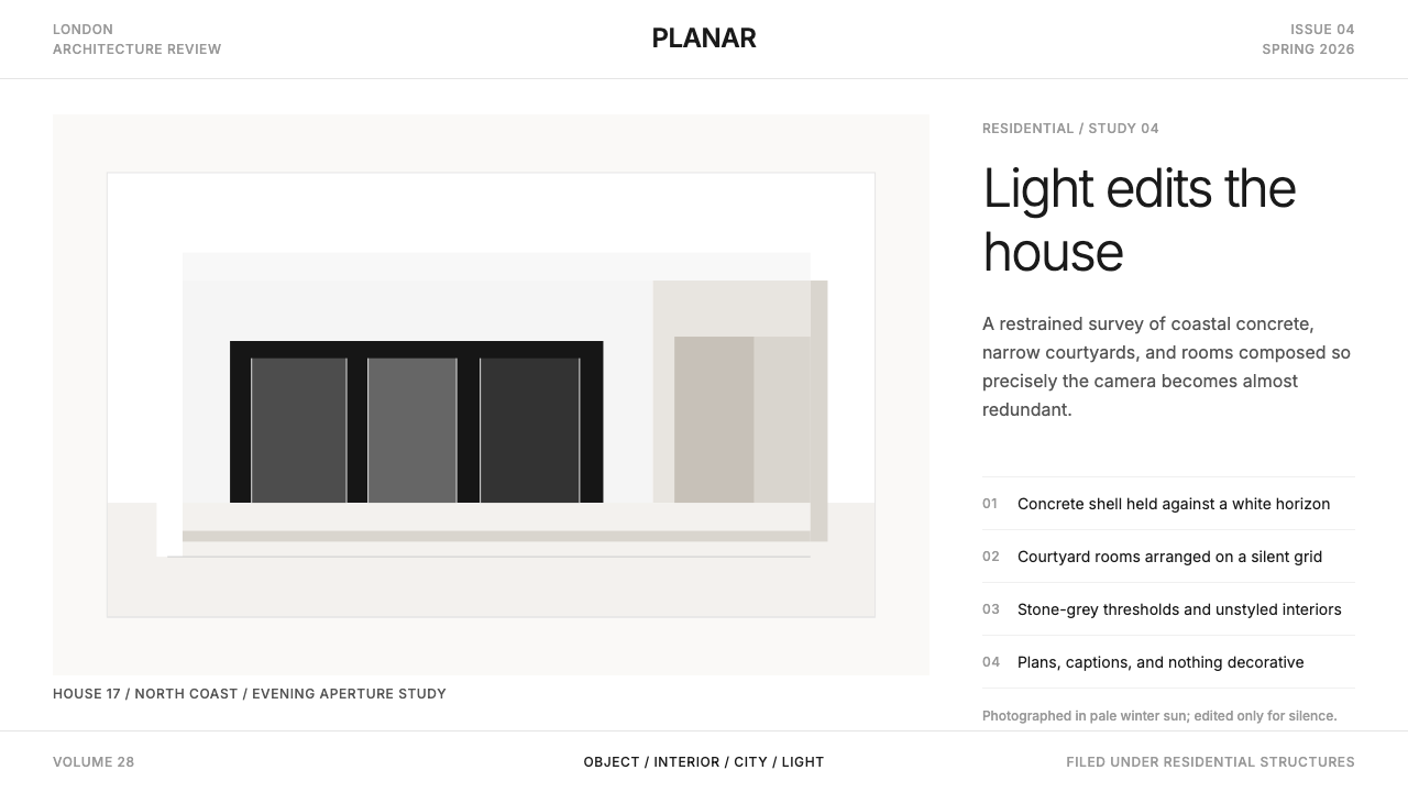 Wallpaper* ArchitecturePhotography does the speaking. Gallery-white grid, Inter captions, and hairli…让摄影发声。画廊白网格、Inter 小标题与细线退后。
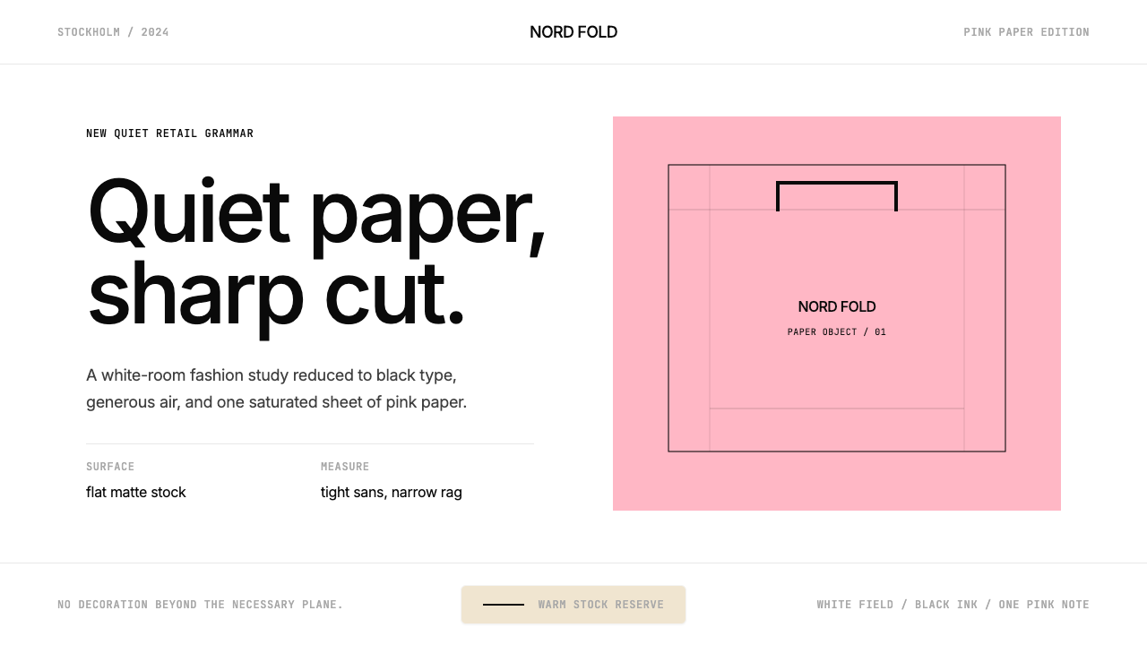 Acne Studios Pink-PaperQuiet luxury in one pink plane. Inter type floats on white with a bag-like re…粉色平面定义安静奢华:Inter 黑字漂浮于白场,像一只纸袋。
 ChanelLuxury needs no color. Black on white, pearl-cream warmth, geometric capitals…百年宣言:真正的奢华无需色彩。纯黑配纯白,唯一的偏移是珍珠乳白——克制即气场。