What is Optima (Hermann Zapf, 1958)?什么是 Optima (Hermann Zapf, 1958)?
Optima is the typeface that abolished serifs without abandoning the calligrapher's hand — its flared stems carry two thousand years of Roman inscription into the modern page.Optima 废除了衬线,却未放弃书法家的手——微张的竖画末端将两千年罗马碑刻的记忆带入了现代版面。
Optima (Hermann Zapf, 1958) in briefOptima (Hermann Zapf, 1958) 速览
Optima is a humanist sans-serif typeface designed by Hermann Zapf and released by the Stempel foundry in Frankfurt in 1958. Unlike geometric sans-serifs whose strokes are mechanically uniform in width, Optima's strokes taper and swell with the rhythm of a calligraphic pen: each stem widens slightly toward its terminal end, giving the letters a warmth and vitality that purely constructed letterforms cannot achieve. The typeface occupies a rare intermediate territory — indisputably a sans-serif in that it carries no true serifs, yet unmistakably humanist in that every curve and junction echoes the movements of a trained hand.Optima 是赫尔曼·察普夫设计的人文主义无衬线字体,1958年由德国法兰克福的 Stempel 铸字厂正式发布。与笔画机械等宽的几何无衬线字体不同,Optima 的笔画随书法钢笔的节奏收细与鼓涨:每一竖画末端微微张开,赋予字母一种纯粹构造性字形无法企及的温度与生命力。这款字体占据了一个罕见的中间地带——它确实没有衬线,但每一条曲线与转折都回荡着训练有素的手的动作,无可辩驳地属于人文主义传统。
The visual character of Optima is one of quiet authority. Set in text, it reads with the comfortable familiarity of a serif face while projecting a clean, unencumbered silhouette at display sizes. Its proportions are generous without being wide, its contrast is subtle without being invisible, and its overall impression is of restraint that has been earned rather than imposed. These qualities made it an almost inevitable choice for contexts that demand dignity without ostentation: luxury goods, memorial inscriptions, museum signage, and institutional identity.Optima 的视觉气质是一种沉静的权威感。在正文尺寸下,它读起来具有衬线字体的亲切熟悉感;在展示尺寸下,它投射出干净、无负担的轮廓。它的字宽比例慷慨而不宽松,笔画对比微妙而不消隐,整体印象是一种赢得的克制,而非强加的克制。这些特质使它几乎不可避免地成为那些需要尊严而非张扬的场合的选择:奢侈品、纪念碑铭文、博物馆标识与机构视觉识别。
Optima belongs to a tradition of calligraphic-revival sans-serifs that sought to recover what the strict geometric sans of the early twentieth century had discarded — the historical continuity between letterforms and the human hand. Where Futura or Helvetica consciously erased that continuity, Optima made it the central argument. The result is a typeface that feels simultaneously timeless and considered, a quality that has sustained its authority across more than six decades of use.Optima 属于二十世纪书法复兴无衬线字体的传统,这一传统试图找回严格几何无衬线字体所抛弃的东西——字形与人手之间的历史连续性。当 Futura 或 Helvetica 有意抹去这种连续性时,Optima 却将其作为核心论点。结果是一款同时感觉永恒与深思熟虑的字体,这一品质在超过六十年的使用中维持了它的权威性。
See the Optima (Hermann Zapf, 1958) design system查看 Optima (Hermann Zapf, 1958) 完整设计系统
Where does Optima (Hermann Zapf, 1958) come from?Optima (Hermann Zapf, 1958) 从何而来?
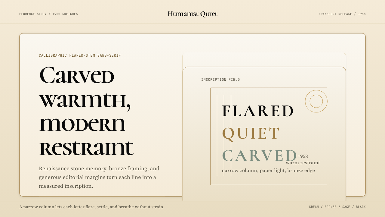
The story of Optima begins not at a drawing board but in a church floor. In 1950, Hermann Zapf visited the Basilica of Santa Croce in Florence — the Franciscan church where Michelangelo, Galileo, and Machiavelli are buried — and found himself studying the Renaissance stone inscriptions set into the floor. These fifteenth- and sixteenth-century carved capitals displayed something Zapf had not encountered in the strict geometric sans-serifs then dominating progressive typography: their stems were not uniform in weight but flared gently at the terminals, as if a calligrapher's broad nib had been translated into stone. Zapf made sketches on whatever paper he had available, reportedly including the margins of a fifty-lire banknote, capturing the proportions and the subtle terminal flare before the detail escaped him.Optima 的故事不始于绘图桌,而始于一片教堂地板。1950年,赫尔曼·察普夫造访佛罗伦萨的圣十字圣殿——那座埋葬着米开朗基罗、伽利略与马基雅维利的方济各会教堂——他凝视着嵌入地板的文艺复兴石刻铭文。这些十五、十六世纪的雕刻大写字母展示了察普夫在当时主导进步排印界的严格几何无衬线字体中从未见过的东西:竖画并非等宽,而是在末端微微张开,仿佛书法家的宽斜笔尖被翻译成了石头。察普夫用手头能找到的任何纸张——据说包括一张五十里拉纸币的空白边距——记录下这些比例与微妙的末端张开,在细节从记忆中消逝之前将其捕获。
Zapf had already established himself as one of the most accomplished calligraphers and type designers of his generation before he began working on Optima. His Palatino (1949) had demonstrated his mastery of Renaissance humanist letterforms in a revival serif; Optima was the logical next question: what would remain of the calligraphic tradition if the serifs themselves were removed? The answer he developed through the early 1950s was that the calligraphic gesture could survive in the modulation of stroke weight — in the barely perceptible swelling of a stem from its thinnest midpoint to its slightly heavier terminal. This modulation, absent from geometric sans and largely suppressed in transitional sans, is what distinguishes Optima from its contemporaries.在开始创作 Optima 之前,察普夫已凭借同代中最出色的书法家与字体设计师之一的身份确立了自己的地位。他的 Palatino(1949年)已在衬线字体的复兴中展示了他对文艺复兴人文主义字形的掌握;Optima 是下一个逻辑性问题:如果衬线本身被移除,书法传统还能留存什么?他在1950年代初逐渐找到的答案是:书法的姿态可以在笔画粗细的调制中存续——在竖画从最细的中段到略微丰满的末端之间几乎难以察觉的鼓涨里。这种调制,在几何无衬线字体中缺席,在过渡性无衬线字体中也大体被压制,正是 Optima 区别于同代字体的所在。
Production of the typeface was a lengthy process. Zapf worked on the design through the early 1950s, and the drawings passed through the skilled hands of August Rosenberger at the Stempel foundry in Frankfurt, who translated Zapf's calligraphic originals into precise punchcutter drawings suitable for metal type production. The typeface was released by Stempel in 1958 under the name Optima — a name chosen to reflect the designers' sense that the letterforms had reached an optimal resolution of competing demands: legibility, tradition, and modernity. In the United States it was briefly marketed under the name Cheltenham, causing some confusion, before the Optima name prevailed internationally.这款字体的生产是一个漫长的过程。察普夫在1950年代初持续推进设计,图纸经过法兰克福 Stempel 铸字厂技艺精湛的奥古斯特·罗森贝格尔的双手,将察普夫的书法原稿转化为适合金属活字生产的精确冲压图纸。字体于1958年由 Stempel 发布,命名为 Optima——这个名字的选择反映了设计者的感受:这些字形在可读性、传统与现代性的竞争性需求之间找到了最优的解决方案。在美国,它曾短暂以 Cheltenham 之名销售,造成一些混淆,后来 Optima 这个名字才在国际上确立。
Adoption was rapid in exactly the sectors one might predict. Luxury brands recognized in Optima a letterform that projected refinement without coldness; the military recognized its inscription-like dignity; memorial designers found it the only sans-serif that felt appropriate for the gravest contexts. The most famous single use is the Vietnam Veterans Memorial in Washington, D.C., designed by architect Maya Lin and unveiled in 1981, where Optima was chosen to incise the names of more than 58,000 fallen service members into the black granite wall. The choice was not incidental: the typeface's roots in stone inscription gave it a memorial gravity that no other sans-serif could have provided. This association with memory, loss, and endurance has since become inseparable from Optima's cultural identity.这款字体在人们预期的领域里迅速获得采用。奢侈品牌在 Optima 中认出了一种投射精致而无冷漠感的字形;军事机构认可了它铭文般的庄严;纪念性设计师发现它是唯一一款在最庄重场合仍感觉合适的无衬线字体。最著名的单一使用是1981年揭幕、由建筑师林璎设计的华盛顿特区越战老兵纪念碑——Optima 被选用来将超过五万八千名阵亡军人的名字刻入黑色花岗岩墙壁。这个选择并非偶然:这款字体扎根于石刻铭文的历史,赋予了它其他任何无衬线字体都无法提供的纪念性庄重感。这种与记忆、失落与持久相关联的文化身份,此后与 Optima 的形象再也无法分离。
What defines the Optima (Hermann Zapf, 1958) look?Optima (Hermann Zapf, 1958) 的视觉特征是什么?
Flared Terminals张开的末端
The defining structural feature of Optima is the way each vertical stem widens very slightly as it approaches its terminal end — a gesture derived directly from calligraphic broad-nib writing and from the technique of Renaissance stone-cutters who gave their letters the same gentle flare. This flare is not a serif: it does not form a bracketed foot or cap. It is a modulation of the stroke itself, visible enough to register subconsciously as warmth and weight, subtle enough not to interrupt the clean silhouette of a sans-serif at normal reading sizes.Optima 决定性的结构特征是每条竖画在接近末端时略微张开——这一姿态直接来源于宽斜笔书法的书写习惯,以及文艺复兴石刻工匠赋予字母同样温柔张开的技法。这种张开不是衬线:它不形成有托架的底脚或顶帽。它是笔画本身的调制,在常规阅读尺寸下足以潜意识地传递温度与分量,又足够微妙,不打断无衬线字体干净的轮廓。
Calligraphic Stroke Contrast书法笔画对比
Unlike the perfectly uniform stroke weight of geometric sans-serifs like Futura, Optima carries a visible but gentle contrast between its thick and thin strokes — again inherited directly from the motion of a calligraphic pen. The thickest parts of curved strokes fall at roughly the same positions they would if the letters had been written with a broad-nib pen held at a consistent angle. This contrast is far subtler than that of a Renaissance or Baroque serif, but it gives Optima a liveliness and readability in extended text that purely monolinear sans-serifs tend to lack.与 Futura 等几何无衬线字体的完全等宽笔画不同,Optima 在粗细笔画之间带有可见但温和的对比——同样直接继承自书法钢笔的运动方式。弧形笔画最粗处大致落在以固定角度持握宽斜笔书写时会落下的位置。这种对比远比文艺复兴或巴洛克衬线字体微妙,但它赋予了 Optima 在大段正文中单线无衬线字体往往缺乏的活力与可读性。
Humanist Proportions人文主义字宽比例
Optima's letter proportions follow the classical humanist model established by Renaissance scribes and subsequently codified in the earliest roman type designs of the fifteenth century. The capitals are not mechanically equal in width: the M and W are wide, the I is narrow, the O and C are broad and round. The lowercase has a comfortable x-height — generous enough for text legibility, restrained enough not to feel heavy. These classical proportions are one reason the face reads as refined rather than casual, even when used at small sizes in dense text.Optima 的字母比例遵循文艺复兴抄写员确立、并在十五世纪最早的罗马体字体设计中得到整理的古典人文主义模型。大写字母宽度并非机械等同:M 与 W 宽,I 窄,O 与 C 宽圆。小写字母有舒适的 x 字高——宽裕到足以保证正文可读性,克制到不显沉重。这些古典比例是这款字体即使在密集正文中以小字号使用时,也能读起来精致而非随意的原因之一。
Warm Neutrality温暖的中性感
Optima occupies a rare position on the spectrum of typographic tone: it is simultaneously formal and approachable. It lacks the crisp institutional distance of Helvetica, the corporate rigor of Univers, and the warmth-through-nostalgia of old-style serifs. Instead it achieves warmth through the calligraphic memory encoded in its structure — a warmth that is architectural rather than sentimental. This quality makes it unusually versatile: it serves luxury brand identity, medical and scientific publishing, memorial inscriptions, and museum signage without feeling out of place in any of them.Optima 在字体语调的谱系上占据着罕见的位置:它同时是正式的与平易近人的。它没有 Helvetica 清脆的机构疏离感,没有 Univers 的企业严谨,也没有旧式衬线字体通过怀旧达成的温暖。它的温暖来自编码在其结构中的书法记忆——一种建筑性而非情感性的温暖。这一品质使它具有异乎寻常的通用性:它服务于奢侈品牌识别、医学与科学出版、纪念碑铭文和博物馆标识,在任何一种语境中都不显突兀。
Scale Behavior尺寸表现
Optima behaves differently across scales in a way that rewards deliberate sizing decisions. At large display sizes, the flared terminals and stroke modulation become clearly perceptible, giving headlines and titles a sculptural, lapidary quality — as if the letters were cut in stone. At small text sizes, these details recede and the face reads almost like a restrained, clean sans-serif with unusually good spacing. At intermediate sizes — the heading and subheading range — it is at its most versatile, bridging the display and text registers with equal authority.Optima 在不同尺寸下的表现各异,能回报慎重的字号决策。在大型展示尺寸下,张开的末端与笔画调制清晰可感,赋予标题一种雕塑般、碑刻般的品质——仿佛字母被凿入石中。在小号正文尺寸下,这些细节退隐,字体读起来几乎像一款克制、干净的无衬线字体,但间距异常优良。在中间尺寸——标题与副标题范围——它最为多才多艺,以同等的权威感跨越展示与正文两个语域。
Restrained Palette Affinity与克制色板的亲缘性
The aesthetic values encoded in Optima — warmth, restraint, classical proportion, calligraphic memory — align naturally with palettes that share those qualities. Warm neutrals (cream, ivory, warm stone), muted bronze and gold accents, and sage or deep forest tones as secondary colors all resonate with the typeface's character. Loud, high-saturation color schemes tend to work against Optima by introducing an energy that the letterforms themselves resist. The typeface performs best when it is the most visually active element in a composition — which means surrounding it with quiet, dignified surfaces.Optima 所编码的美学价值——温暖、克制、古典比例、书法记忆——与共享这些品质的色板自然契合。暖中性色(奶油、象牙、暖石色)、哑光青铜与金色点缀,以及鼠尾草绿或深森林绿作为次要色,都与这款字体的气质产生共鸣。高饱和度的强烈配色方案往往与 Optima 对抗,因为它引入的能量正是字形本身所抵制的。这款字体在版面中作为视觉上最活跃的元素时表现最佳——这意味着需要以安静、庄重的底面来衬托它。
Absence of Decorative Elaboration对装饰性繁复的抵制
Despite its calligraphic origins, Optima contains no swashes, no decorative alternates, and no ornamental flourishes. The calligraphic energy is entirely structural — expressed through proportion and stroke modulation, not through added visual ornament. This restraint means that Optima pairs poorly with highly decorative surrounding elements: ornate borders, complex background patterns, or heavily illustrated contexts all compete with and diminish the typeface's particular kind of authority. Optima's natural environment is one of space, quiet material surfaces, and considered simplicity.尽管源自书法,Optima 不含任何花体变形、装饰性替换字形或华丽花饰。书法能量完全是结构性的——通过比例与笔画调制表达,而非通过附加的视觉装饰。这种克制意味着 Optima 与高度装饰性的周边元素搭配效果欠佳:繁复的边框、复杂的背景图案,或大量插图的语境,都会与这款字体特有的权威感产生竞争并削弱它。Optima 的自然生境是空间、安静的材质底面与深思熟虑的简约。
See the Optima (Hermann Zapf, 1958) design system查看 Optima (Hermann Zapf, 1958) 完整设计系统
Who shaped Optima (Hermann Zapf, 1958)?谁塑造了 Optima (Hermann Zapf, 1958)?
Zapf (1918–2015) was one of the most important typeface designers and calligraphers of the twentieth century. Self-taught as a calligrapher after reading Edward Johnston's Writing and Illuminating and Lettering, he joined the Stempel foundry in Frankfurt and went on to design some of the most widely used typefaces of the modern era, including Palatino (1949), Optima (1958), and Zapf Chancery (1979). His work consistently sought to reconcile the calligraphic tradition with the demands of industrial and later digital type production. Late in his career he collaborated with Xerox on digital typeface technology and held a professorship at Rochester Institute of Technology, ensuring that his influence extended to the generation of designers who built the typographic systems of the digital age.察普夫(1918—2015年)是二十世纪最重要的字体设计师与书法家之一。他在读到爱德华·约翰斯顿的《书写、装饰与字母》后自学书法,随后加入法兰克福的 Stempel 铸字厂,继而设计了现代史上使用最广泛的一批字体,包括 Palatino(1949年)、Optima(1958年)与 Zapf Chancery(1979年)。他的作品始终寻求在书法传统与工业、后来是数字活字生产的需求之间取得调和。职业生涯晚期,他与施乐公司合作开发数字字体技术,并在罗切斯特理工学院担任教职,确保了他的影响力延伸至建立了数字时代字体系统的那代设计师。
Rosenberger was the master punchcutter at the Stempel foundry in Frankfurt who translated Zapf's calligraphic drawings for Optima into the precise technical drawings and physical punches required for hot-metal type production. The relationship between a type designer and a skilled punchcutter was in the pre-digital era one of the most critical in the entire process of typeface production: the punchcutter's interpretation of the designer's intentions in metal determined how the face would actually appear on the printed page. Rosenberger's ability to capture the subtlety of Optima's flared terminals and stroke modulation in metal — features that are easily lost in mechanical translation — was essential to the typeface's success.罗森贝格尔是法兰克福 Stempel 铸字厂的首席冲压工匠,他将察普夫的书法图纸转化为热金属活字生产所需的精确技术图纸与实体冲头。在前数字时代,字体设计师与技艺精湛的冲压工匠之间的关系是整个字体生产过程中最为关键的关系之一:冲压工匠在金属上对设计师意图的诠释,决定了字体在印刷页面上的实际呈现。罗森贝格尔将 Optima 张开末端与笔画调制的微妙性转化为金属的能力——这些特征在机械转译中极易丧失——对这款字体的成功至关重要。
Maya Lin (born 1959) was a twenty-one-year-old architecture student at Yale University when her design for the Vietnam Veterans Memorial was selected from among more than 1,400 entries in a national competition in 1981. Her choice of Optima for the incised names on the black granite wall was in retrospect an act of deep typographic literacy: she needed a letterform that could be cut cleanly into stone, that would read with clarity in all lighting conditions, that carried monumental weight without militaristic severity, and that honored the calligraphic tradition of Western memorial inscription without resorting to period ornament. Optima met every condition. The memorial, unveiled in Washington, D.C. in 1982, became one of the most visited monuments in the United States and gave Optima an association with remembrance and gravity that no other type commission could have provided.林璎(生于1959年)是耶鲁大学建筑系的学生,年仅二十一岁时,她的越战老兵纪念碑设计从1981年全国竞赛的逾1400件参赛作品中脱颖而出。她选择 Optima 来刻写黑色花岗岩墙上的名字,回顾来看是一次深刻的字体素养的体现:她需要一款能被干净刻入石头的字形,能在各种光线条件下清晰辨读,具有纪念碑的庄重感而无军事化的严酷,能致敬西方纪念碑铭文的书法传统而不借助历史装饰。Optima 满足了每一个条件。纪念碑于1982年在华盛顿特区揭幕,成为美国参观人数最多的纪念碑之一,赋予了 Optima 一种任何其他字体委托都无法提供的、与追忆和庄重的关联。
Gudrun Zapf-von Hesse (1918–2019) was herself one of the twentieth century's foremost book type designers and calligraphers — a peer to her husband Hermann Zapf rather than merely a biographical companion. Her own typefaces, including Diotima (1951) and Alcuin (1991), share Optima's commitment to the humanist tradition and the integration of calligraphic memory into type structure. She outlived Hermann by four years, passing away at the age of one hundred and one. Their shared life and work represented perhaps the most sustained dual engagement with humanist calligraphic letterform design in the history of twentieth-century typography, and Gudrun's own rigorous standards are understood to have influenced the precision with which Hermann approached every design decision in Optima and his other major faces.古德伦·察普夫-冯·赫斯(1918—2019年)本身是二十世纪最杰出的书籍字体设计师与书法家之一——她是丈夫赫尔曼·察普夫的同伴,而非仅仅是传记意义上的陪伴。她自己的字体,包括 Diotima(1951年)与 Alcuin(1991年),与 Optima 共享对人文主义传统的承诺以及将书法记忆融入字体结构的追求。她在赫尔曼去世四年后离世,享年一百零一岁。他们共同的生活与工作,代表了二十世纪字体史上对人文主义书法字形设计最为持久的双重投入,而古德伦自身严格的标准,被认为影响了赫尔曼在 Optima 及其他主要字体的每一个设计决定中所持有的精确性。
How do you use Optima (Hermann Zapf, 1958) today?今天怎么用 Optima (Hermann Zapf, 1958)?
Optima transfers readily to contemporary design practice precisely because its authority is earned through structure rather than historical costume. Applying it correctly requires understanding what the typeface is actually doing — encoding warmth into geometry, bridging calligraphic tradition and typographic modernity, projecting dignity without distance — rather than simply reaching for it as a high-end or memorial signal. When those underlying values align with the project's values, Optima is extraordinarily versatile. When they do not, it is liable to feel miscast.Optima 之所以能顺畅地迁移到当代设计实践,恰恰是因为它的权威感来自结构而非历史服装。正确应用它,需要理解这款字体实际上在做什么——将温暖编码入几何,跨越书法传统与字体现代性,投射尊严而无疏离感——而非仅仅将其作为高端或纪念性的信号来援引。当这些底层价值与项目的价值对齐时,Optima 具有非凡的通用性;当它们不对齐时,这款字体很可能显得选角失当。
For presentation slides, Optima works with particular strength at both the cover and content levels, but the application logic differs. Cover slides benefit from the typeface's lapidary quality at large scale: a single large word or short title set with generous letter-spacing on a warm cream or warm stone background, with a muted bronze or deep forest accent element, produces a cover that reads as considered and authoritative. Content slides should be treated with discipline: Optima at heading size defines the hierarchy, body text in a complementary but subordinate face (or Optima at a lighter weight if available) handles the density, and data slides treat Optima labels as the quiet organizing layer over charts designed with restrained, muted fills rather than saturated color blocks.在演示文稿中,Optima 在封面页与内容页都表现出特别的力量,但应用逻辑有所不同。封面页得益于这款字体在大尺寸下的碑刻品质:在温暖的奶油或暖石色背景上,以宽松字间距设置的一个大词或短标题,搭配哑光青铜或深森林绿的点缀元素,能产生一个读来深思熟虑而权威的封面。内容页应当以纪律处理:Optima 在标题尺寸下定义层级,正文以互补但从属的字体(或可用时以 Optima 较细字重)处理密度,数据页将 Optima 标签作为安静的组织层叠加在用克制、低饱和度填充而非饱和色块设计的图表上。
For web interfaces and dashboards, Optima is well-suited to contexts where the product positions itself through craft, precision, or cultural prestige — financial wealth management platforms, premium health and science tools, cultural institutions, and luxury e-commerce. In these contexts, Optima headings over generous whitespace, with warm neutral backgrounds and carefully controlled accent tones, create the sense of considered architecture that the typeface rewards. Pricing pages benefit from the typeface's ability to confer value: a pricing tier name in Optima at a confident size reads as a considered promise rather than a commercial transaction. Navigation and interactive elements should be typographic rather than icon-heavy, leaning on the letterforms themselves to carry the interface's character.对于网页界面与数据仪表板,Optima 非常适合那些通过工艺、精确度或文化声望来定位自身的产品语境——金融财富管理平台、高端健康与科学工具、文化机构与奢侈品电商。在这些语境中,Optima 标题搭配慷慨留白、暖中性背景与精心控制的强调色调,创造出这款字体所奖赏的那种深思熟虑的建筑感。定价页面得益于这款字体赋予价值的能力:以自信字号设置的定价层级名称读起来像是深思熟虑的承诺,而非商业交易。导航与交互元素应当以字体性而非图标堆砌的方式处理,让字形本身承载界面的气质。
For editorial and marketing work, the style supports strong and unhurried information hierarchy. An Optima-led article layout uses wide margins as a structural commitment rather than a decoration — the negative space is part of the argument. Section headers in Optima with ample leading above them, body text in a carefully matched companion, and call-outs or pull quotes treated as typographic punctuation rather than graphic interruptions: this approach produces layouts that feel curated rather than assembled. Marketing pages work well when they commit to the typeface's own restraint: full-width feature sections with short, confident statements in large Optima over muted photographic or material backgrounds convey luxury and intentionality without resorting to ornamental decoration.对于编辑与营销内容,这种风格支持强劲而从容的信息层级。以 Optima 为主导的文章版面将宽阔边距视为结构性承诺而非装饰——负空间是论点的一部分。Optima 节标题搭配充足的上方行距,正文选用精心匹配的伴侣字体,引用语或提炼引言作为排印性标点而非图形中断处理:这种方法产生的版面感觉是策划过的,而非拼凑的。营销页面在承诺这款字体自身克制的前提下效果最好:在哑光摄影或材质背景上,以大号 Optima 设置简短、自信的陈述的全宽特性区块,传递奢侈感与意图性,无需借助装饰性元素。
A common and consequential mistake when applying Optima is deploying it in contexts that reward energy, urgency, or casual approachability — startup landing pages positioning for disruption, youth-facing consumer products, high-excitement entertainment contexts, or any layout where the dominant visual register is playful or loud. Optima carries a gravitas that is not adjustable: it cannot be made casual by surrounding it with informal elements. Another frequent error is crowding it — setting it too tight, too small, or in too-long lines without adequate leading. Optima's structure requires room to express itself; compressed, it loses the very qualities that distinguish it and becomes an undifferentiated sans-serif. When in doubt, add space.应用 Optima 时一个常见且后果显著的错误,是在奖励能量、紧迫感或随性亲切感的语境中部署它——那些以颠覆为定位的初创公司落地页、面向年轻人的消费产品、高度兴奋的娱乐语境,或任何主导视觉语调是活泼或喧闹的版面。Optima 携带着一种不可调节的庄重感:它不能因被有活力的元素包围而变得随意。另一个常见错误是挤压它——字间距过紧、字号过小,或在缺乏足够行距的情况下设置过长行距。Optima 的结构需要空间来表达自身;被压缩时,它失去了那些使其独特的品质,沦为一款无差别的无衬线字体。拿不准的时候,加空间。
See the Optima (Hermann Zapf, 1958) design system查看 Optima (Hermann Zapf, 1958) 完整设计系统
Optima (Hermann Zapf, 1958) — FAQOptima (Hermann Zapf, 1958) · 常见问题
Is Optima a serif or a sans-serif?Optima 是衬线字体还是无衬线字体?
Optima is classified as a sans-serif — it does not have the bracketed, horizontal serifs that define serif typefaces. However, it occupies an unusual position at the boundary because its stems flare slightly at the terminals, which gives it a visual warmth and historical resonance that strict sans-serifs lack. Some typographers use the term 'flared sans' or 'humanist sans with terminal stress' to describe it more precisely. The practical implication is that Optima behaves like a sans-serif in layout decisions (it pairs well with geometric and transitional serifs as body text companions) but reads with a warmth and formality that is more typical of serif faces.Optima 被归类为无衬线字体——它没有定义衬线字体的托架式横向衬线。然而,它占据着边界上一个不寻常的位置,因为它的竖画末端微微张开,赋予了它严格无衬线字体所缺乏的视觉温度与历史共鸣。一些字体排印师用「张开无衬线」(flared sans)或「具有末端应力的人文主义无衬线」来更精确地描述它。实际意义在于:Optima 在版面决策中表现得像无衬线字体(它与几何体和过渡型衬线字体作为正文伴侣搭配良好),但读起来具有更典型于衬线字体的温暖感与正式感。
Why does Optima feel appropriate for memorials when most sans-serifs do not?为什么 Optima 在纪念碑场合感觉合适,而大多数无衬线字体却不然?
The answer lies in Optima's origins in stone inscription. Hermann Zapf derived the typeface directly from his study of Renaissance lapidary inscriptions — letters that were designed from the outset to be cut into stone and to be read for centuries. Those original inscribed letters were themselves derived from the calligraphic tradition, which is why the flared terminals that define Optima are not a modern invention but a contemporary echo of a very old technique. When Optima is incised into stone or granite, it is doing exactly what its structural DNA was designed for. By contrast, geometric sans-serifs like Helvetica or Gill Sans have no such lineage — they were designed for print reproduction and commercial communication, and their neutrality, while a virtue in those contexts, becomes a form of blankness in memorial ones.答案在于 Optima 起源于石刻铭文。赫尔曼·察普夫直接从对文艺复兴碑刻铭文的研究中提炼出这款字体——那些字母从一开始就被设计为刻入石头、供数百年阅读。那些原始铭刻字母本身源自书法传统,这就是为什么定义 Optima 的张开末端并非现代发明,而是对一种非常古老技法的当代回响。当 Optima 被刻入石头或花岗岩时,它正在做它的结构 DNA 被设计来完成的事。相比之下,Helvetica 或 Gill Sans 等几何无衬线字体没有这样的谱系——它们被设计用于印刷复制与商业传播,它们的中性感在那些语境中是优点,在纪念性语境中却成为一种空洞。
How does Optima differ from Palatino, Zapf's other famous typeface?Optima 与察普夫另一款著名字体 Palatino 有何不同?
Palatino is a full serif typeface in the humanist tradition, designed to revive the warmth and calligraphic energy of the best Renaissance roman type while remaining completely legible in demanding printing conditions. Optima asks the question: what if we removed the serifs entirely but preserved everything else — the calligraphic stroke modulation, the humanist proportions, the Renaissance inscription reference? The result is a typeface that shares Palatino's warmth and historical resonance but projects a cleaner, more contemporary silhouette. In practice, Palatino is better suited to extended text in traditional publishing contexts; Optima is better suited to display, signage, identity, and contexts where a clean silhouette is important but cold neutrality would be wrong.Palatino 是人文主义传统中的完整衬线字体,旨在复兴文艺复兴最佳罗马体的温度与书法能量,同时在苛刻的印刷条件下保持完全可读。Optima 提出的问题是:如果我们完全移除衬线,但保留其他一切——书法笔画调制、人文主义比例、文艺复兴碑刻参照——会怎样?结果是一款与 Palatino 共享温度与历史共鸣,但投射出更干净、更当代轮廓的字体。在实践中,Palatino 更适合传统出版语境中的大段正文;Optima 更适合展示、标识、品牌识别,以及那些干净轮廓重要、但冷漠中性感会出错的语境。
Does Optima work well in digital interfaces given that it was designed for metal type?Optima 设计于金属活字时代,在数字界面中表现良好吗?
Optima translates to digital use with more grace than many typefaces of its era, for two reasons. First, its defining characteristics — the flared terminals and stroke modulation — are gentle enough that they survive screen rendering well, particularly on modern high-resolution displays; they add the intended warmth without producing the hinting artifacts that heavier detail creates in serif faces at small sizes. Second, the typeface has been carefully redigitized multiple times, most notably as Optima Nova, a comprehensive digital revision that extended the family with additional weights and refined the hinting for contemporary screen use. The main caution in digital contexts is that Optima requires slightly more letter-spacing than many comparable faces to read comfortably on screen, and that the terminal flare, which is subtle enough in print, can occasionally read as a rendering artifact on lower-resolution displays.Optima 转换到数字使用比同时代许多字体更为优雅,原因有二。首先,它的决定性特征——张开的末端与笔画调制——足够温和,在屏幕渲染中表现良好,尤其在现代高分辨率显示器上;它们增添了预期的温暖感,而不像衬线字体在小字号时的较重细节那样产生字形提示(hinting)瑕疵。其次,这款字体经过了多次精心数字化重制,最著名的是 Optima Nova——一个全面的数字修订版,扩展了字重,并为当代屏幕使用优化了字形提示。在数字语境中主要的注意事项是:Optima 比许多同类字体需要略宽的字间距才能在屏幕上舒适阅读,而且末端张开在印刷中足够微妙,偶尔在低分辨率显示器上可能被读作渲染瑕疵。
What palettes and materials pair most naturally with Optima?哪些色板和材质与 Optima 搭配最自然?
Optima's own aesthetic values — calligraphic warmth, classical proportion, lapidary weight — point toward specific palette and material directions. Warm neutral grounds (cream, ivory, warm parchment, warm stone) work better than cool whites; the typeface reads cold and unmoored on a blue-white or cool grey ground. Metallic accents in bronze, aged gold, or dark champagne amplify the typeface's memorial and luxury associations; bright chrome or hard silver work against it. For secondary colors, muted and desaturated tones — sage green, warm slate, dusty rose, deep forest — resonate better than high-saturation alternatives. Textures that recall physical materials — laid paper, uncoated stock, stone, linen — are natural companions. The one direction Optima actively resists is the combination of high-gloss, high-saturation, and high-contrast surfaces, which produces a dissonance between the typeface's character and its environment.Optima 自身的美学价值——书法温度、古典比例、碑刻分量——指向特定的色板与材质方向。暖中性底面(奶油、象牙、暖羊皮纸、暖石色)比冷白色效果更好;这款字体在蓝白或冷灰底面上读起来冷漠而失去根基。青铜、陈年金或深香槟色的金属质感点缀,放大了这款字体的纪念性与奢侈品关联;明亮铬色或硬银色则与它对抗。对于次要色,低饱和度的柔和色调——鼠尾草绿、暖石板灰、粉尘玫瑰、深森林绿——比高饱和度替代方案更有共鸣。让人联想到物理材质的质感——帘纹纸、非涂布纸、石头、亚麻——是天然的伴侣。Optima 积极抵制的唯一方向是高光泽、高饱和度与高对比度底面的组合,这会在字体的气质与其环境之间产生不和谐。
Related design styles相关设计风格
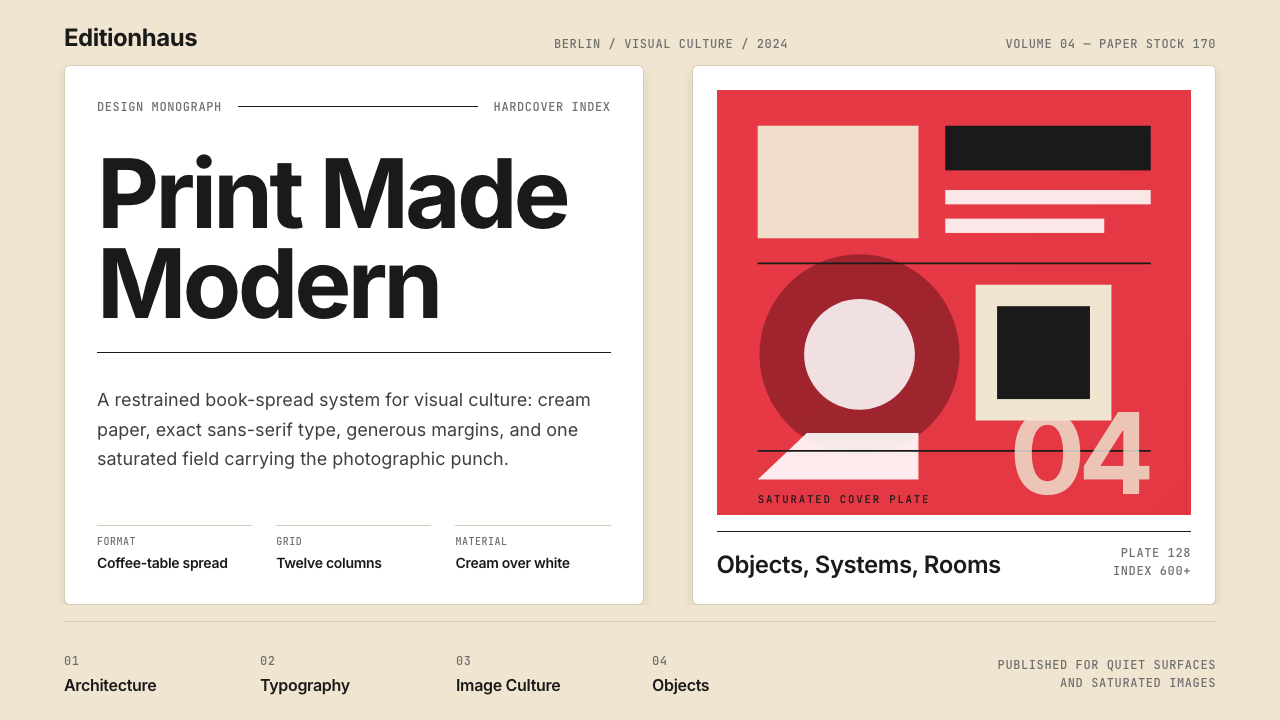 Gestalten Design BookCoffee-table calm. Cream paper, tight sans, one saturated block, and a strict…咖啡桌式冷静。奶油纸、紧凑无衬线、单一高饱和色块与严格网格。
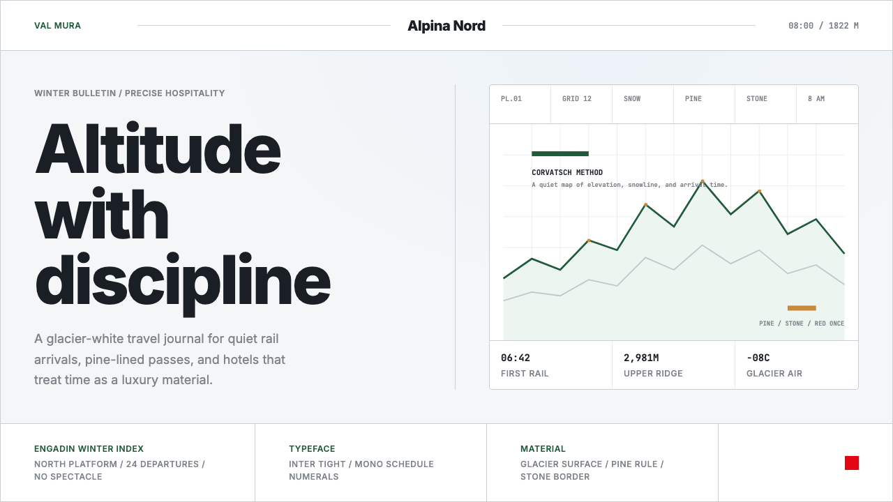 Swiss Alps GraubündenAlpine precision, restrained. Glacier white, pine rules, and tight Inter grid…阿尔卑斯式克制精确。冰川白、松绿线与紧排Inter构成静默网格。
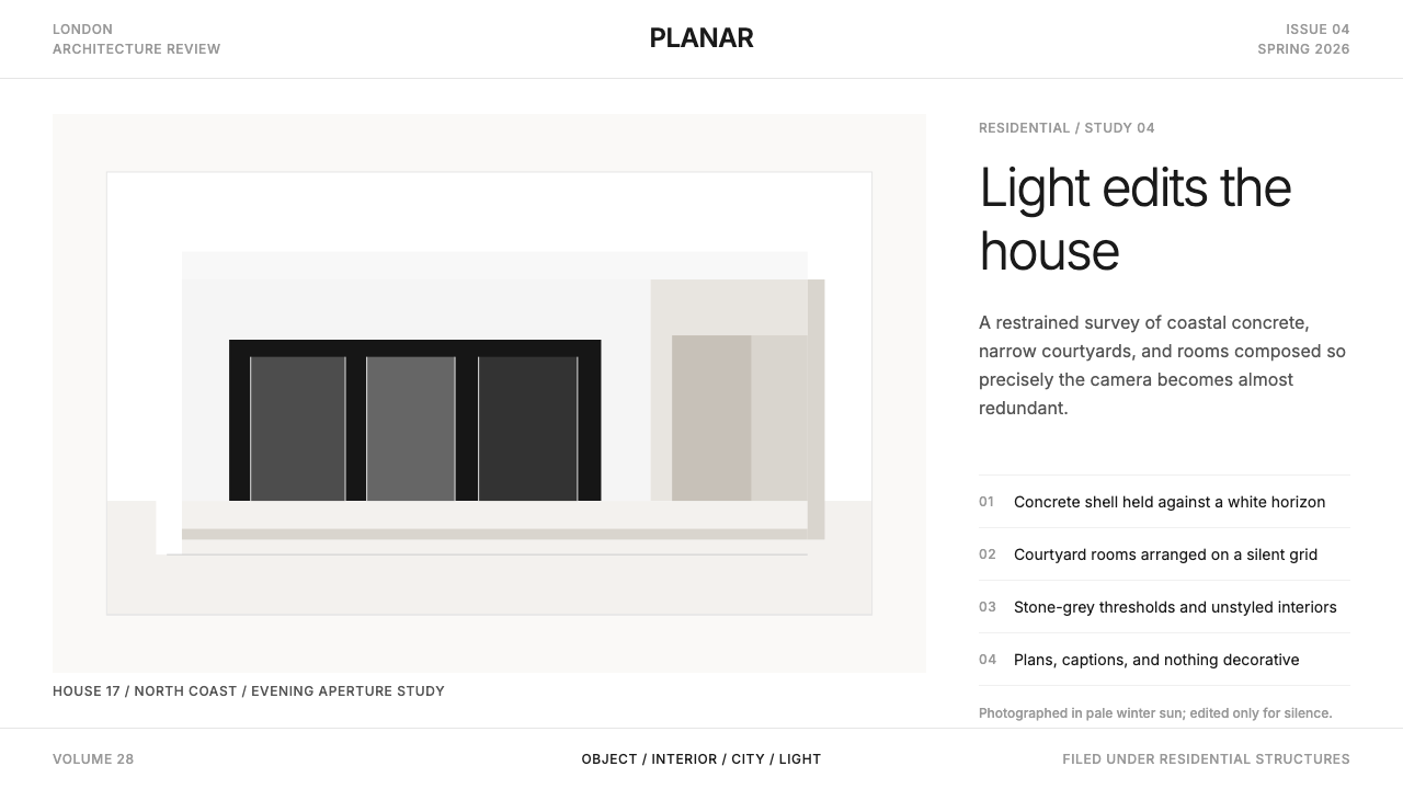
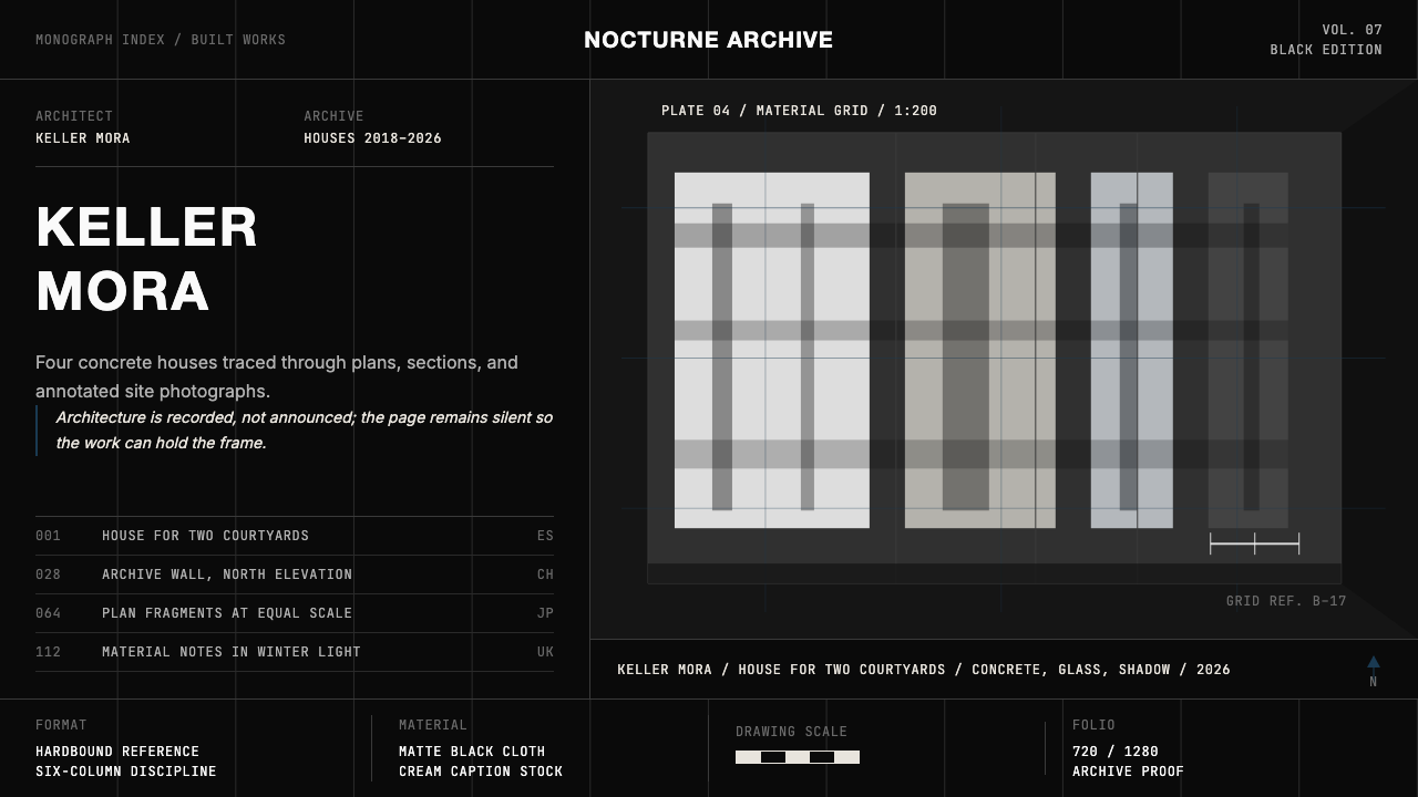 Architect Monograph (Black Edition)Architecture stays sovereign. Matte black, Helvetica caps, hairline grids, bl…建筑始终为主:哑光黑、Helvetica 大写、发丝网格与蓝图蓝。
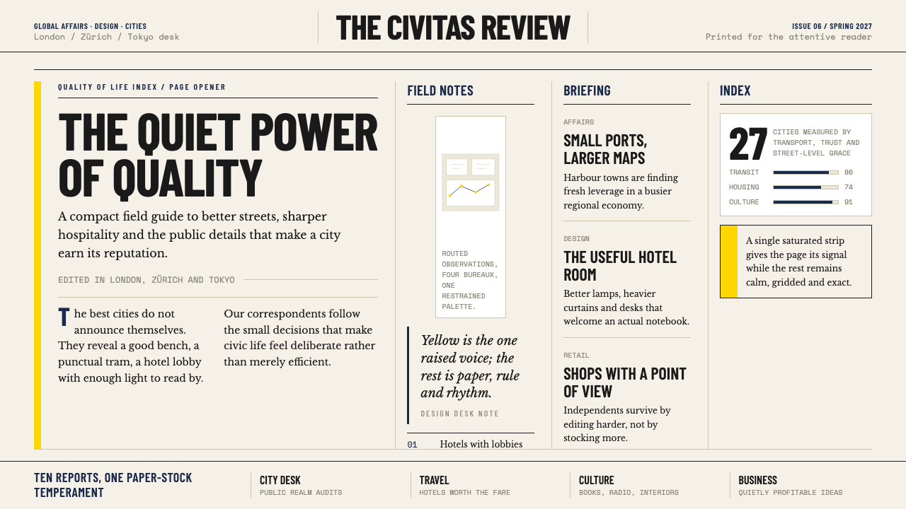 Monocle MagazineQuiet authority. Yellow spine, warm paper and dense ruled columns speak at li…安静的权威。黄色书脊、暖纸色与密集栏线,低声建立品味。
 Wallpaper* ArchitecturePhotography does the speaking. Gallery-white grid, Inter captions, and hairli…让摄影发声。画廊白网格、Inter 小标题与细线退后。
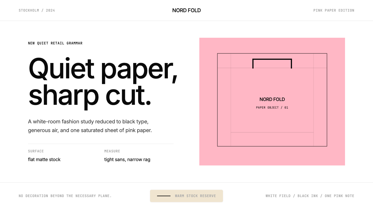 Acne Studios Pink-PaperQuiet luxury in one pink plane. Inter type floats on white with a bag-like re…粉色平面定义安静奢华:Inter 黑字漂浮于白场,像一只纸袋。