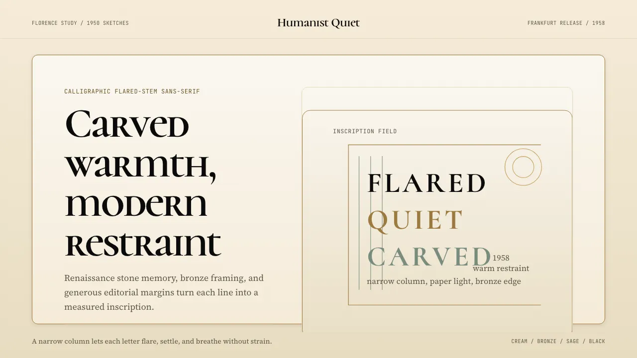
About Optima (Hermann Zapf, 1958)
Optima is the typeface that proves a sans-serif can carry two thousand years of calligraphic memory. Hermann Zapf studied Florentine stone inscriptions in Santa Croce, then drew letters whose stems flare like chiseled Roman capitals — no serifs, yet unmistakably humanist.
This system channels that same restraint: warm cream paper, polished bronze accents, and generous editorial margins that let each letterform breathe with monumental dignity.
- Origin
- Frankfurt, Germany
- Era
- 1950 sketches; 1958 Stempel release; luxury/memorial adoption 1960s–present
- Key figures
- Hermann Zapf · Gudrun Zapf-von Hesse · Maya Lin
- Movements
- post-WWII German typography · calligraphic-revival sans-serif · Renaissance inscription influence
Optima (Hermann Zapf, 1958) design spec
Colors
Background
Surface
Primary
Secondary
Accent
Text
Typography
Cormorant UnicaseHeadings
Source Serif 4Body
JetBrains MonoMono
Unlock for 1 credit
The other 11 sections — buttons, cards, spacing, motion, techniques and more — open once you unlock. Download the DESIGN.md or send it to your AI in one click. Unlock once, yours forever.
Sign up nowHave an account? Sign in
Styles similar to Optima (Hermann Zapf, 1958)
Also inspired by print & type, with a close feel.
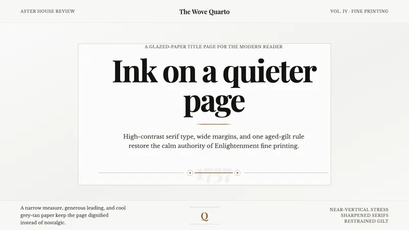 Baskerville Transitional SerifCalm authority in print. Glazed grey-tan paper, sharp serif contrast, one aged-gilt rule.
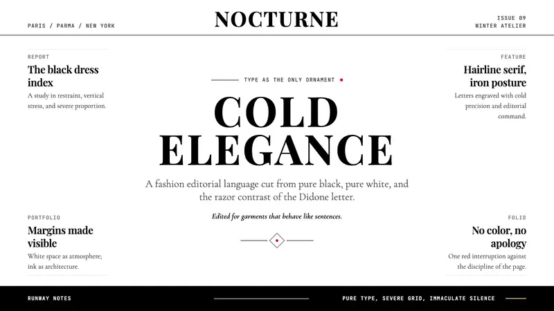 Vogue DidoneCold authority. Black-on-white Didone, red accent, and vast editorial whitespace.
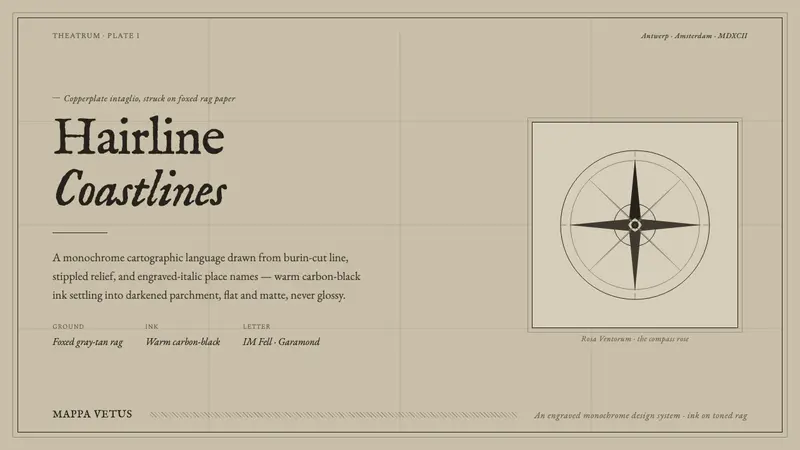 Engraved Monochrome MapThe gravity of an old printed sheet. Warm carbon-black ink on foxed rag paper, hairline coastlines.
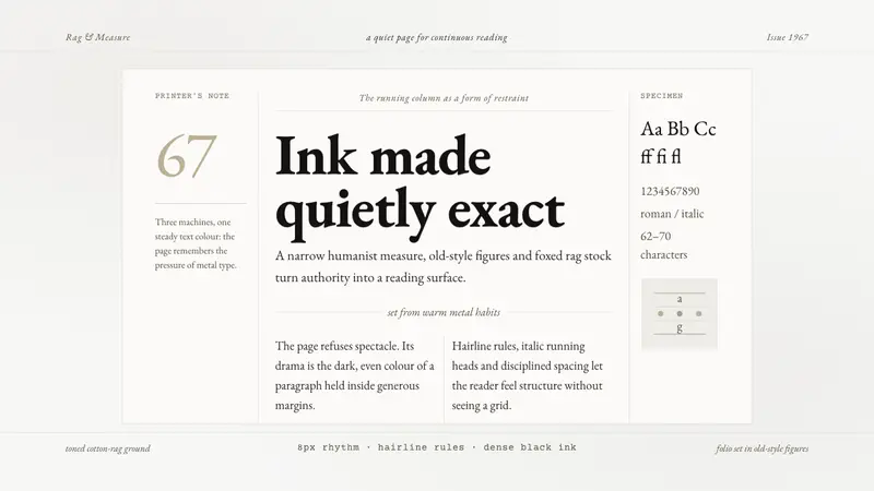 Sabon by Jan TschicholdQuiet authority in print. Dense black Garamond rests on foxed grey-tan rag paper.