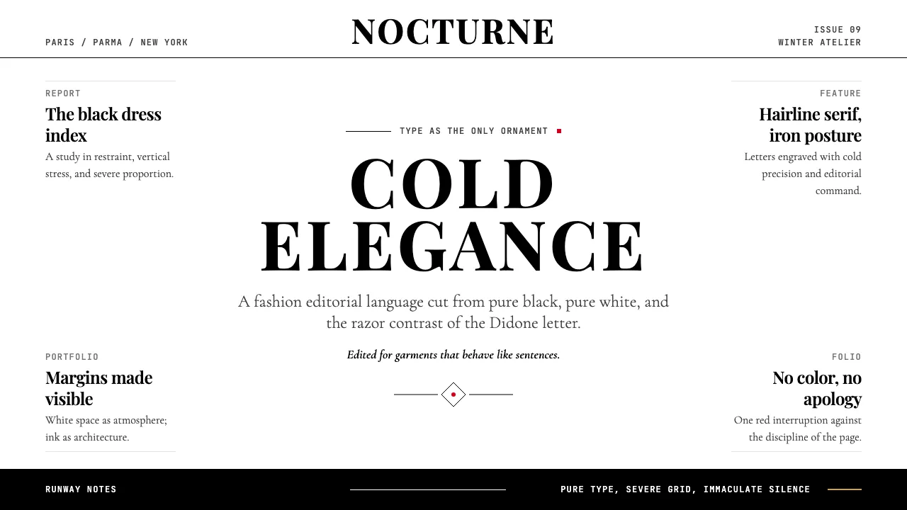
About Vogue Didone
The Didone typeface — born simultaneously in 1780s Paris and Parma — is the typographic signature of luxury. Its extreme thick-thin contrast, vertical stress, and unbracketed hairline serifs create an atmosphere of cold, precise elegance that fashion editorial has claimed as its own for over a century.
Vogue adopted the Didone register in 1908 with Pat O'Hara's logotype, and under M.F. Agha's art direction the magazine cemented high-contrast serif as the visual code for "fashion authority." This system distills that code into a digital design language: pure black on pure white, generous editorial whitespace, and type as the sole decoration.
- Origin
- Paris (Didot), Parma (Bodoni); editorial application in NYC, Paris, Milan, London
- Era
- Typeface origin 1780s; Vogue adoption 1908; Didone-led editorial dominance 1920s–present
- Key figures
- Firmin Didot · Giambattista Bodoni · Pat O'Hara · M.F. Agha
- Movements
- Didone neoclassicism · luxury fashion editorial · modernist typography
Vogue Didone design spec
Colors
Typography
The other 11 sections — buttons, cards, spacing, motion, techniques and more — open once you unlock. Download the DESIGN.md or send it to your AI in one click. Unlock once, yours forever.
Sign up nowStyles similar to Vogue Didone
Also inspired by print & type, with a close feel.
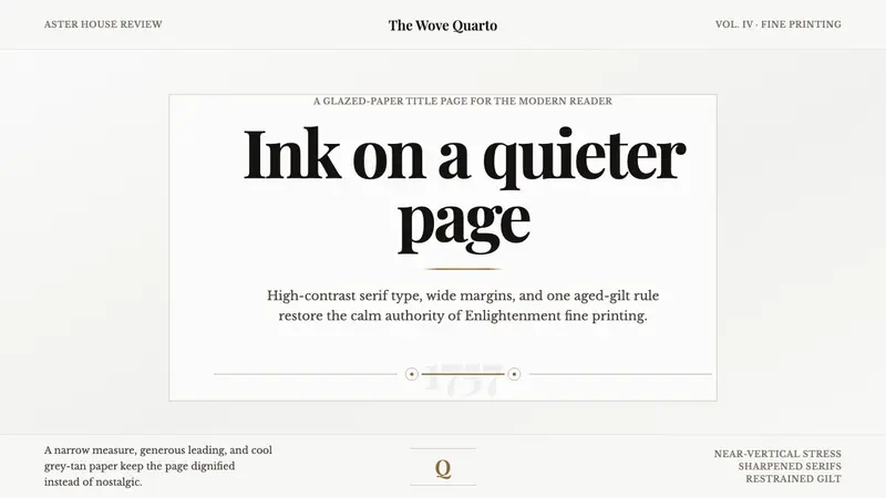 Baskerville Transitional SerifCalm authority in print. Glazed grey-tan paper, sharp serif contrast, one aged-gilt rule.
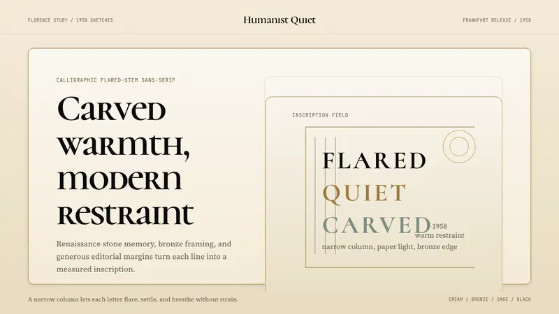 Optima (Hermann Zapf, 1958)Calligraphic calm, cut in cream and bronze. Narrow margins let the letters breathe.
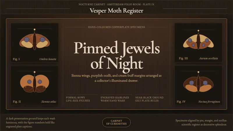 Cramer Exotic MothsJewel-like precision. Sienna specimens glow in formal rows on a near-black plate.
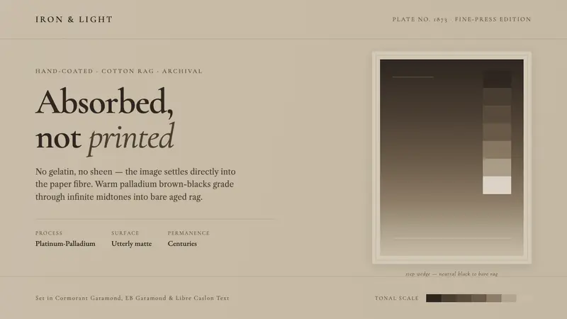 Platinum-Palladium PrintAbsorbed, not printed. Warm palladium brown-blacks grade into aged cotton-rag taupe, utterly matte.