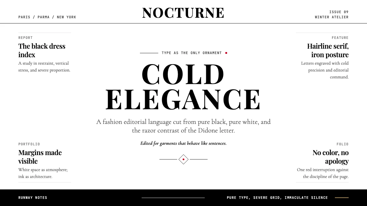
关于 Vogue Didone
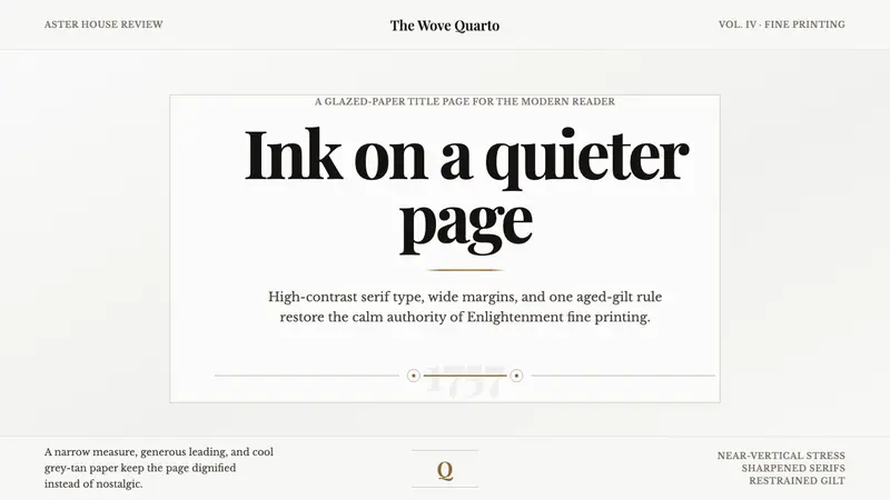
迪多尼体诞生于18世纪80年代的巴黎与帕尔马——它是奢侈品的排版符号。极端的粗细对比、垂直重心与无托架的发丝衬线,构成了一种冷峻而精确的优雅,百余年来被时尚编辑视为专属视觉语言。
1908年,帕特·奥哈拉为《Vogue》设计的标志字体确立了迪多尼在时尚杂志中的统治地位。在阿格哈的艺术指导下,高对比度衬线体成为"时尚权威"的视觉密码。本设计系统将这一传统凝练为数字化设计语言:纯黑纯白、慷慨的编辑留白、以字体本身作为唯一装饰。
- 来源
- 法国巴黎(迪多)、意大利帕尔马(博多尼);时尚编辑应用中心:纽约、巴黎、米兰、伦敦
- 年代
- Typeface origin 1780s; Vogue adoption 1908; Didone-led editorial dominance 1920s–present
- 代表人物
- Firmin Didot · Giambattista Bodoni · Pat O'Hara · M.F. Agha
- 所属运动
- Didone neoclassicism · luxury fashion editorial · modernist typography
Vogue Didone 的设计规格
和 Vogue Didone 相似的风格
同样来自印刷与字体,气质相近。