What is Vogue Didone?什么是 Vogue Didone?
Vogue Didone turns the extreme thick-thin contrast of eighteenth-century type into the coldest, most authoritative silence in luxury editorial.Vogue Didone 将十八世纪迪多尼体的极端粗细对比,凝练为奢侈品编辑领域最冷峻、最具权威感的沉默。
Vogue Didone in briefVogue Didone 速览
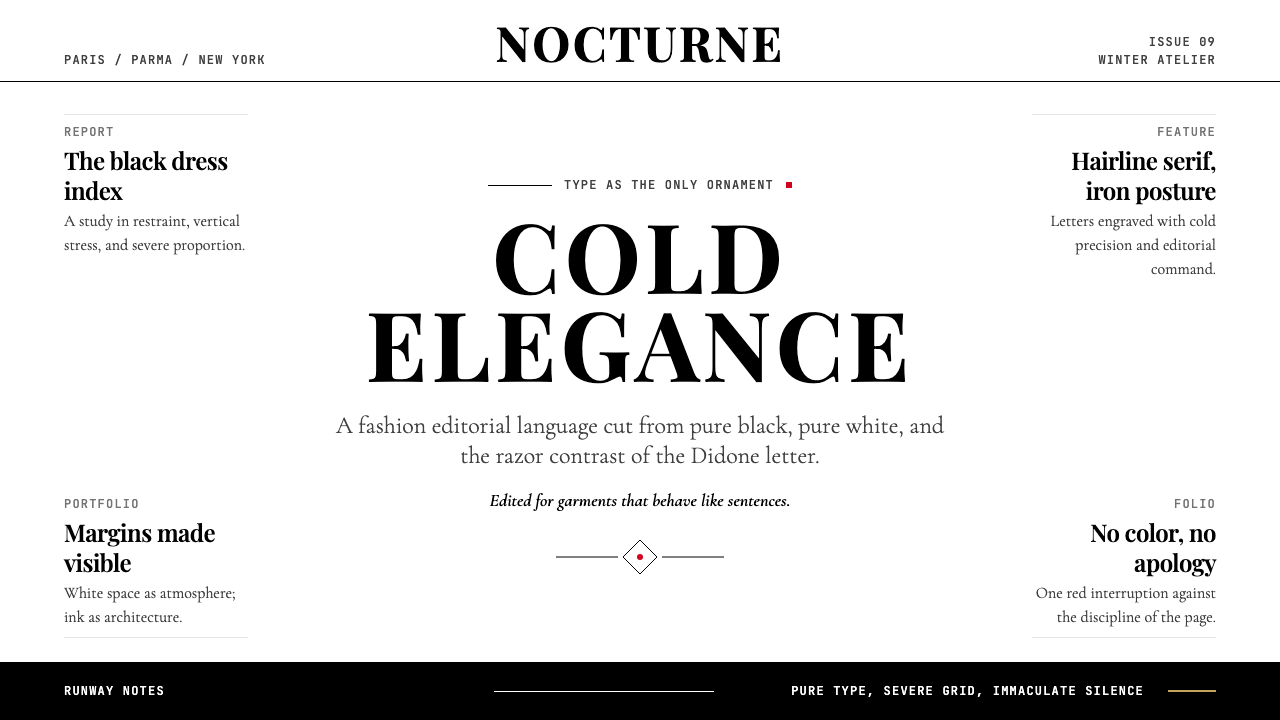
Vogue Didone is a typographic design system built entirely around the visual logic of the Didone typeface family — the group of high-contrast serifs that emerged in France and Italy in the 1780s and that fashion publishing has claimed as its own visual signature for more than a century. Its palette is reduced to near-absolute terms: pure black on pure white, with a single accent color — typically a sharp, cool red — used sparingly as a punctuation mark rather than a decorative field. Whitespace is not padding; it is the primary compositional material.Vogue Didone 是一套完全围绕迪多尼字体家族视觉逻辑构建的排版设计系统。迪多尼体是一组高对比度衬线字体,诞生于十八世纪八十年代的法国和意大利,百余年来被时尚出版业视为专属视觉符号。它的色板被简化至近乎绝对的程度:纯黑纯白,以单一强调色——通常是一种尖锐而冷峻的红色——作为标点符号般的点睛之笔,而非装饰性色块。留白不是间距,它是最主要的构图材料。
The system's defining quality is cold precision. Unlike historically warm or handcrafted editorial styles, Vogue Didone withholds all softness: no gentle gradients, no warm paper tones, no illustrative flourishes. Every element is either fully present or fully absent. A headline set in a Didone face at large scale occupies the layout with the weight of a formal declaration; the body text that follows retreats to near-invisibility by comparison. This tension between typographic scale extremes is the system's central aesthetic act.这套系统最鲜明的特质是冷峻的精确。与历史上温暖或手工感的编辑风格不同,Vogue Didone 拒绝一切柔软:没有轻柔的渐变,没有暖调纸面,没有插图式的花饰。每个元素要么完全存在,要么完全缺席。一个以迪多尼字体大字号排列的标题,以正式宣言般的分量占据版面;随之而来的正文则相形之下几近隐形。这种排版尺度的极端张力,是这个系统核心的美学行为。
Understood correctly, Vogue Didone is not a layout style with a Didone font dropped in — it is a philosophy about where authority comes from. In this system, authority is typographic. The letterform itself — its hairline serifs, its vertical stress axis, its dramatic modulation from thick stroke to almost-nothing — is the sole decoration. Everything else steps back to let the type speak at full volume.正确理解 Vogue Didone,它并非一种加入迪多尼字体的版式风格,而是一种关于权威从何而来的哲学。在这套系统中,权威是字体性的。字形本身——发丝般的衬线、垂直重心轴、从粗笔画到近乎虚无的戏剧性调制——就是唯一的装饰。其他一切都退后一步,让字体以全部音量发声。
Where does Vogue Didone come from?Vogue Didone 从何而来?
The Didone typeface genre takes its name from a portmanteau of Didot and Bodoni — the two families whose near-simultaneous development in the 1780s defined the category. In Paris, Firmin Didot refined the transitional serifs inherited from his family's earlier work into something far more extreme: strokes modulated with mechanical precision, serifs reduced to unbracketed horizontal hairlines, and a stress axis turned almost perfectly vertical. At almost exactly the same time, working in Parma under the patronage of the Duke of Parma, Giambattista Bodoni arrived at a remarkably parallel solution through different means — a letterform of operatic contrast, designed with the perfection of a mathematical instrument but carrying the emotional weight of Italian Baroque architecture. Both men were working in the same cultural moment: the Neoclassical turn away from Rococo warmth toward rational, geometric order.迪多尼字体流派的名称,来自迪多(Didot)与博多尼(Bodoni)两个家族名称的合并——这两个在十八世纪八十年代几乎同时发展起来的字体家族共同定义了这一门类。在巴黎,菲尔曼·迪多将家族早期作品中承继的过渡性衬线体推向极致:笔画以机械般的精确度调制,衬线简化为无托架的水平发丝线,重心轴几乎完全垂直。几乎在同一时期,在帕尔马公爵的资助下工作的詞扬巴蒂斯塔·博多尼,通过不同的路径抵达了高度相似的解答——一种具有歌剧式对比的字形,以数学仪器般的完美度设计,却承载着意大利巴洛克建筑般的情感分量。两位设计师都身处同一文化时刻:新古典主义从洛可可的温暖转向理性的几何秩序。
The industrial era that followed made Didone type ubiquitous. The extreme contrast that made these faces unsuitable for certain printing conditions also made them spectacular for display use — on playbills, fashion almanacs, and the new illustrated press of the nineteenth century. By the time the modern fashion magazine emerged in the late nineteenth and early twentieth centuries, Didone was already the typographic register of luxury: its sharp geometry implied precision, its high contrast implied drama, and its vertical stress implied the erect posture of aristocratic bearing.随后到来的工业时代使迪多尼体无处不在。这类字体极端的对比度在某些印刷条件下是劣势,在展示性用途上却极为壮观——无论是戏剧节目单、时尚年鉴,还是十九世纪新兴的图文报刊。到了十九世纪末、二十世纪初现代时尚杂志诞生之际,迪多尼体已经是奢侈品的字体语域:尖锐的几何感意味着精确,高度对比意味着戏剧性,垂直重心则暗示着贵族般笔挺的姿态。
The specific link between Didone and the fashion magazine as a form was forged at Vogue. In 1908, Pat O'Hara designed the logotype that would define the publication's visual identity for generations — a high-contrast serif wordmark whose thick-thin drama became instantly synonymous with fashion authority. The deeper transformation came in the 1930s under M.F. Agha, Condé Nast's art director, who moved the magazine's internal typography decisively toward a Didone-led system in which the contrast of the letterform did the work that color or decoration might have done elsewhere. The editorial whitespace Agha introduced — generous margins, wide leading, restrained use of illustration — gave the Didone type room to radiate its particular atmosphere of cold luxury.迪多尼与时尚杂志这一媒体形式之间的具体联结,在《Vogue》确立。1908年,帕特·奥哈拉设计了这本杂志的标志字体——一个粗细对比鲜明的衬线字母标识,其厚薄之间的张力几乎立刻成为时尚权威的同义词。更深层的转变发生在1930年代,康泰纳仕集团艺术总监阿格哈(M.F. Agha)将杂志的内部排版明确推向以迪多尼为主导的系统——在这套系统中,字形本身的对比承担了色彩或装饰在其他地方可能承担的功能。阿格哈引入的编辑留白——慷慨的页边距、宽松的行距、对插图的克制使用——给予迪多尼字体足够的空间,辐射出那种特有的冷峻奢华氛围。
This typographic tradition extended through the twentieth century across the major fashion capitals. Paris, Milan, London, and New York each developed their own inflection of the high-contrast serif editorial, but the underlying system remained consistent: black type, white ground, minimal color, and maximum typographic contrast. By the time digital design tools made it possible to apply these principles to screen-based interfaces, the Didone editorial register had accumulated over a century of cultural association with luxury, precision, and editorial authority — an association that transferred intact into digital product design.这一排版传统在二十世纪贯穿了各大时尚之都。巴黎、米兰、伦敦和纽约各自发展出高对比度衬线编辑体的独特变奏,但底层系统始终如一:黑色字体、白色底面、极少的色彩、最大程度的字体对比。当数字设计工具使这些原则得以应用于屏幕界面时,迪多尼编辑体已经积累了超过一个世纪与奢侈品、精确感和编辑权威的文化关联——而这种关联完整地转移进了数字产品设计之中。
What defines the Vogue Didone look?Vogue Didone 的视觉特征是什么?
Typographic Contrast字体对比
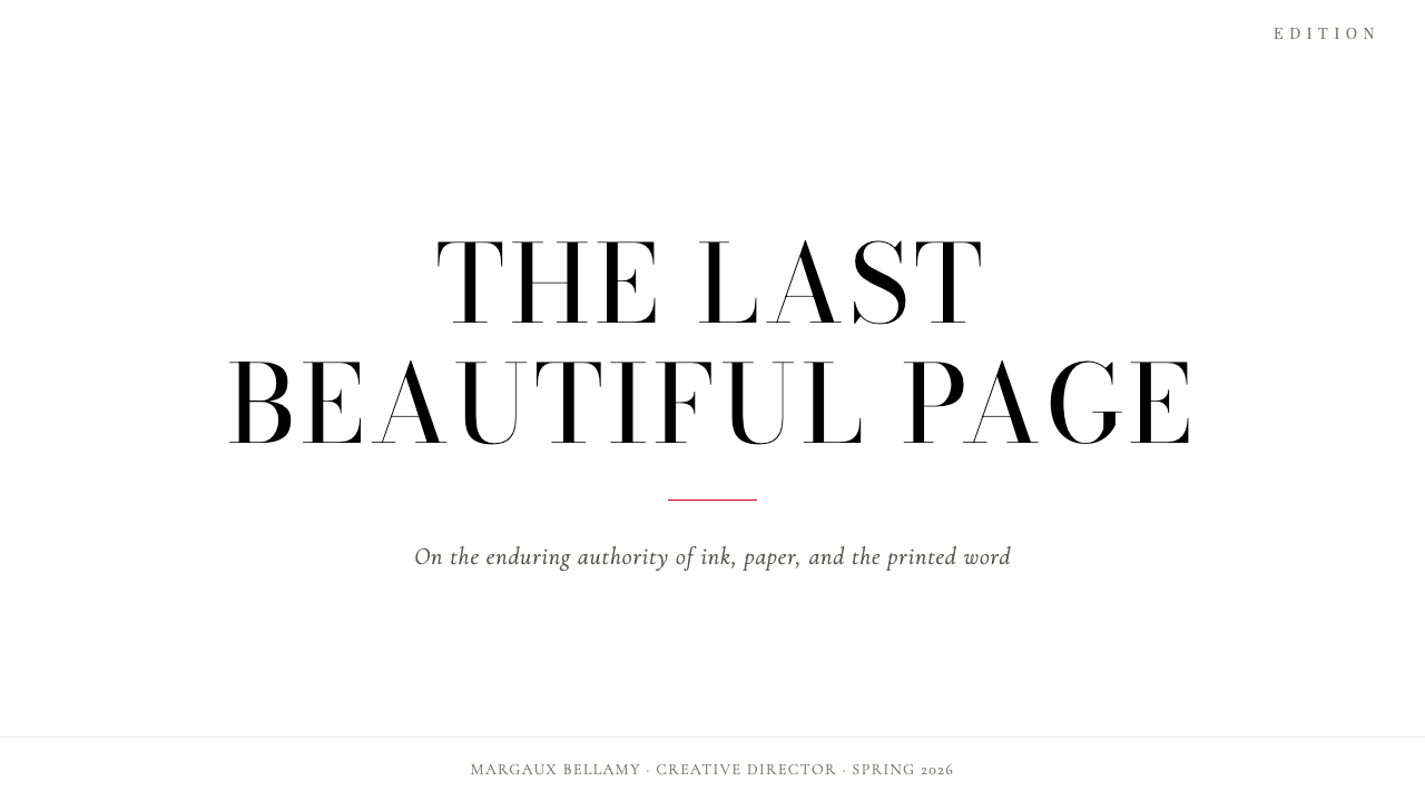
The system's visual engine is the extreme thick-thin modulation of Didone letterforms. The thickest strokes of a capital letter can be many times the weight of its thinnest hairlines, creating a drama unmatched in any other serif tradition. This contrast is not a stylistic choice within the system — it is the system. Scale amplifies the effect: setting a Didone face at large display sizes makes the contrast nearly sculptural, each letter a study in tension between mass and void.这套系统的视觉引擎,是迪多尼字形极端的粗细调制。一个大写字母最粗的笔画,可以是最细发丝的数倍之重,创造出任何其他衬线传统都无法匹敌的张力。这种对比在系统内不是一种风格选择——它就是这个系统本身。字号放大会强化这种效果:将迪多尼字体排在大尺寸展示字号时,对比感近乎雕塑性,每个字母都是关于实与虚之间张力的研究。
Black-and-White Discipline黑白纪律
The foundational palette is absolute: pure black type on pure white ground. This is not a preference for light colors but a structural commitment — the chromatic neutrality of the ground is what allows the typographic contrast to operate at full intensity. Introducing warm off-whites or cool grays softens the effect considerably; this system demands the hardest possible ground against which its type can assert itself.基础色板是绝对的:纯黑字体置于纯白底面。这不是对浅色的偏好,而是一种结构性承诺——底面的色彩中立,正是让字体对比以最强烈度运作的前提。引入暖调的米白或冷调的灰色会显著柔化这种效果;这套系统需要最坚硬的底面,让字体在其上充分显现自身。
Editorial Whitespace编辑留白
Generous margins and deliberate negative space are not the absence of design — they are its primary material. The whitespace that surrounds a Didone headline is as compositionally active as the headline itself; it creates the silence that makes the type feel declarative rather than communicative. Crowding the space destroys the system's atmosphere completely. When in doubt, the correct move is always more white.慷慨的页边距与刻意的负空间,不是设计的缺席,而是它最主要的材料。围绕迪多尼标题的留白,与标题本身一样在构图上具有能动性;它制造出一种沉默,使字体感觉像宣言而非陈述。压缩这种空间会彻底摧毁这套系统的氛围。当不确定时,正确的选择永远是更多的白。
Vertical Stress and Upright Axis垂直重心与直立轴线
Didone letterforms carry their weight along a nearly perfect vertical axis, unlike the diagonal stress of earlier Old Style and Transitional types. This vertical orientation imparts a quality of formal uprightness — posture, in a physical sense — that distinguishes the style from more relaxed editorial approaches. The letters stand at attention. Combined with unbracketed hairline serifs, this axis reinforces the system's cold, geometric authority.迪多尼字形沿着近乎完美的垂直轴线分配笔画重量,不同于早期旧式体与过渡体的斜向重心。这种垂直取向赋予字体一种正式的挺拔感——在生理意义上是一种姿态——将这种风格与更为轻松的编辑方式区别开来。字母仿佛立正站立。与无托架的发丝衬线相结合,这条轴线强化了系统冷峻而几何性的权威感。
Single Accent Color单一强调色
Where color enters the system at all, it arrives as a single, precisely placed accent — most often a sharp, cool red whose function is punctuation rather than decoration. It might mark a folio, underline a key phrase, or signal an action state in a digital interface. Its power comes entirely from scarcity: the moment a second accent color joins it, both colors lose their authority. The red survives only while it remains alone.色彩一旦进入这套系统,就以单一、精确放置的强调色形式出现——通常是一种尖锐而冷峻的红色,其功能是标点符号而非装饰。它可能用来标注页码、为关键短语添加下划线,或在数字界面中标示动作状态。它的力量完全来自稀缺性:一旦第二种强调色加入,两种色彩都会失去权威。红色只有在独处时才能保持其效力。
Type as Sole Decoration字体即唯一装饰
In authentic Vogue Didone work, there is no illustrative ornament, no decorative border, no geometric motif used for visual richness. The letterform itself — in its drama, its contrast, its scale — is the visual event. Any additional decorative element competes with what the type is already doing and weakens the system. Thin rules used as structural dividers are permissible; anything more elaborate is a concession.在真正的 Vogue Didone 作品中,没有插图式装饰,没有装饰性边框,没有用于丰富视觉的几何母题。字形本身——以其张力、对比与尺度——就是视觉事件。任何附加的装饰元素都会与字体已经在做的事情形成竞争,并削弱整个系统。用作结构性分割线的细线条是可以允许的;任何更复杂的东西都是一种妥协。
Scale Hierarchy Over Color Hierarchy以尺度建立层级而非色彩
Information hierarchy in this system is established almost entirely through scale and weight — the difference between a large, heavy headline and small, light body text can span a vast range, and it is this range that organizes the reader's attention. Color is not used to mark hierarchy; it is reserved for the single-accent function described above. This means that the typographic scale must be considered and deliberate, not arrived at by default.在这套系统中,信息层级几乎完全通过尺度与字重建立——大而厚重的标题与小而纤细的正文之间的差距可以跨越极大的区间,正是这个区间组织着读者的注意力。色彩不用于标示层级,它被保留给上述的单一强调功能。这意味着排版的尺度必须是深思熟虑的,而非默认得到的结果。
Who shaped Vogue Didone?谁塑造了 Vogue Didone?
Firmin Didot was the French punchcutter and publisher who, working in Paris in the 1780s and 1790s, pushed the modulation of the Latin serif to its rational extreme. His letterforms — with their almost mechanical thick-thin contrast and their horizontal, unbracketed hairline serifs — represented the culmination of the Neoclassical typographic project: a letterform that looked as though it had been derived by geometric principle rather than carved from living tradition. The typefaces that bear his family's name became the standard of French luxury printing and remain the reference point for the entire Didone category.菲尔曼·迪多是法国铸字师与出版商,在十八世纪八十至九十年代的巴黎工作期间,将拉丁衬线体的笔画调制推向理性的极致。他的字形——以近乎机械的粗细对比和水平无托架的发丝衬线为特征——代表了新古典主义排版计划的顶点:一种看起来像是由几何原则推导而非从活的传统中雕凿出来的字形。以其家族姓名命名的字体成为法国奢侈品印刷的标准,并至今仍是整个迪多尼门类的参照基准。
Working in Parma under the patronage of the Duke of Parma from 1768 onward, Giambattista Bodoni arrived at a parallel solution to Didot's through a distinctly Italian sensibility — more operatic in its contrast, more luxurious in its spacing, and perhaps more emotionally present despite its formal severity. His Manuale Tipografico, published posthumously in 1818, is among the most beautiful books of type specimens ever produced. Bodoni's name became synonymous with a particular ideal of typographic grandeur that fashion publishing would inherit wholesale.詞扬巴蒂斯塔·博多尼自1768年起在帕尔马公爵的赞助下工作,以鲜明的意大利感性抵达了与迪多平行的解答——对比更具歌剧性,间距更为奢华,尽管形式上严峻,情感却更加在场。他的《排印手册》(Manuale Tipografico)于1818年身后出版,是有史以来最美丽的字体样本书之一。博多尼的名字成为排版宏大理想的同义词,而时尚出版业将整体继承了这一理想。
Pat O'Hara designed the Vogue logotype in 1908, establishing the high-contrast Didone wordmark that would anchor one of the most recognizable visual identities in magazine history. The decision to set the publication's name in a Didone face — rather than the more common display types of the period — was a declaration about the magazine's position: precision, authority, and the cold beauty of the perfectly formed letter as the visual signature of fashion itself.帕特·奥哈拉于1908年设计了《Vogue》的标志字体,以这个高对比度迪多尼字母标识,奠定了杂志史上最具辨识度的视觉身份之一。用迪多尼字体——而非当时更为常见的展示字体——排列刊名这一决定,是对杂志立场的一次宣示:精确、权威,以及完美成形的字母所具有的冷峻之美作为时尚本身的视觉签名。
Mehmed Fehmy Agha served as art director for Condé Nast publications — including Vogue — from 1929 to 1943, and it was under his direction that the high-contrast Didone editorial system reached its mature form. Agha introduced generous whitespace, disciplined typographic hierarchy, and the restrained use of photography that became the template for luxury editorial design throughout the mid-twentieth century. His work demonstrated that the Didone typeface family, given adequate space and typographic discipline, was sufficient to carry an entire visual identity without the support of decorative elements.穆罕默德·费赫米·阿格哈(M.F. Agha)于1929年至1943年间担任康泰纳仕出版集团(包括《Vogue》)的艺术总监,正是在他的指导下,高对比度迪多尼编辑系统达到了成熟形态。阿格哈引入了慷慨的留白、严谨的排版层级以及对摄影的克制使用,这一套方法论成为整个二十世纪中期奢侈品编辑设计的模板。他的工作证明:给予足够的空间与排版纪律,迪多尼字体家族本身就足以承载整个视觉身份,无需装饰性元素的支撑。
How do you use Vogue Didone today?今天怎么用 Vogue Didone?
Vogue Didone translates directly and powerfully into presentation design, but it requires a discipline that most slide software defaults actively resist. The cover slide should be treated as a fashion editorial spread: the title set large in a high-contrast serif, positioned with deliberate asymmetry against a pure white or pure black ground, with no background imagery, no badge or logo cluttering the lower corners, and no decorative frame. The title is the image. Interior content slides must honor the same whitespace logic — one idea per slide, type sized to fill the available space confidently, and any supporting copy set small and subordinate enough that it does not compete with the headline.Vogue Didone 在演示设计中的转化既直接又有力,但它需要一种大多数幻灯片软件的默认设置会主动抵制的纪律。封面页应当被当作时尚编辑跨页来处理:标题以高对比度衬线字体排得宽大,以刻意的非对称方式置于纯白或纯黑底面,没有背景图像,没有徽标或徽章杂乱于角落,没有装饰性边框。标题本身就是图像。内容幻灯片必须遵守同样的留白逻辑——每页一个概念,字号大到足以自信地填满可用空间,任何支持性文字都要足够小、足够从属,以至于不与标题产生竞争。
Data slides present a particular opportunity within this system. Charts and graphs rendered in monochrome — all bars in black, all lines in black, with a single data series highlighted in the system's red accent — acquire an analytical authority that color-coded charts rarely achieve. The key is treating the chart as a typographic element rather than an infographic: label axes directly in the same typeface as the body copy, remove gridlines that do not carry information, and let the shape of the data speak in high contrast against the white field.数据幻灯片在这套系统中提供了独特的机会。以单色渲染的图表——所有柱条为黑色,所有折线为黑色,仅以系统的红色强调色高亮单一数据系列——获得了彩色编码图表鲜少能达到的分析权威感。关键在于将图表视为排版元素而非信息图形:用与正文相同的字体直接标注坐标轴,删除不承载信息的网格线,让数据的形态在白色底面上以高对比度自行陈述。
For web interfaces, Vogue Didone is best deployed in contexts where the product's positioning depends on communicating exclusivity, authority, or refined taste: luxury e-commerce, high-end service landing pages, premium editorial platforms, and pricing pages for products at the upper end of their market. In these contexts, the correct approach is to resist the temptation to soften the system for screen — the coldness is the message. Keep the background white, the type black, and the interactive accent color to one. Card components should have crisp borders rather than soft shadows; hover states should shift the accent color, not introduce new visual complexity.对于网页界面,Vogue Didone 最适合部署在产品定位依赖于传达独特性、权威感或精致品味的场景中:奢侈品电子商务、高端服务落地页、高级编辑平台,以及市场高端产品的定价页面。在这些场景中,正确的做法是抵制为屏幕柔化系统的诱惑——冷峻感本身就是信息。保持背景为白色,字体为黑色,交互强调色只用一种。卡片组件应有清晰的边框而非柔和阴影;悬停状态应切换强调色,而非引入新的视觉复杂度。
In editorial and marketing applications, the system's poster-like directness becomes a significant advantage. A marketing email built on Vogue Didone principles — large Didone headline, minimal body copy set in a contrasting small scale, and a single link or button in the accent color — will read with far more force than one built around imagery and decorative elements. The same logic applies to social media assets: the system's high contrast reproduces well at small sizes and across varied screen conditions, making it more durable than softer, texture-dependent approaches.在编辑与营销应用中,这套系统海报般的直接性成为一个显著优势。一封基于 Vogue Didone 原则构建的营销电子邮件——大号迪多尼标题、以对比鲜明的小字号排列的精简正文、单一强调色的链接或按钮——将以远超图像与装饰元素堆砌版本的力量被阅读。同样的逻辑适用于社交媒体资产:这套系统的高对比度在小尺寸下和多种屏幕条件下都有良好的再现性,使其比更柔和、依赖质感的方式更具耐久性。
The most common failure mode when applying Vogue Didone is confusing restraint with emptiness. Designers who have not internalized the system's logic often add elements — a secondary typeface for warmth, a background texture for richness, a second accent color for variety — at precisely the moments when the correct choice is to hold the line and trust the whitespace. Each addition slightly dilutes the cold authority that the system depends on, and the cumulative effect is a layout that looks like an imitation of luxury rather than the thing itself. The discipline is to treat every element not yet present as already removed for good reason.应用 Vogue Didone 时最常见的失败模式,是将克制与空洞混淆。尚未内化这套系统逻辑的设计师,往往在最需要坚守阵地并信任留白的时刻,开始添加元素——用第二种字体带来温度,用背景纹理带来丰富感,用第二种强调色带来变化。每一次添加都会轻微稀释这套系统所依赖的冷峻权威,累积效果是一个看起来像是对奢侈品的模仿而非奢侈品本身的版面。这种纪律在于:将每一个尚未出现的元素视为已经被充分理由移除的东西。
Vogue Didone — FAQVogue Didone · 常见问题
Is Vogue Didone suitable for dark-background interfaces?Vogue Didone 适合深色背景界面吗?
The historic Didone editorial tradition is definitively light-ground: pure black on pure white was the canonical form, and the system's energy derives from this reversal of the natural reading condition. A dark inversion is possible — white Didone type on a black ground carries genuine drama — but it changes the emotional register from cold authority to something closer to theatrical menace. The accent color must be reconsidered for the dark ground: a warm red that works crisply on white can feel aggressive or unstable on black, and a cooler red or no accent at all may serve better. The dark variant is a legitimate creative choice, not a compromise, but it should be approached as a different application of the principles rather than a simple inversion.迪多尼编辑传统的历史形态明确是浅色底面的:纯黑字体置于纯白底面是经典形态,系统的能量来自于对自然阅读条件的这种颠倒。深色反转是可行的——白色迪多尼字体在黑色底面上承载着真实的戏剧性——但它会将情感语域从冷峻权威转变为更接近剧场式压迫感的东西。强调色必须针对深色底面重新考量:在白色底面上清晰有效的暖调红,在黑色底面上可能感觉具有攻击性或不稳定,较冷的红色或完全不使用强调色可能更为合适。深色变体是合理的创意选择而非妥协,但应当将其视为这些原则的不同应用,而非简单的反转。
How is Vogue Didone different from a generic luxury style?Vogue Didone 与一般的奢侈品风格有何不同?
Generic luxury design tends to rely on warm metallics, softened edges, ambient texture, and a palette drawn from natural precious materials — champagne, gold, cream, pale stone. Vogue Didone refuses all of this. It achieves luxury through severity rather than richness: the more it removes, the more authoritative it becomes. The test is whether a layout could appear in a mid-tier fashion publication with a few adjustments — if yes, it is not Vogue Didone but a softer variant. True Vogue Didone work has an almost uncomfortable coldness that only a few contexts can carry.一般的奢侈品设计倾向于依赖温暖的金属色、柔化的边缘、环境感质感,以及从天然贵重材料中提取的色板——香槟色、金色、奶油色、淡石色。Vogue Didone 拒绝一切这些。它通过严峻而非丰富来实现奢华感:去除得越多,就越具权威感。检验标准是:一个版面能否稍作调整就出现在中端时尚出版物中——如果可以,它就不是 Vogue Didone 而是更柔和的变体。真正的 Vogue Didone 作品具有一种几乎令人不适的冷峻感,只有极少数语境能够承载。
Can Vogue Didone include photography or imagery?Vogue Didone 可以包含摄影或图像吗?
Photography is compatible with the system, but only when treated with the same typographic discipline as everything else. Fashion editorial photography in the Didone tradition is high-contrast, often cropped to near-abstraction, and presented against a pure ground rather than integrated into a textured layout. The photograph should function as a shaped form within the composition — its placement and proportion governed by the same whitespace logic as the type. Lifestyle photography, textured product shots, and backgrounds with natural visual noise are all foreign to the system's logic and weaken it significantly.摄影与这套系统是相容的,但前提是以与其他一切相同的排版纪律处理。迪多尼传统中的时尚编辑摄影是高对比度的,通常被裁剪至接近抽象,置于纯净底面而非融入纹理化版面。摄影应当作为构图中的一个形态发挥作用——其位置与比例受到与字体相同的留白逻辑的支配。生活方式摄影、带质感的产品图,以及具有自然视觉噪音的背景图像,都与这套系统的逻辑格格不入,并会显著削弱它。
What kinds of products or brands should avoid this style?哪些类型的产品或品牌应该避免这种风格?
Vogue Didone is poorly suited to any context where warmth, approachability, or human connection is a core brand value. Children's products, food and beverage brands, wellness and health applications, community platforms, and consumer products competing primarily on friendliness or affordability will all be misrepresented by this system's cold authority. The style communicates distance — intentionally — and that distance is appropriate only when the product's value proposition is enhanced rather than undermined by formality and precision. Using it outside these conditions does not merely fail aesthetically; it actively signals the wrong relationship between the brand and its audience.Vogue Didone 不适合任何将温度感、亲切感或人际联结作为核心品牌价值的场景。儿童产品、食品饮料品牌、健康与养生应用、社区平台,以及主要在友好感或亲民价格上竞争的消费品,都会被这套系统的冷峻权威所错误表达。这种风格传达距离感——这是刻意的——而只有当产品的价值主张因正式感与精确性而得到强化而非削弱时,这种距离才是恰当的。在这些条件之外使用它,不仅仅是美学上的失败,它还会主动发出品牌与受众之间错误关系的信号。
How do you apply Vogue Didone without it looking dated or overly editorial?如何应用 Vogue Didone 而不显得过时或过于编辑感?
The risk of a dated appearance arises when designers faithfully reproduce the surface markers of 1920s–1940s fashion editorial — period-specific decorative rules, particular column structures, a pastiche relationship with the original material — rather than applying the underlying principles. Vogue Didone updated for contemporary digital contexts uses the same typographic logic — extreme contrast, disciplined whitespace, cold palette, single accent — but at the proportions and interaction patterns native to screens. The scale of type changes; the principle does not. A pricing table that applies this system correctly will not look like a magazine page — it will look like itself, organized by the same values.过时外观的风险出现在设计师忠实再现1920至1940年代时尚编辑的表面标志——特定时期的装饰性线条、特定栏目结构、对原始材料的仿古式处理——而非应用底层原则时。针对当代数字语境更新的 Vogue Didone,使用相同的排版逻辑——极端对比、严谨留白、冷峻色板、单一强调——但以屏幕原生的比例与交互模式呈现。字体的尺度发生变化,原则不变。一个正确应用这套系统的定价表格,不会看起来像一页杂志——它会看起来像它自己,由相同的价值观所组织。
Related design styles相关设计风格
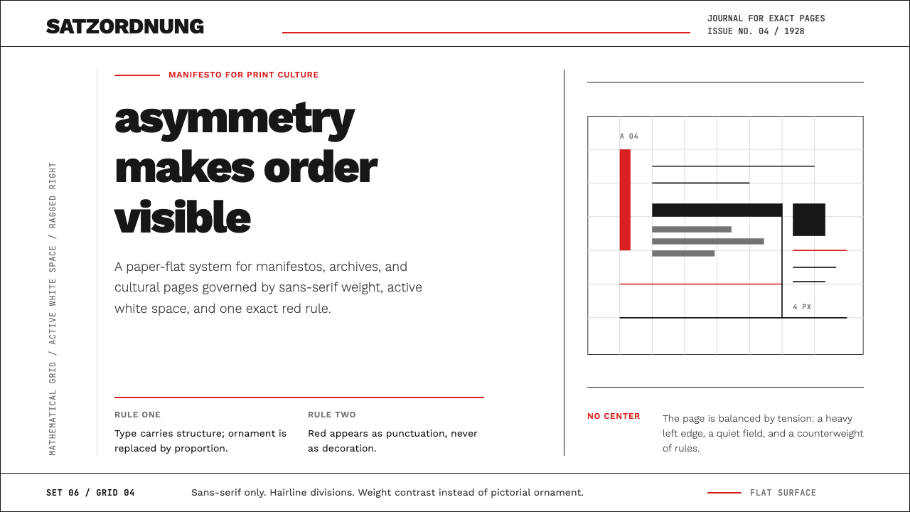 New Typography (Tschichold 1928)Tschichold's 1928 doctrine in CSS. Asymmetric grid, hairline rules, red-and-b…奇肖尔德 1928 年《新版式》宣言:非对称网格、发丝线、红黑二色——唯一允许…
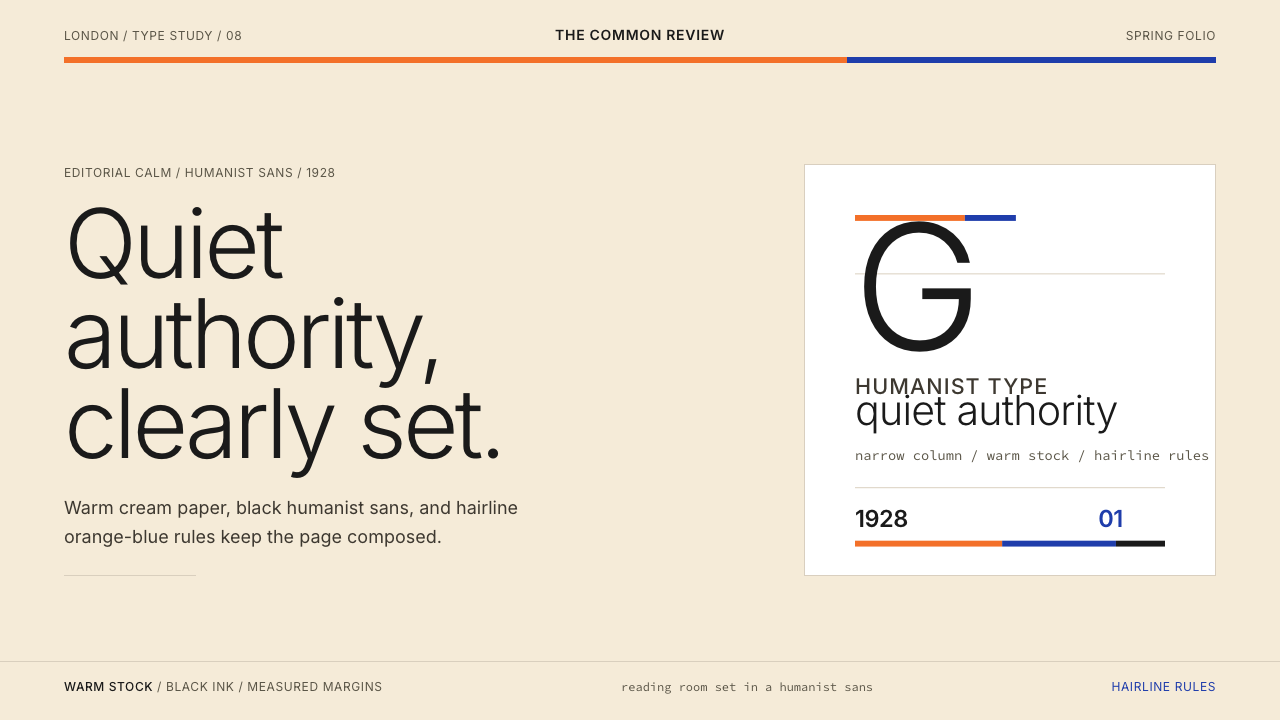 Gill Sans (BBC, 1928)Quiet authority, clearly set. Warm cream, black humanist sans, and hairline o…安静而权威。奶油底、黑色人文无衬线与橙蓝细线。
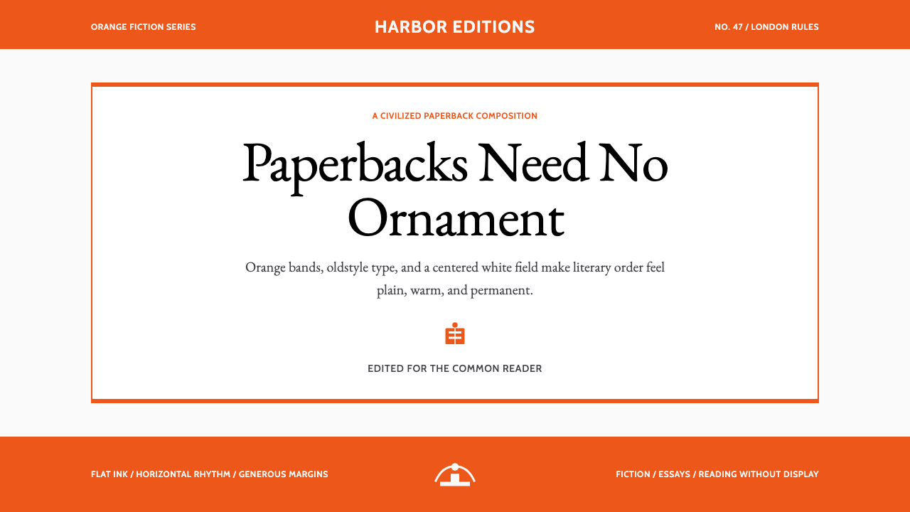 Penguin Classics OrangePaperback authority. Orange tri-bands, serif title panel, and flat ink enforc…平装书的权威感:橙色三段、衬线标题与平面油墨建立克制秩序。
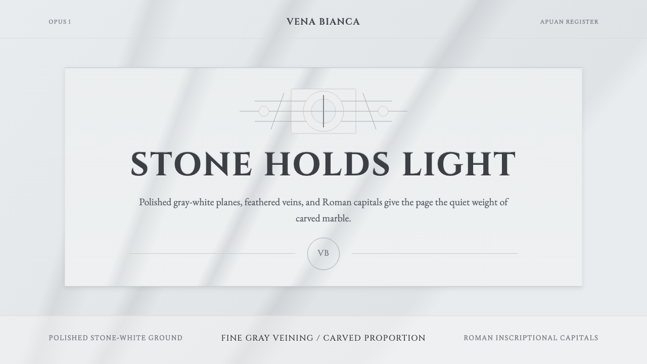 Carrara MarbleLuxury in restraint. Cool stone-white fields, feathery gray veins, and Cinzel…克制即奢华:冷石白、羽状灰纹与 Cinzel 罗马大写。
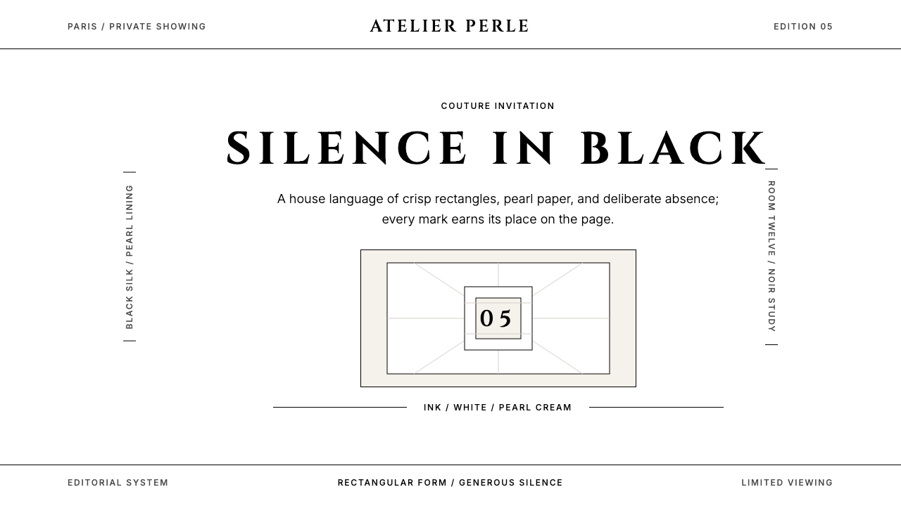 ChanelLuxury needs no color. Black on white, pearl-cream warmth, geometric capitals…百年宣言:真正的奢华无需色彩。纯黑配纯白,唯一的偏移是珍珠乳白——克制即气场。
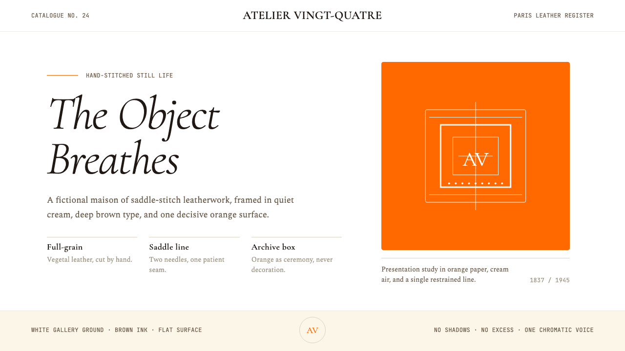 HermèsTwo centuries of restraint in orange. Brown serif on cream, gallery-quiet, ne…近两个世纪的巴黎皮革工艺:标志性的爱马仕橙、深棕衬线落于乳白纸底——产品如美术…