What is Carrara Marble?
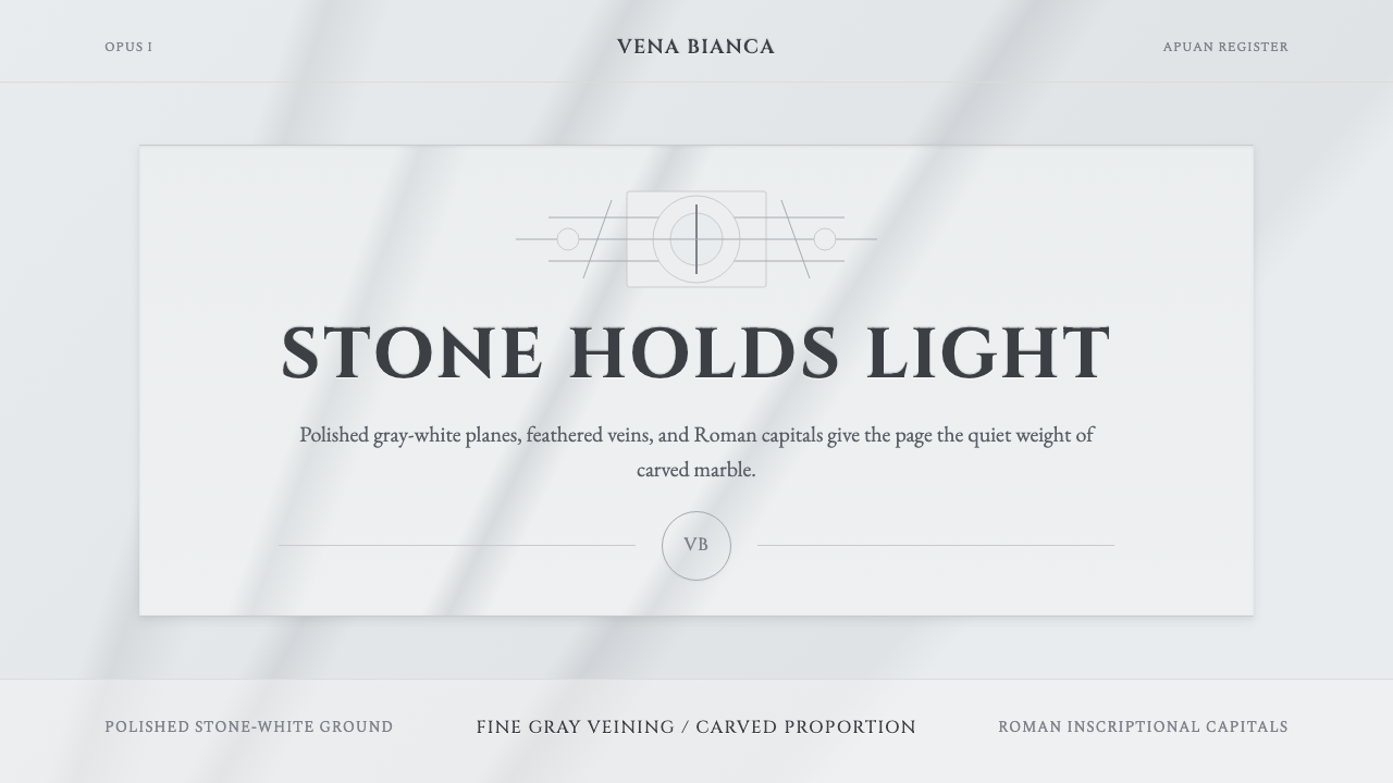
Carrara marble is not white — it is stone-white, the particular cool grayish tone of statuary marble quarried from the Apuan Alps, threaded with feathery gray-blue veins and polished to a calm, reflective plane. As a design language it translates the physical and historical weight of that stone into typography, space, and surface: Roman inscriptional capitals, generous negative space, shadow as carved relief, and an unwavering commitment to restraint as luxury.
Carrara Marble in brief
Carrara Marble is a design style rooted in the visual and material character of Bianco Carrara — the grayish-white statuary marble quarried from the mountains above the Tuscan city of Carrara since antiquity. Its surface color is not the stark white of a painted wall or the warm ivory of parchment, but a specific cool, faintly bluish-gray white: the color of polished stone under soft northern light. The veining — fine, feathery lines drifting from soft gray into blue-gray — is the style's defining signature.
In design, the Carrara Marble register is sculptural and classical. It draws on two overlapping traditions: the physical presence of the stone itself, with its weight, polish, and quiet surface drama, and the typographic tradition of Roman inscriptional lettering — the carved capitals that appear on ancient monuments from the Arch of Titus to Trajan's Column. The result is a visual language that reads simultaneously as ancient and refined: every element feels like it has been given considered form rather than typed out or clicked together.
The aesthetic is built on a small number of controlled decisions: a near-white field as the primary ground, the vein pattern as the only texture, Roman-cut capital letterforms for headings and hierarchy, and light-shadow modeling that suggests depth through carving rather than illumination. Decoration is entirely absent — the luxury is expressed through material quality, proportion, and stillness.
Where does Carrara Marble come from?
The marble quarries of Carrara have been worked since at least the first century BCE, when Roman builders began extracting stone for the monuments of the Republic and later the Empire. The ancient Romans called the material marmor lunense — Luni marble, after the nearby port of Luni through which the stone was shipped. The quarries supplied the Pantheon's columns, the facing of the Forum of Augustus, and countless portrait busts and dedicatory altars. By the time of the Empire, Bianco Carrara was synonymous with imperial permanence: the cool, calm stone that outlasted its carvers.
The style's typographic dimension has equally ancient roots. Roman inscriptional capitals — the letterforms carved into monuments across the classical world — represent one of the most refined achievements in the history of letterforms. The proportions of the Roman capital, with its careful modulation of thick and thin strokes and its subtly flared terminals, were studied and codified during the Renaissance and have remained a touchstone for formal typography ever since. When Renaissance scholars encountered these inscriptions, they identified them as the graphic expression of the same civilization that had produced the marble architecture they admired: the stone and the letter belonged together.
The Renaissance deepened this connection. The sculptor Michelangelo Buonarroti made repeated journeys to Carrara to select marble personally, spending months in the mountains assessing the stone's grain, color, and flaw patterns. He used Bianco Carrara for the David (1501–1504), the Pietà (1498–1499), and much of the Medici Chapel cycle. Gian Lorenzo Bernini, working a century later in Rome, used Carrara marble to achieve effects of almost impossible softness — drapery, skin, breath — in material that is cold and crystalline. Antonio Canova carried the Neoclassical tradition into the early nineteenth century, using the same stone to render mythological subjects with a milky, idealized surface quality that defined European sculpture's final great classical phase.
As a visual language, the Carrara Marble style was not codified by a single designer or school but emerged through the shared vocabulary of classical architecture, luxury goods, and high-end print design. Italian luxury brands working in the late twentieth century — in fashion, jewellery, and hospitality — instinctively reached for stone-white grounds, Roman typefaces, and vein-like fine-line ornament when they needed to signal heritage, permanence, and material quality without resorting to gold or explicit heraldry. The style's contemporary relevance is partly typographic: the revival and digital refinement of inscriptional typefaces derived from Roman models has made the characteristic Carrara letterform widely available and increasingly influential in brand identity and editorial design.
What defines the Carrara Marble look?
Color
The palette is built around a single ground tone: the cool grayish-white of polished Bianco Carrara, which reads neither as pure white nor as warm cream but as something between the two, inflected toward cool blue-gray. Against this ground, the veining introduces a secondary tone — a soft gray ranging into blue-gray — that functions as both texture and accent. Type and structural elements appear in near-black or deep charcoal rather than absolute black, maintaining the stone's softness. Warm tones, saturated colors, and metallic accents are entirely excluded; any warmth in the palette would undermine the cool, mineral quality that defines the register.
Typography
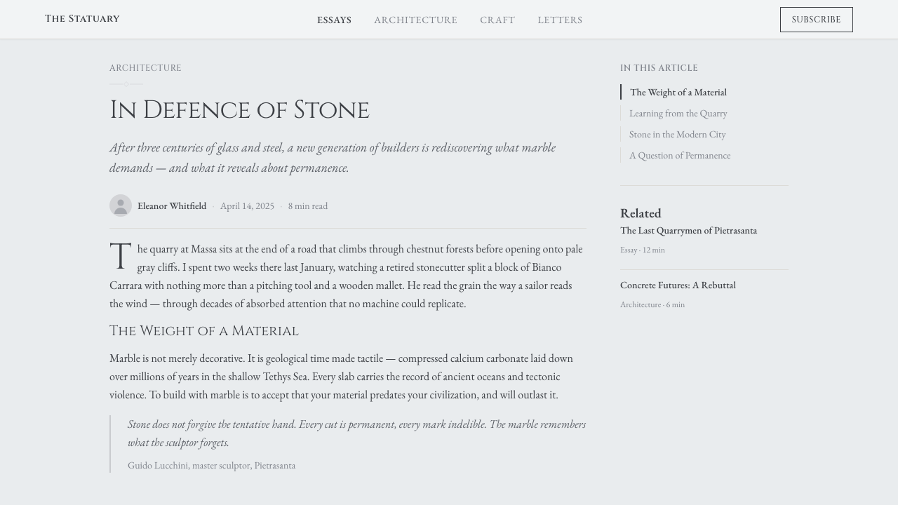
Headings are set in Roman inscriptional capitals — typefaces derived from or sympathetic to the letterforms carved into ancient Roman monuments. These capitals are characterized by careful modulation of stroke weight, subtly flared or bracketed serifs, and proportions that were studied and formalized during the Renaissance. They carry the visual authority of cut stone. Body text may be set in a lighter, more readable serif that complements but does not compete with the display capitals. Type is spaced generously, allowing each character to read as a discrete, considered form — the letter as sculptural object rather than information unit.
Texture and Surface
The marble vein pattern is the style's single permitted texture. It is not decorative in the conventional sense — it is inherent to the material, a natural feature that the design simply makes visible. The veining should feel like it has been revealed rather than applied: fine, drifting lines with soft edges rather than hard-bordered graphic motifs. Beyond the veining, surfaces are matte and calm. Gradient fills, noise textures, and photographic backgrounds are incompatible with the register; every surface should read as a material plane — stone, not paper or screen.
Space and Proportion
Classical proportion governs layout: symmetrical axes, generous margins, and a strong vertical rhythm reflect the influence of both Renaissance architectural theory and inscriptional composition. In the classical tradition, the text block sits within a field of margin — the space around the text is as considered as the text itself. Content is never crowded; hierarchy is expressed through scale and placement rather than visual noise. Each section is given enough space to read as complete in itself, the way a relief panel is given its own architectural frame.
Light and Shadow
Shadow in the Carrara Marble style refers to sculptural relief modeling rather than drop shadows or ambient glows. Depth is suggested through subtle gradation at edges — the way a carved form catches light on its highest point and recedes into shadow at its base — rather than through cast shadow effects. This is not a flat, two-dimensional style: it has dimensionality, but the dimensionality comes from surface modeling, not from lighting simulation. The shadows are built into the form, not projected onto the background.
Restraint as Language
The most fundamental characteristic of the Carrara Marble style is what it excludes. No decorative flourishes on letterforms, no pattern fills beyond the veining, no illustrative elements, no warm color, no visual effects that simulate material other than stone. The restraint is not economy — it is the primary expressive gesture. The style's luxury is communicated by what is absent: noise, ornament, trend, and acceleration. Everything on the surface has been weighed and permitted. This is the design equivalent of the marble block before carving: not empty, but complete in its potential.
Scale and Hierarchy
Hierarchy in the Carrara Marble style is established primarily through scale — a large, spaced heading in Roman capitals dominates a page; subordinate text is set smaller and lighter, creating a clear sequence of reading levels. Unlike systems that rely on color or graphic devices to signal hierarchy, this style trusts scale and weight within a single typographic family. The heading-to-body contrast is characteristically bold: a very large capital letter against a very small body text creates the same visual relationship as an inscription on a monument and the explanatory plaque beside it.

Who shaped Carrara Marble?
Michelangelo's relationship with Carrara marble was personal and obsessive. He made repeated journeys to the Apuan Alps to select stone himself, assessing not just color and grain but the character of each block's internal structure. He believed the figure existed within the marble and that the sculptor's task was to release it. The David, carved from a single block of Bianco Carrara between 1501 and 1504, and the Pietà, completed in 1499, remain the most celebrated instances of the stone used at the highest level of sculptural intention. His work established the association between Bianco Carrara and transcendent formal ambition that the design style draws on.
Bernini demonstrated that Carrara marble could transcend its own hardness — that the stone could become fabric, skin, hair, and breath in the hands of a sufficiently skilled carver. Works such as Apollo and Daphne (1622–1625) and the Ecstasy of Saint Teresa (1647–1652) pushed the material to its expressive limits, achieving a surface quality of almost living softness. For the design language, Bernini represents the dimension of sensory refinement: the idea that constraint in material does not mean constraint in feeling, and that the most restrained palette can produce the most emotionally complex result.
Canova, working at the turn of the nineteenth century, brought the Carrara marble tradition into the Neoclassical era. His mythological subjects — Psyche Revived by Cupid's Kiss (1787–1793), the Three Graces (1814–1817) — are defined by a milky, idealized surface quality achieved through an innovative polishing technique that left the stone with a subtle translucency. Canova's work represents the style's dimension of idealization: the transformation of the material's inherent qualities into a visual language of timeless refinement. His influence on luxury goods design and high-end visual identity in the modern era is considerable and largely unacknowledged.
Trajan's Column, completed in Rome in 113 CE, represents the pinnacle of Roman inscriptional lettering — the tradition that provides the Carrara Marble style with its typographic foundation. The base inscription, identifying the column's purpose and height, is considered the finest example of Roman imperial capitals ever cut in stone. Its letterforms — with their controlled modulation of thick and thin strokes, their subtly flared serifs, and their rigorously maintained proportions — became the model for inscriptional typeface design during the Renaissance and remain the reference for capital letterforms in formal typographic systems today.
Garamond, the sixteenth-century French punchcutter, represents the bridge between the Roman stone inscription and the printed page. His typefaces — designed in Paris in the 1530s and 1540s and based directly on the Roman capital proportions codified by Renaissance scholars studying classical monuments — translated the incised letter into a form suitable for casting in metal and printing in ink. The Garamond type family and its many revivals provide the most direct typographic connection between the Carrara Marble aesthetic and contemporary digital design, and remain among the most commonly used typefaces in editorial and luxury-goods visual identity.
How do you use Carrara Marble today?
The Carrara Marble style translates most directly into contexts that value heritage, permanence, and quiet refinement over novelty or energy. It is the design language of categories — fine jewellery, hospitality, architectural services, high-end skincare, cultural institutions — where the product's quality is communicated by the communication itself rather than by claims made within it. Applying it correctly requires understanding this logic: the style does not describe luxury, it enacts it through restraint, proportion, and the apparent absence of effort.
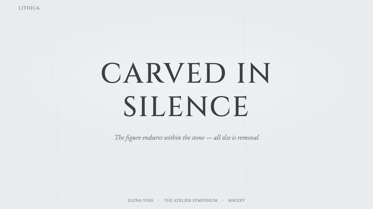
For presentation slides, the Carrara Marble register works exceptionally well on covers and divider pages, where its classical authority gives structure and weight to the presentation as a whole. A cover built on this style uses a stone-white field, a heading in large Roman capitals with generous letter-spacing, and a single fine line or subtle vein element as the only visual accent. Content slides should maintain the same ground tone and the same typographic logic — Roman caps for section headings, a light serif for body text — with content organized along a symmetrical vertical axis and surrounded by substantial margins. Data slides work best when charts and tables are treated as if they were carved relief: clean, structural, and given as much space as they need to read without crowding.
For web interfaces, the style suits landing pages, about pages, and hero sections for luxury or cultural brands, where the first impression matters more than information density. Key decisions: set the background to the marble ground tone, use Roman cap letterforms for the primary headline, introduce a barely-visible vein texture at full-page scale as the only background element, and restrict all accent use to the soft gray-blue of the veining rather than introducing new colors. Interaction states can be handled through scale and opacity shifts rather than color changes. The style is poorly suited to interfaces that require dense information, multiple visual hierarchies, or bright calls to action — these introduce energy and noise that erode the register's essential calm.
For editorial and marketing work, the Carrara Marble style supports long-form content with strong visual authority. An editorial layout using this register places large Roman cap headings at the opening of each section, sets body text in a light serif with generous leading and measure, and uses the vein element — as a fine horizontal rule, as a column separator, or as a subtle background plane — to articulate structure without decorative intent. Marketing pages work well as a single long scroll: a full-width stone-white field with centered content, minimal section breaks indicated by scale shifts rather than graphic devices, and a final call-to-action that inherits the same restraint — no button gradients, no high-saturation color, no animation.
The most common mistake when applying Carrara Marble is introducing warmth. Warm whites, warm grays, gold accents, and beige or cream tones all shift the register away from the cool mineral quality that defines it and toward something more domestic or approachable — which may be the right choice for a different style, but it defeats the purpose here. The second most common mistake is using an insufficiently distinctive Roman typeface: not all serif typefaces evoke the inscriptional tradition, and a generic transitional serif in place of a genuinely classical Roman capital face will read as merely conventional rather than genuinely classical. The specificity of the typographic choice carries most of the style's communicative weight.
Carrara Marble — FAQ
Is Carrara Marble a luxury style, and does that limit where it can be applied?
It is a style that communicates luxury, which is not the same as being limited to luxury products. The underlying values — restraint, classical proportion, material honesty, quietness — are relevant wherever those qualities are the right match for the product's purpose. A small architectural practice, a cultural nonprofit, a long-form editorial publication, or an academic institution can use this register authentically without any association with high price. Where it genuinely struggles is in contexts where energy, approachability, or mass-market appeal are required values: fast food, youth brands, entertainment platforms, and promotional design that needs to read as urgent or exciting. The style's fundamental stance is still and authoritative, and using it to communicate urgency or excitement produces incoherence.
How does Carrara Marble differ from other classical or heritage styles?
The key distinction is in what classical tradition it draws from and how it handles ornament. Neoclassical revival styles often use gold, symmetry, and explicit heraldic or architectural ornament to signal heritage — pediments, cartouches, lion motifs, ruled borders with decorative corners. Carrara Marble is more austere: it takes the inscriptional tradition and the physical quality of the stone as its reference, which produces a style that is classical but mineral rather than palatial. It is also cooler in temperature than most heritage styles, which tend toward warm creams and warm golds. The closest relatives are certain strands of Italian luxury identity design and the cooler end of Neoclassicism, but even there the commitment to the stone-white ground and the absence of warm accents sets it apart.
Can the vein texture be used prominently, or should it always be subtle?
The vein texture can appear at a range of intensities, but the register changes significantly depending on how prominent it is. At its most restrained — barely perceptible against the stone-white ground, visible only on close inspection — the veining functions as a material indicator: the surface reads as stone rather than paper, adding depth without visual noise. At higher intensity, with more visible gray-blue lines covering a larger proportion of the field, the veining becomes a pattern element and the design reads more decoratively. Both approaches are valid, but the more prominent the veining, the more care is needed to ensure that other elements are sufficiently restrained to prevent the surface from becoming busy. The mistake is using both prominent veining and a lot of typographic or graphic content at the same scale of visual complexity — the two compete and neither reads cleanly.
Why are Roman capitals specifically important to this style rather than just any classical serif?
Because the visual relationship between Carrara marble and Roman inscriptional letterforms is not metaphorical — it is historical and material. The Romans carved both the stone architecture and the letters into the same stone surfaces. The inscription on Trajan's Column and the marble architecture of the Forum were conceived together; the letterform and the material are part of the same visual culture. Using a Roman capital face derived from this tradition activates that connection and gives the design its classical authority. A transitional serif or a contemporary text face in the same setting reads as a serif typeface on a marble texture — a surface combination rather than a coherent system. The specificity matters because it is what distinguishes the style from decoration.
Does this style work at small scale, or does it require large formats?
The style's classical roots are in monumental scale — columns, temple facades, large public inscriptions — and its most natural application involves generous space. But it does translate to small formats, with adjustments. At business card, label, or stamp scale, the key is to reduce complexity rather than reduce size: one typeface, one text hierarchy, the vein element as a single thin line rather than a full texture field, and substantial white space relative to the format's dimensions. The instinct to compensate for small size by adding more information or more graphic elements is exactly wrong for this style; at small scale, the restraint becomes even more important. The style works as a seal or colophon, as a label, as a label within a label — wherever a small mark needs to communicate authority and refinement in a compressed space.
Related design styles
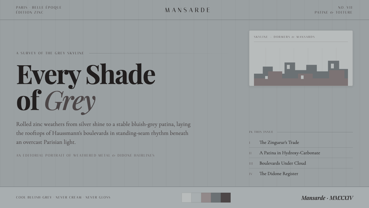 Paris Zinc RooftopsEvery shade of grey. One weathered zinc palette, set in high-contrast Playfai…
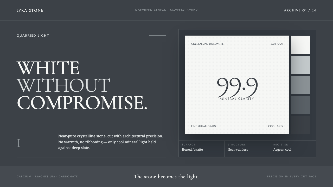 Thassos White MarbleWhite becomes material. Crystalline serif forms float on deep, cool Aegean sl…
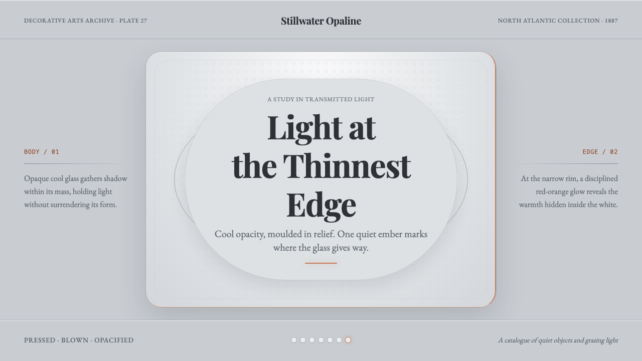 Milk Glass OpalineCool opacity holds one warm secret. Bluish milk-white relief catches a red-or…
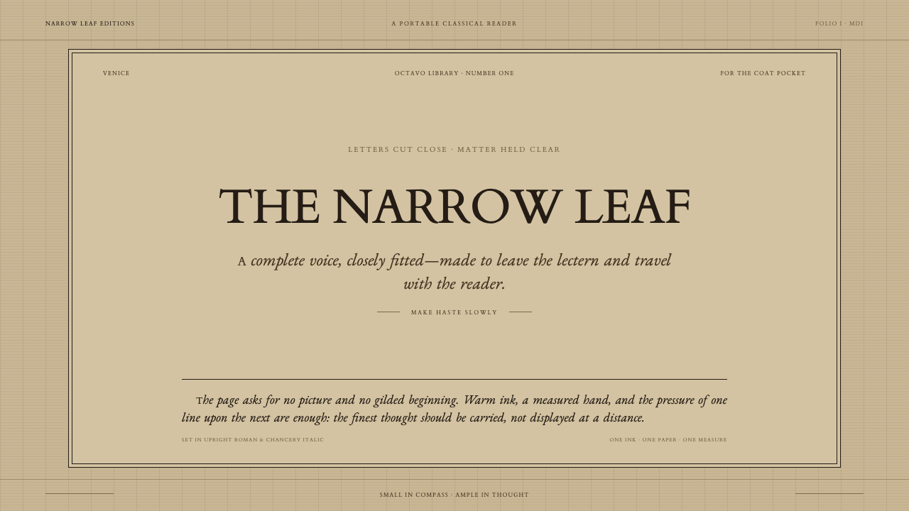 Aldine Press ItalicText needs nothing added. Tight chancery italic meets upright roman caps on m…
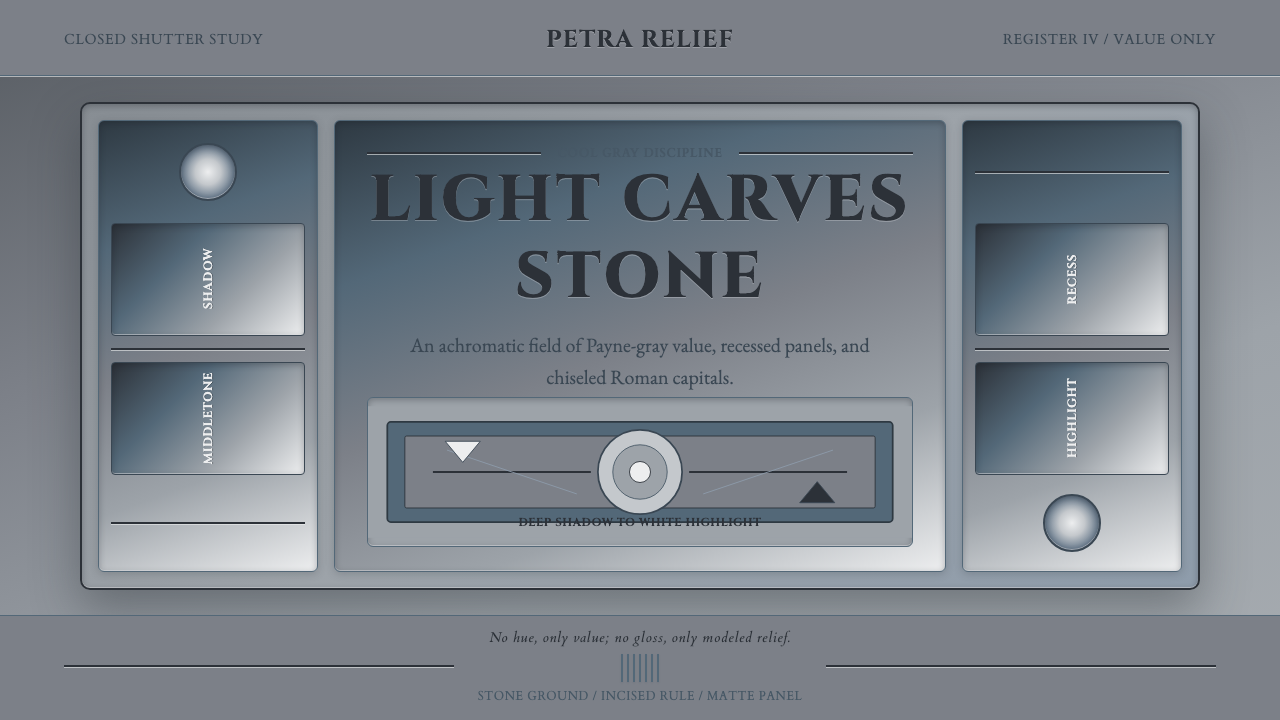 Grisaille PaintingStone without color. Payne-gray relief, Cinzel capitals, and recessed panels…
 HermèsTwo centuries of restraint in orange. Brown serif on cream, gallery-quiet, ne…