What is Quaker Plain Style?
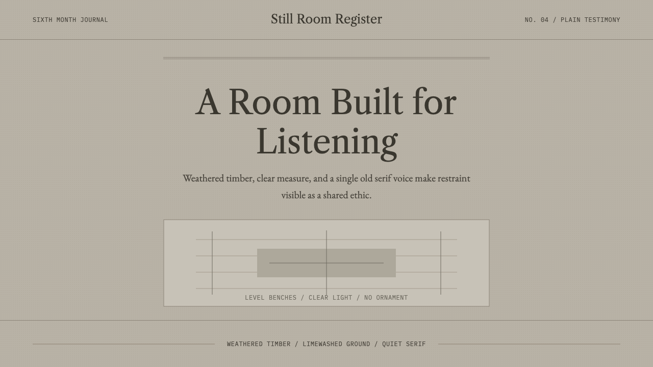
Quaker Plain Style makes silence visible — weathered timber tones, an unhurried old-style serif, and generous bench-like spacing, with nothing added that does not serve a purpose.
Quaker Plain Style in brief
Quaker Plain Style is the deliberate anti-ornamental aesthetic of colonial and early American meeting houses — the unadorned wooden halls where members of the Religious Society of Friends gathered for unprogrammed worship. There is no pulpit, no altar, no stained glass, no carved ornament. Benches face benches, windows are clear glass, and the walls are bare plaster or bare wood. Restraint here is not a stylistic preference; it is a religious position made physical.
The core conviction behind the style is the Quaker 'testimony of simplicity' — the belief that unnecessary adornment distracts from spiritual truth and creates false hierarchies between people. A meeting house was built to be identical in visual authority regardless of who sat where; there is no seat of honor, no raised platform for a minister, because Quaker worship holds that any member present may be moved to speak. The architecture and the theology are the same argument.
Visually, the result is a palette of weathered timber grays and browns against plain plaster, wide unbroken expanses of quiet surface, and a typographic register that echoes old-style book serifs — legible, unshowy, built for reading rather than display. Nothing gleams. There is no gilding, no gloss, no decorative flourish competing for attention with the room's actual purpose: a level, calm ground built for people to sit still and listen.
Where does Quaker Plain Style come from?
The Religious Society of Friends, popularly known as Quakers, emerged in England in the 1640s and 1650s under the itinerant preacher George Fox, who rejected the formal clergy, sacraments, and hierarchical structure of the established church in favor of direct, unmediated spiritual experience — the conviction that there is 'that of God in everyone,' meaning any person, regardless of rank or training, could receive and speak divine truth. This theology had immediate architectural consequences: if no one held special spiritual authority, no building needed a pulpit or a raised platform to elevate one speaker above the congregation.
Quakers faced persecution in England for refusing to swear oaths, pay tithes to the established church, or remove their hats before social superiors — all of which were read as radical assertions of spiritual equality. Many Friends emigrated to the American colonies seeking religious freedom, most consequentially William Penn, who was granted the colony of Pennsylvania by royal charter in 1681 and explicitly designed it as a haven for Quakers and other persecuted groups. Pennsylvania, along with parts of New England and the Delaware Valley, became the demographic and architectural heartland of American Quakerism.
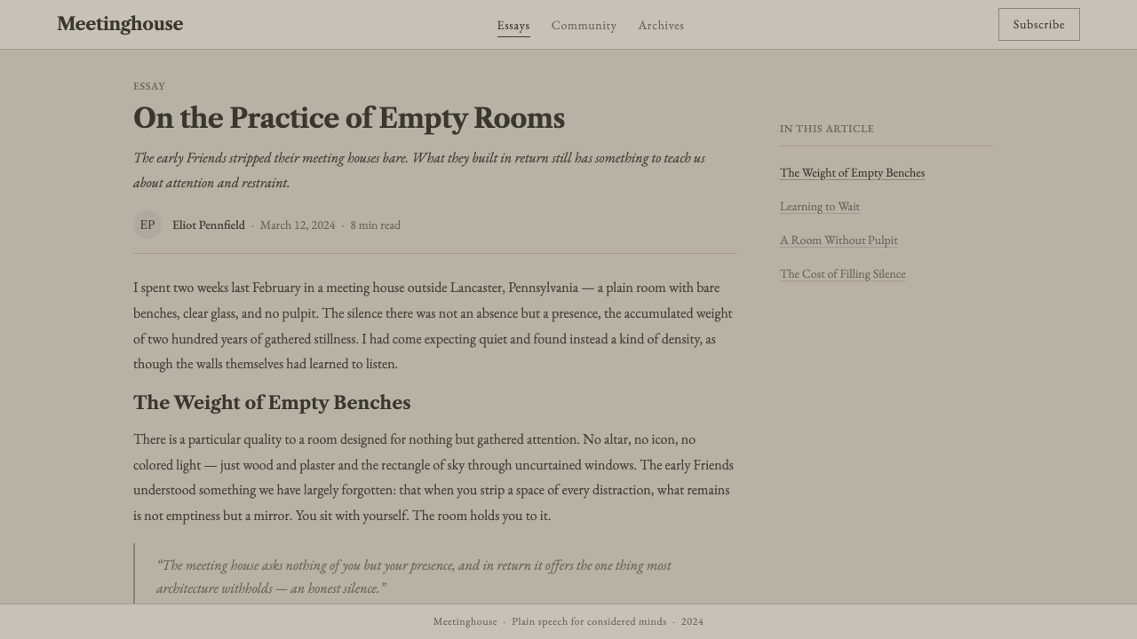
The meeting houses built across this region between the seventeenth and nineteenth centuries followed a remarkably consistent plan regardless of specific location: a plain rectangular hall, benches arranged facing benches rather than toward a focal altar, clear windows admitting natural light without colored glass, and an almost complete absence of applied ornament. Some meeting houses included a raised bench at one end reserved for elders, a practical concession to visibility rather than a claim of higher spiritual rank. The buildings were typically built of local stone, brick, or timber, left in its natural, unpainted, or lightly whitewashed state.
The moral philosopher and diarist John Woolman, an eighteenth-century Quaker minister, extended the testimony of simplicity into an active social ethic, campaigning against slavery within Quaker meetings decades before abolition became a wider American cause, and arguing that plainness in dress, speech, and possessions was inseparable from justice and honesty in dealing with others. This linkage between visual restraint and ethical seriousness is central to why Quaker plain style reads as a moral statement rather than a mere absence of decoration.
What defines the Quaker Plain Style look?
Color
The palette draws from weathered, unpainted timber — grayed browns and muted tans — set against the pale neutrality of plaster or whitewash. There is no bright accent color competing for attention; tonal variation comes from the natural aging of wood and stone rather than applied pigment, giving the whole system a quiet, settled quality.
Typography
Type takes on the register of an old-style book serif — the kind of unshowy, high-legibility letterform found in early printed religious texts and Quaker meeting minutes. There is no display flourish or calligraphic embellishment; the type exists purely to be read carefully and at length, matching the meeting house's function as a room built for listening.
Space
Generous, unbroken negative space is the system's most important structural element — mirroring the wide, uncluttered floor of an actual meeting hall where benches face benches across open space. Elements are given room to sit quietly rather than being packed tightly together.
Symmetry without hierarchy
Layouts favor a level, benches-facing-benches symmetry rather than a single dominant focal point — there is no equivalent of a raised pulpit commanding the composition. Where a raised element does appear, it is a modest, practical adjustment rather than a hierarchy-asserting gesture.
Material honesty
Wood is left visibly wood, stone visibly stone; nothing is painted to imitate a finer material and nothing is polished to a gloss it would not naturally hold. This honesty about material is a direct visual expression of the Quaker refusal to project a false appearance of wealth or status.
Absence of focal ornament
There is no carved altar, no stained glass narrative, no gilded inscription — the total absence of a singular decorative focal point is itself the defining visual gesture, reflecting a theology in which spiritual authority is distributed rather than concentrated in one symbolic object.
Natural light
Clear glass windows admit plain daylight rather than the filtered, colored light of stained glass — light in this system is functional and even, meant to let people see one another clearly during worship rather than to create a theatrical or mystical atmosphere.

Who shaped Quaker Plain Style?
The founding preacher of the Religious Society of Friends in mid-seventeenth-century England, Fox rejected formal clergy and sacraments in favor of direct spiritual experience available to all. His theological insistence on the equal spiritual standing of every believer is the direct source of the meeting house's refusal to elevate any single speaker's position architecturally.
Granted the colony of Pennsylvania by royal charter in 1681, Penn deliberately designed it as a haven for Quakers and other persecuted religious groups. His colony became the demographic center of American Quakerism, and its meeting houses — built across Pennsylvania, New England, and the Delaware Valley — established the plain style as an enduring American architectural tradition.
An eighteenth-century Quaker minister and diarist, Woolman extended the testimony of simplicity into a campaign against slavery within Quaker meetings, arguing that plainness in dress, speech, and dwelling was inseparable from ethical honesty in one's dealings with others. His writing is central to understanding why plain style reads as a moral position rather than mere visual austerity.
How do you use Quaker Plain Style today?
Quaker Plain Style is a style of subtraction — applying it well means resisting the urge to add anything, even elements that feel 'safe' or conventionally polished, unless they serve a direct functional purpose.
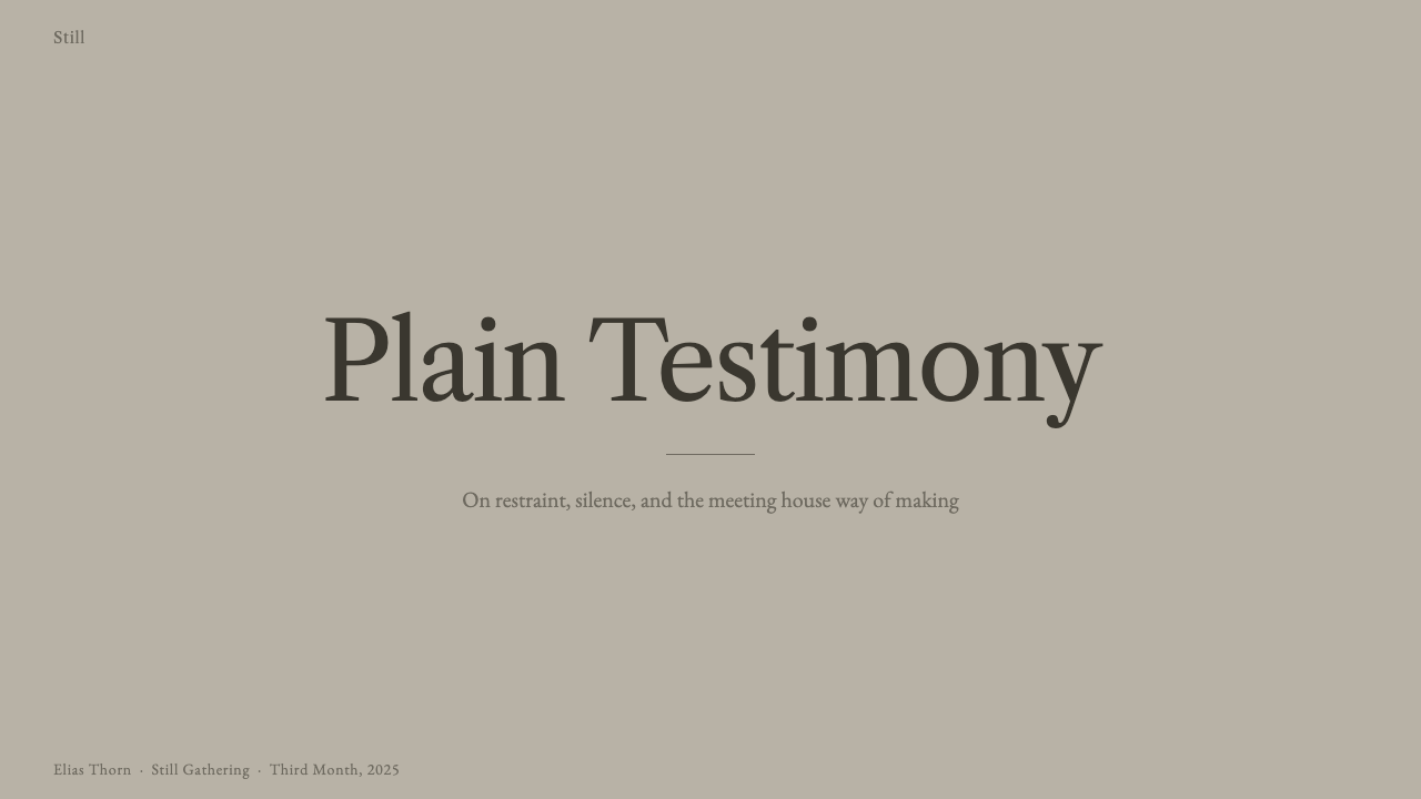
For presentation slides, the style produces a calm, trustworthy cover page: a title set in quiet serif type against a plain, timber-toned or pale plaster ground, with no cover image, gradient, or decorative border competing for attention. Content slides should carry this restraint through — a single hierarchy of text sizes, generous margins, and no decorative rules or icon flourishes separating sections. The style communicates credibility precisely because it refuses to perform credibility through polish.
For web interfaces, this plainness suits products whose value proposition is trust, transparency, or seriousness of purpose — financial tools, civic and nonprofit platforms, long-form reading products, or any dashboard where the content itself, not the chrome around it, needs to carry authority. Pricing pages benefit from the level, non-hierarchical layout logic: options presented as equals, in a row of plain bordered panels, rather than one artificially inflated 'recommended' tier fighting for visual dominance.
For editorial and marketing work, the style favors long-form, text-first treatments — an essay-like article layout with a narrow reading measure, wide quiet margins, and section breaks marked only by whitespace or a single thin rule, never a decorative divider. Marketing pages built in this style should resist the instinct toward a bold, attention-grabbing hero image; the style's persuasive power comes from calm confidence, not visual noise.
A common mistake is confusing plainness with plainness of effort — treating the style as an excuse to skip typographic care or spacing discipline. Authentic plain style requires more discipline than an ornamented style, not less: every proportion, margin, and line length has to be right, because there is no decoration left to distract from a mistake.
Another mistake is introducing a single decorative accent 'for interest' — a gradient button, a drop shadow, a flourish on a heading. In an ornamented system such an accent would be minor; in plain style it reads as a visible violation of the entire premise, because the premise is that nothing exists which does not serve a direct purpose.
Quaker Plain Style — FAQ
Isn't Quaker plain style just a religious version of modern minimalism?
The visual outcome can look similar — restraint, negative space, an absence of ornament — but the motivation is different. Contemporary minimalism is usually a stylistic or commercial choice aimed at signaling sophistication or focus. Quaker plain style is an ethical position: ornament is avoided because it is believed to distract from spiritual truth and to create false social hierarchy, not because restraint is fashionable. That ethical seriousness is why the style predates modern minimalism by roughly three centuries and carries a different emotional register — humble and communal rather than sleek and individual.
Why is there no focal point like an altar or pulpit in a meeting house?
Quaker unprogrammed worship holds that any member present, not a designated clergy, may be moved to speak during meeting. Because spiritual authority is understood to be distributed rather than vested in one person, the architecture avoids any single raised or ornamented focal point that would visually assert one speaker's precedence over another. Benches typically face each other rather than a single wall, physically embodying this distributed authority.
Can this style work with color, or does it require an entirely neutral palette?
The historic palette is drawn from natural, unpainted materials — weathered wood and plain plaster — which produces a narrow range of grayed browns and pale neutrals rather than an entirely colorless scheme. A contemporary application can work within that same narrow, muted range, but introducing a bright or saturated accent color would work against the style's core logic: color in plain style should feel like it occurred naturally through aging material, not like it was chosen to attract attention.
Is plain style only appropriate for religious or historical content?
No — its underlying values of trust, transparency, and refusal to perform status through ornament translate well to secular contexts that want to signal seriousness and honesty: financial services, civic institutions, nonprofits, and long-form journalism all benefit from the same logic. What matters is that the product's actual substance can carry the weight, since the style deliberately offers no decorative distraction if the content itself is thin.
How does plain style handle imagery, since photographs or illustrations can feel like ornament?
Historic meeting houses contain almost no representational imagery at all — no paintings, no carved figures, no stained-glass scenes. A faithful contemporary application follows the same logic: imagery, where it appears, should be documentary and functional (a plain photograph illustrating an actual fact) rather than decorative or aspirational. Heavily stylized illustration, staged lifestyle photography, or anything that exists primarily to create mood rather than convey information sits uneasily within the style's premise.
Related design styles
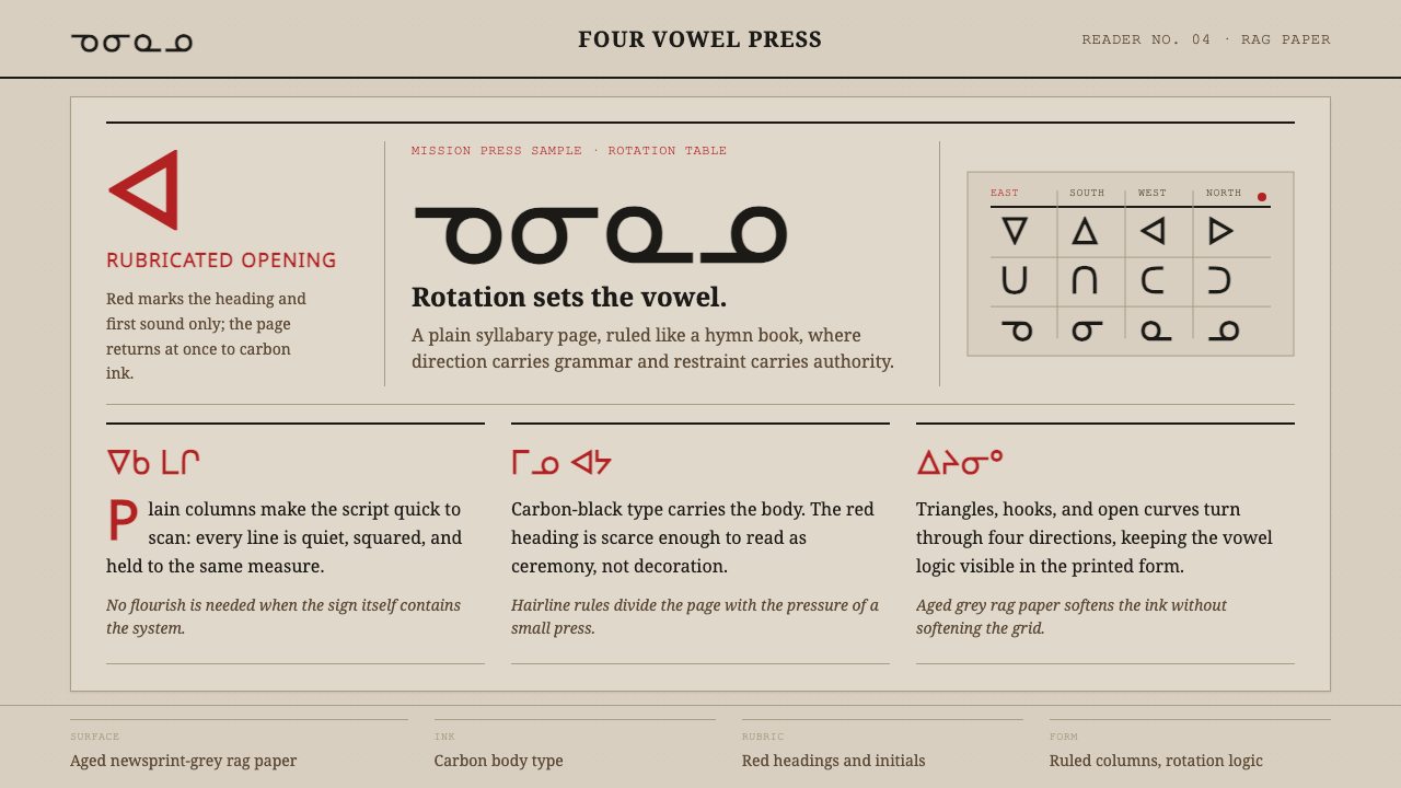 Cree SyllabicsPlain ink has authority. Carbon columns and red rubrication sit on rag-grey p…
 Sabon by Jan TschicholdQuiet authority in print. Dense black Garamond rests on foxed grey-tan rag pa…
 The Atlantic MonthlyAuthority slows down. Navy Garamond on warm cream, ruled like an essay page.
 Afar Nomad TextileWeight lives at the edge. Rust and madder selvedges cut across a quiet cotton…
 Aldine Press ItalicText needs nothing added. Tight chancery italic meets upright roman caps on m…
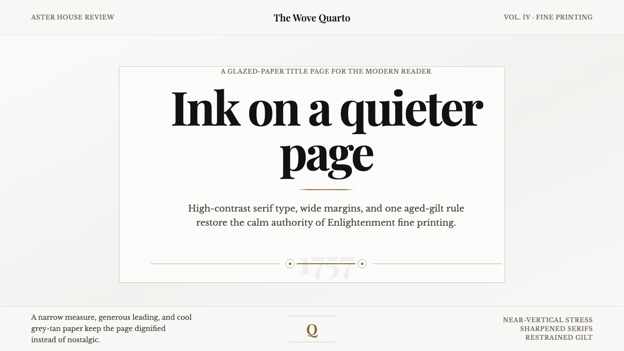 Baskerville Transitional SerifCalm authority in print. Glazed grey-tan paper, sharp serif contrast, one age…