What is Regency England?
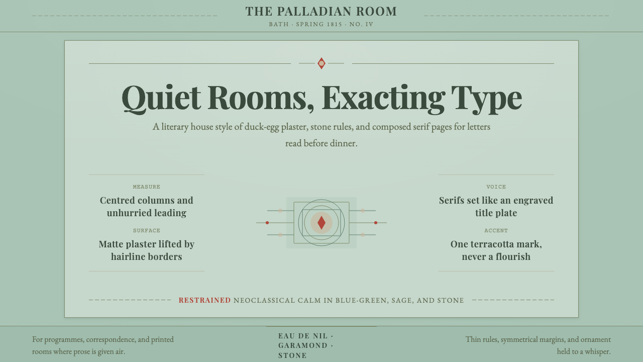
Regency England turned restraint into elegance — pale duck-egg walls, slender Neoclassical proportion, and a serif type that never has to raise its voice.
Regency England in brief
Regency England names the visual language of Britain's Regency era — formally 1811 to 1820, when George, Prince of Wales, governed as Prince Regent because his father George III had been declared unfit to rule, though the taste associated with the name runs more broadly from the 1790s to Victoria's accession in 1837. It is a domestic, drawing-room Neoclassicism: pale duck-egg blue-green paired with warm stone, cream, and touches of black, applied with a discipline that treats ornament as something to be rationed rather than spent freely.
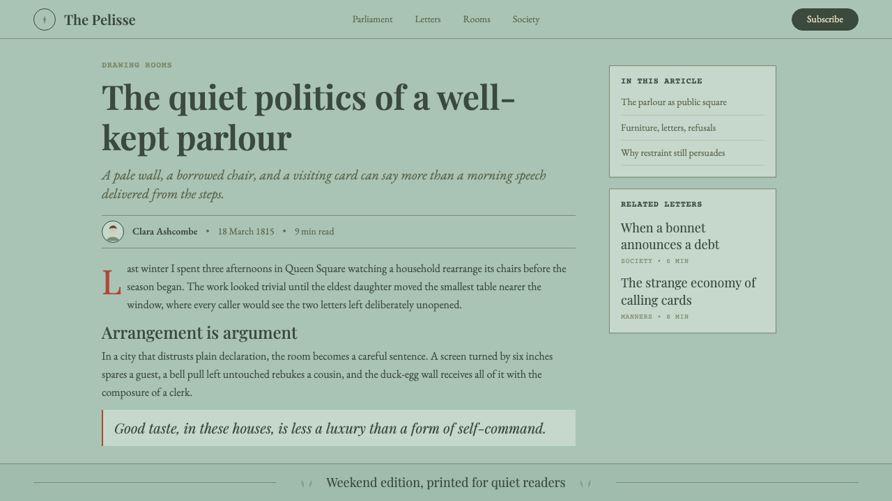
The style's home is the interior rather than the monument. Where the grander Neoclassicism of temples and public buildings could afford columns and pediments, Regency taste worked at the scale of a townhouse parlour or a country rectory: painted plaster walls, striped or sprigged wallpapers, printed cottons, and furniture with tapered, saber-curved legs borrowed from Greek and Roman originals. Everything is proportioned rather than piled on — a room reads as calm because each element has been given room to be seen on its own.
Print culture carried the same restraint. Books, invitations, and newspapers of the period were set in old-style serif faces in the Garamond tradition, with generous margins, unhurried letter-spacing, and symmetrical, centered title pages. Nothing shouts. A hairline rule or a slender printer's ornament does the work that heavier borders or bold display type would do in a louder era — the authority of the page comes from its evenness, not its volume.
Where does Regency England come from?
The Regency proper began in February 1811, when Parliament passed the Regency Act after George III's recurring illness — now generally believed to be the blood disorder porphyria compounded by dementia — left him unable to perform his duties. His eldest son ruled in his place until the old king's death in 1820, at which point the Prince Regent was crowned George IV in his own right. The Regent's personal taste ran to extravagance: the Royal Pavilion at Brighton, remodeled under his patronage into a fantasy of Indian domes and Chinese-inspired interiors, has almost nothing in common with the restrained style that now carries the Regency name. That style belongs instead to the gentry and professional classes whose drawing rooms Jane Austen described — sober, well-proportioned, and deliberately unshowy, precisely because showiness was what marked the nouveau riche and the Regent himself.
The wider social backdrop was the Napoleonic Wars, which did not actually end until Waterloo in 1815 and the Congress of Vienna settlement that followed. Britain's home front, however, remained comparatively insulated from invasion, and a mannered domestic culture flourished alongside the fighting abroad: circulating libraries lending three-volume novels, subscription assembly balls in provincial towns, and a marriage market conducted through calling cards, chaperoned dances, and closely watched conversation — the world of courtship and income that Austen's novels, published between 1811 and 1817, record in such precise social detail.
The style's classical vocabulary reaches back further, to the mid-eighteenth-century excavations at Pompeii and Herculaneum, which sent a wave of authentic Greco-Roman motifs — urns, laurel swags, key-fret borders, fluted columns — through European design. Architects and decorators such as Robert Adam had already softened Georgian interiors with pale, delicate Neoclassical plasterwork a generation earlier; the Regency inherited that vocabulary and pushed it toward even greater simplicity. Josiah Wedgwood's jasperware, with its pale, matte, antique-toned grounds and crisp white classical relief, became a widely imitated model for how Neoclassical restraint should look and feel across an entire household, from ceramics to wall color.
Fashion reinforced the same values. Beau Brummell, the dandy who dictated London menswear for a decade, argued that true elegance lay in impeccable cut, spotless linen, and the near-total absence of decoration rather than in embroidery, powder, or bright color — a man well dressed, he held, should not be noticed for his clothes at all. That principle of visible discipline, applied to a coat instead of a wall, is the same sensibility that shaped the Regency room: correctness and proportion carrying more authority than display ever could.
What defines the Regency England look?
Color
The palette centers on a soft, slightly grey-green blue often called duck-egg, paired with warm stone, bone, and cream grounds and finished with thin black or dark bronze accents for line work. Colors are never saturated or high-contrast; the whole scheme sits close together in value, so that structure and proportion do the visual work that bold color would do elsewhere.
Typography
Text is set in old-style serif letterforms in the Garamond tradition — moderate stroke contrast, bracketed serifs, a warm and slightly humanist feel rather than the rigid geometry of a modern typeface. Letter-spacing is generous and even; title pages and headings are centered and symmetrical rather than left-aligned or asymmetric, echoing the balanced proportion of the rooms the type once furnished.
Ornament and Motif
Neoclassical motifs drawn from Greek and Roman antiquity — urns, laurel swags, key-fret borders, fluted forms — appear as isolated accents rather than as an overall repeating pattern. A single motif might mark a border, a chapter opening, or a corner, and then the surrounding field is left plain. The restraint is the point: ornament here is a punctuation mark, not the sentence itself.
Symmetry and Proportion
Composition follows a Palladian sense of balance: a central axis, mirrored elements to either side, and careful mathematical proportion between the parts. This is not decorative symmetry but structural symmetry — the same instinct that governs the facade of a Georgian townhouse governs the layout of a title page or the placement of furniture around a fireplace.
Line and Border
Hairline rules and slender framing devices replace heavy borders throughout. A thin single line, sometimes doubled with a narrow gap, is enough to separate a panel of text or set off a printed illustration. The thinness of the line is itself a signal of refinement — a heavy border would read as provincial or overwrought.
Surface and Material
Painted and lightly textured plaster walls, printed cottons and muslins, and striped or small-figured wallpapers stand in for the marble and gilt of grander Neoclassicism. Surfaces read as matte and softly worn rather than polished and reflective — the sense of a lived-in drawing room rather than a showroom.
Furniture Silhouette
Furniture legs taper and curve in the saber-leg manner adapted from the ancient Greek klismos chair, replacing the heavier cabriole and bulbous turnings of earlier Georgian pieces. Forms are light, open, and legible in outline — a chair or table should be readable as a clean silhouette even before its surface detail is considered.

Who shaped Regency England?
Austen's six novels, published between 1811 and 1817, are the most precise surviving record of Regency gentry manners — the drawing-room economy of income, marriage, and reputation that the visual style now evokes. Her prose shares the aesthetic's central value: restraint that communicates more than ornament could, wit delivered through understatement rather than display.
As Prince Regent from 1811 and later king, George IV's own extravagant patronage — most visibly the Indian- and Chinese-inspired Royal Pavilion at Brighton — stands in sharp contrast to the restrained style that bears his era's name. The gap between the Regent's personal excess and the gentry's sober good taste is itself part of the period's story.
Wedgwood's jasperware ceramics, with their pale, matte antique-toned grounds and crisp white Neoclassical relief, popularized a household model of restrained classicism that reached far beyond ceramics — the same pale, chalky sensibility appears in Regency wall colors and printed textiles of the period.
Brummell's decade of dictating London menswear fashion established impeccable cut and near-total absence of ornament as the mark of true elegance — the sartorial equivalent of the Regency room's visual restraint, and a lasting influence on the plain, well-tailored aesthetic of modern menswear.
How do you use Regency England today?
Regency England is a style built for arguments that need to sound calm and unassailable rather than urgent. Applying it well means understanding that its authority comes from evenness — consistent proportion, sparing ornament, and a narrow, closely valued color range — not from any single striking element.
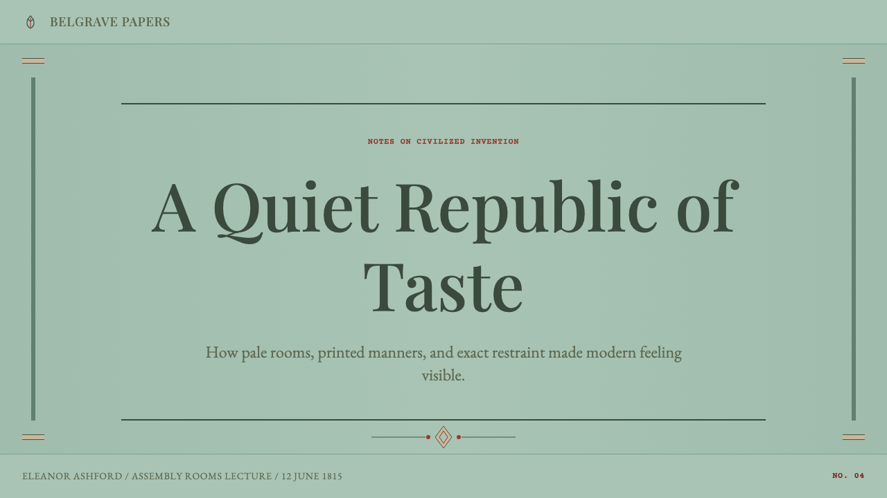
For presentation slides, a Regency cover works best as a quiet, symmetrical composition: a centered title in old-style serif type, a thin rule above or below it, and perhaps one small Neoclassical motif — a laurel sprig, a fret border — placed with obvious deliberation rather than repeated across the page. Content slides should keep to a narrow set of type sizes and a single accent line color; bullet points read better as understated dashes than as bold geometric markers. Data slides benefit from the same restraint: charts rendered in the duck-egg and stone palette, with grid lines kept faint, communicate authority through legibility rather than visual noise.
For web interfaces, the style suits dashboards, account pages, and pricing tables aimed at an audience that reads calm and trustworthy rather than energetic — private banking, boutique professional services, wellness or heritage brands. Cards should use hairline borders rather than heavy shadows; interactive states can be marked with the accent color rather than bold color blocks; typography should stay in the serif family throughout rather than mixing in a display sans for contrast, since contrast in this system comes from spacing and scale, not typeface variety.
For editorial and marketing work, Regency suits long-form writing, heritage brand storytelling, and any context where the goal is to read as established rather than trendy. A narrow text measure, generous margins, and centered pull-quotes framed by a single thin rule all reinforce the sense of an unhurried, confident voice. Section breaks are best marked by a small centered ornament rather than a bold color block.
A common mistake is to treat Regency as simply 'pastel colors plus a serif font.' Done that way, it reads as generically vintage rather than specifically Regency. The style depends on strict symmetry and genuinely sparing ornament — a single motif used once, not scattered decoratively across a layout — and on keeping the whole palette close in value so that nothing shouts. Overusing the Neoclassical motifs, or mixing in heavier Victorian-style ornament from a later, more crowded era, breaks the effect faster than any color choice could.
Regency England — FAQ
Is Regency style the same as Georgian style?
Regency sits inside the broader Georgian period (1714–1837) as its final, most restrained phase. Earlier Georgian interiors, especially the mid-eighteenth century, could carry heavier ornament, bolder color, and more elaborate carved detail. Regency taste — running roughly from the 1790s to the 1830s — pared that back toward paler colors, thinner lines, and sparer Neoclassical accents. Think of Regency as Georgian design after it decided that less carried more authority.
Can Regency style work with a dark background?
It is possible but requires real care, because the historic palette is fundamentally light-ground — duck-egg, stone, and cream were meant to be read against daylight and pale plaster. A dark variant works best if it keeps the same close, muted value relationships rather than jumping to high contrast: a deep bronze or charcoal ground with the duck-egg and stone tones used as restrained accents, rather than a black background with bright pastel type, which would break the era's essential quietness.
How does Regency differ from the later Victorian style it was followed by?
Victorian design, which followed from 1837 onward, moved in almost the opposite direction: heavier ornament, darker and more saturated color, denser patterning, and a delight in visible craftsmanship and accumulation. Regency's Neoclassical restraint — pale grounds, sparing motif, generous negative space — was in many ways a reaction against the heaviness of what came before it in the eighteenth century, and it was in turn reacted against by the Victorians who followed. The two styles make useful opposites: Regency says a room proves its taste by what it leaves out, Victorian says a room proves its taste by what it can afford to include.
Does Regency style suit modern tech products?
It suits products that want to signal trust, heritage, or quiet competence rather than speed or novelty — private wealth management, boutique professional or legal services, heritage retail, wellness and hospitality brands. It struggles for products that need to feel fast, playful, or cutting-edge, since the style's entire logic depends on unhurried pacing and restraint; forcing bright, high-energy interaction patterns onto a Regency palette undermines the very calm the style is built to project.
Why does the style avoid the Prince Regent's own flamboyant taste, like the Brighton Pavilion?
Because the Regency style now referenced in design is drawn from the gentry drawing room, not the royal court — the world Jane Austen described rather than the world the Prince Regent actually inhabited. The Brighton Pavilion's Indian domes and Chinese-inspired interiors were a personal extravagance widely mocked even at the time as an example of exactly the excess the era's mainstream good taste defined itself against. Using that imagery would misrepresent what 'Regency' means as a design reference — it would import the exception rather than the rule.
Related design styles
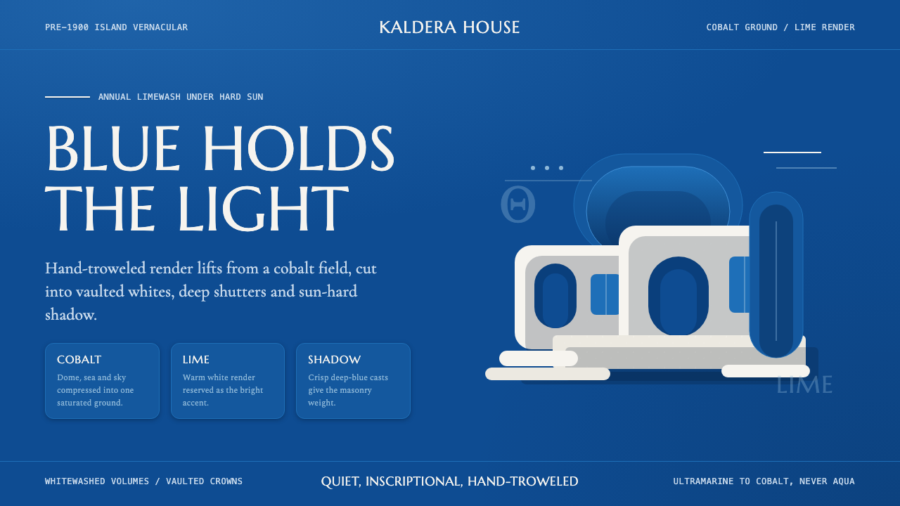 Cycladic SantoriniQuiet island gravity. Cobalt field, Marcellus capitals and white vaults hold…
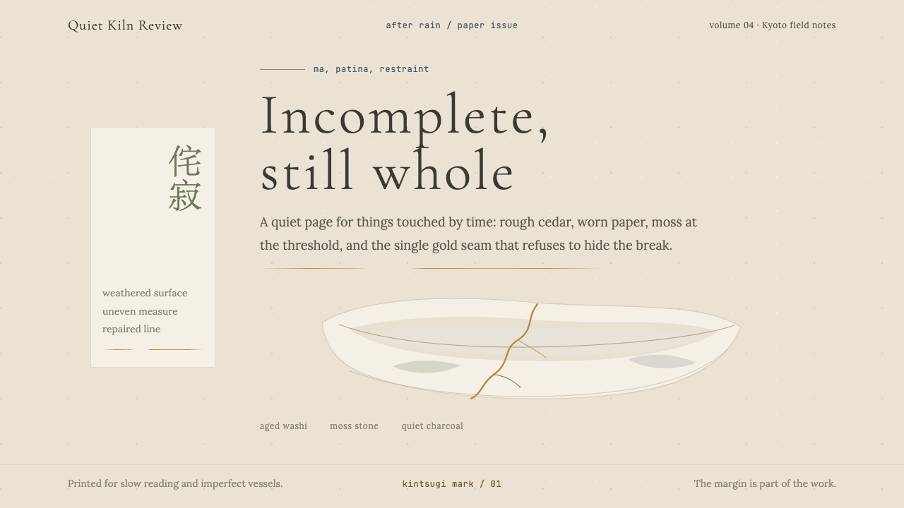 Wabi-SabiStillness makes imperfection whole. Washi beige, moss sage, and a spare gold…
 Bamboo GroveQuiet goes vertical. Fir green, Mincho type, and dappled culm rules create de…
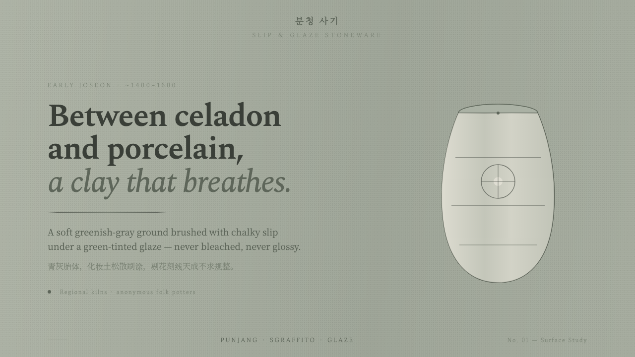 Buncheong Gray Slip WareBetween celadon and porcelain. Greenish-gray clay, chalky slip brushwork, dar…
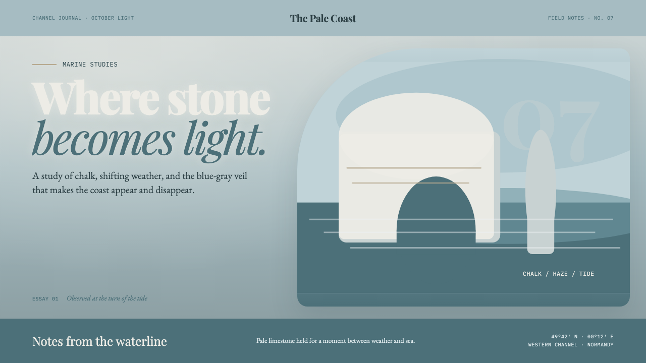 Étretat Chalk CliffsStone becomes light. Chalk-white forms dissolve through blue-gray mist and li…
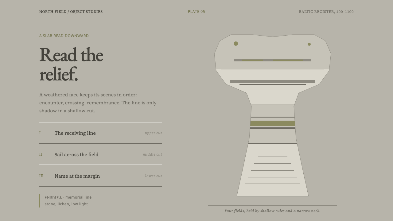 Gotland Picture StoneMeaning emerges slowly. Weathered limestone greys divide a story into shallow…