What is Yemeni Socotra Dragon's Blood Tree?
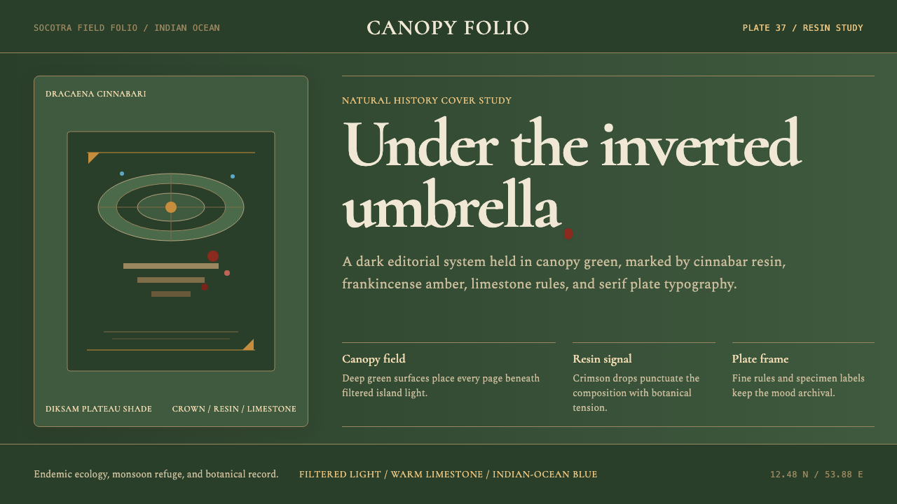
Socotra Island is one of the world's most isolated landmasses — an ark of evolution adrift in the Arabian Sea where a third of all plant species exist nowhere else on Earth. Its emblem, the dragon's blood tree, grows nowhere so magnificently: its dense, inverted-umbrella crown filters the monsoon light into something deep and primordial, while its cut bark weeps a crimson resin that ancient traders brought to Rome as medicine and pigment. This design system bottles that encounter — canopy dark, resin red, frankincense amber — into a visual language of sober richness.
Yemeni Socotra Dragon's Blood Tree in brief
The Yemeni Socotra Dragon's Blood Tree design system takes its entire visual logic from a single ecosystem: the highland forests of Socotra Island, where Dracaena cinnabari — the dragon's blood tree — grows in formations unlike any other plant on Earth. The deep green-to-black page ground evokes the dim light beneath a dragon-tree canopy; the crimson accent is the literal color of Socotran dragon's blood resin; and the warm amber of frankincense warms the corners of the palette like the Diksam plateau at first light.
Where many dark-palette design systems reach for blue-black or charcoal, this system commits to something more specific: the green-tinged darkness of a living forest canopy at midday, when the light is filtered through a ceiling of foliage rather than simply absent. Combined with the resin red — not a punchy scarlet but the deep, layered crimson of dried sap — the system produces a mood that is both ancient and precise, as though an illuminated manuscript from the Indian Ocean spice trade had been flattened into interface components.
The result is a dark-mode design vocabulary that earns its depth through ecological specificity rather than generic 'night mode' conventions. Typography is set in upright, authoritative serif forms that reinforce the sense of specimen framing — as if each piece of content is a label in a naturalist's cabinet of curiosities. This is Curio in the most literal sense: the island, the tree, the resin, framed.
Where does Yemeni Socotra Dragon's Blood Tree come from?
Socotra Island has been known to the outside world for at least three thousand years. Ancient Egyptians traded with it; Periplus of the Erythraean Sea, a first-century Greek navigation manual, describes it as a major entrepôt for frankincense, aloe, and dragon's blood resin — the last of which was used across the Mediterranean world as a wood stain, medicine, varnish, and artist's pigment. Arab sailors called the island Suqutra, possibly derived from the Sanskrit Dvipa Sukhadara, 'island of bliss.' For most of its recorded history, Socotra was governed by the Mahri Sultanate and then, from the nineteenth century onward, by the British Empire as part of the Aden Protectorate.
The first systematic Western botanical survey was conducted in 1880 by the Scottish explorer and archaeologist Theodore Bent, who documented the island's extraordinary flora including the dragon's blood tree. Subsequent surveys by the British Natural History Museum and, later, international conservation teams confirmed what Bent had intuited: the island's radical isolation — formed when the Arabian peninsula rifted from the African continent roughly twenty million years ago — had produced an evolutionary experiment of singular richness. Today, 307 of the island's plant species are endemic, a rate of endemism comparable only to the Galápagos Islands or the Hawaiian archipelago.
Dracaena cinnabari takes its common name from the resin it produces when injured: a deep crimson sap that dries to a translucent dark red and was long believed, across multiple cultures, to be the mingled blood of dragons and elephants engaged in mortal combat. The tree grows extraordinarily slowly, reaching maturity only after several centuries, and its distinctive crown — flat-topped, dense, radiating branches that curve upward at their tips to form an inverted umbrella — is an ecological adaptation to the island's dry fog and monsoon climate: the wide crown captures moisture from the mist and channels it down the trunk to the root zone.
In 2008, UNESCO inscribed Socotra as a World Heritage Site, citing its exceptional universal value as a biodiversity hotspot. The designation brought international attention but also new pressures: mass tourism, infrastructure development, and the effects of the ongoing Yemeni civil war (which began in 2015) have since threatened the island's ecological stability. The dragon's blood forests of the Diksam plateau — the most accessible and most photographed — are under particular pressure from overgrazing and climate-driven drought. This design system, in naming itself after Socotra, carries an implicit argument: that rarity, once encountered, changes what you see everywhere else.
What defines the Yemeni Socotra Dragon's Blood Tree look?
Ground Color
The page ground is a deep, green-inflected darkness — not the cool blue-black of a digital night mode, but the living, slightly warm darkness of forest shade filtered through dense foliage. This distinction matters: the green undertone prevents the background from reading as void or absence, anchoring it instead in a specific ecology. Objects placed against this ground gain the quality of specimens — things set apart and studied, not merely stacked on a dark surface.
Resin Red
The primary accent is drawn from Socotran dragon's blood resin: a deep, layered crimson with brownish-amber undertones rather than a cold blue-red. It is not a brand red or a warning red; it is a pigment red — the color of something that has dried and settled, weighted with history. Used for calls to action, key data points, and interactive states, it reads as both urgent and ancient, which is an unusual and effective combination in dark-palette UI work.
Frankincense Amber
A secondary warm tone — the amber of Socotran frankincense resin — serves as the system's softer accent: it appears in metadata, secondary labels, and the warm light that edges certain components. Where the resin red is decisive and action-oriented, the frankincense amber is contemplative and informational. Together they evoke the palette of the ancient spice trade: two resins from the same island, used for different purposes, readable against the deep forest ground.
Serif Typography
Unlike many dark-palette systems that default to geometric sans-serifs, this system uses upright serif typefaces throughout — specifically the kind of authoritative, slightly condensed serifs associated with natural history specimen labels, scientific classification, and pre-photographic atlases. The choice is deliberate: serifs on a dark ground carry intellectual weight and reinforce the cabinet-of-curiosities framing. Display text is set large and spare; body text uses comfortable leading with no typographic decoration beyond the letterforms themselves.
Limestone and Ocean Accents
At the periphery of the palette, two more tones appear sparingly: a chalky limestone white — the color of the island's dramatic karst formations — used for primary text and UI chrome, and a recessive Indian Ocean blue that surfaces only in links and navigational indicators. Both are used with great restraint; the system's warmth lives in the ground color, the red, and the amber. The limestone white keeps text readable without bleaching the atmosphere; the ocean blue provides orientation without asserting itself.
Canopy Structure
Layout in this system mirrors the dragon tree's structural logic: a dense, weight-bearing center that spreads outward at the edges. Content blocks are generous in their internal padding and separated by space rather than ruled lines — the canopy model, where each element holds its own territory and the space between is not emptiness but breathing room. Horizontal rules, where they appear, are rendered as fine, slightly warm-toned strokes rather than stark white lines.
Endemism as Aesthetic Principle
The deepest logic of this system is not botanical decoration but the concept of endemism: the idea that a thing evolved in isolation is unlike anything else, and that this unlikeness is not a limitation but a kind of precision. Every choice — the specific green darkness, the resin red rather than a generic crimson, the amber rather than gold — is made to be unreproducible by approximation. If you swap any of these tones for a similar, more common alternative, you lose the system. This is a design vocabulary that rewards fidelity.
Who shaped Yemeni Socotra Dragon's Blood Tree?
The Scottish explorer and archaeologist Theodore Bent led the first systematic Western survey of Socotra in 1880, accompanied by his wife Mabel, who documented the expedition in watercolor sketches. Bent's published account, Southern Arabia (1900), introduced Socotran flora — including the dragon's blood tree — to a European readership for the first time in accessible form. His descriptions of the Diksam plateau forests, rendered with the enthusiastic precision of Victorian natural history, remain among the most vivid early accounts of the island's ecological strangeness.
The dragon's blood tree is not a character or an artist but a species — one that has nonetheless shaped human aesthetics, pharmacology, and trade for millennia. Its resin, harvested by making cuts in the bark and collecting what flows, was used in classical antiquity as a wood stain, a dye for wool, a dentifrice, and a pigment for Renaissance painters (it appears in the palette of the Venetian school). The tree's crown morphology — the inverted umbrella form — has been reproduced endlessly in botanical illustration, and the silhouette is now globally recognized as one of the world's most distinctive plant forms.
A contemporary Yemeni conservationist and one of the most prominent local advocates for Socotra's ecological protection, Adnan Abdul Halim has worked to document and publicize the threats facing the island's endemic species under the pressures of climate change and the civil war. His efforts represent a growing generation of Socotran voices insisting that international attention to the island's aesthetics — which has intensified dramatically since social media made the dragon-tree forests widely visible — must translate into genuine protection, not merely visual consumption.
This anonymous Greek-language navigation manual, probably written by a merchant sailor based in Roman Egypt, is one of the earliest surviving documents to describe Socotra in commercial terms. It catalogs the island's exports — dragon's blood, aloe, tortoiseshell, and frankincense — and situates it within the Indian Ocean trade network that connected Rome to India long before the age of European exploration. The Periplus establishes that the aesthetic materials of this design system — crimson resin, amber frankincense — have been valued commodities for at least two thousand years.
A contemporary photographer whose long-form documentary work on Socotra — produced over multiple visits spanning the 2010s — has done more than almost any other single body of imagery to bring the dragon's blood forests to global visual awareness. Banfield's photographs resist the exotic-destination framing common in travel photography: they are slow, attentive to texture and light quality, and frequently shot in the early morning or late afternoon when the canopy light has the amber quality that this design system treats as one of its core visual references.
How do you use Yemeni Socotra Dragon's Blood Tree today?
The Yemeni Socotra Dragon's Blood Tree system is a dark-palette vocabulary with a very specific temperature: not cold, not neutral, but organic and ancient. Applying it well requires committing to that temperature throughout — never reaching for a cool white, a neutral gray, or a generic red that breaks the ecological logic. Every deviation pulls the system toward 'generic dark mode' and away from the thing that makes it distinctly itself.
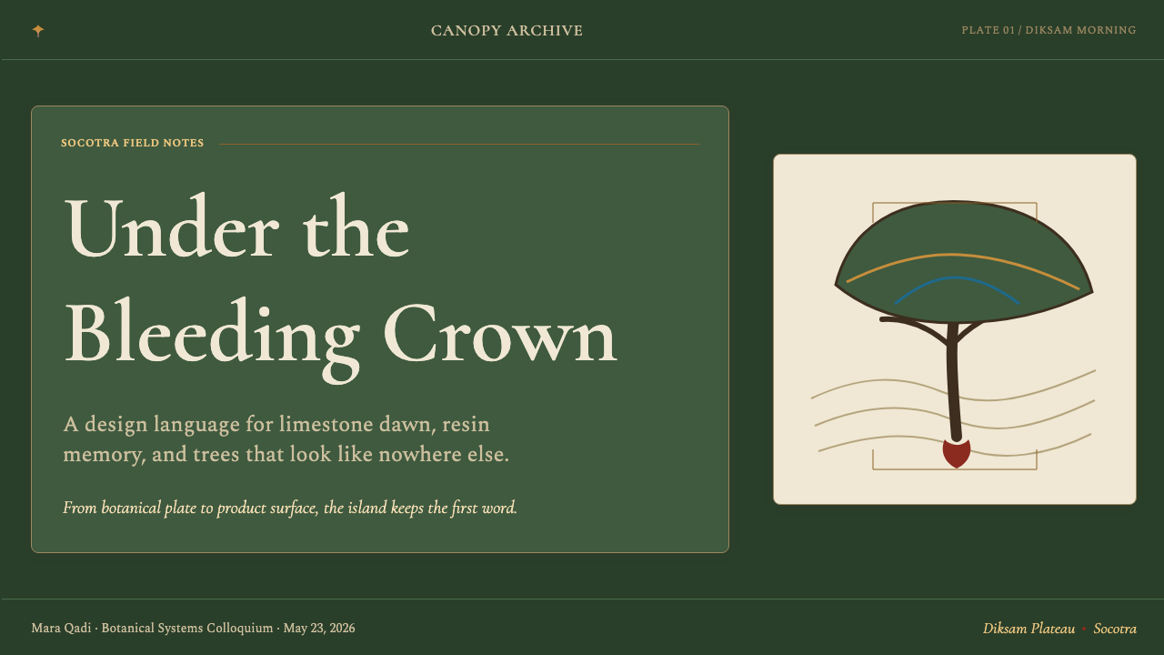
For presentation slides, this system excels in contexts that call for gravitas without formality — research presentations, natural history and science communication, cultural heritage work, and any pitch where the subject matter benefits from feeling earned rather than polished. A cover slide works best with a single specimen-style composition: the subject centered and labeled in the authoritative serif, the resin-red accent marking one key point of interest, the amber appearing in the subtitle or metadata line. Content slides should maintain the generous spacing of the canopy model — never crowded, always giving each element room to be examined. Data visualization in this system works well when charts are rendered in the warm palette rather than the default blues and grays of most charting libraries.
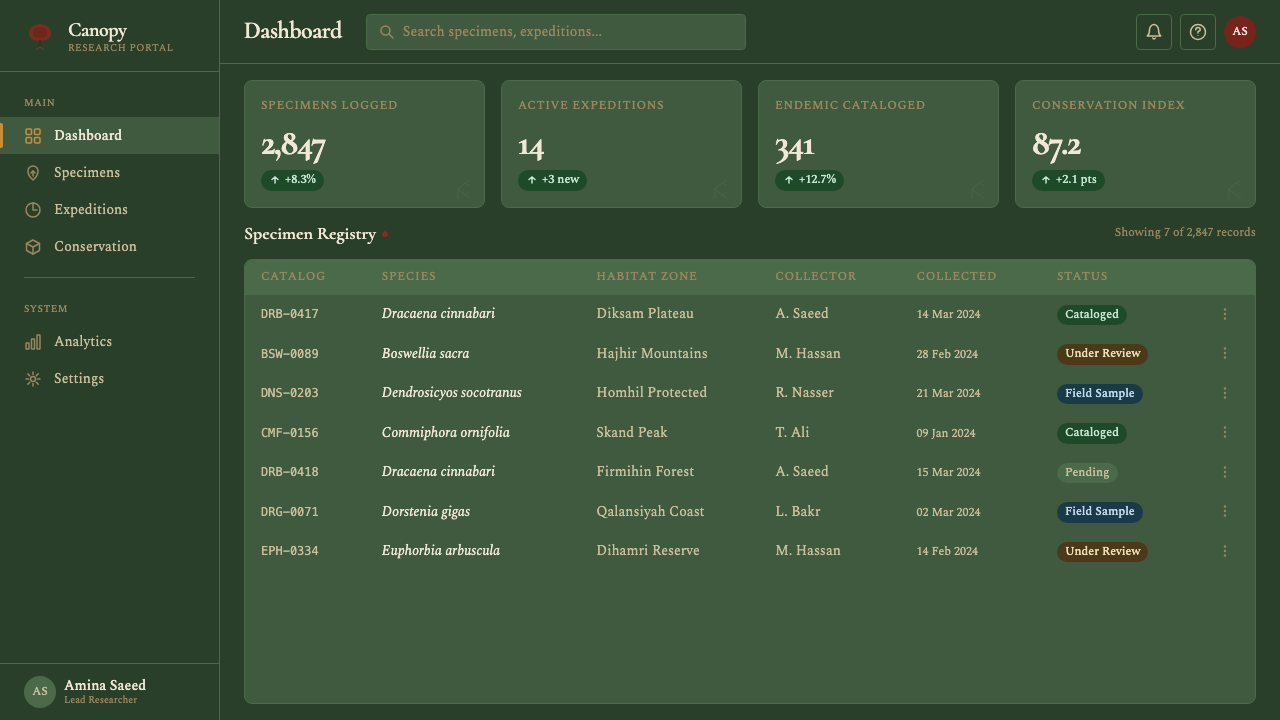
For web interfaces, the system is well suited to editorial platforms, archive and museum sites, natural science publications, and any product whose brand values include depth, rarity, and considered craft. Dashboard implementations should avoid cluttering the deep ground with too many UI elements — the system's power comes from restraint and the deliberate use of accent colors. Reserve the resin red for the single most important interactive element per view; use the amber for secondary information; let the limestone white carry text. Navigation and chrome should be minimal, almost receding, so the content reads as the specimen on display.
For editorial and marketing work, the system's strongest application is the long-form article or feature with a strong visual identity: think natural history magazine spreads, exhibition catalogues, or high-production brand storytelling. Frankincense amber works well for pull quotes and running headers; the resin red for section openers or key data callouts. Marketing pages can lean into the poster-like quality of the system — full-width dark sections with the amber or red used sparingly for the single most important headline or call to action.
The most common mistake when applying this system is treating the deep ground as simply 'a dark background' and then decorating it with whatever accent colors seem attractive. The system's ground has a specific quality — organic, warm-dark, green-inflected — and the accents were chosen to work with that specific quality. Bringing in a cool blue-white for body text, or substituting a generic scarlet for the resin red, breaks the temperature logic immediately. A second common mistake is overusing the resin red: because it is saturated and striking against the dark ground, it is tempting to use it for every interactive element, every heading, every label. Used this sparingly as the original designers intended — on one or two key elements per screen — it reads as precious. Used everywhere, it becomes noise.
Yemeni Socotra Dragon's Blood Tree — FAQ
Is this system suitable for products that aren't related to nature or ecology?
Yes — the system's ecological specificity is its visual foundation, not its thematic requirement. What it brings to any product is a dark-palette with genuine warmth and depth, a serif-forward typographic register that feels authoritative without being cold, and an accent color logic that resists genericness. These qualities are valuable in archival products, premium e-commerce, cultural institution sites, serious publications, and any context where the brand wants to communicate depth, considered craft, and something that doesn't look like everything else. The connection to Socotra or dragon's blood trees does not need to be explained or acknowledged in the product itself.
How does this system differ from other dark-palette design systems?
Most dark-palette systems use cool or neutral grounds — blue-blacks, charcoals, or near-blacks with no particular chromatic identity. This system's ground has a specific warm-green character derived from forest ecology, which changes how everything placed on it reads. Additionally, most dark systems default to either white or a bright accent for all interactive elements. This system's two-accent approach — deep resin red for action, frankincense amber for information — creates a more layered and less visually aggressive hierarchy. The serif typography is also distinctive: most dark UI systems reach for geometric sans-serifs.
Can the system work in a light-mode version?
Technically yes, but with significant caveats. The system's character depends on the relationship between the specific dark ground and the two warm accent colors — a relationship that inverts poorly. On a light ground, the resin red tends to read as simply 'a dark red accent,' losing the specificity that makes it feel like a material rather than a brand color. The frankincense amber, on a cream or white ground, can work well — it retains warmth. If a light variant is needed, a limestone-white ground with the amber as the primary accent and the resin red appearing only in small quantities (icons, underlines, key data points) is the most coherent approach. Avoid making the light mode the primary mode: the system was designed from the canopy down.
What kinds of imagery work best with this system?
Photography or illustration that shares the system's ecological and material character: images with warm amber or crimson tones, significant areas of deep shadow, and a documentary or specimen-like quality. Natural history photography works particularly well — the system was designed to frame content the way a natural history museum frames specimens. High-contrast images with areas of near-black shadow integrate smoothly. What doesn't work well: clean studio product photography with white or light-gray backgrounds (they fight the dark ground), brightly saturated lifestyle photography, or any imagery with heavy post-processing in cool tones (blues, cyans). Photography is best treated as a cropped specimen — silhouetted or contained — rather than as a full-bleed window.
Socotra is a real, ecologically threatened place. Is using it as a design reference exploitative?
This is worth taking seriously. The dragon's blood forests are under genuine pressure from climate change, overgrazing, and the consequences of the Yemeni civil war. Using their image in a design system does not, by itself, help or harm them. The more interesting question is whether the design system can do what good naming does: make the referenced thing more present in the mind of its users, more worthy of attention, more real as a place with a history rather than merely a striking visual. If the system prompts even a fraction of its users to learn about Socotra — its UNESCO designation, its conservation challenges, its cultural significance to the Mahri people and the broader Arab world — then the reference has done something beyond decoration. At minimum, using the system is an occasion to think about what it points toward.
Related design styles
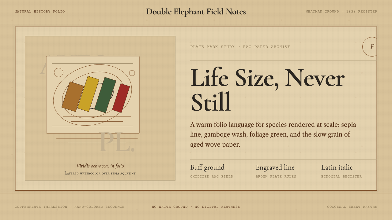 Audubon Birds of AmericaAged natural history breathes. Buff rag paper, sepia rules, and italic binomi…
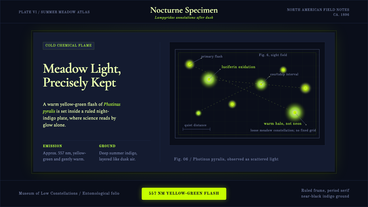 Firefly BioluminescenceQuietly luminous. Yellow-green 557 nm sparks drift through ruled indigo plate…
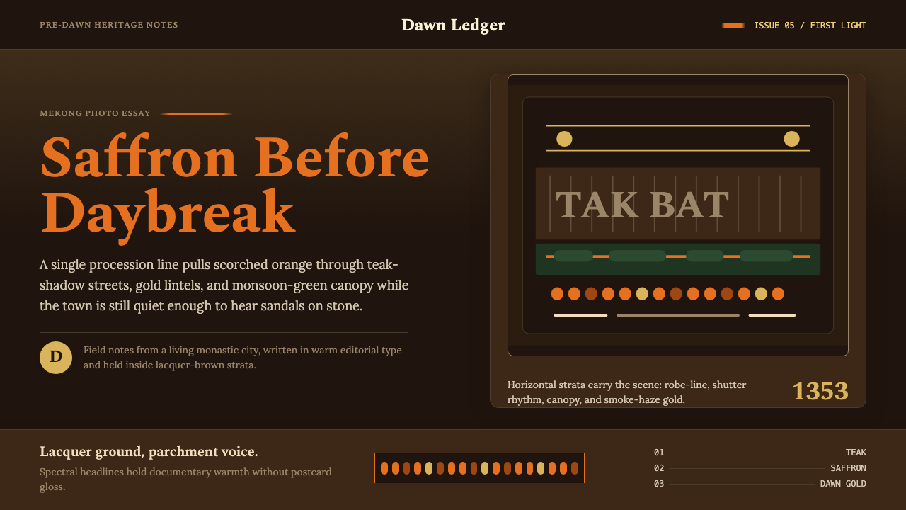 Luang Prabang Saffron AlmsDawn has weight. Saffron bands cut through teak brown and smoke-gold editoria…
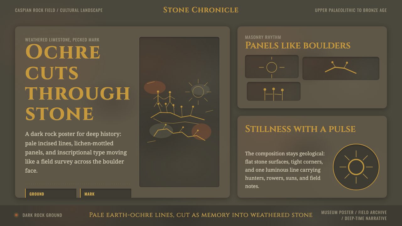 Azerbaijani Gobustan PetroglyphAncient rock speaks. Ochre incisions glow across dark lichen-mottled stone.
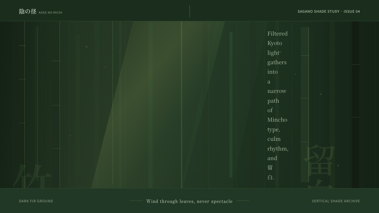 Bamboo GroveQuiet goes vertical. Fir green, Mincho type, and dappled culm rules create de…
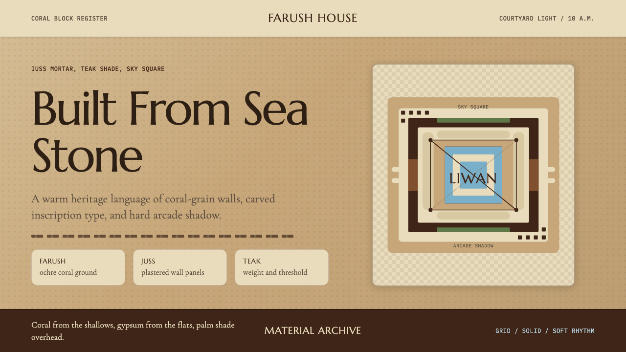 Emirati Bait Al Naboodah Coral HouseFeels built, not styled. Coral ochre, teak brown, and a sky-square courtyard…