What is Koi Pond?
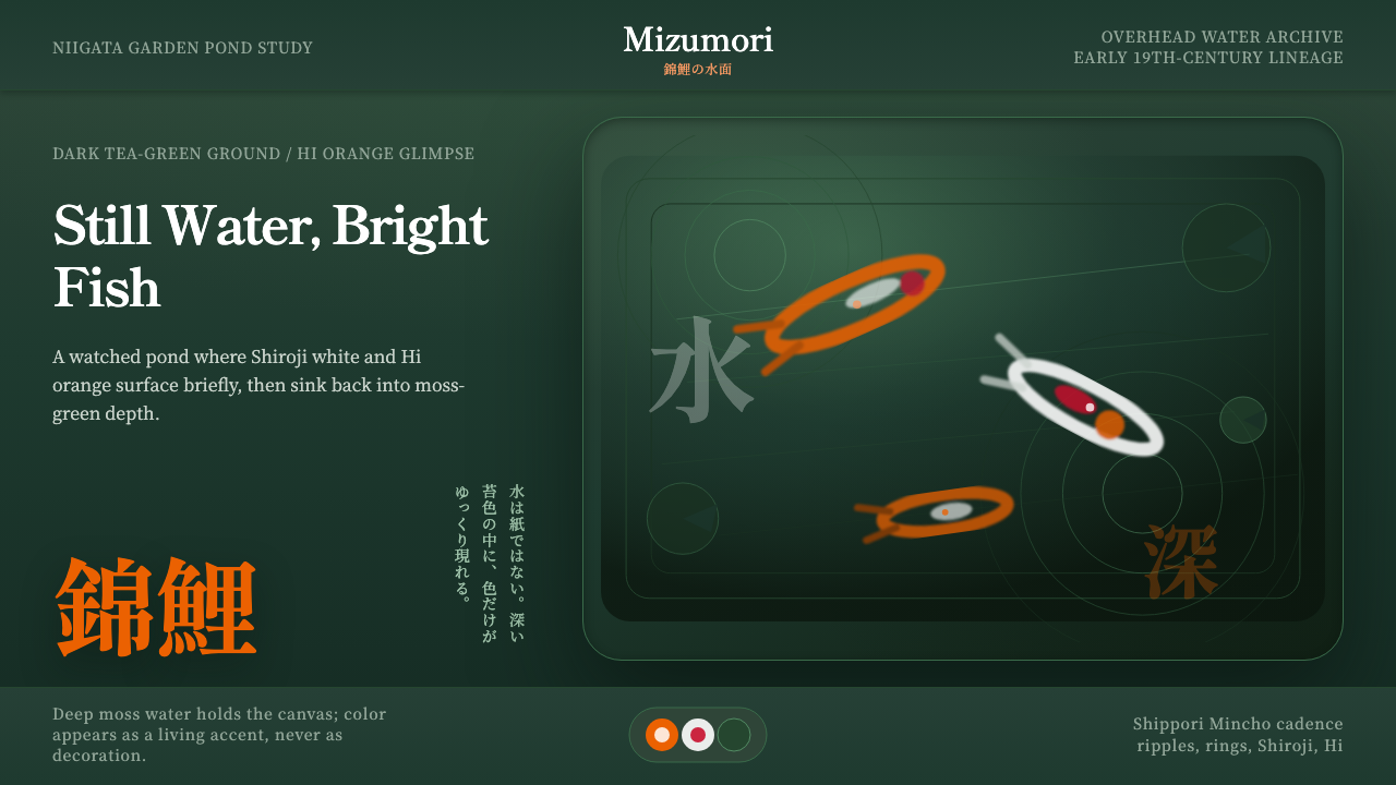
Koi Pond looks straight down into still garden water and asks a designed surface to hold color the way a pond holds a fish — glimpsed, not displayed.
Koi Pond in brief
Koi Pond is a design system built from the vantage point of someone leaning over the edge of a Japanese garden pond and looking straight down. The water itself — a deep, tea-tinted green that thickens toward the bottom of the frame — is the ground on which everything else sits. Ornamental carp, rendered as bright slips of orange, white, and red, move beneath that surface rather than across it, which is the system's central visual idea: color is glimpsed through depth, not laid flat on top of a background.
This is a dark-toned system by design. The moss-deep water holds most of the frame, and the carp read as incident, not subject — a flash of Hi orange breaking the surface calm rather than a hero image posed for the viewer. Concentric ripples radiate outward from wherever a fish has just surfaced or a drop has just fallen; lily pads and the sinuous outline of koi bodies layer over the ink-wash gradient like objects suspended at different depths in real water.
Type carries the mood rather than fighting it. Period-appropriate Japanese mincho serifs — the brush-descended serif tradition used in Japanese books and signage for well over a century — set the pace at an unhurried, watched-over-an-afternoon cadence. Nothing in the system rushes; the pleasure of a koi pond is precisely that you have to wait for something to happen, and the visual language is built to reward that patience.
Where does Koi Pond come from?
Nishikigoi — literally 'brocaded carp' — trace back to ordinary black and grey carp (magoi) that Japanese farmers in the mountainous rice-growing districts of Niigata Prefecture kept in irrigation ponds and paddy reservoirs as a winter protein source. Sometime in the early-to-mid 19th century, farmers in villages such as Yamakoshi began noticing occasional color mutations among their food carp — flashes of red or white scale among the drab grey — and began setting those individuals aside to breed rather than eat.
What followed was decades of patient, localized selective breeding carried out almost entirely by rice farmers rather than professional animal breeders. Niigata's mountain villages were snowbound for much of the year, so breeding lines developed in near-quarantine, each village favoring its own patterns and color combinations. Over generations this produced a widening vocabulary of named patterns — red and white, red-white-and-black, solid metallic sheens — bred purely for visual pleasure, a rare case of an agricultural byproduct becoming a deliberate ornamental art.
Nishikigoi remained a largely local, almost secret pleasure of Niigata's mountain farmers for a long stretch of the 19th century. Wider recognition is often linked to a formal exhibition in Tokyo in the early 20th century, after which koi keeping spread through Japan as a marker of garden refinement and, in the postwar decades, became an international export and hobbyist tradition — koi ponds now appear in gardens, hotels, and temple grounds far outside Japan.
The pond itself belongs to an older and separate lineage: the Japanese garden tradition of building still water as a contemplative feature, framed by irregular stone, moss, and overhanging plant life, meant to be observed slowly rather than crossed or used. Koi Pond as a design system fuses these two histories — the farmer-bred ornamental fish and the garden's philosophy of unhurried, framed stillness — into a single visual mood.
What defines the Koi Pond look?
Color
The palette is dominated by a deep, tea-tinted moss green that stands in for the pond water itself, darkening progressively from a lighter surface tone toward a near-black depth at the lower edge of any composition. Against that ground, nishikigoi color appears sparingly and in small area: the Hi orange-red of classic koi markings, a clean Shiroji white, and touches of black or red used the way a fish's markings would actually appear — as isolated patches, never as large fields. The system's discipline is restraint: the water must always read as the dominant color event, with carp color functioning as incident and accent rather than as the main palette.
Typography
Type is set in a period-appropriate Japanese mincho — the serif tradition descended from brush calligraphy that has carried Japanese books, signage, and formal documents for more than a century. The strokes carry visible variation in weight, echoing the brush's pressure rather than the uniform stroke of a geometric sans. This choice ties the system to an unhurried, literary register rather than a modern commercial one; mincho on a moss-dark ground reads closer to a woodblock print's caption than to a contemporary interface label.
Composition and Depth
The compositional logic is a straight overhead view into water, so depth is conveyed through value and layering rather than perspective lines or vanishing points. Elements stack as if suspended at different distances beneath the surface: ripple rings sit nearest the viewer, lily pads and koi silhouettes occupy a middle layer, and the ink-wash gradient recedes into an implied bottom that is never fully resolved or lit. The effect is a believable sense of looking down through liquid rather than at a flat illustration.
Motion and Ripple
Concentric rings are the system's primary motion motif, standing in for the moment a fish breaks the surface or a drop disturbs still water. These rings are drawn as thin, widening circles that fade as they travel outward, mimicking the physical decay of a real ripple rather than repeating at uniform strength. Movement is always implied and momentary — a ring, a fish mid-glide, a lily pad's edge just disturbed — never a sustained animated flourish, since the mood is water that is mostly still, occasionally interrupted.
Imagery and Silhouette
Koi themselves are rendered as sinuous, elongated silhouettes rather than detailed illustrations — a body shape and a patch of color are enough to read as 'fish glimpsed underwater' without the specificity of a photographic study. Lily pads follow the same logic: simplified rounded forms with a visible cleft, floating flat on the implied surface plane while the fish move in the plane beneath. This silhouette-first approach keeps the system feeling like an impression of a pond rather than a biological diagram of one.
Restraint and Negative Space
Large areas of the deep water ground are left visually quiet on purpose — a koi pond composition earns its moments of color precisely because most of the frame withholds it. This is closer to the pacing of an ink-wash painting than a densely patterned surface design: emptiness is not unfinished space but the condition that makes an occasional fish or ripple legible as an event. Overcrowding the water collapses the system's central effect.
Cultural Register
Every element in the system is drawn from a specific, real practice rather than a generalized 'Japanese' mood board — the fish are nishikigoi as bred in Niigata, the water treatment echoes the framed stillness of a garden pond, and the type is a genuine period serif rather than a decorative approximation. This specificity is what keeps the system from sliding into pastiche: it reads as a considered homage to an actual craft and a real regional history, not a loose gesture at 'Japan' in general.
Who shaped Koi Pond?
The anonymous generations of farmers in Niigata Prefecture's mountain districts who first noticed color mutations in their food carp, and chose to breed rather than eat them, are the true origin point of nishikigoi. Working without formal genetics, guided by patient observation across many breeding seasons, they turned a food animal into an ornamental art form — a transformation that happened almost entirely outside any institution or named school, driven by farmers pursuing beauty on the side of subsistence agriculture.
Yamakoshi, one of the mountain villages most closely associated with early nishikigoi breeding, is often cited as a cradle of the practice precisely because of its isolation — heavy snowfall cut the village off for long stretches of the year, letting distinct color lines develop with little outside cross-breeding. Its continued association with koi culture today reflects how thoroughly local geography shaped what became a globally traded ornamental fish.
The still-water pond as a contemplative garden feature belongs to the broader tradition of Japanese garden design, whose anonymous and named practitioners over centuries developed the vocabulary of framed stillness — irregular stone edges, moss, overhanging foliage, and water treated as a plane to be looked into rather than a body to be crossed. Koi Pond as a design system borrows this framing philosophy as much as it borrows the fish themselves.
How do you use Koi Pond today?
Koi Pond rewards restraint, which makes it most effective wherever a brand wants to signal calm attentiveness rather than energy or urgency. Applying it well means treating the deep water tone as the dominant visual event and letting color accents behave the way a fish actually behaves in a pond — appearing briefly, in a small area, then receding.
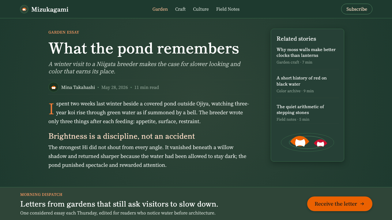
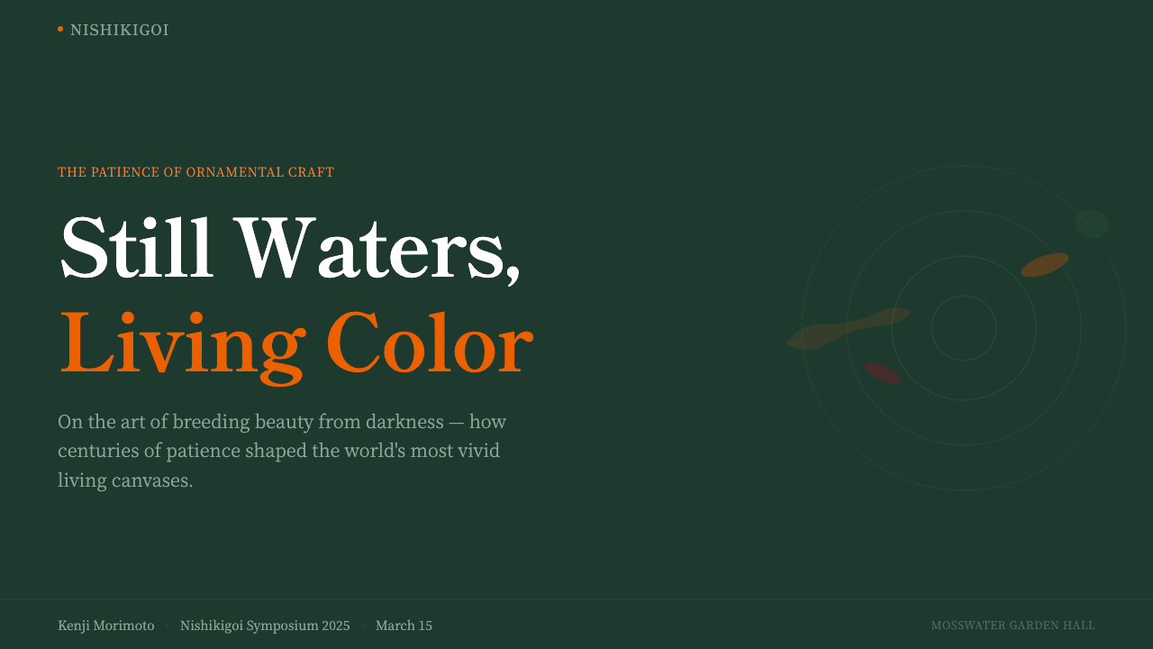
For presentation cover slides, the style is strongest when the moss-dark water fills most of the frame and a single ripple or koi silhouette anchors one corner, with the title set in a quiet, generously spaced mincho-inspired serif rather than a bold display face. Content and data slides should keep that water-first logic: a near-black or deep-green background, sparing use of the orange-red accent for the one number or label that matters most, and no more than a hint of ripple or lily-pad motif as a section marker rather than a repeated border.
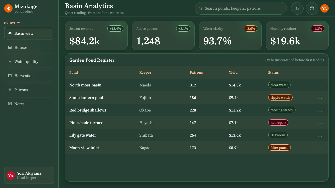
For web UI work, dashboards and account panels benefit from the system's quiet confidence — a deep, desaturated ground reduces visual fatigue over long sessions, while the orange-red accent becomes a natural signal color for primary actions or alerts, since it is the one color trained to draw the eye. Pricing pages can use the same logic in reverse: keep tier cards calm and dark, and reserve the accent almost entirely for the recommended-tier highlight, so the moment of choice reads the way a flash of koi reads against still water.
In editorial and marketing contexts, Koi Pond suits any brand story built around patience, craft, or long cultivation — wellness, tea and hospitality brands, slow-fashion, or any narrative that benefits from a 'still waters, considered outcome' mood. A magazine-style layout can let a full-bleed water-toned image carry a spread with a single koi detail cropped tight, headline type set small and unhurried against the dark ground, and pull quotes treated as if they, too, were glimpsed rather than announced.
The most common mistake is treating nishikigoi color as a palette to spread evenly across a layout — filling a page with orange, white, and red the way a tropical or festival theme might use bright color as a field. That inverts the system's logic. Koi Pond works because the water dominates and the fish are rare; a layout with color scattered everywhere reads as decorative pattern rather than as the specific, disciplined act of looking down into a real pond.
Koi Pond — FAQ
What makes Koi Pond different from a generic 'Japanese garden' or 'zen' aesthetic?
The difference is specificity. A generic zen mood board tends to borrow loosely from many sources — raked gravel, bamboo, cherry blossoms — without committing to any one of them in detail. Koi Pond commits to two concrete, real traditions: nishikigoi as actually bred in Niigata's mountain villages, and the still-water garden pond as a framed, contemplative feature. Every characteristic in the system — the water's tea-green depth, the specific accent colors of real koi markings, the period-correct mincho type — traces back to one of those two histories rather than to an atmosphere assembled from unrelated references.
Why is the water treated as the dominant color and the koi as accents, rather than the other way around?
Because that inversion is precisely what makes the fish feel alive rather than posed. If nishikigoi color filled most of a composition, the fish would read as a decorative pattern laid over a background — a wallpaper of koi. By keeping the deep water dominant and letting orange, white, or red appear only in small, deliberate patches, the system recreates the actual experience of watching a real pond: you look at still water for a long stretch, and color is the thing that occasionally interrupts it. That scarcity is what gives the accent its impact.
Can Koi Pond work in a light or high-key layout, or does it require a dark background?
The system is conceived as dark-toned, and the deep-water gradient is central to how depth and calm are communicated, so a fully light, high-key version works against its own logic. That said, isolated light moments are fine — a caption panel or a card within a larger dark layout can sit on a lighter, still tea-tinted ground without breaking the system, as long as the dominant field stays in the deep-water register. Treat the dark water as the rule and any lighter passage as a deliberate, contained exception.
Does the mincho typography have to be genuinely Japanese, or can a similar-feeling serif substitute?
For any layout that actually sets Japanese characters, a genuine period-appropriate mincho face is what carries the system's cultural weight — a generic serif approximation would undercut the specificity that makes the style credible. For Latin-alphabet layouts where no Japanese type is needed, the goal is to match the register mincho creates: unhurried pacing, visible stroke-weight variation reminiscent of brush pressure, and generous spacing rather than a tightly set, modern commercial serif. The letterforms will necessarily differ, but the pacing and restraint should not.
What kinds of products or brands should avoid Koi Pond?
The style struggles anywhere the brand needs to project speed, urgency, or high energy — flash sales, fast-turnaround consumer apps, sports and gaming contexts built around adrenaline rather than patience. Its deep, low-saturation ground and sparse color accents will read as slow or even inert in those settings, undercutting the message rather than supporting it. It is also a poor fit for brands with no genuine connection to Japanese craft or garden culture where the aesthetic would land as a costume rather than a considered choice; the style's credibility depends on the same specificity that makes it effective.
Related design styles
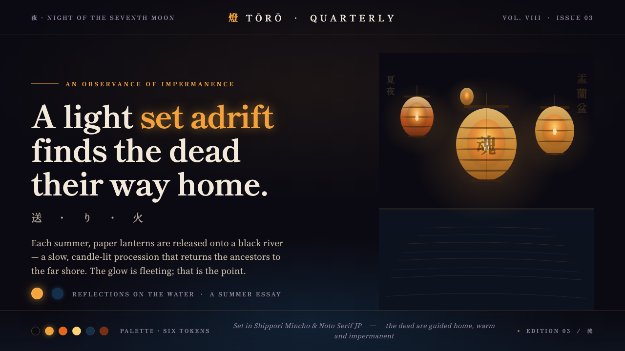 Obon Floating LanternsLight, set adrift. Amber washi lanterns on near-black water, each glow double…
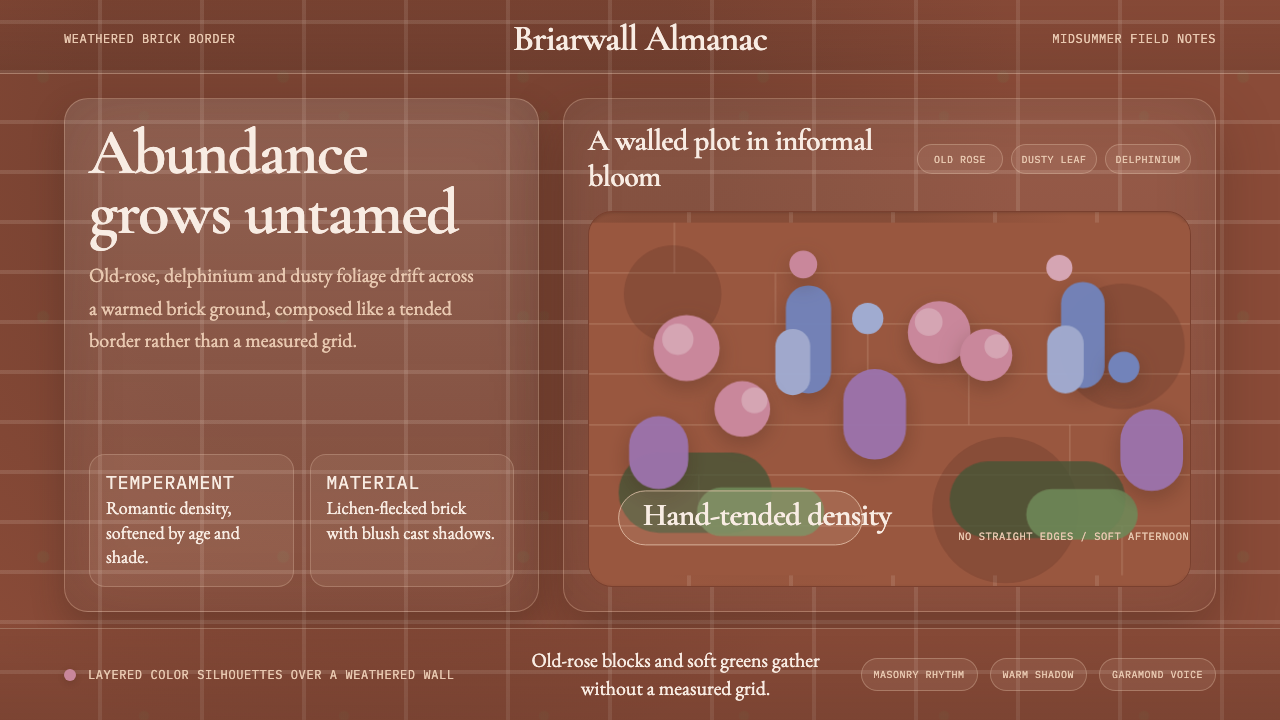 English Cottage GardenAbundance wins. Old-rose Garamond blooms over weathered brick and dusty leaf.
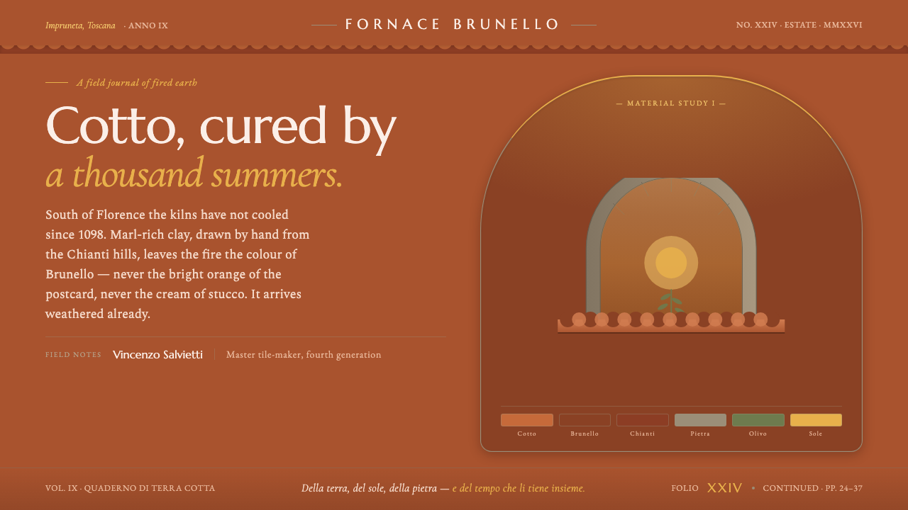 Tuscan TerracottaWeathered fired clay, never cream stucco. Brunello browns and sun ochre on hu…
 Yule SolsticeHolds the longest night. Pine-dark ground, carved Cinzel gold, an eight-spoke…
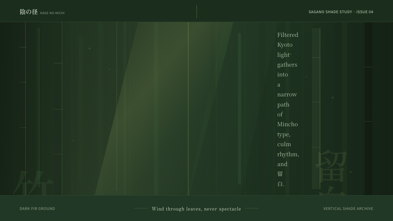 Bamboo GroveQuiet goes vertical. Fir green, Mincho type, and dappled culm rules create de…
 Gulf Pearl Trade EraA vanished maritime economy, stamped. Sea-teal water, dhow silhouettes, nacre…