What is Marbled Endpaper?
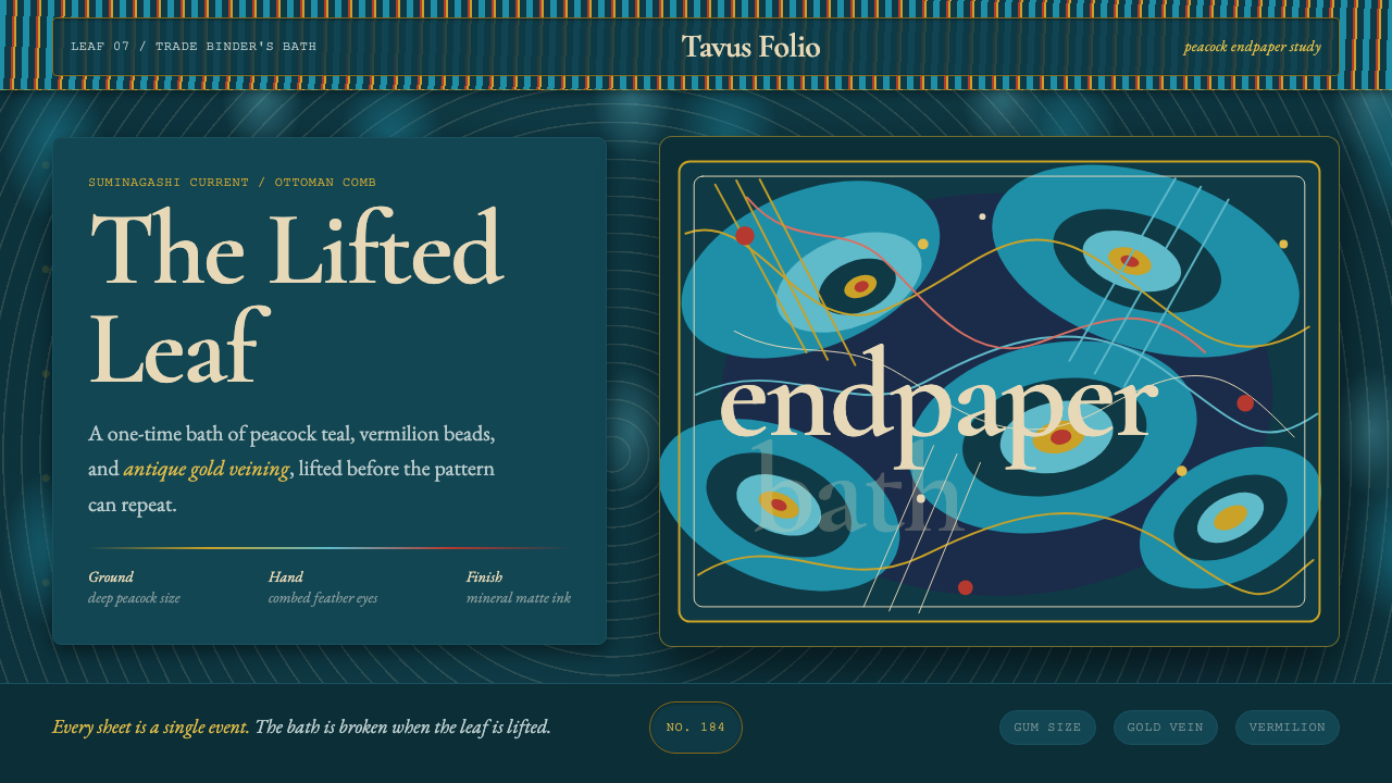
No two sheets of marbled paper are ever the same, because the pattern is drawn from ink drifting on water — and this system carries that same unrepeatable flow into an interface.
Marbled Endpaper in brief
Marbled Endpaper is a design system built from one of the most distinctive surfaces in the history of the book: the marbled paper glued inside the front and back covers of a finely bound volume. Unlike a printed pattern, marbled paper is made by floating pigment on a liquid surface and manipulating it with combs and fine tools before transferring the still-wet pattern onto a sheet of paper — which means every piece of authentic marbled paper is genuinely one of a kind.
The system draws on two related but distinct traditions that both feed into the European marbling this style channels: Ottoman ebru, in which pigments are floated on a thickened size and combed into structured patterns, and Japanese suminagashi — literally 'floating ink' — an older and simpler technique in which ink is dropped onto plain water and coaxed into rings with a breath of air or the light touch of a brush, then lifted onto paper as concentric, rippling circles. European binders adopted and elaborated the technique for book decoration from roughly the sixteenth century onward, and marbled endpapers became a signature mark of quality binding.
Visually, the palette is mineral and matte rather than glossy or synthetic — a deep peacock teal ground, a brighter teal-blue current running through it, crimson-red accents, and fine veins of antique gold, with a single lighter, combed highlight cutting across the composition. Nothing here is gridded, neon, or flat; everything is organized around curling, flowing movement, and typography leans toward a humanist, hand-bound character rather than a rigid technical typeface.
Where does Marbled Endpaper come from?
Suminagashi, meaning 'floating ink,' is generally considered one of the oldest ink-marbling techniques in the world, practiced in Japan since at least the Heian period. In its traditional form, drops of sumi ink are placed on the still surface of plain water, and the practitioner uses a light breath of air, a fan, or the gentle touch of a brush to spread the ink into fine concentric rings, which are then lifted directly onto a sheet of paper. Because the technique uses no thickening agent in the water, the patterns tend toward soft, rippling circles rather than the more structured combed patterns of later traditions, and historically the papers produced this way were prized for poetry writing and calligraphy.
Ottoman ebru developed a more elaborate approach: pigments are dispersed on a bath thickened with a size, traditionally derived from a plant gum such as tragacanth, which lets floating color hold its shape and be combed and manipulated far more precisely than plain water allows. Using tools such as fine styluses and wide-toothed combs, ebru masters could draw the pigment into structured motifs — tight, repeating 'eyes,' feathered nonpareil swirls, and wave-like currents — turning the technique into a disciplined craft passed down through workshops and guilds across the Ottoman world, closely associated with the broader tradition of Islamic book arts and manuscript decoration.
The technique reached Europe via Ottoman trade routes from roughly the sixteenth century onward, and European bookbinders adopted it enthusiastically for a very practical purpose: a marbled sheet, glued as the endpaper facing the inside of a book's cover, concealed the rough joint between the binding boards and the text block while adding a flash of color and pattern to an otherwise plain book. Because marbling was time-consuming, skill-dependent, and produced patterns that could never be exactly duplicated, a fine marbled endpaper became a quiet signal of a well-made, well-bound book, distinct from cheaper bindings that used plain paper.
European marblers went on to develop their own distinctive named patterns — variations achieved by different combing sequences and additives such as ox gall, which alters how pigments spread and interact on the size. The craft persists today largely as a hand practice maintained by book conservators, bookbinders, and dedicated marbling artists, who continue to float pigment on size and lift it onto paper using methods that remain recognizably close to the historical Ottoman and Japanese techniques from which the European tradition descends.
What defines the Marbled Endpaper look?
Color
The palette centers on a deep peacock teal, layered with a brighter teal-blue current, crimson-red accents, and fine antique gold veining, all rendered in a matte, mineral-pigment quality rather than a glossy or synthetic one. A single lighter, combed highlight cuts through the composition, echoing the pale streak a comb leaves when it is drawn once through a floating pattern.
Combed and Feathered Pattern
Motifs draw directly from real marbling patterns: tight, repeating 'eyes' formed by combing through concentric drops, and feathered, nonpareil-style swirls created by dragging a fine stylus through a field of color. These patterns are structured and rhythmic rather than random splashes, reflecting the disciplined hand movements of an actual marbling craftsperson.
Fluid Composition
The layout follows the logic of a pattern that was never gridded to begin with — content flows in curling, wave-like arrangements rather than locking to strict rows and columns. Straight, mechanical grids are avoided wherever possible in favor of arrangements that suggest movement and current, the way pigment genuinely drifts and folds on a liquid surface.
Typography
Type carries a humanist, hand-bound character rather than a geometric or technical one, reflecting the craft-book origins of the material. Latin text favors a warm, classically proportioned serif, while text set in Japanese honors the suminagashi lineage with a serif suited to that script, so the two writing systems feel like part of the same considered, hand-finished object rather than mismatched typefaces bolted together.
Surface Texture
Surfaces carry the subtle texture of fine paper rather than a perfectly smooth digital gradient — a quiet reminder that the pattern was lifted onto a physical sheet, not generated on a screen. This texture is kept restrained rather than heavy, since real marbled paper is fine and matte, not coarse or fibrous.
Asymmetric Balance
Because no two marbled sheets are ever identical, the system avoids mirrored or perfectly repeating symmetry. Balance is achieved through the visual weight of color and pattern density rather than exact repetition — a dense swirl on one side may be balanced by a calmer current elsewhere, the way a real marbler's hand never produces the exact same motion twice.

Who shaped Marbled Endpaper?
The Japanese floating-ink technique of suminagashi, practiced since at least the Heian period, is generally considered one of the oldest ink-marbling traditions in the world. Its practitioners developed a technique using no thickening size at all, relying instead on breath, fans, and brush touches to move ink across plain water into concentric rings.
Guilds of ebru masters in the Ottoman world developed the size-based, comb-driven marbling tradition that produces structured motifs such as eyes and feathered swirls, closely tied to the broader practice of Islamic manuscript and book decoration. Their disciplined, workshop-taught methods are the direct technical ancestor of the more elaborate combed patterns this design system draws from.
A twentieth-century Turkish calligrapher and marbling artist widely credited with innovating within the ebru tradition, including developing floral marbling motifs that layered representational flower shapes onto the classical combed patterns. His work is a well-documented example of the craft continuing to evolve within its own historical discipline rather than remaining static.
European binders who adopted marbling after it arrived via Ottoman trade routes used it for a practical purpose — concealing the joint between binding boards and text block — that also became an aesthetic signature of fine binding. Their workshops are the direct link between the Ottoman and Japanese origins of the craft and the marbled endpaper as it is known in Western book culture today.
The craft survives today largely through book conservators, bookbinders, and dedicated marbling artists who continue to float pigment on size and lift it onto paper using methods recognizably close to the historical technique, preserving both the practical skill and the specific visual vocabulary — eyes, feathers, currents — this design system is built from.
How do you use Marbled Endpaper today?
Marbled Endpaper works best where a message benefits from a sense of considered craft, rarity, and quiet luxury, because the entire system is built around the logic of a surface that can never be exactly reproduced. Applying it well means preserving the flowing, non-gridded composition and the restrained mineral palette, rather than simply overlaying a swirl texture on an otherwise conventional layout.
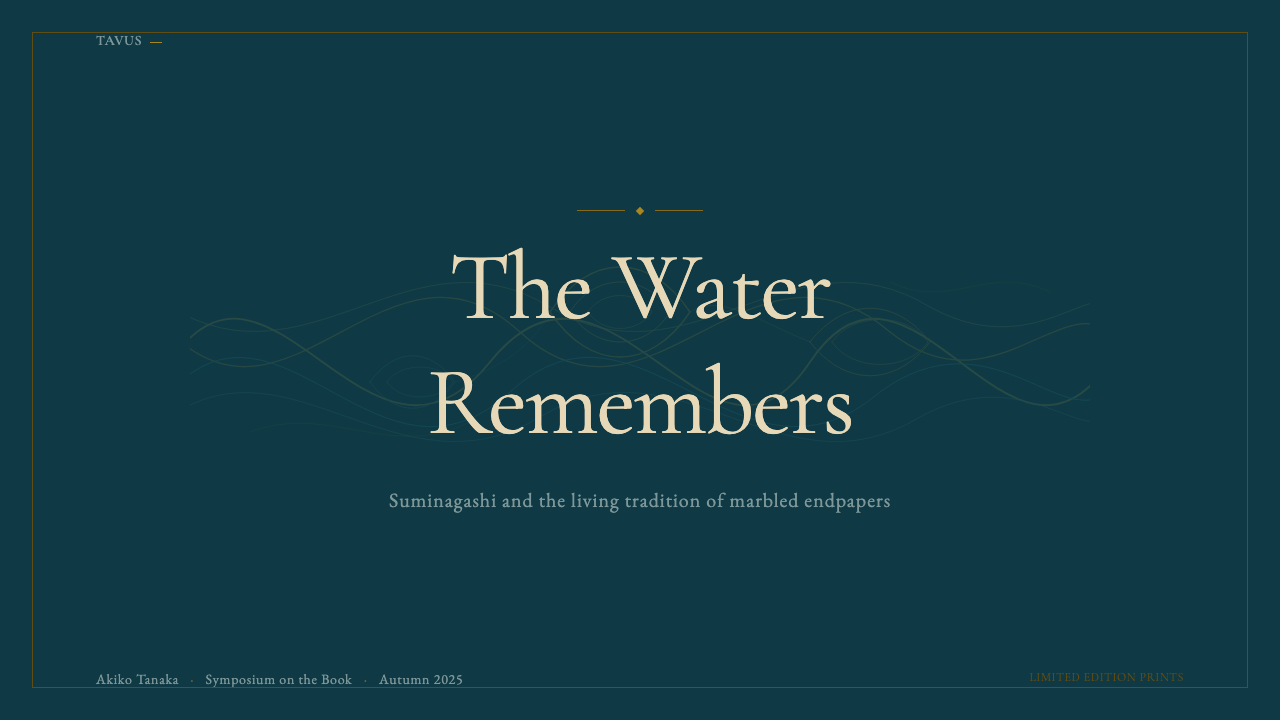
On presentation slides, the system is well suited to cover and section-divider slides, where a full-bleed marbled field can carry a title the way an endpaper announces the beginning of a fine book. Content slides should keep the flowing pattern in the background or margins rather than the main content area, letting body text sit on a calmer, more even passage of the pattern so it stays legible.
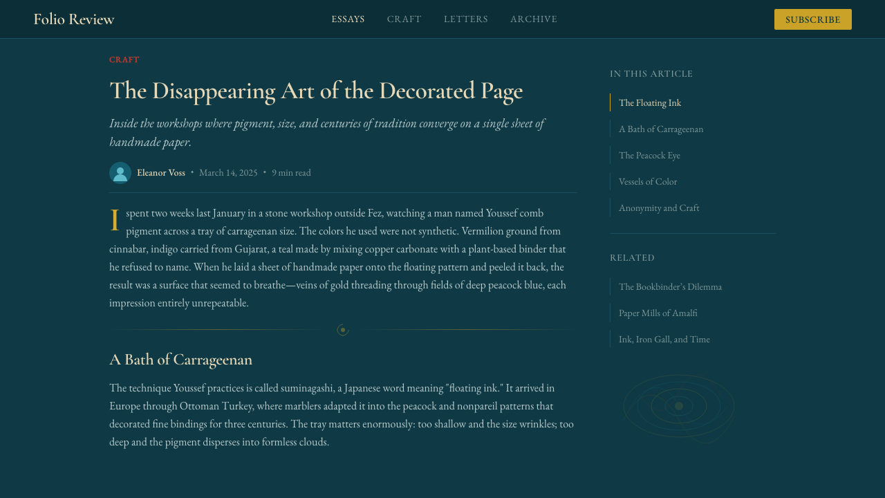
For web interfaces, the system suits editorial platforms, publishing tools, and premium creative products, where dashboards and account pages can afford a considered, book-like warmth rather than a purely functional feel. Section dividers and card borders can take on the fine, feathered line quality of a combed pattern instead of a plain rule, and gold-veined accents work well reserved for a small number of premium or highlighted elements.
In editorial and marketing contexts, the system is a strong match for storytelling about craft, books, printmaking, or heritage. Long-form articles benefit from a marbled field used as a section-opening flourish rather than a repeating background, and pull quotes can be framed against a calmer current of the pattern. Marketing pages for handmade or limited-edition goods read naturally within the system's built-in sense of uniqueness — no two instances of the pattern need to look identical.
A common mistake is treating the marbling pattern as a generic decorative texture to be tiled uniformly across a whole page, which flattens its meaning; authentic marbled paper varies in density and direction across a single sheet, and the design should preserve that variation rather than repeating one motif mechanically. A second mistake is forcing the flowing pattern into a strict grid layout, which contradicts the entire logic of a technique defined by liquid, ungridded movement.
Marbled Endpaper — FAQ
What is the difference between ebru and suminagashi?
Suminagashi is the older and simpler technique, floating plain ink on untreated water and shaping it with breath or a light brush touch into soft concentric rings. Ebru uses a thickened size, traditionally derived from a plant gum, which lets pigment hold its shape and be combed into far more structured, repeating motifs. Both traditions feed into the European marbling practice that produced the fine book endpapers this design system is based on.
Why is marbled paper always unique — can it be exactly reproduced?
Because the pattern is formed by pigment actually floating and moving on a liquid surface at the moment it is lifted onto paper, and no two combing motions, drop placements, or transfer moments are ever perfectly identical. Skilled marblers can produce closely similar results within a named pattern family, but true one-to-one duplication is not possible with the traditional hand technique, which is precisely why fine marbled endpapers were historically valued as a mark of quality.
Why did European bookbinders start using marbled paper?
The original purpose was practical: a marbled sheet glued as the endpaper facing the inside of a book cover concealed the rough joint between the binding boards and the text block. Because the technique was skill-dependent and time-consuming, and produced patterns that could never be exactly duplicated, a fine marbled endpaper also became a visible signal of a well-made, well-bound book.
Is this style only appropriate for dark backgrounds?
The system as sourced here is built around a deep peacock-teal ground, which is how the specific specimen it draws from is composed, but marbling itself has a long history on lighter, cream-toned papers as well. What matters more than light-versus-dark is preserving the flowing, ungridded composition and the restrained, mineral-toned palette rather than a bright, synthetic color range.
What is the most common mistake when applying this style?
The most common mistake is treating the marbled pattern as a uniform, repeating decorative texture tiled evenly across a page, which contradicts the whole point of a technique whose density and direction genuinely vary across a single sheet. A close second is forcing the flowing composition into a strict rectangular grid, which fights against the liquid, ungridded logic that defines authentic marbling.
Related design styles
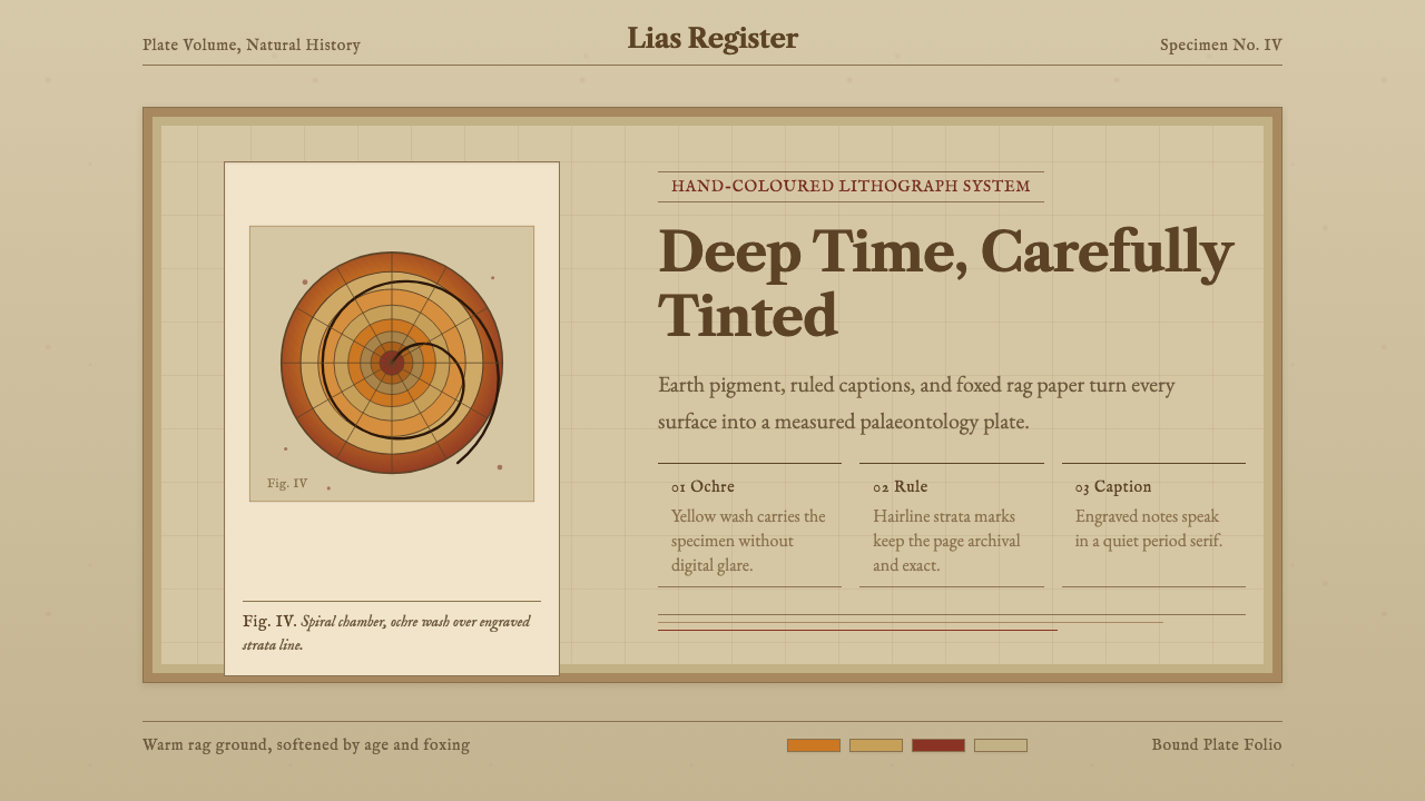 Ammonite Fossil PlateDeep time feels hand-tinted. Ochre spiral, foxed paper, and engraved captions…
 New Caledonia Kanak TotemSolemn carved darkness. Ochre axis, kaolin serif type, and conch dots hold th…
 Icelandic Turf HouseThe hillside becomes shelter. Peat coursing surrounds one narrow line of yell…
 La Tène Celtic MetalworkMetalwork that still moves. Patina-green relief radiates from a bronze boss,…
 Robin Hood (Sherwood ballad)The greenwood sings in print. Black-letter, Lincoln green, and gilt borders f…
 William Morris Arts & CraftsOrnament is the argument. Forest green wallpaper frames cream pages, gold rul…