What is Ammonite Fossil Plate?
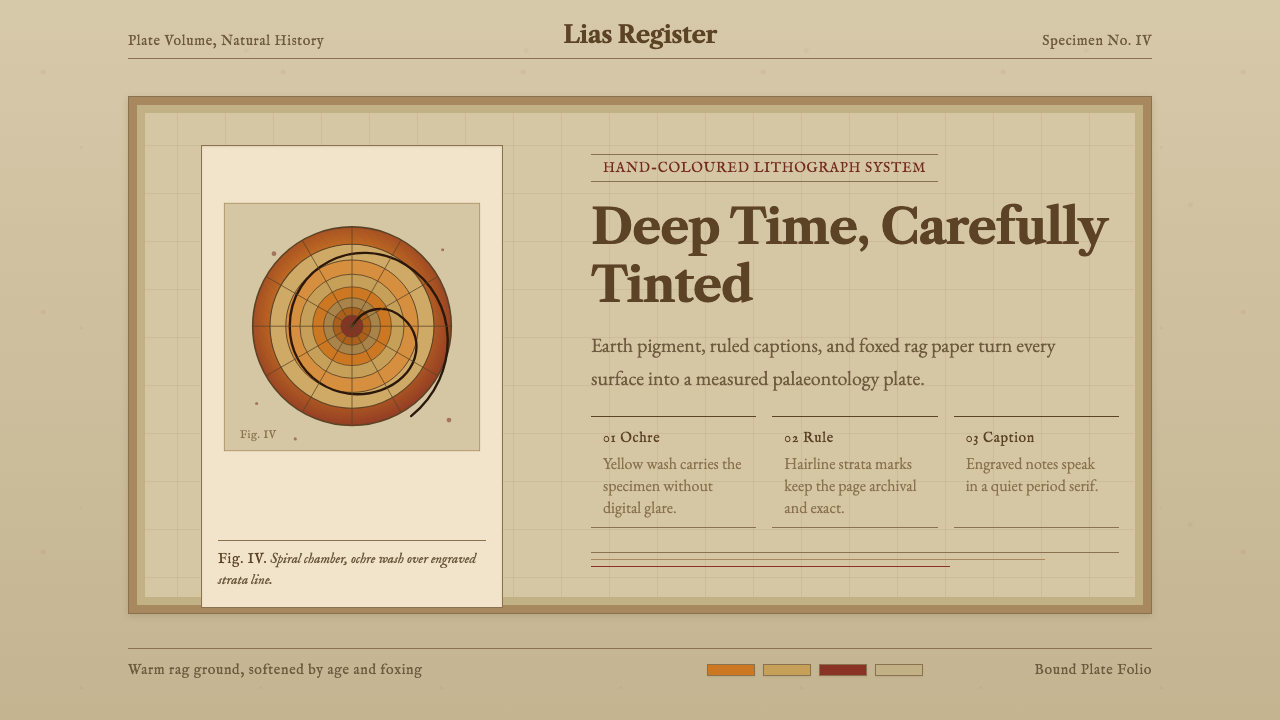
The Ammonite Fossil Plate style turns a hand-tinted Victorian science illustration into a design system — ochre spirals, foxed paper, and engraved captions standing in for a whole vanished world of gentleman geologists.
Ammonite Fossil Plate in brief
An Ammonite Fossil Plate is the visual language of a mid-nineteenth-century palaeontology lithograph: a spiral-chambered ammonite shell, drawn in engraved line and then hand-coloured in yellow ochre and raw sienna, printed on toned rag paper that has since darkened and spotted with age. It is the specific look of the plates bound into geological monographs of the 1840s and 1850s, where every specimen was numbered, captioned in engraved serif, and cross-referenced to a stratum.
As a design system, it treats that plate as a template rather than a museum artefact. Backgrounds read as warm, aged paper rather than clean digital white. Colour is restricted to muted earth pigment — ochre, sienna, umber — never saturated or synthetic. Cards behave like plate panels bordered in fine rule; dividers behave like ruled strata lines separating one geological layer from the next; and the ammonite's own logarithmic spiral recurs as the system's signature ornament, appearing wherever a system needs a mark rather than a photograph.
The overall effect is closer to opening an old cabinet of curiosities than browsing a modern interface. Every surface carries the implication of having survived a century and a half on a shelf, which is precisely what gives the style its authority — it borrows the credibility of the specimen record itself.
Where does Ammonite Fossil Plate come from?
The style descends from a very specific moment in the history of science: the decades immediately following the founding of the Geological Society of London in 1807, when geology and palaeontology were still assembling their basic vocabulary. Fossils had only recently been accepted as the remains of extinct creatures rather than 'sports of nature' or biblical curiosities, and the men cataloguing them needed a way to communicate specimens precisely enough that a colleague working from the printed plate alone could identify the same species in his own local rock. The engraved, hand-coloured lithograph was the answer — precise enough to serve as scientific evidence, beautiful enough that collectors bound the plates into their own libraries.
James Sowerby and his sons were central to this tradition. Their multi-volume works on British shells and fossils, produced across the early decades of the nineteenth century, established the convention of the numbered plate: a specimen drawn in careful profile, its chambers and sutures rendered in fine engraved line, then washed by hand with muted mineral-derived pigment, and captioned below in a restrained engraved serif giving the species name, locality, and often the stratum in which it was found. Ammonites — with their dramatic spiral form and their usefulness as index fossils for dating rock layers — were disproportionately popular subjects.
Henry De la Beche, a founding figure of British geological science and later the first director of the Geological Survey of Great Britain, worked in this same milieu of illustrated stratigraphy — a world in which drawing accurately was inseparable from doing the science itself. The plates produced in and around the Geological Society's circles were not decorative afterthoughts; they were the primary evidence, the thing that let geology become a comparative, cumulative discipline rather than a collection of isolated local observations.
By the time these plates reached the shelf-worn state the style now evokes, they had usually passed through decades of handling in private libraries and society reading rooms — rag paper darkening unevenly, foxing spreading in small rust-coloured spots, ink and hand-colour both fading a little at the edges. That patina is not an accident the design system tolerates; it is the entire point. The style asks a screen to look like the survivor of that century and a half, not like a fresh reproduction of it.
What defines the Ammonite Fossil Plate look?
Color
The palette is drawn entirely from mineral and earth pigments — ochre, raw sienna, umber, and a warm neutral standing in for foxed paper — with no bright or saturated hues anywhere in the system. Ochre carries most of the symbolic weight, standing in for the ammonite itself; it is used sparingly, as an accent rather than a field colour. There is no pure black; dark values are always warmed, as if mixed from the same earth-derived pigments as everything else.
Typography
Type carries the quiet, slightly formal authority of an engraved caption rather than the neutrality of a modern interface font. Headlines and labels favour a period-appropriate serif with the restrained, evenly cut quality of copperplate engraving — nothing decorative or calligraphic, closer to a scientific label than an invitation card. Body text is set with generous, unhurried spacing, echoing how captions sat below a plate with room to breathe rather than being crowded against the image.
Paper and Surface
Every background reads as toned rag paper rather than a neutral canvas — warm, slightly uneven, and marked by the faint irregularity of foxing rather than a flat tint. This is the system's most important departure from typical archival or vintage styles, which often idealize old paper as uniformly cream. Here the surface is allowed to look genuinely aged: darker at the edges, spotted unevenly, closer to a page that has actually spent a century and a half on a shelf than to a template's idea of 'old.'
Line and Engraving
Structural marks — borders, dividers, underlines — behave like engraved lines rather than clean vector rules: fine, slightly uneven in weight, with the understated precision of a burin drawn by hand rather than a ruler drawn by machine. A divider is never a flat, perfectly uniform rule, but carries the faint irregularity of an engraved stratum line on the original plate.
The Spiral Motif
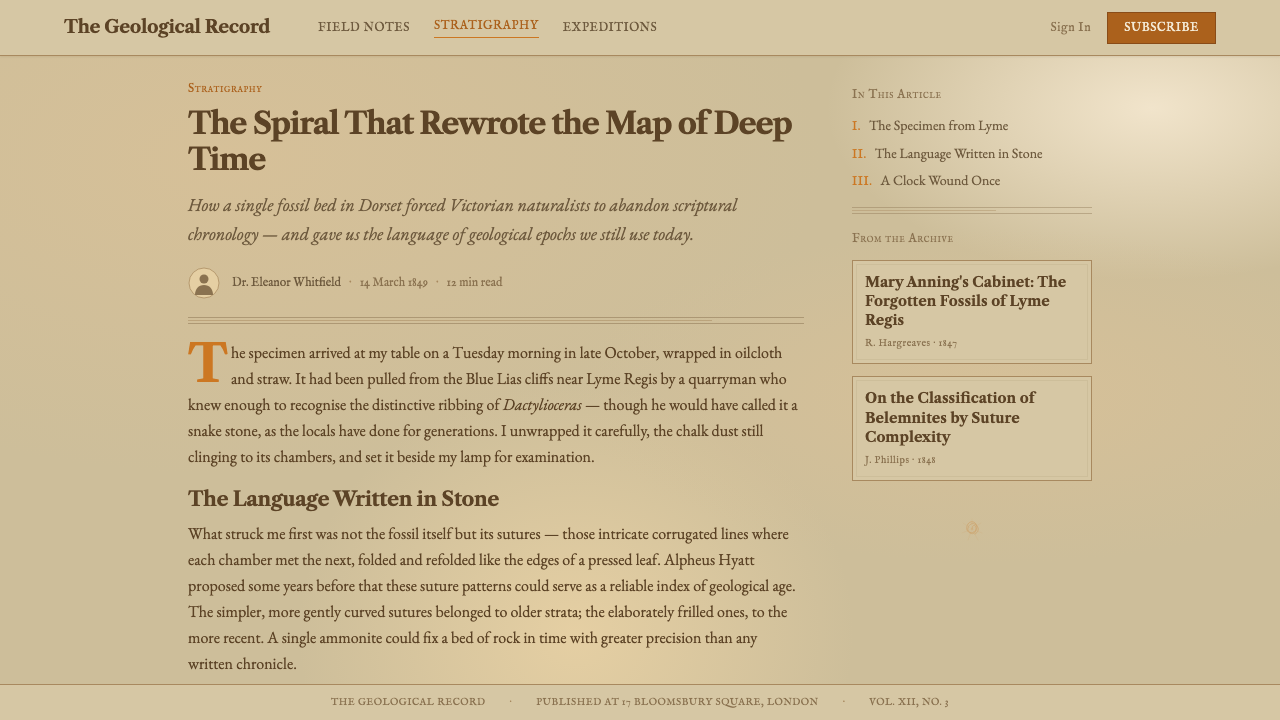
The ammonite's logarithmic spiral is the system's one recurring emblem, used the way a scientific plate would use a specimen mark rather than the way a modern brand would use a logo mark. It appears as a quiet structural reference — a chapter marker, a loading indicator, a corner ornament — always rendered as line rather than filled shape, always modest in scale. It is never used as a bold decorative centrepiece; its authority comes from restraint and recurrence, not prominence.
Composition and Captioning
Layouts follow the logic of a plate paired with a caption block rather than a modern asymmetric grid: a dominant visual area (the specimen, or its screen equivalent) sits with generous surrounding space, and the explanatory text sits below or beside it in a distinct, quieter register — smaller, more restrained, clearly subordinate to the image it describes. This mirrors how a nineteenth-century plate separated the act of looking from the act of reading the label.
Restraint and Absence of Gloss
Nothing in the system is glossy, glowing, or high-contrast in the way modern digital surfaces often are. Elevation, where it exists at all, is suggested through paper-like layering rather than through soft glows or vivid drop shadows. The style deliberately withholds any effect that would read as 'screen' rather than 'plate' — no gradients that mimic light sources, no saturated highlight states. Its restraint comes from fidelity to print, not from a general minimalist instinct.
Who shaped Ammonite Fossil Plate?
Sowerby and his sons produced the multi-volume illustrated catalogues of British shells and fossils that established the visual convention this style draws on: the numbered, hand-coloured engraved plate with a captioned specimen. Their work set the template that geological publishing followed for decades, and ammonites were recurring subjects across the family's output.
A founding figure of British geological science and the first director of the Geological Survey of Great Britain, De la Beche worked in the same illustrated-stratigraphy milieu that produced this style's source plates. His career reflects how central precise, publishable illustration was to establishing geology as a comparative, evidence-based discipline.
Founded in 1807, the Society was the institutional home for the circle of authors and illustrators who produced this era's palaeontological plates. Its transactions and members' private publications gave the numbered, captioned, hand-coloured plate its standard form.
Often called the father of English geology, Smith pioneered the practice of using fossils — ammonites prominent among them — to identify and correlate rock strata across distant locations, producing the first geological map of England in 1815. His method is the scientific logic underlying every captioned, stratum-referenced plate this style evokes.
How do you use Ammonite Fossil Plate today?
The Ammonite Fossil Plate style rewards contexts where an audience should feel they are handling something rare and vetted, rather than something mass-produced — its aged-paper surface and engraved restraint work against speed and against novelty, so it is most effective wherever credibility and specimen-like precision matter more than immediacy.
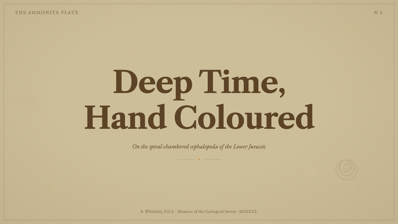
For presentation slides, the style excels on cover and content pages where the goal is gravitas rather than energy. A cover slide can treat the title like a plate caption beneath a single large spiral motif, generous margins standing in for a matted frame. Content slides work best as a specimen-and-label pairing: one dominant visual or diagram occupying most of the frame, with a smaller, quieter caption block beneath carrying the explanatory text. Data slides should resist the urge to look like modern dashboards; a single chart rendered in the muted earth palette, captioned plainly below, reads far more in keeping with the system than a grid of colourful widgets.
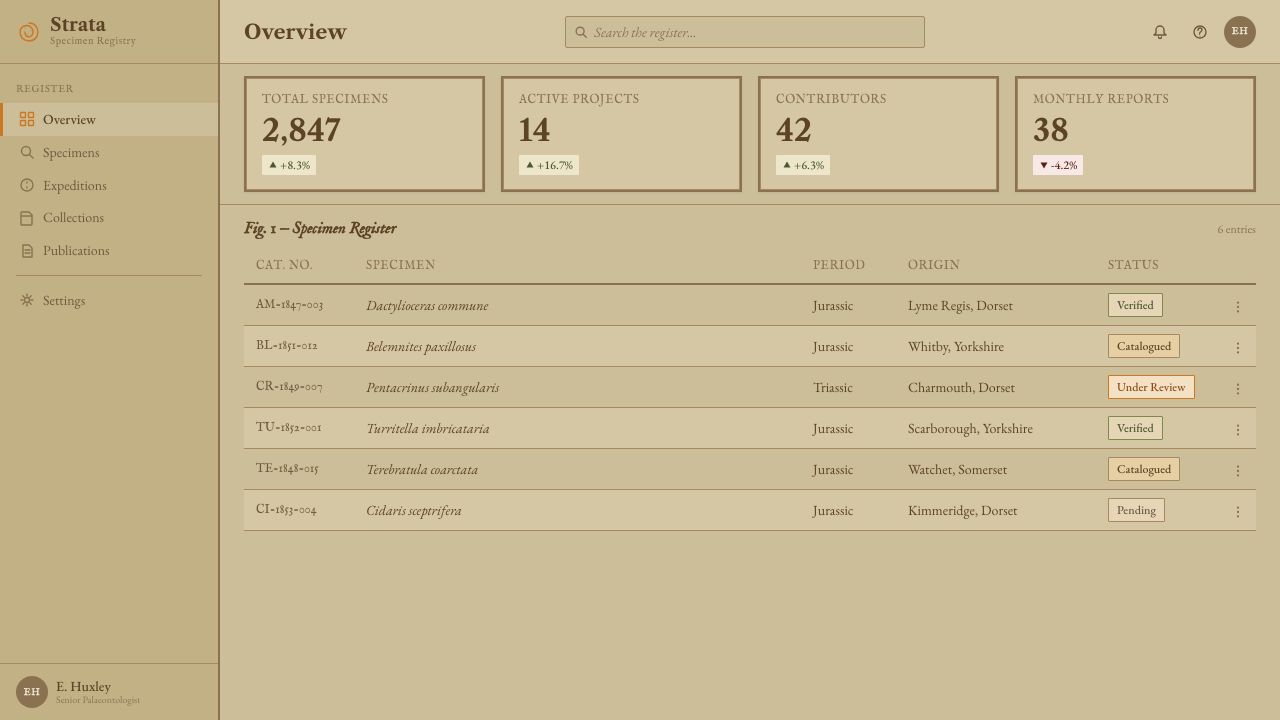
For web interfaces, the style is a strong fit for dashboards and pricing pages aimed at an audience that values expertise and heritage — archival tools, research platforms, premium subscription products positioning themselves as considered rather than trendy. Cards should read as bordered plate panels rather than floating tiles; dividers should carry the fine, slightly uneven quality of an engraved stratum line; and any accent colour used for pricing tiers should stay within the ochre-to-umber range rather than introducing a bright brand colour that would break the paper illusion.
For editorial and marketing work, the style suits long-form writing that wants to feel authoritative and unhurried — natural history explainers, heritage brand storytelling, or premium print-adjacent editorial. A pull-quote or section break can borrow the spiral motif as a quiet chapter marker; body copy benefits from generous line spacing that echoes how captions once sat with room to breathe beneath a plate. Marketing pages should lead with a single strong specimen-like image rather than a montage.
A common mistake is to treat this style as generic 'vintage' or 'sepia filter' dressing, applying a brown tint to an otherwise ordinary layout and calling it done. That misses what actually carries the system: the restraint of the earth-only palette, the specificity of engraved-caption typography, and the deliberate unevenness of the aged paper surface. Skipping the fine engraved line-work in favour of plain flat borders, or introducing a bright saturated accent colour for 'pop,' collapses the illusion immediately — the style depends on every element behaving like it belongs to the same worn, hand-coloured plate.
Ammonite Fossil Plate — FAQ
Is this the same as a generic 'vintage' or 'sepia' theme?
No. A generic vintage theme usually just tints an ordinary layout brown and calls it aged. The Ammonite Fossil Plate style is built around a specific historical object — the numbered, hand-coloured geological plate — and inherits its actual conventions: an earth-only palette rather than a single tint, engraved-caption typography rather than a generic serif, genuinely uneven foxed paper rather than a flat cream background, and the recurring spiral motif drawn specifically from the ammonite's own geometry. It is closer to a museum reproduction than a filter.
Can this style work with bright or saturated accent colors?
Not without breaking the illusion. The whole system depends on every colour reading as a pigment a Victorian hand-colourist could plausibly have mixed from earth and mineral sources. Introducing a bright saturated blue or a neon accent immediately signals 'modern digital interface' rather than 'aged scientific plate,' and undercuts the credibility the style is built to convey. If a product absolutely requires a bright brand colour, it should be used extremely sparingly and isolated from the plate-like surfaces — never blended into the core palette.
Does this style suit playful or casual products?
Generally not. The style's entire authority comes from evoking careful, evidence-based Victorian science — restraint, precision, and the implication of age. That register reads as serious and considered, which is an asset for research tools, archival products, natural history content, or premium heritage branding, but works against products that want to feel light, fast, or fun. A playful product using this style risks a tonal mismatch: the surface says 'century-old specimen record' while the content says 'quick and casual,' and the two undercut each other.
How does the spiral motif differ from a typical brand logo mark?
A typical logo mark is designed to be bold, memorable, and prominent — it wants attention. The ammonite's spiral, as used in this system, borrows the opposite logic: it behaves like a specimen mark on a scientific plate, appearing modestly and repeatedly as a quiet structural reference, always rendered thin and linear rather than as a filled, graphic shape. Its authority comes from restraint and consistency rather than visual dominance.
What's the biggest risk when applying this style to a modern product?
The biggest risk is treating age as a surface effect rather than a structural discipline. It's tempting to add a paper texture and a brown tint and stop there, but the style's credibility depends on every layer agreeing: the palette must stay within earth pigments throughout, the typography must carry engraved-caption restraint rather than a generic serif, and compositions must separate a dominant visual from a quieter caption the way a real plate does. Leaving any one of these un-updated — a bright accent slipping in, a modern drop shadow under a card — reminds the viewer they are looking at a screen pretending to be a plate, not the plate itself.
Related design styles
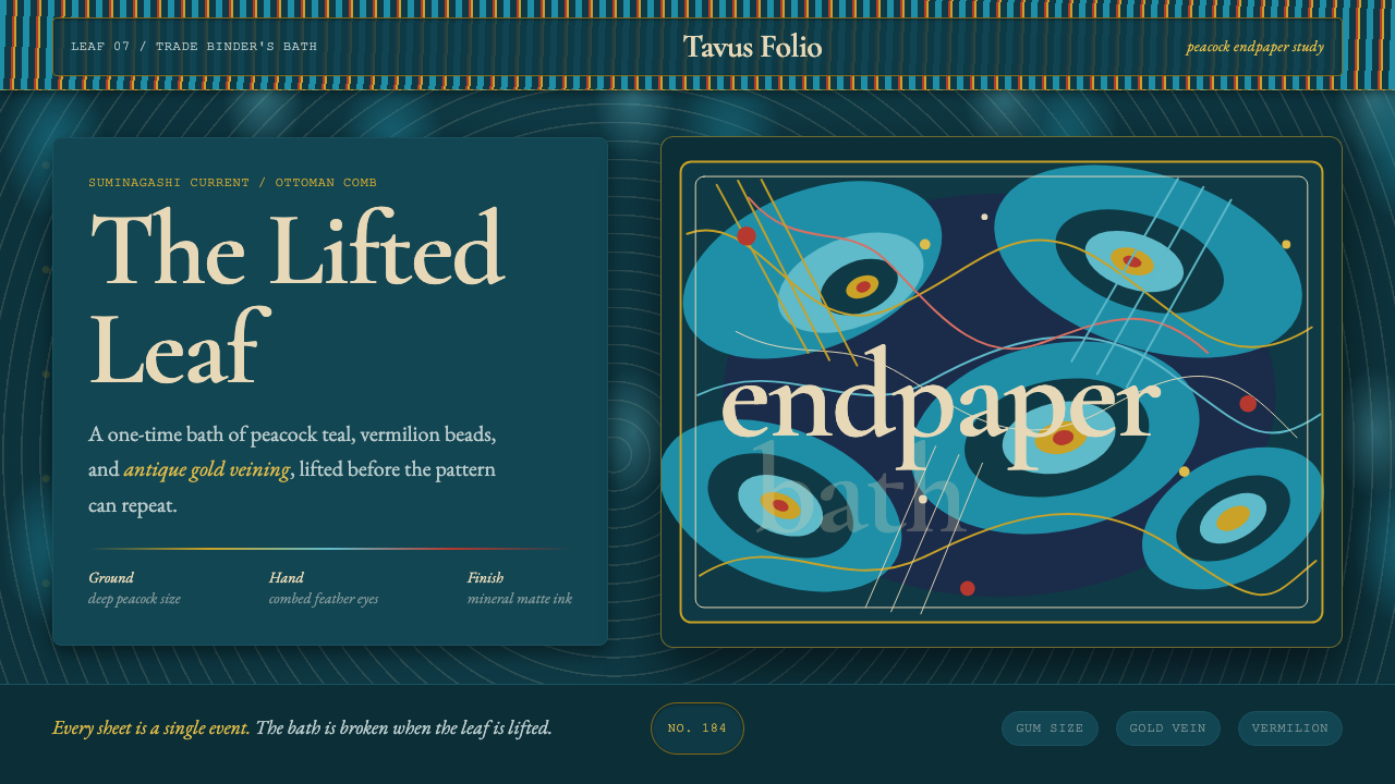 Marbled EndpaperInk refuses repetition. Peacock teal, vermilion beads, and gold veins drift l…
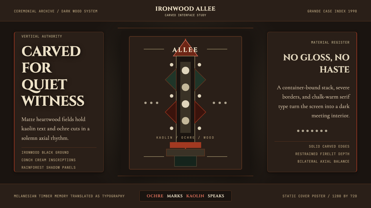 New Caledonia Kanak TotemSolemn carved darkness. Ochre axis, kaolin serif type, and conch dots hold th…
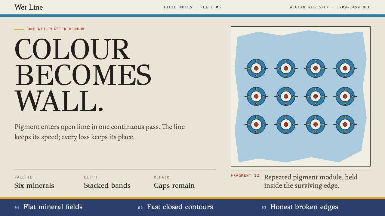 Knossos Minoan FrescoColour becomes wall. Six mineral fields meet swift contours and honest fragme…
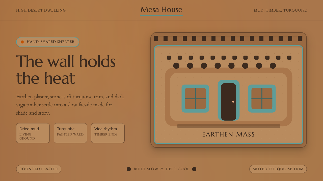 Adobe Pueblo SouthwestFeels made by hand. Earthen tan, turquoise trim, and viga rhythm shape the fr…
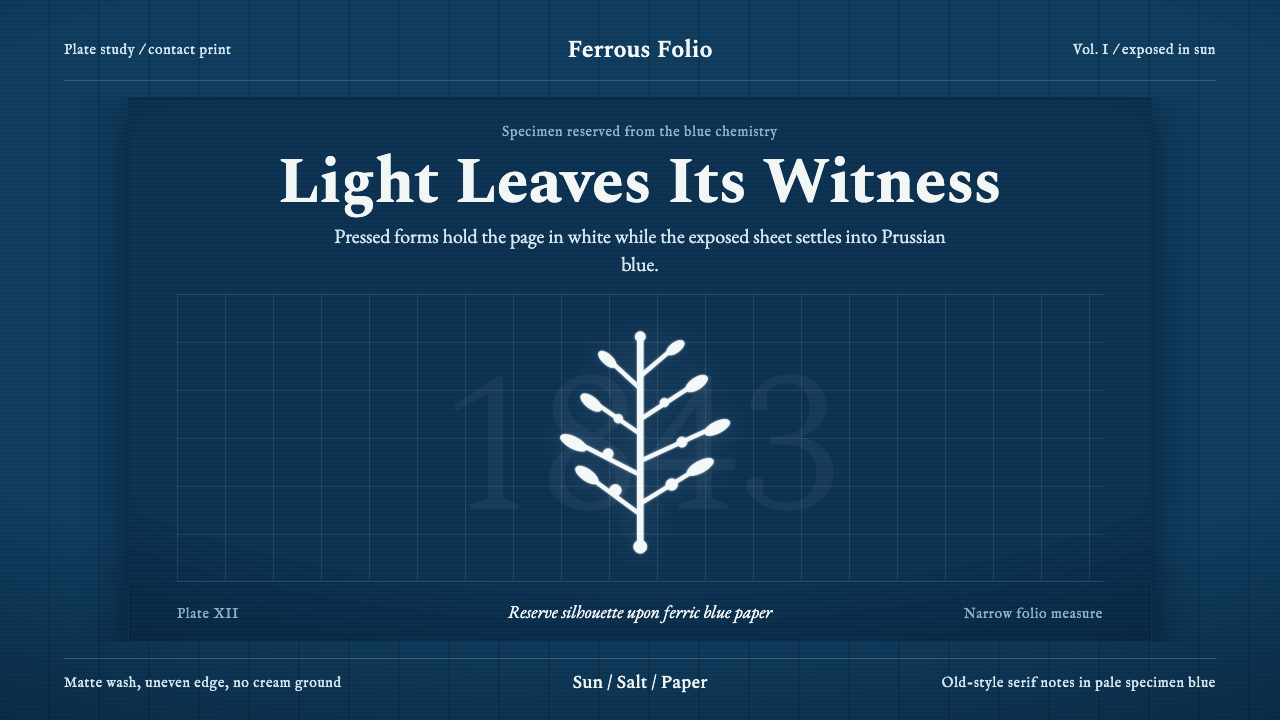 Anna Atkins CyanotypeScience turns spectral. Prussian blue ground, white reserves, Victorian serif…
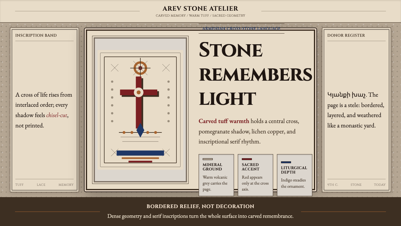 Armenian Khachkar Cross-StoneStone becomes memory. Tuff grey, pomegranate red, and carved borders hold the…