What is Balinese Lontar?
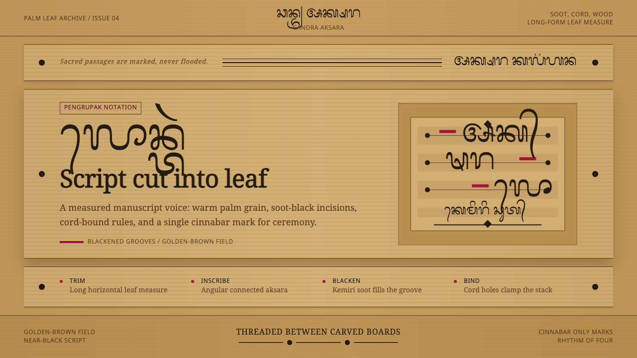
Lontar manuscripts — palm-leaf strips incised with an iron stylus, filled with burnt soot, and bound between carved boards — are Bali's living memory: sacred, tactile, and warm as the island's earth.
Balinese Lontar in brief
The Balinese Lontar design style takes its name and visual logic directly from the island's ancient palm-leaf manuscript tradition. For over a thousand years, Balinese priests and scribes scratched sacred Hindu texts, medical recipes, and literary epics into dried strips of palmyra palm leaf using a small iron stylus called a pengrupak. The incised grooves were then rubbed with a mixture of burnt-candlenut soot and oil, leaving precise, angular, soot-black script against a warm golden-brown leaf surface — a color relationship so internally consistent that it became an entire aesthetic grammar.
As a design system, Lontar translates this material into an interface vocabulary: the leaf itself becomes the ground tone — a golden to amber-brown field, warm and slightly uneven in feel — while incised script becomes near-black type of uncommon precision. The cord and wooden board components of the physical manuscript translate into structural lines and containing borders. Cinnabar red, applied sparingly in actual manuscripts as a pigment marker for special passages or auspicious dates, becomes the sole permitted accent color — always as punctuation, never as flood.
What distinguishes Lontar from other warm or earth-toned design systems is the tension it holds between material warmth and scribal precision. The background feels hand-made and ancient; the typographic mark-making is angular, connected, and exacting. This pairing — organic ground, precise incision — gives the style an authority that purely decorative craft aesthetics lack. It signals both cultural depth and disciplined attention.
Where does Balinese Lontar come from?
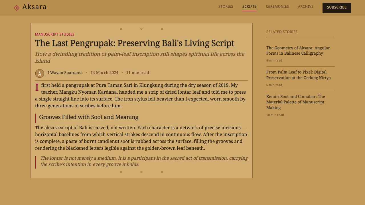
Palm-leaf manuscript traditions existed across much of South and Southeast Asia wherever the palmyra palm (Borassus flabellifer) grew in abundance, from Sri Lanka and Tamil Nadu through Cambodia and Java to the Philippines. But in Bali, the tradition took on an unusual intensity. Unlike the mainland kingdoms that converted to Islam or Theravada Buddhism and gradually abandoned Sanskrit-derived script systems, Bali's Hindu-Balinese culture remained continuous from roughly the tenth century onward. The lontar manuscript was not a historical artifact — it remained a living, actively produced, and religiously indispensable object well into the twentieth century.
The word 'lontar' itself is believed to derive from 'ron tal' — Balinese for 'palmyra leaf.' Preparation of the writing medium was labor-intensive. Harvested young leaves were dried, then boiled with turmeric and other preservatives, dried again, pressed flat, and cut into long strips roughly a finger's width across. Each strip was pierced at intervals for the threading cord. A finished manuscript might contain dozens or hundreds of such strips, clamped between elaborately carved wooden boards called pepaga. The stylus, pengrupak, was typically a small pointed iron blade with a wooden handle, and scribes required years of training to produce the angular, connected Balinese script — called Aksara Bali — with sufficient regularity.
Lontar manuscripts covered an enormous range of subjects. Kekawin were literary poems adapted from Sanskrit epics like the Ramayana and Mahabharata. Usada texts were medical and pharmacological treatises. Tutur were philosophical and theological discourses. Babad were genealogical chronicles of noble families. Puja contained ritual instructions for priests. This diversity means that different manuscript types had different visual conventions: a royal genealogy might use more cinnabar for decorative framing, while a medical text prioritized dense, legible script with minimal interruption. The aesthetic unity across types came from the shared material — the leaf itself, the soot-black ink, the particular quality of the Aksara mark.
The tradition was maintained by two groups of specialists: the Pedanda, the high-caste Brahmin priests who copied and commissioned the most sacred texts, and the Pemangku, lower-caste temple priests with more limited scribal functions. Balinese palace courts and major temples both maintained manuscript libraries — called gedong lontar — as repositories of religious, political, and medical authority. When Dutch colonial rule was established in Bali in the early twentieth century, Dutch scholars documented thousands of lontar manuscripts, and this documentation paradoxically helped preserve awareness of the tradition even as the production of new manuscripts declined. Today, Balinese organizations actively work to conserve and digitize surviving collections, and a small number of practitioners still produce lontar using traditional methods.
What defines the Balinese Lontar look?
Ground Color
The dominant field color is a warm golden to amber-brown — the color of aged palmyra palm leaf, not bleached paper or clean parchment. This warmth is the system's emotional anchor: it signals antiquity, handcraft, and tropical origin without resorting to illustrative decoration. The color is never uniform; slight tonal variation within the ground, suggesting the natural variation of leaf material, gives the surface life without introducing pattern or noise. Avoid any ground color that reads as beige, cream, or tan without this specific golden warmth.
Incised Script and Typography
Text color is near-black with a slightly warm undertone — soot rather than neutral black, ink rather than digital pure-black. The Aksara Bali script itself is angular, connected, and continuous: letterforms flow together without fully separating, suggesting incision rather than brushstroke. In practice, this means preferring compact, slightly angular typefaces over loose, rounded ones. Text should feel carved into the surface — deliberate and irreversible — not placed on top of it. Type size contrast is used sparingly; hierarchy is achieved through placement and weight rather than dramatic scale shifts.
Cinnabar Accent
Cinnabar red — the traditional pigment derived from mercury sulfide, used in manuscripts to mark auspicious passages, dates, and section openings — is the system's only permitted accent color. It is used exclusively as punctuation: a single dividing line, a chapter marker, a highlighted numeral, an active-state indicator. Never as a fill, never for entire text blocks, and never more than one element per visual zone. Its power comes entirely from rarity; introducing it at even moderate saturation levels risks collapsing the manuscript's tonal balance. Think of it as a single vermillion stamp on an expanse of leaf.
Horizontal Strip Layout
Lontar manuscripts are not upright pages but long horizontal strips: the proportion is wide and narrow, typically many times wider than tall. This format shapes the layout logic of the entire design system. Content panels prefer wide, shallow containers over tall, narrow ones. Navigation and headings are laid out horizontally rather than vertically stacked. White space is distributed along the horizontal axis — wide margins at the two ends of a strip, narrow space between successive text lines. This horizontal emphasis sets Lontar layouts apart from paper-derived systems at a glance.
Cord and Board Structure
Physical lontar manuscripts are bound by a cord threaded through holes punched in each leaf strip, and the entire bundle is clamped by two carved wooden boards. Translated into interface terms, this structural vocabulary becomes: fine horizontal rules at consistent intervals (the cord), strong containing borders or header bars in a slightly darker leaf-brown (the boards), and circular or oval puncture-point details at the intersections of structural lines. These elements should be understated — the cord and board are supports, not focal points — but their presence establishes the sense of a bound and ordered collection.
Texture Without Decoration
The lontar aesthetic is not decorative in the way that floral or ornamental traditions are. Its texture arises from material process — the slight irregularities of leaf surface, the variable depth of stylus incision, the uneven uptake of soot in the grooves — not from applied ornament. In digital translation, this means introducing subtle surface variation (a fine noise layer, a slight paper-like grain) only in the ground field, never in text or structural elements. The type and structure remain crisp while the ground breathes. Introducing decorative motifs, floral borders, or illustrative elements would immediately break the character of the system.
Restraint in Color Range
The entire color system operates within a narrow band: golden-brown ground tones, near-black incised marks, cord-brown and board-brown supporting tones, and the single cinnabar accent. There is no blue, no green, no purple, no neutral gray, and no white in the traditional sense. Introducing colors from outside this range — even in muted form — immediately signals a departure from the tradition. The warmth and limitation of the palette is not a constraint to work around; it is the system's identity. Within this narrow band, tonal variation and material texture provide all the visual interest required.
Who shaped Balinese Lontar?
The Pedanda were the primary producers and commissioners of lontar manuscripts in Bali. As high-caste Brahmin priests, they held authority over the most sacred texts — kekawin literature, theological tutur, and ritual puja — and were responsible for both copying manuscripts and transmitting scribal technique across generations. A Pedanda's personal manuscript library was both a spiritual resource and a mark of learning and lineage. Their manuscripts tend to show the most refined scribal hand and the most consistent use of cinnabar marking conventions.
The Pemangku served as lower-caste temple priests with more circumscribed scribal roles — primarily copying and maintaining manuscripts for local temple use rather than producing new theological compositions. Their manuscripts tend toward practical genres: ritual calendars, agricultural almanacs, and local customary law texts. Pemangku lontar often show a slightly less formal scribal hand than Pedanda manuscripts, and the use of cinnabar is rarer and more functional. Their role ensured that the lontar tradition penetrated every level of Balinese religious life, not just the high-court and priestly elite.
The gedong lontar — manuscript libraries attached to Balinese palaces and major temples — were the institutional centers of the lontar tradition. These storage buildings, often structurally separate from main temple complexes to reduce fire risk, held collections of hundreds or thousands of strips organized by genre and lineage. The physical arrangement of a gedong lontar was itself a design statement: manuscripts were stored horizontally in their bound-board form, labeled with hanging cloth tags, and periodically aired and inspected. The collective visual impression of rows of golden-brown leaf bundles bound by cord and capped with carved boards became the iconographic image of Balinese manuscript culture.
European scholarly attention to Balinese lontar began seriously in the nineteenth and early twentieth centuries. Thomas Stamford Raffles, British Governor-General of Java, collected and described lontar manuscripts in his 1817 History of Java. Dutch colonial scholars — most notably P.J. Zoetmulder, whose work on kekawin literature remains foundational — documented thousands of manuscripts, produced catalogues, and brought lontar materials to European institutions including the Leiden University library. This documentation, while entangled with colonial appropriation, paradoxically preserved knowledge of the tradition during a period when the production of new manuscripts was declining under modernization pressures.
Since the late twentieth century, Balinese institutions — including the Gedong Kirtya lontar library in Singaraja, established during Dutch colonial administration in 1928 and now the oldest lontar library in Bali — have worked systematically to conserve, catalogue, and digitize surviving manuscripts. Individual Balinese scholars and priestly families have also continued the practice of producing new lontar, ensuring the tradition remains living rather than purely archival. These conservationists hold the design tradition's meaning in place: without the ongoing practice, the visual language risks becoming merely decorative quotation.
How do you use Balinese Lontar today?
Applying the Lontar design system effectively requires internalizing its single governing tension: material warmth paired with scribal precision. Every design decision should honor both sides of this pairing. The ground field should feel warm and slightly tactile; the typography and structural elements should feel carved and exact. When one side dominates — too warm and the result reads as generic craft-rustic; too precise and cold and the leaf-ground becomes incongruous — the distinctive character of the tradition is lost.
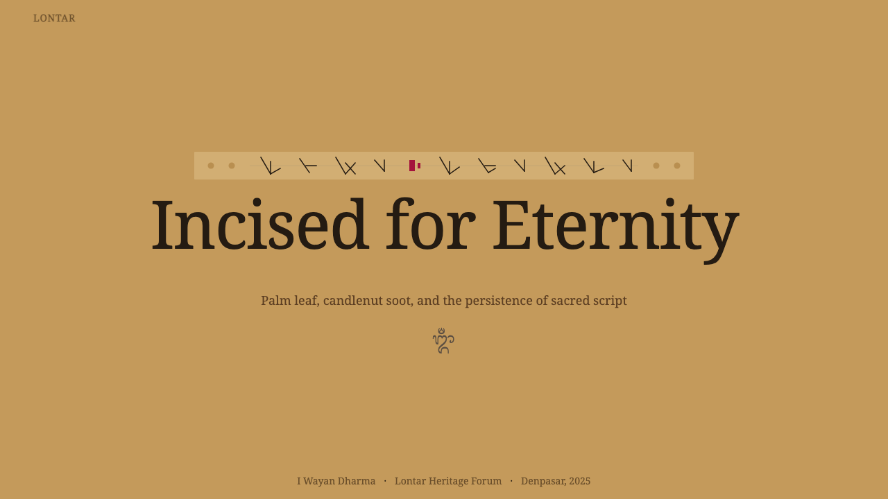
For presentation slides, Lontar is particularly well-suited to content that benefits from an atmosphere of authority and careful scholarship: historical narratives, cultural documentation, brand origin stories, or any presentation where the claim to knowledge should feel earned rather than slick. A cover slide works best with a wide horizontal composition — a single strong text element in near-black against the full golden-brown field, with one cinnabar mark (a rule, a dot, or a date) as the sole accent. Content slides should use the horizontal strip logic: text runs in wide, shallow bands rather than tall columns, and any data visualization takes on a diagrammatic, map-like quality rather than sharp digital chart aesthetics.
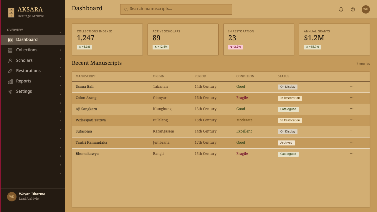
For web interfaces, Lontar is most appropriate for contexts requiring cultural gravitas and unhurried attention: museum or archive platforms, premium heritage brand sites, cultural editorial publications, and scholarly resources. Dashboard contexts are possible but challenging — the warm ground and near-black text work well for reading but require careful attention to ensure that interactive states (hover, active, focus) are distinguishable without reaching outside the permitted color range. The cinnabar accent, used for active links or selected states, must be deployed with strict economy: one interactive-state color for the entire interface, no exceptions.
For editorial and marketing contexts, Lontar's poster-like quality comes from the combination of warm ground and high-contrast near-black type. Wide margins that echo the empty ends of a leaf strip, combined with text set in tight bands, create a sense of considered composition. Section breaks marked with a fine cinnabar rule rather than decorative borders maintain the scribal spirit without straying into illustration. Marketing pages in this style work best for products associated with craft, heritage, or cultural depth — a Lontar-styled page selling tech hardware would feel incongruous; one selling handmade ceramics, artisan food, or traditional craft would feel exact.
The most common mistake when applying Lontar is adding color. Designers reaching for the style often sense its warmth and attempt to reinforce it by introducing additional warm hues — terracotta, ochre, rust, sage — that feel aligned with the palette's spirit but actually destroy its precision. The lontar manuscript palette is brutally narrow by design: exactly two neutrals (near-black and golden-brown) and exactly one accent (cinnabar). Every additional color dilutes the system and pushes the result toward generic world-craft territory. Similarly, introducing decorative motifs — even authentically Balinese ones, like floral carvings from temple architecture — immediately shifts the register from scribal to decorative. Lontar is a writing tradition, not a carving or weaving tradition, and this distinction is what gives it its particular economy.
Balinese Lontar — FAQ
Is Lontar too niche or regional to use outside of Balinese cultural contexts?
No, but intentionality matters. The lontar aesthetic can travel outside its cultural origin when the designer understands what it is actually communicating: disciplined writing on a warm material surface, the gravity of carefully preserved knowledge, the beauty of an unhurried hand. These are legible values across many cultural contexts. Where the style struggles is when it is used for its surface warmth alone, without the scribal precision that gives it authority. A travel brand appropriating the golden-brown for generic tropical warmth, without the tight angular type and the constrained palette, produces something generic rather than distinctive. The deeper you go into the system, the more transferable it becomes — and the more respectful to the tradition it is.
How should the Lontar style handle modern interface components like buttons, tabs, and form inputs?
The key is to derive each component from the manuscript's structural logic rather than from standard UI conventions. Buttons should feel like section markers in a manuscript: a near-black border with near-black label text, using the cinnabar accent only for the primary action and only when its scarcity budget allows. Tabs should echo the physical leaf — horizontally arranged, with the selected tab distinguished by a cinnabar underline or a very slightly lighter ground rather than a filled background. Form inputs should use a simple near-black border on the warm ground, with no rounded corners (the scribal aesthetic favors deliberate angles) and focus states indicated by a cinnabar border color rather than a blue glow. The rule throughout: avoid digital defaults (rounded corners, soft shadows, bright highlights) and replace them with elements that feel incised, bounded, and deliberate.
Can Lontar work as a dark-mode interface?
With significant difficulty. The Lontar system's identity is built around the warm golden-brown ground — invert that to a dark field and the manuscript analogy collapses almost entirely. The near-black ink becomes light text on dark ground, which can be achieved, but the cinnabar accent then reads very differently: against dark backgrounds, red becomes energetic and forward-leaning in a way that is at odds with the scribal economy of the tradition. A more faithful dark translation would use a deep, very dark amber-brown as the ground — the color of old, darkened wood or aged leather — rather than a pure dark gray or black. This retains the material warmth while reducing eye strain. The cinnabar must be muted further in this context: what works as a single mark on a golden field becomes too vivid on a very dark ground without tonal adjustment.
How does the Lontar style relate to other Southeast Asian manuscript design traditions?
The palm-leaf manuscript tradition was widespread across South and Southeast Asia — Thai, Cambodian, Javanese, Sri Lankan, and Burmese traditions all used similar materials and incision techniques. However, each tradition developed its own script system and visual conventions. The Balinese Lontar style is distinguished by the specific character of Aksara Bali script — angular, connected, and written at a consistent slant — by the particular warmth of the Balinese-sourced palmyra leaf, and by the distinctive use of cinnabar as the sole accent pigment. Thai kraing manuscripts, for comparison, are often made from khoi bark paper rather than palm leaf, use ink application rather than incision, and admit a wider range of pigments including gold. These differences produce aesthetically distinct systems even when the underlying manuscript culture is related. Lontar specifically is not interchangeable with these other traditions.
What kind of imagery or illustration is appropriate within the Lontar style?
Lontar manuscripts do occasionally include illustration — cosmological diagrams, anatomical charts in medical texts, and schematic maps of ritual spaces. These are line illustrations, not painterly images: they share the scribal logic of the text, using the same angular incised line to depict figures, borders, and labels. In contemporary application, this means that appropriate imagery is diagrammatic and linear: architectural drawings, maps, technical illustrations, and calligraphic elements — all executed in near-black on the warm ground, with cinnabar reserved for annotation markers only. Photographs, if used, should be treated as reproductions of material artifacts rather than atmospheric images: sharp, orthographic, object-on-warm-ground rather than moody, staged, or color-graded. Decorative illustration — swirls, flourishes, or ornamental motifs unrelated to documentary representation — is outside the tradition's scope entirely.
Related design styles
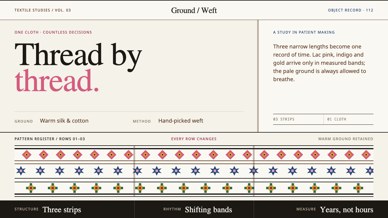 Bhutanese KushutharaPatience made visible. Lac pink and indigo bands shift across a warm silk gro…
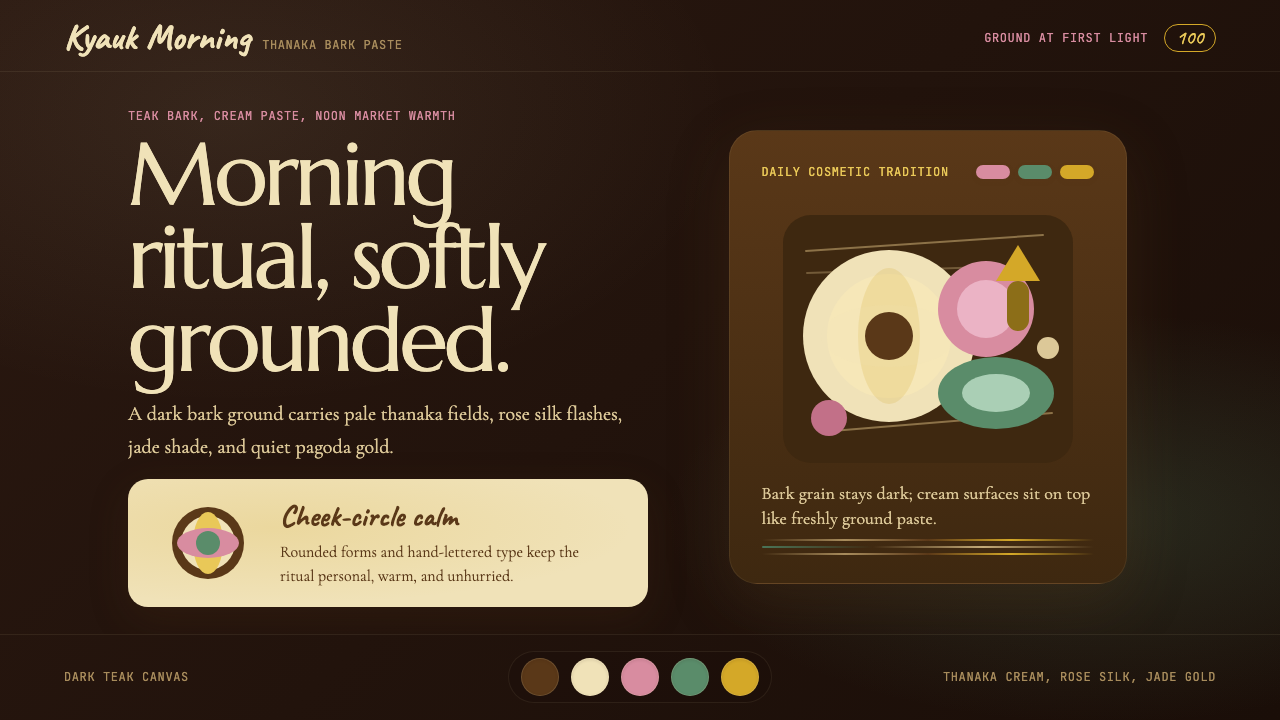 Burmese Shan Thanaka (Bark Paste)Handmade warmth on dark bark. Thanaka cream roundels soften rose, jade, and g…
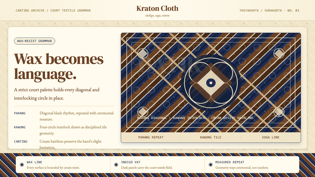 Javanese BatikCeremonial repetition. Indigo, soga, and cream frame a tiled canting motif.
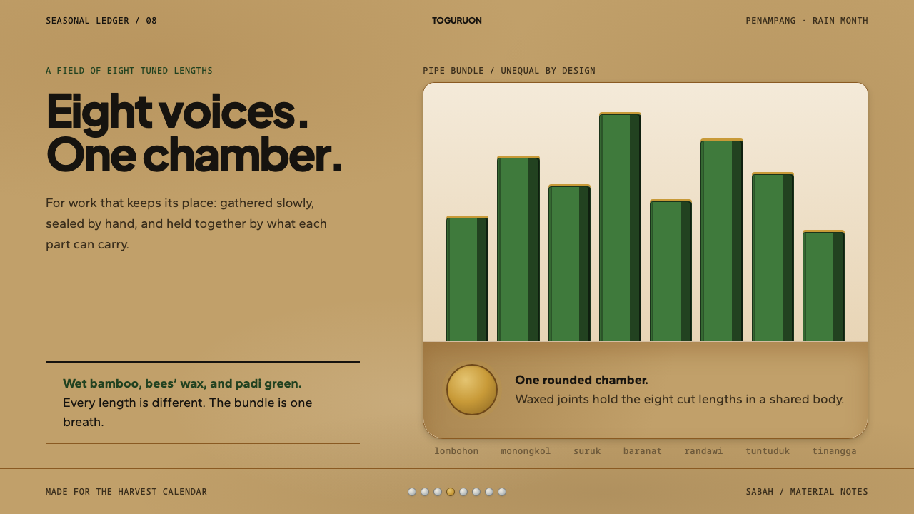 Kadazan SompotonEight uneven voices, held as one. Padi green bamboo rises from a waxed gourd…
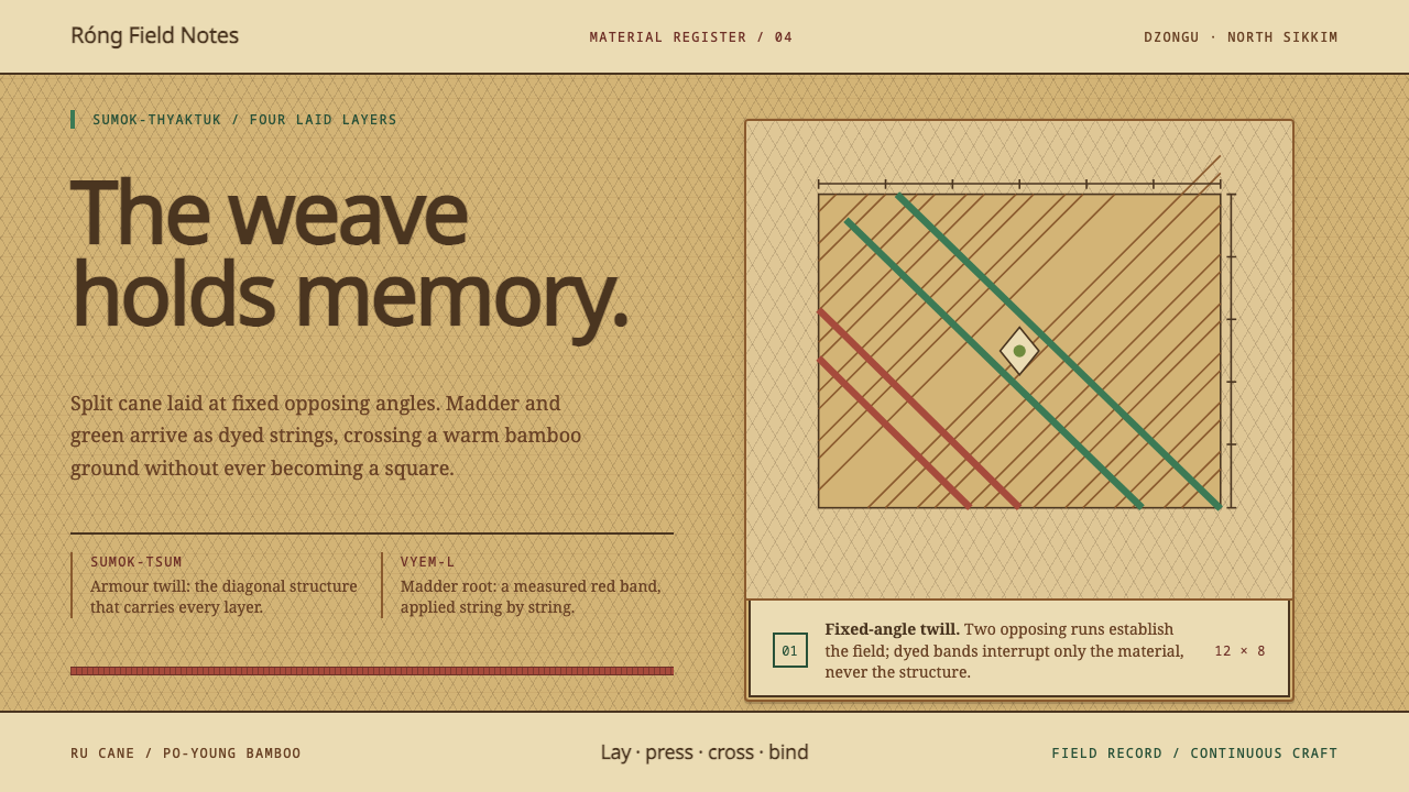 Lepcha Bamboo CraftThe weave holds memory. Madder and green bands cross split-bamboo diagonal tw…
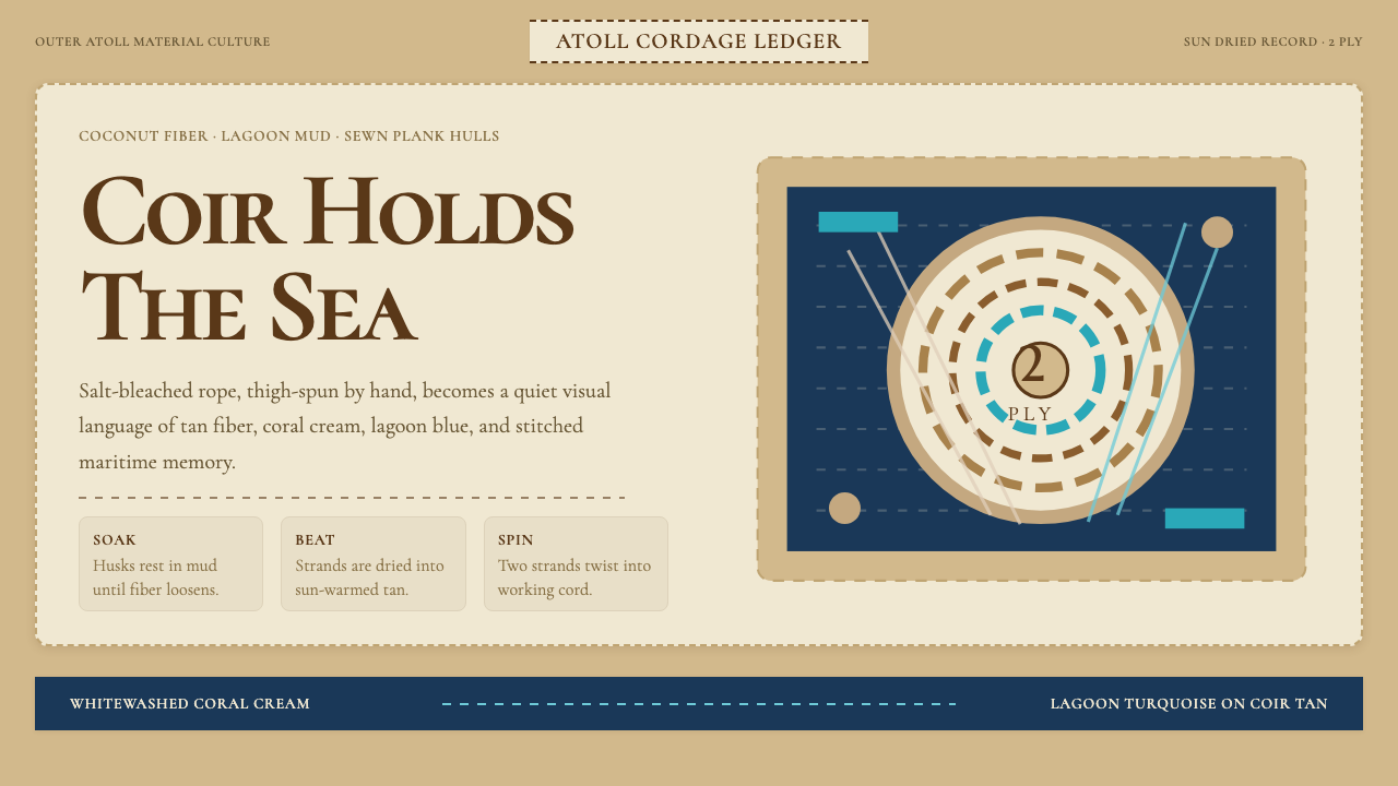 Maldivian Coir (Coconut Rope)Ocean-tested craft. Coir tan, coral cream, Cormorant type, and dashed seam ge…