Design style guide设计风格指南
What is Burmese Shan Thanaka (Bark Paste)?什么是 Burmese Shan Thanaka (Bark Paste)?
Thanaka — the pale cream bark paste pressed onto Burmese cheeks each morning for two thousand years — is not just cosmetic ritual; it is a complete visual language of warmth, organic roundness, and deep-rooted belonging.特纳卡——两千年来每天清晨涂抹于缅甸人脸颊的淡奶油色树皮膏——不只是美妆仪式,更是一套关于温暖、有机圆润与深厚归属感的完整视觉语言。
Burmese Shan Thanaka (Bark Paste) in briefBurmese Shan Thanaka (Bark Paste) 速览
The Burmese Shan Thanaka (Bark Paste) design system draws its entire visual grammar from a single daily act: the grinding of thanaka wood — typically from the Hesperethusa crenulata tree — on a flat wet stone slab called a kyauk pyin, then the brushing of the resulting pale yellow-cream paste onto cheeks in circular patches and delicate leaf-stencil shapes. Every design decision in this system refers back to that ritual: its color, its texture, its forms, and its mood.缅甸掸族特纳卡(树皮膏)设计体系从一个日常动作中提炼出全部视觉语法:将特纳卡木(通常是 Hesperethusa crenulata 树)在名为“kyauk pyin”的湿石板上研磨,再将那淡黄奶油色的膏体以圆斑或树叶模板的形态涂抹于脸颊。这套设计体系中的每一个决定都指向那个仪式:色彩、质感、形态与气质,无不源于此。
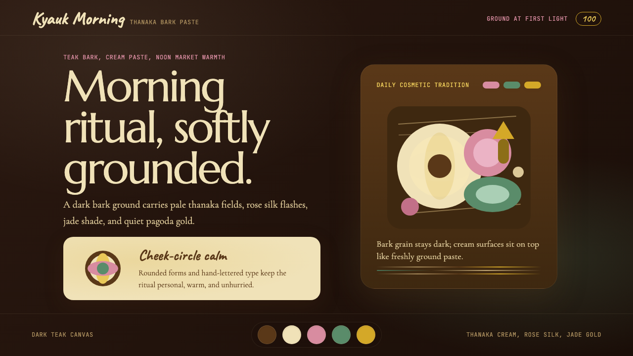
The dominant ground is a deep teak-bark darkness — the color of the source wood before it is ground, rich and warm like aged heartwood. Against this depth, thanaka-cream typography and highlight fields glow with a softness that feels applied rather than printed, handmade rather than mechanical. Rose-pink accents drawn from the silk of traditional Burmese htamein skirts punctuate the palette, while jade-gold ornamental elements invoke the gilded pagoda spires of Bagan and Mandalay.主导底色是深柚木树皮的暗沉——研磨之前原木的颜色,如陈年心材般温厚醇美。在这片深色之中,特纳卡奶油色的文字与高光区域泛出柔和的光,像是涂上去的而非印刷的,手作而非机械。从缅甸传统筒裙(htamein)丝绸提炼的玫瑰粉点缀其间;翡翠金的装饰性元素则唤起蒲甘与曼德勒那些鎏金塔尖的意象。
What sets this system apart from other dark, warm aesthetics is its commitment to the organic over the geometric. Shapes are rounded like cheek-circles — cartouche-like in their completeness. Surfaces carry the subtle impression of bark grain rather than the hard flatness of modernist minimalism. The overall mood is tropical-fresh and sun-warm, the visual equivalent of a Bagan market at noon: generous, unhurried, rooted in handcraft and two millennia of Burmese womanhood.令这套体系区别于其他深色暖调美学的,是它对有机形态而非几何形的执着。形状是圆润的,如脸颊上的圆斑——像椭圆形徽章一般完整自足。表面带有隐约的树皮纹理,而非现代主义极简主义的硬平。整体气质热带清新、阳光温暖,是蒲甘正午集市的视觉等价物:慷慨、从容,扎根于手工艺与两千年缅甸女性传统。
Where does Burmese Shan Thanaka (Bark Paste) come from?Burmese Shan Thanaka (Bark Paste) 从何而来?
Thanaka has been in continuous daily use across Myanmar for more than two millennia. The earliest recorded references appear in Pyu and Mon court documents from around the first century CE, describing cosmetic use of ground bark among royal attendants. By the eleventh century, when the Bagan empire was at the height of its architectural ambition, thanaka use was visible in temple murals — women depicted with the characteristic circular patches on their cheeks, confirming that the practice had long since moved from court to common life.特纳卡在缅甸已有两千多年连续使用的历史。最早的文字记录出现在公元一世纪前后的骠族与孟族宫廷文书中,描述了王室侍从使用研磨树皮作为妆品的习俗。到十一世纪蒲甘帝国建筑成就达于顶峰之时,特纳卡的使用已出现在寺庙壁画中——女性脸颊上那标志性的圆斑清晰可见,说明这一习俗早已从宫廷渗透进普通生活。
The practice is rooted not in vanity but in a practical wisdom that has been verified by modern dermatological research: thanaka bark contains compounds that protect skin from ultraviolet radiation, act as mild antifungals, and keep the complexion cool in tropical heat. In a country where the sun is harsh and skincare as a commercial category did not exist for most of history, grinding wood on stone each morning was the rational solution to a physiological need. The ritual absorbed into daily identity so thoroughly that it ceased to be understood as utility and became culture.这一习俗的根源并非虚荣,而是被现代皮肤科研究所验证的实用智慧:特纳卡树皮中含有防紫外线、轻度抗真菌并能在热带高温中保持肌肤清凉的成分。在阳光强烈、商业化护肤品在历史上长期不存在的国度,每天清晨将木头在石板上研磨,是应对生理需求的理性选择。当这一仪式如此彻底地融入日常身份认同,它便不再被理解为功用,而升华为文化。
Across Myanmar's many ethnic groups — Bamar, Shan, Mon, Rakhine, Karen — thanaka appears in distinct regional variations. The Shan people of eastern Myanmar and the Thai-Shan border regions have their own parallel tradition, using local thanaka varieties and applying the paste in patterns that differ subtly from lowland Bamar practice. This regional diversity within a shared cosmetic tradition mirrors the country's broader cultural texture: common thread, many weaves.在缅甸众多族群中——巴马、掸族、孟族、若开、克伦——特纳卡以各具地域特色的形态存在。缅甸东部及泰掸边境地区的掸族有其平行传统,使用当地品种的特纳卡,涂抹图案与低地巴马习俗有细微差异。这种共同妆品传统内部的地域多样性,折射出缅甸更广泛的文化肌理:同一根线,织出千变万化的纹样。
The design system named for thanaka translates this layered cultural history into visual form. The choice of dark ground over light reflects the bark source rather than the finished paste — honoring the whole process, not just its result. The leaf-stencil motifs that appear as ornamental cartouches in the system echo the traditional thanaka application tools: small wooden stamps or rolled leaves pressed against the cheek to create patterned patches. In this way, the design system encodes not just the cosmetic's appearance but its making.以特纳卡命名的这套设计体系将这段多层次的文化历史转化为视觉形式。选择深色底面而非浅色,折射的是树皮原料而非成品膏体——致敬的是整个过程,而非仅仅是结果。系统中以装饰性徽章形式呈现的树叶模板母题,呼应了传统的特纳卡涂抹工具:小木印章或卷起的叶片,按压在脸颊上留下图案斑块。由此,这套设计体系编码的不只是妆品的外观,更是它的制作方式。
What defines the Burmese Shan Thanaka (Bark Paste) look?Burmese Shan Thanaka (Bark Paste) 的视觉特征是什么?
Color Palette色彩体系
The palette is built around the full arc of the thanaka process: the deep warm darkness of teak bark before grinding forms the primary ground, while the pale yellow-cream of the finished paste provides the dominant foreground tone used for type and key highlights. Rose-pink drawn from htamein silk accents add warmth and femininity, and jade-gold pagoda ornament introduces a luminous focal point. The combination reads as simultaneously earthy and precious — the organic and the ceremonial held in one register.色彩体系围绕特纳卡制作的全程弧线构建:研磨前柚木树皮的深沉暖暗色构成主底色;研磨后膏体的淡黄奶油色提供主导前景色,用于文字与关键高光。从筒裙丝绸提炼的玫瑰粉增添温暖与女性气息,翡翠金的塔形装饰引入发光焦点。整体色调既质朴又珍贵——有机感与仪式感在同一维度共存。
Surface and Texture表面与质感
Unlike modernist systems that insist on perfect flatness, this design language gives every surface a subtle bark-grain quality — a fine, directional texture that evokes the kyauk pyin grinding stone and the rough-smooth bark of the thanaka tree. This texture is never aggressive; it anchors surfaces in the physical world, preventing the palette's warmth from floating into abstraction. Cards, backgrounds, and containers all carry this tactile undertone.不同于坚持完美平整的现代主义体系,这套设计语言赋予每个表面隐约的树皮纹理——一种细腻、有方向性的质感,唤起磨石板(kyauk pyin)与特纳卡树粗中带润的树皮触感。这种质感从不咄咄逼人;它将表面锚定在物质世界中,防止色板的温暖飘浮进抽象。卡片、背景与容器都携带这种触感底色。
Form Language形态语言
Circular and oval forms — derived directly from the cheek-roundel application of thanaka paste — define the system's shape vocabulary. Buttons echo the leaf-stencil cartouche: slightly elongated, softly curved at the corners, never sharply rectangular. Cards take the form of circular or rounded-rectangular containers. This organic roundness distinguishes the system from both the hard geometry of Bauhaus-derived aesthetics and the rigid rectangularity of most contemporary interface design.圆形与椭圆形——直接源自特纳卡膏体的脸颊圆斑涂抹方式——定义了系统的形态词汇。按钮呼应树叶模板的轮廓:略微延长、角部柔和弯曲,绝非锐利的矩形。卡片取圆形或圆角矩形容器的形态。这种有机圆润感令此系统区别于包豪斯衍生美学的硬朗几何,也区别于当代界面设计普遍的严格矩形。
Typography字体排印
Typography in this system is warm and legible against dark grounds, favoring letterforms with a hand-applied quality — a slight softness in stroke weight rather than mechanical perfection. Thanaka-cream type on dark teak ground is the primary mode. Headlines carry weight through generous size and the inherent contrast of the palette rather than through extreme boldness or condensed cuts. The typographic register is unhurried: wide leading, comfortable measure, no aggressive compression.这套系统的字体排印温暖而易读,在深色底面上尤为出色,偏好具有手工涂抹质感的字形——笔画粗细略带柔软而非机械精准。深柚木底色上的奶油色文字是主要模式。标题通过慷慨的字号与色板内在对比获得分量,而非依靠极粗字重或压缩字形。排印节奏从容不迫:宽行距、舒适行宽、无激进压缩。
Ornamentation装饰元素
Unlike zero-ornament systems, thanaka design makes deliberate space for cultural ornament — but ornament that carries meaning rather than mere decoration. Pagoda silhouettes, lotus motifs, and leaf-cartouche borders are drawn from the iconographic tradition of Burmese Buddhist art and applied as accent elements at structural junctions: section dividers, card borders, and icon treatments. Each ornamental choice is legible as a cultural reference rather than arbitrary surface decoration.与零装饰体系不同,特纳卡设计为文化装饰留有刻意的空间——但这种装饰承载意义,而非纯粹点缀。塔形轮廓、莲花母题与树叶徽章边框,取自缅甸佛教艺术的图像传统,被用作结构节点处的强调元素:段落分隔、卡片边框与图标处理。每一个装饰性选择都作为文化索引清晰可辨,而非随意的表面装饰。
Depth and Layering深度与层叠
Depth in this system is achieved through warm-toned layering rather than hard geometric shadow. Overlapping surfaces in close tonal steps — slightly lighter or darker variants of the same bark-brown — create a sense of gentle relief, like the subtle three-dimensionality of a bark surface itself. This soft layering approach stands in deliberate contrast to the hard drop-shadows of Swiss or Bauhaus-derived systems; the light here is diffused and tropical, not directional and architectural.这套系统中的深度通过暖色调的层叠而非硬朗的几何阴影来实现。在相近色阶上叠加——同一树皮棕色的略深或略浅变体——营造出轻柔的浮雕感,如树皮表面本身那微妙的立体感。这种柔和层叠的处理方式,与瑞士或包豪斯衍生体系的硬边投影形成刻意对比;这里的光线是漫射的、热带的,而非有方向性的、建筑式的。
Iconography and Illustration图标与插图
Icons and illustrative elements are drawn with the same round, hand-crafted quality as the stencil forms of thanaka application: slightly organic outlines, fills in the key palette tones, a suggestion of the imperfect beauty of a hand-painted edge. Representational elements — faces, figures, market scenes — appear as warm, soft-outlined silhouettes rather than hard vector shapes. The illustration register is gentle and human, consistent with the tradition's origin in a daily act of quiet self-care.图标与插图元素以与特纳卡涂抹模板相同的圆润、手工质感绘制:略带有机感的轮廓线、以核心色板填充、隐约呈现手绘边缘不完美之美。人物、形象与市集场景等具象元素以温暖、轮廓柔软的剪影呈现,而非硬朗的矢量形。插图基调温柔而富有人情味,与这一传统源于日常安静自我照护行为的起源一脉相承。
Who shaped Burmese Shan Thanaka (Bark Paste)?谁塑造了 Burmese Shan Thanaka (Bark Paste)?
One of Myanmar's most celebrated twentieth-century writers, Khin Myo Chit documented everyday Burmese life and material culture with scholarly warmth. Her essays on thanaka and other traditional practices remain foundational texts for understanding how cosmetic ritual functions as cultural continuity in Myanmar — how the daily act of grinding bark on stone transmits identity across generations without a single word being spoken.缅甸二十世纪最著名的作家之一,钦妙吉以学者的温度记录了缅甸日常生活与物质文化。她关于特纳卡及其他传统习俗的散文,至今仍是理解缅甸美妆仪式如何作为文化延续载体的基础文献——每天清晨将树皮在石板上研磨这一动作,是如何无需一语,便将身份认同代代相传的。
A historian and folklorist, Maung Htin Aung catalogued the ritual dimensions of Burmese daily life including cosmetic traditions, providing the historical scaffolding that connects modern thanaka practice to its Pyu and Mon antecedents. His work demonstrated that thanaka was never merely functional — even in its earliest documented forms, it was entangled with ideas of beauty, status, and spiritual protection.作为历史学家与民俗学者,貌亨昂系统记录了缅甸日常生活的仪式维度,包括美妆传统,为将现代特纳卡实践与其骠族、孟族历史根源相连接提供了学术框架。他的研究表明,特纳卡从来不只是功能性的——即便在最早的文字记录中,它也已经与美、地位和精神庇护的观念缠绕在一起。
An art historian specializing in Burmese religious and cultural heritage, Stadtner's research on Bagan temple murals and material culture provided critical visual evidence that thanaka appeared in Burmese artistic representation as early as the eleventh century. His archaeological and iconographic work grounds what might seem like living folk tradition in a continuously documented history of more than a thousand years of artistic witness.唐纳德·斯塔特纳是专攻缅甸宗教与文化遗产的艺术史学家,他对蒲甘寺庙壁画及物质文化的研究提供了关键视觉证据:特纳卡早在十一世纪便已出现在缅甸艺术表现中。他的考古与图像学研究,将这一看似活态民间传统的习俗,置于一段拥有逾千年艺术见证的连续记录历史之中。
While not a single individual, the collective tradition of Shan textile weavers — whose silk and cotton weaving practices run parallel to and intertwined with thanaka culture — provides the rose-pink and jade-gold palette of this design system. Shan weavers in eastern Myanmar and across the Thai border have maintained geometric and floral pattern vocabularies for centuries that directly inform the ornamental language of thanaka-derived design.掸族纺织传统并非指某一具体人物,而是指掸族纺织工匠的集体传承——他们的丝麻编织实践与特纳卡文化并行交织,为这套设计体系提供了玫瑰粉与翡翠金的色彩基础。缅甸东部及泰边境一带的掸族织工数百年来维系着几何与花卉纹样词汇,直接为特纳卡衍生设计的装饰语言提供了滋养。
The flat grinding stone on which thanaka is prepared is not a designer but a design object — perhaps the most important material object in this visual system's lineage. Its rough-smooth surface, the circular motion of grinding, the residue of cream left on stone — all of these physical facts translate directly into the system's texture, roundness, and color. Crediting the kyauk pyin is crediting the process over the maker: a form of design attribution that the tradition itself would recognize.研磨特纳卡所用的平石板(kyauk pyin)并非设计师,而是一件设计物——也许是这套视觉体系谱系中最重要的物质对象。它粗中带润的表面、研磨时的圆形动作、石板上残留的奶油痕迹——所有这些物质事实都直接转化为这套系统的质感、圆润度与色彩。将功劳归于磨石,是将功劳归于过程而非制造者:这种设计归因方式,是这一传统本身所能认同的。
How do you use Burmese Shan Thanaka (Bark Paste) today?今天怎么用 Burmese Shan Thanaka (Bark Paste)?
The Burmese Shan Thanaka design system is exceptionally well-suited to projects that need warmth, cultural depth, and handcrafted authenticity — qualities that most contemporary interface design intentionally strips away. Applying it correctly means committing to its organic roundness, its layered depth, and its specific palette rather than borrowing one element while keeping everything else in a default digital register.缅甸掸族特纳卡设计体系极适合那些需要温暖感、文化深度与手工真实性的项目——这些正是大多数当代界面设计有意剥除的品质。正确应用它,意味着完全投入其有机圆润、层叠深度与具体色板,而非只借用其中一个元素、其余一切保留默认数字风格。
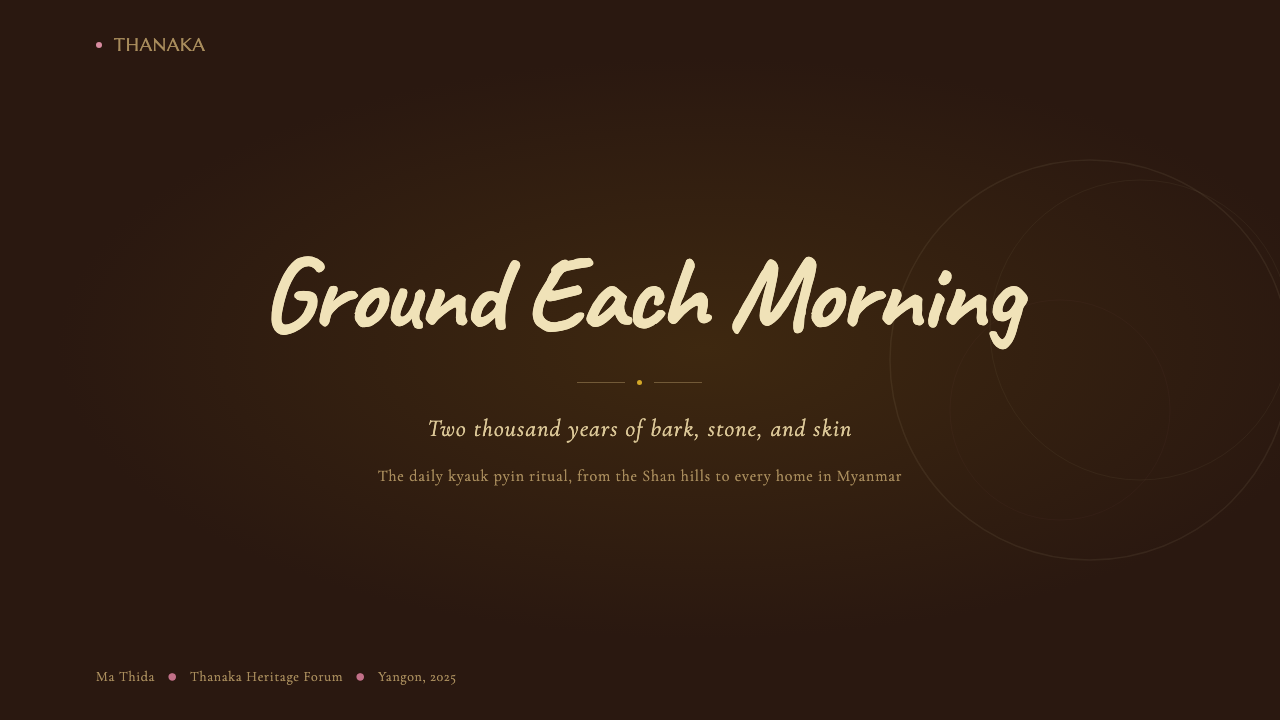
For presentation slides, the system rewards courage on the cover: a deep teak-bark ground, thanaka-cream headline in generous size, and a single leaf-cartouche ornament placed at a structural corner creates an immediate atmospheric impact unlike anything in the standard template library. Content slides work best when the organic roundness extends to every container — section labels in rounded pill shapes, data pulled into soft-edged cards rather than hard-bordered tables. Avoid the impulse to switch to a white background for content slides; the depth of the dark ground is precisely what makes the cream type feel warm rather than merely light.在演示文稿中,封面页值得大胆尝试:深柚木底色、慷慨字号的奶油色标题、一个树叶徽章装饰置于结构性角落,所营造的即时氛围冲击力是标准模板库中无可比拟的。内容页在有机圆润感延伸至每个容器时表现最佳——段落标签采用圆角药丸形,数据归入软边卡片而非硬边表格。抵制把内容页切回白底的冲动;深色底面的厚度正是令奶油色文字感觉温暖而非仅仅明亮的原因所在。
For web interfaces, this system finds its strongest application in pages that need to feel culturally grounded and human rather than frictionless and corporate. A landing page for a wellness brand, a cultural institution, a craft marketplace, or an artisanal product line will benefit from the system's bark-warm depth and roundel forms. Navigation elements should use the leaf-cartouche button shape consistently; card components should carry the subtle bark-grain texture on their surfaces. The rose-pink accent is most effective used sparingly — for a single call-to-action or a key status indicator — rather than deployed across multiple elements simultaneously.对于网页界面,这套系统在需要文化底蕴与人情味而非无摩擦感和企业感的页面上发挥最强。健康品牌、文化机构、手工艺集市或匠人产品线的落地页,都将受益于系统的树皮暖色深度与圆斑形态。导航元素应一致使用树叶徽章按钮形;卡片组件应在其表面携带隐约的树皮纹理。玫瑰粉点缀色最有效的用法是克制——仅用于一处行动号召或一个关键状态指示——而非同时铺展于多个元素之上。
For editorial and marketing work, the system's rich dark ground creates immediate poster-quality impact. Feature sections that alternate between teak-dark and a slightly lighter bark-brown layer produce a sense of depth that purely flat layouts cannot achieve. Thanaka-cream pull quotes on dark grounds function as natural anchors in long-form editorial. The jade-gold accent, when used for section headers or iconography, ties individual pages back to the pagoda-ornament tradition that runs through the system's decorative DNA.对于编辑与营销内容,系统浓郁的深色底面具有即时的海报级冲击力。深柚木与略浅树皮棕交替的特性区块,产生纯平面版式无法企及的深度感。深色底面上的奶油色引用段,在长篇编辑内容中天然充当视觉锚点。翡翠金点缀色用于段落标题或图标时,将各页面与贯穿系统装饰基因的塔形传统紧密相连。
A common mistake when applying this system is importing too much from familiar dark-mode conventions — specifically, the tendency to use pure near-black or near-white backgrounds instead of committing to the specific warm teak-bark and cream tones. Another error is placing the rose-pink accent too frequently, which destabilizes the dark-ground warmth and pulls the composition toward a generic tropical palette. The system's integrity depends on the cream remaining the dominant light tone and the rose-pink staying rare enough to register as a genuine accent when it appears.应用这套系统时最常见的错误,是过多借入熟悉的深色模式惯例——具体表现为用接近纯黑或纯白的背景,而非投身于特定的暖柚木与奶油色调。另一个错误是过于频繁地使用玫瑰粉点缀,这会动摇深色底面的温暖感,将构图拉向泛泛的热带色板。系统的完整性依赖于奶油色始终作为主导浅色调,而玫瑰粉足够稀少,才能在出现时真正作为强调色被感知到。
Burmese Shan Thanaka (Bark Paste) — FAQBurmese Shan Thanaka (Bark Paste) · 常见问题
Is this system appropriate for digital interfaces, or is it primarily a print and branding aesthetic?这套系统适合数字界面吗?还是说它主要是印刷与品牌美学?
It works well in digital contexts but requires deliberate adaptation. The dark teak ground renders beautifully on screens — warm tones at depth have less of the harshness that pure dark-mode blacks carry — and the cream typography reads clearly across device types. The key challenge is the bark-grain texture: applied at full fidelity on small screens it can read as visual noise rather than warmth, so a reduced or more subtle application is advisable for mobile contexts. The system is strongest for editorial web design, culture-facing landing pages, and rich media interfaces where visual atmosphere contributes to the user experience rather than being stripped for efficiency.它在数字语境中效果良好,但需要刻意的适配。深柚木底色在屏幕上呈现优美——暖色调深色比纯深色模式的黑色少了几分刺眼——奶油色文字在各类设备上清晰易读。主要挑战在于树皮纹理:在小屏幕上以完整精度呈现,可能被感知为视觉噪声而非温暖感,因此在移动端建议采用更细腻低调的处理。这套系统在编辑类网页设计、面向文化的落地页,以及视觉氛围对用户体验有实质贡献(而非为效率而被剥除)的富媒体界面上表现最为出色。
How does the Shan regional tradition differ from the broader Burmese practice, and does that distinction appear in the design system?掸族地区传统与更广泛的缅甸习俗有何差异?这种差异在设计体系中有所体现吗?
The Shan thanaka tradition, practiced across the highlands of eastern Myanmar and the Thai border regions, uses locally sourced tree varieties and applies the paste in patterns that have their own geometric distinctiveness — often more angular and pattern-dense than the circular roundels common in lowland Bamar practice. The design system absorbs both traditions: the circular cheek-roundel form is the primary shape vocabulary, while the leaf-cartouche borders carry the geometric pattern density associated with Shan textile and thanaka traditions. The jade-gold tone specifically references Shan pagoda ornamentation, distinct from the hotter gold of central Myanmar Bamar Buddhist art.掸族特纳卡传统在缅甸东部高地及泰边境地区流传,使用当地品种的树木,涂抹图案有其独特的几何性——往往比低地巴马族常见的圆形圆斑更具棱角感、图案更为密集。这套设计体系融合了两种传统:脸颊圆斑形态是主要形态词汇,而树叶徽章边框则携带与掸族纺织及特纳卡传统相关的几何图案密度。翡翠金色调特指掸族寺塔装饰,不同于缅甸中部巴马族佛教艺术中更为热烈的金色。
Can this system be used for brands outside the beauty and wellness category?这套系统能用于美妆与健康类别以外的品牌吗?
Yes, and some of the most interesting applications lie outside those obvious categories. The system's core values — warmth, handcraft, cultural rootedness, generous depth — are transferable to any brand that wants to signal authentic, non-corporate quality. A craft food brand, a cultural travel platform, a heritage textile retailer, an artisanal architecture firm, or an independent publishing house could each adopt the system with full conviction. What does not transfer well: brands where immediacy, frictionlessness, or technological neutrality are primary values. The system carries cultural weight; it will always read as coming from somewhere specific and handmade.可以,而且一些最有趣的应用恰恰在这些显而易见的类别之外。这套系统的核心价值——温暖、手工、文化根植、慷慨的深度——可迁移至任何希望传递真实、非企业感品质的品牌。手工食品品牌、文化旅行平台、传统纺织零售商、匠人建筑事务所或独立出版社,都可以全然投入地使用这套系统。不能迁移的情形:即时性、无摩擦感或技术中立性是核心价值的品牌。这套系统承载文化分量;它永远会被解读为来自某个具体的、手工制作的地方。
How should the ornamental elements be used without the result feeling costume-y or theme-park cultural?如何使用装饰元素,才能避免结果显得像舞台戏服或主题公园式的文化挪用?
The rule is: ornament at structure, not ornament everywhere. Pagoda silhouettes and leaf-cartouche borders are most effective when placed at genuine structural junctions — the meeting point of two sections, the container edge of a key card, the header zone of a document. When they appear in these load-bearing positions they read as design decisions; when scattered across a composition they read as decoration for its own sake, which is precisely the costume-y effect to avoid. The other principle is restraint in quantity: one ornamental motif used consistently throughout a layout at two or three specific positions will produce far more cultural coherence than five different motifs distributed loosely.原则是:在结构处使用装饰,而非处处使用装饰。塔形轮廓与树叶徽章边框,在真正的结构节点处最为有效——两个区块的交汇处、关键卡片的容器边缘、文档的标题区域。当它们出现在这些承重位置时,会被解读为设计决定;当散布于整个构图时,则会被解读为装饰而装饰,这正是要避免的舞台感。另一条原则是数量上的克制:一种装饰母题在版面中的两三个特定位置一致使用,比五种不同母题松散分布产生远为深厚的文化一致性。
How does this system handle light-background applications — is it possible to invert it?这套系统如何处理浅色背景的应用?可以将其反转吗?
An inversion is possible but changes the character of the system significantly. On a thanaka-cream or warm off-white ground, dark teak-bark type reads clearly, and the rose-pink and jade-gold accents retain their warmth. However, the system's most distinctive quality — the sense of depth and glow that thanaka-cream elements have against dark grounds — is entirely absent in the inverted version. What remains is a warm, organic light palette that reads more like a general artisanal aesthetic than the specific night-market depth of the dark version. The light inversion works well for long-form editorial contexts where reading comfort over extended sessions matters, but it should be understood as a different use of the palette, not a full expression of the system.反转是可行的,但会显著改变系统的气质。在特纳卡奶油色或暖白色底面上,深柚木色文字清晰可读,玫瑰粉与翡翠金点缀依然温暖。然而,这套系统最具辨识度的品质——特纳卡奶油色元素在深色底面上的深度感与发光感——在反转版本中完全不复存在。所剩下的是一套温暖、有机的浅色色板,读起来更像泛泛的匠人美学,而非深色版本特有的夜市深度。浅色反转版本在长篇编辑内容场景中效果良好——长时间阅读舒适度在那里更为重要——但应当被理解为对色板的另一种使用方式,而非这套系统的完整表达。
Related design styles相关设计风格
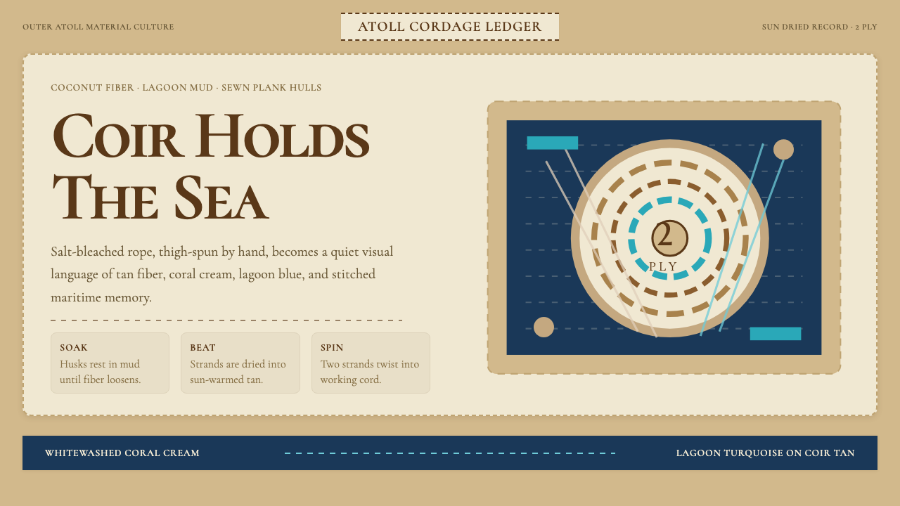 Maldivian Coir (Coconut Rope)Ocean-tested craft. Coir tan, coral cream, Cormorant type, and dashed seam ge…经海考验的手工感:椰棕褐、珊瑚乳白、Cormorant 字体与虚线缝合几何。
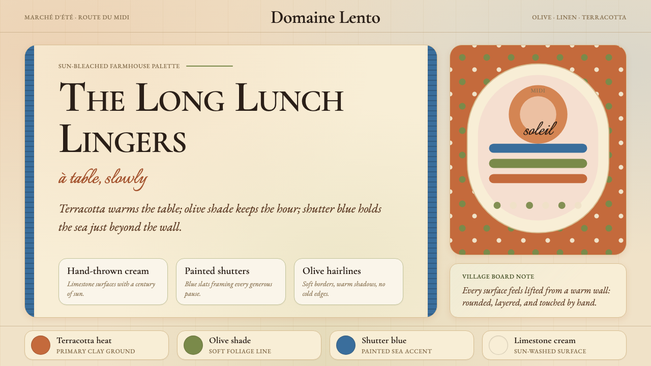 Provençal MediterraneanWarmth refuses the clock. Terracotta, olive lines, and shutter blue frame slo…温暖拒绝计时:陶土、橄榄线与百叶窗蓝框住奶油墙面。
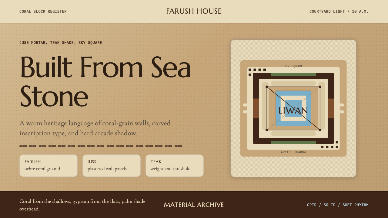 Emirati Bait Al Naboodah Coral HouseFeels built, not styled. Coral ochre, teak brown, and a sky-square courtyard…像被建造而非装饰。珊瑚赭、柚木棕与天井方格定调。
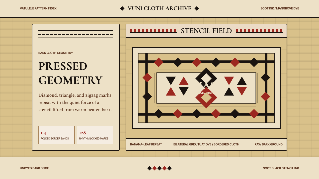 Fijian Masi Tapa StencilGeometry keeps ceremony. Soot-black diamonds repeat on bark beige with rust-r…几何守住仪式感:树皮米黄上,烟黑菱形与锈红边带反复压印。
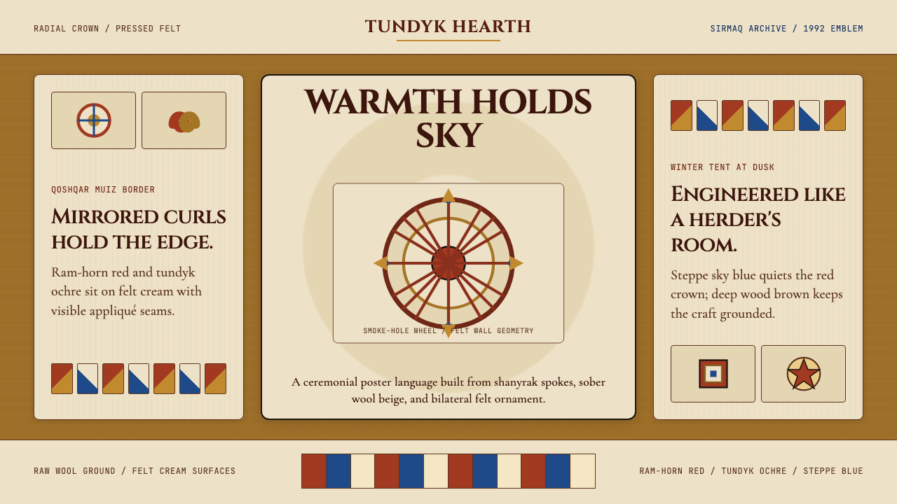 Kazakh Shanyrak Yurt FeltDomestic warmth, engineered. Ram-horn red felt curls around a radial shanyrak…居家暖意如工程般精密。羊角红毡纹环绕沙尼拉克轮。
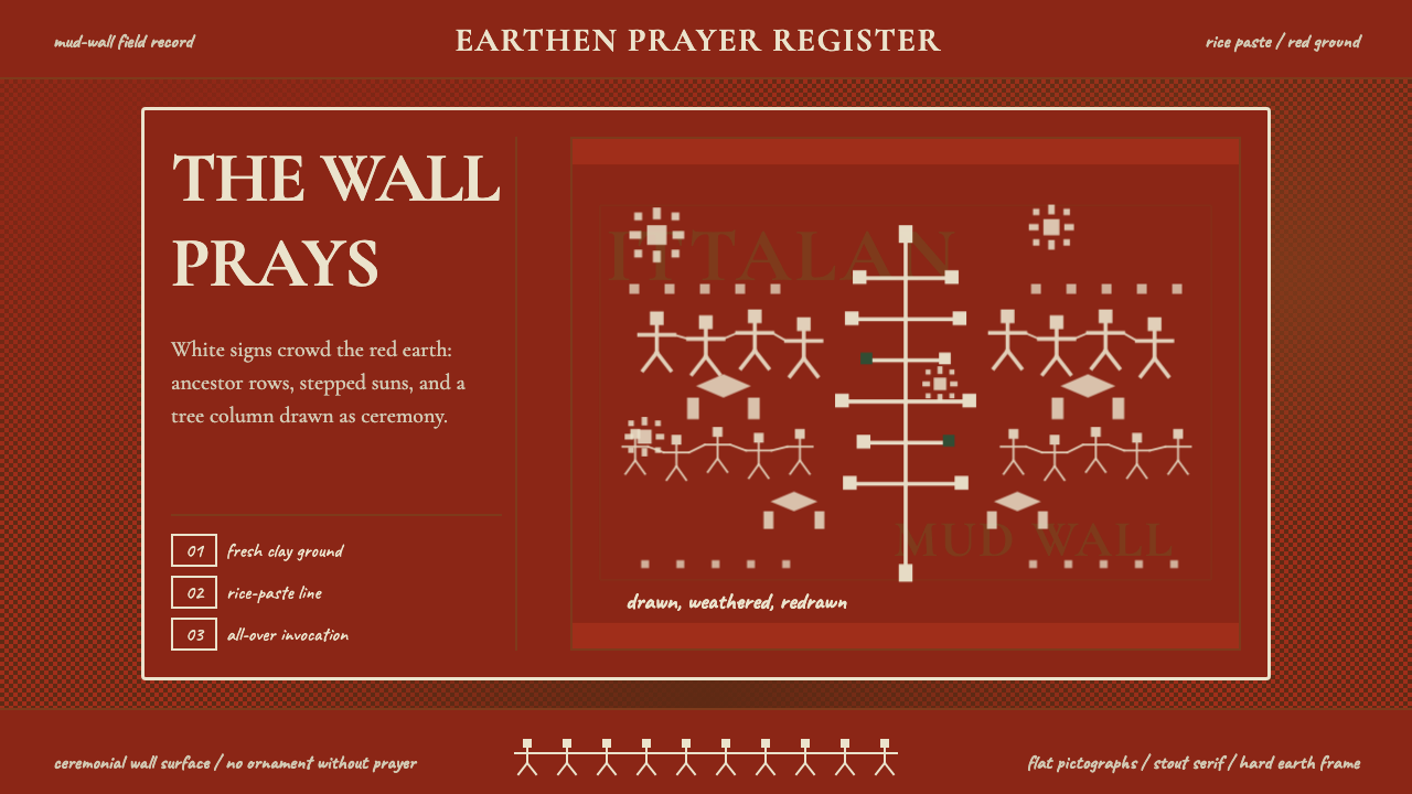 Odisha Saura Tribal MuralSacred density. Rice-white pictographs crowd a red-earth wall in ritual rhyth…神圣密度:米白象形符号挤满红土地墙,形成仪式节奏。