Design style guide设计风格指南
What is Maldivian Coir (Coconut Rope)?什么是 Maldivian Coir (Coconut Rope)?
Maldivian coir design channels a millennium of ocean-tested craft — sun-bleached fiber tones, coral-inscribed letterforms, and the dashed geometry of hand-sewn dhoni hulls.马尔代夫椰棕设计语言凝聚了千年海洋考验的手工智慧——被日光漂白的纤维色调、珊瑚石刻般的字形,以及手缝多尼船体的虚线几何。
Maldivian Coir (Coconut Rope) in briefMaldivian Coir (Coconut Rope) 速览
Maldivian Coir (Coconut Rope) is a design system rooted in the material culture of the Maldivian outer atolls, where women have thigh-spun coconut-husk fibers into two-ply rope for over a thousand years. The system translates that tactile, ocean-weathered craft into a visual language: warm tan and whitewashed coral cream as the dominant grounds, lagoon turquoise and deep indigo as restrained accents, and the rhythmic dashed lines of sewn-plank boat seams as the primary decorative motif.马尔代夫椰棕(椰棕绳)是一套植根于马尔代夫外环礁物质文化的设计系统。千余年来,当地妇女将椰壳纤维在大腿上搓成两股绳。这套系统将那种触感强烈、经海风侵蚀的手工艺转化为视觉语言:以温暖棕褐和珊瑚白灰为主调底面,以潟湖青绿和深海靛蓝为克制的点睛,以缝合船板的虚线针脚为主要装饰母题。
The palette takes its cue from the raw materials of coir production — the sun-bleached fiber, the lagoon mud in which husks were soaked to soften, the whitewashed coral walls of atoll villages, and the brief flash of turquoise water glimpsed between them. Typography draws from the tradition of incised coral signage, favoring letterforms with sharp, deliberate cuts rather than soft curves. Every visual decision points toward the village beach and the working harbor, not the resort terrace.色板从椰棕生产的原材料中汲取灵感——被日光漂白的椰纤维、浸泡椰壳使其软化的潟湖泥、环礁村落经石灰水粉刷的珊瑚石墙,以及在石墙间隙里闪烁的青绿色海水。字体排印借鉴珊瑚石刻传统,偏爱线条利落、刻凿感强的字形,而非柔和的圆弧。每一个视觉决定都指向渔村沙滩和劳作中的港口,而非度假酒店的露台。
What distinguishes this style from generic coastal or nautical aesthetics is its specificity. It does not borrow the saturated blues and crisp whites of Mediterranean sailing imagery. It works instead with the muted, sun-faded warmth of the Indian Ocean craft tradition — a palette that feels worn in rather than designed, textured rather than polished, and grounded in a production culture where every material had to earn its place on a long ocean crossing.使这种风格有别于一般海岸或航海美学的,是它的特殊性。它不借用地中海帆船图像中饱和的蓝白配色,而是以印度洋手工艺传统的暗哑、日晒后褪色的温暖感为底色——那是一种经过岁月磨合而非刻意设计的色调,有质感而非抛光,植根于一种必须让每一样材料都在漫长海途中证明自身价值的生产文化。
See the Maldivian Coir (Coconut Rope) design system →查看 Maldivian Coir (Coconut Rope) 完整设计系统 →
Where does Maldivian Coir (Coconut Rope) come from?Maldivian Coir (Coconut Rope) 从何而来?
The practice of coir rope-making in the Maldives dates to at least the ninth century, when Arab and Persian navigators documented the islands as a major supplier of coconut-fiber cordage for the Indian Ocean trade network. The archipelago's position along the monsoon trade routes — roughly equidistant between the Arabian Peninsula and the Indian subcontinent — made it a critical provisioning stop, and coir rope was among its most valued exports. Historical sources record Maldivian coir being used to lash together the planks of Arabian dhows and to rig vessels as far east as Java.马尔代夫椰棕制绳的历史至少可追溯至九世纪。彼时,阿拉伯和波斯航海家已将这片群岛记录为印度洋贸易网络的重要椰棕绳供应地。这片群岛扼守季风贸易航线的要冲——大致等距于阿拉伯半岛与印度次大陆之间——是不可或缺的补给站,而椰棕绳正是其最受珍视的出口商品之一。历史文献记载,马尔代夫椰棕绳曾用于缝合阿拉伯独桅帆船的船板,也曾为远至爪哇的船只提供索具。
The production process was distinctly gendered and atoll-specific. On outer atolls such as Huvadhoo, Fuvahmulah, and Addu, women soaked coconut husks in lagoon mud for months to ret the fibers, then beat them into loose strands, and finally thigh-spun them into two-ply rope with a practiced rolling motion against the thigh. The resulting cordage was exceptionally resistant to saltwater degradation — a property that synthetic ropes did not reliably match until the late twentieth century. This material resilience gave Maldivian coir a premium position in the regional maritime economy that persisted across centuries.椰棕制绳的生产过程有着鲜明的性别分工与环礁特色。在胡瓦杜、富瓦穆拉、阿杜等外环礁,妇女将椰壳在潟湖泥中浸泡数月以软化纤维,再将其捶打成松散的纤维束,最后用大腿内侧来回搓动的熟练动作将其搓成两股绳。这种绳索对海水腐蚀的抵抗力极强——这一特性直到二十世纪下半叶才被合成纤维绳可靠地复制。正是这种材料韧性,使马尔代夫椰棕绳在区域海洋经济中始终保持着高端地位,这一地位延续了数百年。
The scholar H. C. P. Bell, who conducted the first systematic archaeological survey of the Maldives in the late nineteenth and early twentieth centuries, documented coir production in detail alongside the coral-stone architecture and carved woodwork that together define the visual culture the design system draws from. Clarence Maloney's ethnographic work in the mid-twentieth century traced the social organization of coir production, establishing how the craft was transmitted through female lineages and how atoll communities specialized in different grades of rope for different maritime applications.学者H·C·P·贝尔在十九世纪末至二十世纪初对马尔代夫进行了首次系统性考古调查,详细记录了椰棕生产,以及珊瑚石建筑和雕刻木作——后两者共同构成了这套设计系统所汲取的视觉文化基底。克拉伦斯·马洛尼在二十世纪中叶的民族志研究追踪了椰棕生产的社会组织方式,阐明了这门手艺如何在母系家族中传承,以及各环礁社区如何专门化生产不同等级的绳索以适配不同的航海用途。
Thor Heyerdahl's expeditions to the Maldives in the 1980s, and the subsequent research of Pierre Vérin, drew international attention to the question of how far Maldivian coir-lashed vessels had traveled and what role the archipelago played in early trans-oceanic contact. Their work situated the coir tradition within a broader argument about the sophistication of pre-modern Indian Ocean navigation — a context that gives the design system its characteristic tension between humble material and epic reach. The visual language that emerges from this tradition is not exotic or decorative: it is the look of tools that worked.托尔·海尔达尔在1980年代对马尔代夫的多次考察,以及皮埃尔·维兰随后的研究,将国际目光引向一个核心问题:以椰棕绳缝合的马尔代夫船只究竟航行到了多远的地方,这片群岛在早期跨洋接触中扮演了什么角色?他们的工作将椰棕传统置于一个更宏大的论题之中——前现代印度洋航海技术的高度复杂性。正是这一背景,赋予了这套设计系统其标志性的张力:朴素的材料与史诗般的航程之间的对话。由此传统生长出的视觉语言既非异域风情,也非装饰性的,它是一种曾经真正有效的工具所留下的痕迹。
What defines the Maldivian Coir (Coconut Rope) look?Maldivian Coir (Coconut Rope) 的视觉特征是什么?
Color Palette色彩体系
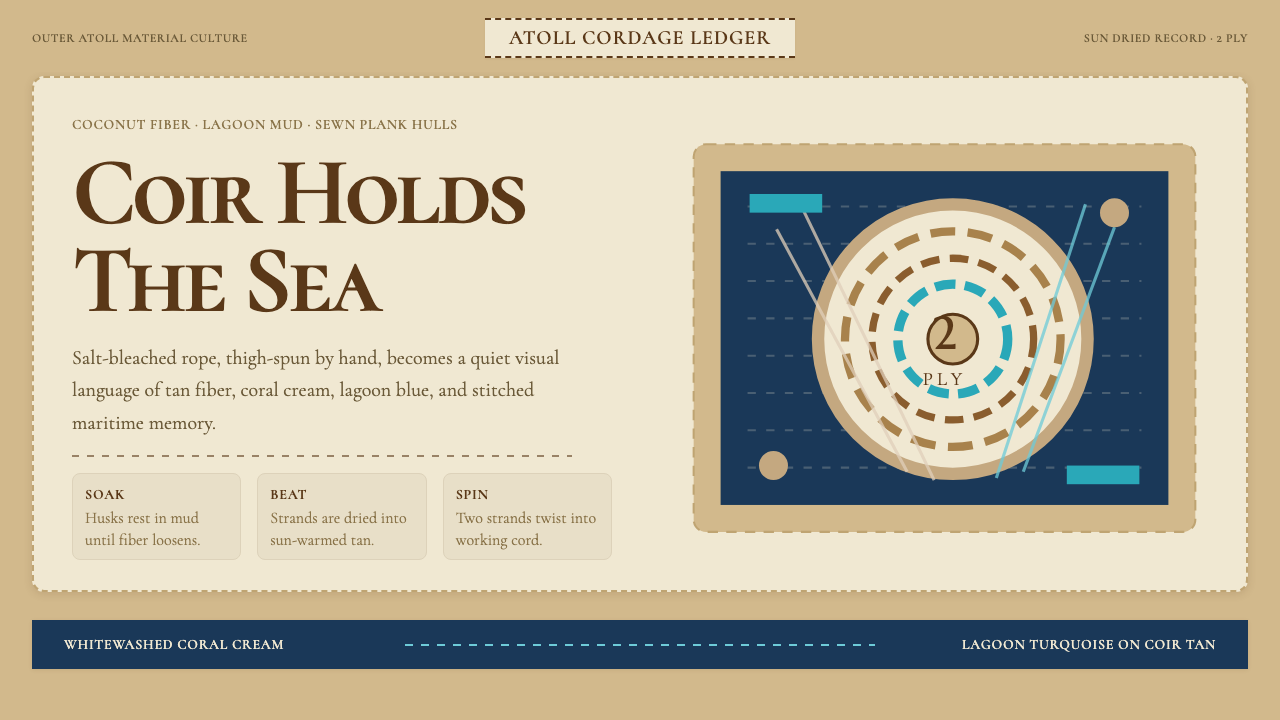
The palette is built around three anchoring tones: coconut-fiber tan, a warm mid-brown that reads as the dominant neutral; whitewashed coral cream, a near-white that carries the warmth of sun-bleached stone; and lagoon turquoise, a soft, slightly desaturated aqua used sparingly as an accent. Deep ocean indigo appears as a secondary accent for emphasis or structural contrast. The palette avoids both the cool clarity of Scandinavian minimalism and the vivid saturation of tropical resort branding — it sits in the middle register of sun-faded warmth, the look of materials that have been outside for years.色板围绕三个基准色调构建:椰纤维棕褐,一种温暖的中棕,作为主导中性色;珊瑚白灰,接近白色但带有日晒石材的暖意;潟湖青绿,一种柔和、略微去饱和的水蓝色,作为点缀色克制使用。深海靛蓝则作为强调或结构对比的次要点缀色。这个色板刻意回避斯堪的纳维亚极简主义的清冷,也远离热带度假村品牌的鲜艳饱和——它停留在日晒后褪色暖意的中间音域,那是在户外风吹日晒多年的材料所呈现的模样。
Typography字体排印
The defining typographic reference is incised coral stone — the signage tradition of Maldivian villages where letters were cut into pale coral rock with clean, decisive strokes. This points toward serif typefaces with visible contrast between thick and thin strokes and a quality of sharp deliberateness rather than calligraphic flow. Display type is set at generous sizes against open ground; body text is treated conservatively, with wide leading that evokes the measured spacing of hand-carved letterforms. Ligatures and historical alternates, where available, reinforce the sense of craft without tipping into ornate excess.这套系统的字体参照核心是珊瑚石刻——马尔代夫村落的标识传统,以干净、果断的刀法将字母凿入浅色珊瑚石。这一参照指向那些粗细笔画对比明显、具有尖锐而刻意感而非书法流畅感的衬线字体。展示性文字以慷慨的字号设置在开阔的底面上;正文排印处理保守,行距宽裕,呼应手工刻制字母的从容间距。在条件允许时,合字与历史变体字形可用于强化手工质感,但不宜过度,以免滑向繁复装饰。
Texture and Line纹理与线条
Rope grain and sewn seams are the two primary textural references. Rope grain — the twisted, slightly irregular parallel lines of hand-spun two-ply cord — appears as a subtle background texture or as an explicit motif in dividers and section headers. Sewn seams translate into dashed lines: short, evenly spaced dashes that evoke the visible stitch of a coir-lashed plank joint. These dashes carry more visual weight than a simple rule; they have the presence of something functional, not merely decorative. Both textures are used sparingly so they read as material references rather than surface busyness.绳纹和缝合针脚是两个主要的纹理参照。绳纹——手搓两股绳那种扭转的、略带不规则的平行线条——以微妙的背景肌理或分割线、章节标题中的显性母题形式出现。缝合针脚转化为虚线:短促、间距均匀的破折线,让人联想到椰棕绳缝合船板接缝时可见的针迹。这些虚线比普通直线具有更强的视觉分量,它们有一种功能性的存在感,而非仅仅是装饰。两种纹理都应克制使用,以保持其作为材料参照的可读性,而非制造视觉噪音。
Geometry and Form几何与形态
The formal vocabulary favors the practical geometry of boat-building and rope-work: elongated rectangles that echo the proportions of a dhoni hull, circular forms that reference the cross-section of twisted cordage, and the slight irregularity that comes from hand rather than machine production. Grid systems are present but not rigidly mathematical — they allow for the gentle asymmetry of craft objects rather than the exact symmetry of industrial production. Decorative elements, where they appear, are reduced to their simplest geometric statement.形态词汇偏向造船与制绳的实用几何:拉长的矩形呼应多尼船体的比例,圆形参照扭绞绳索的截面,以及手工而非机器生产所带来的轻微不规则感。网格系统存在,但并非严格的数学性网格——它容纳手工器物那种温和的不对称,而非工业生产的精确对称。装饰元素(若出现)被还原为最简洁的几何表达。
Warmth and Wear温暖感与岁月感
Unlike coastal aesthetics that present a pristine, idealized version of the sea, this style carries the trace of use. Gradients and drop shadows are avoided not because of a strict no-decoration rule but because they would introduce a kind of photorealistic polish that conflicts with the hand-made register of the source material. Surfaces read as slightly worn, as though salt air and sun have muted the sharpest edges. This is achieved through palette choices and texture density rather than explicit aging effects — the warmth is structural, not applied.与那些呈现海洋精致、理想化形象的海岸美学不同,这种风格携带着使用痕迹。渐变和投影阴影的回避,不是因为严格的无装饰规则,而是因为它们会引入一种写实的抛光感,与原始材料的手工质感相悖。表面应呈现出轻微磨损的质地,仿佛海盐和阳光已将最锋利的边缘柔化。这种效果通过色板选择和纹理密度来实现,而非依赖显式的做旧处理——那种温暖感是结构性的,而非附加的。
Negative Space留白
Open space is treated as the visual equivalent of the lagoon itself — the clear, uncluttered water between islands that defines the atoll form as much as the land does. Layouts breathe generously. Elements are separated by margins that feel unhurried, reflecting the pace of craft production rather than the urgency of commercial design. This generosity of space is one of the style's most distinctive qualities and one of the easiest to sacrifice under production pressure — compressing the margins turns the style into generic coastal decoration.留白被视为潟湖本身的视觉等价物——那片清澈、开阔的岛屿间水域,它定义环礁形态的力量不亚于陆地本身。版面的呼吸感慷慨而从容。各元素之间的间距令人感到不急迫,映照着手工生产的节奏,而非商业设计的紧迫感。这种空间的慷慨是这种风格最鲜明的特质之一,也是在制作压力下最容易被牺牲的一项——压缩间距会让这种风格沦为泛泛的海岸装饰。
Restraint in Accent点缀色的克制
The turquoise and indigo accents are used at low frequency — as a single element on a page, a hover state, a data highlight, or a dividing line — never as a background or large surface. Overusing the accent colors collapses the system's contrast structure and, more importantly, destroys the sense that these colors are earned: in the source culture, the lagoon is visible only in glimpses between buildings and boats. That momentary quality is what makes it striking. The same logic governs the accent in the design system.青绿与靛蓝点缀色以极低频率使用——作为页面上的单个元素、悬停状态、数据高亮或分割线——绝不用作背景或大面积铺色。过度使用点缀色会破坏系统的对比结构,更重要的是,会消解这些颜色的「得来不易感」:在原始文化语境中,潟湖只在建筑与船只之间的间隙里一瞥而见。正是这种转瞬即逝的特质使它令人惊艳。同样的逻辑支配着设计系统中点缀色的使用。
See the Maldivian Coir (Coconut Rope) design system →查看 Maldivian Coir (Coconut Rope) 完整设计系统 →
Who shaped Maldivian Coir (Coconut Rope)?谁塑造了 Maldivian Coir (Coconut Rope)?
Henry Charles Purvis Bell conducted the first systematic archaeological surveys of the Maldives between 1879 and 1922, documenting coral-stone architecture, coir production, carved woodwork, and the material culture of outer atolls in detail that has not been surpassed. His reports established the scholarly record from which later researchers worked and remain the primary historical source for the visual traditions that underpin this design system.亨利·查尔斯·珀维斯·贝尔在1879至1922年间对马尔代夫进行了首次系统性考古调查,以至今无人超越的细致程度记录了珊瑚石建筑、椰棕生产、雕刻木作以及外环礁的物质文化。他的报告建立了后来研究者赖以工作的学术档案,至今仍是支撑这套设计系统的视觉传统的主要历史来源。
Maloney's mid-twentieth century ethnographic research in the Maldives traced the social organization of coir production with particular attention to its gendered structure and its role in the atoll subsistence economy. His work documented how specific outer atolls specialized in different grades of rope for different maritime uses, and how the craft was transmitted through female lineages across generations — context that gives the design system its grounding in actual production culture rather than romanticized craft imagery.马洛尼在二十世纪中叶对马尔代夫进行的民族志研究,追踪了椰棕生产的社会组织方式,尤其关注其性别化结构及其在环礁生计经济中的角色。他的工作记录了特定外环礁如何专门化生产不同等级的绳索以适配不同的航海用途,以及这门手艺如何在母系家族中跨代传承——这一背景使这套设计系统扎根于真实的生产文化,而非浪漫化的手工艺想象。
Heyerdahl's expeditions to the Maldives in the 1980s, following his earlier Kon-Tiki and Ra voyages, investigated the question of how far coir-lashed vessels from the archipelago could have sailed and what role the Maldives played in early trans-oceanic contact. His popular accounts brought international attention to Maldivian maritime heritage and helped frame the coir tradition as part of a story about the deep history of human ocean navigation — a framing that resonates in the design system's emphasis on functional beauty over decorative display.海尔达尔在经历了早期的「孔蒂基」号和「拉」号航行之后,于1980年代多次前往马尔代夫考察,研究这片群岛的椰棕绳缝合船只究竟能够航行多远,以及马尔代夫在早期跨洋接触中扮演了怎样的角色。他的通俗著作将国际目光引向马尔代夫的海洋遗产,并将椰棕传统定位为人类深远航海史的组成部分——这一框架与这套设计系统强调功能之美而非装饰炫示的核心取向产生了深刻共鸣。
The French historian and archaeologist Pierre Vérin contributed foundational research on Maldivian material culture, trade connections, and the place of the archipelago in the wider Indian Ocean world. His work, often conducted alongside Bell's legacy documentation and in dialogue with Heyerdahl's expeditionary findings, helped establish the scholarly framework within which Maldivian coir production is understood not as a local curiosity but as a technology embedded in one of the world's most extensive pre-modern trade systems.法国历史学家兼考古学家皮埃尔·维兰对马尔代夫物质文化、贸易联系及该群岛在更广泛的印度洋世界中的地位作出了奠基性研究。他的工作常与贝尔的遗留文献并置开展,并与海尔达尔的考察发现相互对话,帮助建立了理解马尔代夫椰棕生产的学术框架——在这一框架中,椰棕生产不再是地方性的珍奇,而是嵌入世界上最广泛的前现代贸易体系之中的一项技术。
How do you use Maldivian Coir (Coconut Rope) today?今天怎么用 Maldivian Coir (Coconut Rope)?
The Maldivian coir style transfers most naturally to contexts where warmth, tactility, and a sense of earned craft are valued over precision or clinical clarity. It is not a style for dashboards where every millisecond of scan speed matters; it is a style for contexts where the user is meant to slow down, feel a sense of quality, and trust the product's origins. Travel, hospitality, artisan goods, cultural heritage platforms, and editorial contexts centered on the Indian Ocean, South Asian craft, or the broader theme of human relationship with materials — these are its natural homes.马尔代夫椰棕风格最自然地适用于重视温暖感、触感和手工质感胜过精确或临床清晰度的场景。它不适合每毫秒扫描速度都举足轻重的仪表板,而适合那些需要用户放慢节奏、感受品质、信任产品来源的场景。旅游、酒店、手工艺品、文化遗产平台,以及以印度洋、南亚手工艺或人与材料之关系为主题的编辑内容——这些是它天然的归宿。
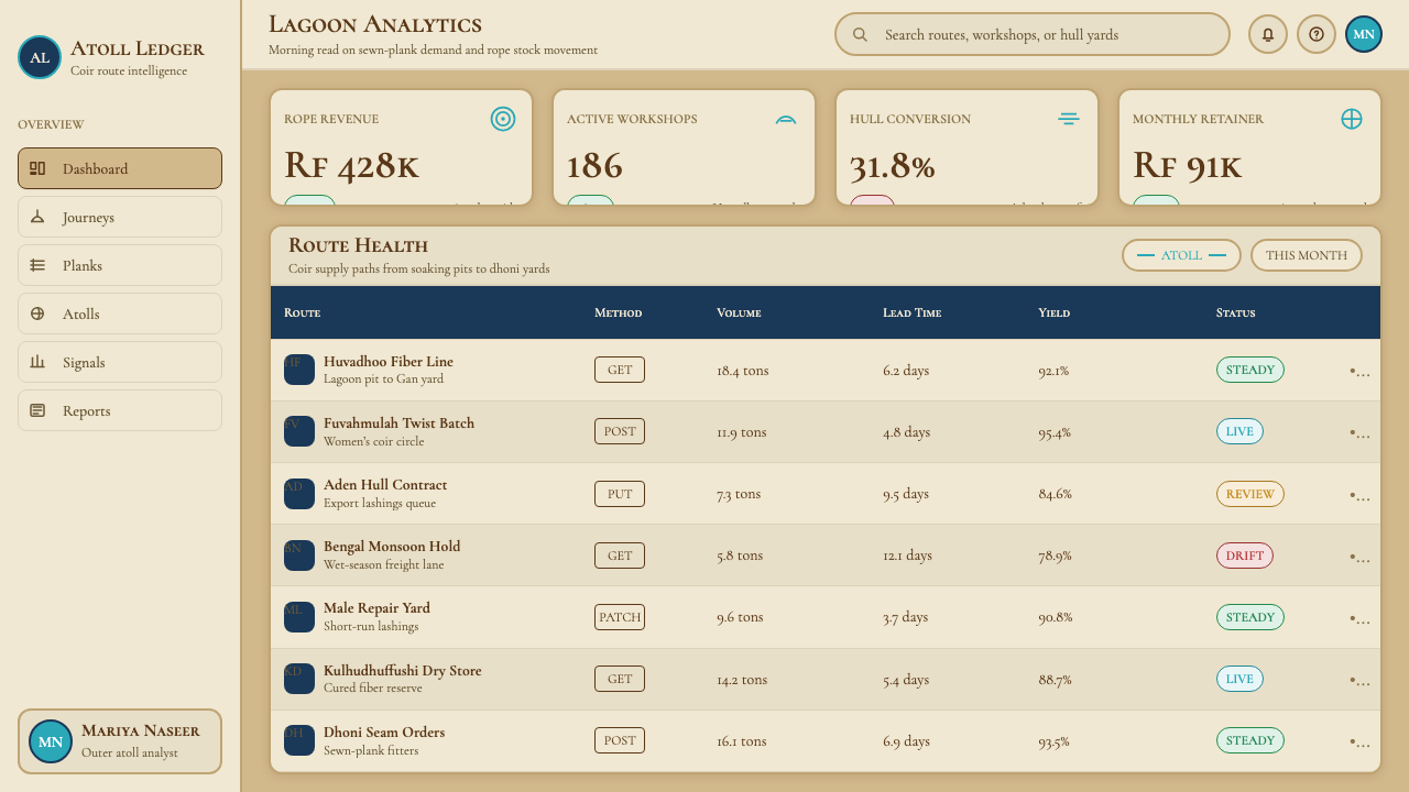
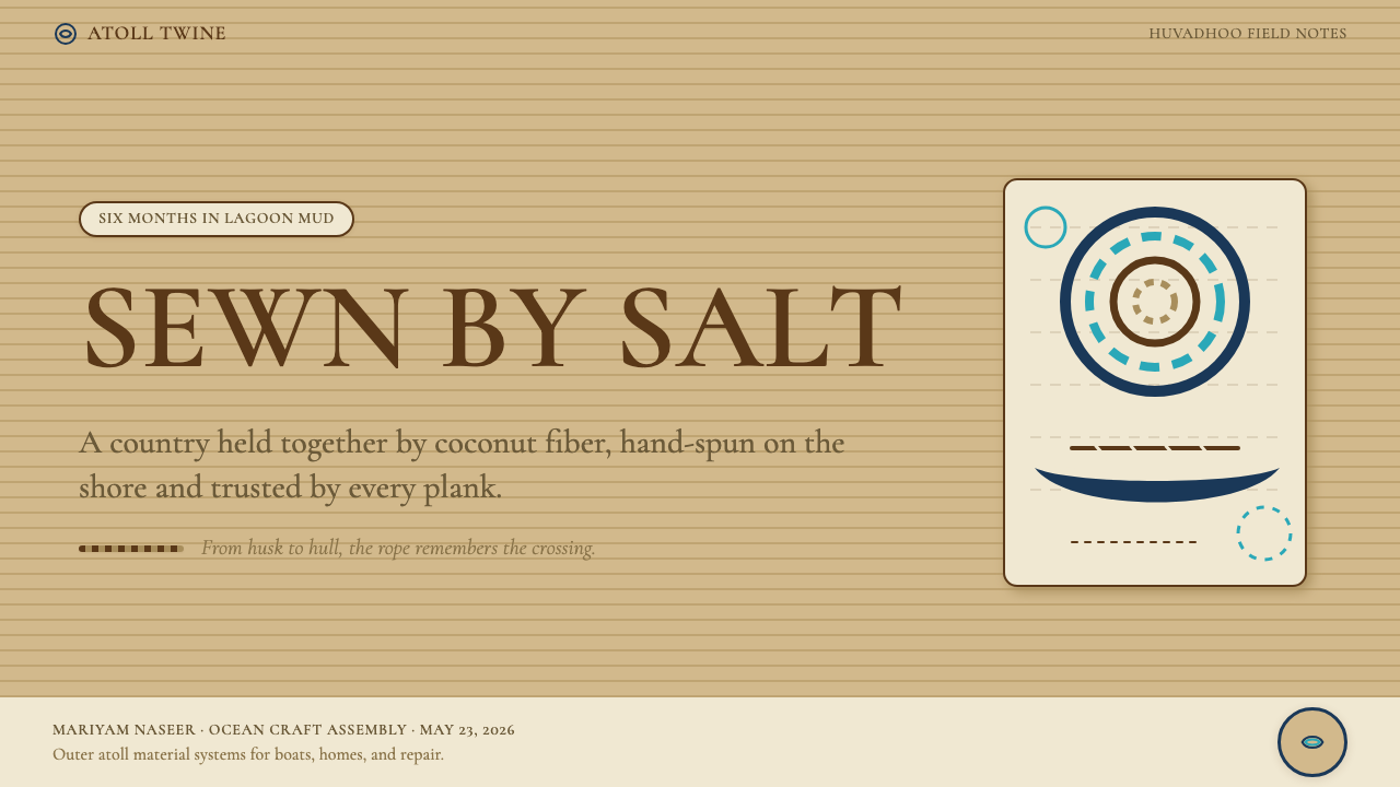
For presentation slides, the style works especially well on cover and section-break pages. A cover built in this system uses the coconut tan as the background, sets the title in a sharp serif at generous scale, and introduces a single dashed horizontal rule — the sewn-seam motif — below the headline. Section breaks use the lagoon turquoise accent sparingly: one ruled line, or a single geometric element, not a full-color panel. Content slides are clean and unhurried, with body text in a weight that reads easily against the warm ground, and data presented in a palette restricted to the two or three tones most needed for that slide's argument. The style struggles on dense data slides where many categories need visual differentiation — the restrained palette does not scale well beyond three or four distinct values.对于演示文稿,这种风格在封面和章节分隔页上表现尤为出色。用这套系统制作的封面以椰棕褐为背景,将标题以锐利衬线字体设置为慷慨的大字号,并在标题下方引入一条单一的虚线水平线——缝合针脚母题。章节分隔页克制地使用潟湖青绿点缀:一条规则线,或一个单一的几何元素,而非整块彩色面板。内容页干净而从容,正文字重在温暖底色上易于阅读,数据展示的色板限制在该页论点所需的两到三个色调。这种风格在需要大量类别进行视觉区分的密集数据页上力不从心——克制的色板无法扩展到三到四个明确值之外。
For web interfaces, the style suits editorial pages, about pages, product story pages, and any landing page where narrative pacing matters. The warm ground and generous spacing create a reading experience that feels considered rather than efficient. Pricing pages can work in this system if they are kept simple and the hierarchy is built through scale and spacing rather than color contrast. Dashboard interfaces are more difficult: the style's warmth and textural restraint do not naturally lend themselves to the density of information and the need for rapid visual differentiation that dashboards require. If a dashboard must be built in this system, treat the coir palette as the chrome and use the turquoise and indigo accents strictly for data encoding.对于网页界面,这种风格适合编辑页、关于页、产品故事页,以及任何叙事节奏至关重要的落地页。温暖的底色和慷慨的间距创造了一种「经过深思熟虑」而非「追求效率」的阅读体验。如果定价页面保持简洁,并通过比例和间距(而非色彩对比)构建层级,也可以在这套系统中呈现。仪表板界面则更为困难:这种风格的暖意和纹理克制感,天然地不适合仪表板对信息密度和快速视觉区分的要求。如果必须在这套系统中构建仪表板,建议将椰棕色板作为界面框架,严格将青绿和靛蓝点缀色用于数据编码。
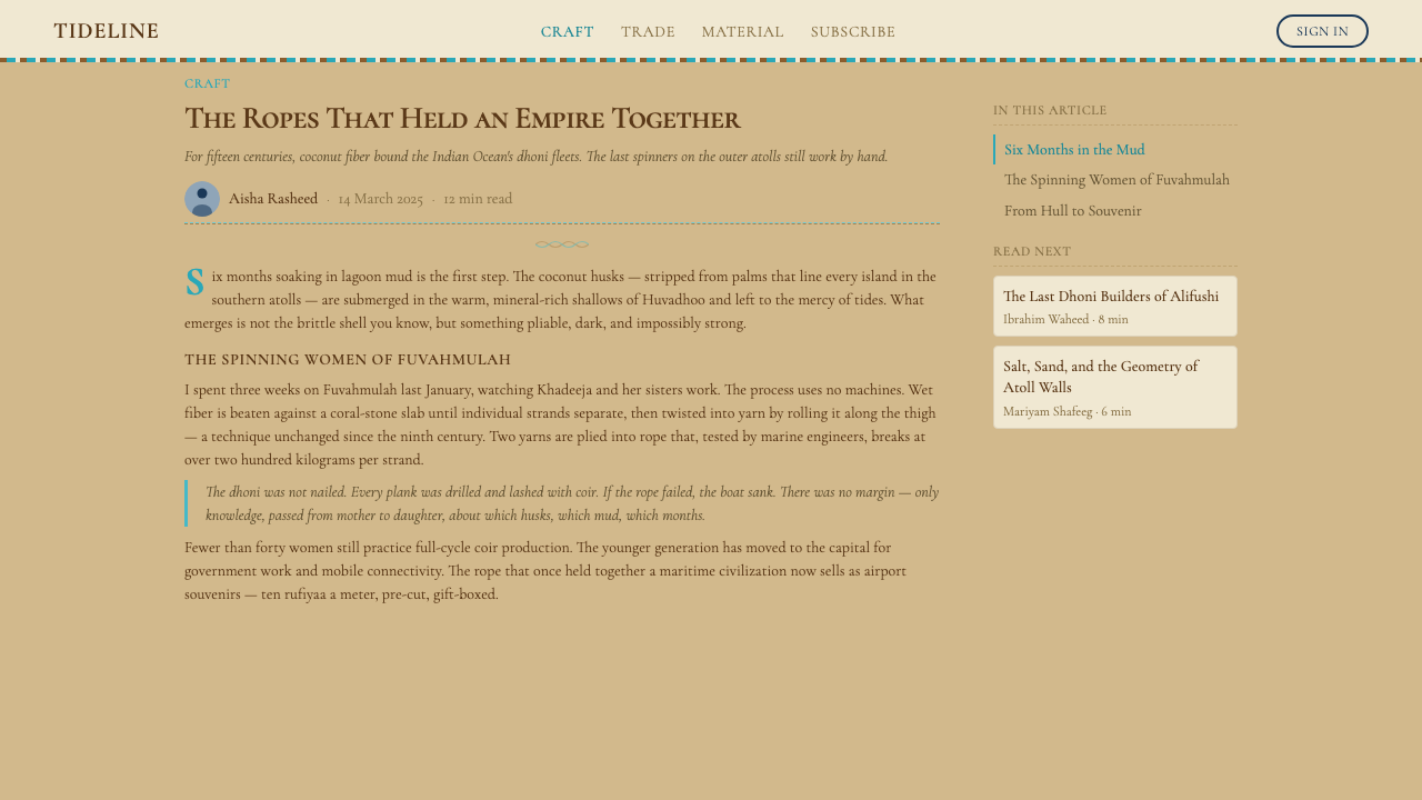
For editorial and marketing work, the style excels. An editorial layout using this system gives body text a wide measure with generous margins — the open space is non-negotiable. Pull quotes can be set in the display serif with visible contrast against the warm ground. Marketing pages benefit from the poster-like quality of the system: a full-width image of rope grain or water surface, a bold headline in the display weight, and a single call-to-action in the lagoon turquoise. The dashed-seam line motif makes an excellent section divider that carries visual meaning without being merely decorative.对于编辑和营销内容,这种风格表现卓越。使用这套系统的编辑版面给正文留有宽阔的行宽和慷慨的边距——开阔的空间是不可妥协的。引用语可以用展示衬线字体设置,与温暖底色形成明显对比。营销页面受益于这套系统的海报式品质:一张全宽的绳纹或水面图像,一行粗重展示字重的标题,以及一个以潟湖青绿呈现的单一行动号召。虚线缝合母题是绝佳的章节分隔符,具有视觉意义却不流于纯粹装饰。
A common mistake when applying this style is importing general coastal or tropical clichés — palm illustrations, wave motifs, saturated sunset gradients — that have no basis in the actual coir tradition and collapse the specificity that makes the style distinctive. Another error is over-saturating the turquoise accent, turning what should be a lagoon glimpse into a swimming-pool blue that reads as generic beach branding. A third mistake is using the texture references too heavily, so that every surface carries a rope-grain overlay and the work feels busy rather than grounded. The discipline of this style is restraint in every register: restrained palette, restrained texture, restrained accent use. Each element should feel like it is there because it had to be.应用这种风格时最常见的错误,是引入泛泛的海岸或热带俗套——棕榈插图、海浪母题、饱和的日落渐变——这些在椰棕传统中毫无依据,会瓦解使这种风格独特的特殊性。另一个错误是过度饱和青绿点缀色,将本应是潟湖一瞥的颜色变成游泳池蓝,令人读成通俗的海滩品牌。第三个错误是过度使用纹理参照,以至于每个表面都覆盖绳纹叠加层,使作品感觉繁杂而非扎实。这种风格的自律在于每个维度都保持克制:克制的色板、克制的纹理、克制的点缀色使用。每一个元素都应给人一种「因为不得不在这里而在这里」的存在感。
See the Maldivian Coir (Coconut Rope) design system →查看 Maldivian Coir (Coconut Rope) 完整设计系统 →
Maldivian Coir (Coconut Rope) — FAQMaldivian Coir (Coconut Rope) · 常见问题
How is this style different from generic coastal or nautical design?这种风格与泛泛的海岸或航海设计有什么不同?
Generic coastal design typically draws from a Mediterranean or Atlantic sailing vocabulary — crisp navy and white, rope-and-anchor motifs, clean sans-serif type, and a sense of recreational leisure. Maldivian coir is Indian Ocean in origin and craft in register: the palette is sun-faded and warm rather than cool and crisp, the reference materials are hand-made rope and coral stone rather than nautical hardware, and the tone is that of working maritime culture rather than recreational sailing. The specificity is what matters — this style carries the look of a particular place and practice, not a generalized sea-and-sun mood.泛泛的海岸设计通常借鉴地中海或大西洋帆船语汇——深蓝与白色的干净对比、绳索与锚的母题、清晰的无衬线字体,以及一种休闲娱乐的氛围。马尔代夫椰棕风格来自印度洋,属于手工艺的语域:色板是日晒后褪色的温暖,而非清冷利落;参照材料是手制绳索和珊瑚石,而非航海金属配件;基调是劳作的海洋文化,而非休闲帆船运动。特殊性是关键所在——这种风格携带着一个具体地方和具体实践的面貌,而非泛泛的海洋与阳光情绪。
Can this style work for dark-background layouts?这种风格能用于深色背景版面吗?
A dark variant is possible but requires deliberate adjustment. The canonical version is light-ground — the cream and tan tones are the dominant surface, and the warm-ground logic depends on them. On a dark background, the system shifts toward its ocean-depth register: deep indigo as the ground, with cream and tan used as type and detail colors, and turquoise as the accent. This works for contexts with a nighttime or underwater association — a maritime heritage archive, a deep-sea research presentation — but loses the sun-bleached warmth that is the style's most distinctive quality. Treat the dark variant as a specific, intentional application rather than an automatic alternative.深色变体是可行的,但需要刻意调整。标准版本以浅色为底——奶油色和棕褐色是主导表面,温暖底色的逻辑依赖于它们。在深色背景上,系统转向其「深海」语域:以深海靛蓝为底,以奶油色和棕褐色用于文字和细节,以青绿色作为点缀。这适用于具有夜间或水下联想的场景——海洋遗产档案馆、深海研究演示——但会失去日光漂白的温暖感,而那正是这种风格最鲜明的特质。将深色变体视为特定的、有意为之的应用,而非自动的替代方案。
Is the dashed-seam line motif essential to the style, or can it be omitted?虚线缝合母题对这种风格来说是必不可少的,还是可以省略?
It is important but not mandatory. The dashed line is the most direct visual reference to the coir tradition — specifically to the sewn-plank construction technique of the dhoni — and it carries more semantic weight than a plain rule. However, overusing it (as a decoration on every element) undermines that weight. The principle is that every dashed line should feel like it is marking a joint, a seam, or a threshold — not merely breaking up space. If the design context does not support that reading, using a plain rule is preferable to turning the dashed line into ornament.它重要,但并非不可或缺。虚线是对椰棕传统最直接的视觉参照——特别是对多尼船体缝合船板建造技术的参照——其语义分量超过一条普通直线。然而,过度使用(在每个元素上都加虚线装饰)会削弱这种分量。原则是:每一条虚线都应令人感到它在标记一个接缝、一道缝合或一个门槛,而非仅仅在分割空间。如果设计语境不支持这种读法,使用普通直线比将虚线沦为装饰更为可取。
What kinds of imagery work with this style?什么类型的图像与这种风格相配?
The most coherent imagery is documentary in register: close-up photographs of rope grain, woven fiber textures, worn coral stone, weathered wood, or still lagoon water. These images should be treated as flat elements — cropped tightly, allowed to fill a defined space without competing with type, and not subjected to filters that would introduce artificial warmth or color grading. Aerial imagery of atolls works well as an establishing shot but should be used once, not repeatedly. Avoid stock-photo tropical scenes with people on beaches or resort interiors — they read in a different register entirely and collapse the style's specificity. When no appropriate photography is available, the rope-grain and dashed-seam texture motifs carry the visual work without imagery.最具一致性的图像属于纪录片式语域:绳纹的特写照片、编织纤维的质感、风化的珊瑚石、饱经风霜的木材,或静止的潟湖水面。这些图像应当作为平面元素处理——紧密裁切,填充于明确的空间而不与文字竞争,不添加会引入人工暖意或色彩分级的滤镜。环礁鸟瞰图像适合作为定场镜头,但应只使用一次,不宜反复出现。避免使用人物在海滩上或度假村室内的图库热带场景——它们属于完全不同的语域,会瓦解这种风格的特殊性。当没有合适的摄影素材时,绳纹和虚线缝合纹理母题可以在无图像的情况下承担视觉工作。
Does this style suit luxury or premium positioning?这种风格适合奢华或高端定位吗?
It suits a specific kind of premium positioning — one grounded in craft heritage, material honesty, and cultural depth rather than gloss, opulence, or contemporary minimalism. Think of the difference between a resort that markets itself through its infinity pool and a lodge that markets itself through its connection to local fishing culture. This style works for the latter. It does not suit brands whose premium claim rests on technical precision, clinical cleanliness, or aspirational modernity. The warmth and texture of the style read as approachable and grounded, which is a premium quality in contexts where authenticity is valued but a liability in contexts where efficiency or innovation are the primary signals.它适合一种特定类型的高端定位——那种以手工遗产、材料诚实和文化深度为基础的高端,而非光泽、奢华或当代极简主义。想象一下这两者的区别:一家以无边泳池营销自身的度假村,与一家以其与当地渔业文化的联结营销自身的小屋。这种风格适合后者。它不适合那些高端主张建立在技术精确、临床洁净或向往现代性之上的品牌。这种风格的温暖感和质感读起来平易近人而扎实,在真实性受到重视的场景中这是高端品质,但在效率或创新是主要信号的场景中则可能成为负担。
Related design styles相关设计风格
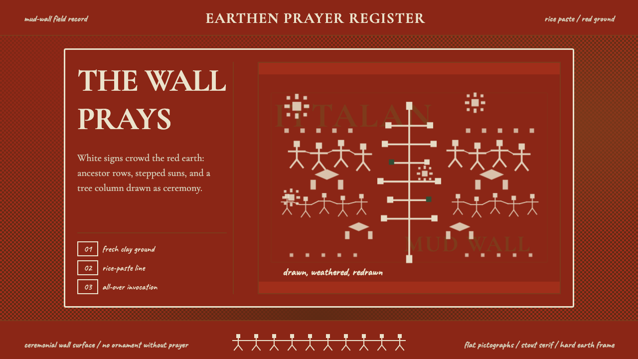 Odisha Saura Tribal MuralSacred density. Rice-white pictographs crowd a red-earth wall in ritual rhyth…神圣密度:米白象形符号挤满红土地墙,形成仪式节奏。
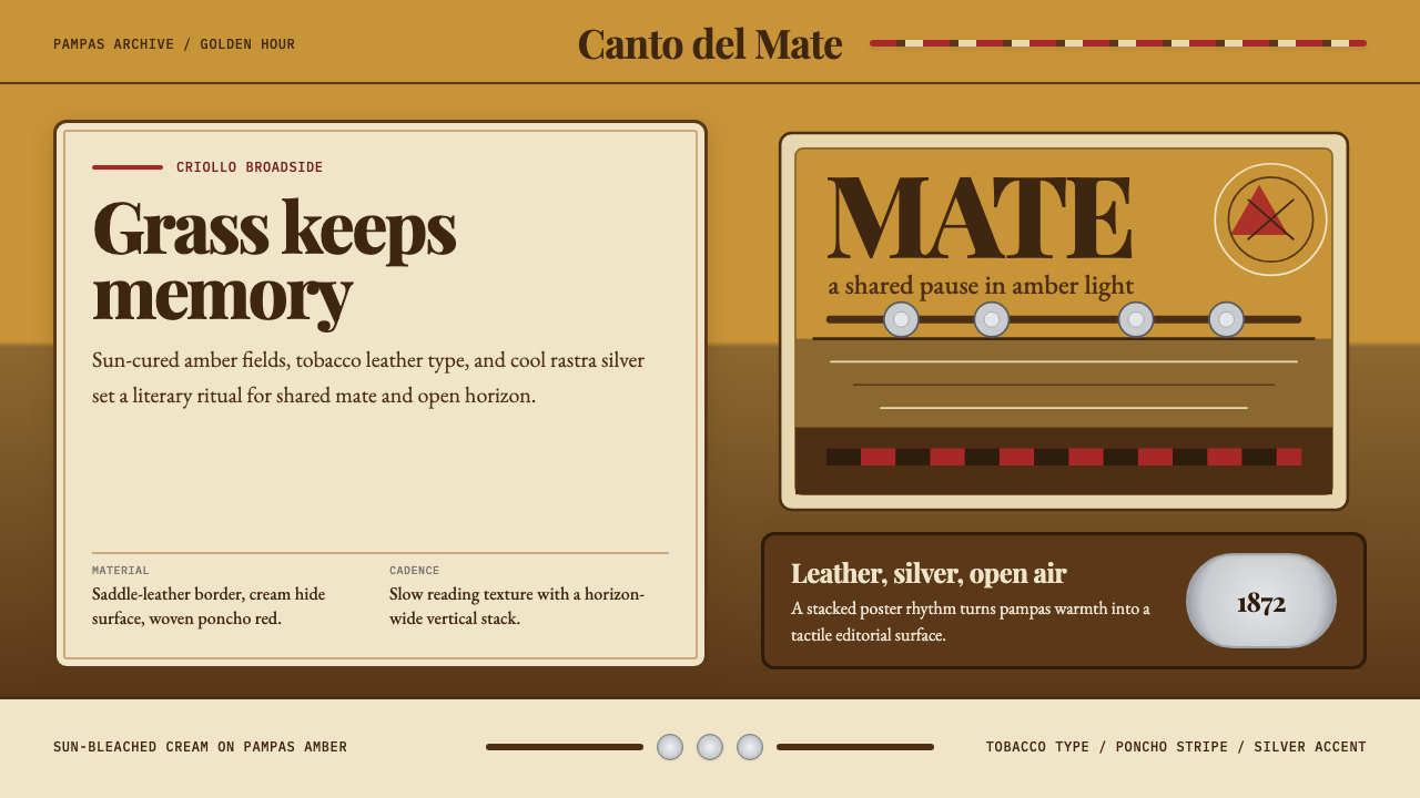 Argentine Gaucho (Pampas Mate Culture)Open grassland, printed warm. Amber fields, Playfair serif, and silver rastra…开阔草原的温热印刷:琥珀底、Playfair衬线与银色腰带几何。
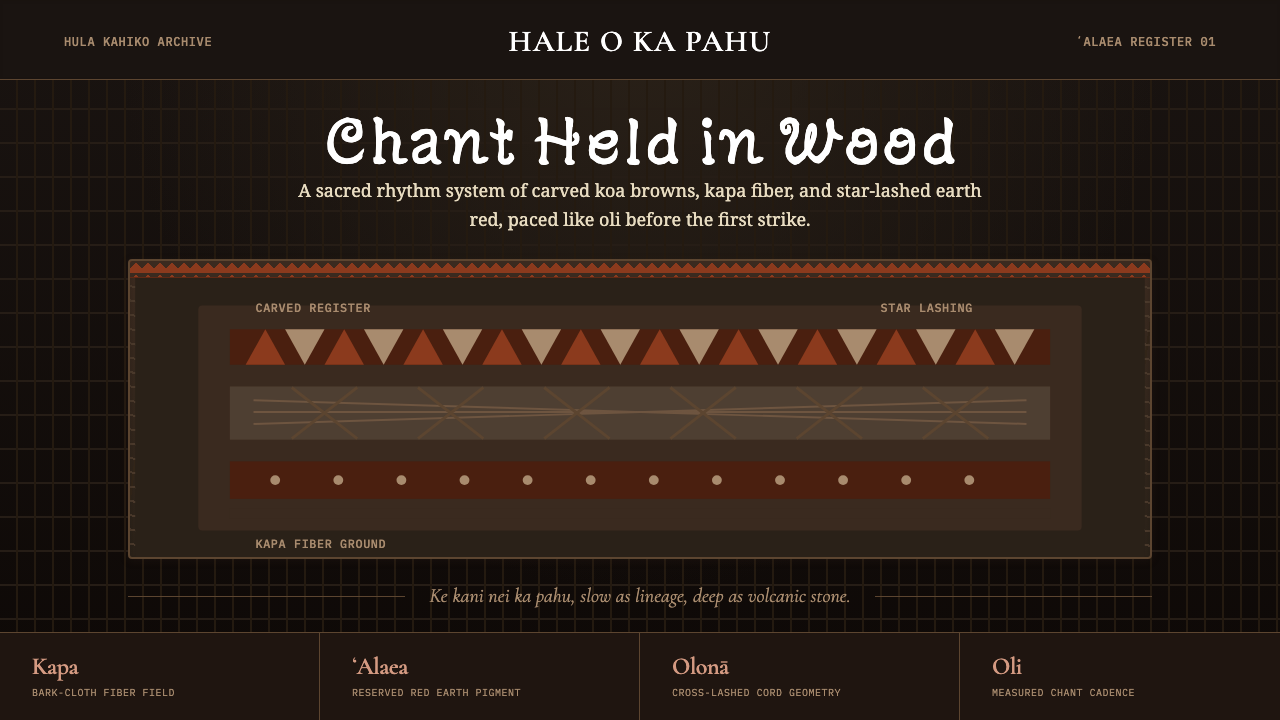 Hawaiian Hula Pahu DrumSacred weight, hand-marked. ʻAlaea red, kapa texture, and stacked carved regi…圣重而手作。ʻAlaea红、卡帕纹理与层叠雕刻带。
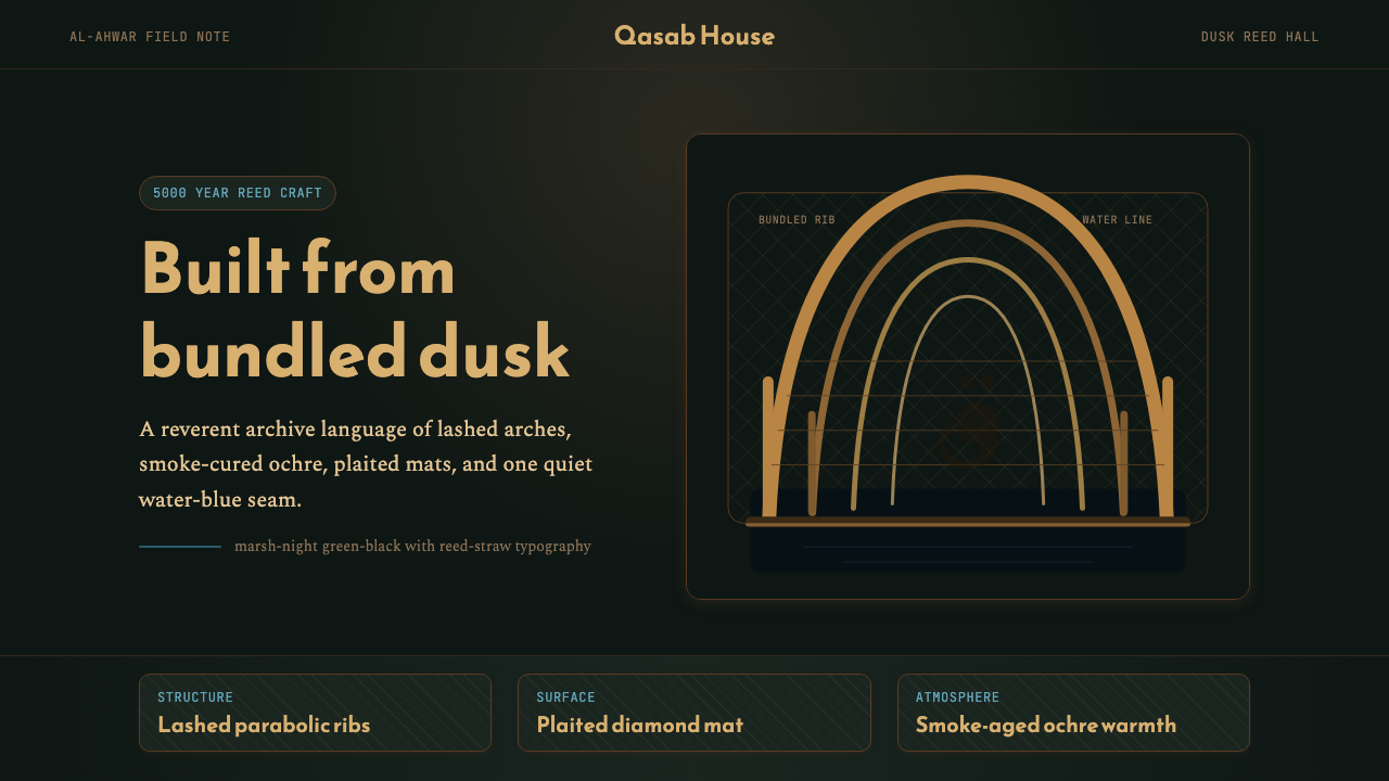 Iraqi Marsh Arab Mudhif ReedReverent reed darkness. Kufi arches, ochre lattice, and one water-blue line h…庄重的芦苇夜色。库菲拱线、赭黄格纹与一笔水蓝托住黄昏。
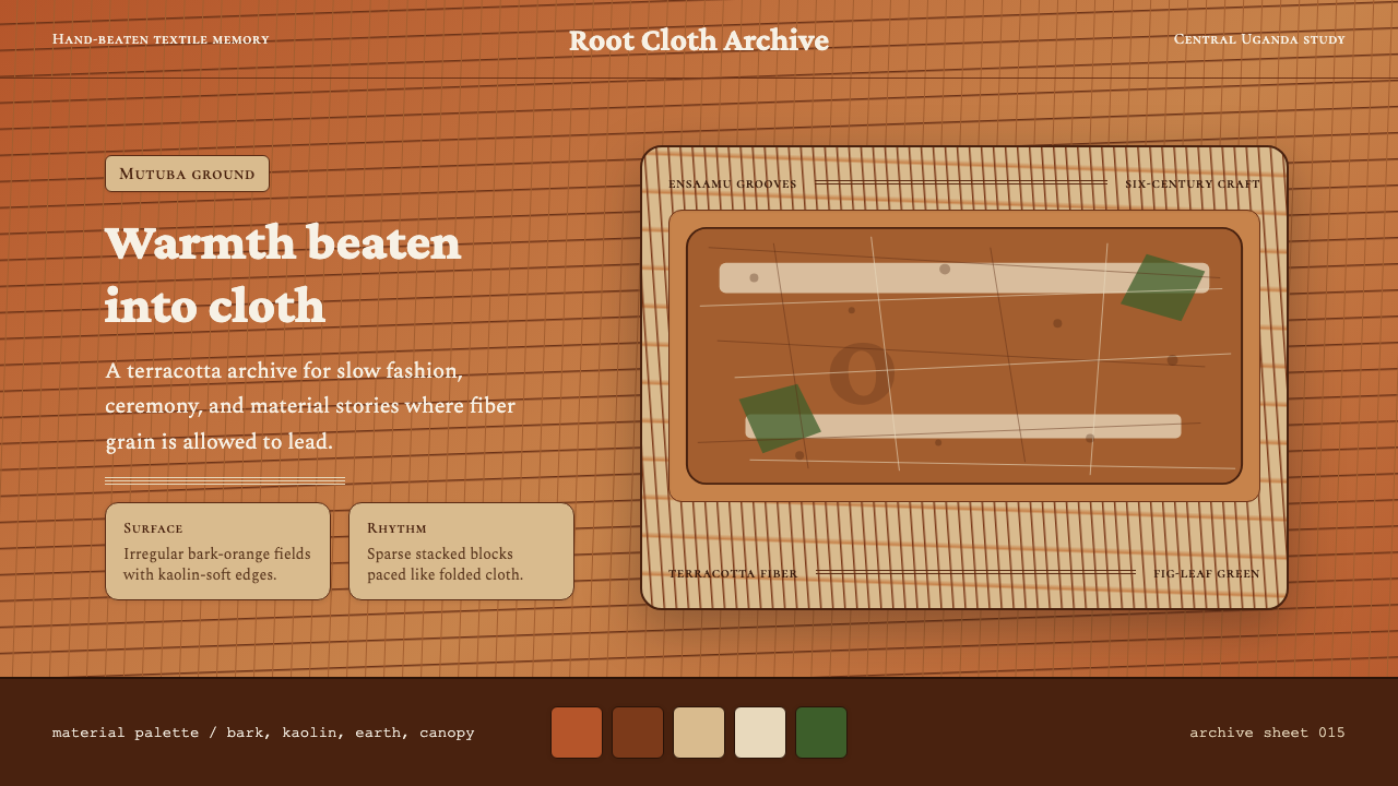 Ugandan Mutuba BarkclothHandmade warmth holds. Terracotta grain, Crimson Pro, and sparse stacked clot…手作温度沉稳铺开。赤陶纤维、Crimson Pro 与疏朗叠布构图。
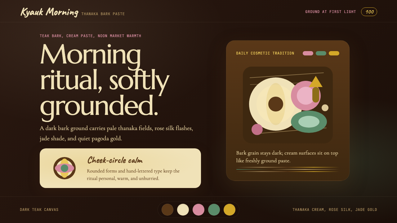 Burmese Shan Thanaka (Bark Paste)Handmade warmth on dark bark. Thanaka cream roundels soften rose, jade, and g…深色树皮上的手作暖意。特纳卡奶油圆斑柔化玫瑰、翡翠与金色。