Design style guide设计风格指南
What is Argentine Gaucho (Pampas Mate Culture)?什么是 Argentine Gaucho (Pampas Mate Culture)?
The Argentine gaucho distills a century of open-sky cattle culture into warm amber grounds, hand-tooled silver accents, and the unhurried hospitality of shared mate.阿根廷高乔风格将一个世纪的旷野牧牛文化提炼为温暖的琥珀底色、手工錾刻银饰的点缀,以及共享马黛茶时那份不疾不徐的待客之道。
Argentine Gaucho (Pampas Mate Culture) in briefArgentine Gaucho (Pampas Mate Culture) 速览
Argentine Gaucho (Pampas Mate Culture) is a design aesthetic rooted in the visual and material world of the nineteenth-century South American cattle herder. It draws on the warm amber light that floods the pampas at dusk, the dark tobacco-brown of worn saddle leather, the cold glint of silver rastra belt ornaments, and the sun-bleached cream of estancia walls — translating a living rural tradition into a cohesive typographic and compositional language.阿根廷高乔(潘帕斯马黛茶文化)是一套植根于十九世纪南美牧牛人视觉与物质世界的设计美学。它汲取了潘帕斯草原黄昏时泛漫的温暖琥珀光,磨损鞍革的深烟草棕,银色rastra腰带饰件的冷光闪烁,以及庄园白墙在日晒后褪成的奶油色——将一种鲜活的乡野传统转化为连贯的字体与版式语言。
At its core, the style is about warmth and weight. Every surface carries the temperature of the grassland: backgrounds glow with amber or aged parchment tones, structural elements take on the density of hand-stitched hide, and accents catch the eye the way firelight catches silver. The overall impression is neither rustic nor primitive — it is dignified, deliberate, and deeply literary, reflecting the gaucho's dual existence as both working horseman and romantic national symbol.这种风格的核心是温度与分量。每一层界面都携带着草原的体温:背景散发着琥珀或老羊皮纸的光晕,结构性元素有手工缝制皮革的厚重感,而点睛之笔则像篝火映照银器那样在深处闪光。整体印象既不粗粝,也非原始——而是庄重、从容、充满文学气质,折射着高乔人作为草原骑手与浪漫民族象征的双重身份。
The aesthetic reached its fullest cultural articulation in the criollismo movement of late nineteenth-century Argentine letters, which elevated the gaucho from a marginal outlaw figure to the country's defining archetype. José Hernández's epic poem Martín Fierro (1872) and Ricardo Güiraldes's novel Don Segundo Sombra (1926) gave the gaucho moral gravity and lyrical weight. The design system inherits that literary seriousness: it favors typefaces with traditional serif authority, compositional patience, and a restrained palette that speaks of endurance rather than spectacle.这一美学在十九世纪末阿根廷克里奥约主义文学运动中得到了最完整的文化表达。该运动将高乔人从边缘化的流浪者形象提升为国家的核心原型。何塞·埃尔南德斯的史诗《马丁·菲耶罗》(1872年)与里卡多·吉拉尔德斯的小说《唐·塞贡多·松布拉》(1926年)赋予了高乔人道德分量与诗性重量。这套设计系统继承了那种文学严肃性:它偏好具有传统衬线权威感的字体、构图上的沉着气度,以及一套传达耐久而非奇观的克制色板。
Where does Argentine Gaucho (Pampas Mate Culture) come from?Argentine Gaucho (Pampas Mate Culture) 从何而来?
The gaucho emerged as a distinct social type on the Río de la Plata plains during the seventeenth century, as feral cattle — descendants of stock brought by Spanish colonizers — multiplied across the vast grasslands of what would become Argentina, Uruguay, and southern Brazil. These horsemen lived outside the formal colonial economy, hunting wild cattle for their hides, camping under the Southern Cross, and developing a material culture shaped entirely by what the pampas provided: leather for clothing and shelter, silver traded from the Andean mining routes for ornamentation, and the yerba mate plant for the communal drink that structured their social life.高乔人作为一种独特的社会类型,在十七世纪出现于拉普拉塔河平原。西班牙殖民者带来的牲畜在如今阿根廷、乌拉圭和巴西南部的广袤草原上野化繁衍,造就了一批游走于正式殖民经济体系之外的骑手。他们猎杀野牛换取皮革,在南十字星下露营,发展出一套完全由潘帕斯草原所提供之物塑造的物质文化:皮革用于衣物与遮蔽,从安第斯矿路交易来的银饰用于装点,而马黛茶植物则提供了构建社会生活的共饮仪式。
The rastra, a wide belt composed of interlocking silver coins or medallions, became the gaucho's most distinctive ornament — at once a display of accumulated wealth, a functional tool, and a marker of identity. Similarly, the mate gourd and its silver bombilla straw were objects of daily ritual: shared in a circle, passed in order, and governed by unspoken etiquette that defined community belonging. These objects — the rastra, the mate, the facón knife, the poncho — became the visual vocabulary of gaucho identity and remain its most recognizable design references.rastra——一条由相互扣连的银币或银章组成的宽腰带——成为高乔人最具辨识度的装饰:既是积累财富的展示,也是实用工具,更是身份认同的标记。同样,马黛茶葫芦和银制bombilla吸管是日常仪式的器物:围圈传递,依序饮用,受不言而喻的礼仪约束,界定着共同体的归属感。这些器物——rastra腰带、马黛茶具、facón短刀、斗篷——构成了高乔身份认同的视觉词汇,至今仍是最具辨识度的设计参照。
By the mid-nineteenth century, the gaucho's way of life was being systematically erased by the expansion of wire fencing, agricultural settlement, and the military campaigns that pacified the pampas. It was precisely at the moment of its disappearance that the gaucho became a national symbol. The Argentine government and literary intelligentsia, seeking a distinctly American identity separate from both Spanish colonial heritage and European modernism, found it in the idealized figure of the horseman who lived by his own code in open country. José Hernández's Martín Fierro, published in two parts in 1872 and 1879, gave this idealization its definitive literary form: a first-person lament from a gaucho driven off his land, resisting conscription, and ultimately reconciling himself to a settled life.到十九世纪中叶,高乔人的生活方式正被铁丝网围栏的扩张、农业定居点和平定潘帕斯的军事行动系统性地抹除。恰恰是在消逝的时刻,高乔人成为了民族象征。正在寻求独立于西班牙殖民遗产与欧洲现代主义之外的美洲身份认同的阿根廷政府与文学知识界,在这位以自己的准则生活于开阔大地上的骑手理想化形象中找到了答案。何塞·埃尔南德斯于1872年和1879年分两部出版的《马丁·菲耶罗》,赋予了这一理想化以最终的文学形态:一个被逐出土地的高乔人以第一人称哀诉,抵抗征召,最终与定居生活和解。
Ricardo Güiraldes's Don Segundo Sombra (1926) completed the literary canonization, presenting the gaucho not as a victim of history but as a teacher of stoic wisdom. By this point, gaucho imagery — the warm earth tones, the silver ornament, the wide horizon — had become a stable visual code circulating across Argentine painting, illustration, and graphic arts. The national poet Leopoldo Lugones declared Martín Fierro the Argentine national epic in 1913, formally installing the gaucho at the center of the country's cultural identity. The design aesthetic that carries this heritage forward is one of earned warmth: nothing flashy, everything meaningful.里卡多·吉拉尔德斯的《唐·塞贡多·松布拉》(1926年)完成了文学经典化,将高乔人呈现为不是历史的受害者,而是斯多葛智慧的传授者。至此,高乔形象——温暖的大地色调、银饰、宽阔地平线——已成为流通于阿根廷绘画、插图与平面艺术中的稳固视觉代码。国家诗人莱奥波尔多·卢戈内斯于1913年宣告《马丁·菲耶罗》为阿根廷民族史诗,正式将高乔人置于国家文化认同的核心。延续这一遗产的设计美学,是一种经历过的温暖:没有浮夸,一切皆有深意。
What defines the Argentine Gaucho (Pampas Mate Culture) look?Argentine Gaucho (Pampas Mate Culture) 的视觉特征是什么?
Color Palette色彩体系
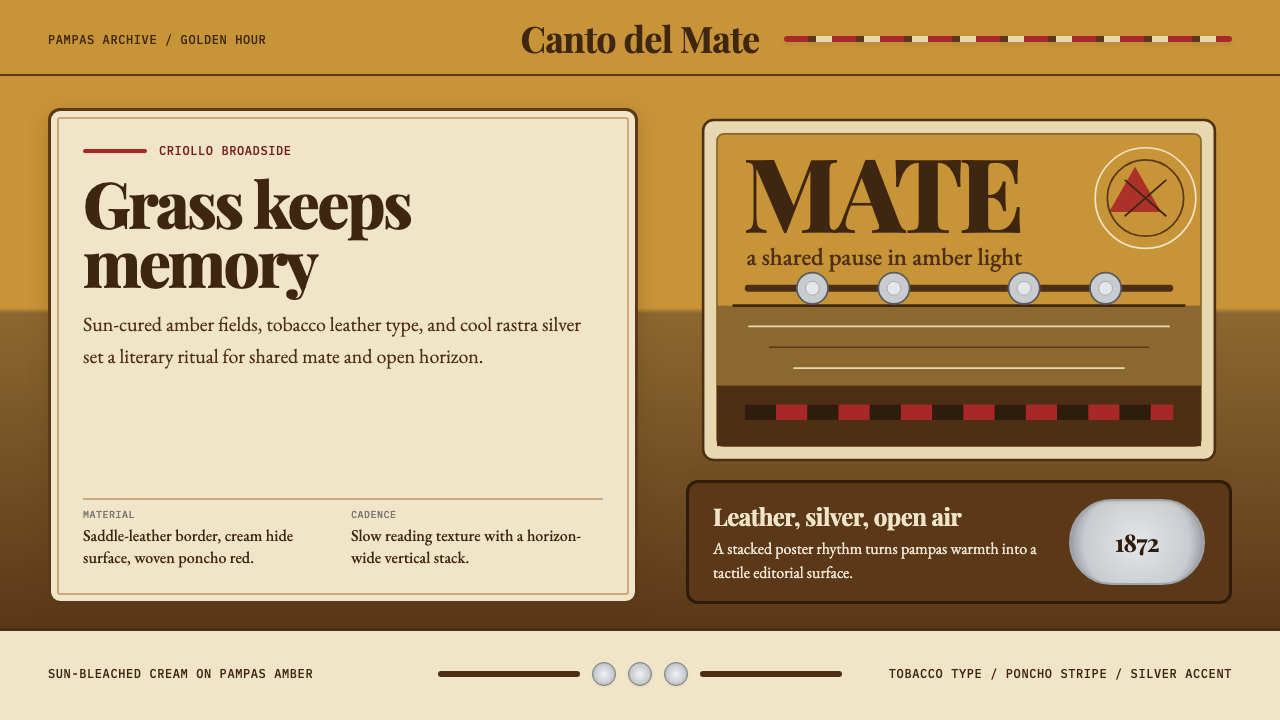
The palette is built from the pampas itself. Warm amber and golden ochre serve as primary grounds, evoking the grassland at midday. Deep tobacco brown anchors structural elements — panels, dividers, and borders — with the weight of aged saddle leather. Sun-bleached cream or off-white provides a quiet field for body text and content areas. Accents arrive in two forms: a deep poncho red for emotional warmth and calls to action, and a cool metallic silver-gray for navigational or decorative details that reference the silver ornaments of gaucho dress. The overall temperature is consistently warm and earthen; no cool blues or synthetic brights enter the system.色板从潘帕斯草原本身提炼。温暖的琥珀色与金赭色作为主要底色,唤起正午时分的草地光感。深烟草棕锚定结构性元素——面板、分隔线与边框——带有陈年鞍革的厚重感。日晒褪色的奶油白或米白,为正文与内容区提供静谧的底面。点缀色以两种形式出现:深斗篷红传递情感温度,充当行动引导;冷调的金属银灰用于导航或装饰细节,呼应高乔服饰中的银器传统。整体温调持续维持温暖的大地气息,不引入冷调蓝或合成鲜艳色。
Typography字体排印
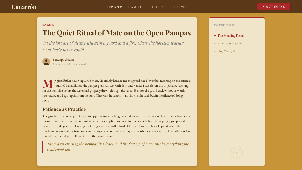
Type choices carry the literary weight of criollismo. Display headings call for serif faces with traditional authority — letterforms that recall the hand-set type of nineteenth-century Argentine broadsheets and the gravity of Martín Fierro's printed editions. Body text pairs warm, readable serif letterforms that reward extended reading rather than scanning. The typographic voice is unhurried: generous line spacing, moderate measure, and a clear hierarchy between title, subtitle, and body that unfolds like the stanzas of a payada (the gaucho improvised song duel). Decorative capitals and occasional use of italic convey the rhetorical richness of oral tradition translated into print.字体选择承载着克里奥约主义的文学分量。展示标题选用具有传统权威的衬线字体——那种字形让人联想到十九世纪阿根廷报刊的手工铅字排版与《马丁·菲耶罗》印刷版本的庄重感。正文搭配温润易读的衬线字形,鼓励沉浸阅读而非快速扫视。字体基调从容不迫:宽松行距、适中行宽,标题、副标题与正文之间形成清晰层级,像payada(高乔即兴对唱)的诗节般一一展开。装饰性大写字母和适度使用的斜体,传递着口头传统转化为印刷文字时所带的修辞丰富性。
Texture and Surface肌理与表面
Unlike austere minimal styles that insist on flat surfaces, the gaucho aesthetic embraces tactile depth. Subtle grain textures evoke the pressed hide, woven wool, or aged paper of pampas material culture. These textures are never photorealistic — they read as an atmospheric quality, like the slight tooth of watercolor paper or the worn surface of a field journal. Card components and panel backgrounds carry this grain quality, making the interface feel like it has been held in many hands over many years. The texture is purposeful: it reinforces warmth and signals craft rather than manufacturing.与坚持平面表面的极简风格不同,高乔美学拥抱触觉深度。细腻的颗粒肌理唤起潘帕斯物质文化中的压制皮革、编织羊毛或陈年纸张质感。这些纹理从不追求照片级真实感——它们呈现为一种氛围品质,像水彩纸的轻微纸纹或野外日志封面的磨损表面。卡片组件与面板背景携带这种颗粒质感,让界面感觉像是经过许多人的手、历经许多年岁的器物。肌理具有目的性:它强化了温度感,传达的是手工而非批量制造的信号。
Composition and Horizon构图与地平线
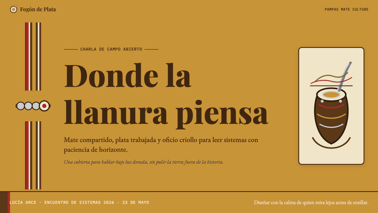
Gaucho composition is horizontal and expansive, mirroring the pampas horizon. Wide-format hero sections make full use of lateral space; the eye is invited to sweep across the field before settling on a focal point. Visual hierarchy moves from left to right or from a wide establishing shot to a concentrated detail — much like the gaucho's gaze that reads the landscape before pinpointing a single calf. Panel divisions often reference the strong horizontal bands of the Argentine landscape: sky above, grassland below, the estancia buildings as a thin stripe between them. This orientation gives even dense content layouts a quality of openness and breathing room.高乔构图是横向而辽阔的,镜射潘帕斯地平线。宽幅主视觉区充分利用横向空间;视线被邀请在定格于焦点之前,先横扫整个画面。视觉层级从左到右,或从宽幅全景收向集中细节——就像高乔人在锁定某头小牛前,先读懂整片草原地势。面板分割常常援引阿根廷景观中强烈的水平色带:天空在上,草地在下,庄园建筑作为中间一条细线。这种方向感赋予即便内容密集的版面以开阔与呼吸的品质。
Silver Accent System银色点缀体系
Just as the gaucho's rastra belt and mate bombilla provided flashes of precious metal against earthy clothing, the design system uses cool silver tones as a precise accent against warm grounds. These silver elements are used sparingly: border highlights on interactive components, fine rule lines between sections, icon strokes, or the occasional decorative geometric that references the medallion patterns of the rastra. The restraint is essential — overuse flattens the contrast. Silver is a surprise; it should feel earned, the way the glint of a belt ornament registers in peripheral vision during a long ride.就像高乔人的rastra腰带和bombilla吸管在朴素衣物上闪出贵金属光芒,这套设计系统以冷调银色作为温暖底色上精准的点缀。银色元素使用克制:交互组件的边框高光、段落之间的细线分隔、图标笔画,或偶尔出现的装饰几何元素(援引rastra腰带上的圆章图案)。克制至关重要——过度使用会拉平对比。银色是一个惊喜;它应该像长途骑行中腰带饰件的反光在余光中的闪现——来得自然,却令人印象深刻。
Ornament as Craft装饰即手艺
Unlike movements that reject ornament entirely, the gaucho aesthetic treats decoration as evidence of craft skill and cultural pride. But this ornament is always structural or thematic — it references actual gaucho material culture (the braided leather patterns of sogas, the geometric stamping of silver work, the diamond patterns of woven ponchos) rather than being applied arbitrarily. Decorative borders, section dividers, and pull-quote ornaments derive from these craft sources. The distinction from pastiche is intentionality: every decorative choice should trace back to a specific material or cultural tradition of the pampas.与彻底拒绝装饰的运动不同,高乔美学将装饰视为手工技艺与文化自豪的证明。但这种装饰始终是结构性或主题性的——它援引真实的高乔物质文化(sogas编织皮绳的纹样、银器錾刻的几何印记、编织斗篷的菱形图案),而非任意施加。装饰性边框、段落分隔线与引文装饰,均从这些手工艺来源中衍生。与仿制品的区别在于意图性:每一个装饰选择都应能追溯至潘帕斯草原某种具体的物质或文化传统。
Mood: Solitude and Hospitality情绪基调:孤独与好客
The gaucho aesthetic holds two apparently contradictory emotional registers in balance. On one hand, it evokes the solitude of the open pampas — vast negative space, unhurried pacing, the long unbroken horizon. On the other, it carries the warmth of mate circle hospitality — generous spacing between elements as an act of welcome, the amber warmth of firelight, the sense that there is always room for one more at the fire. This duality means the style can serve both contemplative, long-form reading experiences and genuinely welcoming product surfaces. The key is that the warmth always feels earned rather than manufactured.高乔美学在两种表面上相互矛盾的情感频率之间保持平衡。一方面,它唤起旷野潘帕斯的孤独感——大面积留白、不疾不徐的节奏、绵延不断的地平线;另一方面,它携带着马黛茶圈子里的待客温暖——元素间宽裕的间距如同欢迎的姿态,琥珀色的篝火暖意,以及那种火堆旁永远还有一个位置的安心感。这种二元性意味着这种风格既能服务于沉思式的长篇阅读体验,也能支撑真正令人感到受欢迎的产品界面。关键在于:那份温暖始终像是挣来的,而非制造出来的。
Who shaped Argentine Gaucho (Pampas Mate Culture)?谁塑造了 Argentine Gaucho (Pampas Mate Culture)?
Hernández (1834–1886) was the journalist, politician, and poet who wrote Martín Fierro, the two-part epic poem published in 1872 and 1879 that became the foundational text of Argentine national literature. Hernández was himself from the province of Buenos Aires and had spent time among gaucho communities; his poem gave the gaucho a voice rather than merely an image, documenting the herder's dialect, oral poetic traditions, and social grievances with an intimacy that subsequent writers and artists have drawn from ever since. The poem's formal structure — the payada verse form, the six-line décima stanza — provided a template for how criollismo aesthetics would balance folk tradition with literary ambition, a balance that the visual design system inherits.埃尔南德斯(1834—1886)是记者、政治家与诗人,著有分两部出版于1872年与1879年的史诗《马丁·菲耶罗》,该作品成为阿根廷国家文学的奠基之作。埃尔南德斯本人来自布宜诺斯艾利斯省,曾在高乔社区中生活过;他的诗作赋予了高乔人一个声音而不仅仅是一个形象,以亲历者的亲密感记录了牧人的方言、口头诗歌传统与社会积怨——此后的作家与艺术家不断从中汲取。诗作的形式结构——payada诗体、六行décima诗节——为克里奥约美学如何在民俗传统与文学抱负之间取得平衡提供了模板,而这套视觉设计系统正是这一平衡的继承者。
Güiraldes (1886–1927) was a Buenos Aires patrician who became the gaucho tradition's most sophisticated literary champion. His novel Don Segundo Sombra (1926) presented the gaucho not as a tragic outlaw but as a figure of stoic dignity and practical wisdom — a mentor to a younger generation learning how to live with integrity in a world of change. Güiraldes wrote with a modernist sensibility while drawing on authentic gaucho oral traditions he had absorbed on his family estancia in San Antonio de Areco. That town became, and remains, the spiritual capital of gaucho culture in Argentina — its silversmith workshops, leather artisans, and annual festival providing the living material culture that the design aesthetic directly references.吉拉尔德斯(1886—1927)是布宜诺斯艾利斯的贵族后裔,却成为高乔传统最具文学修养的守护者。他的小说《唐·塞贡多·松布拉》(1926年)将高乔人呈现为不是悲剧性的亡命者,而是具有斯多葛尊严与实践智慧的人物——在一个变动不居的世界里,向年轻一代传授如何保持正直生活的导师。吉拉尔德斯以现代主义感性写作,同时汲取他在家族位于圣安东尼奥-德阿雷科庄园中浸淫而来的真实高乔口头传统。那座小镇曾经并仍然是阿根廷高乔文化的精神首都——其银器工坊、皮革工匠与年度节庆,提供了设计美学直接援引的活态物质文化。
Juan Moreira was a real historical gaucho (1819–1874) who became Argentina's first popular culture legend. Originally a small landowner who turned outlaw after a series of injustices, he was dramatized in Eduardo Gutiérrez's serialized novel of 1879–1880 and subsequently adapted into Argentina's first circus drama in 1884 — widely considered the origin of Argentine national theater. Moreira represents the gaucho as tragic rebel: the man who lives by the code of the pampas in a society that has stopped honoring it. In visual and design terms, his story underlies the aesthetic's tension between the warm amber of community and the steely silver of defiance.胡安·莫雷拉是一位真实的历史高乔人(1819—1874),后成为阿根廷第一位大众文化传奇人物。他本是一个小土地主,在遭受一系列不公正对待后沦为亡命徒,被爱德华多·古铁雷斯改编为1879至1880年的连载小说,随后在1884年被改编为阿根廷首部马戏剧——被广泛认为是阿根廷国家戏剧的起源。莫雷拉代表着高乔人作为悲剧性反叛者的形象:在一个已不再崇尚潘帕斯法则的社会中,仍然按那套法则生活的人。在视觉与设计层面,他的故事是这套美学内在张力的底色——共同体温暖的琥珀色与抗争精神的钢铁银色之间的对话。
Slatta is the American historian whose comparative study Gauchos and the Vanishing Frontier (1983) provided the most rigorous scholarly account of gaucho social history across the Rio de la Plata region. His work documented the gaucho's actual material culture — the tools, dress, customs, and daily routines — with ethnographic precision, separating the historical reality from the romantic mythology that Argentine literature had constructed around it. For designers working with the gaucho aesthetic, Slatta's scholarship is indispensable: it grounds the color palette, the ornamental vocabulary, and the compositional logic in documented historical practice rather than mere romanticization.斯拉塔是美国历史学家,其比较研究著作《高乔人与消逝的边疆》(1983年)提供了关于拉普拉塔河流域高乔人社会史最严谨的学术记录。他的研究以民族志的精确性记录了高乔人真实的物质文化——工具、服饰、风俗与日常生活常规——将历史现实与阿根廷文学围绕其构建的浪漫神话加以区分。对于运用高乔美学的设计师而言,斯拉塔的学术研究不可或缺:它将色板、装饰词汇与构图逻辑植根于有据可查的历史实践,而非仅仅停留于浪漫化想象。
Pueyrredón (1823–1870) was the Argentine painter whose canvases provided the first sustained visual record of gaucho life. Trained in Europe but deeply attached to the Argentine landscape, he painted the pampas with both ethnographic fidelity and romantic warmth: the amber afternoon light, the dark-skinned horsemen in their bright ponchos, the estancia buildings low against the horizon. His paintings established the canonical color palette of gaucho visual culture — the warm earth tones, the sky made luminous by the flat grassland beneath it — and remain the most direct precedent for the design system's color and compositional vocabulary.普埃雷东(1823—1870)是阿根廷画家,其画作提供了高乔生活最早的持续视觉记录。他受训于欧洲,却对阿根廷风景怀有深厚情感,以民族志忠实性与浪漫温度同时描绘潘帕斯:下午的琥珀光线、穿着鲜艳斗篷的深肤色骑手、贴着地平线的低矮庄园建筑。他的画作确立了高乔视觉文化的经典色板——温暖的大地色调、被脚下平坦草地照亮的天空——至今仍是这套设计系统色彩与构图词汇最直接的先例。
How do you use Argentine Gaucho (Pampas Mate Culture) today?今天怎么用 Argentine Gaucho (Pampas Mate Culture)?
The Argentine Gaucho aesthetic is well suited to products that want to communicate warmth, craft, heritage, and unhurried quality — without sacrificing legibility or contemporary usability. It is a particularly strong fit for food and beverage brands, travel and hospitality products, artisanal goods platforms, cultural institutions, and any project that wants to convey a sense of earned authenticity rather than manufactured lifestyle appeal.阿根廷高乔美学非常适合那些希望传达温暖、手工质感、传承感与从容品质的产品——同时不牺牲易读性与当代可用性。它特别适合食品饮料品牌、旅行与酒店产品、手工艺品平台、文化机构,以及任何希望传递“经历过的真实性”而非制造出来的生活方式吸引力的项目。
For presentation slides, the style works best when the cover is treated as a wide-canvas composition: the amber or ochre ground fills the full frame, a subtle grain texture gives it presence, and the title sits in a generous serif display face. Subheadings and body text on content slides should stay in the cream-to-off-white range, with tobacco-brown or deep amber used for structural rules and section dividers. Data slides benefit from the palette's warmth: bar charts and area charts in amber and brown read as more considered than the default chart palettes most tools provide. Reserve the poncho red for single data points or call-out annotations that need to draw the eye.对于演示文稿,这种风格在封面处理为宽幅构图时效果最佳:琥珀色或金赭色底铺满整个画面,细腻的颗粒肌理赋予其存在感,标题以宽裕的衬线展示字体落定其上。内容页的副标题与正文应保持在奶油至米白的色调范围内,烟草棕或深琥珀色用于结构性分隔线和章节标记。数据页从色板的温暖中受益:琥珀色与棕色的柱状图和面积图,比大多数工具默认的图表配色显得更有考量。将斗篷红保留给需要吸引眼球的单一数据点或标注。
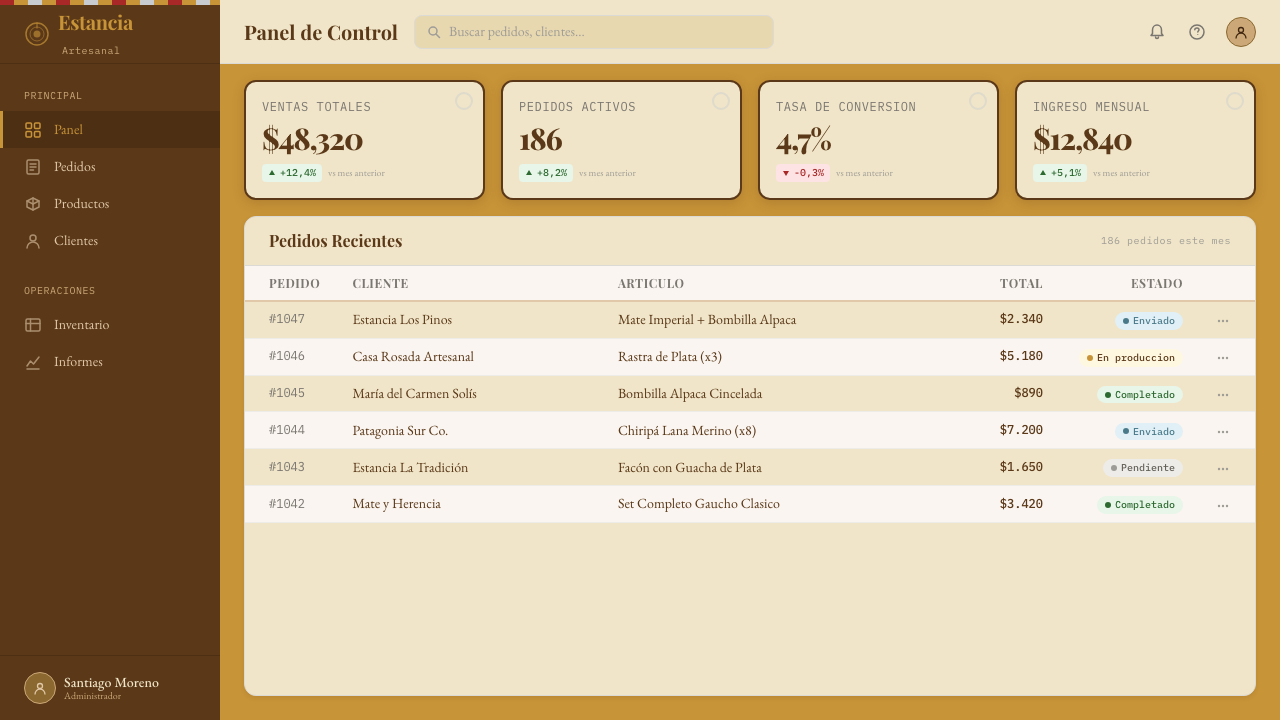
For web interfaces, the gaucho aesthetic translates best into editorial layouts, long-form content pages, and product detail pages where the user is expected to spend time rather than scan. Navigation should be typographic and restrained — word-level labeling in a warm serif, with a silver accent on the active state. Hero sections should use the full horizontal width to establish the pampas-horizon sense of scale, then resolve into a tight content column. Dashboards and analytics interfaces can use the palette, but the texture should be reduced or eliminated so that data legibility remains primary; let the amber ground and careful typography carry the character.对于网页界面,高乔美学最适合转化为编辑性版面、长篇内容页面与产品详情页,即预期用户会驻留而非快速扫视的场景。导航应当是字体性的、克制的——温暖衬线字体的词级标签,激活状态使用银色点缀。主视觉区应充分使用全横向宽度来建立潘帕斯地平线式的尺度感,然后收敛至紧凑的内容列。仪表板与数据分析界面可以使用这套色板,但肌理应减少或取消,以确保数据易读性为先;让琥珀底色与精心选择的字体承载风格气质。
For editorial and marketing work, the gaucho style excels at establishing a voice of authority and tradition. A long-form article or brand story benefits enormously from generous margins (evoking the wide pampas), a readable serif body face, and section breaks marked by a fine silver or tobacco-brown rule rather than bold typographic intrusion. Marketing pages can take advantage of the style's poster sensibility: alternating full-width blocks in amber-on-cream and cream-on-deep-brown, with poncho red reserved strictly for primary calls to action. The silver accent system adds a premium quality signal without resorting to gradient or glow effects.对于编辑与营销内容,高乔风格在建立权威感与传统感的语气上表现出色。长篇文章或品牌故事大量受益于宽裕的页边距(唤起开阔的潘帕斯印象)、易读的衬线正文字体,以及用细银色或烟草棕分隔线标记章节——而非粗重的字体侵入。营销页面可以利用这种风格的海报感:琥珀底奶油字与深棕底奶油字的全宽区块交替出现,斗篷红严格保留给主要行动号召按钮。银色点缀体系在不借助渐变或光晕效果的前提下,增添了一种优质信号。
The most common mistake when applying this style is pushing the warmth so far that legibility suffers — amber on amber, brown on brown, a system so committed to its earth tones that contrast disappears. Authentic gaucho material culture always resolved this through the sharp contrast of the silver rastra against the brown hide: every warm ground needs a cool or bright point of contrast to give the eye a landing place. A secondary error is applying the grain texture everywhere at full intensity, which reads as noise rather than craft. Texture should be present on backgrounds and panel surfaces but reduced or absent on interactive elements such as buttons, form fields, and data components where clarity trumps atmosphere.应用这种风格时最常见的错误,是将温暖推得太远以至于易读性受损——琥珀色叠琥珀色,棕色叠棕色,整个系统沉迷于大地色调以至于对比度消失。真实的高乔物质文化始终通过银色rastra与棕色皮革的强烈对比解决了这一问题:每一块温暖底面都需要一个冷调或明亮的对比焦点,给视线一个落脚处。第二个常见错误是在所有地方以全强度铺设颗粒肌理,这会呈现为噪点而非手工质感。肌理应出现在背景与面板表面,但在按钮、表单字段与数据组件等交互元素上应减少或取消,因为在那里清晰度优先于氛围。
Argentine Gaucho (Pampas Mate Culture) — FAQArgentine Gaucho (Pampas Mate Culture) · 常见问题
How does the gaucho aesthetic differ from general Latin American rustic styles?高乔美学与泛拉丁美洲乡村风格有何不同?
The gaucho aesthetic is specifically pampas-derived and carries the visual vocabulary of a particular material culture: the silver ornament, the amber grassland light, the horizontal horizon composition, and the literary gravity of the criollismo movement. General Latin American rustic styles tend to draw from a much wider range of sources — Andean weaving patterns, colonial architecture, Mesoamerican motifs, tropical color palettes — and lack the specificity of historical and cultural grounding that makes the gaucho style coherent. The gaucho palette is warm but controlled; it does not use the saturated terracotta, vivid turquoise, or celebratory polychromy associated with other Latin American vernacular traditions. The restraint is the tell.高乔美学特定地源于潘帕斯草原,携带着特定物质文化的视觉词汇:银饰装点、琥珀色草原光线、横向地平线构图,以及克里奥约主义运动的文学厚重感。泛拉丁美洲乡村风格往往汲取更宽泛的来源——安第斯编织纹样、殖民地建筑、中美洲母题、热带色板——缺乏高乔风格赖以连贯的历史与文化根基的特殊性。高乔色板温暖而克制;它不使用与其他拉丁美洲民俗传统相关的饱和赭红、鲜艳绿松石色或节庆式多彩。这种克制,正是高乔美学的辨识标志。
Is this style appropriate for digital product interfaces, or is it better suited to print and branding?这种风格适合数字产品界面,还是更适合印刷品与品牌设计?
The gaucho style adapts well to digital interfaces, but it requires deliberate choices about where warmth and where clarity take priority. The amber-and-cream palette maintains excellent legibility for text-heavy interfaces when contrast is preserved. The horizontal compositional logic maps naturally to wide-screen web layouts. The texture system needs to be used with restraint on interactive elements — buttons, inputs, and data components work better with flat, clean surfaces — while backgrounds and decorative panels benefit from the grain. The style is especially strong for content-heavy editorial interfaces, e-commerce product pages, and hospitality booking flows where the design is expected to build mood as much as convey information.高乔风格可以很好地适配数字界面,但需要刻意决策哪里优先保证温度感、哪里优先保证清晰度。在保持对比度的前提下,琥珀与奶油色板对文字密集界面保持出色的易读性。横向构图逻辑自然映射到宽屏网页布局。肌理系统在交互元素上需要克制使用——按钮、输入框与数据组件在平面干净的表面上效果更好——而背景和装饰性面板则受益于颗粒质感。这种风格对内容丰富的编辑界面、电商产品页和酒店预订流程尤为有效,因为这些场景下设计被期待在传递信息的同时营造氛围。
How should the mate ritual inform the design's sense of pacing and interaction?马黛茶仪式应如何影响设计的节奏感与交互体验?
The mate circle — where a gourd is prepared, passed in order, and received without rushing — is one of the most useful conceptual models the gaucho aesthetic offers to user experience design. It suggests an interaction philosophy of deliberate sequence rather than simultaneous overwhelm: one thing at a time, completed before the next begins, with pauses treated as part of the experience rather than dead time to be filled. In practice, this translates to generous whitespace between content sections, single-action screens rather than multi-modal interfaces, progressive disclosure of information rather than front-loading, and transitions that feel measured rather than instant. The mate model also implies hospitality: the interface should feel like it is anticipating the user's needs and accommodating them, not demanding that the user navigate a system designed for internal efficiency.马黛茶圈子——一个葫芦茶具被精心准备、依序传递、从容接受——是高乔美学为用户体验设计提供的最具启发性的概念模型之一。它暗示着一种刻意顺序而非同时涌现的交互哲学:一次做一件事,完成后再开始下一件,停顿被视为体验的组成部分而非需要填满的空白。在实践中,这转化为内容区块之间宽裕的留白、单一动作页面而非多模态界面、渐进式信息披露而非一次性前置,以及显得有节制而非瞬时的过渡动效。马黛茶模型同样意味着好客:界面应当感觉像是在预期并体贴用户的需求,而不是要求用户导航一个为内部效率设计的系统。
Can the gaucho aesthetic work for a dark-mode interface?高乔美学能用于深色模式界面吗?
A dark inversion of the gaucho palette is possible but requires careful recalibration. The canonical version is light-ground — warm amber and cream — because that matches the actual experience of pampas light. A dark variant works best when it uses deep tobacco brown or very dark amber as the background rather than pure black, preserving the warmth of the palette rather than abandoning it. On these dark grounds, cream and off-white serve as body text, amber-gold works as an accent or highlight, and silver remains effective as a precise detail color. The poncho red reads more aggressively on dark grounds and should be used even more sparingly. The grain texture actually becomes more atmospheric on dark grounds, making the interface feel like a candlelit estancia interior rather than a digital screen.对高乔色板进行深色反转是可能的,但需要仔细重新校准。经典版本是浅色底面——温暖琥珀色与奶油色——因为这与潘帕斯光线的真实体验相符。深色变体最好使用深烟草棕或极深琥珀色作为背景,而非纯黑,以保留色板的温暖感而不是放弃它。在这些深色底面上,奶油色与米白用于正文,琥珀金用作强调色或高亮,银色作为精准细节色依然有效。斗篷红在深色底面上攻击性更强,应该用得更加克制。颗粒肌理在深色底面上实际上更具氛围感,让界面感觉像一个烛光照耀的庄园室内,而非数字屏幕。
What is the difference between using this style authentically versus producing a cliché?真实运用这种风格与产生刻板印象之间的区别是什么?
Authentic gaucho-derived design is grounded in specific material and cultural references — the rastra's medallion geometry, the mate gourd's organic oval form, the estancia's horizontal massing, the criollismo literary tradition's balance of folk and literary — and makes visual decisions that can trace back to these sources. Cliché arrives when designers reach for surface signals — a lasso graphic, a cowboy hat silhouette, a spur icon — without understanding the deeper visual culture those objects come from. The authentic approach treats the gaucho aesthetic as a complete typographic and compositional language rather than a costume applied to a generic layout. The warmth should come from the palette and typography, the craft from the texture and ornament system, the scale from the horizontal composition — not from a stock image of the pampas dropped into an otherwise undifferentiated template.真实的高乔衍生设计扎根于具体的物质与文化参照——rastra腰带的圆章几何、马黛茶葫芦的有机椭圆形态、庄园建筑的水平体量、克里奥约文学传统在民俗与文学之间的平衡——并作出能追溯至这些来源的视觉决策。刻板印象的出现,是设计师在没有理解那些器物所来自的更深层视觉文化的情况下,仅仅抓取表面信号——一个套索图形、一顶牛仔帽轮廓、一个马刺图标。真实的方法将高乔美学视为一套完整的字体与版式语言,而非叠加在通用版面上的服装。温暖感应来自色板与字体,手工质感应来自肌理与装饰体系,尺度感应来自横向构图——而不是一张放入其他方面毫无特色的模板中的潘帕斯草原库存图片。
Related design styles相关设计风格
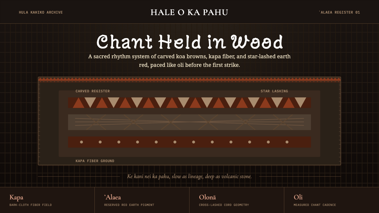 Hawaiian Hula Pahu DrumSacred weight, hand-marked. ʻAlaea red, kapa texture, and stacked carved regi…圣重而手作。ʻAlaea红、卡帕纹理与层叠雕刻带。
 Iraqi Marsh Arab Mudhif ReedReverent reed darkness. Kufi arches, ochre lattice, and one water-blue line h…庄重的芦苇夜色。库菲拱线、赭黄格纹与一笔水蓝托住黄昏。
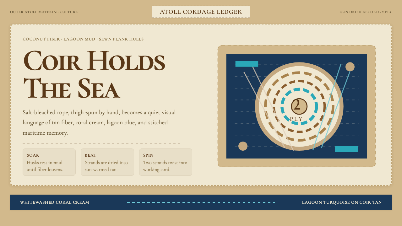 Maldivian Coir (Coconut Rope)Ocean-tested craft. Coir tan, coral cream, Cormorant type, and dashed seam ge…经海考验的手工感:椰棕褐、珊瑚乳白、Cormorant 字体与虚线缝合几何。
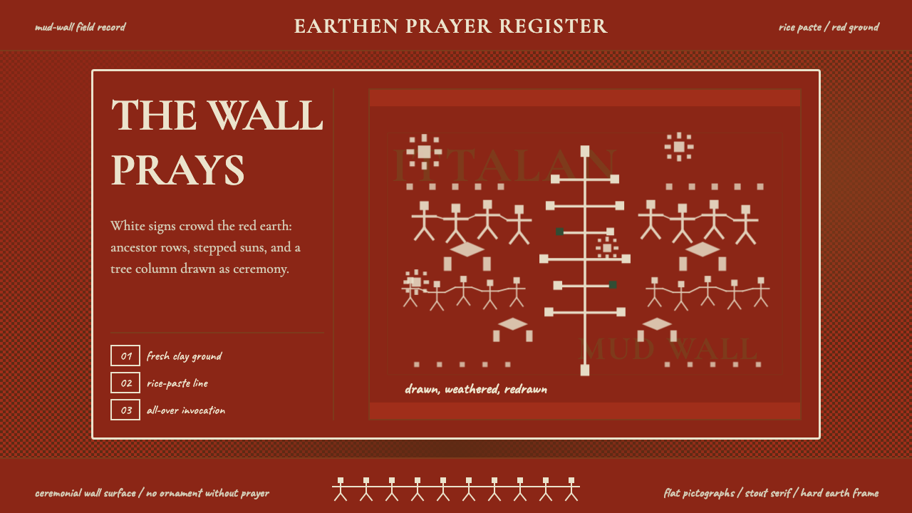 Odisha Saura Tribal MuralSacred density. Rice-white pictographs crowd a red-earth wall in ritual rhyth…神圣密度:米白象形符号挤满红土地墙,形成仪式节奏。
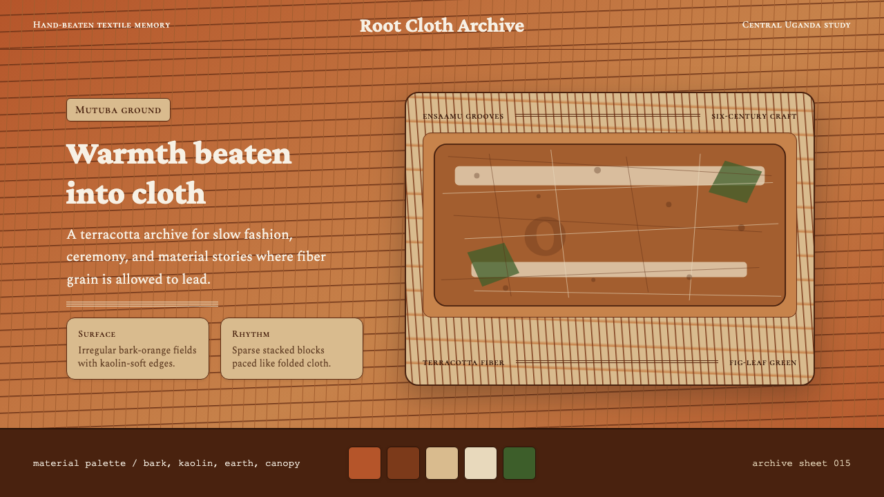 Ugandan Mutuba BarkclothHandmade warmth holds. Terracotta grain, Crimson Pro, and sparse stacked clot…手作温度沉稳铺开。赤陶纤维、Crimson Pro 与疏朗叠布构图。
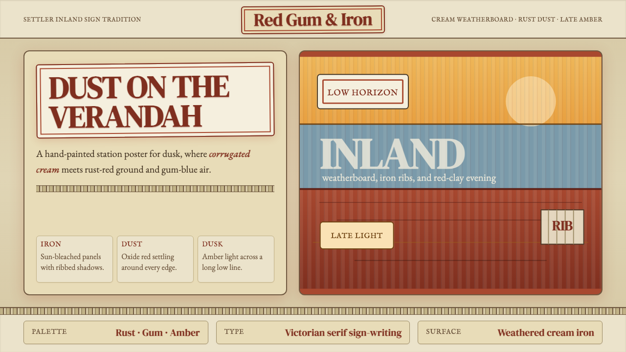 Australian Outback VernacularWeather is the voice. Rust dust, gum-blue bands, and serif sign-writing age t…风化就是声音:锈红尘土、桉蓝横带与衬线招牌让页面有年岁。