What is Adobe Pueblo Southwest?
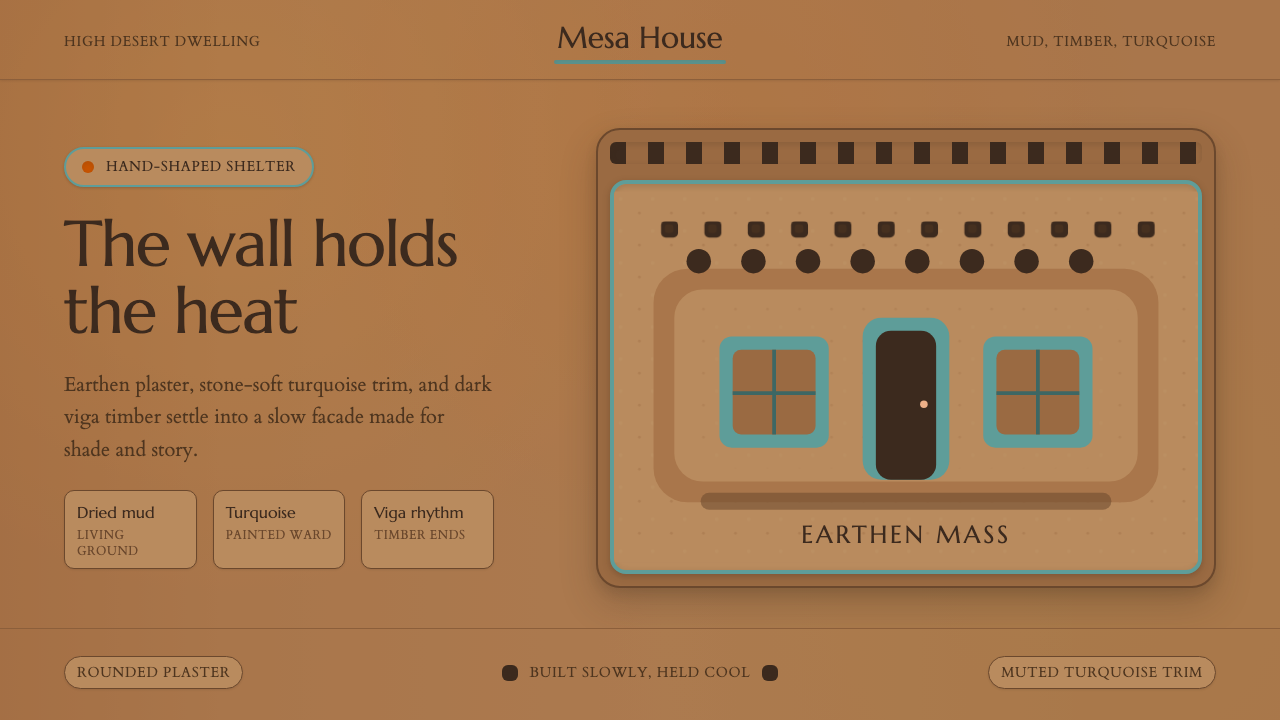
Adobe Pueblo Southwest is the design language of sun-baked earth — warm tan walls rounded by hand, muted turquoise trim that wards off the desert wind, and exposed timber vigas that mark time in shadow. It is one of the oldest continuously built traditions in North America, and its aesthetic instincts are as direct as the materials it comes from.
Adobe Pueblo Southwest in brief
Adobe Pueblo Southwest is a vernacular design tradition rooted in the mud-brick dwellings of the American Southwest — particularly the Pueblo peoples' communities of New Mexico and Arizona. Its visual vocabulary is defined by earthen plaster walls in warm tan-brown tones, muted turquoise accents on doors and window frames, and the regular cadence of exposed timber viga ends along the roofline. The style is simultaneously ancient and alive: buildings in Taos Pueblo have been continuously inhabited for nearly a thousand years, and new structures continue to be built by the same hand-shaped method.
The aesthetic grammar is tactile and organic rather than geometric and abstract. Walls are not perfectly flat — they bear the slight undulation of hand-applied plaster, and corners are rounded rather than sharp. Surfaces absorb light unevenly, producing subtle gradients of tone across the course of a day. Color comes from the land itself: the ochres and siennas of adobe mud, the soft blue-greens of naturally occurring mineral pigments, and the warm grey of weathered cottonwood and pine. There is no applied ornament in the modernist sense; the beauty is structural, emerging from the rhythm of mass, opening, and shadow.
Culturally, the style carries deep meaning. The turquoise trim is not decorative choice — it is a centuries-old protective practice, a color associated with sky, water, and spiritual protection across many Pueblo and Navajo traditions. The viga — the round timber beam whose ends project through the exterior wall — is both structural necessity and visual signature. Every element of the vocabulary was shaped by the realities of building in a high-desert environment: thick earthen walls that store heat by day and release it slowly at night, small window openings that limit harsh solar gain, and smooth plaster surfaces that reflect and diffuse rather than absorb direct sun.
Where does Adobe Pueblo Southwest come from?
The Pueblo peoples of the American Southwest have built with adobe — sun-dried mud brick — for more than a thousand years. The oldest continuously occupied sites, including Taos Pueblo in northern New Mexico, date back to at least 1000 CE, with some archaeological evidence suggesting even earlier occupation. Adobe construction was not invented by the Pueblo peoples; the technique appears independently across many arid regions of the world wherever clay-rich soil, scant timber, and intense sun converged. But the Pueblo communities of the Rio Grande valley and the Colorado Plateau developed the style into something distinctively their own: multi-story communal dwellings built around central plazas, with rooms that stepped back in terraces as they rose, and access provided by ladders rather than doors at ground level — a defensive arrangement that could be quickly secured against raiding.
Spanish colonial contact from the late sixteenth century onward introduced new elements while leaving the essential vocabulary intact. Spanish missionaries brought the rounded apse, the thick bell tower, and the enclosed courtyard garden — forms that merged with Pueblo construction methods to produce the distinctive New Mexico mission church style, visible at places like the Santuario de Chimayó and the churches at Acoma. Spanish colonizers also formalized the use of exterior portals — covered wooden colonnades — that became a signature of Santa Fe's plaza architecture and persist in every strip mall and government building in the region that attempts to evoke a regional character.
The territorial and early statehood periods of New Mexico (roughly 1848–1912) brought Anglo-American settlers, railroad money, and a growing tourist economy that looked at the indigenous and colonial adobe tradition with romantic eyes. The Santa Fe Style emerged as a conscious regional identity in the early twentieth century, driven partly by a coalition of artists, architects, and civic boosters who wanted to preserve and promote what they saw as the authentic character of the Southwest against the encroachment of Victorian and then Beaux-Arts imported styles. The 1912 statehood building codes in Santa Fe institutionalized adobe aesthetics, requiring new buildings in the historic district to conform to the Pueblo Revival or Territorial styles — a policy that has shaped the city's built environment ever since.
In the latter half of the twentieth century, the style gained a second life through the sustainable building movement. Adobe's thermal mass properties — its ability to absorb and slowly release heat — made it a natural fit for passive solar design principles. Architects and builders across the Southwest began to reexamine the vernacular tradition not as nostalgia but as climate-adaptive technology. Contemporary adobe builders have refined the material with stabilized adobe blocks, earthen plasters with improved water resistance, and hybrid construction techniques that preserve the visual character while meeting modern building codes. The style remains a living practice rather than a historical artifact.
What defines the Adobe Pueblo Southwest look?
Color Palette
The palette is derived from the earth and sky of the high desert. Wall surfaces range from warm tan through sienna and terracotta — never bright, never white, but the living color of dried mud with slight warmth from iron-rich clay. Turquoise appears as an accent color on doors, window frames, and portal columns: it is always muted, tending toward teal or sage rather than electric blue. The trim palette also includes weathered ochre and soft terracotta for gates and accent walls. Browns and warm grays from exposed timber provide the structural undertone. The overall effect is narrow in hue range but rich in tonal variation, with every color appearing to have absorbed sunlight and age simultaneously.
Form and Volume
The defining formal quality of Adobe Pueblo architecture is mass — walls are understood as volume rather than as thin planes. Corners are rounded rather than crisp, reflecting the way hand-applied plaster naturally softens sharp angles. Parapets along rooflines create strong horizontal silhouettes against the sky. Window and door openings are deeply recessed into the thick wall mass, creating pronounced shadow reveals that give every opening its own shadowed frame. The overall impression is of forms that have been carved from the earth rather than assembled from parts.
Texture and Surface
Surface texture is fundamental to the aesthetic in a way that sets Adobe Pueblo apart from almost every other vernacular tradition. Exterior walls are finished with earthen plaster applied by hand — traditionally by women using bare hands or smooth stones — which leaves a slightly undulating surface that catches raking light. Interior walls are often burnished to a near-polished smoothness with bee's-wax or mica-flecked plaster. The imperfection of the surface is not a failure of craft; it is the evidence of craft. In a digital or print application of the style, this texture dimension must be translated into tone variation, grain, and the suggestion of handwork rather than mechanical precision.
Rhythm of the Viga
The exposed viga end — the round timber beam whose tip projects through the exterior wall — is the most immediately recognizable element of the Pueblo visual vocabulary. Vigas appear at regular intervals along the top of a wall, creating a rhythmic horizontal pattern of dark circular or ovoid forms against the lighter plaster. The spacing is structural rather than decorative, determined by the length of available timber, but the visual effect is of a deliberate pattern. In applied design, this rhythm can be translated into horizontal banding, repeated circular motifs, or the regular spacing of structural framing elements.
Light and Shadow
Adobe Pueblo architecture is inseparable from its light conditions: the intense, directional sunlight of the high desert produces deep, hard-edged shadows in recessed windows and doorways, along the undersides of portal roofs, and at the bases of thick parapet walls. These shadow regions are a significant compositional element — in many views of Pueblo buildings, dark shadow occupies nearly as much visual area as the lit wall surface. The style treats shadow not as absence of light but as a form in its own right. A deep window reveal is as much a design element as the turquoise-painted frame within it.
Turquoise as Cultural Accent
In the Southwest Adobe tradition, turquoise is not simply a color choice — it carries centuries of cultural and spiritual weight. The mineral itself, found throughout the region, was traded across Mesoamerica and the Southwest for millennia and considered among the most precious of materials. In architectural use, the blue-green pigment applied to doors and window frames was understood to repel malevolent spirits — a protective threshold marking. This specificity of meaning distinguishes its use from any generic decorative accent: turquoise in this context is always purposeful, always applied to liminal surfaces (doors, windows, gates), and always in tension with the warm earth tones that surround it.
Courtyard and Threshold
Pueblo and Spanish colonial architecture both organize space around the relationship between enclosed courtyard and protective wall. The portal — a covered colonnade along the front of a building — creates a transitional zone between street and interior: shaded, sheltered, and spatially ambiguous in the best sense. Doors and gates are oversized relative to the scale of the wall, framing the passage into enclosed space as a deliberate architectural moment. In contemporary applications, this sensibility translates into a preference for clear spatial hierarchy, strong framing elements, and the deliberate design of transitional zones rather than abrupt shifts between one context and another.
Who shaped Adobe Pueblo Southwest?
The Adobe Pueblo tradition has no single founder — it is the cumulative expression of dozens of Pueblo communities including the Tiwa, Tewa, Towa, Zuni, and Hopi peoples, among others. These communities developed and maintained the adobe building tradition across centuries, passing construction knowledge, plastering techniques, and spatial conventions from generation to generation largely through practice rather than written record. Their communal structures, including the great houses at Chaco Canyon and the still-inhabited villages at Taos and Acoma, represent architecture as collective cultural expression.
Meem was the most influential architect in the formalization of Pueblo Revival Style in the twentieth century. Based in Santa Fe, he designed hundreds of buildings across New Mexico from the 1920s through the 1950s, including the Laboratory of Anthropology, Christ Church, and numerous University of New Mexico campus buildings. His work defined the modern vocabulary of Santa Fe Style — how to translate the vernacular Pueblo and Spanish colonial aesthetic into buildings with running water, electricity, and contemporary programmatic needs, while preserving the essential qualities of mass, texture, and earth-toned color.
Though a painter rather than a builder, O'Keeffe's decades-long residence in Abiquiú and Ghost Ranch, New Mexico, made her a key figure in transmitting the visual sensibility of the Southwest to a global audience. Her paintings of adobe walls, doors, and the surrounding desert landscape articulated the aesthetic logic of the tradition — the interplay of warm earth and saturated sky, the formal beauty of deeply recessed windows, the sculptural quality of smooth plastered surfaces — in a vocabulary legible far beyond the region itself. Her home and studio at Abiquiú, a Spanish colonial adobe, became one of the most photographed examples of the regional style.
The multi-story adobe complex at Taos, New Mexico, is both a living community and a UNESCO World Heritage Site — one of the oldest continuously inhabited structures in North America. The north and south house complexes, rising four and five stories respectively against the Sangre de Cristo mountains, represent the most complete surviving example of pre-contact Pueblo architecture. Their stepped-back terraced form, rounded plaster surfaces, and the rhythm of viga ends along every roofline define the visual grammar that the entire Adobe Pueblo Southwest style tradition refers back to.
The Franciscan friars and indigenous laborers who built the New Mexico mission churches in the seventeenth century created a synthesis that would define the regional adobe aesthetic for four centuries. Working without trained architects, using only the materials available at each site — adobe brick, timber from distant forests, and local stone for foundations — they produced buildings of remarkable architectural presence: massive buttressed walls, dramatic interior light through clerestory windows, and the thunderous scale of mission facades that contrast with the intimate human scale of the surrounding pueblo homes. The synthesis of Spanish Baroque ambition and Pueblo material pragmatism is the ancestor of the Santa Fe Style.
How do you use Adobe Pueblo Southwest today?
Adobe Pueblo Southwest is a high-warmth, low-contrast style that rewards restraint and punishes overloading. Its emotional register — grounded, tactile, ancient, protective — makes it well-suited for brands and products that emphasize craft, authenticity, heritage, wellness, and the relationship between human beings and natural materials. It works against brands that need to signal speed, precision, technological sophistication, or cosmopolitan urbanity.
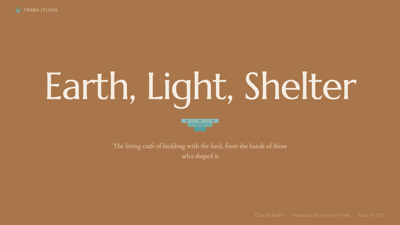
For presentation slides, the style works best when you treat the background as the wall itself — a warm tan or pale terracotta field rather than white or off-white. Cover slides benefit from a single strong horizontal band of deeper earth tone anchoring the bottom quarter of the frame, with the title set in a warm neutral or dusty terracotta text. Turquoise used as a single accent color for a subtitle line or underline element creates the characteristic contrast without overwhelming the warmth. Content slides should use earth-toned horizontal rules rather than gray lines for section dividers, and avoid bullet points in favor of short, contained text blocks with generous surrounding space. Data visualizations should use the earth-tone palette — ochres, siennas, terracottas — as the primary data color range, with turquoise reserved for highlighting a single key data point.
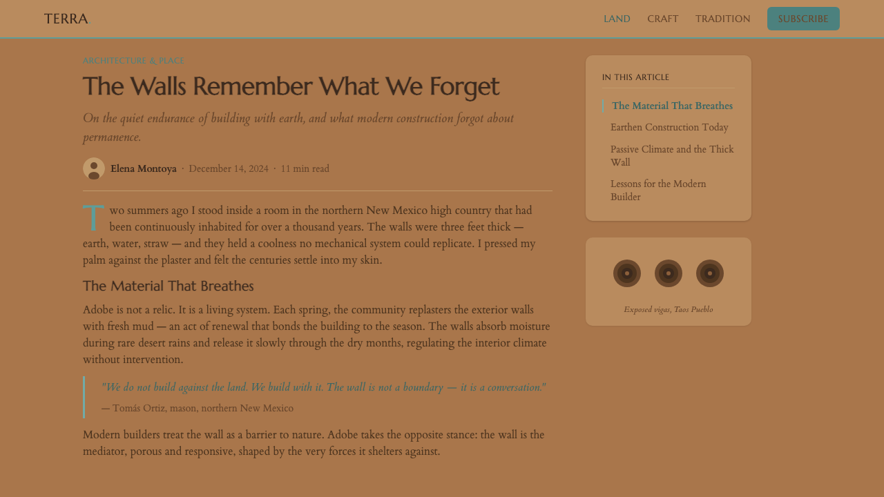
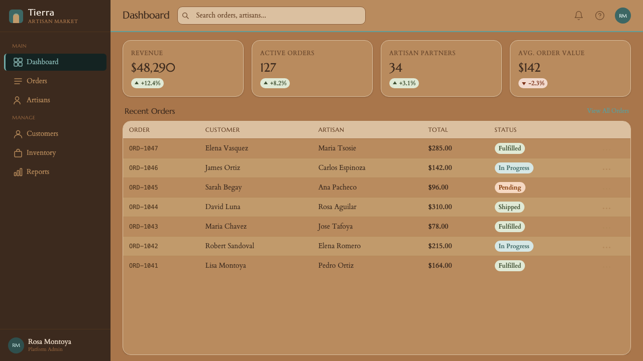
For web interfaces, the style translates well to hospitality, artisan commerce, wellness, and cultural institution contexts. The approach: use a warm off-white or light tan as the base surface, reserve turquoise for primary interactive states and CTAs only, and choose a rounded typeface with humanist proportions rather than geometric or grotesque sans-serifs. Card components should have subtle warm shadow rather than harsh drop shadows, and images should be treated with a slight warm tone overlay rather than cool or neutral color correction. Navigation should be understated — thin, well-spaced, warm-toned — giving the content itself the visual weight.
For editorial and marketing work, the style supports long-form storytelling better than quick-scan content hierarchies. A full-page spread in this style might feature a large full-bleed image of weathered adobe surface or desert landscape, with typography set in warm tan on a deep terracotta band at the bottom — reversing the typical light-on-dark approach by using the earth-tone palette rather than black. Marketing pages for craft products, travel, real estate, and wellness brands benefit from liberal use of whitespace and a muted, natural color palette that feels edited rather than exuberant.
The most common mistake when applying Adobe Pueblo Southwest is reaching for color vibrancy. The palette's defining characteristic is its mutedness — every color appears to have been filtered through dust, time, and sun. Using saturated versions of turquoise or terracotta — the colors as they appear in a paint chip sample rather than as they appear in a wall after decades of weathering — produces a result that reads as southwestern kitsch rather than the genuine tradition. The test is whether your palette could have been mixed from clay, mineral pigments, and plant-based dyes found within fifty miles of Taos: if not, it is probably too saturated.
Adobe Pueblo Southwest — FAQ
Is Adobe Pueblo Southwest the same as the broader 'Southwest style' or 'boho' aesthetic?
They overlap but are distinct. Adobe Pueblo Southwest refers specifically to the architectural and visual tradition of the Pueblo peoples and Spanish colonial builders of New Mexico and Arizona — a tradition grounded in particular materials (adobe, timber, earthen plaster), spatial forms (thick walls, recessed openings, portals), and cultural meanings (turquoise as protection, viga rhythm as structural signature). The broader 'Southwest style' or 'boho' aesthetic borrows some surface elements — warm terracottas, turquoise, woven textiles — but typically applies them to a much more eclectic and decoratively dense context that has little to do with the restrained, materially honest qualities of the original tradition. Authentic Adobe Pueblo work is defined by what it leaves out as much as what it includes.
Can this style work in a digital-first product that has no physical analog?
Yes, but the translation requires thought. The core qualities that make the style work — warmth, texture, a sense of handmade imperfection, deep shadow as a design element — can all be rendered digitally without being literal. A warm tan background with subtle noise or grain texture suggests adobe plaster without depicting it. Rounded corners on cards and inputs echo the softened angles of hand-plastered walls. Deep, warm-toned shadows (not the standard flat drop shadow) reference the shadow reveals of recessed window openings. The key is to carry the sensibility rather than the literal visual vocabulary: Adobe Pueblo is about warmth, age, and the evidence of human making — and those qualities can be expressed in a UI without any desert imagery at all.
How do you handle typography in this style — are there specific typefaces that fit?
The tradition itself is pre-typographic in the sense that it has no specific inscriptional convention — carved stone and hand-lettered signage in the Southwest tend toward simple, upright, utilitarian letterforms. Contemporary applications of the style work best with typefaces that have organic rather than mechanical qualities: humanist sans-serifs with slight variation in stroke weight, or transitional serifs with warm proportions. Extremely geometric typefaces — those derived from pure circles and straight lines — feel wrong in this context because they carry the industrial-modernist sensibility that the Adobe Pueblo tradition resists. Slab serifs with rounded finishes or display types with hand-lettered quality can work well for headlines. Whatever the typeface choice, the setting should be generous in line-spacing and comfortable in column width — nothing compressed or tightly packed.
Does Adobe Pueblo Southwest work for dark-mode interfaces?
A dark mode version is possible but requires a specific approach. The natural dark analog to adobe plaster is not black but the deep, warm brown of wet adobe mud or charred timber — a dark that retains warmth rather than cooling into neutral black. On such a ground, the characteristic accents shift: turquoise becomes more luminous, terracotta becomes a mid-toned accent rather than a background, and text works best in warm off-white or light tan rather than pure white. The danger in a dark version is losing the warmth that defines the style — if the dark ground reads as cool or neutral, the Adobe Pueblo sensibility evaporates and you are left with a generic dark UI with southwestern color accents. Keep the dark ground warm, and the style survives the inversion.
How should imagery be selected for an Adobe Pueblo Southwest design?
Photography and imagery in this style should feel documentary rather than art-directed — slightly grainy, shot in natural light, and emphasizing texture, shadow, and the specific quality of light at high altitude in an arid landscape. Close-up details of materials — the undulation of an adobe surface, the grain of a weathered timber beam, the mineral variation in turquoise — work well as background textures or section-break imagery. Landscape photography should lean toward the dramatic light conditions of the Southwest: golden hour long shadows, deep blue-sky contrast with earth-tone foreground, or the flat silver light of an overcast winter desert. Avoid photography that looks polished, color-graded to cool neutrals, or staged for a catalog aesthetic. The style's authority comes from the sense that what you are looking at has been there long before the photograph was taken.
Related design styles
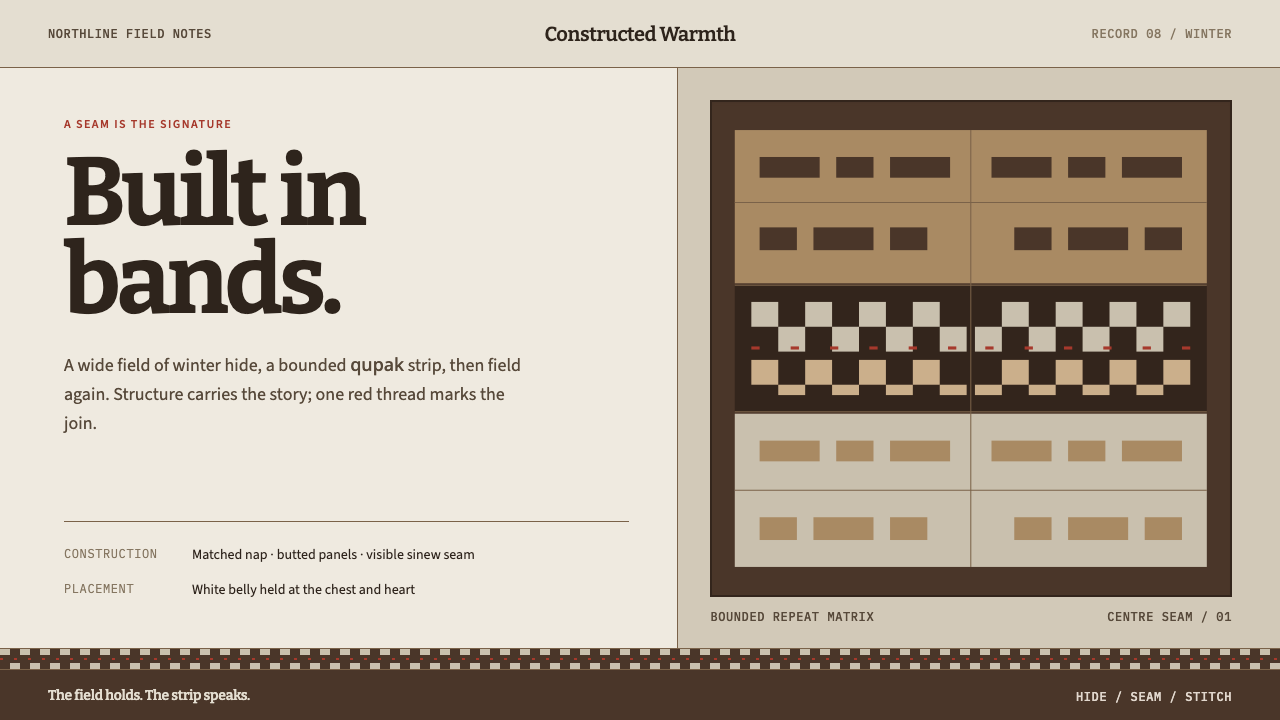 Iñupiat ParkaStructure carries the signature. Caribou-hide bands frame a bounded qupak rep…
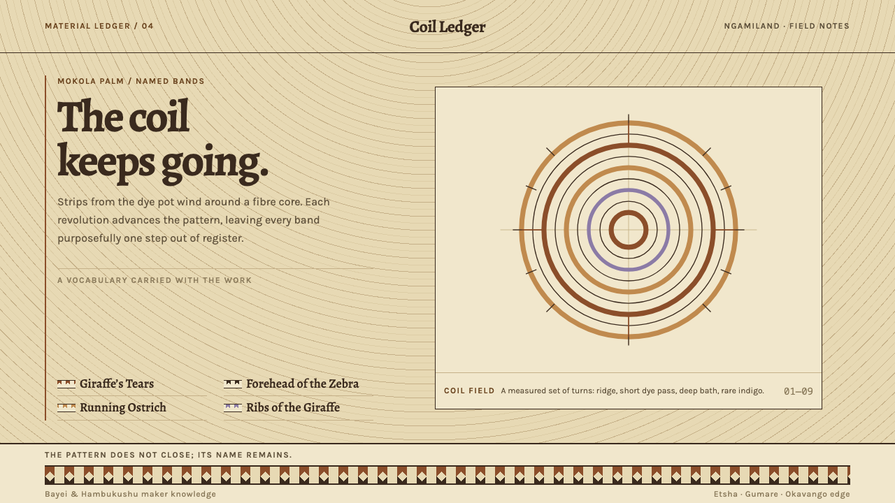 Botswana Coiled BasketThe pattern keeps travelling. Bark-brown stepped bands wind across a straw co…
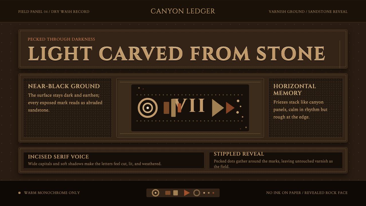 Desert VarnishStone remembers. Sandstone glyphs cut through near-black varnish in stacked f…
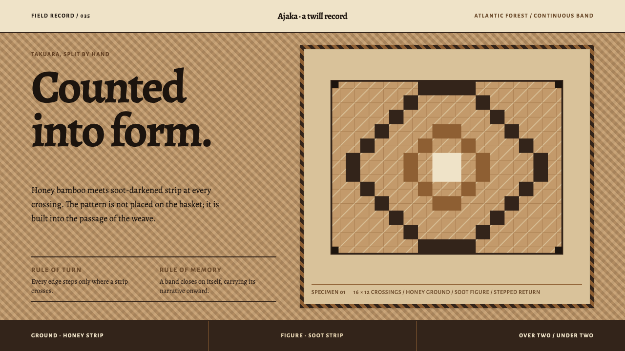 Guaraní Takuara BasketPattern is a record, not garnish. Honey bamboo and soot strips lock into a co…
 Kanak Grande CaseDarkness gives memory form. Bitter type rises on a thatch-brown central axis.
 Knossos Minoan FrescoColour becomes wall. Six mineral fields meet swift contours and honest fragme…