What is 本草纲目 Herbal?
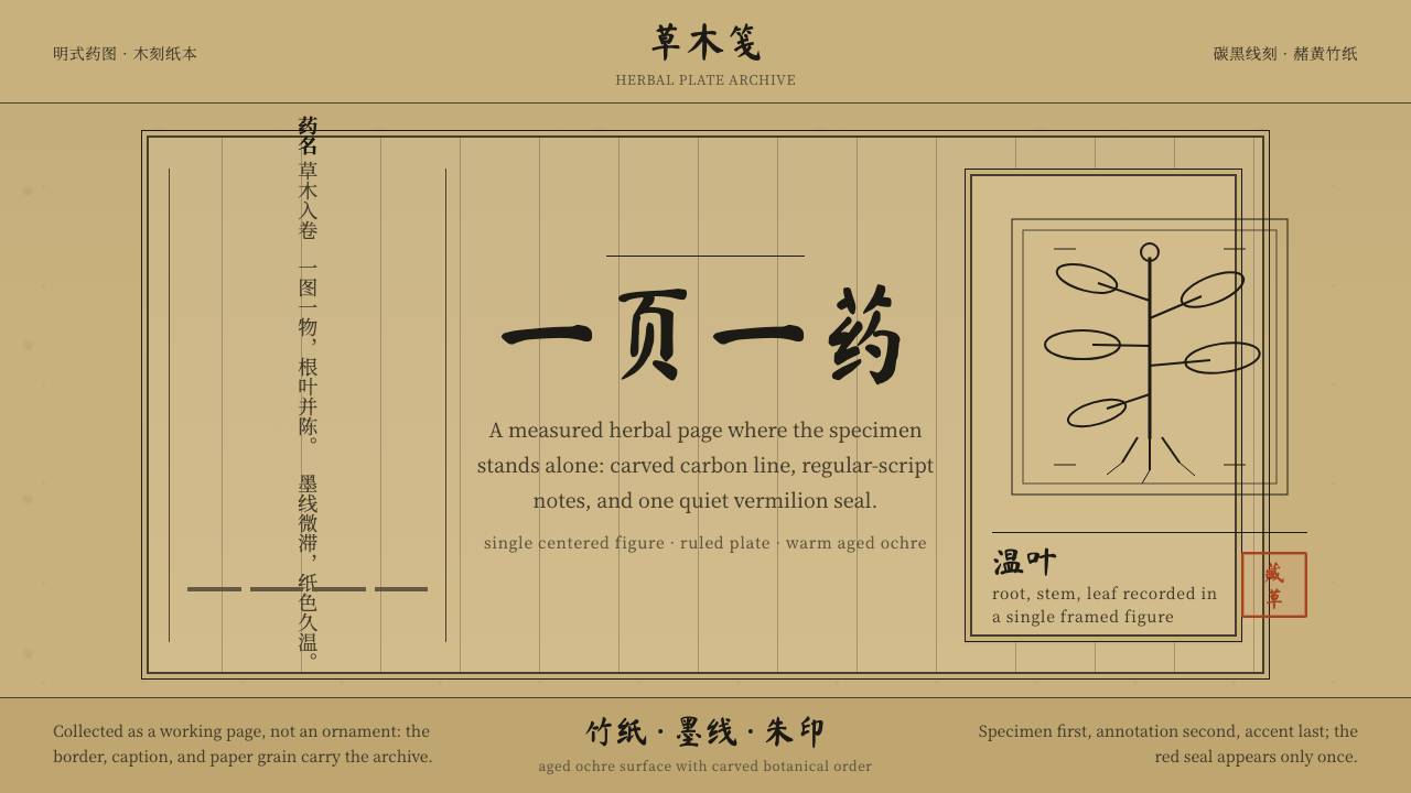
The 本草纲目 Herbal style is an act of disciplined archaeology — aged bamboo paper, carbon-black woodcut lines, one solitary specimen centered on the page, and the warm blush of a collector's vermilion seal. It translates the visual grammar of Li Shizhen's 1596 Compendium of Materia Medica into a living design language: scholarly, unhurried, and rooted in the belief that the most beautiful page is the one that lets the plant speak.
本草纲目 Herbal in brief
本草纲目 Herbal is a design style drawn directly from the visual conventions of the 1596 Jinling woodblock edition of 《本草纲目》, Li Shizhen's encyclopedic Compendium of Materia Medica. Its palette is anchored in aged bamboo paper — a warm, deep ochre carrying the memory of decades, never the clinical whiteness of fresh paper. Against this ground, carbon-black carved lines render one botanical specimen per composition, centered and isolated, accompanied by the close-set columns of regular-script annotation that characterize Ming scholarly printing.
The style belongs to the tradition of Chinese materia medica illustration (本草图谱), a genre in which visual precision and medicinal accuracy were inseparable. Each figure was carved by hand into a woodblock — a process that imposes its own logic on the image: lines are firm and deliberate, curves carry the slight angularity of the chisel, and the overall effect is one of controlled gravity rather than fluid naturalism. The illustration is not decoration; it is evidence.
What distinguishes this system from generic 'vintage' or 'aged paper' aesthetics is its specificity. The ochre is not nostalgic beige; it is the particular tone of bamboo fiber that has spent centuries in a library. The vermilion seal is not ornament; it is the mark of ownership, scholarship, and transmission. The composition is not atmospheric; it is taxonomic. Every element serves the function of identifying, recording, and transmitting botanical knowledge.
Where does 本草纲目 Herbal come from?
Li Shizhen (1518–1593) spent approximately twenty-seven years compiling 《本草纲目》, drawing on more than eight hundred earlier texts, conducting field observations throughout Hubei province, and consulting farmers, fishermen, and travelling merchants about the medical properties of plants, animals, and minerals. The manuscript he completed around 1578 ran to nearly two million characters and catalogued more than eighteen hundred distinct substances, each with entries covering nomenclature, appearance, habitat, cultivation, preparation, and therapeutic use.
The Jinling edition of 1596, printed by publisher Hu Chenglong in Nanjing three years after Li Shizhen's death, established the visual template that all subsequent editions would reference. Its woodblock illustrations — numbering in the hundreds — were carved by craftsmen who translated Li Shizhen's field descriptions and earlier botanical drawings into a standardized format: one specimen per block, centered on the printing area, with annotation in a regular script that balanced clarity with economy of space. The bamboo paper used for this edition, already yellowing at the time of printing, has continued to darken and mottle with foxing over four subsequent centuries, producing the distinctive tonal range that defines the style.
The history of woodblock botanical illustration in China predates the 本草纲目 by several centuries. Earlier compendia such as the 《证类本草》 (Classified Materia Medica, Song dynasty) had established conventions for depicting medicinal substances, but the Jinling edition's combination of comprehensive scope, refined carving, and wide commercial distribution gave it an authority that later became canonical. It was reprinted and adapted across the subsequent Ming and Qing dynasties, each reprinting introducing small variations in line quality and paper tone that collectors now use to date editions.
The inclusion of the collector's vermilion seal — a red ink stamp applied by successive owners to mark provenance and scholarly endorsement — is a feature of Chinese book culture that extends far beyond the 本草纲目 but is most visually dramatic against the ochre-and-black of materia medica illustration. Seals appear in corners or margins, sometimes overlapping illustration or text, their bold red asserting the chain of human hands through which a text has passed. In the design style derived from this tradition, the seal functions as the sole chromatic accent in an otherwise restrained palette.
What defines the 本草纲目 Herbal look?
Ground Color
The dominant tone is aged bamboo paper: a deep, warm ochre that carries both warmth and weight. This is not the pale ivory of clean cotton paper, nor the warm beige of modern recycled stock. It is a color that has been worked on by time — slightly uneven across the field, deepening at the edges, with occasional suggestions of water damage or foxing that are not defects but evidence of survival. The ground is never neutral; it sets a temperature that makes carbon-black lines appear richer and vermilion seals more decisive.
Woodcut Line
Lines are rendered as though carved rather than drawn: firm, deliberate, and carrying the slight angularity inherent in cutting across grain. Curves are constructed from short arcs rather than flowing in a continuous sweep, and the ends of strokes have a blunt, resolved quality rather than tapering to nothing. Line weight is relatively consistent within a given element, with variation appearing at junctions and endpoints rather than as a continuous calligraphic modulation. The effect is confident and a little severe — these are lines made to last, cut into hard material for reproduction.
Botanical Composition
Each figure presents a single specimen in full, centered within the printing area with generous surrounding space. The plant is shown at a scale that allows recognition of its characteristic features — leaf shape, stem structure, root form, seed or flower — without recourse to photographic literalism. Multiple views of the same specimen (root detail, fruit cross-section) may be grouped within a single composition, but the principle is always singularity: one subject, examined with full attention. Background is absent; the ground color of the paper is the negative space.
Scholarly Annotation
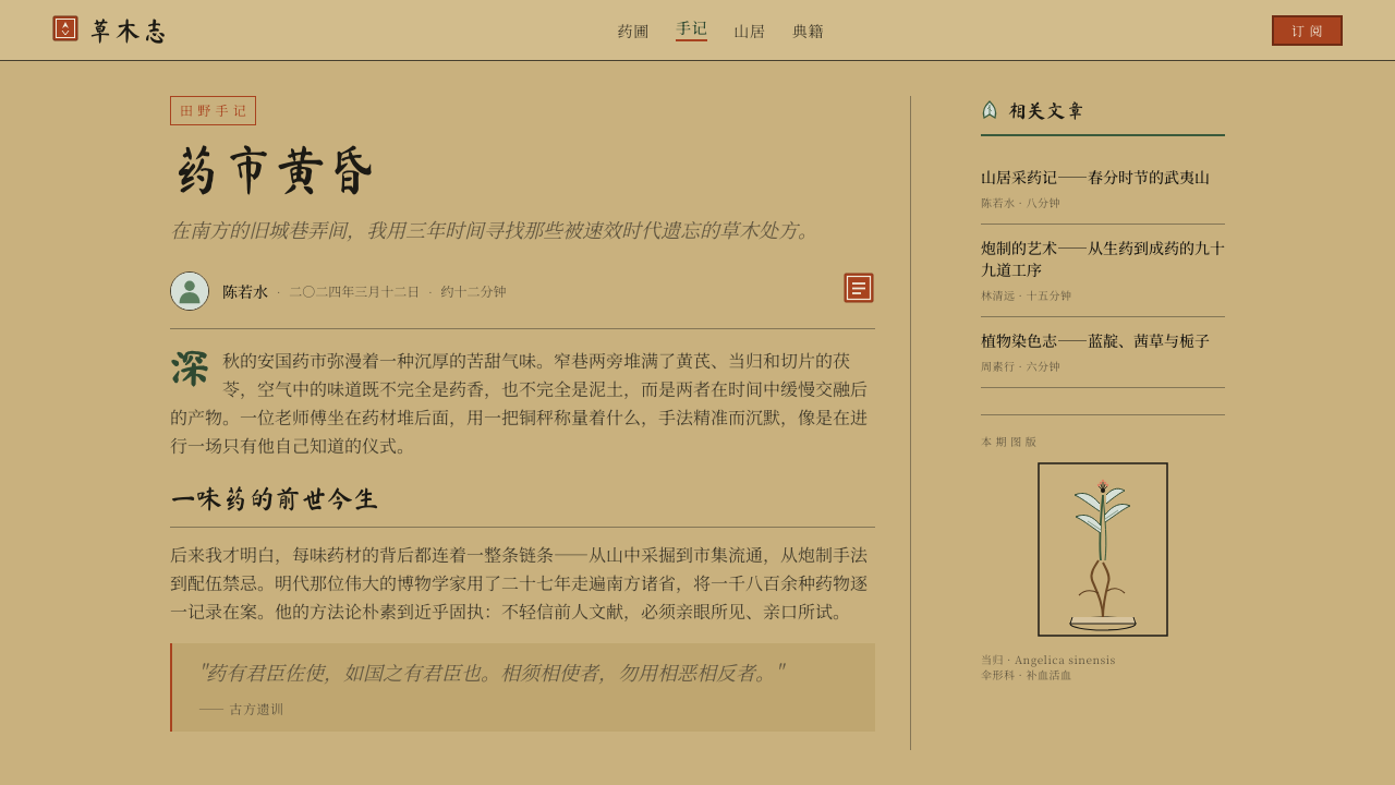
Text and image occupy the same composition as partners, not as caption and illustration in a hierarchy. Dense columns of regular-script characters run alongside or below the figure, set tightly in the manner of Ming scholarly printing. The typeface logic — regular script at a consistent size, without bold or italic variation — means that all information has equivalent weight at the character level, with hierarchy established only by column arrangement and occasional rubrication (red ink for headings or cross-references, rarely used). The overall impression is one of completeness: nothing has been summarized for the casual reader.
Vermilion Seal
The collector's seal is the single chromatic departure from the ochre-and-black ground. It is applied as a dense, flat red — the particular warm crimson of traditional Chinese seal ink — and appears as a block of carved characters, a round or square form, sometimes alone and sometimes in clusters of two or three. Placed in a corner, overlapping illustration or text, the seal asserts presence without apologizing for the interruption. In the derived design style, one seal per composition is canonical; more than two tips into clutter. The seal is never centered, never symmetrically placed, and never at a predictable distance from the edge.
Structural Restraint
The system carries almost no decorative element that is not already present in the source tradition. There are no borders that do not also appear on Ming woodblock pages; no color that does not derive from ink, paper, or seal; no typographic flourish that exceeds the conventions of regular script. What remains is a set of relationships — between aged ground and carbon line, between figure and annotation, between the mass of the printed area and the silence of the margins — that constitutes the aesthetic without requiring any additional layer.
Time as Texture
The style does not attempt to reproduce the look of a new book from 1596; it embraces the visual evidence of four centuries of survival. Foxing, slight tonal unevenness, and the faint ghosting of ink bleed through thin bamboo paper are not flaws to be cleaned up in a digital derivation — they are part of the visual argument. They communicate that the information being presented has been tested by time, that it existed before the reader and will exist after. This is a design choice with epistemological weight: the material appearance of the book endorses the credibility of its contents.
Who shaped 本草纲目 Herbal?
The compiler of 《本草纲目》 and the intellectual foundation of the entire style. Li Shizhen spent nearly three decades traveling through Hubei and beyond, consulting local knowledge-holders and cross-checking earlier texts, before producing a manuscript that nearly doubled the number of substances documented in previous Chinese pharmacopoeias. His insistence on direct observation — correcting errors in earlier texts on the basis of personal examination of plants and animals — established a standard of empirical scholarship that the book's visual system was designed to serve. The illustrations exist because Li Shizhen believed that text description alone was insufficient for accurate identification.
Not a person but an artifact of decisive aesthetic authority. The Nanjing printing house of Hu Chenglong produced the first complete edition of 《本草纲目》 in 1596, setting the visual precedent that all later editions referenced and adapted. The craftsmen who carved the woodblocks — anonymous, as was conventional — translated Li Shizhen's field notes and schematic drawings into a standardized illustration format that balanced botanical accuracy with the practical constraints of mass woodblock reproduction. The Jinling edition survives in very few complete copies; its paper, illustrations, and typography have been studied extensively as the canonical reference for the style.
The botanical illustration conventions that 《本草纲目》 synthesized and extended stretch back at least to the Song dynasty, when the 《证类本草》 (Classified Materia Medica) established the format of woodblock botanical figures accompanying pharmacological text. Through successive dynasties, the tradition developed conventions for depicting root forms, leaf venation, flower structure, and seed pods that were schematic rather than photographic — concerned with identification rather than beauty. The 本草纲目 Herbal design style inherits this entire lineage, not merely the Jinling edition, which is why its visual logic feels both ancient and systematic.
The vermilion seal that defines the style's only chromatic accent belongs to a broader culture of scholarly annotation and provenance marking in Chinese book history. Collector seals (收藏印) were applied by each successive owner of a valuable text, often multiple per volume, documenting a chain of ownership that itself became evidence of the work's importance. Major collectors — imperial libraries, eminent scholars, prominent families — had distinctive seals that functioned simultaneously as ownership marks, aesthetic statements, and credentials. The presence of a famous collector's seal could raise both the scholarly and commercial value of a text. In the 本草纲目 Herbal design style, the single vermilion seal is an homage to this tradition: a mark that says this content has been vouched for by human judgment across time.
Li Shizhen's son and grandson, who were instrumental in bringing 《本草纲目》 to print. Li Shizhen died in 1593, three years before the Jinling edition appeared. Li Jianyuan, his son, managed the relationship with publisher Hu Chenglong and saw the manuscript through the complex process of woodblock carving and printing. Li Shubeng, a grandson, contributed a preface. Their role was not creative but custodial — ensuring that the visual and textual standards established by Li Shizhen's manuscript were maintained through the process of translation into woodblock form. Their dedication to fidelity over innovation is itself a reflection of the style's values.
How do you use 本草纲目 Herbal today?
The 本草纲目 Herbal style is most powerful when the content it frames carries genuine depth or age — reference material, archival publications, educational guides, natural health products, or any digital context where credibility and patient scholarship are the primary values. It is a style that signals that the information was not assembled quickly. Applying it to content that does not merit this authority will read as costume rather than conviction.
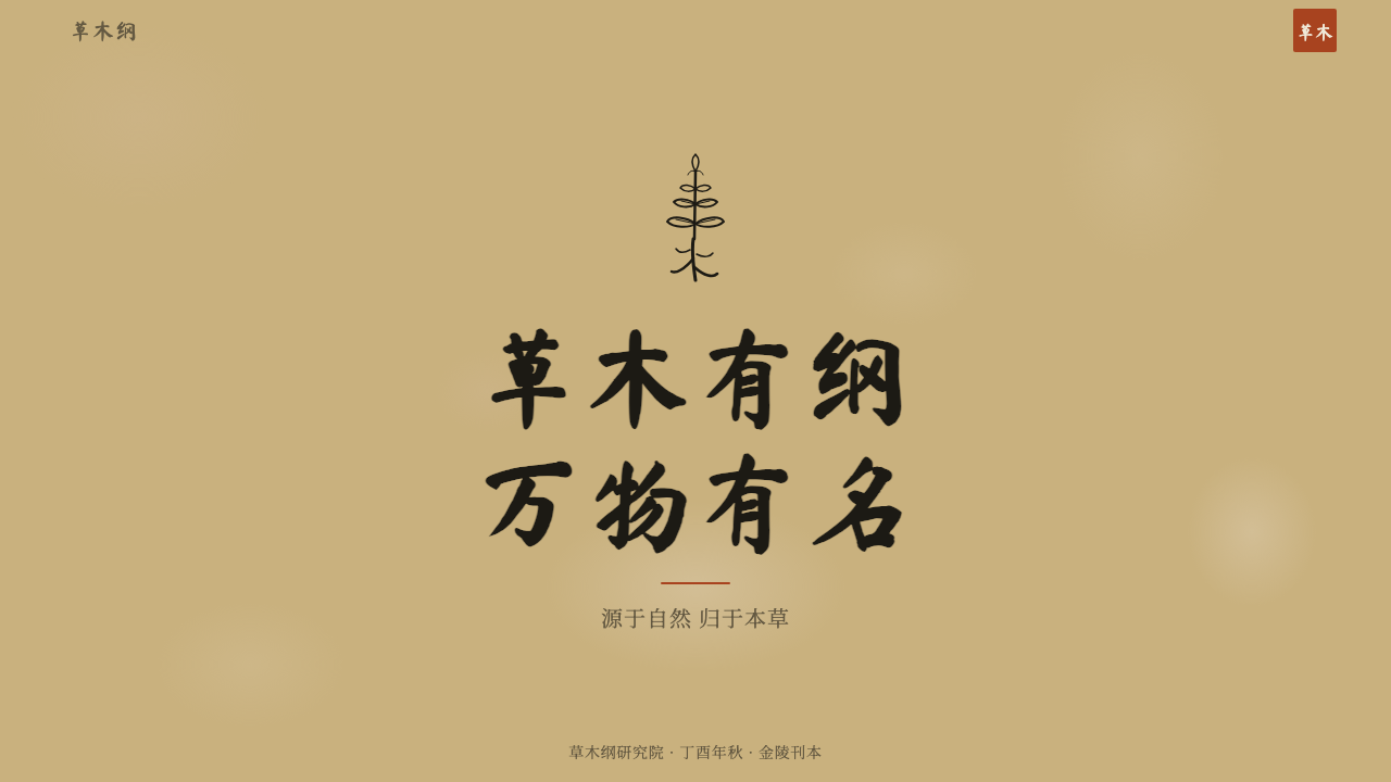
For presentation slides, the style works best on covers and section dividers rather than dense content pages. A cover composition should follow the woodblock logic: one central element — an illustration, a title rendered in a typeface with calligraphic affinity, or a simplified botanical motif — surrounded by the ochre ground, with annotation-style text placed to one side and a seal element anchoring a corner. Content slides should be typographically minimal, treating the aged-paper ground as the hero and using body text sparingly, as though each word were carved rather than typed. Data visualization should take on the quality of schematic illustration: simple line drawings rather than filled shapes, labels placed beside rather than inside elements.
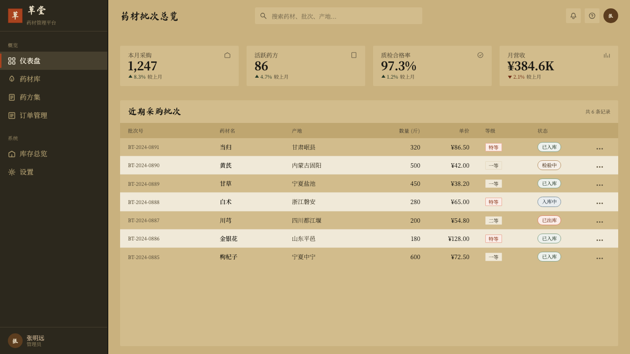
For web interfaces, this style suits editorial platforms, botanical or natural product e-commerce, archival databases, and wellness applications where the user relationship to content is contemplative rather than transactional. The approach is to treat the interface as a scroll rather than a screen — vertical rhythm, generous white (or rather, ochre) space between sections, typographic columns that suggest the printed page. Interactive elements should be subtle: a seal-red hover state, a hairline underline, a modest cursor change. The interface should feel as though it resists urgency.
For editorial and marketing contexts, the style pairs naturally with content about craft, tradition, natural materials, sustainable production, or Asian cultural heritage. It is ill-suited to contexts demanding speed, tech enthusiasm, or contemporary cool — it carries a gravitational pull toward slowness and depth that will feel like friction in the wrong setting. Marketing pages that use this style should allow the ochre ground to breathe at full width, avoid crowding the composition with multiple calls to action, and treat the vermilion accent as a considered reward rather than a reflexive highlight color.
The most common mistake when working with this style is treating it as a textured background effect — applying the ochre and foxing as a skin over a modern layout without restructuring the composition itself. Authentic application requires adopting the underlying principles: one subject at a time, annotation as equal partner to image, hierarchical text established by column arrangement rather than typographic variation, and the seal as the only chromatic punctuation. If those structural commitments are not made, the result is nostalgia cosplay rather than a functioning design system.
本草纲目 Herbal — FAQ
How does 本草纲目 Herbal differ from generic 'aged paper' or 'vintage' design aesthetics?
Generic aged-paper aesthetics borrow surface texture — sepia tones, grain overlays, distressed letterforms — without a structural logic. 本草纲目 Herbal derives from a specific visual system with specific rules: the ochre is the precise tone of aged bamboo fiber, not arbitrary warm beige; the lines are woodcut-weight, not calligraphic brush strokes; the composition is taxonomic (one subject, centered, annotated), not atmospheric; and the vermilion seal is a cultural institution with defined meaning, not a decorative stamp. A layout that applies this style correctly will look like a page from a scholarly compendium. A layout that borrows only the surface will look like a coffee-stained notebook.
Can this style work for digital products beyond editorial contexts?
Yes, with careful adaptation. The style's underlying logic — one primary subject, generous surrounding space, annotation as equal partner, a single chromatic accent — translates to digital interfaces if the surface conventions are understood as expressions of those principles rather than rules to follow literally. A product that uses the ochre ground, a single woodcut-weight icon per card, right-aligned metadata in a lighter weight, and a vermilion hover state will read as belonging to this tradition without literally replicating a Ming-dynasty page. The constraint is fitness: the style carries connotations of patience, depth, and natural origin. Products that benefit from those connotations — reference tools, craft marketplaces, wellness platforms — are strong candidates. Products that need to communicate speed, innovation, or digital-first identity will find the style works against them.
Is the style inherently Chinese, or can it be applied across cultural contexts?
The style's visual vocabulary is unambiguously rooted in Ming dynasty Chinese book culture — its ochre, its woodcut line, its column-form text, and its seal are all historically specific. Applying it outside a Chinese cultural context requires deciding whether you are making a reference or making a claim. A Japanese botanical brand drawing on East Asian printed-book traditions is making a related reference; a Scandinavian wellness brand adopting the ochre and seal without any cultural connection may read as appropriation or costume. The most honest application is one where the content justifies the style: if you are documenting a tradition of East Asian natural medicine, botanical illustration, or scholarly archiving, the style is doing legitimate work. If you are simply reaching for 'ancient and trustworthy' associations, a style rooted in your own tradition's material culture will serve better.
How should the vermilion seal be used — and misused?
Used correctly, the seal is a single chromatic event in a composition that has earned its presence through restraint elsewhere. It appears once, in a corner or marginal position, never centered, never symmetrically placed, and at an angle or offset that feels incidental rather than designed. Its content — carved characters or a symbolic form — should be legible but not necessarily readable to the viewer; the semantic content matters less than the visual assertion of the seal as an object. Used incorrectly, the seal multiplies: three seals on a single page, seals used as callout boxes, seal-shaped icons throughout the interface, or the red used for multiple interface elements as though it were a standard accent color. Once the seal is treated as a system-wide color rather than a singular event, the tension it creates collapses and it becomes decoration.
What is the relationship between this style and contemporary East Asian design?
Contemporary East Asian design — particularly in Japan, Taiwan, and mainland China — has produced a sustained engagement with historical printed-book aesthetics that the 本草纲目 Herbal style sits within. Publishers of craft, food, and cultural heritage brands have developed sophisticated modern applications of aged-paper grounds, woodcut-derived illustration, and seal typography without resorting to pastiche. The common thread is structural fidelity: these designers understand the original system's logic and transpose it into contemporary production methods while preserving the composition principles. The 本草纲目 Herbal style is most credible in the hands of practitioners who approach it as a living tradition undergoing contemporary interpretation, rather than as a historical object to be reproduced with digital tools.
Related design styles
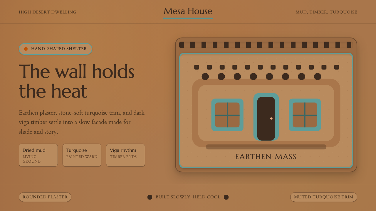 Adobe Pueblo SouthwestFeels made by hand. Earthen tan, turquoise trim, and viga rhythm shape the fr…
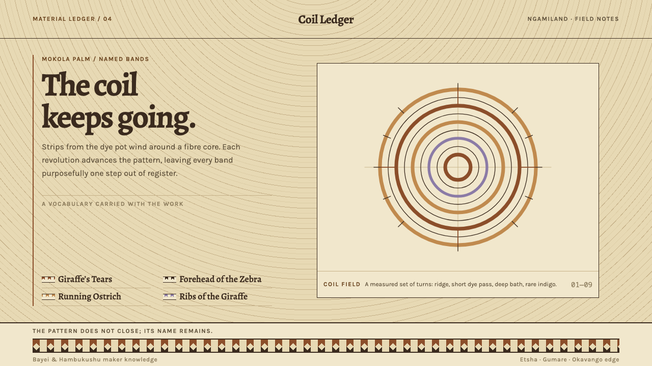 Botswana Coiled BasketThe pattern keeps travelling. Bark-brown stepped bands wind across a straw co…
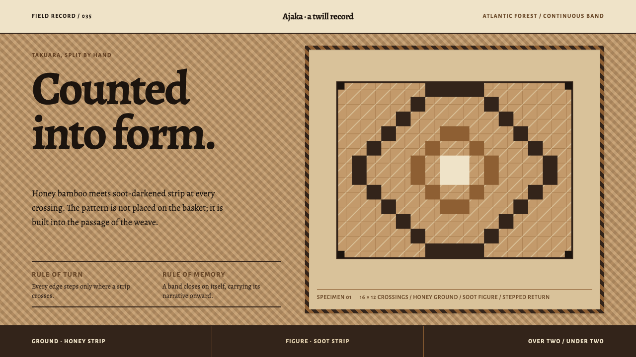 Guaraní Takuara BasketPattern is a record, not garnish. Honey bamboo and soot strips lock into a co…
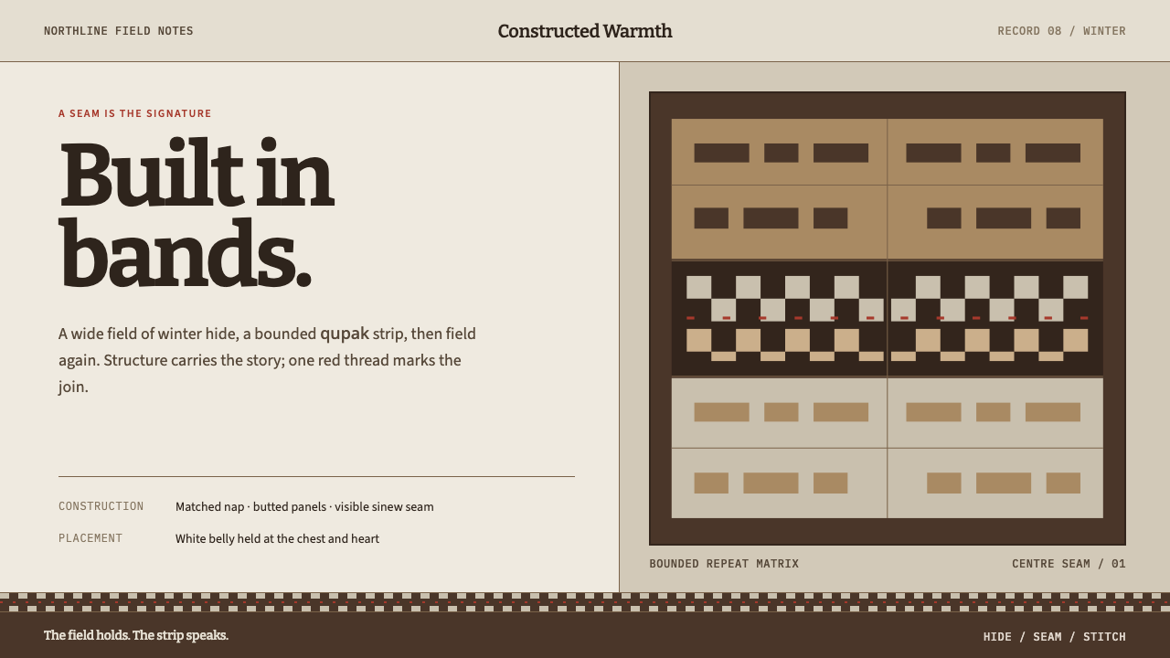 Iñupiat ParkaStructure carries the signature. Caribou-hide bands frame a bounded qupak rep…
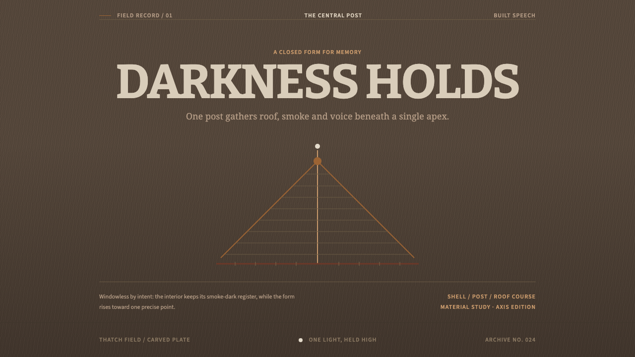 Kanak Grande CaseDarkness gives memory form. Bitter type rises on a thatch-brown central axis.
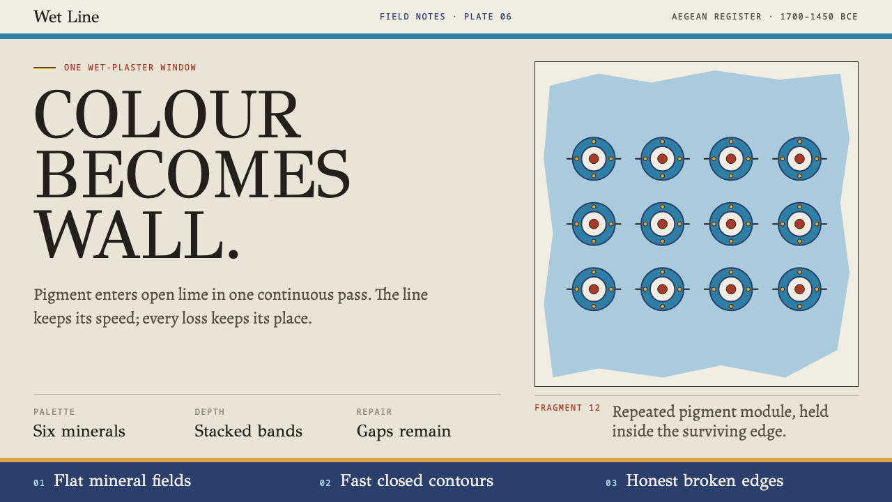 Knossos Minoan FrescoColour becomes wall. Six mineral fields meet swift contours and honest fragme…