What is Desert Varnish?
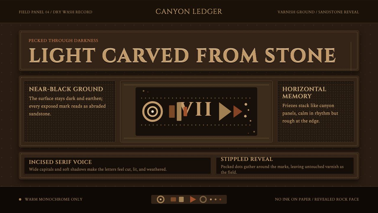
Desert Varnish inverts the logic of print: instead of marking a light surface with dark ink, it reveals a pale figure by cutting away a near-black patina — the thousand-year-old technique of the American Southwest translated into a screen design system.
Desert Varnish in brief
Desert Varnish is a dark-ground design aesthetic rooted in the petroglyph traditions of the American Southwest, where Ancestral Puebloan and Fremont artists pecked through the manganese-iron coating on sandstone canyon walls to expose the lighter rock beneath. The visual result — pale buff figures floating on near-black stone — is the system's organizing metaphor. The screen is treated as a varnished rock face, and every element on it is 'revealed' rather than drawn.
The system is defined by reversal and revelation. Where most dark-mode interfaces apply light type over a dark field, Desert Varnish goes further: its figures, friezes, and glyphs carry the irregular, slightly eroded edges of engraved stone. Stippled textures, hand-pecked borders, and imperfect silhouettes signal that imagery has been uncovered rather than manufactured. The aesthetic sits at the intersection of geology, Indigenous visual heritage, and a rigorous dark-surface compositional discipline.
Compositionally, Desert Varnish organizes content into horizontal registers — stacked friezes of figures the way petroglyph panels accumulate across a rock face over generations. This frieze logic produces a reading rhythm that moves laterally across the screen before descending, mimicking the way a viewer scans an actual carved panel at Newspaper Rock or Chaco Canyon. Serif letterforms with engraved, incised weight carry the typographic voice; ornamental borders are replaced by the natural striations of layered stone.
Where does Desert Varnish come from?
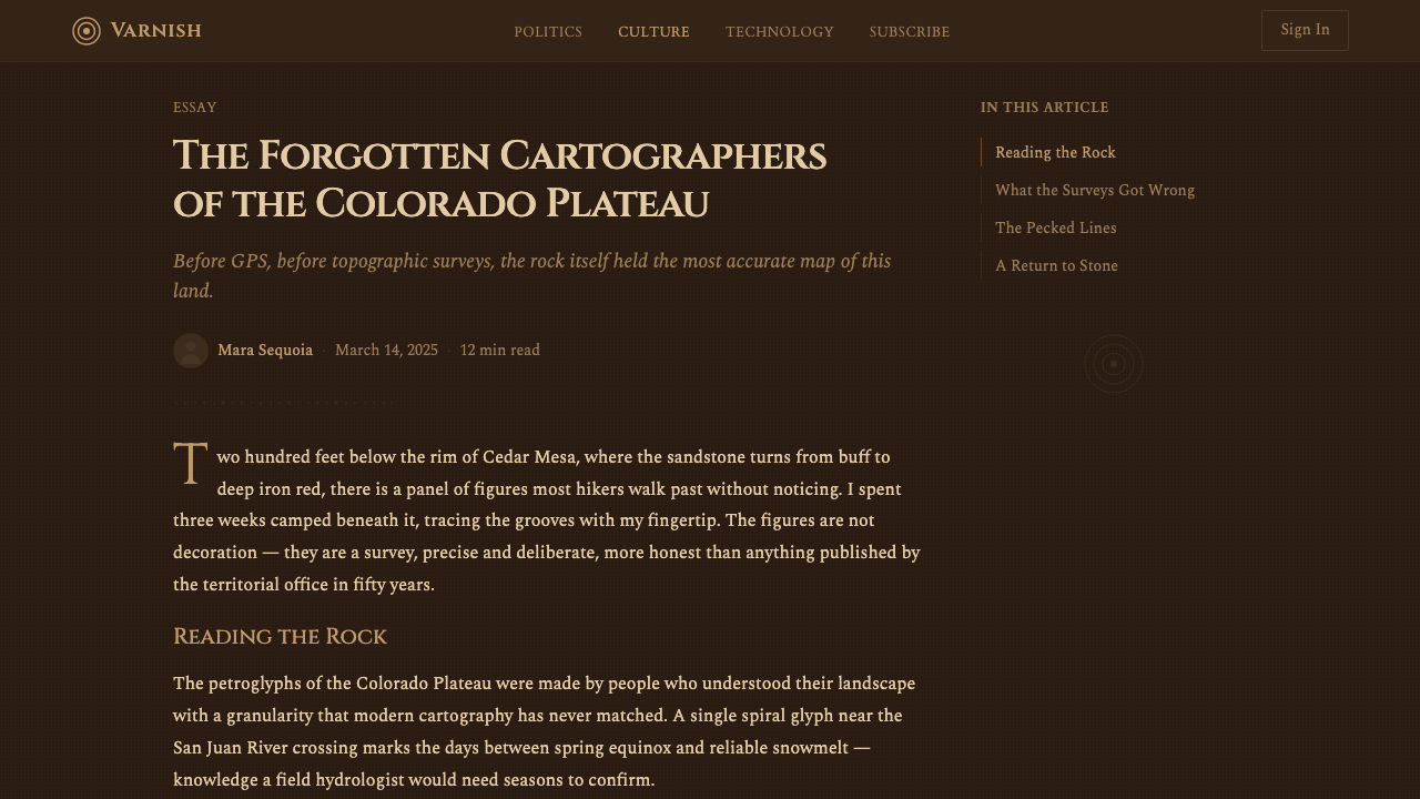
Desert varnish — the phenomenon, not just the design style — is a geological coating of manganese dioxide and iron oxide that accumulates over centuries on exposed rock surfaces in arid climates. In the canyon country of Utah, Arizona, New Mexico, and Colorado, this dark patina can be several millimeters thick. Ancestral Puebloan peoples (once called Anasazi), whose civilization flourished from roughly 100 CE through the 1300s CE in the Four Corners region, discovered that pecking or abrading this dark coating revealed the dramatically lighter sandstone or basalt beneath. The resulting contrast — pale figure on near-black ground — made pictorial and symbolic communication possible at enormous scales, legible from hundreds of meters away.
The most celebrated concentration of petroglyph art in the American Southwest is Newspaper Rock State Historic Monument in southeastern Utah, where an estimated 650 figures pecked over 2,000 years cover a single sandstone panel roughly the size of a large billboard. Figures range from abstract spirals and geometric grids to animal forms, human silhouettes, and celestial symbols. No single cultural group produced the panel; it accumulated across Archaic, Ancestral Puebloan, Fremont, Navajo, and Anglo periods, giving it the layered, palimpsestic quality that makes it an enduring visual reference. Similar concentrations exist at Petroglyph National Monument near Albuquerque, at Canyonlands, and across the length of the San Juan River canyon system.
The Fremont culture, which occupied the Great Basin and Colorado Plateau from roughly 400 CE to 1300 CE, developed a distinctive petroglyph style characterized by trapezoidal anthropomorphic figures with elaborate headdresses, broad shoulders, and stylized limbs — forms that carry a totemic, ceremonial gravity quite different from the more narrative Ancestral Puebloan traditions to the south. Fremont petroglyphs at Nine Mile Canyon in Utah represent the largest known concentration of rock art in the world, with more than 10,000 individual figures along a roughly 40-kilometer stretch of canyon. These two traditions — Ancestral Puebloan at Newspaper Rock and Fremont at Nine Mile Canyon — together define the visual grammar that Desert Varnish draws on.
The translation of petroglyph aesthetics into a screen-based design system rests on a literal analogy: a screen in dark mode is a varnished rock face, and light-on-dark compositional logic — the 'revelation' of form rather than its inscription — maps cleanly onto contemporary interface conventions. The stippled texture of pecked stone finds its digital equivalent in grain overlays and noise fields; the frieze layout of horizontally banded panels maps onto modular row-based layouts; the engraved weight of incised glyphs maps onto serif typefaces with high stroke contrast. What makes the analogy productive rather than merely decorative is that both the original petroglyphs and the screen system share the same compositional problem: how to achieve maximum legibility and emotional weight on a dark, textured surface.
What defines the Desert Varnish look?
Ground Color
The foundational surface is a near-black that reads as aged, mineral-dark stone rather than a pure technical black. This slight warmth — a brownish or reddish undertone in the darkest value — distinguishes the system from generic dark-mode UI and aligns it with the actual color of heavy desert varnish, which carries iron-oxide warmth even at its deepest. Nothing about the ground is neutral; it is geological, specific, and earned by time.
Figure Color
Against the dark ground, figure color is a warm sandstone buff — the hue of exposed Navajo sandstone or Entrada sandstone after the varnish has been pecked away. This is not a clean off-white or cream; it carries a decidedly earthy, dusty warmth that ties every element visually to the canyon-land geology. Secondary figure tones — when layered registers appear in the composition — shift toward ochre, terracotta, or a drier, pale bone, mimicking the slightly different exposures of rock strata at different depths.
Texture and Stippling
Smooth, homogenous surfaces are deliberately avoided. The ground carries a subtle noise or grain field that simulates the micro-pitting of a rock surface — the accumulated tool marks left by generations of stone peckers. Figure edges are not clean vector outlines; they are slightly irregular, as though chipped rather than traced. Stippled fill patterns, where dots of varying density build up tone, appear within figures to suggest the hatching and infill techniques of actual petroglyphs. This accumulated texture is what separates Desert Varnish from any flat dark-mode palette.
Frieze Composition
Content is organized into stacked horizontal registers — friezes — rather than into isolated floating elements. This frieze logic mirrors the way petroglyph panels accumulate across a cliff face: figures band together in registers that read left-to-right before the eye drops to the next tier. In screen application, this produces a row-based compositional grid where each horizontal band is thematically unified and visually distinct from the next through the use of subtle ground tones or spacing shifts. The overall composition grows downward from a header register through body bands to a footer register, producing a sense of vertical geological strata.
Typography
Serif typefaces with high stroke contrast carry the typographic voice of Desert Varnish. The implied logic is incision: thick-to-thin stroke variation reads as the difference between a deeply gouged groove and a shallow scratch, mimicking the variable depth of hand-pecked marks. Display type is set at generous scale with deliberate letterspacing, giving headlines the monumental, spaced-glyph quality of petroglyph sequences. Caption and label text is set smaller with tighter tracking, evoking the denser, more compressed passages that appear at the edges of large panels.
Iconography and Glyphs
Iconographic elements in Desert Varnish draw directly from the petroglyph repertoire: spirals, concentric rings, anthropomorphic silhouettes with raised arms, animal tracks, and solar or stellar disk forms. These are not used as decorative motifs layered over functional content; they are treated as the functional content itself — section markers, navigational glyphs, category indicators. The same inventory of forms that marked seasons, territories, and ceremonial events on canyon walls becomes a wayfinding system on screen.
Layering and Palimpsest
One of Desert Varnish's most distinctive structural qualities is the palimpsest effect: the visual impression that later marks have been added over earlier ones, as they were at sites like Newspaper Rock where centuries of different cultural groups left their marks on the same surface. In screen application, this translates to carefully layered compositions where elements of different tones and weights overlap at the edges, creating a sense of accumulated depth. The layering is never chaotic — each generation of marks is readable — but the composition implies that the surface has a history reaching back further than any single session of design.

Who shaped Desert Varnish?
The civilization that archaeologists call Ancestral Puebloan — centered on the Four Corners region of the American Southwest — built the great cliff dwellings at Mesa Verde and the monumental architecture of Chaco Canyon between roughly 100 CE and 1300 CE. Their petroglyph traditions, pecked across the canyon systems of Utah and Arizona, represent the largest single body of lithic imagery in North America. The visual vocabulary they developed — spirals indicating solstice alignments, handprints asserting presence, animal forms recording seasonal migrations — forms the iconographic foundation of the Desert Varnish style.
The Fremont people occupied the Great Basin and Colorado Plateau from approximately 400 CE to 1300 CE, developing a petroglyph style distinct from their Ancestral Puebloan contemporaries to the south. Their defining contribution is the trapezoidal anthropomorph — a broad-shouldered, narrow-hipped figure wearing elaborate headdresses and necklaces — which carries a totemic gravity that has become one of the most visually striking elements of the Southwest rock-art canon. Nine Mile Canyon in Utah's Book Cliffs contains the world's highest known concentration of Fremont rock art, making it an essential reference for the frieze-based compositional logic of Desert Varnish.
Newspaper Rock State Historic Monument in southeastern Utah is the single most referenced visual source for Desert Varnish. The panel — named by early settlers who saw it as analogous to a community bulletin board — concentrates roughly 650 petroglyphs across a period spanning more than 2,000 years and at least five distinct cultural traditions. Its density, its layered accumulation of marks from different periods, and the sheer visual power of pale sandstone figures against a deeply varnished black surface make it the defining image of what light-on-dark petroglyph aesthetics can achieve at maximum intensity.
Nine Mile Canyon in the Book Cliffs of northeastern Utah holds the world's largest known concentration of rock art — more than 10,000 individual figures along roughly 40 kilometers of canyon. While much of the imagery is Fremont in origin, the canyon also contains Ute and Ancestral Puebloan work, creating a multi-generational palimpsest that is the direct inspiration for Desert Varnish's layered compositional logic. The canyon's visual rhythm — panels of varying density alternating with plain varnished stretches — provides the template for the style's modular, frieze-based page structure.
Among the hundreds of motifs at Newspaper Rock, the large spiral — a form appearing independently in rock-art traditions from Ireland to Australia — carries particular significance as a design motif. In the American Southwest petroglyph context, spirals mark solar alignments: at solstice and equinox, a shaft of sunlight strikes the spiral's center at specific sites, functioning as a precise astronomical calendar. In the Desert Varnish design vocabulary, the spiral appears as a section marker, a loading indicator, or a navigational element — inheriting its ancestral function as a device that measures and marks the passage of time.
How do you use Desert Varnish today?
Desert Varnish carries the full emotional freight of its geological source: antiquity, endurance, silence, and the weight of accumulated human marking. Applied correctly, it communicates that something — a product, a brand, a document — has depth and permanence that transcends the ephemeral. This makes it well-suited to archival platforms, cultural institutions, premium dark-mode tools, and any application where gravitas and historical rootedness are desired values. It is poorly suited to contexts calling for lightness, approachability, or playful immediacy.
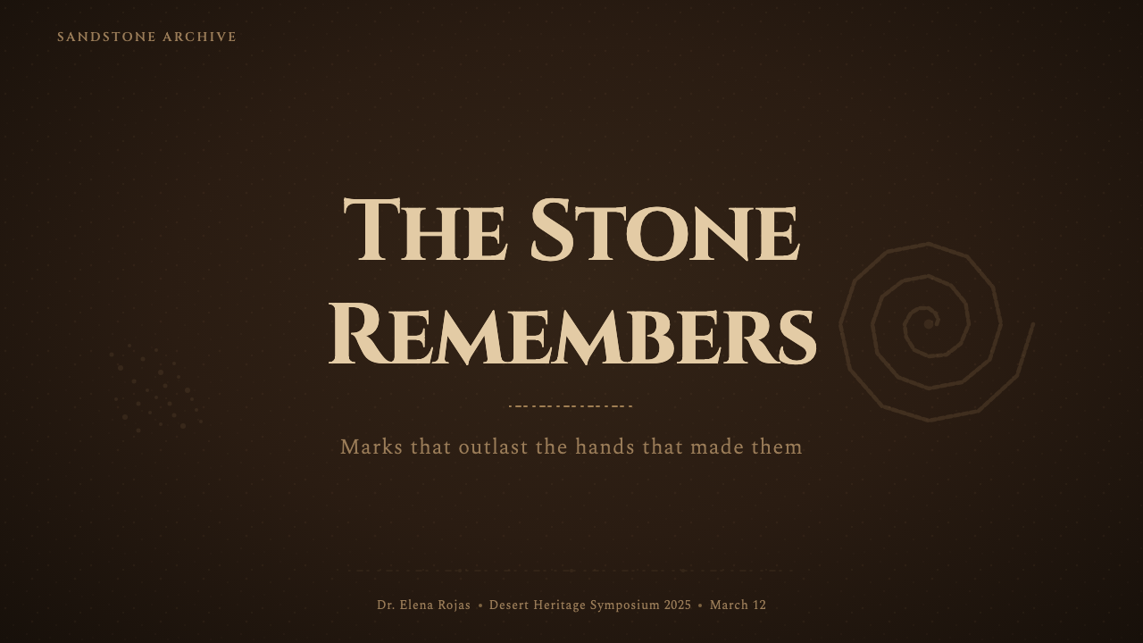
For presentation slides, Desert Varnish works best as a consistent dark-ground system applied throughout, rather than mixed with light-ground slides. Cover slides benefit from a single dominant petroglyph-derived motif — a large spiral, a trapezoidal figure, a handprint silhouette — positioned asymmetrically against the near-black ground with the title set in high-contrast sandstone-colored serif type. Content slides should use the frieze layout: horizontal bands of content separated by thin ground-tone rules rather than decorative dividers, with body text in a warm off-white that reads as warm stone rather than pure screen white. Data slides gain in authority by treating charts as geometric friezes — bars and lines in the sandstone color family, set against the near-black ground with no grid lines, only minimal axis labels.
For web interfaces, Desert Varnish is most effective in full-screen immersive contexts: editorial long-reads, portfolio showcases, premium product landing pages, and documentation sites that want to communicate depth and care. The approach is to commit fully to the dark ground and use structural layering rather than color variety to create hierarchy. Navigation should be typographic and minimal, with no icon decoration beyond simple glyph markers. Card components use subtle ground-tone variation — a slightly lighter or slightly warmer dark — rather than outline borders, creating depth through tone rather than line. Interactive states use a warm amber or terracotta accent rather than a cold blue-white.
For editorial and marketing work, the style's strongest application is in long-form cultural or archival contexts: exhibition catalogs, museum digital experiences, heritage brand communications, and documentary-format storytelling. The frieze compositional structure adapts naturally to alternating full-width image bands and text bands, with the petroglyph imagery appearing as full-bleed backgrounds behind text registers. Marketing materials gain from the style's inherent sense of scarcity and permanence — it implies that what is being communicated has been here for a long time and will continue to be here.
The most common mistake when applying Desert Varnish is cleaning it up: smoothing the textured ground, regularizing the figure edges, substituting a flat black for the mineral near-black, or replacing the irregular stippled fills with clean flat fills. Each of these corrections removes precisely the quality that gives the style its emotional weight. The second most common mistake is applying it to content or contexts that cannot support its gravitas — using a system rooted in two-thousand-year-old sacred marks for something lightweight and transient creates a tonal mismatch that feels either pompous or ironic, neither of which serves the user.
Desert Varnish — FAQ
Is Desert Varnish appropriate for use by non-Indigenous designers or brands?
This is a legitimate question and deserves a direct answer. Desert Varnish as a design system draws on the visual grammar of petroglyph art — its compositional logic, its light-on-dark revelation principle, its frieze structure — rather than reproducing specific sacred symbols with their original ceremonial meanings. The distinction matters: using a spiral as a loading indicator is categorically different from using a clan symbol as a brand mark. The system is calibrated to draw on the formal and aesthetic properties of petroglyph traditions rather than their religious or territorial content. Even so, any brand deploying this style should be able to articulate why the association with Indigenous Southwest heritage is appropriate to their context — proximity without accountability tends to read as exploitation.
How does Desert Varnish differ from generic dark mode or brutalist dark aesthetics?
Generic dark mode uses black or near-black as a neutral backdrop to reduce eye strain — it has no formal logic beyond inversion. Brutalist dark aesthetics typically use pure black with raw, unfinished typography and a deliberately anti-polished sensibility. Desert Varnish is distinct from both because its dark ground is not neutral and not raw — it is geological and mineral-specific. Its defining move is not darkness but revelation: the sense that figures are being uncovered from within the surface rather than drawn on top of it. The texture, the warm near-black, the irregular figure edges, and the frieze compositional logic all serve this revelation metaphor. A pure-black background with white text is not Desert Varnish. A textured near-black with warm sandstone figures arranged in horizontal registers is.
Can Desert Varnish work for light-mode layouts, or is it inherently a dark-mode system?
Desert Varnish is inherently dark-ground: the entire logic of the system depends on the revelation principle, which requires a dark surface through which lighter figures are uncovered. A light inversion would reverse this logic entirely — you would have dark marks on a light surface, which is the logic of ink on paper or paint on canvas, not the logic of petroglyph revelation. That said, a partial light-mode adaptation is possible: use a warm parchment or pale sandstone as the background, with deep near-black figures and sparse warm-toned accents. This version loses the revelation quality and becomes a surface-mark system, but it retains the geological palette and the frieze compositional structure. Think of it as looking at the exposed sandstone itself rather than at the varnished dark surface — a related but fundamentally different visual experience.
How should Desert Varnish handle color accents beyond the sandstone and near-black base?
The system's accent colors should be drawn from the geological palette of the Colorado Plateau: terracotta and burnt sienna from iron-rich sandstone formations, a deep turquoise from the copper-mineral deposits found in Ancestral Puebloan jewelry and pottery, and a dusty sage from desert lichen. These are earthy, low-saturation hues — not electric or screen-optimized blues and oranges. The key constraint is that accent colors should never read as contemporary digital colors; they should feel as though they have been deposited in the rock rather than applied by a screen. A maximum of two accent colors in any single composition maintains the geological coherence; more than two tilts the system toward decoration and away from its documentary severity.
What types of products or brands are a poor fit for Desert Varnish?
Desert Varnish is a system of gravity, antiquity, and territorial depth. Brands or products that depend on speed, levity, freshness, or consumer warmth will find it tonally misaligned. Specific mismatches: consumer social platforms (the style's silence contradicts the premise of constant social activity), children's products (the aesthetic registers as ancient and slightly forbidding), health and wellness applications (the mineral, geological tone is at odds with the organic warmth these contexts require), and any brand whose identity is built on accessibility and approachability. The system works best where the user is expected to slow down, where depth is valued over immediacy, and where the product genuinely has the kind of permanence that the geological metaphor implies.
Related design styles
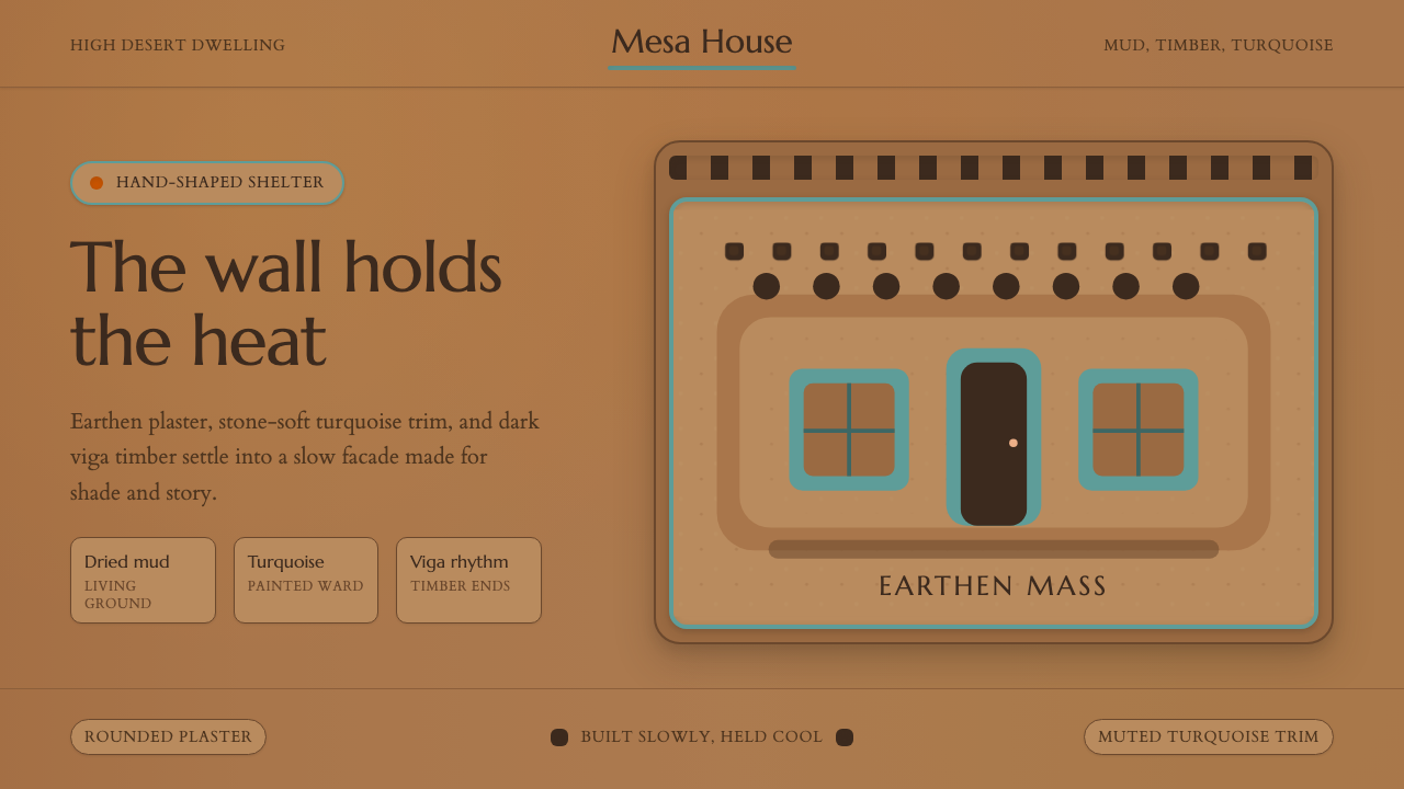 Adobe Pueblo SouthwestFeels made by hand. Earthen tan, turquoise trim, and viga rhythm shape the fr…
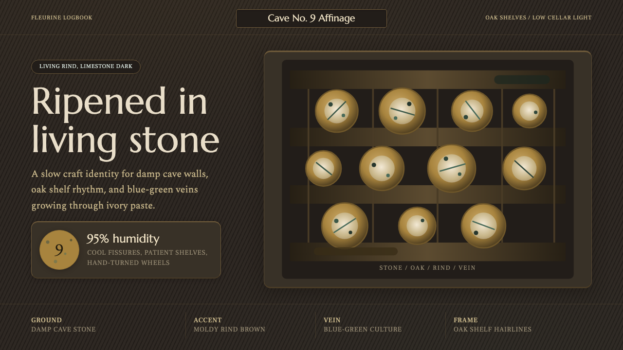 Cheese Affinage CavePatience reads as stone. Rind brown, mold green, and oak shelf grids glow in…
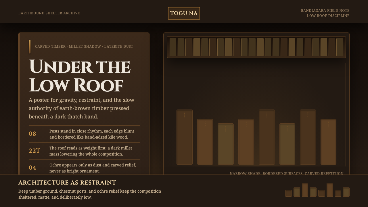 Dogon Toguna Shelter MaliGravity made visible. Deep umber ground, low roof band, chestnut posts in sha…
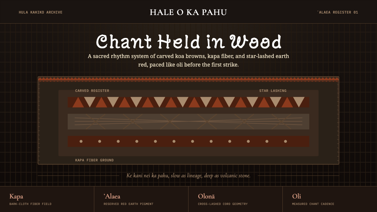 Hawaiian Hula Pahu DrumSacred weight, hand-marked. ʻAlaea red, kapa texture, and stacked carved regi…
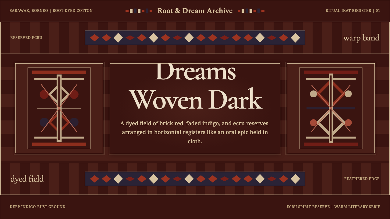 Iban Pua KumbuSacred cloth logic. Indigo-rust bands, ecru reserves, and blurred ikat edges…
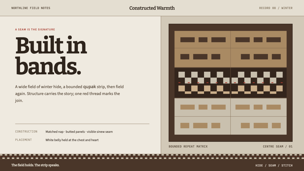 Iñupiat ParkaStructure carries the signature. Caribou-hide bands frame a bounded qupak rep…