What is English Cottage Garden?
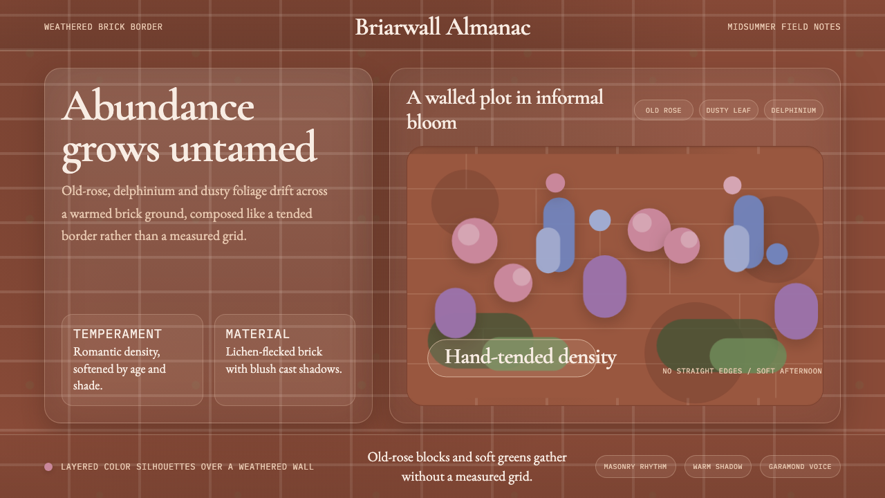
The English cottage garden is organized abundance — roses, delphiniums and foxgloves crowding against a lichen-flecked brick wall, with no visible geometry and no apology for the overflow.
English Cottage Garden in brief
The English cottage garden is a design sensibility rooted in late-nineteenth-century horticultural rebellion. Where Victorian formal gardens enforced symmetrical parterres and disciplined topiary, the cottage garden style championed naturalistic planting — fragrant roses scrambling over old brick, tall foxgloves and delphiniums rising without rigid arrangement, dense borders where plant species overlap and compete in a way that reads as beautiful precisely because it is not engineered.
As a visual idiom, the style is defined by layered warmth rather than geometric structure. Its palette draws from the garden itself: the dusty muted rose of an old wall, the soft green of lichen and weathered stone, the deep burgundy and lavender of heritage blooms, all playing against an underpainted warmth that gives the whole composition its aged, sun-touched quality. Typography runs to classic serif letterforms — Garamond or Caslon weights — that carry the authority of an old botanical illustration or a hand-lettered seed catalogue, never the cleanness of modernist sans-serif.
What the cottage garden aesthetic most resists is the designed look. A layout in this tradition should feel as though it grew rather than was arranged: overlapping elements, a slightly irregular rhythm, flourishes that read as natural rather than decorative. This is not the same as sloppiness. Gertrude Jekyll, who did more than anyone to formalize the style, was a highly trained artist who understood color theory and compositional flow — she simply wanted the outcome to feel lived-in rather than prescribed.
Where does English Cottage Garden come from?
The English cottage garden as a self-conscious design movement emerged in the 1870s and 1880s, as a direct reaction to the high Victorian fashion for elaborate formal bedding schemes — masses of uniform carpet-bedding annuals, imported from glasshouses and arranged in symmetrical patterns that changed seasonally. These displays were expensive, labor-intensive, and, to their critics, fundamentally dishonest: plants forced into geometric submission, their natural habits suppressed.
William Robinson, an Irish-born gardening journalist and polemicist, launched the foundational attack in his 1870 book The Wild Garden and followed it with The English Flower Garden in 1883. Robinson argued for planting hardy perennials and self-seeding species in naturalistic drifts, allowing plants to colonize their ground organically and return year after year without replanting. He drew on the model of the rural cottage plot — the vernacular English working garden that had existed for centuries outside the reach of wealthy taste-makers — and reframed it as an aesthetic ideal.
Gertrude Jekyll, a Surrey-born artist and plantswoman, took Robinson's principles and gave them sophisticated compositional discipline. Trained in the fine arts and deeply influenced by the color theories of Michel-Eugène Chevreul, Jekyll designed herbaceous borders as paintings composed in time — the cool blues and whites of early summer gradually warming to the hot golds and reds of late season. Her forty-year collaboration with architect Edwin Lutyens produced a complementary pairing: Lutyens's structured stone walls, paths, and formal enclosures provided the architectural bones, while Jekyll's planting billowed and softened every edge. Together they established a template of organized profusion within firm structure that became the defining grammar of the English garden.
The style became globally influential during the early twentieth century, exported through Jekyll's published planting plans, her fourteen books, and the influence of the Arts and Crafts movement with which the cottage garden aesthetic overlapped significantly. The garden at Sissinghurst Castle, created in the 1930s by Vita Sackville-West and Harold Nicolson, became the twentieth century's most-visited garden and a living textbook of the idiom: a series of outdoor rooms with strong architectural enclosure and lavish, slightly controlled planting. The National Trust preservation of many Jekyll-designed gardens has sustained the tradition as a living reference point, not merely an archival record.
What defines the English Cottage Garden look?
Palette
The cottage garden palette is built on muted, dusty warmth rather than high saturation. Weathered brick red and old rose anchor the warmer end; these are not vivid crimsons but the faded, slightly orange-tinged reds of clay after years in the sun. Against them sit cooler notes: the grey-green of sage and rosemary foliage, the dusty lavender of catmint, the soft blue-violet of delphiniums. The overall impression is of colors that have been lived in — mellowed, touched by weather and age. Pure white appears sparingly, usually in floral detail rather than as a ground color, and black is avoided in favor of very deep forest green or near-black aubergine.
Typography
Display typography in the cottage garden style reaches for old-face and transitional serifs — the kind of letterforms found in eighteenth and early nineteenth-century botanical books, seed catalogues, and herbal manuscripts. These faces have bracketed serifs, varying stroke contrast, and a slight irregularity that connotes hand-craft. Body text should be set generously, with open line-spacing that gives the reader room to breathe, mirroring the unhurried density of the garden itself. Decorative drop caps, botanical initial letters, and slightly uneven baseline rhythms all feel at home here; rigid mechanical precision does not.
Layering and Depth
The defining compositional move of the cottage garden aesthetic is layering — foreground, mid-ground, and background elements that overlap and partially obscure one another, creating a sense of depth without formal perspective. In two-dimensional design this translates to elements that bleed into one another at the edges: a botanical illustration whose leaves extend beyond a border, a background texture that shows through where a foreground element ends, overlapping circles of slightly different values that create the impression of depth without hard cutlines. Nothing has a perfectly clean boundary.
Texture and Surface
Texture is essential to the cottage garden idiom. The aesthetic resists flat, smooth surfaces — the visual equivalent of a perfectly kept lawn — in favor of surfaces that carry evidence of time and weather. In print and screen terms, this means paper-grain textures, watercolor washes that lift unevenly, stone or linen grounds that break up solid color into something more tactile. The goal is not a faithful simulation of weathered material but rather the emotional register of it: aged, handmade, impermanent.
Botanical Motifs
Floral and botanical imagery is native to this style — not as decoration applied to a neutral background but as structural content that organizes space. The specific botanical vocabulary of the English cottage garden has its own character: heritage roses with many-petalled heads, spire-form plants like foxglove, delphinium, and hollyhock, as well as softer fillers like sweet peas, nigella, and achillea. These are not tropical exotics or simplified flat icons but rather the naturalistic, slightly irregular renderings familiar from Georgian botanical prints — detailed, scientific, and beautiful in exactly the same gesture.
Organized Informality
The great paradox of the cottage garden aesthetic is that its apparent randomness is carefully constructed. Jekyll spent years studying plant heights, bloom times, and color transitions so that her borders would read as effortless. In design terms, this means concealing the grid behind apparent disorder: an irregular but internally consistent rhythm, margins that vary slightly rather than being strictly measured, an asymmetric balance that holds even when the eye cannot immediately identify why. The hardest thing to fake about this style is the confidence of its apparent carelessness.
Warmth as Principle
Where Bauhaus pursued rational clarity, the cottage garden aesthetic pursues warmth — an emotional quality rather than a temperature. This warmth comes from the palette's bias toward aged earth tones, from serif typography that carries the memory of handwriting, from textures that suggest use and habitation, and from a compositional looseness that never feels institutional. It is a design language whose goal is to make the viewer feel at ease rather than impressed, to suggest hospitality and continuity rather than authority and precision.

Who shaped English Cottage Garden?
Jekyll is the defining figure of the English cottage garden aesthetic — not merely a plantswoman but a trained artist who applied color theory and compositional thinking to garden design with systematic rigor. Originally a student of fine art, a needlewoman, a woodcarver, and a watercolorist, she turned to gardening after her eyesight deteriorated in the 1890s. Her great contribution was the drift planting system: long diagonal sweeps of single or closely related species arranged to produce color gradients across the depth of a border. Her collaboration with Edwin Lutyens on over a hundred garden commissions produced the template of strong architectural form softened by abundant planting that remains the default image of the English garden worldwide.
Robinson is the polemical founder of the naturalistic gardening movement in Britain. Born in Ireland and largely self-educated in horticulture, he arrived in London in the 1860s and quickly established himself as a prolific and combative writer. His 1870 book The Wild Garden challenged the artificiality of Victorian carpet bedding with a vision of hardy plants grown in naturalistic conditions inspired by European alpine meadows, woodland edges, and hedgerows. Robinson's influence was ideological as much as practical: he legitimized the cottage garden as serious design rather than peasant informality, and his monthly magazine The Garden brought the aesthetic to a broad educated audience for decades.
Sackville-West, poet and novelist, created Sissinghurst Castle Garden in Kent with her husband Harold Nicolson between 1930 and 1962, producing what became the twentieth century's most visited and most imitated cottage garden. The design follows the Jekyll-Lutyens principle in concentrated form: strong architectural enclosure — roofless outdoor rooms defined by clipped yew hedges and old brick walls — filled with abundant, romantically planted interiors. The famous White Garden, the Rose Garden, and the Tower Lawn demonstrate the range possible within the idiom. Sackville-West wrote a weekly gardening column for the Observer for fifteen years, extending the influence of the aesthetic through her accessible, personal prose.
Lutyens is the architectural counterpart to Jekyll's planting intelligence. Their decades-long collaboration produced over a hundred houses and gardens, and it was their partnership — not either practice alone — that fully articulated the cottage garden vocabulary as a designed system. Lutyens's contribution was formal geometry: carefully proportioned steps, paths, walls, pergolas, and water features that provided the spine against which Jekyll's planting could billow and overflow. His garden architecture draws on vernacular Surrey building traditions — local stone, hand-made brick, tile and timber — giving his structures the same quality of age and belonging that Jekyll cultivated in her plant combinations.
Sissinghurst is less a single figure than a place that became a canonical work — a living text that has influenced more designers, garden makers, and visual artists than any other English garden of the twentieth century. The garden's organization into distinct rooms, each with its own color palette and planting character, demonstrated that the cottage garden aesthetic could be simultaneously intimate and ambitious, personal and instructive. Its continuing operation under the National Trust preserves it as a working reference for all the key principles: structured enclosure, seasonal planting drifts, the controlled overflow of abundance within strong architectural definition.
How do you use English Cottage Garden today?
The cottage garden aesthetic is one of the warmer and more immediately approachable historical styles in a designer's palette, but it requires restraint in execution. Its apparent looseness is deceptive: the underlying decisions about color family, texture layering, and typographic hierarchy need to be just as deliberate as they would be in a more obviously systematic style. The danger is not that it looks too controlled — it is that undisciplined application produces muddy, cluttered work that reads as amateur rather than abundant.
For presentation slides, the cottage garden style suits covers and section dividers with genuine visual richness. A cover built around a large botanical illustration in dusty rose and sage green, set against an aged parchment background with Garamond display type, communicates warmth, craft, and historical depth in a single composition. Content slides should be more restrained: one texture, one serif family, generous leading, and a single botanical spot illustration in the margin rather than heavy decoration on every page. Data slides are the most challenging — pie charts and bar charts resist this aesthetic — but watercolor-wash data visualizations, if executed with control, can carry the register.
For web and app interfaces, the cottage garden aesthetic is strongest on landing pages, editorial sites, wellness products, independent food brands, and heritage commerce. The approach: cream or aged white background, sans-serif body type for readability with serif display headlines, botanical illustration used structurally rather than decoratively, and a restrained color palette of two or three muted tones rather than many competing hues. Navigation should be minimal and typographic; icon sets should be replaced by small illustrated marks when budget allows.
For editorial and marketing work, the style has a long tradition in food publishing, lifestyle magazines, and heritage brand identity. A Bauhaus-influenced editorial page signals authority and rationality; a cottage-garden-influenced editorial page signals warmth, care, and seasonal pleasure. The style works particularly well for cookbook covers, seed company catalogues, small hospitality brands, artisanal food packaging, botanical product lines, and any context where the promise to the reader is abundance, seasonality, and the pleasures of craft. Social media applications are trickier — the style resists the flat high-contrast look that performs well on small screens — but textured square-format compositions with good botanical illustration can find their audience.
The most common mistake when applying the cottage garden aesthetic is confusing abundance with clutter. The style permits — indeed requires — density, but every element within that density should have a reason to be there. A composition that layers botanical illustration, textured background, serif display type, and decorative borders all at full weight simultaneously will read as noise rather than richness. The discipline of Jekyll's borders was precisely that she knew when to stop adding: a bed that contains a dozen species in careful succession reads as abundant; a bed that contains three dozen without internal logic reads as a mess. Apply the same test to every layout: if you cannot describe why each element is present, remove it.
English Cottage Garden — FAQ
Is the cottage garden aesthetic only appropriate for brands that sell flowers or plants?
Not at all. The aesthetic is really about a cluster of values — warmth, abundance, craft, seasonality, and the pleasures of the handmade — rather than literal gardening. Brands across food and drink, wellness, independent hospitality, heritage textile, artisanal goods, and lifestyle publishing have all used it effectively. The question to ask is not whether your product involves plants but whether the values the style communicates — care, patience, natural process, the beauty of impermanence — resonate with what your brand promises. A bakery, a natural skincare line, or a slow travel company might find the aesthetic as fitting as a seed catalogue.
How does the cottage garden aesthetic differ from general 'vintage' or 'rustic' styling?
The distinction matters. Generic vintage styling borrows the surface signals of age — distressed type, sepia tones, worn textures — without the underlying design logic. Rustic styling tends toward roughness, raw materials, and the deliberately unfinished. The cottage garden aesthetic is neither: it has a specific botanical vocabulary, a particular color range built on floral heritage rather than industrial aging, and a compositional logic rooted in naturalistic garden design. It is warm without being rough, aged without being worn, abundant without being maximalist in the contemporary sense. The botanical illustration tradition that underpins it is centuries old and carries genuine cultural and scientific weight.
Can the cottage garden style work in a dark-background or night-mode interface?
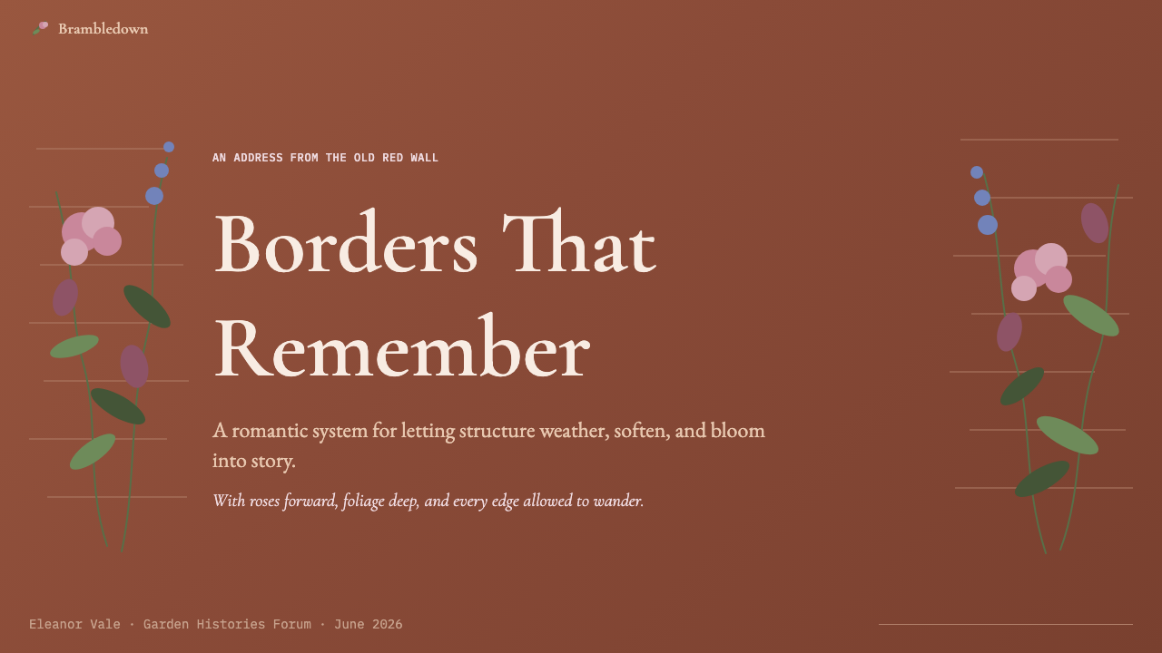
It can, but with significant trade-offs. The aesthetic's warmth depends heavily on light grounds — the aged parchment, the cream, the weathered white that gives its palette room to breathe. On dark backgrounds, the dusty midtones that define the style lose their distinctiveness and can feel muddy. A dark variant works best when it commits to deep forest green or very dark aubergine as the ground (rather than pure black), and then builds the palette upward with warm dusty pinks and ivory rather than high-saturation primaries. Botanical silhouettes in a lighter warm tone against a deep ground can carry the botanical reference without losing legibility. This is a fundamentally more difficult execution than the light-ground version.
What is the biggest difference between applying the cottage garden aesthetic in print versus on screen?
Texture behaves very differently across media. In print, genuine paper grain, letterpress impression, and subtle ink variation can be physically present; the aesthetic has an obvious natural home in offset or letterpress printing on textured stock. On screen, texture must be simulated, and the simulation is harder to pull off convincingly on high-resolution displays where artifice is more visible. The solution is usually to use texture sparingly — as a background surface note rather than a heavy overlay — and to rely more on typographic warmth, color palette, and botanical illustration to carry the aesthetic's register. Web performance is also a practical consideration: high-resolution botanical illustration files can be large, and the style's visual richness can conflict with load time requirements if not managed carefully.
How do I avoid making cottage garden-inspired work look dated rather than timeless?
The distinction between dated and timeless in this style often comes down to two things: the quality of the botanical illustration and the discipline of the typographic system. Low-quality clip-art florals, overly cute watercolor bundles, and the particular dusty-pink-and-mint-green palette that saturated markets in the early 2010s all read as dated instantly. The style ages well when it draws on genuinely high-quality botanical sources — Georgian-period engravings, Redouté rose plates, Victorian herbarium-style illustration — rather than trend-derived contemporary pastiche. Typographically, committing to one well-made classical serif family and using it with genuine control (proper optical sizing, careful leading, considered hierarchy) separates thoughtful work from fashionable decoration.
Related design styles
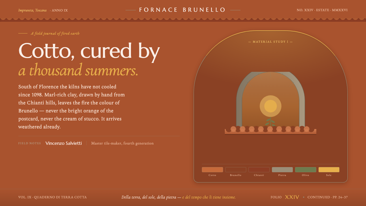 Tuscan TerracottaWeathered fired clay, never cream stucco. Brunello browns and sun ochre on hu…
 Yule SolsticeHolds the longest night. Pine-dark ground, carved Cinzel gold, an eight-spoke…
 Koi PondQuiet water carries color. Moss depth, Mincho type, and orange koi flashes.
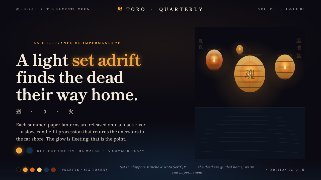 Obon Floating LanternsLight, set adrift. Amber washi lanterns on near-black water, each glow double…
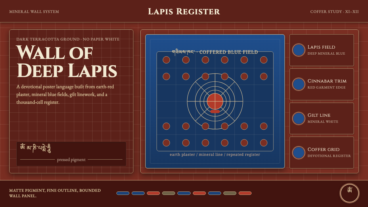 Alchi Monastery MuralDevotional depth. Lapis fields and coffered grids glow on terracotta plaster.
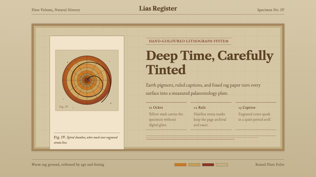 Ammonite Fossil PlateDeep time feels hand-tinted. Ochre spiral, foxed paper, and engraved captions…