What is Autumn Momiji 紅葉?
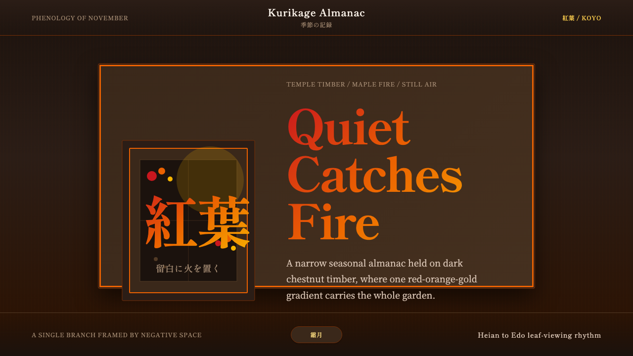
Koyo is the Japanese art of watching maple leaves burn — a centuries-old practice of sitting with the transient, of finding stillness inside a moment that is already passing. As a design system, it translates that experience into deep chestnut grounds, a single controlled gradient of anthocyanin red bleeding into carotenoid orange and yellow, wide negative space, and mincho serif type that moves at the unhurried pace of a seasonal poem.
Autumn Momiji 紅葉 in brief
Autumn Momiji Koyo is a dark Japanese aesthetic rooted in the seasonal tradition of koyo (紅葉) — the formal appreciation of autumn maple foliage in temple gardens across Kyoto and Nara. The design system takes one phenomenon from the natural world — the simultaneous, graduated color shift of Acer palmatum momiji leaves from green through red, orange, and yellow — and treats it as both subject and visual grammar.
Where most dark design systems reach for cool darkness or high-contrast drama, Koyo chooses warmth and restraint. The ground is a deep chestnut-timber brown, not a cold black. The leaf-fire gradient appears as a single ornamental gesture, placed with the editorial judgment of a haiku poet: once, deliberately, where it earns its place. Everything else is quiet — vast open fields of near-neutral ground, mincho serif type with the weight and spacing of a brushed character, and a compositional logic built around ma (間), the Japanese concept of the meaningful interval or pause.
The result is a dark interface aesthetic that does not shout. It understands that depth is created by restraint, that a single vivid gesture is more powerful than many competing ones, and that the viewer's eye needs stillness to appreciate what it is being shown. Koyo is, in this sense, a design system about editing as much as it is about adding.
Where does Autumn Momiji 紅葉 come from?
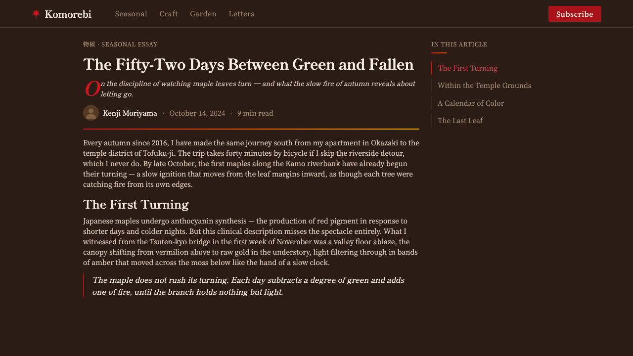
Koyo has been practiced in Japan since at least the Heian period (794–1185), when the imperial court in Kyoto formalized seasonal celebrations of natural phenomena — hanami for cherry blossoms in spring, tsukimi for the full moon in autumn, and koyo for the turning of maple leaves. Waka poets competed to capture the moment of peak color in five-line verse; the maple leaf, with its palmately lobed silhouette and its singular ability to hold multiple colors simultaneously on a single leaf, became one of the defining aesthetic subjects of classical Japanese culture.
The Acer palmatum — known in Japanese simply as momiji, a word that also means 'to turn red' — was cultivated with extraordinary care in the temple and imperial gardens of Kyoto. Gardeners selected and positioned individual trees for the quality and timing of their color change, understanding that the same species could shift from scarlet to orange to gold depending on soil acidity, water availability, and daily temperature variation. The resulting landscapes were not wild but curated: nature edited to its most expressive form. This sensibility — that beauty is achieved through careful selection and placement rather than accumulation — is the direct ancestor of the design system's compositional logic.
The aesthetic philosophy underlying Koyo is inseparable from broader Japanese concepts of transience and presence. Mono no aware (物の哀れ) — the 'pathos of things,' an appreciation of beauty sharpened by its impermanence — is the emotional register in which koyo is traditionally experienced. The leaf is most beautiful in the moment before it falls. This is not melancholy exactly; it is a trained attention to the present that transforms a moment of loss into a moment of acute perception. The design system inherits this quality: its characteristic restraint is not minimalism for its own sake, but attention management — the deliberate removal of everything that would distract from the single vivid thing being offered.
The tradition crossed into visual art through Japanese woodblock prints (ukiyo-e) of the Edo period, where autumn maples appeared repeatedly as background framing for human figures and landscapes. Artists like Hiroshige and Hokusai understood the compositional power of the maple's branching structure: the way a single overhanging branch could simultaneously frame a scene, introduce diagonal movement, and supply the warm red-orange accent that made a cool grey composition come alive. This compositional grammar — one vivid diagonal gesture against a quiet neutral field — passed from ukiyo-e into Meiji-era screen painting, into twentieth-century graphic design, and finally into the language of contemporary interface design.
What defines the Autumn Momiji 紅葉 look?
Color
The palette is built around two distinct registers that never compete: a warm, deeply saturated chestnut-brown ground (the color of aged cedar and temple timber), and the leaf-fire gradient that runs from vermilion red through burnt orange to the amber-gold of a leaf at peak turn. These are not decorative additions but seasonal facts — the exact color shift produced by anthocyanin and carotenoid pigments as chlorophyll retreats in late autumn. Against the warm dark ground, white and near-white carry all typographic content. The gradient itself is used once per composition, as a single directional sweep or isolated motif, never as a repeating texture.
Negative Space (Ma)
The concept of ma (間) — the Japanese aesthetic of the meaningful interval, the pause between notes, the space between branches — governs compositional density. Koyo layouts use negative space not as an absence of content but as an active compositional force. A single piece of type set in a wide field of chestnut-brown ground carries more weight than the same type surrounded by competing elements. This requires editorial discipline: the temptation to fill quiet space must be resisted at every turn, because the silence is where the design breathes.
Typography
Mincho-style serif letterforms are the typographic equivalent of brushed calligraphy: each character has a modulated stroke weight that evokes the seasonal and literary tradition from which the aesthetic descends. For Latin-script applications, a high-contrast editorial serif with pronounced thin strokes and strong bracketed serifs captures the same quality — deliberate, legible, carrying the weight of something written rather than printed. Type is set with generous line spacing and measured tracking, never compressed. Headings are quiet, not loud; scale is achieved through placement and contrast with surrounding space rather than through sheer size.
The Single Gesture
The Koyo system enforces a compositional law borrowed from haiku: one vivid image, held in stillness. In practice, this means each layout contains exactly one element that carries full chromatic intensity — the leaf-fire gradient, a cluster of maple silhouettes, a single vermilion vertical accent. Every other element is subordinate, held in the quiet register of near-neutral ground and controlled type. This is not decoration by subtraction; it is a deliberate hierarchy in which the one vivid thing earns its place precisely because everything around it has been quieted.
Texture and Material
While the system is not about simulating physical surfaces, its warmth comes from a chromatic texture implied by the ground color itself. Chestnut-brown grounds suggest the depth and grain of aged timber without reproducing it literally. The leaf gradient carries an organic quality — nothing about it is mechanical or flat — because it is derived from a natural phenomenon that itself produces continuous, non-repeating variation. In practice, a very subtle paper or wood-grain texture applied at low opacity to the ground can reinforce this quality, though it must remain below the threshold of legibility as a pattern; the moment it becomes readable as a surface treatment, it shifts the register from atmosphere to decoration.
Motion and Temporal Quality
Koyo's native temporal register is the slow and the seasonal — phenological rather than mechanical. When motion is used, it should evoke the unhurried drift of a falling leaf or the gradual revealing of a scene from behind morning mist, not the snappy transitions of a contemporary UI kit. Fade-ins at gentle curves, subtle parallax where foreground (branch or type) moves at a fractionally different pace from background, and the careful revealing of content rather than its sudden appearance all serve the system's atmosphere. Hard cuts, spring-physics bounces, and rapid slides work against the emotional register of the style.
Darkness Without Coldness
Dark design systems frequently mistake darkness for coolness, producing interfaces that feel clinical, corporate, or futuristic. Koyo's darkness is warm. The chestnut-timber ground sits in the red-brown range of the color spectrum; even when the palette is at its most restrained, there is always an undertone of organic warmth — the color of wood, tea, clay, autumn air at dusk. This warmth is the system's most important differentiator. It makes the interface feel contemplative rather than cold, inhabited rather than empty, ancient rather than technological.

Who shaped Autumn Momiji 紅葉?
The unnamed gardeners of Kyoto's great temple complexes — Tofukuji, Eikando, Arashiyama — are the true authors of the Koyo visual tradition. Working across generations, they selected Acer palmatum cultivars for the specific quality of their color gradient, positioned trees for optimal viewing angles from temple verandas, and maintained the surrounding compositions of moss, stone, and water that give the maple its quiet backdrop. Their work is collective, anonymous, and cumulative — a centuries-long collaboration with seasonal time that the design system inherits.
Hiroshige's series of woodblock prints — particularly his 'One Hundred Famous Views of Edo' and his landscape series — established many of the compositional conventions that Koyo design inherits. His use of the maple branch as a framing device, entering the composition from the upper corner at a diagonal, creating a warm foreground accent against a cool or neutral distance, is perhaps the most frequently borrowed compositional move in the entire Koyo tradition. Hiroshige understood how a single element of intense warmth could organize an entire composition around itself.
The seventeenth-century haiku master Bashō codified the compositional logic that underlies Koyo: the single precise image held in sparse language, the juxtaposition of the still and the transient, the understanding that a poem's emotional charge comes from what it leaves unsaid as much as what it says. His seasonal poems (kigo) about maple leaves, autumn light, and the sound of falling water are not sources for the design system's imagery but for its editorial discipline — the commitment to one vivid thing, surrounded by silence.
The Eikando temple in Kyoto's Nanzenji district has been called 'the temple of autumn leaves' and is considered the standard against which other koyo viewing sites are measured. Its garden arranges maples, water, and stone in a composition that is simultaneously wild in impression and ruthlessly edited in reality — every tree positioned, every branch pruned to serve the whole. As a design reference, Eikando teaches how restraint and abundance can coexist: a profusion of leaves, but a single unified color story; many elements, but a single reading.
The Heian-period waka poet Ki no Tomonori contributed some of the earliest and most influential seasonal verse on autumn maple leaves to the imperial anthology Kokinwakashū (905 CE). His poems established the emotional vocabulary of koyo as a design tradition: the maple not as mere scenery but as a mirror for temporal awareness, beauty made sharper by the knowledge of its end. The literary tradition he helped found shaped how subsequent generations would see, arrange, and represent autumn foliage — always in dialogue with transience.
How do you use Autumn Momiji 紅葉 today?
Koyo is most effective in contexts where the user experience should feel considered, unhurried, and premium — luxury goods, cultural institutions, personal portfolio work, long-form editorial, and high-end hospitality or wellness brands. It is the correct choice when the product's emotional register is contemplative rather than urgent, and when depth is a more valued signal than speed or efficiency. Applied correctly, it conveys that someone has made careful choices about what appears and what does not — a quality that transfers directly to perceptions of brand quality.
For presentation slides, Koyo produces covers of unusual stillness and authority. The cover convention: warm chestnut-dark ground, the leaf-fire gradient entering from one corner as a diagonal sweep or single branch silhouette, title in white mincho-weight serif at a restrained scale with generous spacing. Content slides should be sparse — one idea per slide, generous margins, type set at comfortable reading size with ample line spacing. Do not crowd. A data slide in this system uses minimal gridlines, warm-toned bars or arc segments colored within the red-orange range of the gradient, and labels in small caps or fine serif weight. The overall impression should be a presentation that breathes.
For web UI and dashboard work, Koyo suits dark-mode interfaces where the information density is moderate and the primary user mood is focused rather than reactive. Navigation elements should be quiet — light type on dark ground, no bright interactive states, hover states that reveal rather than announce. A Koyo dashboard uses the leaf-fire gradient sparingly: one accent line, one highlight state, one categorical color for the most important data series. Everything else remains in the warm dark range. Card components should have minimal or no border, relying instead on a very slight background-brightness difference to establish boundaries — the interval should be felt more than seen.
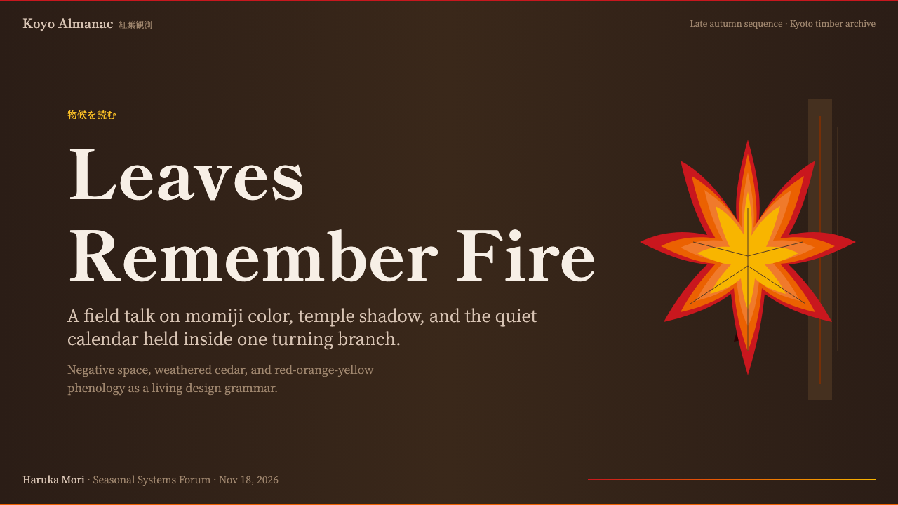
For editorial and marketing work, the style carries significant authority for cultural, editorial, and Japanese-adjacent brands. A long-form article in Koyo uses a wide left margin for pull quotes and annotations, a generous main column measure, and section breaks marked by a short horizontal rule in the warm mid-tone range rather than the full leaf-fire gradient. Marketing pages work well with a alternating structure: chestnut-dark sections for feature descriptions, and a single cream or near-white section — used once, strategically — where the most important call to action lives. The light section should feel like a pause, not like a departure from the system.
The most common mistake when applying Koyo is using the leaf-fire gradient everywhere — as background textures, button states, section dividers, loading animations. This destroys the system's fundamental logic, which depends on the gradient appearing rarely and therefore meaningfully. The second most common mistake is choosing a cool-dark ground (charcoal, slate blue-grey, near-black without warmth) rather than the characteristic warm chestnut-brown. The result feels like any other dark interface rather than like Koyo. The system's warmth is not a stylistic preference; it is the load-bearing element that distinguishes contemplative depth from clinical darkness.
Autumn Momiji 紅葉 — FAQ
Is Koyo really a dark-mode system, or can it work on light backgrounds?
Koyo is fundamentally a dark system — the deep chestnut-timber ground is not a stylistic preference but an essential carrier of the aesthetic's warmth and contemplative quality. A light inversion is technically possible, but it significantly compromises the system. On a light or cream ground, the leaf-fire gradient loses its luminosity (warm colors need dark grounds to glow) and the sense of depth and atmospheric richness collapses. If a light-ground variant is needed for accessibility or specific use cases, the recommendation is to treat it as a separate register — cream grounds, red-orange accents used at reduced saturation — rather than a direct inversion of the dark system.
How does Koyo differ from other dark Japanese-inspired aesthetics like Wabi-Sabi or Japandi?
Wabi-sabi celebrates imperfection, irregularity, and the beauty of deterioration — its color palette tends toward ash, clay, and deliberately broken surfaces. Japandi is a contemporary hybrid of Japanese minimalism and Scandinavian functionalism, characterized by clean lines, light woods, and a cool, neutral restraint. Koyo is distinct from both: it is warm where Japandi is cool, vivid (once, specifically) where Wabi-sabi is muted, and seasonal and celebratory in its emotional register rather than philosophical or functional. Koyo's defining gesture — the single brilliant gradient — has no equivalent in Wabi-sabi or Japandi. It is not about imperfection or neutrality; it is about the one moment of intense aliveness in an otherwise still composition.
Can Koyo handle dense information or is it only suited to sparse layouts?
Koyo can handle moderate information density, but it requires a different approach than most dense information systems. The key is that density must be achieved through type alone — small, carefully spaced, high-quality serif type on the dark ground — rather than through the addition of visual complexity (color coding, icon systems, background fills). The gradient and any other chromatic accent must be reserved for navigation or the single most important data point on the screen. A table or data-heavy panel in Koyo uses the warm dark ground as field, very fine lines for structure, and cream-white type at two weights for hierarchy. The result is readable but maintains atmosphere. What Koyo cannot do gracefully is combine high information density with multiple color categories or a complex icon vocabulary — those needs require a different system.
What is the role of the maple leaf as a literal motif — should it appear in interface design?
Used literally, the maple leaf motif risks tipping into cultural kitsch — the equivalent of using cherry blossom emoji to signal 'Japanese.' The Koyo system draws on the leaf tradition not through literal leaf shapes but through the color gradient the leaves produce and the compositional logic the tradition has refined over centuries. If a literal maple leaf motif appears, it should do so as silhouette — a single branch rendered in solid warm color or cut out of the gradient, not as an illustrated or decorative element. The moment a maple leaf appears as detailed illustration or animated emoji, the system breaks into costuming rather than aesthetic inheritance. When in doubt, let the gradient speak for the leaf without picturing it.
How should Koyo handle accessibility — does the dark warm ground create contrast problems?
The chestnut-timber ground is dark enough that white and near-white type achieves strong contrast ratios for standard text sizes, satisfying WCAG AA requirements without difficulty. The challenge arises with the orange and amber range of the leaf-fire gradient: warm yellows and oranges on dark brown grounds can fall below recommended contrast thresholds for small text. The solution is to reserve the gradient for decorative, navigational, or large-display uses only — never as a background for body text. Interactive elements in the orange-amber range should be used at large sizes or supplemented by an underline or outline treatment rather than relying on color alone. The overall system is accessible in its default configuration; the main risk comes from enthusiastic overuse of the gradient in typographic contexts.
Related design styles
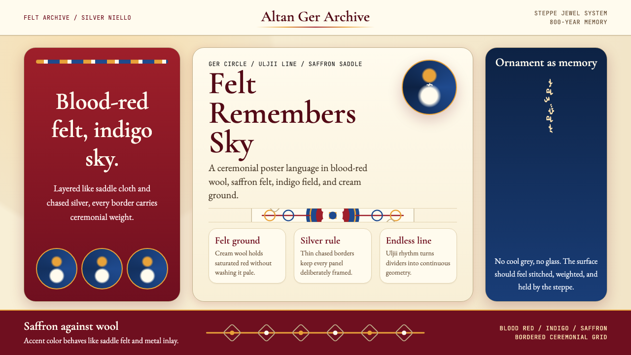 Mongolian Nomadic SteppeSteppe memory in jewel tones. Blood-red felt, saffron, indigo, and bordered u…
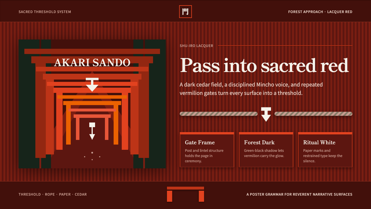 Shinto ToriiSacred red holds the dark. Vermilion gates, Mincho type, and shide white fram…
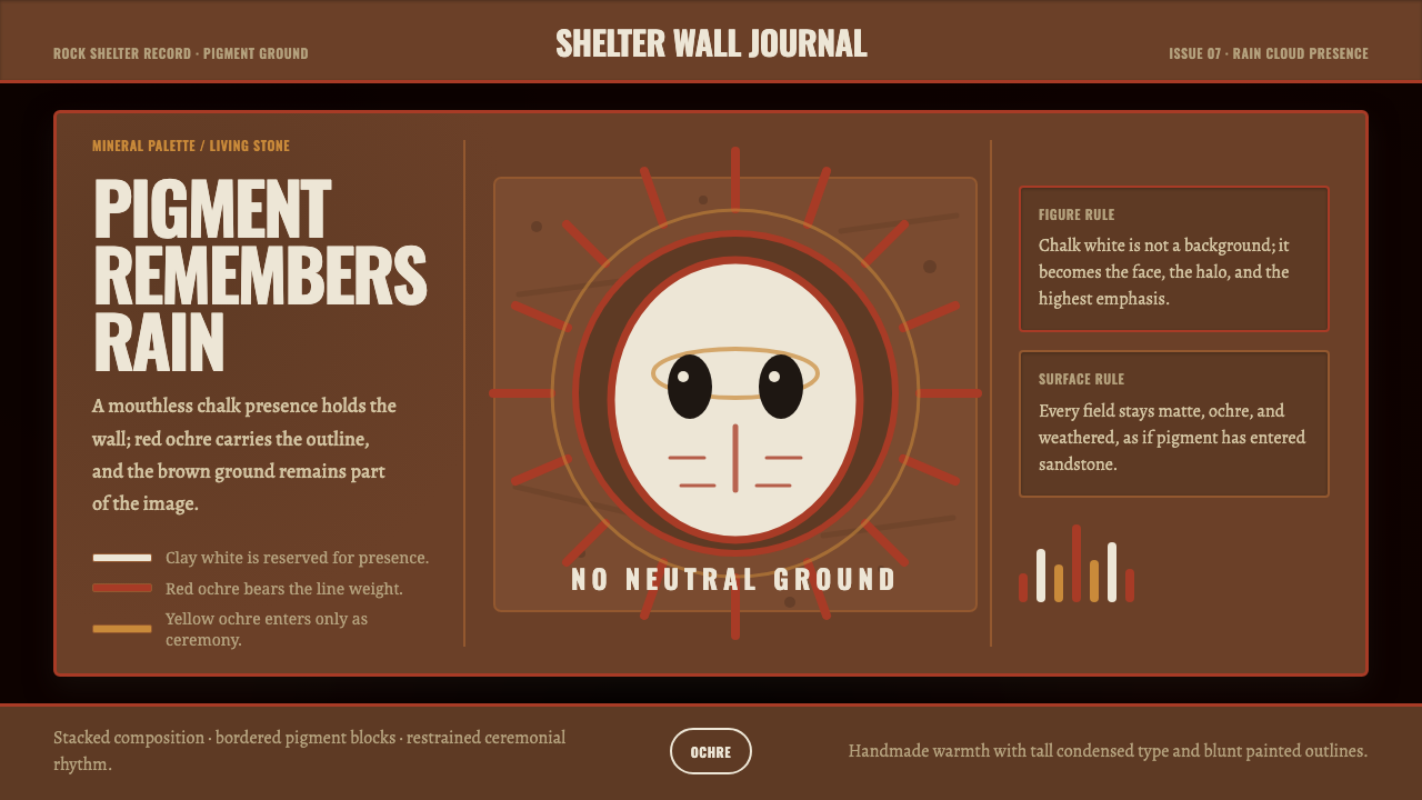 Aboriginal Wandjina KimberleyAncestral presence in stone. Chalk white haloes and red ochre outlines sit on…
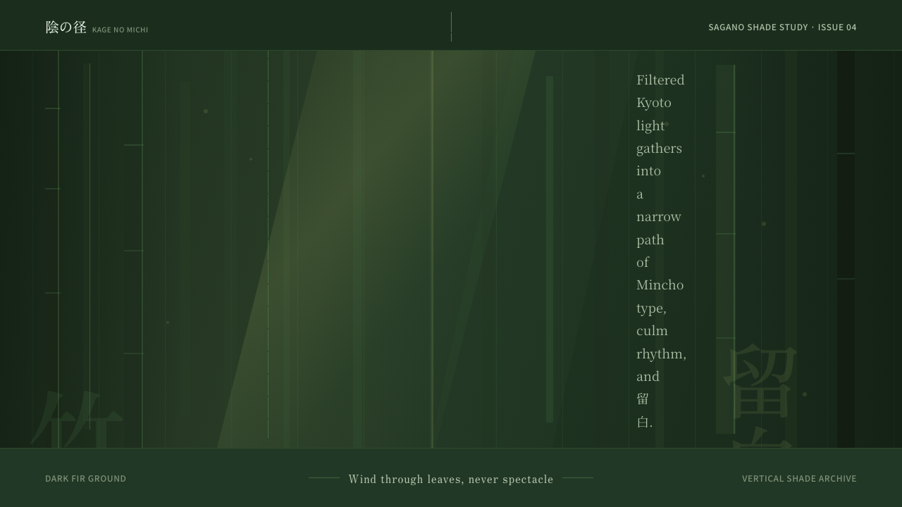 Bamboo GroveQuiet goes vertical. Fir green, Mincho type, and dappled culm rules create de…
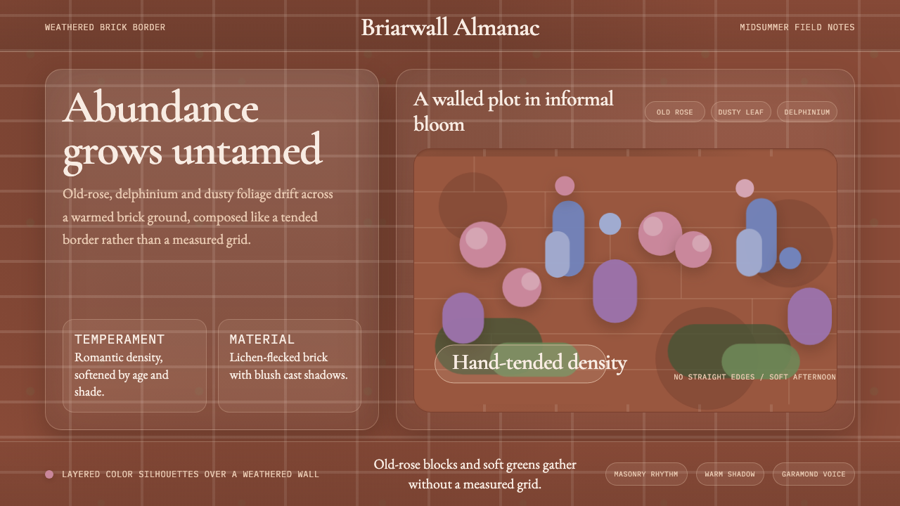 English Cottage GardenAbundance wins. Old-rose Garamond blooms over weathered brick and dusty leaf.
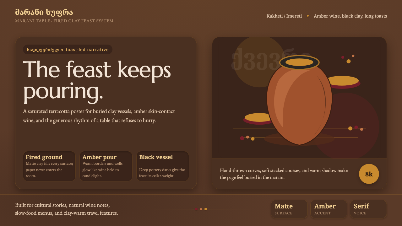 Georgian Qvevri Supra FeastHospitality made earthen. Terracotta ground, amber wine, Georgian serif curve…